

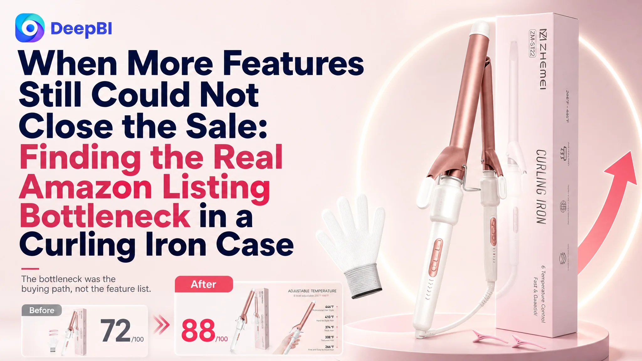
An Amazon seller in the hair-styling category was not facing a simple lack-of-information problem. The product page already included temperature settings, ceramic coating, dual voltage, travel use, safety features, and several lifestyle images. Yet its Listing scored 72 out of 100 against 88 for a comparable high-performing Amazon curling iron Listing.
The initial direction naturally centered on adding more detail: explain the temperature levels, show more functions, clarify the travel design, and make the product images more complete. But the deeper diagnosis showed that the issue was not the number of features on the Amazon product page. It was the way those features were arranged, evidenced, and connected to the buyer’s decision.
DeepBI reframed the case around Listing conversion capacity. The later optimization focused on rebuilding the sales logic of the page: create a stronger first impression, establish hair-care and safety trust earlier, make suitability easier to understand, and use A+ content to show how the product works rather than merely listing what it includes. For other Amazon sellers, the lesson is direct: before sending more paid or organic traffic to a page, determine whether the page gives shoppers enough reason to click, trust, and buy.
The Amazon Listing Had Information. It Did Not Yet Have a Strong Buying Path.
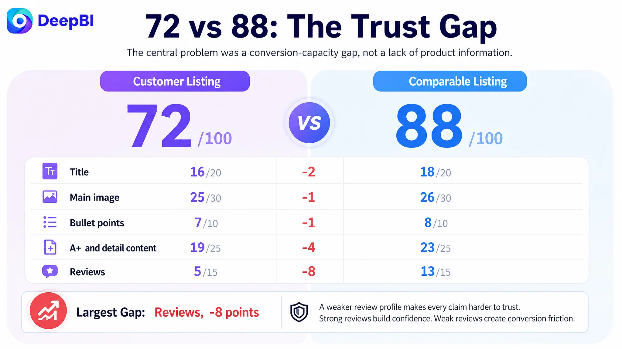
The customer’s Amazon US Listing received a total diagnostic score of 72/100, while the comparable category Listing reached 88/100.
The gap was not evenly distributed:
- Title: Customer Listing: 16/20, Comparable Listing: 18/20, Gap: -2
- Main image: Customer Listing: 25/30, Comparable Listing: 26/30, Gap: -1
- Bullet points: Customer Listing: 7/10, Comparable Listing: 8/10, Gap: -1
- A+ and detail content: Customer Listing: 19/25, Comparable Listing: 23/25, Gap: -4
- Reviews: Customer Listing: 5/15, Comparable Listing: 13/15, Gap: -8
- Total: Customer Listing: 72/100, Comparable Listing: 88/100, Gap: -16
At first glance, the page did not look empty or careless. It contained seven broad content types, including:
- Product and benefit images
- Functional breakdowns
- Hair-type and temperature guidance
- Usage scenarios
- Dimensions and voltage information
- Packaging and accessories
The problem was that these elements did not create a sufficiently persuasive sequence.
The page presented technical information before fully establishing why the product mattered. It showed temperature data before making the customer feel confident that the curling iron was suitable for her hair. It mentioned safety functions without visually demonstrating how they reduced risk. It included travel information, but travel was given more attention than the styling result that ultimately justified the purchase.
The Listing was not missing features. It was missing a clear progression from interest to confidence.
The Original Diagnosis Focused on More Detail
The working direction was understandable. The page appeared to need stronger product communication, so the natural response was to improve the visible elements one by one:
- Add more precise temperature descriptions
- Explain the PTC heating technology
- Highlight ceramic coating
- Clarify dual-voltage travel use
- Add more feature labels to images
- Show more specifications
- Make the product suitable for more hair types
Some of these changes were necessary. But treated independently, they risked producing a page with more information and the same conversion problem.
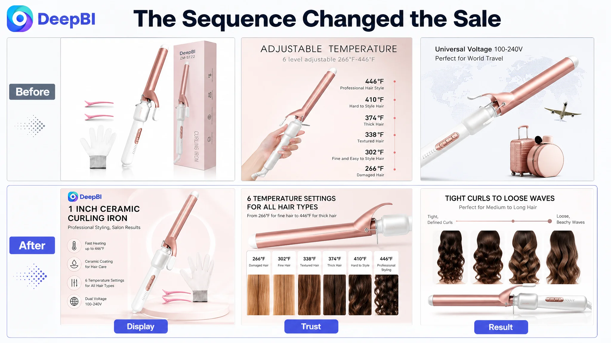
The current image sequence illustrates this issue.
The second image showed a detailed six-level temperature-to-hair-type mapping. That information was useful, but it appeared too early, before the page had established a simple reason to care. The third image focused on heating mechanics, while the buyer’s more immediate concern may have been whether the one-inch barrel was efficient for medium-to-long hair. The fifth image emphasized universal voltage and travel use, but placed the travel scenario ahead of the final styling result.
The original direction was therefore not wrong because the details were irrelevant. It was incomplete because the page was being treated as a collection of features rather than as a decision system.
The Largest Gap Was Trust, Not Product Complexity
DeepBI’s comparison showed that the most severe difference was in reviews.
The customer Listing had:
- A 3.5-star rating
- 50 total reviews
- No effective review content visible on the first page in the diagnostic snapshot
The comparable Listing had:
- A 4.5-star rating
- 438 total reviews
- Seven effective first-page reviews with detailed positive content
This created an eight-point review gap, much larger than the title, main image, or bullet-point gaps.
That difference matters because a curling iron is not purchased only through specifications. Buyers are also evaluating risk:
- Will the tool work on my hair type?
- Will it create curls that last?
- Will it cause excessive frizz or heat damage?
- Is it easy and safe to use?
- Does the product look reliable enough to justify the purchase?
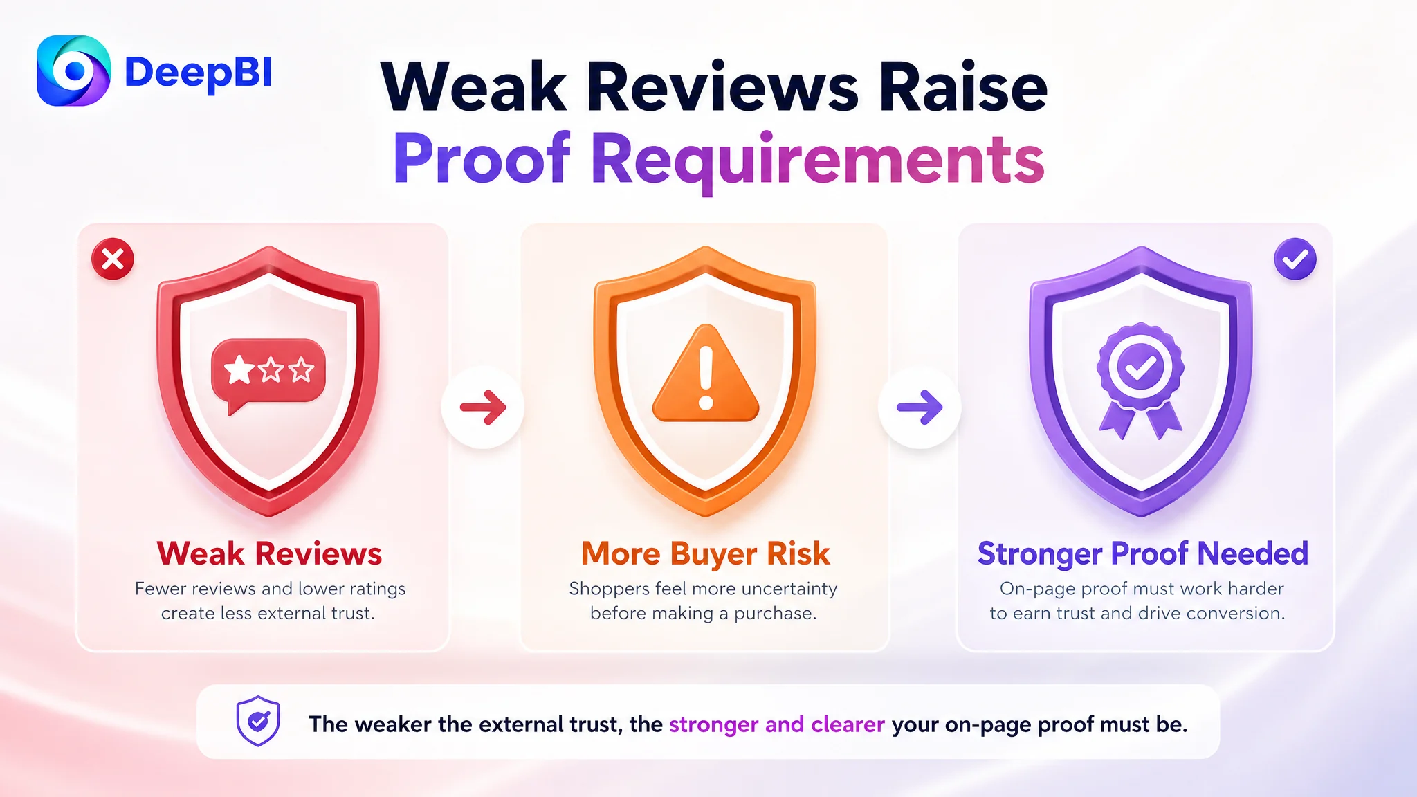
A weaker review profile makes every unsupported claim more expensive. If the page says “professional,” “fast,” or “hair care,” the shopper needs stronger visual and textual evidence to accept those claims.
The review gap itself could not be solved by rewriting a bullet point. But it changed the priority of the content work. When external trust is weak, the Listing must become more disciplined about explaining mechanisms, showing outcomes, and reducing uncertainty.
The Title Was Functional, but Not Yet Outcome-Led
The customer’s title began with a variation of “1 Inch Curling Iron.” The comparable Listing began with “Curling Iron 1 Inch” and moved quickly into more specific benefits, including:
- Long-barrel design
- Ceramic construction
- Fast heating
- Twelve heat settings
- LED display
- Lasting results
- Suitability for different hair types
- Dual-voltage travel use
The customer title included useful specifications such as ceramic coating, six temperature settings, a maximum temperature, and dual voltage. However, the structure was more feature-led and less concentrated around the customer’s likely decision criteria.
DeepBI’s proposed direction brought the core search phrase, material, voltage, product form, hair-length suitability, heating speed, temperature range, and travel use into a tighter sequence.
The purpose was not to imitate the competing title word for word. It was to improve the relationship between search relevance and buying relevance:
- Put the core product phrase earlier
- Keep the one-inch ceramic curling iron identity clear
- Connect the long-barrel design to medium and long hair
- Preserve verified specifications such as 446°F and six temperature settings
- Bring fast heating into the value proposition
- Reduce the sense of scattered technical information
A title can contain the right keywords and still fail to communicate the right reason to click. In this case, the issue was not simply keyword coverage. It was whether the title quickly answered, “Why might this tool be a better fit for me?”
The Main Image Needed to Confirm Value Earlier
The main image gap was only one point, but its role was more important than the score alone suggested.
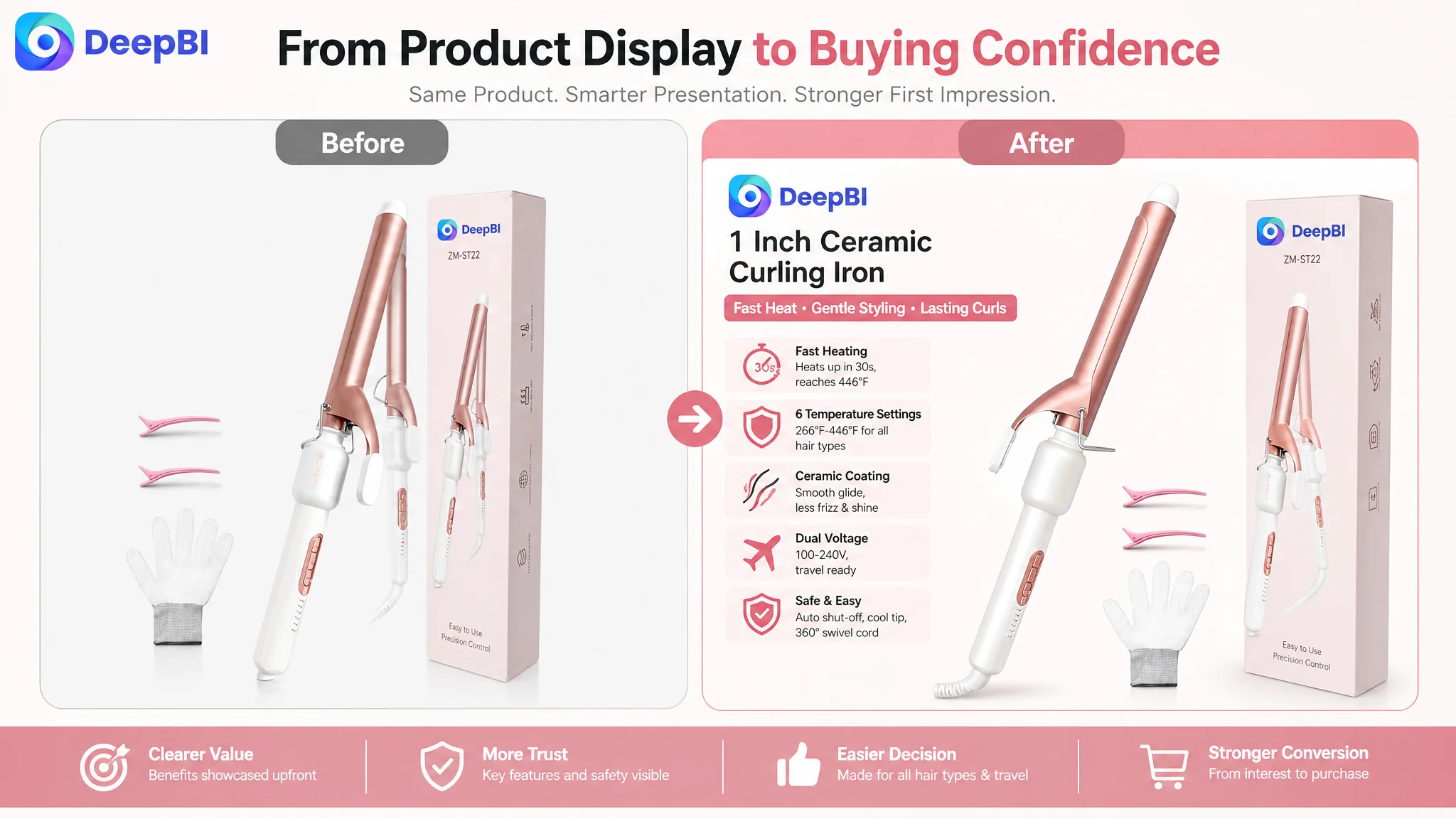
The existing first image established the product type, rose-gold appearance, one-inch barrel, and included accessories. It was clean, but it did not create a particularly strong first impression. The comparable Listing used an active digital display and a clearer presentation of its accessories, immediately communicating a modern, controllable, and safer styling tool.
The proposed change was not to alter the product itself. It was to improve the image’s commercial role:
- Show the active display more clearly
- Present the included gloves and clips together
- Make the product and accessories easier to understand at thumbnail size
- Preserve the product’s actual rose-gold identity
- Create a stronger first impression without introducing unsupported claims
This distinction is important. Main-image optimization is not the same as making an image more decorative. The goal is to make the product’s value easier to recognize before the shopper reaches the rest of the page.
The second image should reduce hair-care doubt
The existing second image placed detailed temperature mapping too early. The proposed role was to explain ceramic coating, even heat distribution, and a smoother, less frizzy finish through clearer visual communication.
The page already had a ceramic-coated barrel and related hair-care claims. What it lacked was a convincing connection between the technology and the user’s concern.
The third image should answer the suitability question
The existing third image visualized the heating mechanism. That was technically interesting but less decisive than showing why the extended barrel was useful for medium-to-long hair.
The proposed image would show:
- The barrel length
- How more hair can be wrapped at once
- Suitability for medium and long hair
- The range from defined curls to looser waves
This moved the content from “how the tool heats” to “how the tool fits my use case.”
The fourth image should support precision
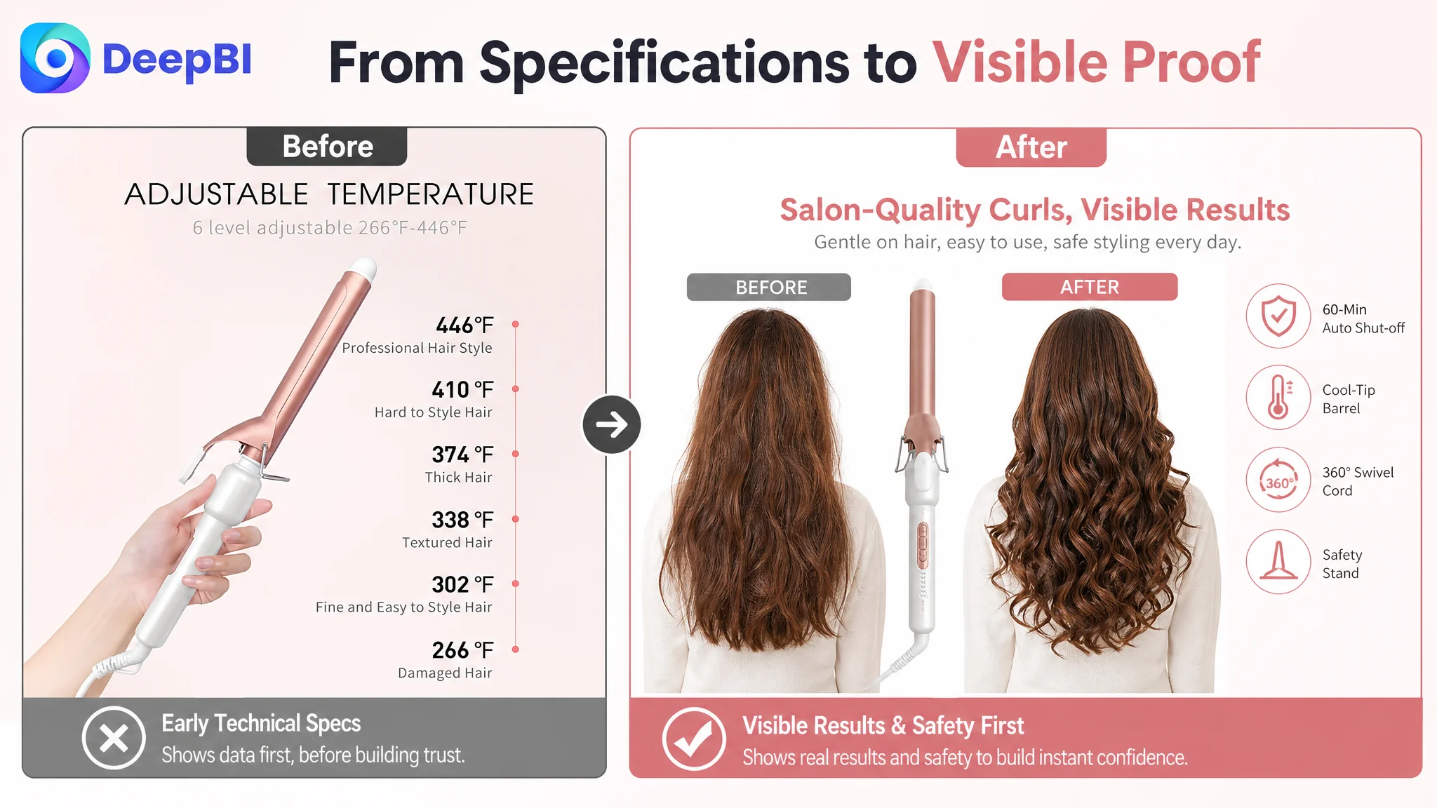
The temperature chart was not discarded. It was moved later in the decision sequence, when shoppers were more likely to seek detailed confirmation.
The six settings, from 266°F to 446°F, could then be linked to different hair conditions without forcing the shopper to process technical data before understanding the product’s primary benefit.
The fifth image should validate the result
The existing fifth image concentrated on travel use. Travel mattered, but it was not the strongest closing argument for a curling iron.
The proposed direction gave more space to the styling result, including defined curls and waves, while retaining safety confirmation such as the 60-minute automatic shut-off. Dual voltage and travel imagery could remain in later content for shoppers who had already accepted the product’s core performance.
The Bullet Points Had Features, but Not Enough Decision Logic
The bullet points were not weak because they lacked specifications. They were weaker because the specifications were not always connected to a concrete user outcome.
The proposed restructuring followed a clearer pattern:
Concern → Product proof → Practical result
For example:
Fast heating should connect to lasting styling
The proposed first bullet linked PTC heating with reaching 266°F in 30 seconds and 430°F in 120 seconds, then connected stable heat to curls intended to last from morning to night.
The important change was not just adding numbers. It was explaining why those numbers mattered.
Ceramic coating should explain the hair-care benefit
The ceramic coating bullet was reframed around smooth gliding, even heat distribution, reduced snagging, and a shiny, less frizzy finish.
This helped move the product from “a heated tool” toward “a tool designed to reduce common styling concerns.”
Six temperatures should become a fit signal
The six temperature settings were connected to fine, fragile strands and thick, resistant hair. This gave the temperature range a practical role instead of leaving it as a specification list.
The long barrel should communicate efficiency
The one-inch extended barrel was positioned around medium-to-long hair and the ability to create both tighter curls and looser beach waves.
That was a stronger conversion argument than simply repeating the barrel size.
Travel and safety should be treated as reassurance
Dual voltage, a 360-degree swivel cord, a cool tip, a stable base, and automatic shut-off were not merely accessories or technical details. They were answers to specific concerns:
- Can I use it abroad?
- Will the cord become difficult to manage?
- Can I handle the tool safely?
- What happens if I forget to turn it off?
The page became more persuasive when each feature had a visible job in the buyer’s decision.
A+ Content Was the Real Page-Level Bottleneck
The A+ and detail-content score was 19/25, four points below the comparable Listing. This was the clearest content-side weakness outside reviews.
The customer’s A+ page included many modules, but several were used as general feature displays. The comparable Listing used fewer broad categories with deeper persuasion, including:
- Before-and-after presentation
- Hair-care mechanism explanation
- Real-time temperature display
- Safety and handling details
- Three-step usage guidance
- Multiple styling scenarios
The difference was not the number of modules. It was the role each module played.
The opening module needed to establish technical value
Instead of repeating the title, the first A+ section should quickly establish:
- One-inch barrel function
- Ceramic coating and smooth glide
- PTC fast heating
- Six temperature settings
- Dual voltage from 100V to 240V
This gave shoppers a reason to continue reading.
Safety features needed to become solutions
The existing page listed features such as the cool tip, holder, temperature button, LED, and swivel cord. The stronger direction connected them to user concerns:
- Automatic shut-off supports unattended-use safety
- The cool tip supports safer handling
- The safety stand helps protect surfaces
- The swivel cord reduces tangling during styling
This is the difference between a component catalog and a reassurance system.
Technical proof needed to appear before lifestyle repetition
The detailed temperature and heating information appeared too far down the current page. Moving it earlier would create trust before the lifestyle sections.
Only after the shopper understood the product’s performance logic would the travel and styling scenarios become more useful.
A missing usage guide needed to reduce complexity anxiety
The page did not have a direct, simple usage module. DeepBI’s recommendation was to add a three-step guide:
1. Set the temperature
2. Place the hair
3. Style and comb
This was not a cosmetic addition. It answered a practical objection: “Will I know how to use this successfully?”
A product can appear technically capable and still lose buyers if the usage path feels uncertain.
For this Listing, A+ content needed to do more than add polish. It needed to replace missing confidence.
Why DeepBI Did Not Prioritize More Ad Tuning First
The case material does not include post-optimization advertising results such as CTR, CVR, ACOS, or TACOS. It would therefore be inaccurate to claim that ad efficiency improved after the changes.
But the decision logic remains clear.
Amazon ads can bring a shopper to the product page. They cannot, by themselves, explain why a curling iron is suitable for a particular hair type, prove that its ceramic coating supports a smoother finish, or compensate for a weak review profile.
If the page is still asking shoppers to assemble the buying argument themselves, more traffic can expose the same conversion weakness at a larger scale.
The correct sequence was therefore:
1. Identify the Listing’s largest trust and decision gaps
2. Rebuild the title, image sequence, bullets, and A+ content around those gaps
3. Preserve factual product boundaries and verified specifications
4. Apply the revised assets
5. Observe subsequent organic and paid traffic behavior through CTR and CVR
This does not mean Amazon ads are unimportant. It means ads should not be used as a substitute for page clarity.
A stronger Listing gives paid traffic a better chance to become useful traffic. It also gives organic shoppers a more coherent reason to choose the product.
The Optimization Was a Reordering of Sales Logic
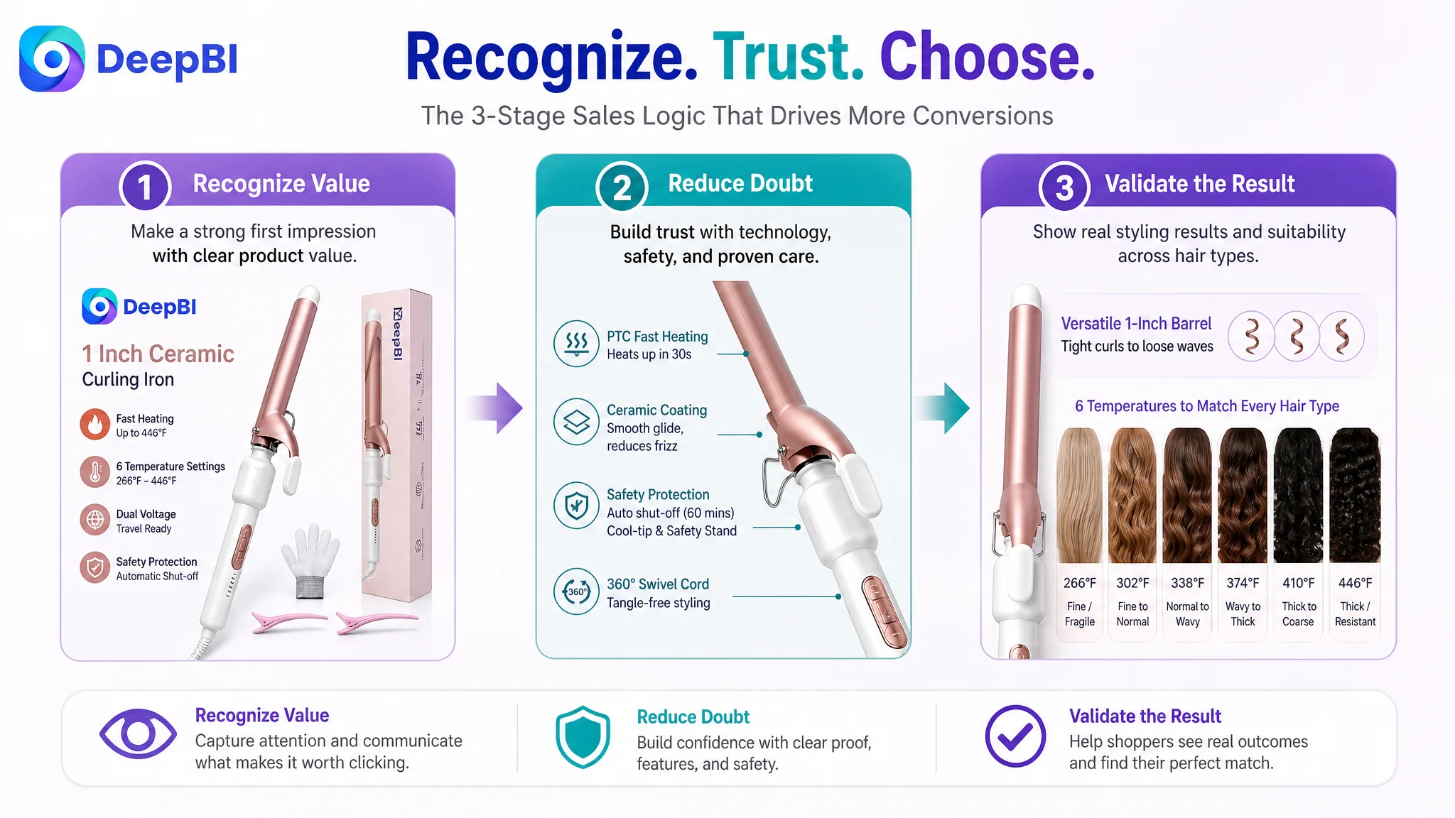
The proposed changes can be summarized as a new page sequence:
First: establish the product and its immediate value
The customer should recognize the one-inch ceramic curling iron, the active display, the included accessories, and the modern styling proposition quickly.
Then: reduce the main risk
The page should explain ceramic coating, even heat, smoother gliding, and safer handling before asking the shopper to process detailed specifications.
Next: prove suitability
The extended barrel and six temperature settings should be connected to medium-to-long hair and different hair conditions.
After that: confirm precision
Temperature levels, heating speed, and operating controls should support the decision with specific information.
Then: validate the result
The page should show the styling outcome and practical use process, rather than closing primarily with travel imagery.
Finally: support secondary purchase motivations
Dual voltage, compactness, and gift suitability can strengthen the decision for relevant shoppers once the core performance case is established.
This is why the case cannot be reduced to “improve the title” or “replace the images.” The real work was to make every element serve the next decision.
What Other Amazon Sellers Can Learn From This Case
The customer’s Listing did not suffer from one dramatic creative failure. It suffered from a misalignment between information and persuasion.
The most useful lessons are therefore operational.
A high Listing score is not created by feature volume. A page can include many specifications and still leave the buyer uncertain.
The largest score gap may not be the only priority, but it changes the strategy. The eight-point review gap could not be solved through copy alone, yet it made stronger on-page proof more important.
Main images should create recognition and value, not just display the product. A clean image is not automatically a competitive image.
Bullet points should translate specifications into decisions. “Six temperatures” becomes more useful when the shopper understands which setting may fit her hair.
A+ content should demonstrate mechanisms, outcomes, and usage. The strongest competitor content did not simply claim better performance. It showed why the product could produce it.
Ads should not be asked to rescue a low-confidence page. Before increasing traffic, sellers should judge whether the Amazon product page is ready to convert it.
The Outcome Was a Clearer Business Decision, Not an Unsupported Promise
The available case material does not provide confirmed post-optimization metrics. There is no verified before-and-after record for CVR, ACOS, TACOS, organic orders, keyword position, or review growth, so those outcomes should not be invented.
What the diagnosis did establish was a more controllable operating direction:
- The title could be organized around search relevance and customer benefit
- The main-image sequence could be rebuilt around click, trust, suitability, precision, and result validation
- The bullet points could connect product facts with user concerns
- The A+ page could move from feature repetition to proof and guided use
- Advertising and organic traffic could be evaluated after the page had been repaired
- Future performance changes could be interpreted against a clearer Listing hypothesis
The central change was in business understanding.
The Amazon seller was not looking at a page that merely needed more features. The page needed to earn confidence in the right order. DeepBI’s value in this case was identifying that constraint through structured comparison, separating controllable content weaknesses from the larger review disadvantage, and turning the diagnosis into a page-level decision path.
Before asking Amazon traffic to work harder, the Listing had to become easier to believe.