

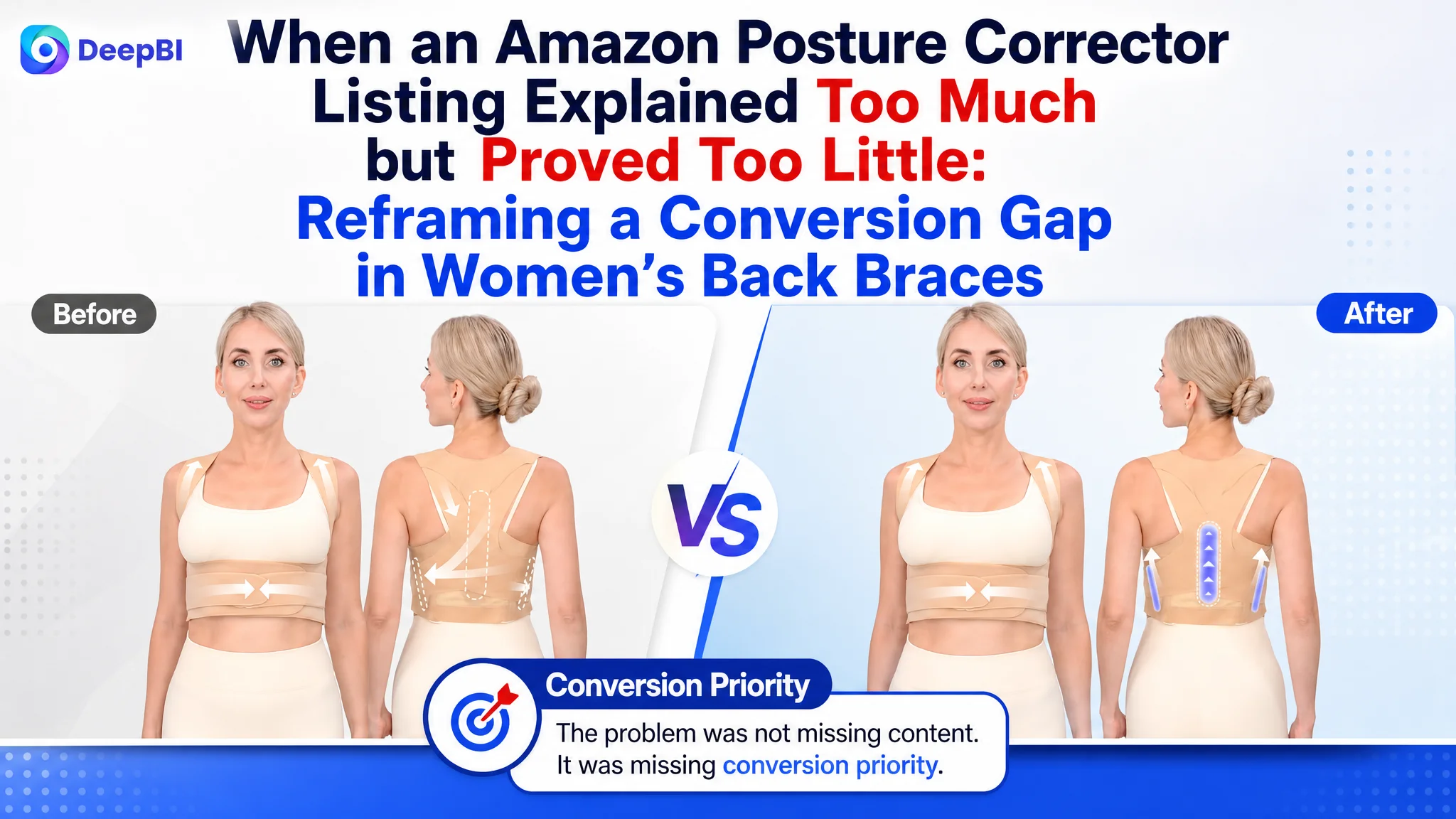
An Amazon seller in the women’s posture corrector category was not facing a simple lack of product information. Its Listing already included feature graphics, material details, posture comparisons, a sizing guide, and multiple usage scenarios. Yet the page remained less competitive than a comparable high-performing Listing, with a total score of 72 versus 88.
The initial optimization direction leaned toward explaining the product more clearly: show the structure, describe the invisible design, highlight ergonomic support, and communicate the expected posture benefits. Those actions were reasonable, but they treated the problem mainly as a presentation issue.
DeepBI’s diagnosis pointed to a deeper constraint in the Amazon product page. The Listing had information, but its sales logic was weaker: the title did not lead with the most immediate user pain, the bullet points did not build a convincing decision path, the imagery did not prove comfort and fit early enough, and the review base could not provide sufficient trust.
The later optimization therefore focused less on adding more claims and more on rebuilding the order of persuasion—from pain recognition and product understanding to fit confidence, daily usability, realistic expectations, and trust. For other Amazon sellers, the case offers a practical reminder: before increasing traffic or repeatedly refining ad settings, determine whether the Listing is ready to convert the traffic it receives.
The Amazon Listing Did Not Lack Content. It Lacked Conversion Priority.
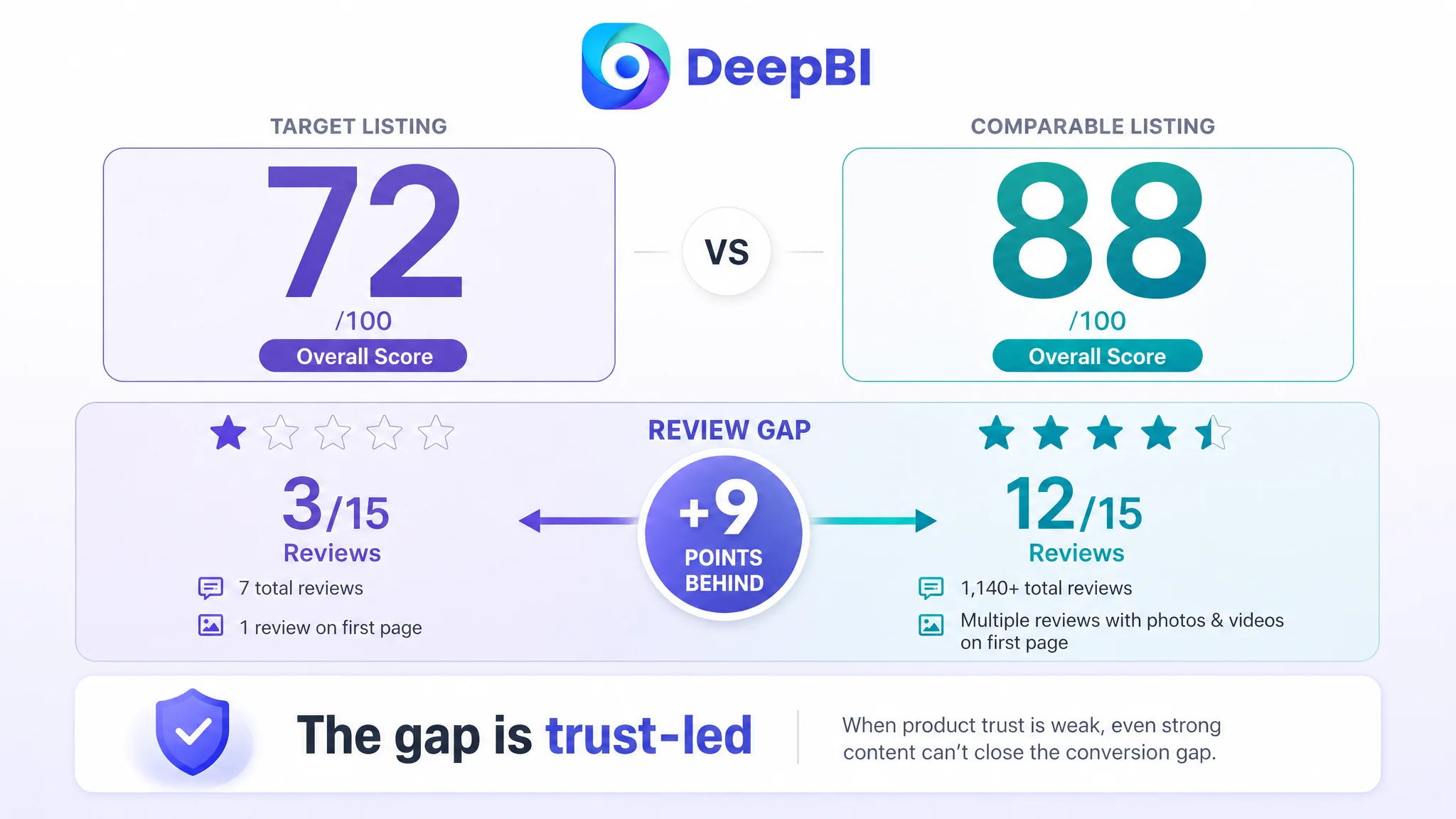
The customer’s US Amazon Listing received an overall score of 72 out of 100, while a comparable high-performing Listing scored 88.
That 16-point gap was not evenly distributed:
- Title: Target Listing: 16/20, Comparable Listing: 18/20, Gap: -2
- Main image: Target Listing: 25/30, Comparable Listing: 26/30, Gap: -1
- Bullet points: Target Listing: 7/10, Comparable Listing: 9/10, Gap: -2
- A+ content: Target Listing: 21/25, Comparable Listing: 23/25, Gap: -2
- Reviews: Target Listing: 3/15, Comparable Listing: 12/15, Gap: -9
- Total: Target Listing: 72/100, Comparable Listing: 88/100, Gap: -16
At first glance, the page did not appear seriously deficient. It had more than enough material to describe the product. The problem was that the content was not arranged according to how a hesitant Amazon shopper makes a decision.
A posture corrector is not purchased only because its fabric is breathable or its straps are adjustable. Buyers may first want to know:
- Does this address the discomfort or slouching I experience?
- Will it fit my body?
- Can I wear it under normal clothes?
- Will it irritate my skin or underarms?
- How long do I need to wear it?
- Is there enough evidence to trust the product?
The target Listing answered some of these questions, but not in the order that reduced hesitation most effectively.
The central issue was not missing information. It was that the page asked buyers to understand the product before giving them enough reason to trust it.
The Original Diagnosis Focused on Features, Not the Buyer’s Risk
The customer’s existing page leaned heavily on functional explanation.
The title began with a generic product term and then moved through neck, shoulder, and upper-back support, invisibility, adjustability, and wearability. The image sequence introduced product structure, material details, posture improvement, and use cases. The A+ content included a brand image, core selling points, structure and function graphics, material close-ups, a 21-day comparison, a comparison table, a sizing guide, and multiple scenarios.
This was a logical product-centered structure. It explained what the item was and how it worked.
But that was also the limitation.
The comparable Listing led with a more immediate buyer problem: hunching, slouching, and upper-back, neck, or shoulder discomfort. It then moved into fit, material thickness, discreet wear, daily usage, and customer reassurance.
The difference was not simply that one Listing had better copy. It was that the competing page converted product attributes into a sequence of answers to buyer concerns.
The customer’s original direction effectively treated the Listing as an information display:
- Here is the posture support structure.
- Here is the invisible design.
- Here is the material.
- Here is how to use it.
- Here is the expected improvement.
The stronger direction treated it as a risk-reduction path:
- This is the problem you recognize.
- This is how the product fits real bodies.
- This is how it stays discreet and comfortable.
- This is how to build a daily wearing habit.
- Here is why the product is credible.
- Here is how uncertainty is handled.
That distinction explains why adding more functional detail alone would not close the conversion gap.
The Largest Gap Was Not the Main Image. It Was Trust.
The most striking result in the score comparison was the review dimension.
The target Listing had:
- A 3.5-star rating
- Seven total reviews
- One review visible on the first page
- A first-page review with no image or video
The comparable Listing had:
- A 3.9-star rating
- More than 1,000 reviews
- Multiple first-page reviews
- More detailed reviews supported by customer images and videos
The rating difference was relatively small. The evidence difference was not.
For a product worn directly on the body, review volume and review quality carry substantial weight. Buyers are not only evaluating whether the posture corrector exists or looks attractive. They are trying to estimate whether it will fit, whether it will feel tolerable, whether it will remain hidden under clothing, and whether the claimed benefits are realistic.
A product page with limited review evidence has to compensate through stronger clarity and stronger risk reduction. It needs to make fit, comfort, wearability, and usage expectations unusually easy to understand.
The target Listing instead placed more pressure on visual polish and product explanation while lacking the social proof that would make those explanations persuasive.
This is why the review gap could not be treated as an isolated reputation issue. It weakened the entire conversion system.
When review evidence is thin, every unclear image, vague promise, and missing sizing cue becomes more expensive.
The Title Was Descriptive, but It Did Not Start With the Strongest Search Intent
The title dimension was not the largest weakness, but its shortcomings revealed the broader problem.
The target title opened with a generic product term, while the comparable Listing established stronger brand recognition and immediately addressed hunchback and slouching. It also brought the lightweight, discreet, under-clothing benefit forward and made the size range clearer.
The target title contained relevant terms, including neck, shoulder, upper-back pain relief, invisibility, and adjustability. However, the terms were arranged more like a feature list than a tightly prioritized search and decision structure.
The recommended direction retained the product’s actual attributes while improving the sequence:
- Start with the core product category.
- Bring the invisible adjustable back-brace concept forward.
- Connect the product to neck, shoulder, and upper-back discomfort.
- Include slouching and hunchback as relevant usage language.
- Clarify discreet wear under clothing.
- Present the available color and size more clearly.
The objective was not to imitate the competitor’s wording. It was to make the title answer two questions earlier:
What is this product, and why might it be relevant to my problem?
For Amazon mobile shoppers, that order matters. A title can contain all the right keywords and still underperform if the most important meaning is buried inside a string of attributes.
The Bullet Points Needed a Buying Logic, Not More Features
The target bullet points followed this sequence:
1. Invisible design
2. Spine alignment and posture improvement
3. Ergonomic back support
4. Adjustability and ease of use
5. Habit formation and confidence
The comparable Listing used a different sequence:
1. Pain and discomfort
2. Specific fit, material, and thickness
3. Discreet wear under clothing
4. Daily wearing routine and muscle-training logic
5. Maintenance and customer support
The difference is important because the first bullet point often determines whether the rest of the Listing receives attention.
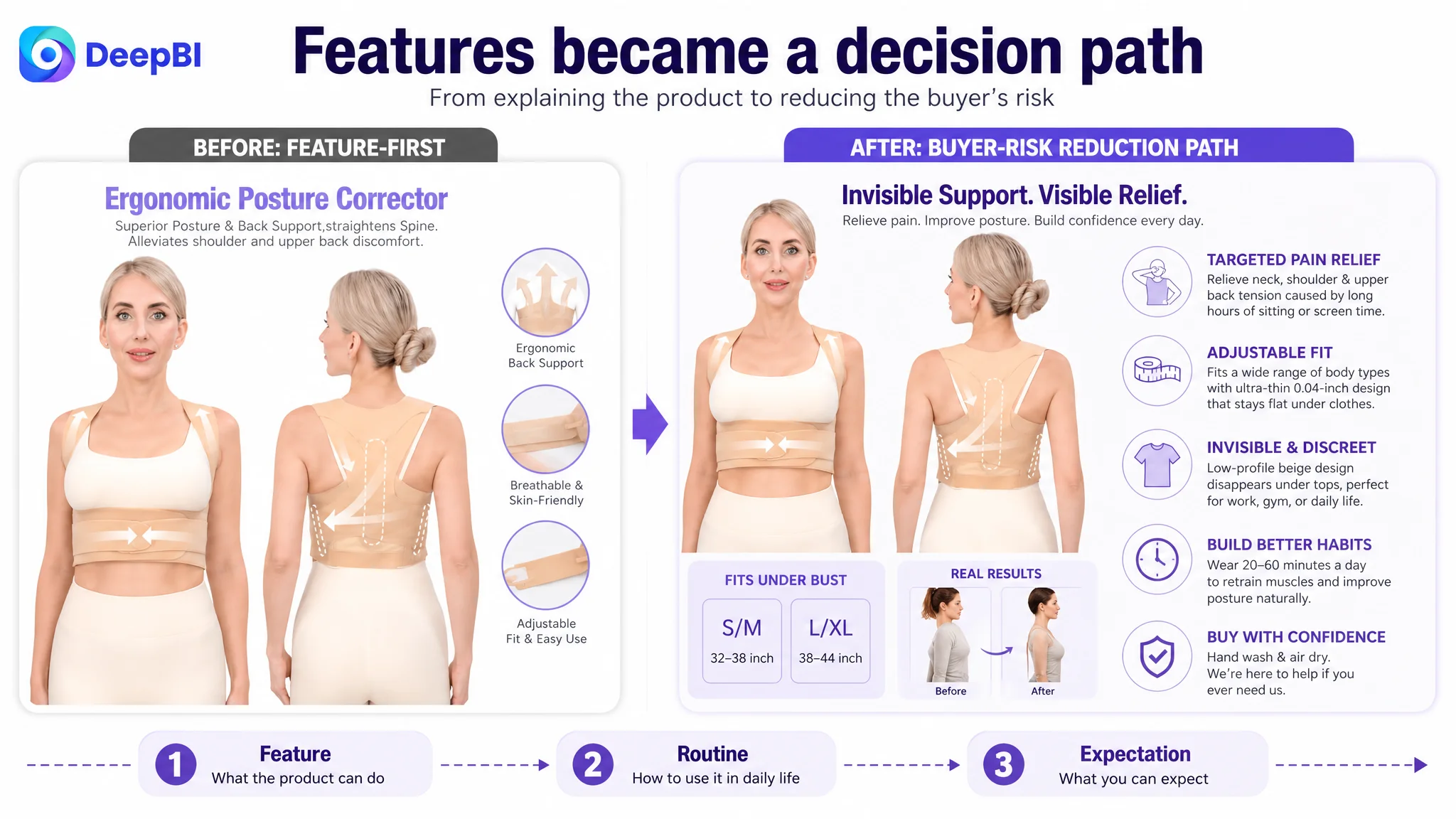
Starting with “invisible design” describes a benefit, but it does not necessarily activate the strongest reason to buy. Starting with neck, shoulder, and upper-back tension caused by long periods at a desk or in front of a screen creates a more recognizable situation.
The recommended structure therefore moved pain and use context to the first position, then followed with measurable or concrete reassurance.
The first bullet needed to identify the problem
Instead of opening with concealment, the revised direction connected the product to desk work, slouching, shoulder alignment, and upper-back tension.
This does not mean making unsupported medical promises. It means expressing the product through the buyer’s actual usage context rather than beginning with a secondary feature.
The second bullet needed to reduce fit uncertainty
The target copy described adjustability and premium materials, but it lacked the specificity that helps buyers judge whether the product will work for them.
The revised direction emphasized the available fit information, breathable fabric, elastic straps, and slim profile. Concrete details make a posture corrector feel less like a generic support product and more like a defined item with understandable wearing conditions.
The third bullet needed to turn “invisible” into a daily-use benefit
The original page described invisibility as a product feature. The stronger direction connected it to real situations: work, casual outings, fitted shirts, and other daily clothing.
This reframes invisibility from appearance alone to consistency. If the product can be worn discreetly and comfortably, the buyer can more easily imagine using it regularly.
The fourth bullet needed to explain the routine
The target Listing mentioned ease of use, but the comparable Listing explained a daily wearing duration and positioned the brace as part of a gradual habit.
That logic was stronger because it answered a practical question: What does using this product actually look like?
The recommended direction used a 20-to-60-minute daily routine and described support as part of posture practice, without presenting the brace as a substitute for professional care.
The fifth bullet needed to lower post-purchase anxiety
The original fifth point discussed confidence and habit formation but offered limited maintenance or support information.
The revised direction added hand-washing, air-drying, reinforced construction, and customer support. These details may not create the initial click, but they help resolve final-stage hesitation and can reduce confusion after purchase.
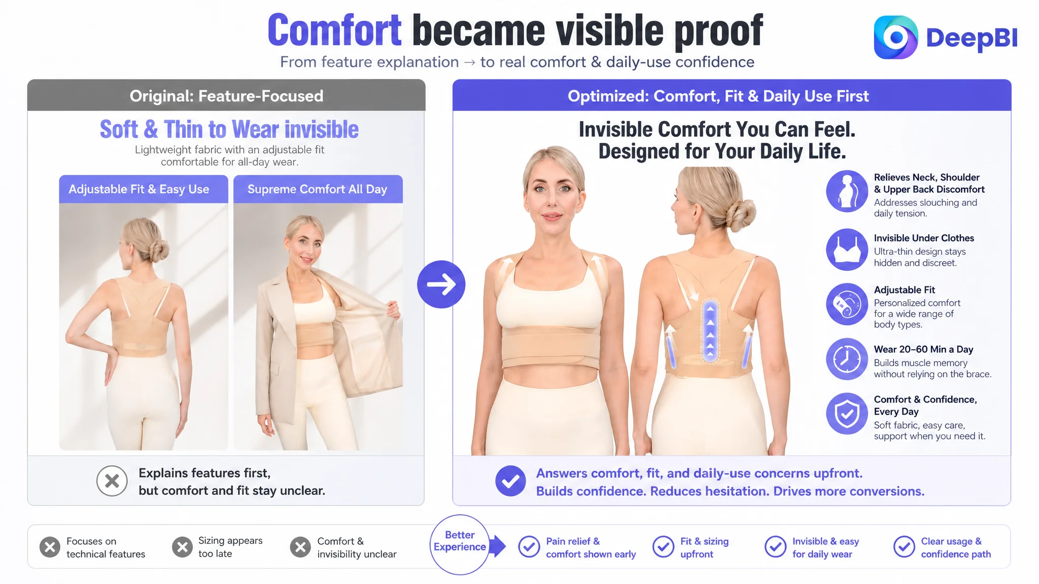
The Main Image Was Not Just a Visual Issue
The main image score gap was only one point: 25 versus 26.
That might suggest the images were already close enough. DeepBI’s analysis showed why a small score difference could still matter.
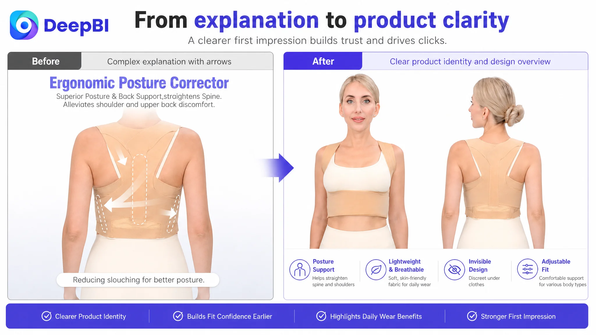
The target image sequence was functional and complete, but its first impression was too complex. The opening visual used a schematic-style explanation before the shopper had fully confirmed what the product looked like or whether it matched their need.
The recommended image sequence changed the role of each frame.
First image: confirm the product before explaining it
The first image should function as a clear product and design overview.
A clean front-and-back presentation on a real model, with a simple beige product and a visible slim profile, would establish product identity faster than a dense functional schematic. The buyer should immediately understand what the posture corrector is and how it is worn.
Second image: show the expected use path
The second image needed to communicate posture alignment, shoulder straightening, reduced slouching, and the suggested daily wearing duration.
The key change was to introduce an understandable usage timeline rather than relying on general claims. A specific wearing routine gives the buyer a clearer expectation of how the product fits into daily life.
Third image: prove the invisible design in context
Material close-ups can support comfort, but they are weaker than showing the product under normal clothing.
The revised direction placed the product beneath a shirt or blouse and used the fabric, shoulder straps, breathability, and skin-friendly construction as supporting evidence. This gave “invisible” a visible use case.
Fourth image: answer discomfort concerns
The existing lifestyle visual repeated the concealment message without directly addressing chafing, underarm irritation, or adjustment difficulty.
The new direction shifted toward a problem-solution frame: adjustable fit, elastic straps, ease of putting on and taking off, and gentler contact with the skin and underarms.
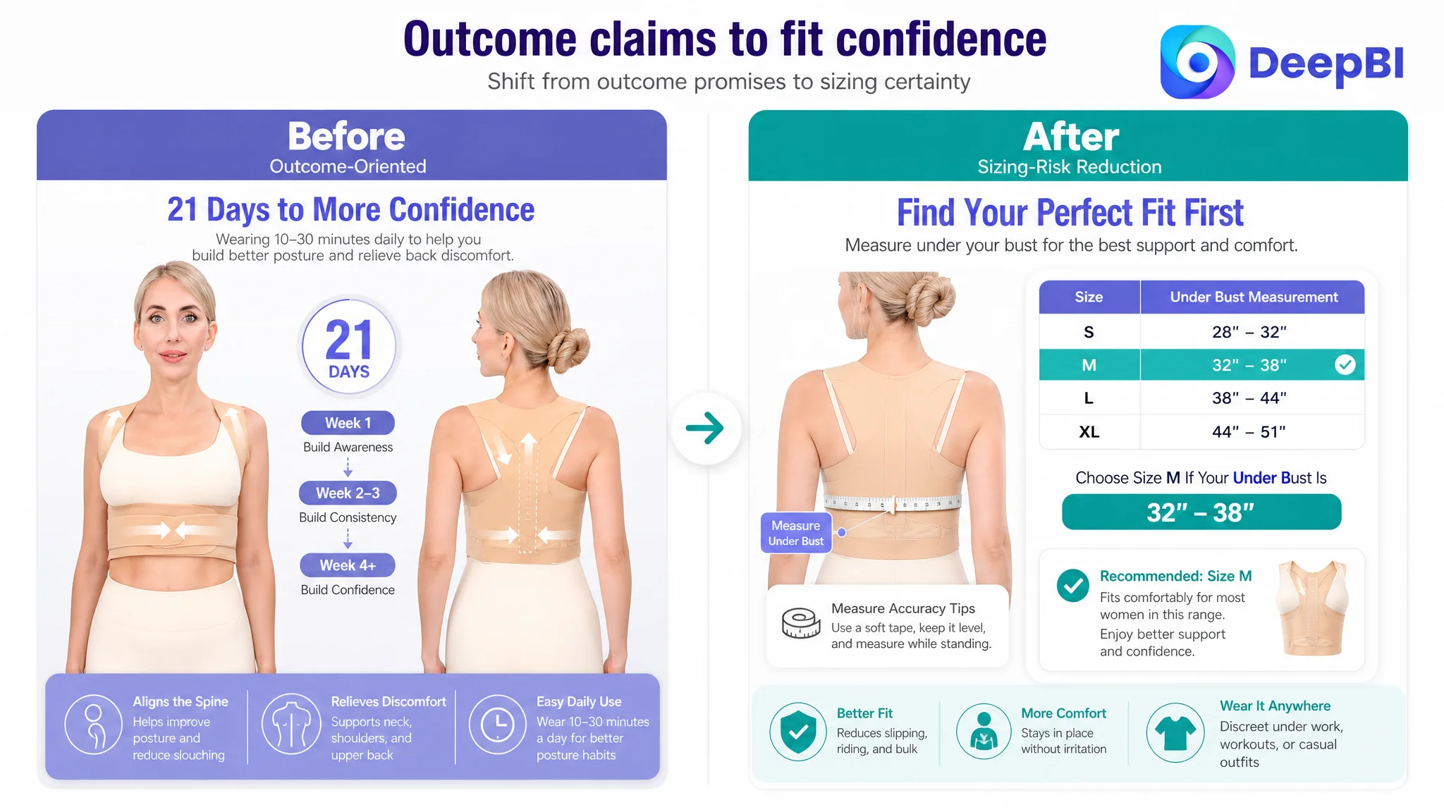
Fifth image: reduce sizing risk
The before-and-after sequence had an outcome-oriented role, but it did not solve one of the most immediate purchase concerns: choosing the right size.
A clear under-bust measurement guide and size range should appear earlier in the decision path. For a first-time posture corrector buyer, sizing clarity can be more valuable than another generalized outcome image.
The image problem was not that the page lacked visuals. It was that the visuals explained the product before they resolved the buyer’s biggest uncertainties.
The A+ Content Looked Complete, but the Trust Chain Was Incomplete
The target A+ content included seven modules covering product introduction, features, materials, sizing, usage, posture comparison, and common scenarios.
The comparable Listing used fewer modules but built a stronger narrative:
Pain point → solution → professional credibility → real-user evidence → after-sale reassurance
This was the most important A+ difference.
The target page’s light purple, fashion-oriented presentation was visually polished, but it did not fully match the expectations of a health-adjacent support product. A more grounded visual direction, including realistic middle-aged users and warmer, more credible visual cues, could better connect with the likely audience of people dealing with posture discomfort or long periods of sedentary work.
The biggest weakness was the use of a demonstrative animation-style “21 Days to More Confidence” visual rather than authentic user evidence with a clear time reference. The comparable Listing’s real-user before-and-after content, customer statements, and star ratings provided stronger social proof.
That does not mean the customer should make stronger outcome claims. It means the page should distinguish clearly between:
- Product design and support
- A suggested wearing routine
- Possible user experience
- Evidence that can be genuinely substantiated
The A+ page needed to make those boundaries clearer while creating more trust.
Pain should come before product specifications
The first module needed to acknowledge neck, shoulder, and upper-back discomfort and the experience of slouching before presenting the product’s features.
This would create emotional relevance without requiring exaggerated promises.
Invisible design should be tied to consistency
The second and third modules could then explain how a low-profile structure, breathable fabric, and ergonomic support help make regular wear more practical.
The point is not that invisibility is inherently persuasive. The point is that discreet wear may remove a barrier to consistent use.
Sizing should move earlier
Sizing was placed alongside wearing instructions, which made it function more like late-stage support.
Moving the sizing guide into the trust-building phase would help buyers confirm fit before investing attention in deeper technical details.
The comparison section should make the timeline clear
The 21-day timeline could remain as an expectation-setting device, but it should be presented carefully and connected to the wearing routine. It should not appear as a standalone visual promise.
Usage instructions should be separated from sizing
Sizing answers whether the product is likely to fit. Wearing instructions answer how to use it. Separating these two functions makes both easier to understand.
Scenario modules should reinforce daily wear
Work, workouts, and casual outings should not merely show that the product is hidden. They should demonstrate why discreet design makes the recommended daily routine easier to maintain.

Why DeepBI Did Not Treat This as an Ads-First Problem
The available case material does not provide a before-and-after advertising dataset, so it would be incorrect to claim a specific ACOS decline, CVR increase, or organic-order recovery.
But the Listing evidence supports a clear operating judgment.
If an Amazon seller sends more paid traffic to a page that has weak trust signals, unclear fit guidance, and a feature-first message structure, the traffic does not automatically become more valuable. It can simply expose the page’s existing conversion limitations more frequently.
Advertising can bring a shopper to the product page. It cannot, by itself:
- Create missing review credibility
- Make an unclear size choice feel safe
- Turn a product schematic into a compelling first impression
- Explain why the product fits a buyer’s daily problem
- Replace authentic evidence
- Organize scattered features into a convincing decision path
That is why repeated ad adjustment should not be the first response when the product page has a clear conversion-capacity gap.
Ads can amplify demand, but the Listing determines how much of that demand becomes a meaningful buying decision.
The appropriate sequence for this case was:
1. Establish what the Listing was currently communicating.
2. Compare it with a genuinely similar, high-performing Amazon page.
3. Identify the largest conversion constraint.
4. Rebuild the page’s order of persuasion.
5. Improve the visual and textual assets within the product’s real attributes.
6. Only then evaluate how paid and organic traffic respond.
This order reduces the risk of amplifying a weak page before its core sales logic is ready.
The Optimization Was a Reframing, Not a Cosmetic Refresh
The final direction did not require the seller to abandon the product’s existing strengths.
The product still had relevant assets:
- A discreet beige design
- Adjustable straps
- A slim profile
- Breathable and skin-friendly materials
- Posture support
- Multiple daily-use scenarios
The problem was that these strengths were presented without enough priority or evidence.
DeepBI’s role in the case was to connect the score differences to specific business consequences:
- A generic title weakened relevance and product recognition.
- A feature-first bullet structure delayed pain recognition.
- Complex opening visuals slowed product understanding.
- Repeated lifestyle images left key discomfort concerns unanswered.
- Late sizing information increased purchase uncertainty.
- A+ content lacked a complete trust chain.
- Thin review evidence made every other weakness more consequential.
The resulting optimization plan was therefore not “make the page more attractive.” It was more precise:
- Lead with the buyer’s recognizable posture and discomfort context.
- Make the product type and key search intent clear earlier.
- Show fit and sizing before deeper technical explanations.
- Turn discreet design into a daily-wear benefit.
- Use realistic visual proof rather than relying on abstract claims.
- Separate sizing, wearing instructions, and usage expectations.
- Strengthen credibility without inventing medical authority or unsupported results.
- Preserve the product’s actual structure, materials, and available specifications.
What the Seller Should Understand After the Diagnosis
The case does not establish a quantified post-optimization outcome, so the responsible conclusion is not a fabricated growth percentage.
The meaningful change is in the operating judgment.
The seller’s page moved from a product-description mindset toward a buyer-decision mindset. The Listing was no longer evaluated by how many modules or features it contained, but by whether each element answered the next question in the shopper’s decision process.
That creates several practical implications for Amazon operations:
- A high information volume does not guarantee strong Listing conversion.
- Review scarcity increases the importance of fit guidance, clarity, and realistic proof.
- The first image should identify the product and create confidence before explaining its mechanics.
- Bullet points should connect pain, product capability, usage, and reassurance.
- A+ content should build a trust chain rather than repeat the image gallery.
- Invisible design matters most when it supports consistent daily use.
- Before scaling Amazon ads, sellers should ask whether the product page is ready to convert the traffic.
For this posture corrector Listing, the real bottleneck was not a lack of effort or a lack of content. It was the gap between what the seller wanted to explain and what the buyer needed to believe.
That is the difference between polishing an Amazon Listing and diagnosing it.