

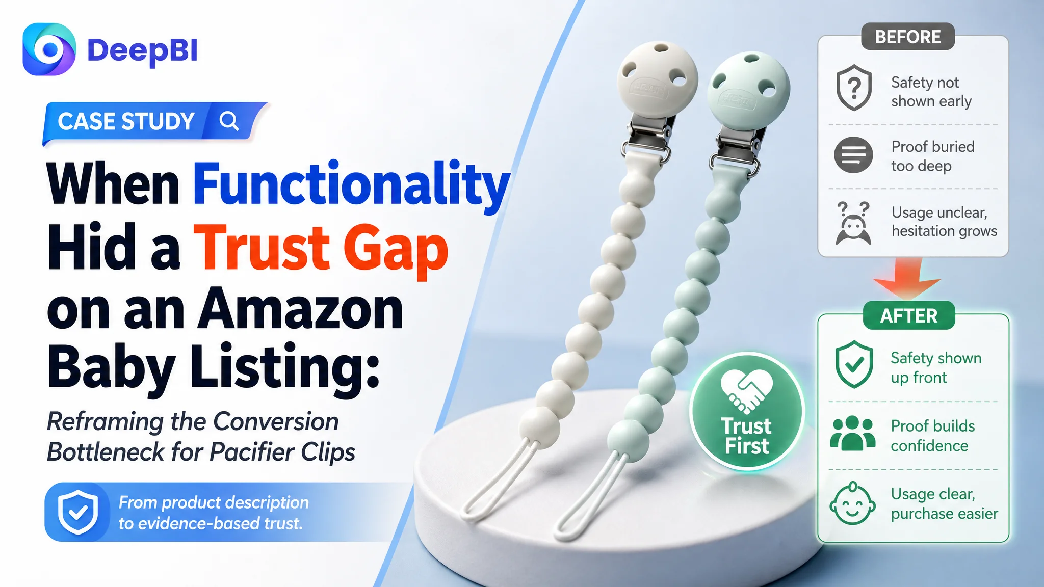
An Amazon seller’s pacifier-clip Listing appeared to have the basic ingredients in place: a recognizable brand position, universal compatibility, usage instructions, and safety claims. Yet its product-page competitiveness remained well behind a comparable high-performing Listing. The initial optimization direction focused mainly on explaining how the clip worked and where it could be used.
DeepBI found that the deeper issue was not a lack of functional information. It was the order and strength of the buying logic. Safety evidence, material details, usage transparency, and review credibility were not building trust early enough in the Amazon product page.
The later optimization therefore focused on more than rewriting a title or adding attractive images. It moved the Listing toward a clearer decision path: identify the product quickly, answer safety concerns early, demonstrate both attachment mechanisms, clarify care expectations, and make the product feel like a reliable everyday and giftable baby essential.
For other Amazon sellers, the case offers a practical reminder: when a product page contains information but conversion remains constrained, the problem may be less about missing features than about whether the Listing answers the buyer’s most important concerns in the right sequence.
The Listing Was Not Empty. It Was Under-Persuasive.
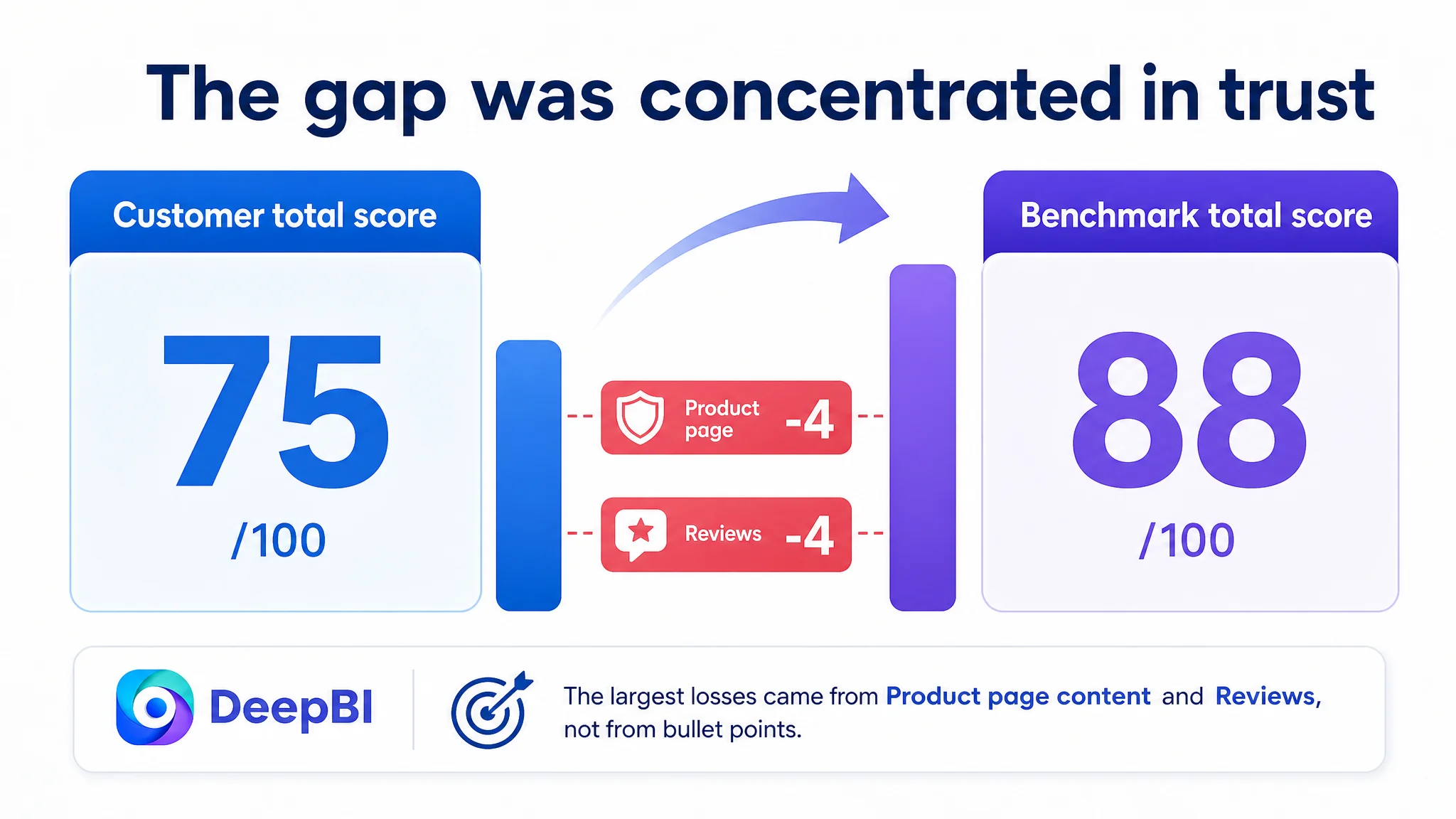
The customer’s Amazon Listing received an overall score of 75 out of 100, compared with 88 out of 100 for a comparable benchmark Listing.
The gap was not concentrated in one isolated element.
- Title: Customer Listing: 16/20, Benchmark Listing: 18/20, Gap: -2
- Main image: Customer Listing: 24/30, Benchmark Listing: 27/30, Gap: -3
- Bullet points: Customer Listing: 7/10, Benchmark Listing: 7/10, Gap: 0
- Product-page content: Customer Listing: 19/25, Benchmark Listing: 23/25, Gap: -4
- Reviews: Customer Listing: 9/15, Benchmark Listing: 13/15, Gap: -4
- Total: Customer Listing: 75/100, Benchmark Listing: 88/100, Gap: -13
The result was important because the Listing did not fail everywhere.
The bullet-point score was equal to the benchmark. The main product image was also considered serviceable as a basic product confirmation image. The page showed the product, explained compatibility, and described several usage details.
But the Amazon product page was weaker where buyers make higher-risk judgments:
- Is the material safe enough for a baby?
- Can the clip be attached without damaging clothing?
- Is the product easy to use correctly?
- Does the page provide enough evidence to trust the safety claims?
- Does the product feel like a dependable purchase rather than a generic accessory?
The problem was not that the Listing lacked information. It was that the information did not create trust quickly enough.
The Initial Direction Focused on Function Before Confidence
The existing Listing emphasized the product’s practical attributes:
- A silicone pacifier clip
- Universal fit
- Usage instructions
- Lightweight and travel-friendly positioning
- Modern colors and design
- General safety language
Those points were relevant, but they were arranged around product description rather than buyer hesitation.
The page explained what the pacifier clip was and how it could be used. It was less effective at proving why parents should feel confident choosing it over a comparable alternative.
That created the original misdiagnosis.
The optimization direction was effectively treating the problem as one of functional explanation and visual presentation: clarify the design, show compatibility, improve lifestyle appeal, and make the product look more polished.
DeepBI reframed the problem as one of Listing conversion capacity.
The customer did not primarily need more statements about the product. The page needed to make its most important trust claims more concrete and easier to verify.
This distinction matters on Amazon. A buyer may understand that a pacifier clip attaches to a pacifier and a baby’s clothing. That understanding alone does not remove the concern that the material may be unsuitable, the clip may slip, the attachment process may be confusing, or the product may damage fabric.
DeepBI Located the Constraint in the Trust Sequence
DeepBI’s diagnosis compared the customer Listing with a closely matched benchmark across the title, images, bullet points, A+ content, and reviews.
The score difference showed that the greatest business constraints were not simply keyword coverage or aesthetic quality. They were the Listing’s ability to establish safety, demonstrate use, and provide credible reassurance.
The title led with recognition, not the buyer’s search logic
The customer’s title began with the brand name and used the phrase “Universal Fit Strap for Pacifiers.”
That approach supported brand recognition, but it delayed several terms that were more immediately useful for both search relevance and buyer understanding:
- Pacifier clips
- Silicone
- 2-pack
- Food-grade material
- CPSIA certification
- BPA-free positioning
- Lightweight and flexible use
- Baby gift intent
The benchmark Listing placed the product category and pack quantity closer to the front, then followed with material and safety claims.
DeepBI’s suggested title direction therefore reorganized the entry point around the product and its highest-value reassurance:
Silicone Pacifier Clips 2-Pack Universal Fit Strap, 100% Food Grade Silicone, CPSIA Certified, BPA Free, Lightweight and Flexible Baby Gifts, 0–18 Months
The purpose was not to imitate the competitor’s wording. It was to make the Listing’s search identity and trust proposition easier to understand at the beginning of the page.
The title needed to answer three questions sooner:
1. What is the product?
2. What is it made of?
3. Why should a parent consider it safe and practical?
The main image set showed the product but did not remove enough doubt
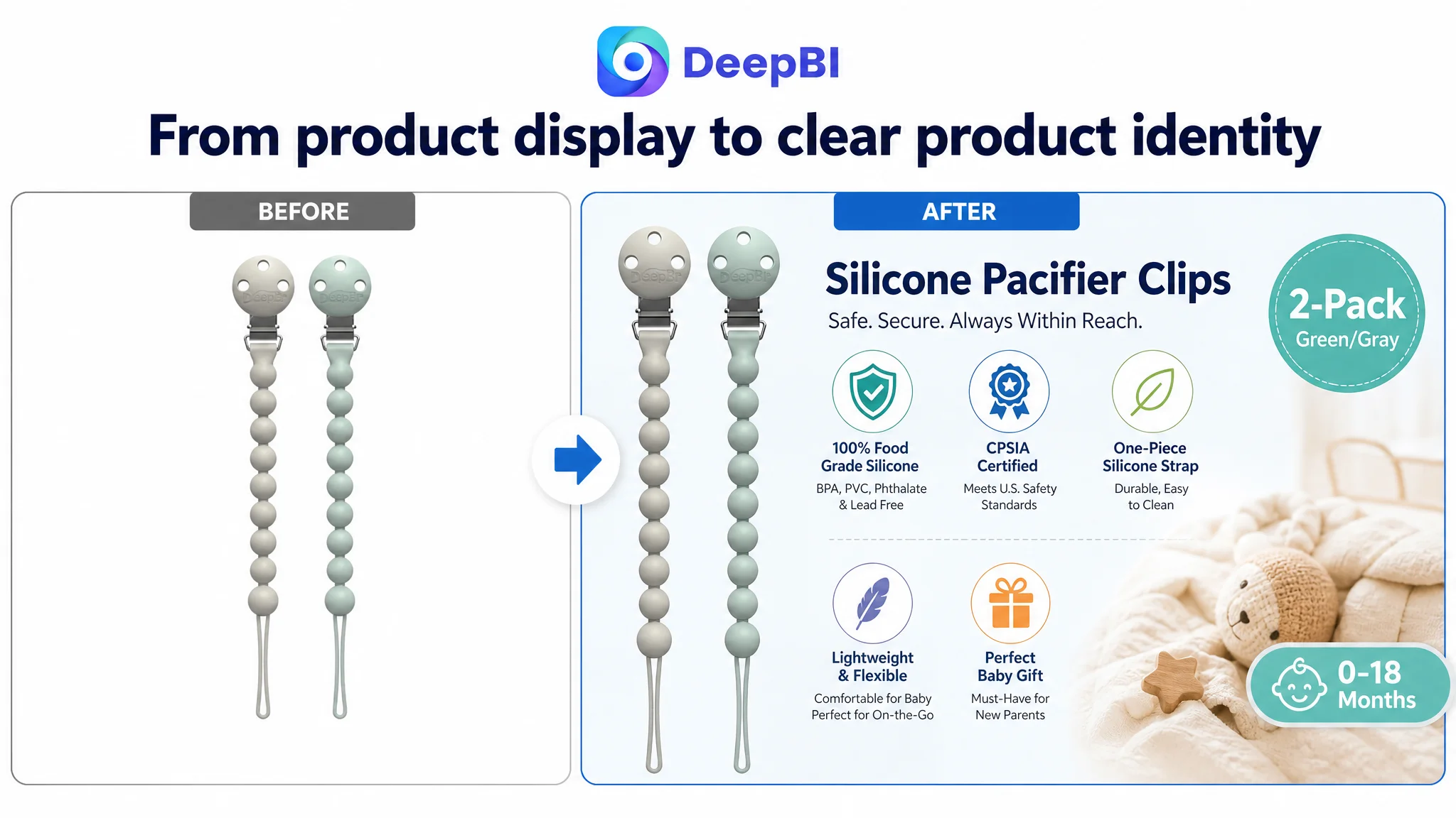
The first product image was not identified as a major weakness. It clearly presented the product as a two-pack and showed the relevant colors. That image could continue serving as the basic confirmation point.
The larger opportunity appeared in the supporting visual sequence.
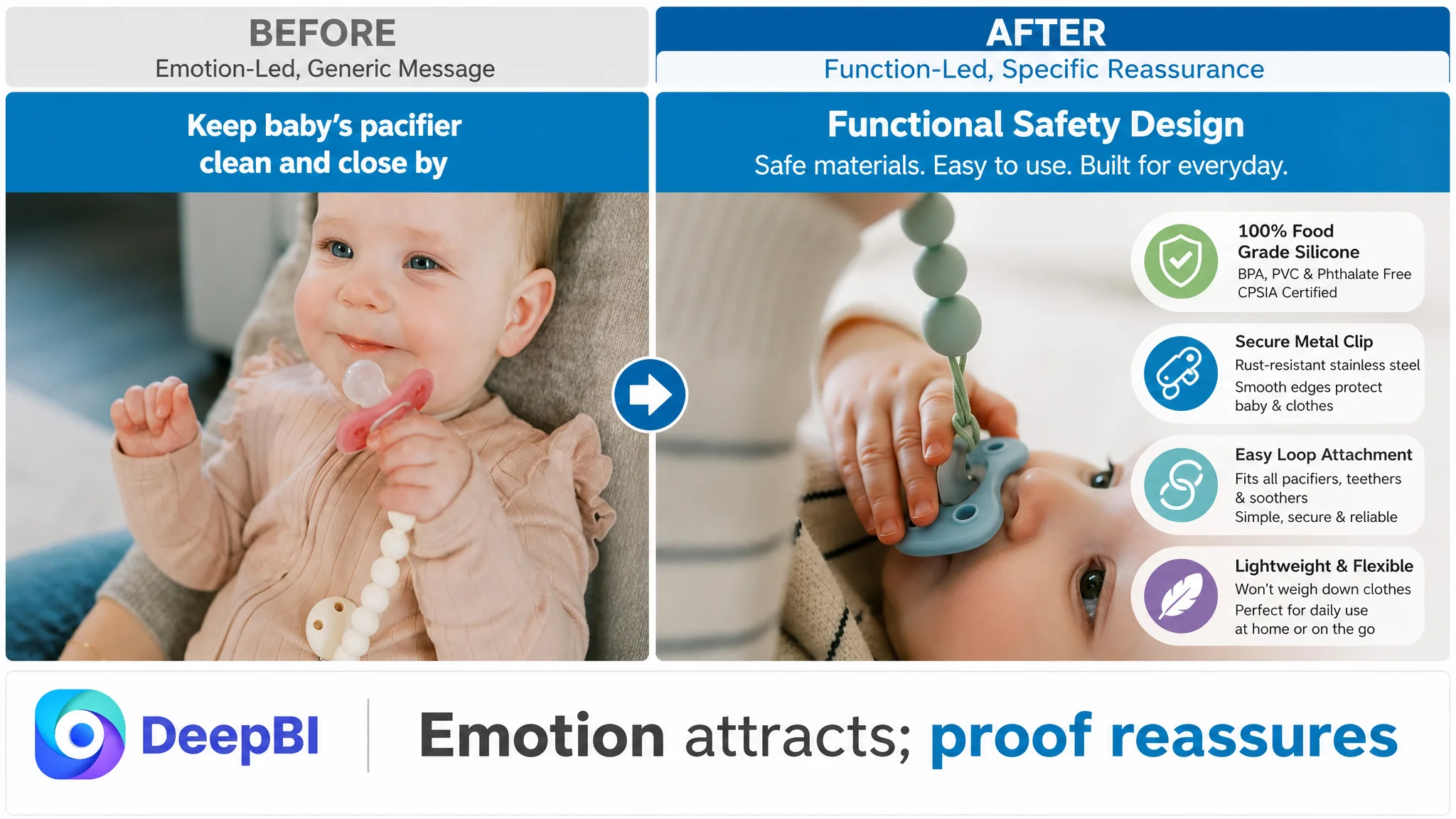
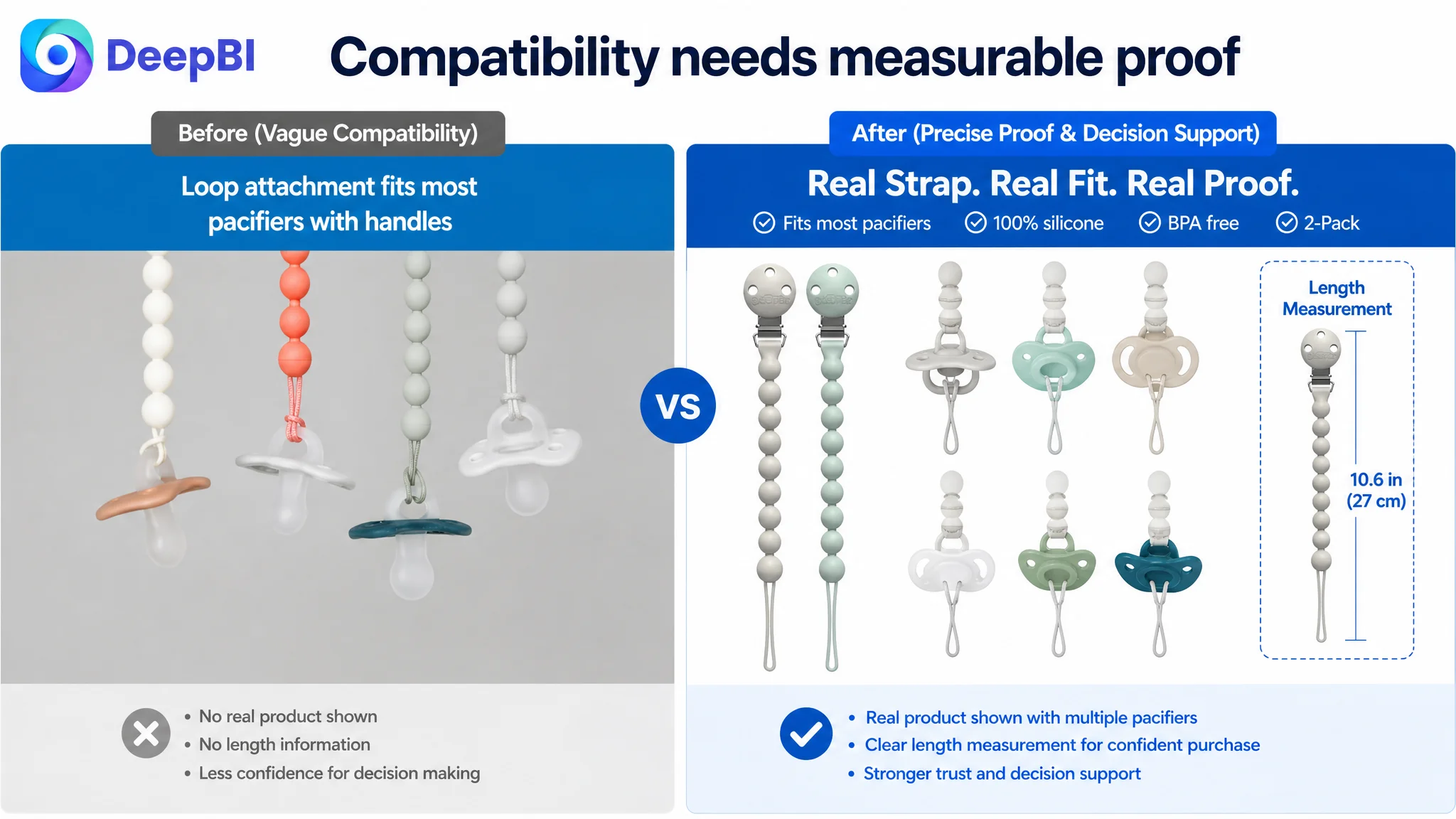
Several images relied on broad emotional or functional language without providing enough concrete proof. In comparison, the benchmark Listing used more direct visual communication:
- Clearer in-use progression
- More precise dimensions
- Stronger material and certification presentation
- More complete attachment instructions
- A more direct connection between product detail and user concern
DeepBI’s recommendations changed the role of the images from general presentation to risk reduction.
The image needed to show the complete use path
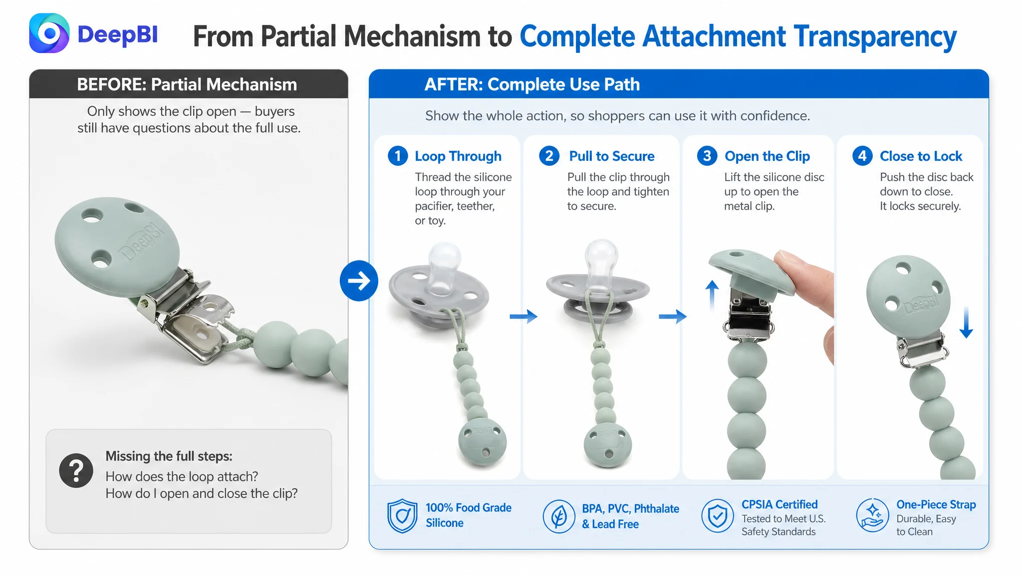
One image showed the clip mechanism in an open state, but it did not fully demonstrate the two actions a buyer needed to understand:
- How to attach the pacifier using the silicone loop
- How to attach the clip securely to the baby’s clothing
The recommended sequence was more explicit:
1. Thread the loop through the pacifier or teether.
2. Pull the clip through the loop.
3. Pull to secure the attachment.
4. Lift the silicone disc to open the clip.
5. Push it back down to close it on the clothing.
This was not merely an instructional improvement. It addressed uncertainty around misuse, security, and ease of use.
A product can be simple to operate, but if the page only shows one part of the process, the buyer still has to imagine the rest.
Safety claims needed evidence, not just reassurance
The customer Listing included safety-related language, but safety was not given enough visual weight or specificity.
The benchmark Listing made material and certification claims easier to process through a more structured visual treatment. Its presentation connected:
- Food-grade silicone
- BPA-free and related material exclusions
- Stainless steel construction
- CPSIA certification
- Third-party testing
- Cleaning expectations
DeepBI’s recommendation was to move concrete material information earlier and present it in a more professional information graphic.
The key shift was from a general claim such as “safe for baby” to a more verifiable sequence of material, certification, construction, and care details.
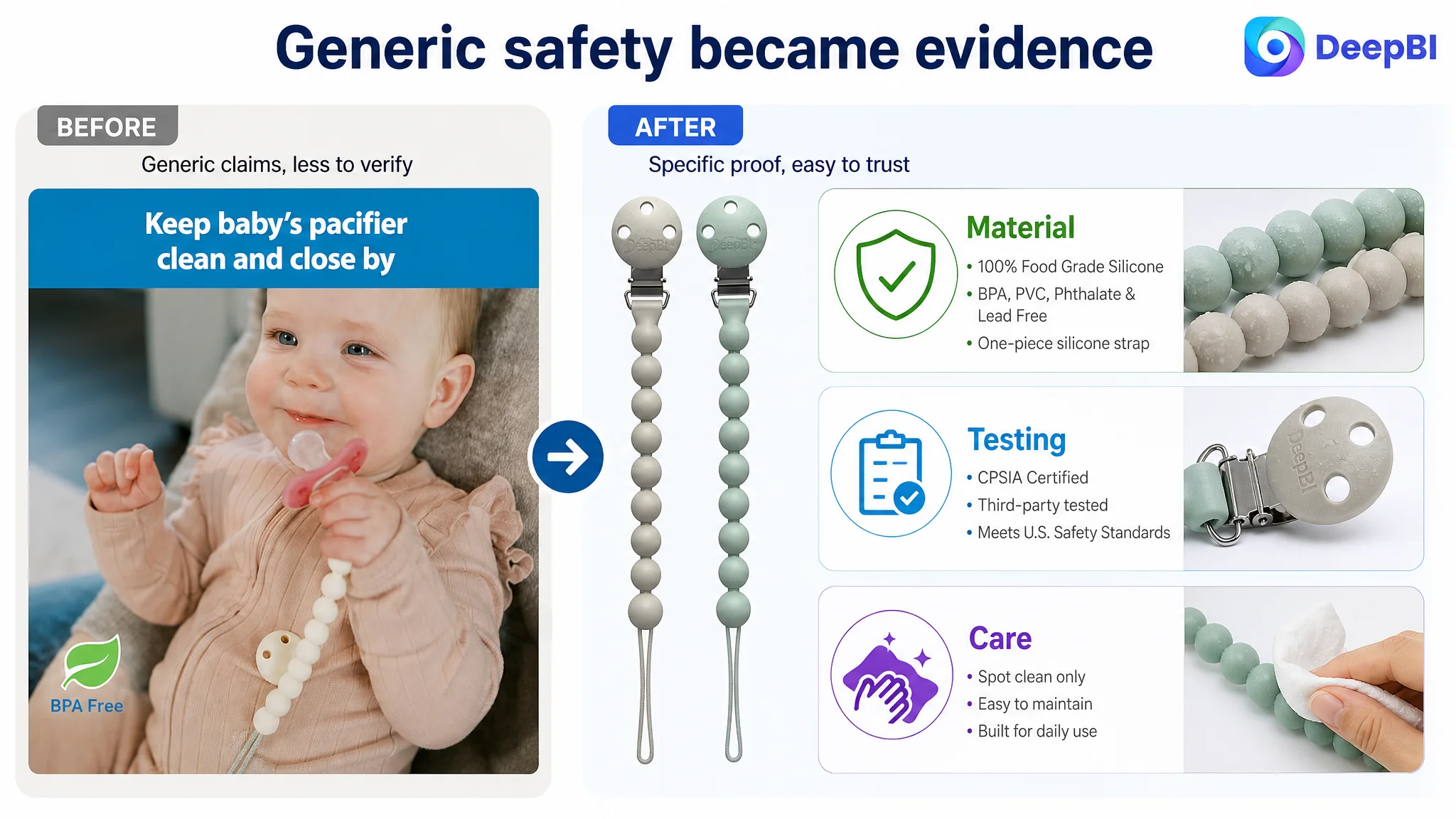
For a baby product, this distinction affects the entire conversion path. Parents are not only evaluating appearance or convenience. They are evaluating perceived risk.
The A+ Content Was Too Soft at the Moments That Mattered
The customer’s A+ content used a recognizable structure:
- Brand and age confirmation
- Compatibility visuals
- Product-detail images
- Use-case scenarios
- Safety messaging
The problem was not that these modules were irrelevant. The issue was their order and information density.
The page addressed compatibility before safety, lifestyle imagery before proof, and general safety language after many of the key decisions had already been left unresolved.
DeepBI’s diagnosis prioritized a different sequence.
Start with value verification
The opening module could retain the brand and age-range role, but it needed to do more than establish identity.
It should quickly communicate:
- The product category
- The two-pack format
- The silicone construction
- The intended age range
- The practical outcome of keeping a pacifier clean and close
This would give the buyer an immediate reason to continue rather than opening with a primarily aesthetic brand scene.
Move material safety ahead of compatibility
The existing compatibility module showed that the product could work with different pacifiers. That answered a legitimate question, but not necessarily the first question for this category.
DeepBI recommended using this position to address the higher-priority concern:
- BPA-free material
- One-piece silicone strap
- Two-pack value
- Clear material-specific benefits
Compatibility proof could remain later in the page, after the product had established a stronger foundation of safety and quality.
Replace partial mechanism detail with complete usage transparency
A close-up of the metal clip helped address concerns about fabric damage, but it did not explain the entire attachment process.
The revised module should show the silicone loop and metal clip working together. It should also make the protective design visible:
- Smooth clip edges
- Soft silicone front
- Secure attachment
- Reduced concern about damage to delicate clothing
This is a better use of A+ space than simply repeating that the clip is easy to use.
Replace soft lifestyle content with rational evidence
A car-seat or outing scene can add warmth, but it does not necessarily answer whether the product is durable or properly tested.
DeepBI recommended using this position for evidence such as:
- Third-party safety testing
- U.S. safety-standard positioning
- Rust-resistant stainless steel
- Secure metal clip construction
The page did not need to eliminate emotional appeal. It needed to stop asking emotional imagery to do the work of technical reassurance.
Add the missing choice and value modules
The customer’s A+ content did not clearly present the available color or bundle choices. The benchmark Listing used a visual SKU matrix to make selection easier and support higher-value consideration.
DeepBI identified two missing closing functions:
Variant choice clarity
A visual grid could show the available colors and combinations, including the green and gray pairing, so shoppers could connect aesthetic preference with a concrete selection.
Final value recap
A closing module could summarize the most important reasons to buy:
- Two-pack format
- Lightweight, travel-friendly design
- BPA-free positioning
- Everyday usefulness
- New-parent gift relevance
This would give the page a more complete ending instead of leaving the buyer to reconstruct the value from scattered modules.
The Bullet Points Did Not Need More Information. They Needed Stronger Priority.
The customer and benchmark Listings received the same bullet-point score, but their structures communicated value differently.
The customer’s bullets covered several useful areas:
- Core function
- Universal compatibility
- Usage instructions
- Travel convenience
- Safety
- Design
- Care guidance
The content was broad, but the sequence was dispersed. Safety appeared as one point among many rather than as the foundation of the product proposition.
The revised direction gave each bullet a clearer job.
Safety and material first
The first bullet should lead with 100% food-grade silicone and specific material exclusions, then connect those attributes to cleaning and everyday use.
Secure construction second
The metal clip should be presented through its practical outcome:
- Rust-resistant stainless steel
- Smooth edges
- Soft silicone front
- Secure grip
- Reduced concern about delicate fabric
Universal fit and ease of use third
Compatibility and operation could be combined into one coherent explanation rather than separated across the page.
The buyer should see both the range of compatible items and the simple loop attachment method in the same place.
Lightweight use fourth
The product should be positioned as secure without being heavy or burdensome on clothing, particularly for outings, walks, and car rides.
Style and gift value fifth
Color, bead-inspired styling, newborn essentials, and baby-gift positioning could close the sequence by extending the product beyond utility.
This created a more deliberate progression:
Safety → secure construction → ease of use → everyday practicality → style and gift appeal
That is stronger than presenting the same attributes as an unordered list.
Reviews Made the Trust Gap More Expensive
The review dimension showed one of the clearest differences between the two Listings.
The customer Listing had:
- 3.9 stars
- 76 total reviews
- 8 reviews visible on the first page
The benchmark Listing had:
- 4.5 stars
- 261 total reviews
- 10 reviews visible on the first page
The customer Listing’s first-page review set also included a one-star review, a two-star review, and a three-star review. Three of the eight visible reviews were below four stars.
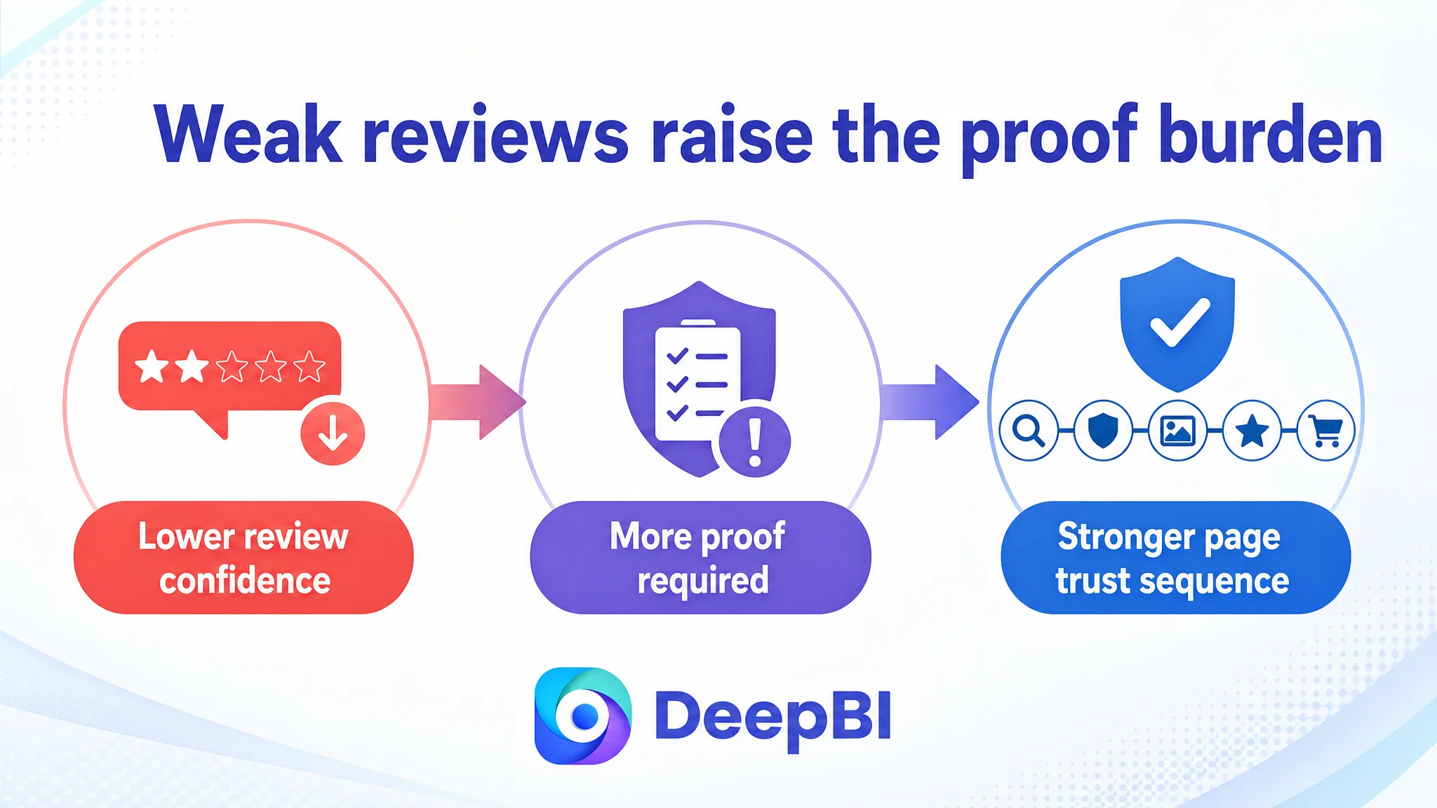
This meant the page had to work harder to overcome doubt. Stronger image design or improved wording could help clarify the product, but they could not fully substitute for accumulated buyer confidence.
DeepBI therefore treated reviews as part of the Listing conversion diagnosis, not as an isolated reputation metric.
The practical implication was important:
- Safety claims needed to be more specific because the review profile was weaker.
- Usage instructions needed to reduce preventable confusion.
- Material and care expectations needed to be explicit.
- Visual content needed to provide confidence before the buyer reached the reviews.
When review strength is behind the category benchmark, the rest of the page must be especially disciplined about reducing uncertainty.
Why DeepBI Did Not Recommend Tuning the Traffic First
The case did not call for blindly increasing traffic or continuing to optimize around advertising inputs before repairing the product page.
The reason was straightforward:
More traffic would not solve a page-level trust sequence problem.
If shoppers arrive at the Amazon product page and still have unresolved questions about safety, attachment, durability, or material care, additional exposure can simply increase the number of visitors who leave without ordering.
The correct decision order was therefore:
1. Clarify the product identity and core search logic in the title.
2. Make the main image sequence more concrete and useful.
3. Move material safety and certification evidence earlier.
4. Demonstrate the full attachment process.
5. Rebuild the A+ page around verification rather than soft repetition.
6. Improve variant and value clarity.
7. Then evaluate how the revised Listing receives and converts paid or organic traffic.
This order protects advertising decisions from being distorted by a weak page.
Advertising can bring a shopper to the Listing. It cannot make an unclear safety claim feel proven or make an incomplete usage demonstration feel complete.
The Optimization Was a Rebuild of Sales Logic, Not a Cosmetic Refresh
The proposed changes were specific, but their value came from how they worked together.
Title
Reposition the opening around:
- Silicone pacifier clips
- Two-pack format
- Universal fit
- Food-grade silicone
- CPSIA certification
- BPA-free positioning
- Lightweight and flexible use
- Baby-gift relevance
- Age range and color
Main images
Use the image sequence to answer concrete questions:
- What is included?
- What are the dimensions?
- How does the loop attach?
- How does the clothing clip close?
- What materials are used?
- What safety evidence is available?
- How should the product be cleaned?
Bullet points
Assign one central purpose to each point and connect product attributes to parental concerns rather than listing specifications independently.
A+ content
Reorder the page around:
- Early value verification
- Material safety
- Complete usage transparency
- Construction and testing evidence
- Cleaning expectations
- Color and bundle selection
- Final value recap
Reviews
Recognize that a lower review rating and smaller review base increase the importance of every other trust signal on the page.
This is why DeepBI’s diagnosis did not end with “improve the images.” It translated each identified gap into a business role for the content.
What Changed in the Customer Team’s Understanding
The case did not provide post-optimization CVR, ACOS, or organic-order data, so no numerical performance result should be claimed.
The more important change was the operating judgment behind the Listing.
The customer’s product page was no longer viewed as a collection of isolated assets:
- A title for keywords
- Images for appearance
- Bullet points for specifications
- A+ content for brand presentation
- Reviews as a separate reputation issue
Instead, these elements were understood as one conversion system.
The title establishes relevance.
The main image earns attention and begins to answer questions.
The bullet points organize the product’s value.
The A+ content proves the important claims and demonstrates use.
Reviews confirm whether the promise feels credible.
If one part is weak, the rest of the page has to compensate. In this case, the largest opportunity was to strengthen the trust path before asking traffic to scale.
The Broader Amazon Lesson
For Amazon sellers, a Listing can look complete and still be commercially underpowered.
A product page may contain all the expected modules while failing to answer the questions that determine purchase confidence. This is especially important in baby and personal-care-adjacent categories, where safety, material quality, and ease of use can outweigh broad lifestyle appeal.
The practical lesson is not to optimize every element equally.
It is to identify the constraint that limits the page’s ability to convert the traffic it already has or may receive next.
For this pacifier-clip Listing, that constraint was not simply missing keywords, weak aesthetics, or insufficient compatibility language. It was the lack of a sufficiently early and evidence-based trust sequence.
Once that diagnosis is made, the optimization direction becomes clearer:
- Put the most important concern first.
- Replace generic reassurance with specific proof.
- Demonstrate the full use process.
- Make choices easier to understand.
- Use every page module to move the buyer closer to a confident decision.
That is the difference between polishing an Amazon Listing and rebuilding its conversion logic.