

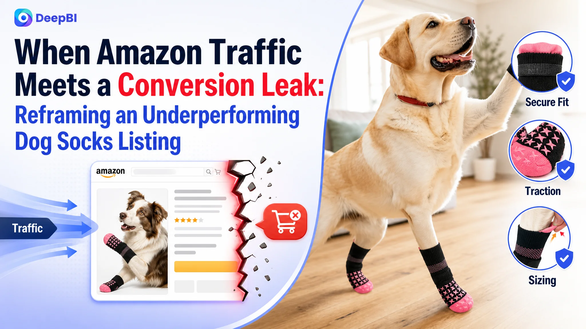
An Amazon seller selling dog socks in the US marketplace was not facing a simple keyword or image-quality issue. The product page had the expected product elements in place, but its Listing was still weaker than a comparable high-performing competitor across the parts of the page that shape search visibility, click confidence, and purchase decisions.
The initial instinct was to improve individual elements: add more functions, refine images, and make the copy more complete. DeepBI’s diagnosis pointed to a more important issue. The Amazon Listing was describing the product, but it was not guiding the shopper through the real decision: will the socks stay on, will they prevent slipping, and are they suitable for a senior or mobility-limited dog?
That reframed the optimization. Instead of treating the page as a collection of features, the later direction focused on rebuilding its sales logic around secure fit, double-sided traction, senior-dog stability, material reassurance, and earlier sizing guidance. For other Amazon sellers, the case shows why traffic and advertising adjustments should not come before checking whether the product page can convincingly convert that traffic.
The Amazon Listing Was Present, but Its Buying Logic Was Weak
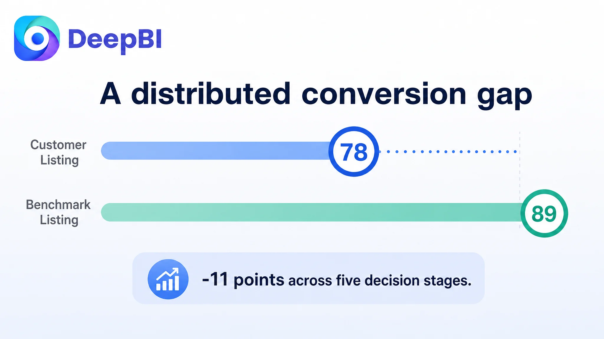
The customer’s Listing received a total score of 78 out of 100, compared with 89 out of 100 for the comparable benchmark Listing.
The gap was not concentrated in one catastrophic failure. It was distributed across the full customer decision path:
- Title: 15 versus 17
- Main image: 25 versus 27
- Bullet points: 7 versus 8
- Detail page: 21 versus 24
- Reviews: 10 versus 13
This distribution mattered.
A two-point difference in the title or main image might appear manageable in isolation. A one-point difference in the bullet points might seem insignificant. But when the same Listing also lagged in A+ content and review depth, the page was losing small amounts of persuasion at every stage.
The result was not necessarily that shoppers could not understand what the product was. They could. The deeper issue was that the page did not make the product’s value easy to believe or easy to compare.
The page did not lack information. It lacked a clear order of persuasion.
For an Amazon product such as dog socks, shoppers are not only looking for “non-slip socks.” They are evaluating several risks at once:
- Will the socks twist during movement?
- Will they fall off?
- Will the dog tolerate them?
- Will the grip work on hardwood, tile, or marble?
- Are they suitable for an older dog with unstable movement?
- Which size should be selected?
- Are four socks included?
- Will the material survive normal use?
The Listing addressed many of these topics, but not in the order that reduced purchase hesitation most effectively.
The Original Diagnosis Focused on Features, Not Friction
The customer’s page already included a broad set of selling points:
- Double-sided anti-slip grip
- Paw protection
- Anti-licking functionality
- Senior-dog use
- Indoor and outdoor scenarios
- Material and comfort information
- Wearing instructions
- Size and measurement guidance
On paper, this looked complete.
That completeness created part of the problem. The content was arranged more like a functional inventory than a buying argument. The page gave shoppers many reasons to consider the product, but it did not clearly establish which concern should be resolved first.
The original optimization direction therefore leaned toward adding or refining features:
- Explain the non-slip function
- Show comfort and material details
- Present seasonal use
- Describe anti-licking benefits
- Include wearing and washing guidance
- Add more usage scenarios
These actions were not irrelevant. They were simply not equally important at the current stage.
The benchmark Listing was more effective because it organized its content around objections and outcomes. It repeatedly answered the questions that most directly affected purchase confidence:
1. Will the socks stay on?
2. Will they still provide traction if they twist?
3. Can the material withstand daily use?
4. Which dogs and environments are they suitable for?
5. What happens before and after the problem is addressed?
That difference explains why traditional “add more information” optimization could fail to move the page forward. More information does not automatically create more conversion capacity.
The Main Problem Was Listing Conversion Capacity
DeepBI’s score comparison showed that the most important weakness was not a missing keyword alone. It was the Listing’s ability to convert interest into confidence.
The three largest scoring gaps were in:
- Detail page: -3 points
- Reviews: -3 points
- Title and main image: -2 points each
The review gap was visible: the customer Listing had 3.9 stars from 43 reviews, while the benchmark had 4.0 stars from 146 reviews. The star-rating difference was small, but the review volume created a much larger social-proof gap.
At the same time, the customer Listing had a lower reported negative-review rate than the benchmark. That was an important positive signal. The product was not simply being rejected because it had clearly worse quality. The problem was that its strengths were not being communicated and validated with enough force.
This distinction changed the business judgment.
The page did not need to imitate every competitor claim or compensate by making unsupported promises. It needed to make its real advantages more visible, more credible, and easier to understand.
The Title Was Relevant, but It Delayed the Reason to Click
The customer’s title included relevant product and use-case terms, but it began with a brand-and-product structure. The benchmark Listing led with a high-intent phrase centered on:
- Dog socks for hardwood floors
- Anti-slip use
- Double-sided grip
- No-twist performance
- Senior dogs
That structure made the shopper’s problem visible immediately.
The customer’s title placed some important scenario and benefit information later in the sequence. As a result, it was more functional than persuasive. The title told shoppers what the product was, but it did not quickly establish why this specific type of dog sock deserved attention.
The revised direction placed greater weight on:
- “Anti Slip Dog Socks”
- “Non Slip Grip”
- Hardwood floors
- Hot pavement
- Paw protection
- Licking prevention
- Small, medium, and large senior dogs
The goal was not to fill the title with keywords. It was to align keyword order with shopper intent.
Search relevance and buying relevance had to work together. A title that contains the right terms but delays the central pain point can still lose efficiency at the search-result stage.
The Main Image Needed a Clearer Job
The main-image gap was not that the product was invisible. The first image already showed the product and its color options clearly enough for basic identification.
The larger opportunity was in the supporting image sequence and the way each image handled a specific objection.
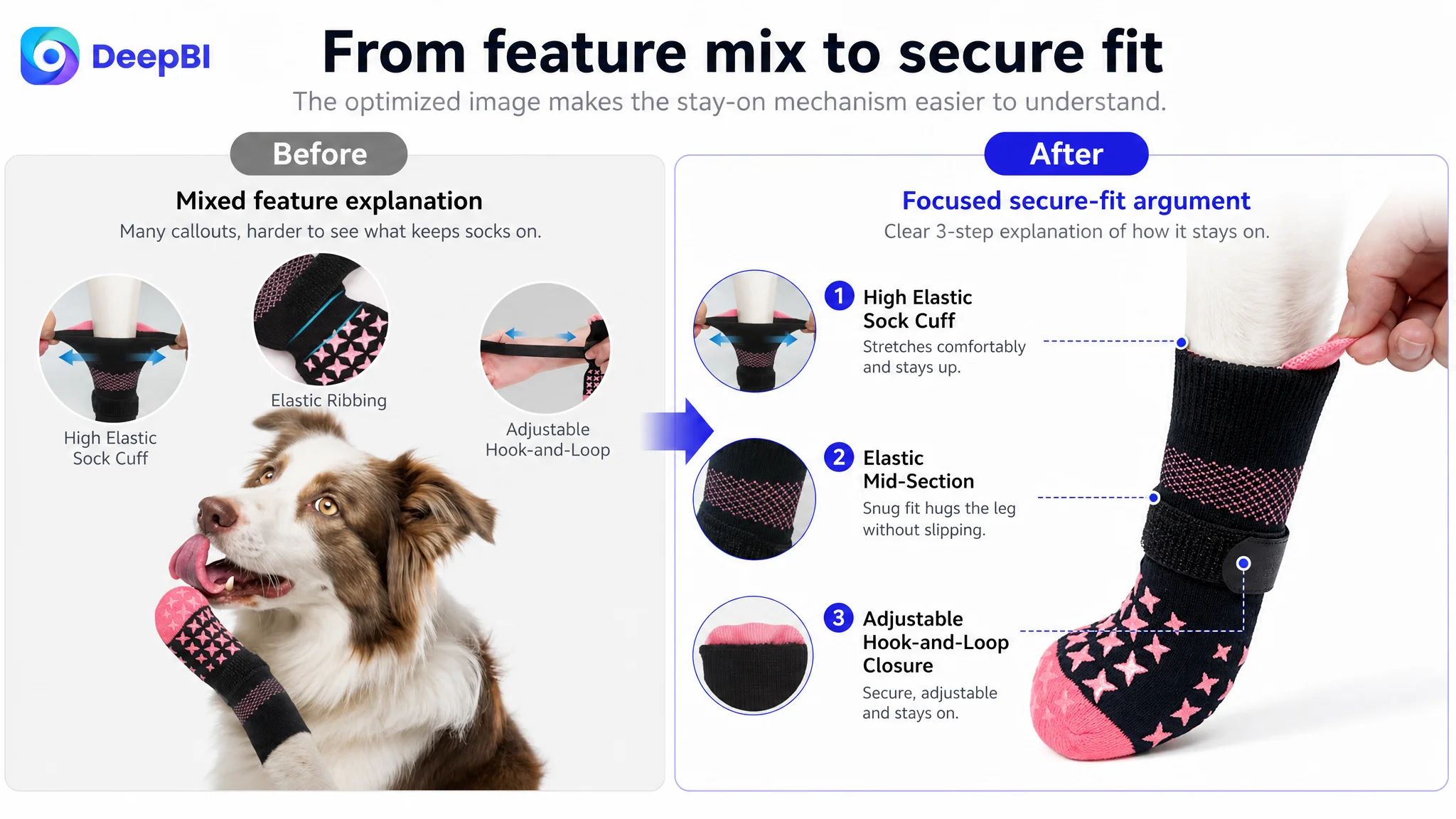
One image mixed several ideas:
- Elastic construction
- Hook-and-loop closure
- General non-slip performance
- A dog licking its paw
This made the message less focused. The first major shopper concern was not yet “what other problem can the product address?” It was:
Will these socks stay on while the dog moves?
The visual strategy therefore shifted toward secure fit:
- High-elastic sock cuff
- Elastic ribbing
- Adjustable hook-and-loop closure
- Pull tabs
- A snug but not overly tight fit
- Relevance for senior dogs and dogs with unstable walking
Another image presented safety and anti-licking content but did not fully exploit the product’s double-sided grip. It was better suited to demonstrate traction on smooth surfaces and explain why grip remains useful even if the sock twists.
This is an important distinction for Amazon image optimization. The issue was not simply making the images more attractive. Each image needed to answer one buyer question without competing with the others.
The visual problem was not a lack of images. It was a lack of image-level roles.
The Bullet Points Listed Features Without Building a Sequence
The customer’s bullet points covered the product’s core functions, but their order and framing were less persuasive than the benchmark’s.
The revised logic placed greater emphasis on five connected decisions.
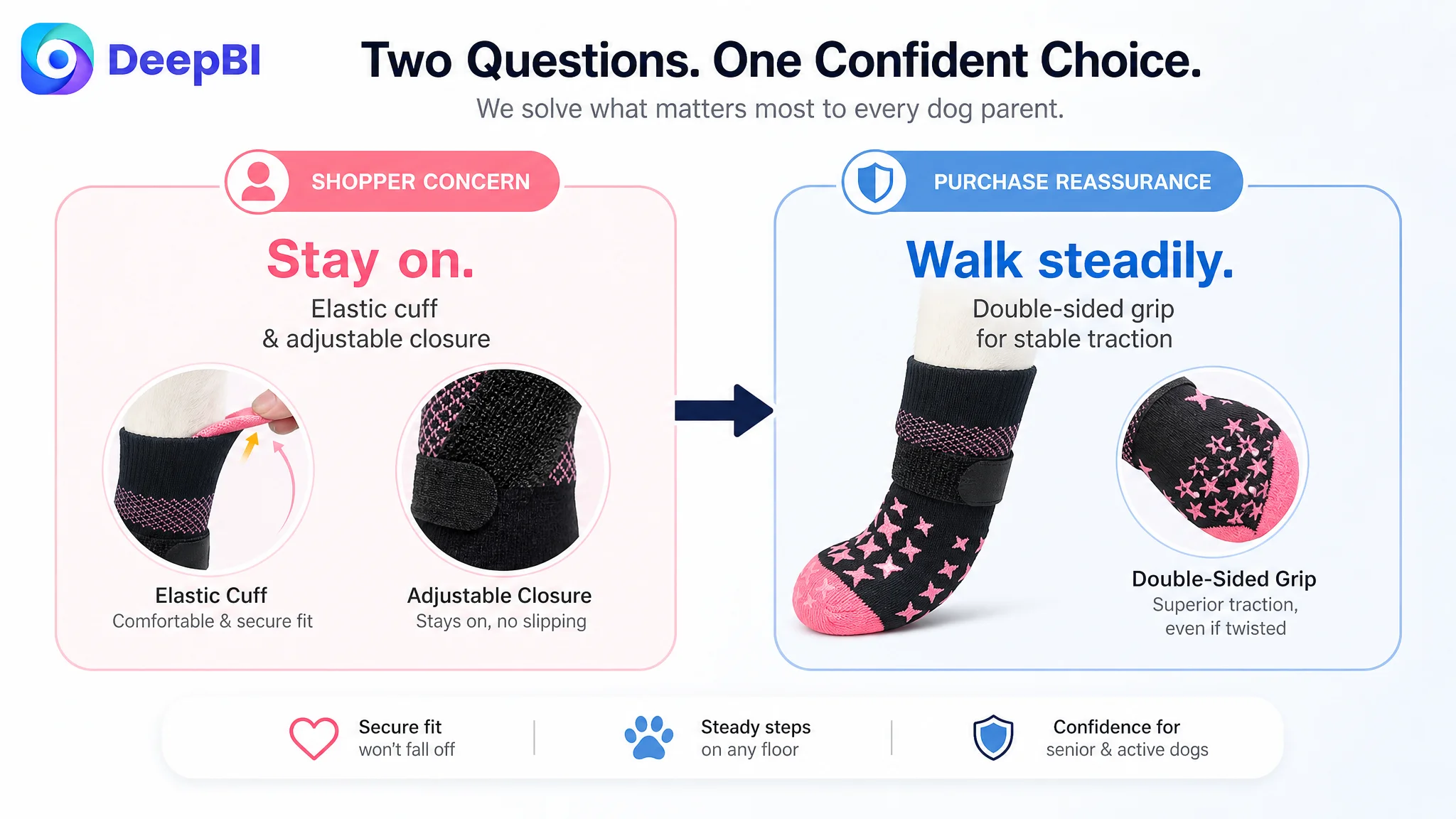
The first decision: will the dog remain stable?
The first bullet should lead with the product’s strongest functional distinction: double-sided non-slip grip.
The key benefit is not only that the bottom has grip. The double-sided coverage provides more tolerance if the sock twists during activity, helping maintain traction on hardwood floors, tile, and marble.
This makes the product easier to understand:
- Stay on: secure cuff and adjustable closure
- Walk steadily: grip coverage on both sides
Separating these two ideas prevents “secure fit” and “anti-slip” from becoming one vague claim.
The second decision: will the socks stay on?
The customer’s product already had relevant fit elements, including hook-and-loop closure and pull tabs. Those details needed to become part of the main argument rather than remaining secondary design information.
The page could then connect:
- Moderate elastic tension
- Soft sewn-in hook-and-loop closure
- Easy adjustment
- Reduced risk of slipping off
- Stability for senior dogs or dogs with arthritis-related mobility concerns
This was more commercially useful than describing the closure as a feature without explaining the risk it addressed.
The third decision: will the material hold up?
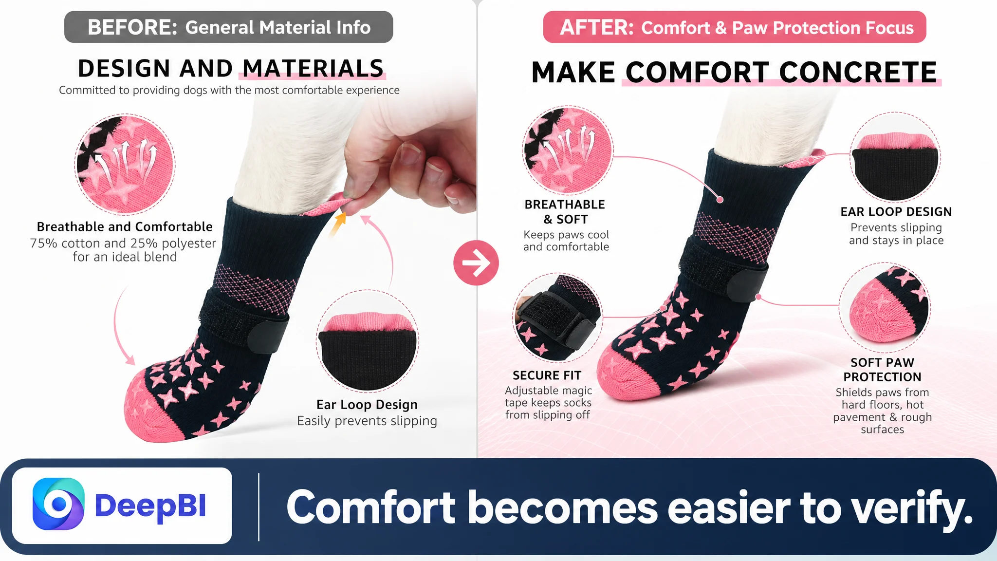
The benchmark Listing used more explicit material and durability communication. The customer’s copy relied more heavily on general terms such as “soft.”
The later direction emphasized:
- Breathability
- Lightweight comfort
- A cotton-and-polyester blend
- Protection against fabric puncture from nails
- All-season indoor and short-duration outdoor use
The important change was not to add unsupported technical claims. It was to turn broad comfort language into a more concrete reason to trust the product during daily use.
The fourth decision: what problems beyond slipping can the product address?
Anti-licking, paw protection, hot pavement, cold floors, dirt, and furniture protection were all relevant. But they needed to support the primary use case rather than compete with it.
The product could be framed as a barrier that helps:
- Discourage excessive licking and biting
- Protect paws from environmental discomfort
- Keep paws cleaner
- Reduce abrasive scratches on floors and furniture
These were secondary purchase reasons that strengthened perceived utility after the core stability problem had been established.
The fifth decision: can the shopper choose the right size?
Sizing was one of the clearest conversion barriers.
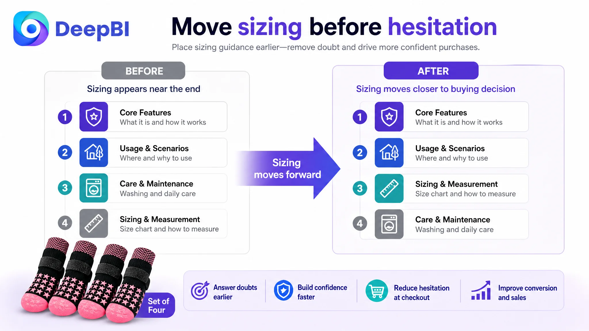
The customer’s sizing information was positioned too late in the page sequence. For a product that must stay on a moving dog’s paws, size is not an afterthought. It directly affects fit, comfort, product performance, and the likelihood of return.
The revised direction moved sizing much earlier and made the buying guidance more actionable:
- Five size options
- Paw-width measurements
- A set of four socks
- A clear instruction to measure before purchase
- Guidance to choose the smaller size when between sizes because of fabric elasticity
- A washing note about fastening the hook-and-loop closure
This was not merely a formatting adjustment. It removed a decision obstacle before the shopper had to commit.
The A+ Content Was Functional, but It Did Not Carry the Story
The customer’s A+ content included a broad range of modules:
- Product introduction
- Pain-point imagery
- Structural details
- Material and function explanations
- Wearing instructions
- Senior-dog scenarios
- Seasonal use
- Multiple use cases
- Sizing and measurement
The benchmark Listing used a stronger progression:
- Core benefit
- Problem-versus-solution comparison
- Structural explanation
- Sizing
- Seasonal and multi-scene use
- Emotional story
- User-voice-style validation
- Before-and-after comparison
- Furniture and vehicle protection
- Material and grip comparisons
- Targeted senior-dog use
The issue was not that the customer’s A+ page lacked effort. It was that the modules were arranged around product completeness rather than decision pressure.
The opening needed to declare the benefit
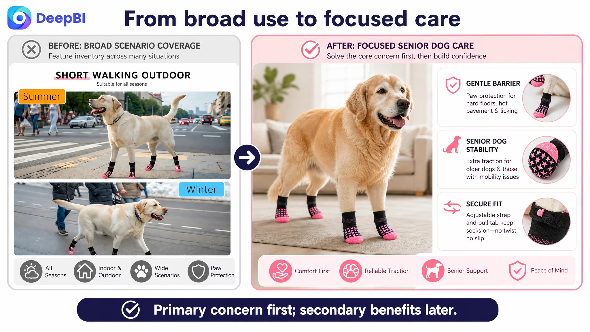
The first module mainly confirmed the product category. It needed to move beyond “anti-slip dog socks” and communicate the central outcome:
- Better traction on smooth surfaces
- Comfortable paw protection
- Greater stability for senior dogs
The opening of an Amazon product page has limited time to earn attention. Product identification is necessary, but it is not enough.
The pain-point module needed to prioritize slipping
The customer’s page gave similar weight to floor scratches, dirty paws, and slipping. The benchmark placed greater emphasis on the consequences of unstable movement, especially for older dogs.
The revised content direction prioritized:
- Slipping on smooth floors
- Instability for senior dogs
- Double-sided grip as the solution
- Secure fit as a supporting reassurance
This created a more direct problem-to-solution path.
The design details needed to work together
The customer’s page treated secure fit and anti-slip performance in separate areas. The stronger direction combined them into one integrated explanation:
- Sock cuff
- Elastic ribbing
- Adjustable closure
- Pull tabs
- Double-sided grip coverage
This helped shoppers understand not only what the product had, but why the product could remain useful during movement.
Sizing had to move forward
The sizing chart appeared around the ninth position in the existing sequence. That placement created friction after the shopper had already invested significant attention in the page.
DeepBI’s diagnosis placed sizing immediately after the basic features and usage value had been established. This was a prioritization decision: resolve a purchase-blocking question before spending more space on maintenance details.
A sizing chart is not administrative content when fit determines whether the core product promise can work.
Why DeepBI Did Not Recommend More Ad Tuning First
The available case material does not include post-optimization advertising metrics such as CTR, CVR, ACOS, TACOS, or organic-order share. Therefore, the diagnosis should not claim that ad efficiency had already improved or that a specific campaign structure had failed.
What the Listing evidence did show was enough to define the order of operations.
If paid traffic were sent to the page before its conversion logic was repaired, the traffic would arrive at a Listing that still had:
- A delayed core benefit in the title
- A main-image sequence that mixed objections
- Bullet points that described functions without a strong priority order
- A+ modules that were more functional than persuasive
- Late sizing guidance
- Weaker review volume and social proof
In that situation, changing bids or campaign settings first would risk treating the output rather than the constraint.
Advertising can increase exposure. It cannot independently solve an unclear value proposition, weak trust formation, or a sizing barrier.
The decision was therefore to repair the page’s ability to receive and convert intent before attempting to scale that intent through advertising.
This is the central operational lesson from the case:
Ads should not be used to amplify a Listing that has not yet earned the next click or the next purchase decision.
The Optimization Direction Became More Focused
The later optimization was not a request to make every image more dramatic or to copy the benchmark’s design.
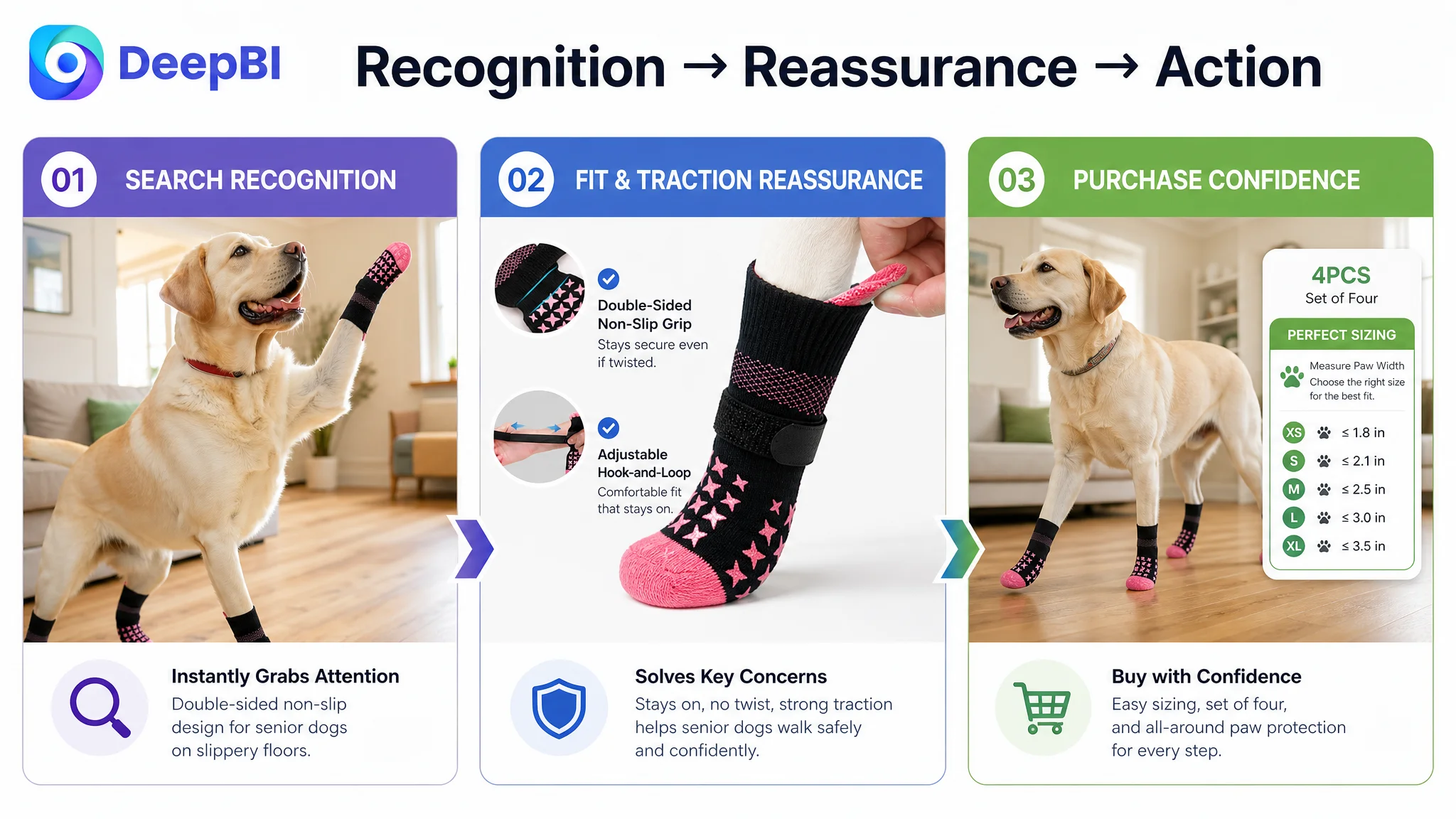
It focused on rebuilding a coherent customer journey:
1. Search recognition
Put anti-slip dog socks, hardwood floors, and related high-intent scenarios closer to the front of the title.
2. Click motivation
Make the product’s double-sided grip and use-case relevance easier to recognize across the image sequence.
3. Fit reassurance
Show how the cuff, elastic structure, closure, and pull tabs support a secure fit.
4. Functional proof
Present traction, durability, comfort, and protection as reasons tied to specific concerns.
5. Senior-dog relevance
Connect stability on smooth floors with the needs of older dogs and dogs with mobility issues.
6. Purchase confidence
Move sizing and measurement guidance earlier, with clear set-of-four and between-size instructions.
7. Broader utility
Use anti-licking, hot-pavement, cold-floor, dirt, furniture, and paw-protection benefits as supporting reasons rather than competing opening messages.
This sequence gave the Listing a clearer commercial job: move the shopper from recognition to reassurance, then from reassurance to action.
The Business Understanding Changed
The case did not establish a quantified post-change result, so the responsible conclusion is not a specific percentage improvement.
The more important change was in how the Amazon seller understood the problem.
The page was no longer treated as a group of isolated assets:
- A title to rewrite
- Images to beautify
- Bullet points to expand
- A+ modules to fill
- A sizing chart to append
Instead, those elements were treated as one conversion system.
The title had to attract the right shopper. The images had to make the product’s solution visible. The bullet points had to answer objections in order. The A+ content had to deepen trust and show use-case relevance. The sizing information had to remove purchase risk. Reviews had to be interpreted not only by star rating, but also by volume and the kind of confidence they created.
For this Amazon dog socks Listing, the real constraint was not a shortage of features. It was the gap between what the product could do and what the page made easy to believe.
That is the judgment DeepBI brought into the case: before changing more traffic variables, determine whether the Amazon product page has enough clarity, proof, and decision structure to convert the traffic it receives.