

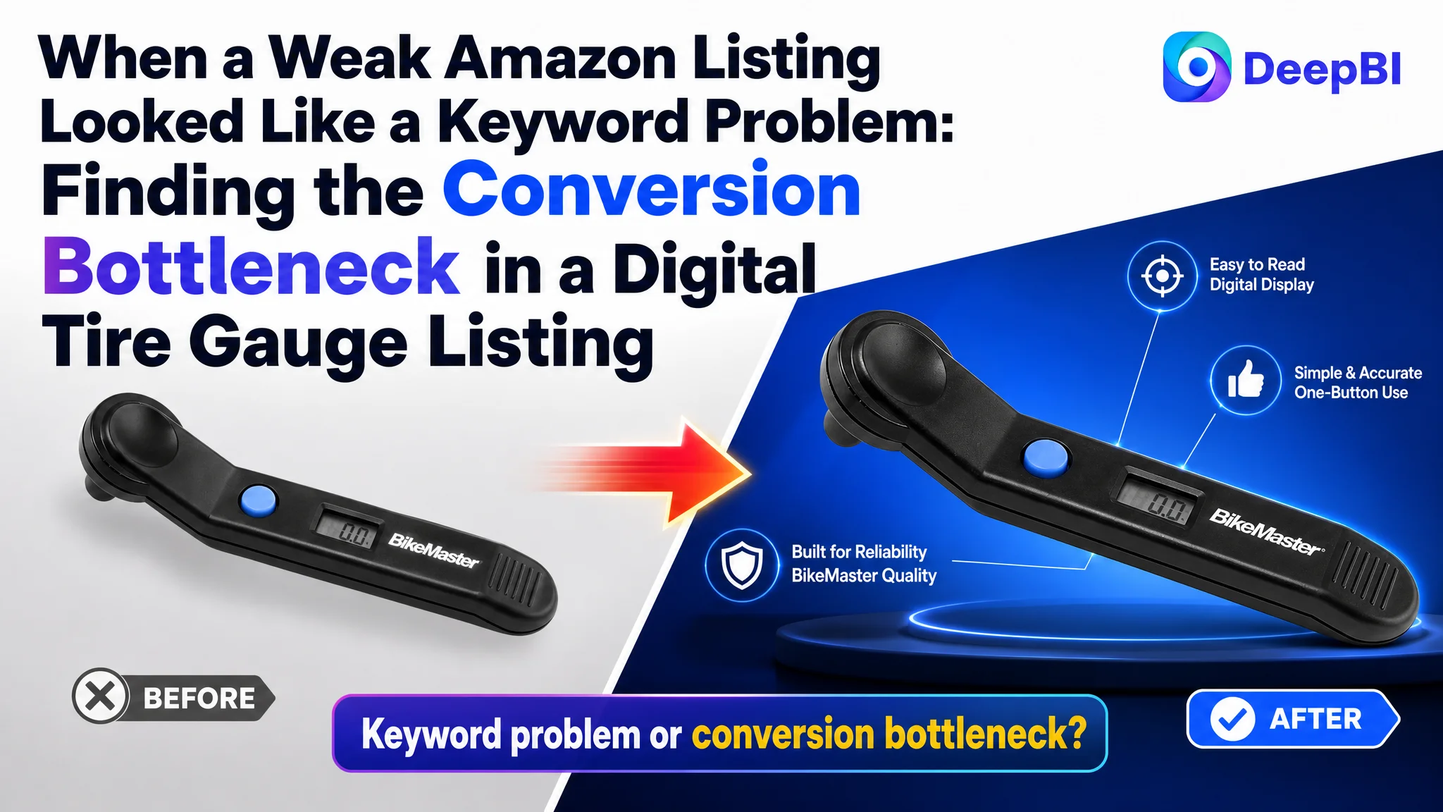
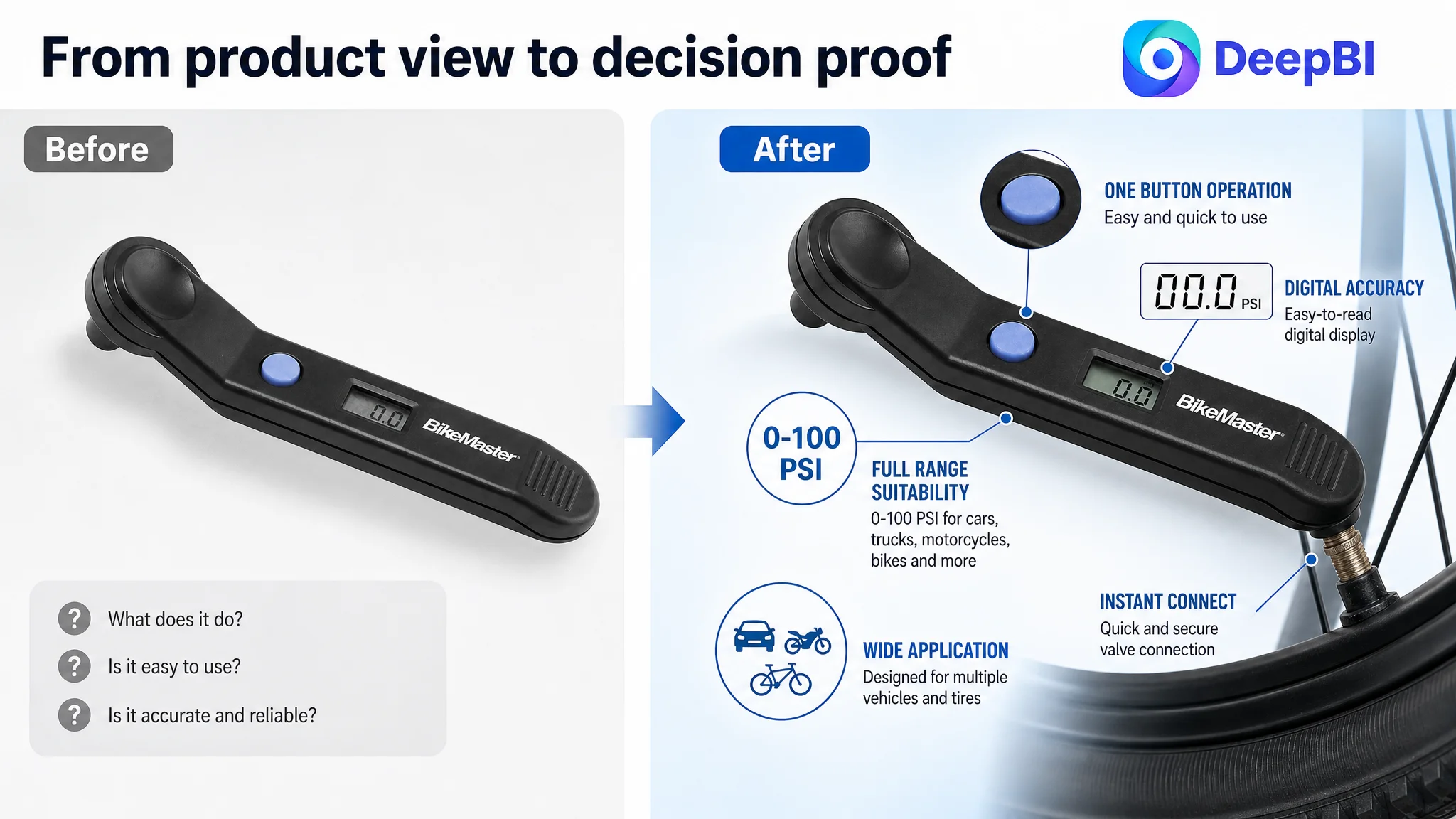
This case follows an Amazon seller whose digital tire gauge Listing was competing for the same search demand as stronger automotive-tool products, but was not giving shoppers enough reason to click or continue toward purchase. The initial direction was largely focused on basic keyword coverage, specifications, and functional description.
That diagnosis was incomplete. DeepBI’s comparison found a 28/100 Listing competing against a comparable high-performing Listing scoring 89/100. The largest gaps were not limited to the title. They appeared across the main image, A+ content, bullet-point structure, and review trust.
The later optimization therefore focused on rebuilding the Amazon product page as a complete decision path: clearer search language, stronger visual proof, practical usage scenes, visible specifications, easier operation, and more credible product context. For other Amazon sellers, the case shows why adding traffic or adjusting keywords cannot compensate for a page that does not convert attention into confidence.
The Amazon seller did not have a product-page traffic problem alone
The product was a digital tire gauge for the US Amazon marketplace. Its Listing had the basic elements of a functioning product page, but those elements were not working together as a persuasive sales system.
The overall Listing score was 28 out of 100, compared with 89 out of 100 for a comparable high-performing Listing.
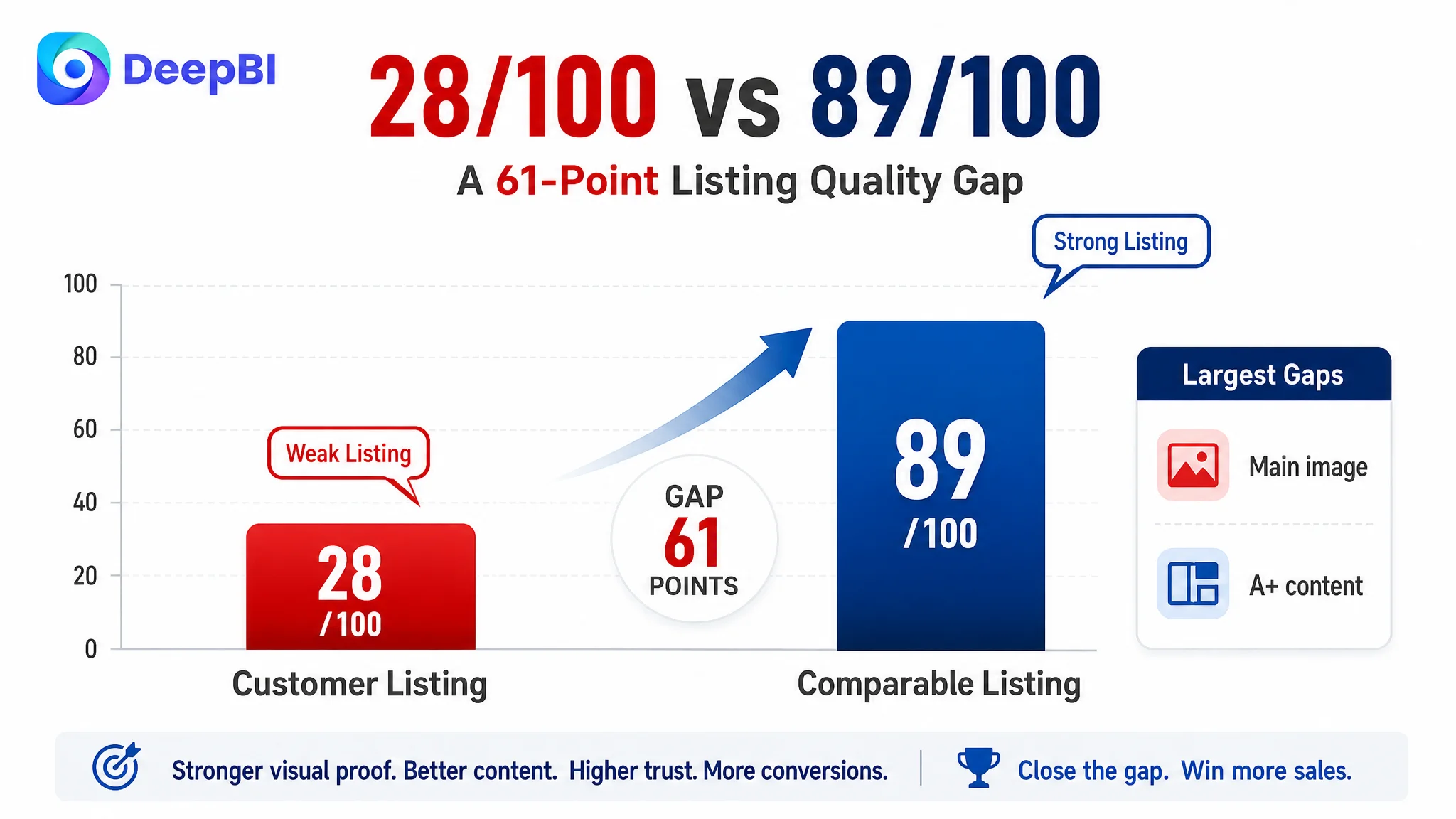
- Title: Customer Listing: 11/20, Comparable Listing: 17/20, Gap: -6
- Main image: Customer Listing: 7/30, Comparable Listing: 25/30, Gap: -18
- Bullet points: Customer Listing: 3/10, Comparable Listing: 9/10, Gap: -6
- A+ content: Customer Listing: 2/25, Comparable Listing: 23/25, Gap: -21
- Reviews: Customer Listing: 5/15, Comparable Listing: 15/15, Gap: -10
- Total: Customer Listing: 28/100, Comparable Listing: 89/100, Gap: -61
The score did not suggest a single isolated defect. It showed a page with weak conversion capacity at almost every major decision point.
The Listing was not merely missing polish. It was missing the evidence shoppers needed to believe the product was accurate, practical, and worth choosing.
That distinction matters for Amazon advertising. If ads send shoppers to a page that does not communicate value quickly, the traffic may expose the page’s weaknesses rather than solve them.
The original diagnosis focused too narrowly on keywords and specifications
The customer’s Listing communicated what the product was, but not why a shopper should choose it over a more established digital tire pressure gauge.
The title included the basic product category, but the core phrase “Digital Tire Gauge” appeared in the middle rather than being organized around the more precise search expression “Digital Tire Pressure Gauge.” The wording also repeated “Tire” without adding meaningful information.
This created two problems at once:
- The title was less efficient as a search-language structure.
- It did not create a strong reason to click in a crowded Amazon results page.
The original optimization direction appeared to treat the page as a specification-cleanup task: correct the wording, explain the operating range, and list basic functions. Those changes were necessary, but they could not address the broader trust gap.
A shopper evaluating a digital tire gauge is not only asking, “What is the pressure range?”
They are also asking:
- Can I read the result quickly?
- Is the gauge easy to operate?
- Will it work for the type of vehicle or bicycle I own?
- Does it feel like a reliable tool or a generic device?
- Is the stated accuracy supported by anything visible?
- What happens if the product does not perform as expected?
The customer’s page answered only part of the first question.
The largest problem was not the title. It was the missing visual decision path.
The main image scored 7 out of 30, creating an 18-point gap against the comparable Listing.
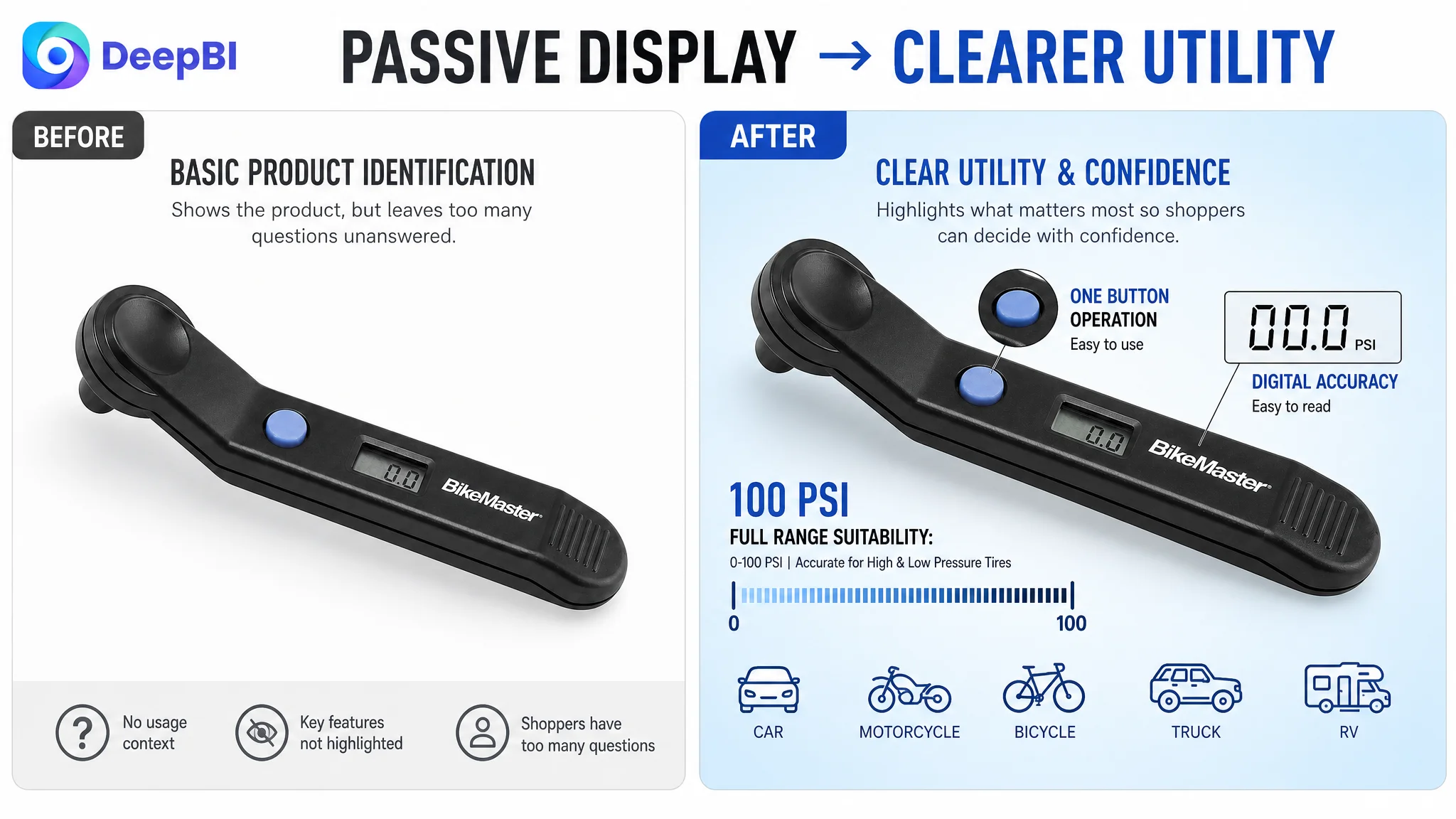
The issue was not simply that the image looked less attractive. Its role in the Amazon shopping journey was too limited. The current view mainly identified the product and displayed its digital readout, but it did not communicate the product’s operating simplicity, practical use, or strongest specifications.
A passive product view leaves too much work to the shopper. The buyer has to infer:
- How the gauge is held
- How the one-button operation works
- Whether the display is easy to read
- Whether the product is suitable for bicycles as well as vehicles
- What pressure range it supports
- Whether the product is designed for real garage or roadside use
A stronger image sequence would not change the product itself. It would make the product’s existing selling points easier to understand.
The first image needed a clearer reason to click
The recommended direction was to use a more dynamic angle that shows the nozzle design and one-button interface more clearly.
That change is important because the main image is not only an identification image. On Amazon, it also competes for attention in a dense search environment. A more deliberate angle can help the shopper recognize the product’s form and operating simplicity before opening the detail page.
The image should still remain truthful to the actual product. The objective is not to make the gauge appear more advanced than it is, but to make its real design easier to evaluate.
The second image needed to make the range visible
The product’s confirmed range was 0–100 PSI, but that information was not given enough visual weight.
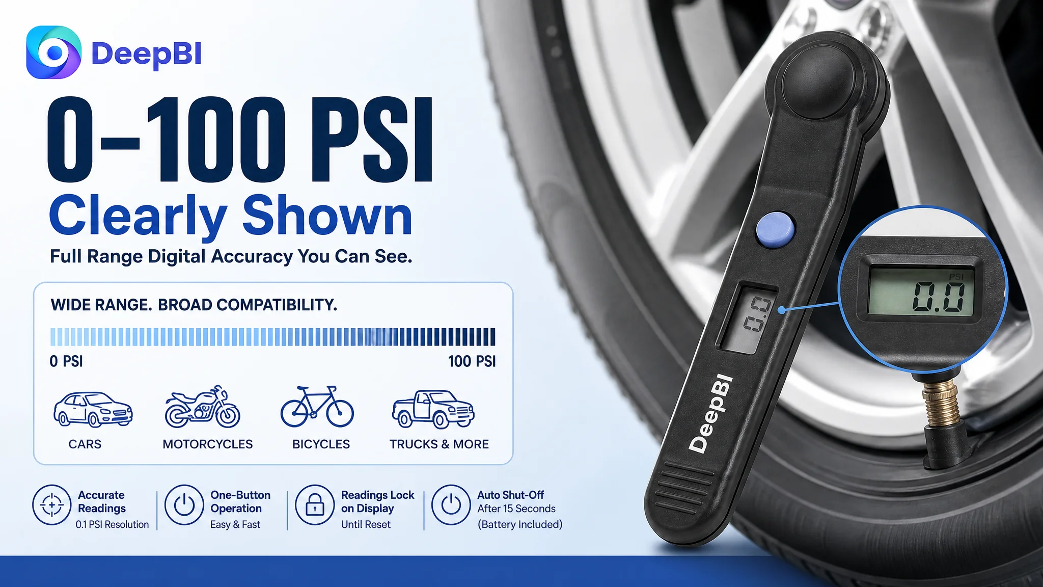
A dedicated image could show the gauge face alongside a clear 0–100 PSI range statement. This would reduce uncertainty for shoppers comparing the product with their intended use, whether for a car, truck, motorcycle, or bicycle.
The range should not be buried in a paragraph or left for the shopper to search for. It should be presented as a direct suitability check.
The usage images needed to reduce misuse concerns
The current Listing did not provide enough evidence of how the gauge works in practice. A visual showing a hand operating the product on a bicycle valve or vehicle tire could clarify the experience without inventing additional functions.
This would address a practical concern: the shopper may understand the product category but still hesitate because they cannot picture using it.
The image sequence should demonstrate:
- The one-button workflow
- A readable digital result
- Connection to a tire valve
- Use in a realistic vehicle or bicycle context
- The product’s suitability for everyday maintenance
The title was missing both precision and commercial structure
The recommended title structure was:
Digital Tire Pressure Gauge - Professional Accuracy - 0–100 PSI
The key improvement was not adding more words. It was reorganizing the words around the customer’s actual search and decision logic.
The revised structure would:
- Use “Digital Tire Pressure Gauge” as the primary product phrase
- Remove redundant wording
- Add the confirmed 0–100 PSI range
- Use a restrained accuracy-oriented descriptor
- Make the product easier to identify and compare in search results
The title should not claim certifications, precision levels, or performance standards that the product material does not confirm. The improvement comes from making verified information clearer, not from adding unsupported authority.
A stronger Amazon title does more than improve keyword coverage. It gives the shopper an immediate answer to what the product is and why it may fit the intended use.
The bullet points listed functions but did not build a buying argument
The bullet-point score was 3 out of 10. The customer’s bullets covered basic functions, operation, automatic shutoff, and accessories, but the structure was fragmented.
The comparable Listing followed a more complete decision sequence:
1. Professional accuracy and supporting evidence
2. Durability and handling
3. Advanced operation and use cases
4. Display visibility and battery management
5. Long-term ownership value
The customer’s bullets did not create the same progression. They described the product, but they did not consistently connect each feature to a shopper concern.
Accuracy needed to connect to the maintenance outcome
The first bullet should lead with the product’s confirmed accuracy positioning and 0–100 PSI range. It should then connect the function to the practical reason for using a tire gauge: maintaining proper tire inflation and supporting more predictable vehicle handling and performance.
The important change is from:
“This product measures pressure.”
to:
“This product helps the user check tire pressure with a clear, professional-oriented digital reading.”
The wording must remain within the product’s verified claims. It should not imitate a competitor’s certification or claim a specific tolerance that has not been confirmed.
Durability needed a more concrete context
The original content gave little sense of how the gauge fits into everyday use.
A bullet about a solid, ergonomic design could position the product for garage or roadside maintenance, provided those descriptions accurately reflect the product. This creates context around the tool without inventing materials, protective features, or construction standards.
The objective is to help the shopper understand the product as a practical maintenance tool rather than an anonymous electronic accessory.
One-button operation needed to become a workflow
The one-button function was present as a selling point, but it was not developed into a clear user experience.
A stronger bullet would explain that the user can power on the gauge and obtain a reading without navigating complex menus. It could also state the intended vehicle and bicycle applications supported by the product positioning.
This is more persuasive than simply repeating “easy to use.” It shows what ease of use means.
The display and shutoff function needed a visible benefit
The product’s digital display and automatic shutoff were treated as technical details. They should instead answer practical concerns:
- Can the reading be seen clearly?
- Is the result easy to interpret?
- Does the gauge help conserve battery power?
- Is a battery included?
The case material confirms an automatic shutoff after 15 seconds and that a battery is included. Those facts can be used to reduce readiness and convenience concerns without overstating battery performance.
The final bullet needed to address ownership value
The fifth bullet was an opportunity to explain why checking tire pressure matters to the shopper’s routine. Proper inflation can support tire life and a safer driving experience, but the copy should avoid turning that into an exaggerated performance promise.
The point of the final bullet is to complete the buying logic:
product function → easier maintenance → practical ownership value.
The A+ content was the deepest conversion gap
The A+ content scored 2 out of 25, compared with 23 out of 25 for the comparable Listing. This was the largest individual gap in the audit.
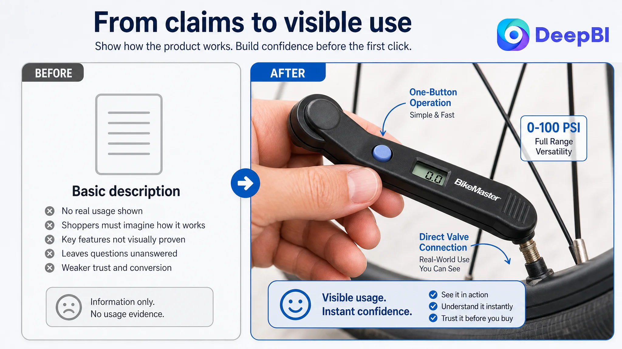
The customer’s page used no meaningful visual A+ story and relied on a repeated basic description. The comparable Listing used a broad set of visual modules covering product scenes, close-ups, operation, specifications, brand positioning, and product comparison.
This difference changes the entire trust environment of the page.
A shopper who sees only one basic description must accept the claims largely on faith. A shopper who sees the product in use, reads the display in a close-up, understands the range, and sees how the tool is handled has more evidence to use in the decision.
The A+ weakness was not a content-volume problem. It was a missing sequence from uncertainty to confidence.
The recommended A+ direction was to move from a parameter-first presentation to a scenario-led structure.
Start with the product in use
The opening module should show the gauge working on a tire, with the digital display visible under a realistic lighting condition.
This immediately answers two questions:
- What does the product do?
- Can the result be read easily?
The product should remain the visual focus. The scene is there to clarify use, not to create an artificial lifestyle image.
Show ergonomic operation
A hand-held operating view can demonstrate the one-button interaction and make the tool feel less intimidating.
This is especially relevant for shoppers who understand the category but are unsure whether a digital gauge will be complicated to operate. Showing the hand position and the interaction makes the feature concrete.
Establish a credible product position
The page should introduce the product’s category role and brand identity earlier, rather than leaving the gauge to appear as a generic item.
The positioning should remain factual. A clean, orderly automotive or tool environment can create useful context without implying certifications, professional endorsements, or company history that has not been confirmed.
Turn accuracy into visual evidence
If the product is described as easy to read and digitally accurate, the A+ page should show the actual display in a close-up.
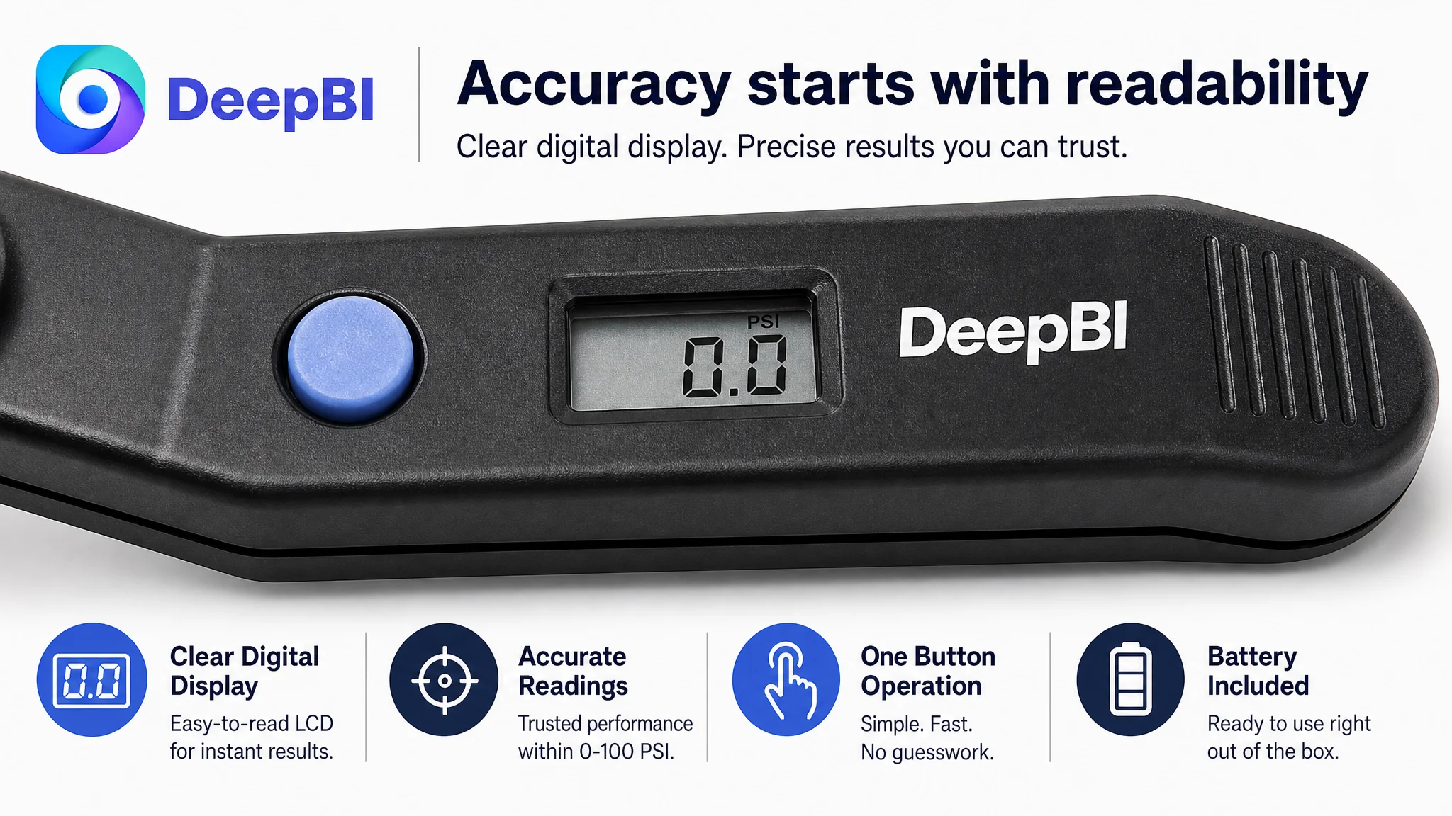
The purpose is not to manufacture a technical claim. It is to let the shopper see the clarity of the digits and understand how a reading is presented.
The page should avoid showing or implying measurement units that are not confirmed as selling points. It should also avoid adding unverified precision figures.
Make the pressure range impossible to miss
A dedicated module can present the confirmed 0–100 PSI range in a clean, high-contrast layout.
This is a simple but valuable form of decision support. Shoppers should not have to move between the title, bullet points, and specifications to determine whether the gauge fits their use case.
Demonstrate connection and practical use
Another module should show how the gauge connects to a tire valve and how the user reads the result.
This can reduce concerns about compatibility and awkward handling. It also gives the page a stronger relationship between the written bullet points and the visual story.
Reviews were not a secondary issue
The review dimension scored 5 out of 15.
The customer Listing had:
- 3.8 stars
- 9 total reviews
- 7 reviews visible on the first page
- A 1-star review among the visible reviews
- No meaningful photo or video review support
The comparable Listing had:
- 4.7 stars
- 6,923 total reviews
- A much stronger review history
- More substantial visual review evidence
This is not a gap that title editing or image generation can erase immediately. It is a structural trust disadvantage that affects how shoppers interpret every other claim on the page.
A weak review base makes visual and textual clarity even more important. When the Listing cannot rely on a large volume of customer experience, it must compensate with stronger product evidence:
- A clear display close-up
- Realistic usage scenes
- A visible operating process
- Precise and verified specifications
- A coherent explanation of the product’s role
The page should not pretend to have the market validation of a long-established competitor. It should instead reduce uncertainty through accurate, well-organized evidence.
Why DeepBI did not recommend continuing with isolated ad or keyword adjustments
The diagnosis did not treat every gap as equally urgent.
The title required improvement, but it was not the highest-priority constraint. The main image and A+ content represented much larger gaps, with scores of 7/30 and 2/25 respectively.
That priority order reflects the customer’s likely conversion path:
1. The shopper encounters the product in Amazon search.
2. The main image and title determine whether the product earns attention.
3. The product page must then explain the product clearly.
4. The bullets and A+ content must resolve practical and trust-related concerns.
5. Reviews reinforce or weaken the final decision.
If the page is weak at stages three and four, increasing traffic before repairing those stages can amplify the problem. More shoppers may arrive, but the product still lacks enough evidence to convert them.
The correct decision was therefore not to keep polishing advertising inputs in isolation. It was to repair the page’s ability to receive traffic.
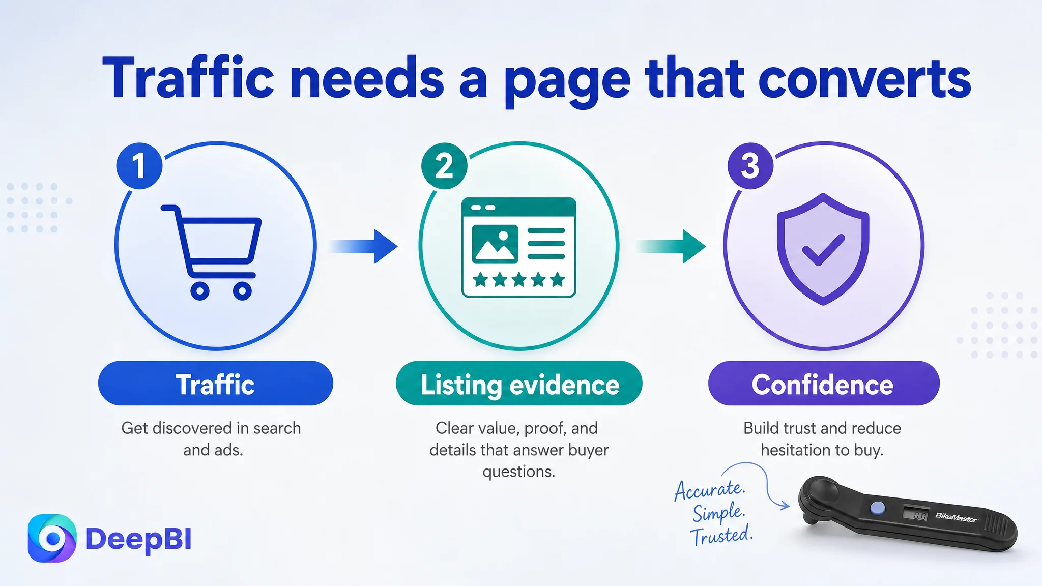
Before scaling the traffic signal, the seller needed to make sure the Listing could produce a useful response from that traffic.
This does not mean advertising is unimportant. It means Amazon ads should be evaluated together with the product page that receives the clicks. A keyword can be relevant, a bid can be competitive, and an impression can be earned, yet the business result can still remain weak if the page does not build confidence.
The optimization direction became a coordinated page rebuild
The later plan focused on alignment rather than isolated edits.
Search language
- Replace the less precise “Digital Tire Gauge” structure with “Digital Tire Pressure Gauge”
- Remove redundant wording
- Add the confirmed 0–100 PSI range
- Use a measured accuracy-oriented descriptor without inventing certifications or tolerances
Main image sequence
- Use a more functional angle for the first image
- Add a clear range image
- Show one-button operation
- Demonstrate use on a bicycle or vehicle tire
- Make the digital reading easier to evaluate
- Address readiness and automatic shutoff with truthful supporting visuals
Bullet-point logic
- Lead with professional-oriented accuracy and range
- Add practical durability and handling context
- Explain the one-button workflow
- Clarify display readability and battery convenience
- Connect proper tire-pressure checks with everyday maintenance value
A+ content
- Open with a realistic usage scenario
- Add ergonomic handling evidence
- Establish category and brand context
- Show the digital readout in close-up
- Use a professional but factual environment
- Demonstrate connection to a tire valve
- Give the 0–100 PSI range a dedicated visual position
The sequence is important. The product should not simply receive more images or longer copy. Each element should answer a different buyer question.
What changed in the business understanding
The case material does not provide confirmed post-optimization CVR, ACOS, CTR, or organic-order results, so no numerical performance outcome should be claimed.
The business change was the decision itself: the seller moved from treating the Listing as a basic product-information page to treating it as the foundation of Amazon traffic efficiency.
The key lessons are clear:
- A title can contain the right product category and still be weakly structured.
- A main image can identify the product without creating a reason to click.
- Bullet points can list features without forming a buying argument.
- A+ content can be technically present but commercially absent.
- Reviews can create a structural trust gap that requires stronger on-page evidence.
- Advertising traffic cannot repair a product page that does not explain, demonstrate, and substantiate its value.
For this digital tire gauge Listing, the central constraint was conversion capacity, not simply keyword presence.
The seller did not need to make the page louder. The seller needed to make it clearer, more credible, and more useful at each stage of the Amazon decision path.
That is the judgment DeepBI brought to the case: not another isolated adjustment to the title, image, or campaign, but a diagnosis of why the Listing was failing to turn visibility into confidence—and why the product page had to be repaired before traffic could become more valuable.