

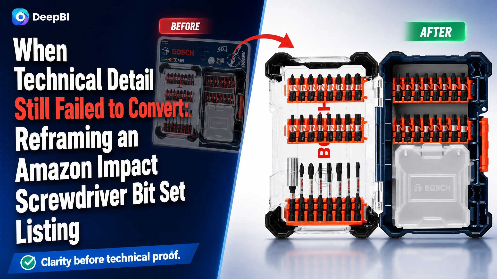
This case involved an Amazon seller in the impact screwdriver bit set category whose product page was communicating plenty of technical information but still lacked persuasive force. The Listing showed durability claims, engineering diagrams, compatibility details, and a storage case, yet its overall competitive score was 58 out of 100 against 88 for a comparable high-performing Amazon Listing.
The initial direction was to make the product’s engineering advantages clearer: explain the manufacturing process, show more specifications, and reinforce claims around durability and torque. DeepBI found that this diagnosis was incomplete. The larger problem was not a lack of technical information. It was that the Amazon product page asked shoppers to interpret the information before confirming what they were buying, why it would be useful, and how it would make their work easier.
The later optimization therefore focused on rebuilding the Listing’s sales logic: show the complete 40-piece set first, make the storage value immediately visible, connect technical features to practical problems such as cam-out and dropped bits, and move dense engineering proof later in the page. The case offers a useful reminder for Amazon sellers: before increasing traffic or adding more claims, determine whether the product page can turn attention into confidence.
The Amazon Listing Had a Product, but Not Yet a Clear Buying Path
The customer’s Amazon Listing was not empty or poorly documented. It contained a full product set, a custom storage case, durability messaging, technical diagrams, compatibility information, and several A+ modules.
The difficulty was the order and role of that information.
The page behaved more like an engineering explanation than a purchase argument. It described how the bits were made, how they handled torque, and how they were designed for impact drivers. But it did not lead shoppers through the questions that usually determine whether a tool set feels worth buying:
- What exactly is included?
- Can I understand the set at a glance?
- Will the bits fit securely and reduce slipping?
- Can I find and remove the right bit quickly?
- Is the case useful in real work?
- Does the product appear reliable enough for repeated high-torque use?
A competing Amazon Listing answered these questions in sequence. It introduced the set visually, explained the storage system, demonstrated practical features, and then used technical details to support the buying decision.
The customer’s page began too far down that path.
The page did not lack information. It lacked a clear order for turning information into confidence.
The Original Diagnosis Focused on Engineering Proof
The original Listing logic treated product superiority as the main conversion lever.
The page emphasized claims such as extended bit life, heat-treated construction, precision manufacturing, torque absorption, and compatibility with impact drivers. These claims may be relevant to experienced buyers, but they were presented primarily as technical statements rather than as solutions to recognizable work problems.
That created an understandable but incomplete optimization direction: if the product’s performance was strong, the page should explain the engineering more thoroughly.
This led to a page with more technical evidence, but not necessarily a stronger reason to buy.
For example, a diagram explaining a torsion zone can be useful after a shopper has already understood the product and become interested in its durability. It is less effective when it appears before the shopper has clearly seen the full set or understood the practical value of the storage case.
The same issue appeared in the bullet points. The customer’s copy leaned toward:
- manufacturing process
- performance declarations
- material and durability claims
- compatibility information
The comparable high-performing Listing leaned more toward:
- easy storage and removal
- visible contents
- reduced movement and dropped bits
- professional applications
- system compatibility
- warranty and long-term confidence
The difference was not simply word choice. It was a difference in decision logic.
The customer’s page described what the product was made to do. The stronger Listing showed why those characteristics mattered during work.
The Score Gap Exposed a Conversion Problem, Not One Isolated Defect
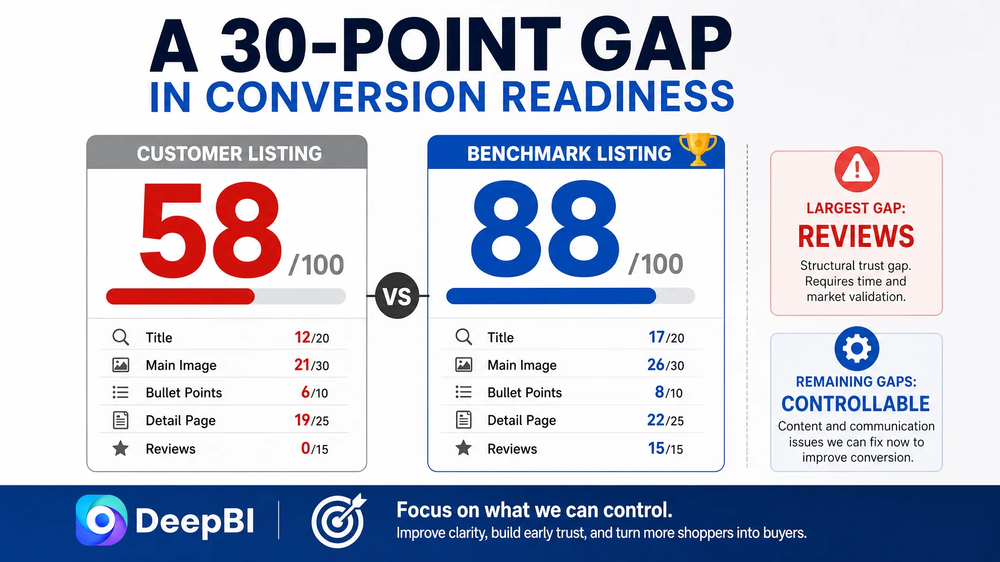
DeepBI’s comparison gave the Listing an overall score of 58, compared with 88 for the benchmark Listing.
The gaps were distributed across the page:
- Title: Customer Listing: 12/20, Benchmark Listing: 17/20, Gap: -5
- Main image: Customer Listing: 21/30, Benchmark Listing: 26/30, Gap: -5
- Bullet points: Customer Listing: 6/10, Benchmark Listing: 8/10, Gap: -2
- Detail page: Customer Listing: 19/25, Benchmark Listing: 22/25, Gap: -3
- Reviews: Customer Listing: 0/15, Benchmark Listing: 15/15, Gap: -15
The review gap was the largest. The customer Listing had no review data, while the benchmark had a mature review base, a 4.8-star rating, and more than 47,000 reviews.
That difference created a serious trust disadvantage that content changes alone could not erase immediately. But it also made the remaining controllable areas more important. The page could not afford to make shoppers work harder to understand the set or verify its value.
DeepBI therefore did not treat every score gap as an equal priority.
The review gap represented a long-term market-validation problem. The title, image sequence, bullet points, and A+ structure represented immediate communication problems that could be addressed through Listing optimization.
The core diagnosis became clear:
The page was not failing because it had too little technical content. It was failing because its content did not establish product value and practical trust early enough.
The Title Was Missing the Search and Click Logic
The title score was 12 out of 20, five points behind the benchmark.
The most important weakness was the placement and structure of the core category terms. The customer title placed “Impact Screwdriving Set” too late and included a model-style code that contributed little to search clarity. It also failed to express the 40-piece quantity in the most recognizable format.
The stronger title structure followed a more established Amazon pattern:
Brand or product identity → core product term → quantity → key performance attribute → product type → storage benefit
For this Listing, the recommended direction was to bring forward terms such as:
- 40-piece
- screwdriver bit set
- impact screwdriver bit set
- impact-rated
- custom storage case
This was not a recommendation to fill the title with more keywords. It was a way to make the product legible to both Amazon search and the shopper scanning the results page.
A buyer looking for an impact screwdriver bit set should not have to infer the product category from a model code or work through an unusual word order. The title needed to establish the product identity first, then support the click with quantity, intended use, durability, and storage.
The Main Image Made Confirmation Too Slow
The main image score was 21 out of 30, five points below the benchmark.
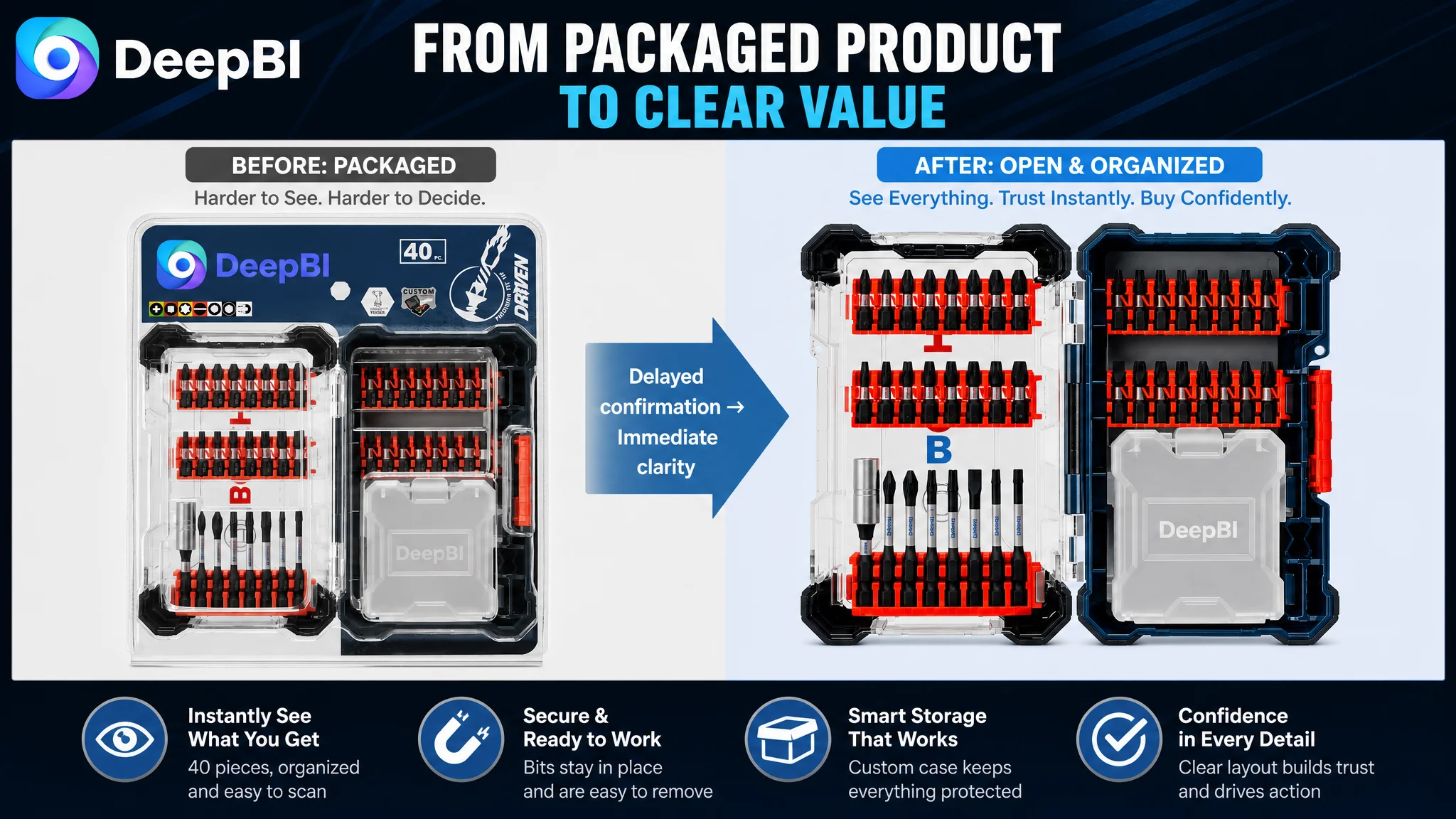
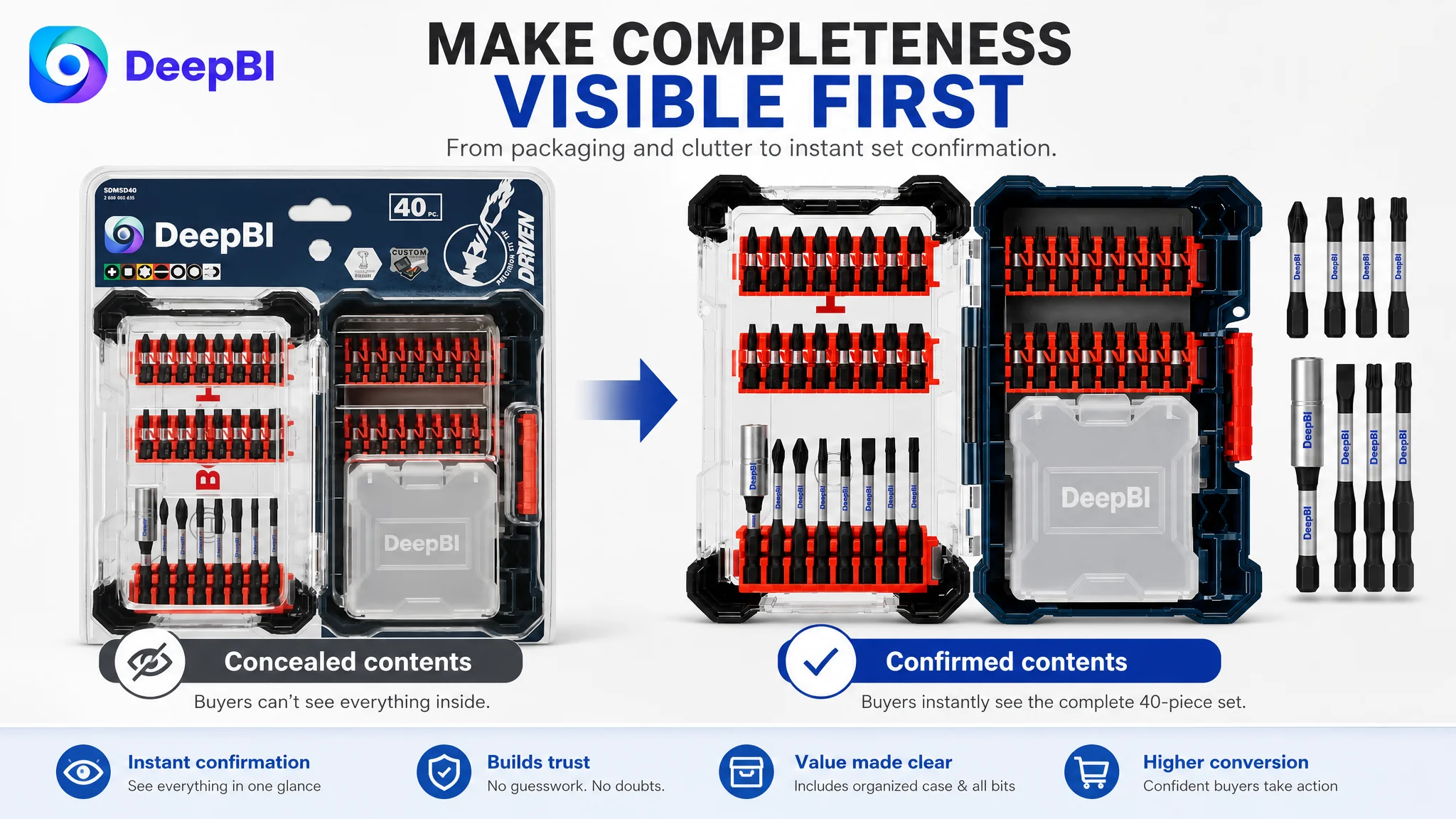
The first image showed the product inside blister packaging. That created several problems at the exact point where shoppers needed certainty.
The buyer could not immediately confirm:
- the complete contents of the 40-piece set
- how the bits were arranged
- whether the custom case was a meaningful part of the offer
- whether the product looked organized and ready for use
Packaging also introduced visual noise. Instead of making completeness obvious, the image made the product feel partially concealed.
The benchmark Listing used its opening images to create a clear progression:
1. full product view
2. contents confirmation
3. structural or functional advantage
4. storage convenience
5. practical use context
The customer’s page reached some of this information only after additional scrolling. Its more technical image appeared too early, while useful visual proof around storage, access, and real work conditions was missing or underdeveloped.
The first image should answer the first buyer question
The recommended first-image direction was straightforward: remove the packaging and show the full 40-piece set neatly arranged in the open custom case on a clean white background.
The purpose was not decorative improvement. It was immediate confirmation of value.
A shopper should be able to recognize the quantity, variety, and organization of the set before reading a technical explanation.
The technical diagram belonged later
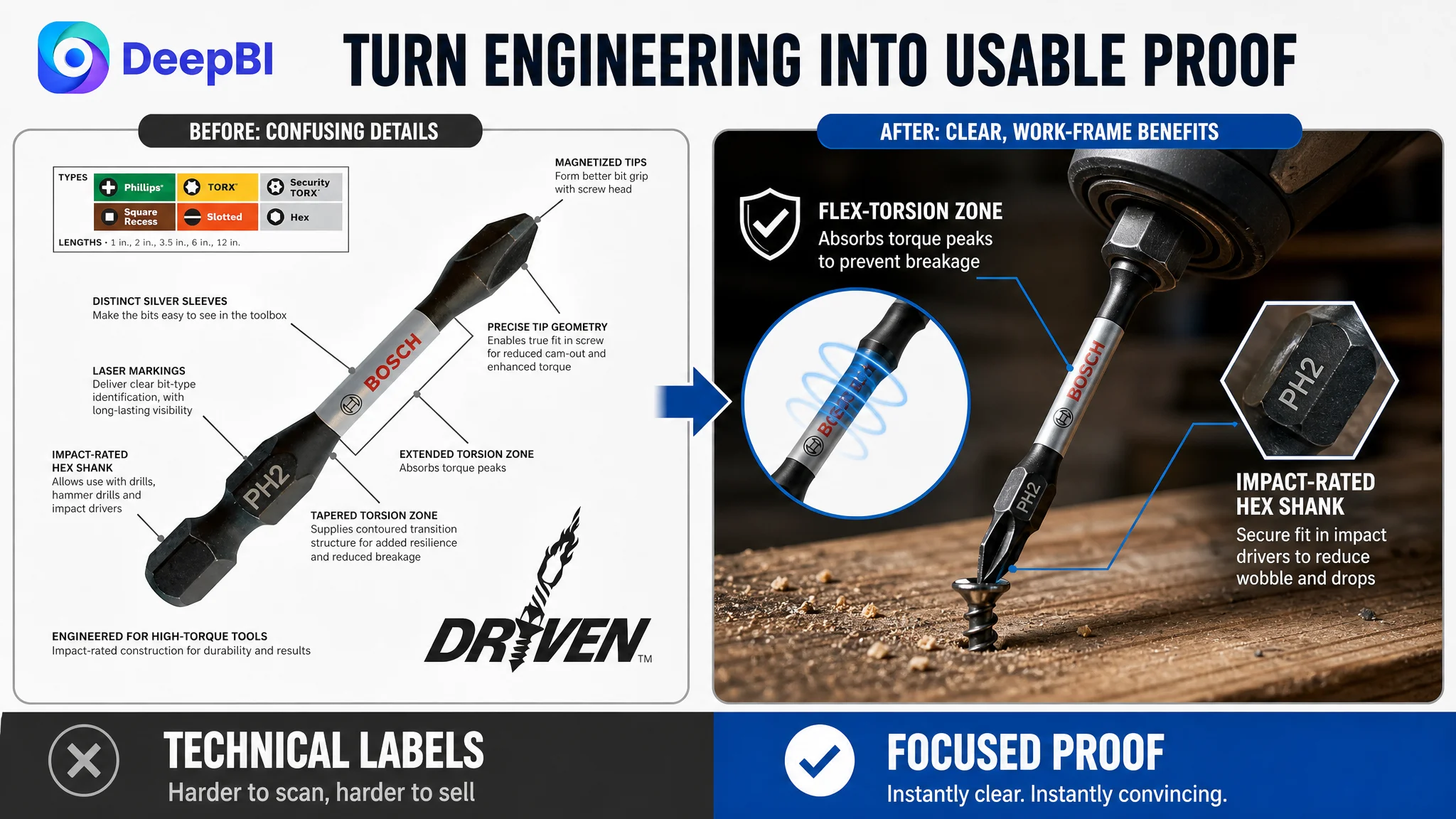
The existing technical image contained useful information about bit types, lengths, fit, and construction. The problem was its position.
Placed too early, it overloaded the confirmation stage. A shopper who had not yet decided that this was the right set was being asked to process engineering detail.
DeepBI’s recommendation was to move this content toward image four or five, where it could serve as rational confirmation after the product’s contents and practical value had already been established.
The missing visual links were practical
The page also lacked dedicated visual treatment for:
- impact-rated construction
- torque management
- secure bit access
- organized case storage
- practical use context
These were not requests to invent new features. They were requests to make existing, verifiable product attributes easier to understand.
The main image did not need to say more. It needed to make the right value visible sooner.
The Bullet Points Had Specifications, but Not a Problem-Solution Structure
The bullet point score was 6 out of 10.
The main issue was not a lack of technical claims. It was the absence of a consistent connection between each claim and a buyer concern.
For example, a statement about precision machining is stronger when it explains that the tip is designed to fit the screw head more precisely and reduce cam-out. A statement about a torsion zone is stronger when it explains how torque peaks from an impact driver affect durability.
The recommended bullet structure followed a more useful sequence:
Durability should connect to repeated high-torque work
A claim such as “50X longer life than standard bits” should be supported by the actual construction details provided in the case, including heat treatment and a hardened surface.
The point is not to repeat the number more prominently. It is to explain what the claim means in demanding use.
Precision should connect to less slipping
“CNC-machined tips” is an engineering description. The buyer benefit is a more precise fit, less cam-out, cleaner fastening, and more consistent torque transfer.
This shift turns a manufacturing statement into a work outcome.
The torsion zone should explain the risk it addresses
The tapered torsion design was presented as a technical concept. It needed to be connected to the problem of high-torque peaks, breakage, and service life.
That gives the shopper a reason to care about the feature rather than asking them to recognize its importance on their own.
Application coverage should make the audience visible
The set was positioned for use across HVAC, electrical, plumbing, carpentry, and general maintenance tasks. Including those contexts could make the product more relevant to professional buyers and help shoppers identify whether the set fits their working environment.
Storage should be treated as workflow value
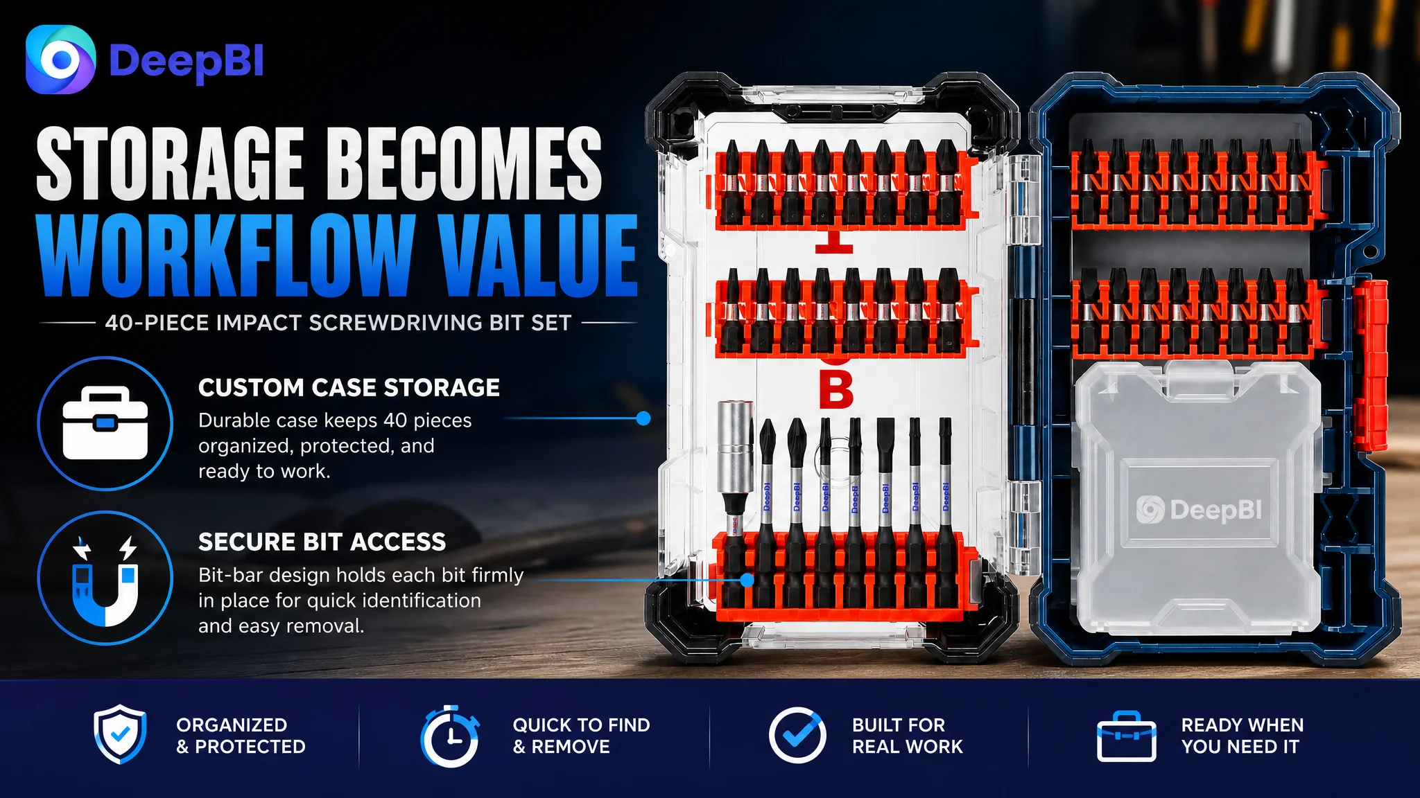
The case was not merely an accessory. It could support:
- faster bit selection
- easier removal
- better organization
- protection during transport
- less time searching through a toolbox
This was an important competitive difference because the benchmark Listing consistently connected storage design to job efficiency.
Compatibility belongs near the end of the decision path
Compatibility with standard impact drivers and drills is necessary, but it does not need to lead the entire argument. It works better as a late-stage reassurance after the shopper understands the contents and key benefits.
The A+ Content Explained the Product Before Solving the Buyer’s Problem
The detail page score was 19 out of 25, three points behind the benchmark.
The customer’s A+ structure included:
- a main visual
- a life comparison
- structural analysis images
- an application scene
- a product type matrix
- a storage system image
The content was substantial, but the modules did not form a strong progression.
The first module presented a general technical suitability statement. The second moved into a quantified durability comparison. The third and fourth both addressed related engineering logic, creating redundancy. The storage image appeared later and was weakened by its presentation and disclaimer.
The benchmark Listing used its A+ content to build a more complete solution story:
1. what the buyer receives
2. how the product solves a practical problem
3. why the construction supports the claim
4. how the storage system works in a real setting
5. why the product deserves trust
Module one needed to confirm the offer
The first A+ module should have shown the complete 40-piece set and the custom storage case clearly.
That information was already present, but it was not given the priority it deserved. A shopper should not need to reach the final module to understand the offer.
Technical proof should follow the promise
The durability and torsion-zone modules had value, but they should support a promise that has already been made.
A stronger sequence would be:
- show the product and its contents
- identify the concern around durability or slipping
- present the construction evidence
- confirm compatibility and use conditions
This creates a more natural “claim, explanation, proof” structure.
Repeated engineering explanations should be consolidated
Two modules addressed similar structural logic under different labels. That consumed valuable page space without adding a distinct argument.
Combining them into one clearer technical proof point would reduce confusion and leave room for a stronger practical benefit module.
The page needed to show the problem being solved
The use image was too generic. It showed the product in use but did not directly answer a specific concern.
The stronger direction was to focus the visual narrative on outcomes such as:
- better fit into screw heads
- reduced cam-out
- secure bit handling
- faster selection from the case
- organized storage during demanding jobs
This is where the Listing could move from “technical product description” to “workplace solution.”
Why DeepBI Did Not Recommend More Technical Detail First
The key judgment was not that the engineering claims were unimportant. It was that they were being asked to perform too early and too often.
DeepBI’s diagnosis compared the customer Listing with a relevant benchmark across multiple dimensions rather than evaluating individual assets in isolation. That exposed a pattern:
- the title did not establish the core product clearly enough
- the opening image did not confirm the complete offer
- the bullet points emphasized specifications over user problems
- the A+ modules introduced technical proof before building basic understanding
- storage and practical organization were underused
- the review gap made clarity and trust even more important
This is the difference between identifying a weak image and identifying a weak conversion system.
A designer might respond by making the technical diagram more attractive. A copywriter might add more durability language. An advertising manager might increase bids to compensate for weak results.
But if the page still makes shoppers ask, “What exactly am I getting, and how will this help me work faster or more reliably?” then additional traffic only brings more people into the same uncertainty.
Advertising can bring a shopper to the page. The Listing still has to make the product easy to understand and safe to choose.
The Correct Decision Order Was Page Clarity Before Traffic Expansion
The recommended sequence was not to keep adding traffic pressure to the existing page.
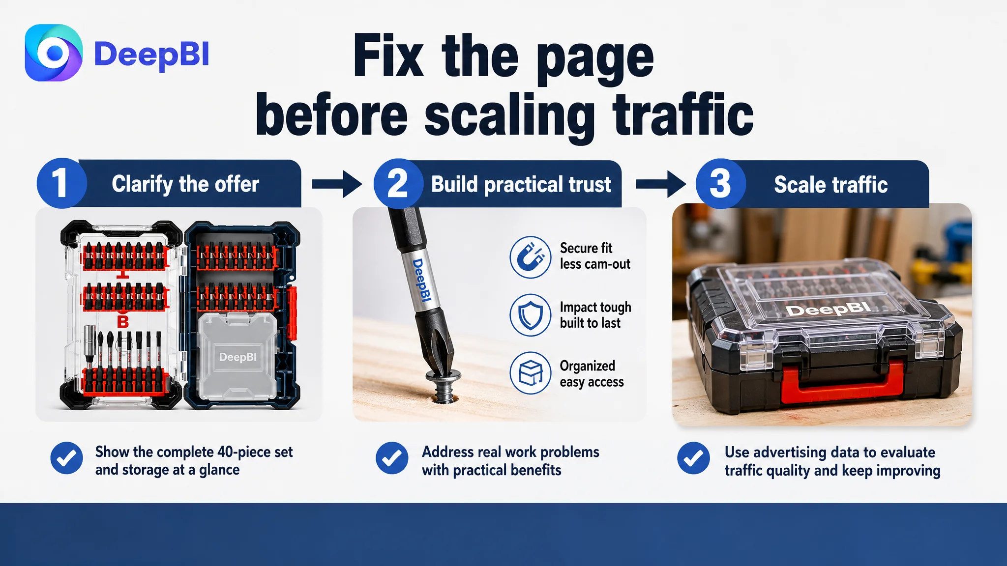
First, the Amazon Listing needed to regain basic conversion capacity:
1. confirm the complete set and storage case
2. clarify the title’s category and quantity terms
3. make practical benefits visible in the image sequence
4. connect bullet points to work problems
5. restructure A+ modules around a claim-and-proof journey
6. use technical details as confirmation rather than as the opening argument
Only after this foundation was addressed would advertising data become easier to interpret.
If traffic arrived at the earlier version of the page, a weak conversion rate could be caused by several overlapping issues: missing reviews, unclear contents, weak visual hierarchy, or insufficient practical trust. Continuing to optimize bids or keywords first would make it difficult to know whether the page had actually become more capable of converting.
The business risk was not merely wasted ad spend. It was the risk of using paid traffic to amplify a Listing that had not yet resolved its communication bottlenecks.
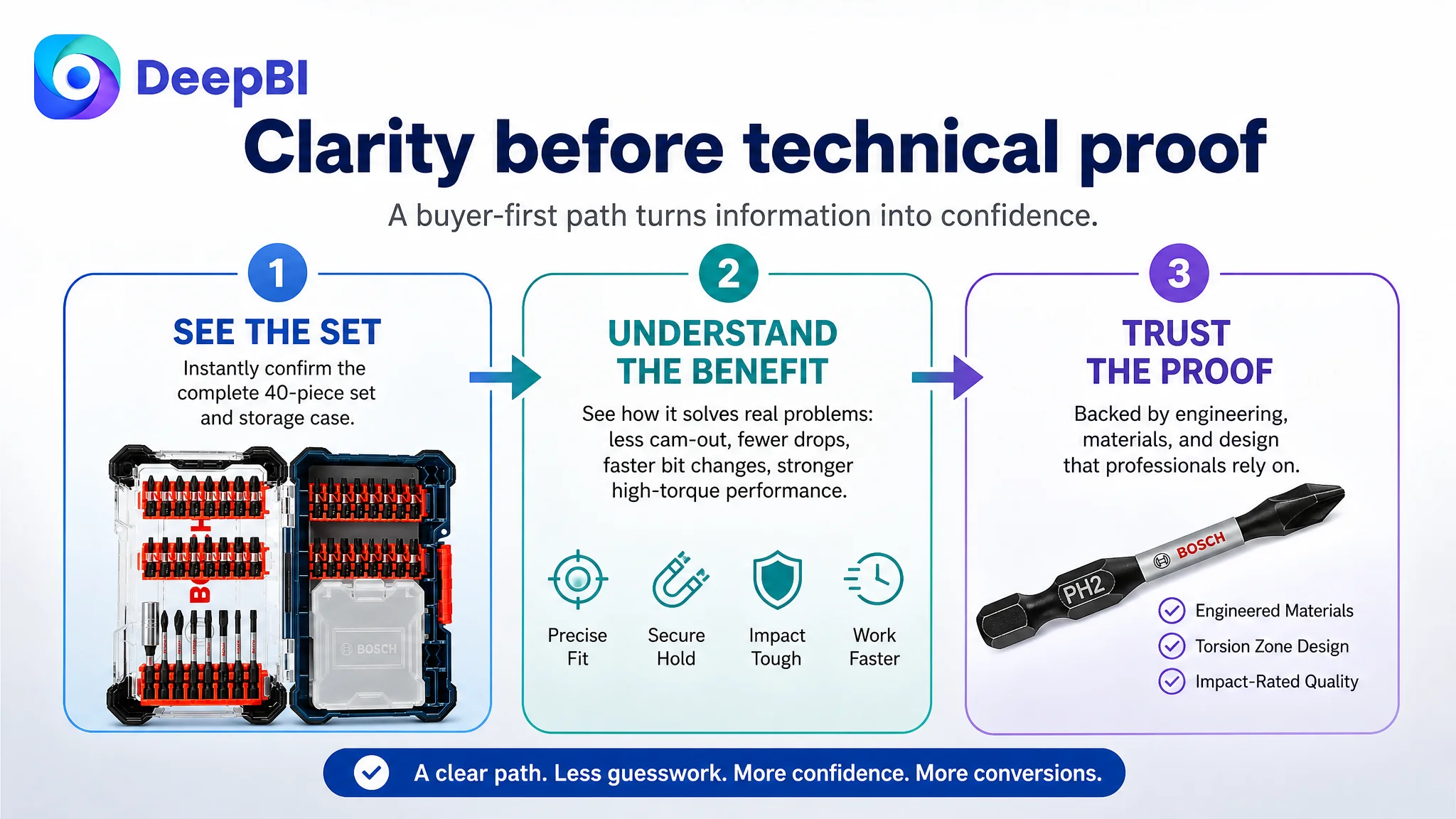
The Listing’s Sales Logic Was Rebuilt Around Three Buyer Questions
The revised direction organized the page around three practical questions.
“What am I getting?”
The first image, title, and opening A+ module should make the 40-piece contents and custom case immediately clear.
“Will it work reliably?”
The bullet points and later images should connect precision tips, impact-rated construction, heat treatment, and torque management to reduced slipping, lower breakage risk, and repeated high-torque use.
“Will it make the job easier?”
The image sequence and A+ content should show storage, access, organization, and application contexts rather than presenting the case as a secondary accessory.
This structure also created a better role for AI-assisted visual production. The goal was not to create a more dramatic image without direction. It was to convert a specific business diagnosis into visual instructions while keeping the actual product, set contents, and verifiable features unchanged.
For this case, that meant improving:
- composition
- image order
- visual emphasis
- use context
- benefit communication
- storage visibility
It did not mean inventing new accessories, changing the product’s physical structure, or adding unsupported performance claims.
What Changed in the Business Understanding
The case did not include post-optimization CTR, CVR, ACOS, or organic-order data, so the outcome should not be presented as a quantified performance success.
The important change was in operating judgment.
The team moved from treating the Listing as an engineering document to treating it as a conversion path. That changed the priority of every major asset:
- The title became a search-and-recognition entry point.
- The main image became a confirmation of contents and value.
- The bullet points became problem-solution arguments.
- The A+ page became a structured proof sequence.
- Technical diagrams became late-stage evidence.
- The storage case became part of the product’s workflow value.
- Compatibility became a final reassurance rather than the opening message.
The review gap remained a serious structural disadvantage. But the team could now distinguish between a trust asset that requires time to build and a page communication problem that could be corrected immediately.
That distinction matters for Amazon sellers operating under pressure. Not every weakness should be attacked with the same tactic, and not every conversion problem is an advertising problem.
The Practical Lesson for Amazon Sellers
An impact screwdriver bit set can be technically strong and still underperform on Amazon if the Listing makes the shopper interpret too much, too early.
The strongest page in this case did not win simply because it contained more features. It won because the features were arranged around the buyer’s decision:
- see the complete set
- understand the storage value
- recognize the practical problem being solved
- receive technical proof
- confirm compatibility
- feel enough trust to move forward
That is the central lesson from the diagnosis.
Before scaling Amazon ads, check whether the Listing deserves more traffic. If the title is unclear, the main image delays confirmation, the bullets read like a specification sheet, and the A+ page explains engineering before demonstrating value, the page may be consuming traffic rather than converting it.
For this Amazon seller, the next optimization was not “add more information.” It was to make the existing product easier to understand, easier to trust, and easier to choose.