

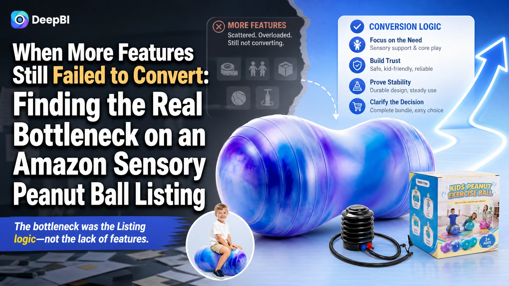
This case follows an Amazon seller in the kids’ sensory and physical-therapy exercise category whose product page was not competitive enough to convert the traffic it received. The initial direction leaned toward broader use cases, more specifications, and more functional information. Yet the Amazon Listing remained far behind a comparable high-performing page.
DeepBI’s diagnosis reframed the issue. The main problem was not a lack of product features, nor simply a need for more images. The Listing was presenting the product as a general-purpose exercise and play item, while higher-performing competitors were building a much clearer decision path around focus, sensory support, safety, stability, and trust.
The later optimization therefore focused on rebuilding the Amazon product page from the customer’s decision logic outward: lead with the core need, move technical details later, strengthen the main-image sequence, sharpen the title and bullet points, and use A+ content to connect emotional value with functional proof. The case offers a practical lesson for Amazon sellers: before increasing traffic or continuing to adjust advertising, determine whether the Listing is ready to convert that traffic.
The Amazon Listing Had Plenty of Information. It Did Not Have Enough Persuasion.
The product was a peanut-shaped sensory exercise ball intended for children and adults. Its potential use cases included balance training, active play, alternative seating, physical therapy, pregnancy support, and classroom or home use.
On paper, that gave the product a wide market.
In practice, the Listing was not communicating a strong reason to choose it.
The overall Listing score was 69 out of 100, compared with 89 out of 100 for a comparable high-performing listing in the same category.
That twenty-point gap did not come from one isolated error:
- Title: Target Listing: 16/20, Comparable listing: 17/20, Gap: -1
- Main images: Target Listing: 24/30, Comparable listing: 27/30, Gap: -3
- Bullet points: Target Listing: 7/10, Comparable listing: 8/10, Gap: -1
- A+ content: Target Listing: 19/25, Comparable listing: 23/25, Gap: -4
- Reviews: Target Listing: 3/15, Comparable listing: 14/15, Gap: -11
- Total: Target Listing: 69/100, Comparable listing: 89/100, Gap: -20
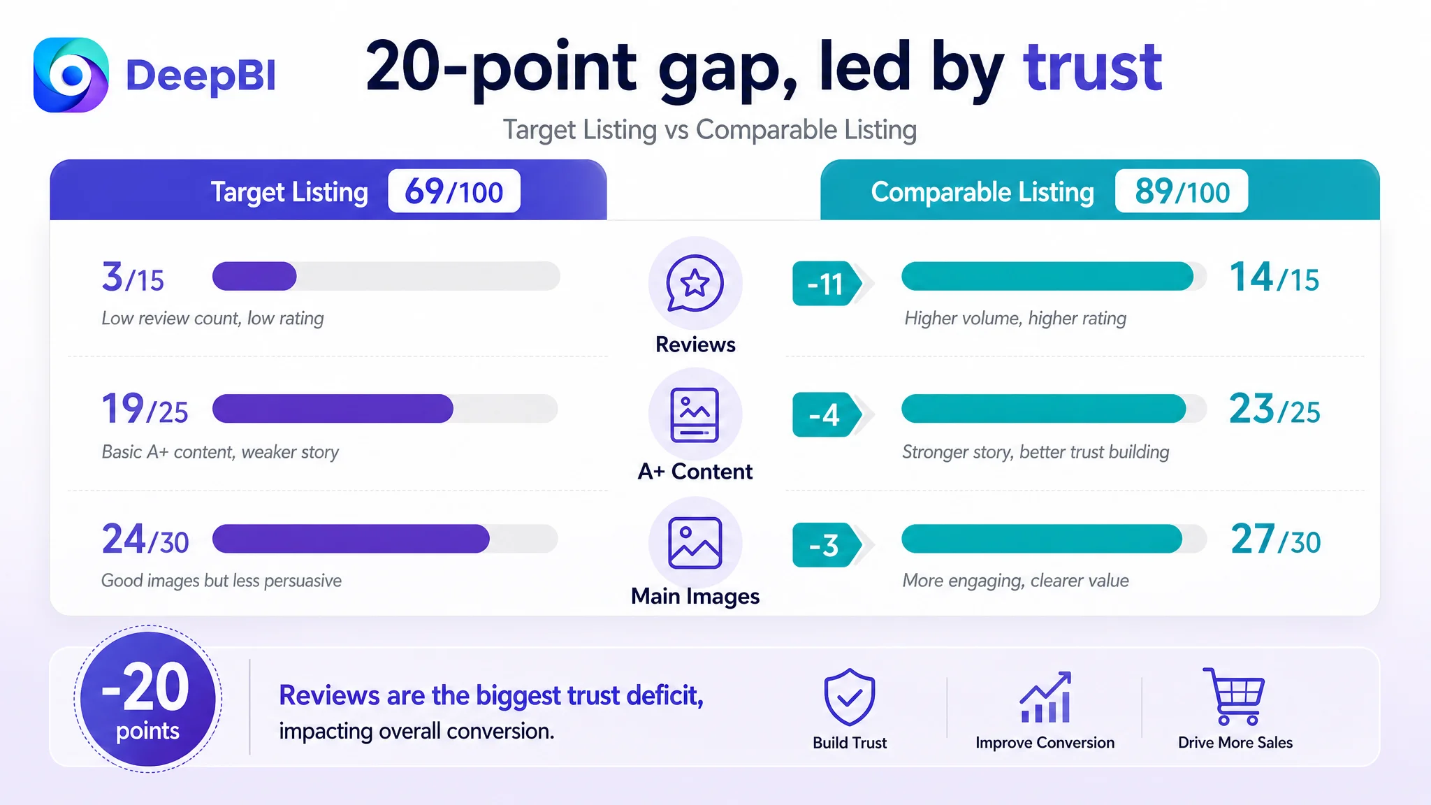
The largest gap was in reviews, but that was not the only reason the page struggled. The Listing also had a weaker value narrative, less precise audience targeting, and a thinner trust structure across the product page.
The page was not short of information. It was short of a convincing sequence for why this product mattered, who it was for, and why a shopper should trust it.
That distinction mattered because the customer’s Listing was not competing only on product shape or physical specifications. It was competing for a parent’s confidence in a product associated with children, sensory needs, safety, stability, and daily use.
The Initial Direction Was Broad Coverage, Not a Sharper Buying Decision
The customer’s existing content tried to cover many possible users and scenarios.
The title included physical characteristics, anti-burst positioning, multiple sizes, pregnancy and yoga use, and a broad range of applications. The images introduced dimensions, demographics, comfort, material details, and general quality. The bullet points emphasized the cloud pattern, non-slip surface, safety, inflation convenience, family use, and gift value.
That approach was understandable. A seller wants to avoid excluding potential customers.
But on Amazon, broad coverage can weaken conversion when it prevents the shopper from identifying the primary value quickly.
The page was effectively asking the shopper to assemble the product’s meaning independently:
- Is this mainly an exercise ball?
- Is it a sensory product?
- Is it a therapy tool?
- Is it a balance chair?
- Is it a children’s toy?
- Is it useful for pregnancy or adult yoga?
- Is the cloud pattern the main differentiator?
- Is safety the most important reason to buy?
The comparable listing made a different choice. It led with sensory support, focus, balance, motor skills, and therapy-related use. Its audience was narrower, but its decision logic was more direct.
This was the original misdiagnosis: the Listing was being treated as a container for more use cases, when it needed to become a clearer answer to a specific customer concern.
The customer had real advantages to communicate. The peanut shape offered greater stability than a traditional round balance ball. The cloud pattern could make the product more attractive to children. The non-slip surface and burst-resistant material could support safety communication. The product could also serve multiple roles across play, seating, exercise, and therapeutic activity.
But those advantages were not arranged according to the order in which a shopper makes a decision.
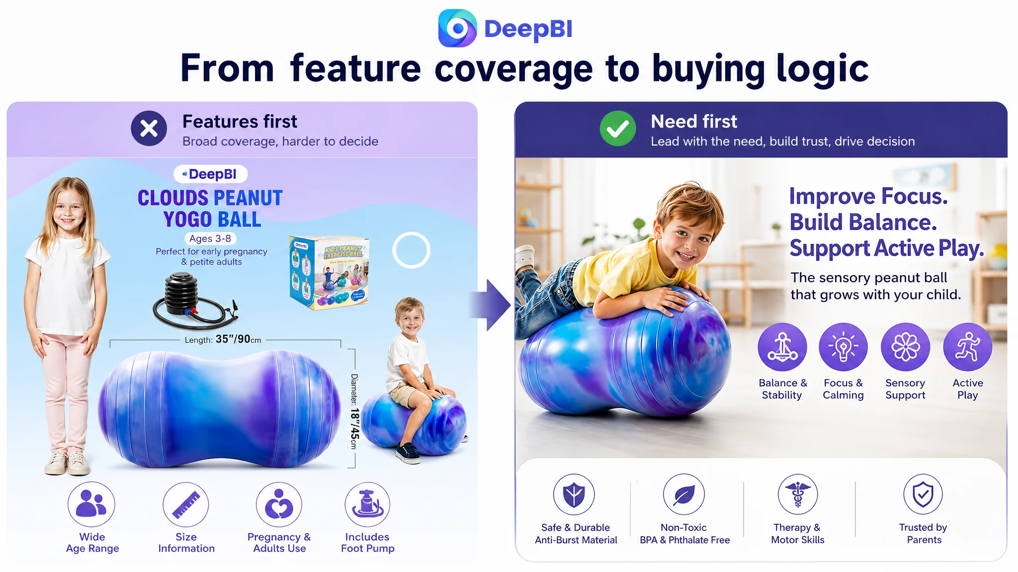
A General-Purpose Positioning Hid the Product’s Strongest Conversion Path
The strongest gap was not that the target Listing lacked features. It was that the features were not connected to the shopper’s underlying need.
The competitor’s content moved through a more persuasive progression:
1. Address the child’s need for focus or positive energy release.
2. Explain sensory and therapeutic support.
3. Establish material safety and durability.
4. Expand into seating, play, study, and exercise.
5. Reduce purchase risk with service reassurance.
The target Listing moved more often in the opposite direction:
1. Show appearance and surface features.
2. Explain safety and materials.
3. Introduce dimensions and usage scenarios.
4. Describe inflation and convenience.
5. Close with gift and family value.
That structure was not factually wrong. It was commercially weaker.
For a product involving children and special sensory needs, shoppers are likely to ask questions such as:
- Will this help my child stay engaged during an activity?
- Is the shape stable enough for everyday use?
- Is the material safe and odor-free?
- Can it serve more than one purpose?
- Does it look suitable for my child rather than clinical or intimidating?
- Will I understand how to use it when it arrives?
The page answered many of these questions, but not in a sequence that built confidence.
The title led with the brand instead of the search intent
The target title began with the brand name and then moved through a long list of product attributes.
The comparable title placed “Sensory Peanut Ball” near the front and connected the product to balance, motor skills, physical therapy, calming development, and flexible seating for autistic children.
The difference was not merely keyword placement. It was a difference in market framing.
The target title described what the product was made of and where it could be used. The competitor’s title more clearly described the result and the user need.
The recommended direction was to bring the core category terms forward, including:
- Sensory peanut ball
- Exercise ball
- Sensory wiggle seat
- Physical therapy
- Balance and motor skills
- Autism-related support
- Anti-burst
- Relevant size information
The goal was not to add every possible keyword. It was to create a title in which search relevance and customer relevance reinforced each other.
The bullet points listed benefits without forming a buying logic
The target bullet points had useful material, including the cloud pattern, non-slip surface, anti-burst construction, multiple use cases, inflation convenience, and gift value.
However, they were oriented toward broad product coverage.
The competitor’s bullets were more concentrated around specific customer problems:
- Focus and positive energy release
- Sensory support
- Balance and coordination
- Safety and durability
- Flexible seating and daily activity
- Physical activity and purchase reassurance
DeepBI’s recommendation was not to copy that wording. It was to rebuild the target Listing’s own content around a similar decision order while preserving its confirmed product attributes.
The proposed structure began with enhanced focus, using the cloud pattern and peanut shape as part of the product’s appeal. It then moved into burst-resistant and toxin-free safety, therapeutic sensory support, multi-use seating, physical fitness, and easy setup.
This created a more complete chain:
Customer concern → product mechanism → practical use → trust confirmation
That was more likely to help a shopper understand why the product should be chosen, rather than merely what it could do.
The Main Images Were Confirming the Product Too Early
The main-image set had useful information, but its order placed too much emphasis on confirmation before desire and trust had been established.
The early images focused on:
- Product and bundle confirmation
- Dimensions and demographics
- Tummy-time and comfort
- General quality icons
- Stability comparison with a round ball
The problem was not that these topics were irrelevant. The problem was their position in the sequence.
The customer was using valuable early image space to explain details such as petite adults, pregnancy, dimensions, and setup. A shopper who had not yet understood the product’s primary benefit had to process technical and demographic information before seeing a compelling reason to continue.
The recommended image logic was different.
First, make the product recognizable and appealing
The first image should retain the product and bundle confirmation, but make the cloud pattern and peanut shape more visually distinctive. The product needed to be immediately identifiable as a child-friendly sensory item, not just another exercise ball.
The non-slip surface, burst-resistant construction, and included pump could remain part of the overall value, but the first impression needed stronger visual clarity.
Then, show the core benefit
The next image should move directly into balance, focus, active play, and sensory movement.
Rather than leading with dimensions or pregnancy-related text, it should help the shopper understand how the product fits into schoolwork, playtime, seating, and movement. The shape’s stability advantage could be shown here as a practical benefit instead of a technical specification.
Establish safety as an early trust signal
Safety information was present in the target Listing, but too fragmented and visually weak. A small icon near the bottom of a later image could not carry the same trust value as a clearly designed safety image.
The revised sequence should consolidate relevant, confirmed claims such as:
- Burst-resistant material
- Odor-free materials
- Non-slip surface
- Applicable safety standards
- Stable use without sudden air loss
The point was not to add unsupported certifications. It was to make existing safety information easier to find and understand.
Follow with real utility
The image set should also demonstrate balance-building, light physical therapy, core activity, energy release, and active play.
The product’s use needed to feel concrete. Instead of repeating “exercise while entertainment,” the page should show how the ball fits into a child’s day.
End with multi-use confirmation
Only after the core need and trust concerns were addressed should the page expand into classroom seating, playrooms, home desks, pregnancy support, adult use, and family activity.
This order helped avoid a common Amazon Listing problem: using every available image to prove versatility before proving relevance.
The A+ Content Was Functional, but It Did Not Carry the Trust Burden
The target A+ content included product options, size information, material details, inflation instructions, and several usage scenarios.
The comparable listing used its A+ content more strategically. It built a story around:
- A clear brand and product promise
- Sensory, balance, and safety pillars
- Professional or therapeutic context
- Product comparison
- Unboxing and setup
- Multiple ages and use environments
The target page’s A+ content was therefore not empty. It was under-positioned.
The early modules spent too much space on details that were useful after interest had been established:
- Color and size selection
- Material close-ups
- Pump instructions
- General scenario images
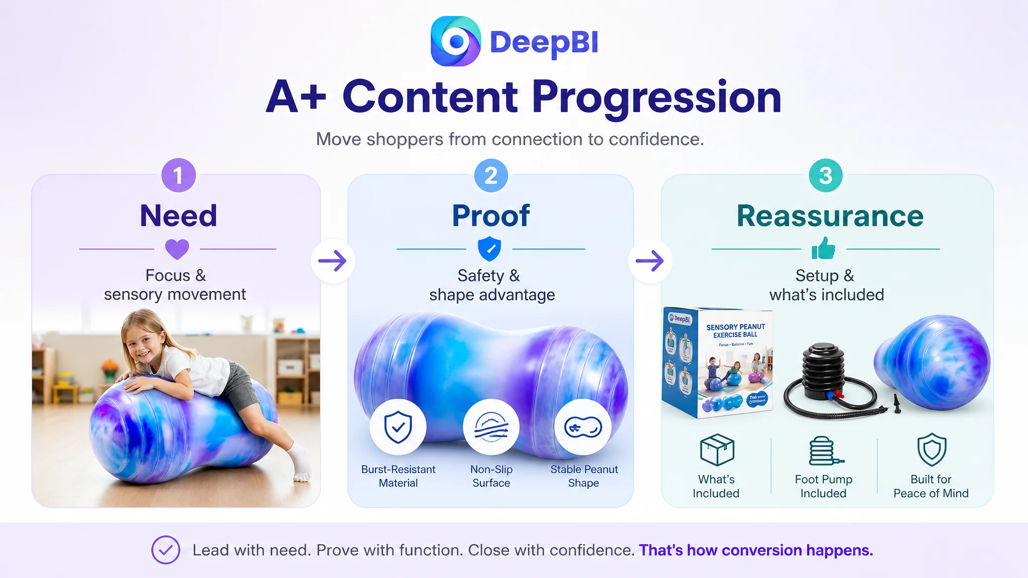
DeepBI’s recommendation was to reorganize the A+ page around the shopper’s confidence curve.
Start with the problem the product helps address
The first module should establish the product as an all-in-one sensory and developmental tool, while staying within the claims that the product and source material support.
The cloud pattern and peanut shape could make the product feel approachable. The stability and non-slip surface could explain the practical difference. The safety message should appear early rather than being left for a later technical section.
Make focus and sensory support visible
The second module should translate abstract ideas such as sensory support, focus, and positive movement into recognizable home and learning situations.
The objective was not to make a medical promise. It was to show how the product could function as a sensory seat, movement tool, or active-play aid in a child’s routine.
Add authority and professional context carefully
The product was positioned around physical therapy and sensory needs, yet the target A+ content did not create enough professional confidence.
A stronger module could present the product in a clearly labeled therapy or developmental context, using only substantiated claims and accurately represented use cases. The role of this module would be to make the page feel considered and trustworthy, not to imply unsupported medical endorsement.
Use comparison to answer “Why this shape?”
One of the most important missing elements was a direct explanation of why shoppers should choose a peanut ball rather than a generic round balance ball.
A comparison module could show the target product’s confirmed differences:
- Peanut shape
- Greater stability than a traditional round balance ball
- Non-slip surface
- Cloud pattern
- Burst-resistant construction
- Relevant size and use context
This was not about attacking unnamed competitors. It was about resolving the shopper’s central product-selection question.
Close logistical anxiety at the end
The pump and setup information belonged in a final “What’s Included” or “Easy Setup” module.
That information mattered, but it should support purchase completion rather than interrupt the main value story. Showing the pump, included components, and setup process near the end could reduce uncertainty without consuming the page’s strongest persuasion space.
A+ content should not merely explain the product. It should remove the reasons a qualified shopper might still hesitate.
Reviews Were the Largest Trust Gap, but They Were Not the Only Diagnosis
The review dimension showed the most severe numerical disadvantage:
- Target Listing: 3.7 stars from 13 reviews
- Comparable listing: 4.7 stars from 175 reviews
- Target Listing negative-review rate: 40%
- Comparable listing negative-review rate: 4%
The target Listing also had no meaningful review content visible on the first page, while the available reviews were described as largely invalid or lacking useful text. The result was a serious trust deficit for a product aimed at parents and children.
This gap could not be solved through title rewriting or image generation alone.
That distinction was important. A good diagnosis should not pretend that every weakness belongs to the same optimization layer.
The page could improve its communication of safety, stability, use cases, and setup. It could make the product’s value easier to understand. But Listing optimization could not manufacture a review history or replace authentic customer experience.
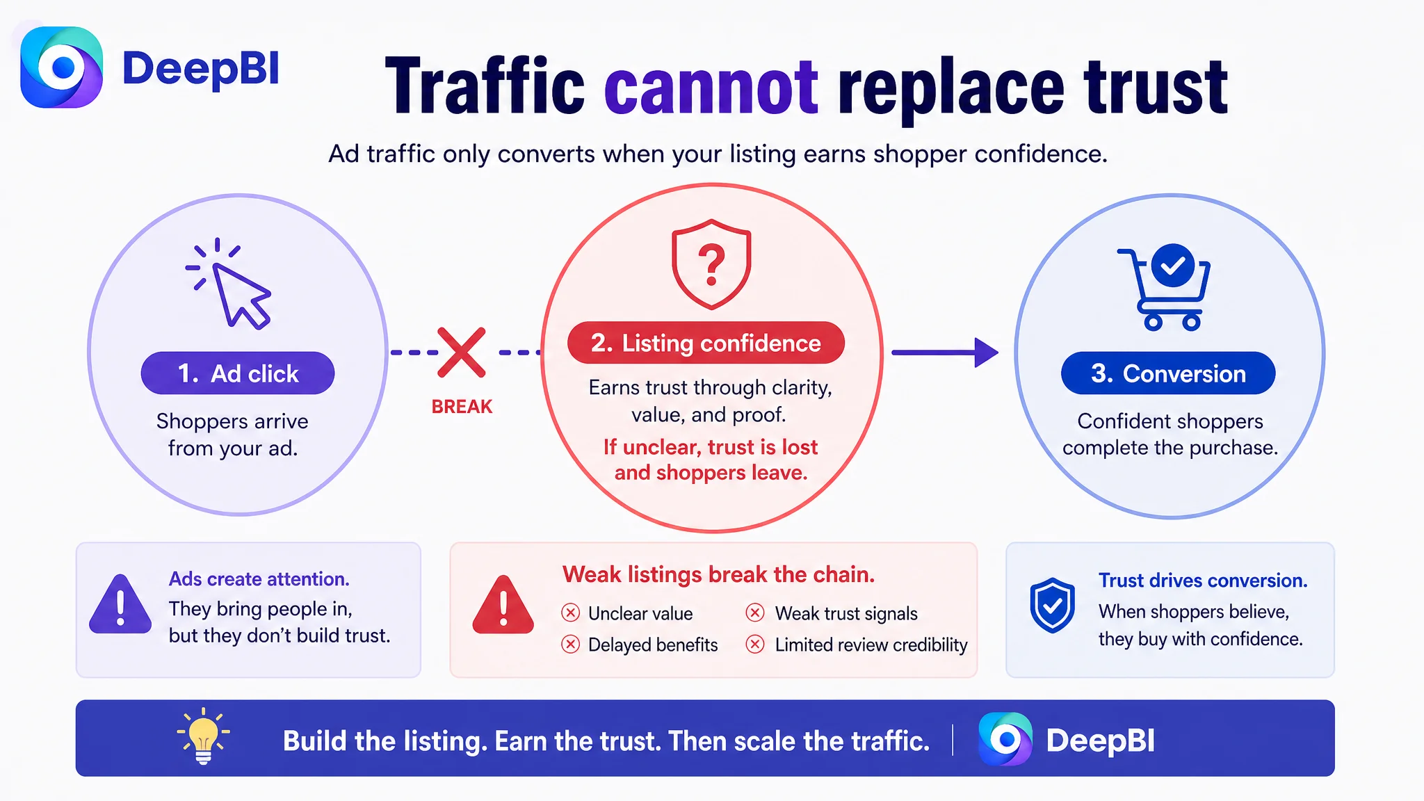
The review gap therefore reinforced the priority of fixing the product page’s conversion logic rather than aggressively scaling traffic into it. When social proof is weak, every other trust signal must be clear and credible. Sending more traffic to a page with unclear positioning and limited review evidence would increase exposure without necessarily increasing confidence.
Why DeepBI Did Not Recommend Tuning Ads First
The case material does not provide post-optimization advertising results, so it would be inaccurate to claim that ACOS declined, CVR recovered, or organic orders increased.
But the Listing evidence does support a clear operating decision: the product page needed to become more capable of converting traffic before traffic acquisition became the primary focus.
This is where the relationship between Amazon ads and Listing conversion becomes commercially important.
Ads can generate impressions and clicks. They can place a product in front of shoppers who may already have relevant intent. But ads cannot make a shopper trust a page that does not explain its value clearly.
If the Listing has:
- A title that emphasizes features without a strong outcome
- Main images that delay the most important benefit
- Bullet points aimed at everyone instead of the highest-value audience
- A+ content that explains logistics before building desire
- Weak comparison against generic alternatives
- Limited review credibility
then additional ad traffic may only expose those weaknesses more frequently.
Advertising does not only amplify a product’s strengths. It can also amplify the Listing’s existing conversion defects.
That did not mean advertising should be stopped permanently. It meant the sequence mattered.
First, repair the page’s ability to answer the shopper’s basic questions:
- What is this product primarily for?
- Who is it most relevant to?
- Why is the peanut shape useful?
- How does it support stability and movement?
- Is it safe and practical for regular use?
- What comes in the package?
- Why should this product be chosen over a generic ball?
Only then does paid traffic have a stronger chance of becoming productive traffic.
The Optimization Direction Was a Reordering of Commercial Priorities
The recommended changes were not a collection of isolated copy edits or visual redesigns.
They followed a deliberate order:
1. Clarify the core audience and need
The Listing needed to speak more directly to parents seeking sensory support, focus, balance, coordination, or structured movement for children, while retaining broader use cases as secondary validation.
2. Lead with outcomes before specifications
Focus, balance, positive energy release, sensory support, and stability should appear before size charts, inflation instructions, and detailed demographic notes.
3. Turn physical features into reasons to believe
The cloud pattern was not just decoration. It could make the product more appealing to children.
The peanut shape was not just a form factor. It could support a more stable seating and movement experience than a traditional round ball.
The non-slip and burst-resistant properties were not just specifications. They were part of the parent’s safety decision.
4. Build a trust sequence across the page
Safety information, material claims, professional context, comparison, usage scenarios, and package contents needed to work together rather than appear as disconnected modules.
5. Keep the product truthful
The optimization could improve composition, ordering, language, and visual explanation. It could not invent certifications, clinical endorsements, performance measurements, or product structures that were not supported by the source material.
This boundary was commercially important. A visually stronger Amazon Listing is only useful if it remains accurate to the product customers receive.
What Changed in the Business Understanding
There are no confirmed post-optimization performance figures in the case material. The responsible conclusion is therefore not that the Listing achieved a specific ACOS or CVR result.
The more important change was in the team’s operating judgment.
The product was no longer viewed as a page that needed more scattered information. It was understood as a Listing with a constrained conversion capacity:
- The title needed stronger search-intent alignment.
- The first images needed to establish desire and trust earlier.
- The bullet points needed to prioritize a deeper customer problem.
- The A+ page needed to carry the emotional, functional, and trust narrative.
- The review weakness needed to be recognized as a separate risk rather than hidden inside a general content score.
- Advertising needed to be evaluated in the context of page readiness.
That reframing made future decisions more controllable.
Instead of asking, “What else can we add to the Listing?” the team could ask:
Which unanswered customer question is currently blocking conversion?
For this Amazon sensory peanut ball Listing, the answer was not simply “more traffic” or “more features.” The page needed to explain its value with greater precision and build trust in the order shoppers actually make decisions.
The Broader Lesson for Amazon Sellers
A Listing can be technically complete and still commercially weak.
It can contain:
- A full title
- Multiple images
- Five bullet points
- Size information
- Material details
- Several use cases
- A+ modules
- A pump and setup explanation
Yet conversion may remain constrained if those elements do not work as one sales argument.
This case shows why Amazon sellers should distinguish between content presence and conversion function.
A title can contain keywords without creating relevance.
A main image can show the product without creating a reason to click.
A bullet point can state a feature without connecting it to a customer concern.
A+ content can provide details without reducing trust.
And advertising can bring traffic without fixing any of those problems.
DeepBI’s value in this case was not a list of edits. It was the ability to compare the Listing against a relevant category benchmark, identify where the score gap concentrated, and translate those gaps into a more disciplined decision sequence.
The final judgment was straightforward:
Before scaling Amazon ads, make sure the Amazon product page deserves the traffic.