

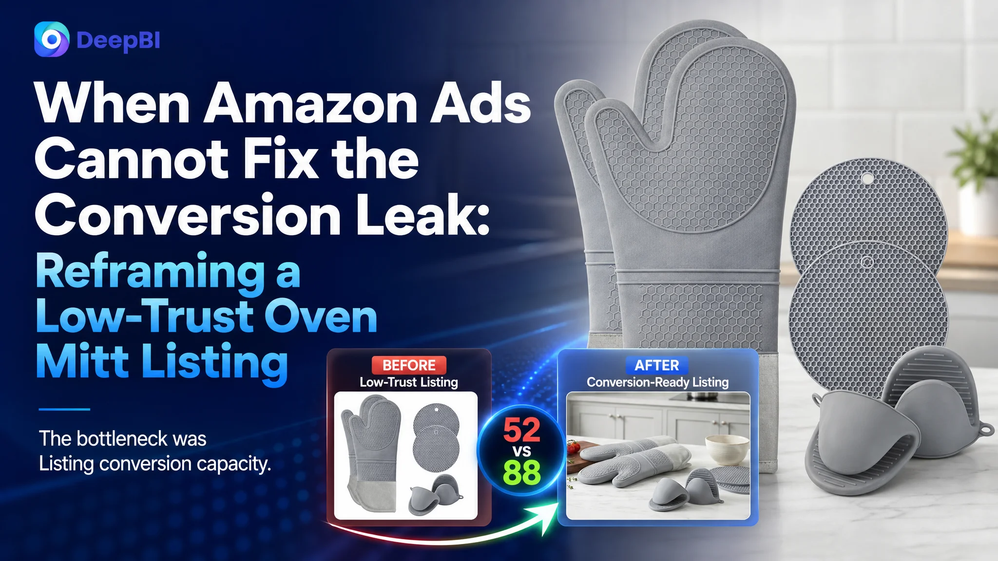
The customer was an Amazon seller in the US kitchen accessories category. Its six-piece silicone oven mitt and pot holder Listing had a clear product proposition, but the product page was not giving shoppers enough evidence to move from interest to purchase. The initial instinct was to improve the title, images, and feature wording one element at a time.
A deeper comparison showed that the main issue was not a single weak keyword or an unattractive image. The customer’s Amazon product page was missing much of the decision-making structure that helped comparable listings convert: visual proof, quantified benefits, clear product-set communication, and social proof. Its overall Listing score was 52/100, compared with 88/100 for a closely matched high-performing listing.
DeepBI therefore reframed the problem around Amazon Listing conversion capacity. Instead of treating the page as a collection of isolated assets, the later optimization focused on rebuilding the complete buying logic: make the six-piece set immediately understandable, communicate measurable protection, explain why silicone matters, show how each piece is used, and replace repeated text with a structured A+ story.
For other Amazon sellers, the lesson is practical: when advertising traffic does not translate into orders, the first question should not always be which bid or keyword to change. It should be whether the product page has earned the right to receive more traffic.
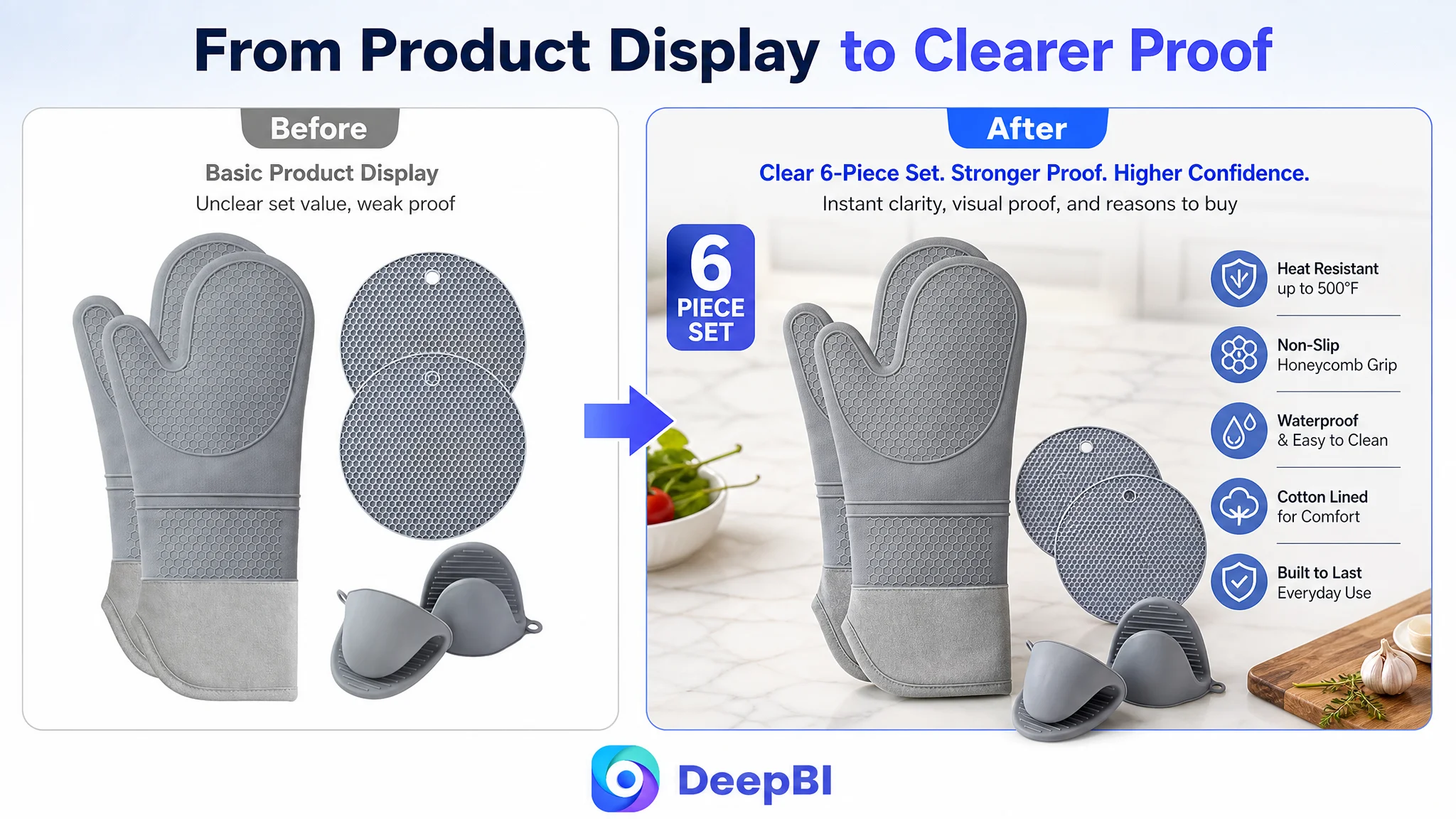
The Listing looked functional. The comparison showed a much larger problem.
At first glance, the customer’s Listing was not empty.
The title mentioned silicone oven mitts, pot holders, heat resistance, and a six-piece package. The main images showed the product and included measurement information. The bullet points covered the material, use cases, cleaning, and durability.
But Amazon shoppers do not evaluate these elements independently. They form a judgment quickly:
- What exactly is included?
- How much protection does it provide?
- Is the material safe and practical?
- Why is it better than a traditional cloth mitt?
- Can I trust the quality?
- Has anyone used it successfully?
The page answered some of these questions, but not in a sequence that built confidence.
DeepBI’s comparison produced a 52/100 score for the customer’s Listing and 88/100 for the comparable benchmark Listing. The most important finding was not the 36-point total gap itself. It was where the gap was concentrated.
- Title: Customer Listing: 16/20, Benchmark Listing: 17/20, Gap: -1
- Main image: Customer Listing: 25/30, Benchmark Listing: 26/30, Gap: -1
- Bullet points: Customer Listing: 6/10, Benchmark Listing: 8/10, Gap: -2
- Detail page: Customer Listing: 3/25, Benchmark Listing: 23/25, Gap: -20
- Reviews: Customer Listing: 2/15, Benchmark Listing: 14/15, Gap: -12
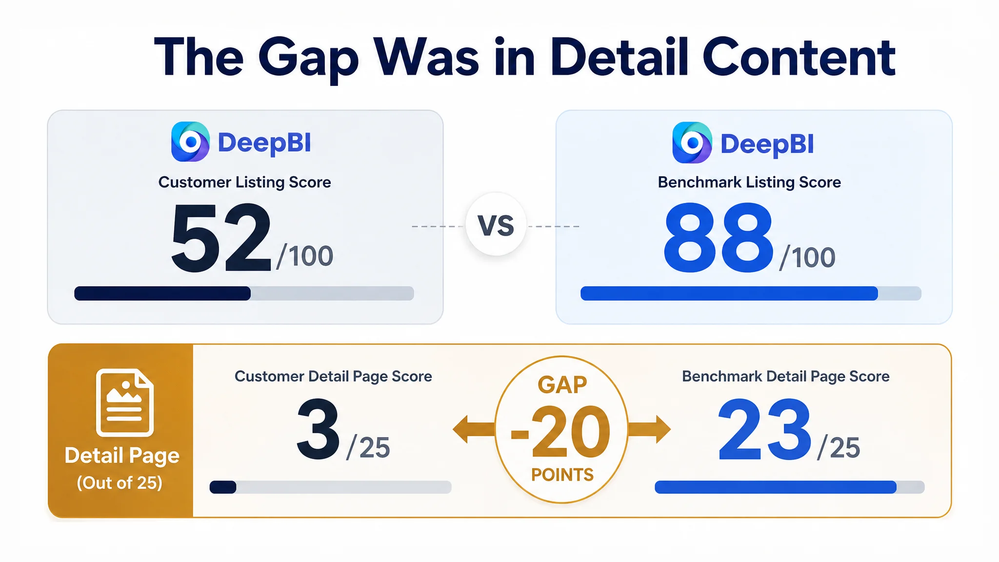
The title, main image, and bullet points were behind, but only moderately. The severe weakness was in the detail page, followed by the complete absence of reviews.
The Listing did not have one dramatic creative failure. It had a missing conversion system.
The original diagnosis focused on visible assets
The customer’s first optimization direction was understandable.
The title could be more concise. The main images could communicate the set more clearly. The bullet points could use stronger wording. These were visible differences, and they were relatively easy to identify.
The customer also had reasons to believe that stronger Amazon SEO and better product presentation could solve the problem. The benchmark title placed the core phrase “6pcs Oven Mitts and Pot Holders Sets” near the beginning. It also highlighted “Extra Long” and “500 Degrees,” while the customer’s title opened with “Silicone” and used broader phrases such as “Heat Resistant.”
That meant the customer’s Listing had a real title problem—but not the largest one.
The same was true of the main image. The product set was present, but the image did not make the six-piece completeness immediately obvious. Its measurement presentation did not connect clearly to the protection benefit. The visual treatment also did less to communicate material quality, grip, and real kitchen use.
These issues could easily lead a team to keep refining the first image, adding keywords, and rewriting individual bullets.
But even a stronger title would still send shoppers to a page with almost no supporting visual story.
The real constraint was Listing conversion capacity
The key judgment came from the distribution of the score gap.
The customer’s detail-page score was only 3/25, compared with 23/25 for the benchmark. This was not a minor design preference. It represented a fundamental difference in how the two pages helped shoppers make a decision.
The customer’s A+ area relied almost entirely on repeated text and did not provide meaningful image modules. The benchmark Listing used:
- A complete product-set introduction
- Kitchen use scenarios
- Material and construction close-ups
- Comparison modules
- Multi-scene application images
- Color-choice presentation
- Gift-oriented content
- Clear visual explanations of heat protection, grip, and cleaning
This created a complete visual path from product recognition to purchase confidence.
The customer’s page, by contrast, asked shoppers to process most of the information through text. Important claims such as heat resistance, material advantages, and product-piece differentiation were not given enough visual support.
That distinction matters on Amazon. A shopper may understand that a product is made of silicone, but still not understand:
- How the long mitts protect the forearm
- Why the mini mitts are useful
- What the pot holders are for
- Whether the material handles steam and hot liquids
- How the inner lining affects comfort
- Whether the set is more practical than cloth alternatives
The page contained product information. It did not yet turn that information into a persuasive decision path.
The title was accurate, but not strategically organized
The customer’s title included useful information, including the six-piece quantity and the different components. However, the detailed parenthetical breakdown increased reading friction.
The benchmark title was more compact. It put the core category phrase first, then added concrete differentiators such as extra length and a 500-degree heat-resistance claim.
The recommended direction was not to add more words indiscriminately. It was to improve the order and density of the existing information:
- Lead with the core oven mitt and pot holder category
- State the six-piece format early
- Use the confirmed 500°F specification
- Highlight extra-long protection
- Include relevant terms such as potholders and hot pads
- Retain the use cases for cooking, baking, and grilling
This is a small but important distinction. Amazon title optimization is not just about keyword inclusion. It is about ensuring that search relevance and shopper understanding reinforce each other.
The main image needed to show the reason to click
The main-image gap was smaller in the score, but its role remained important.
The customer’s visual assets showed the product. They did not always make the product’s value immediately legible.
The revised visual logic focused on five questions:
1. Is the complete six-piece set obvious at a glance?
2. Can shoppers understand the difference between the full mitts, mini mitts, and pot holders?
3. Does the 15-inch length connect to forearm protection?
4. Are heat handling and grip supported by visible evidence?
5. Do the material and construction details look credible?
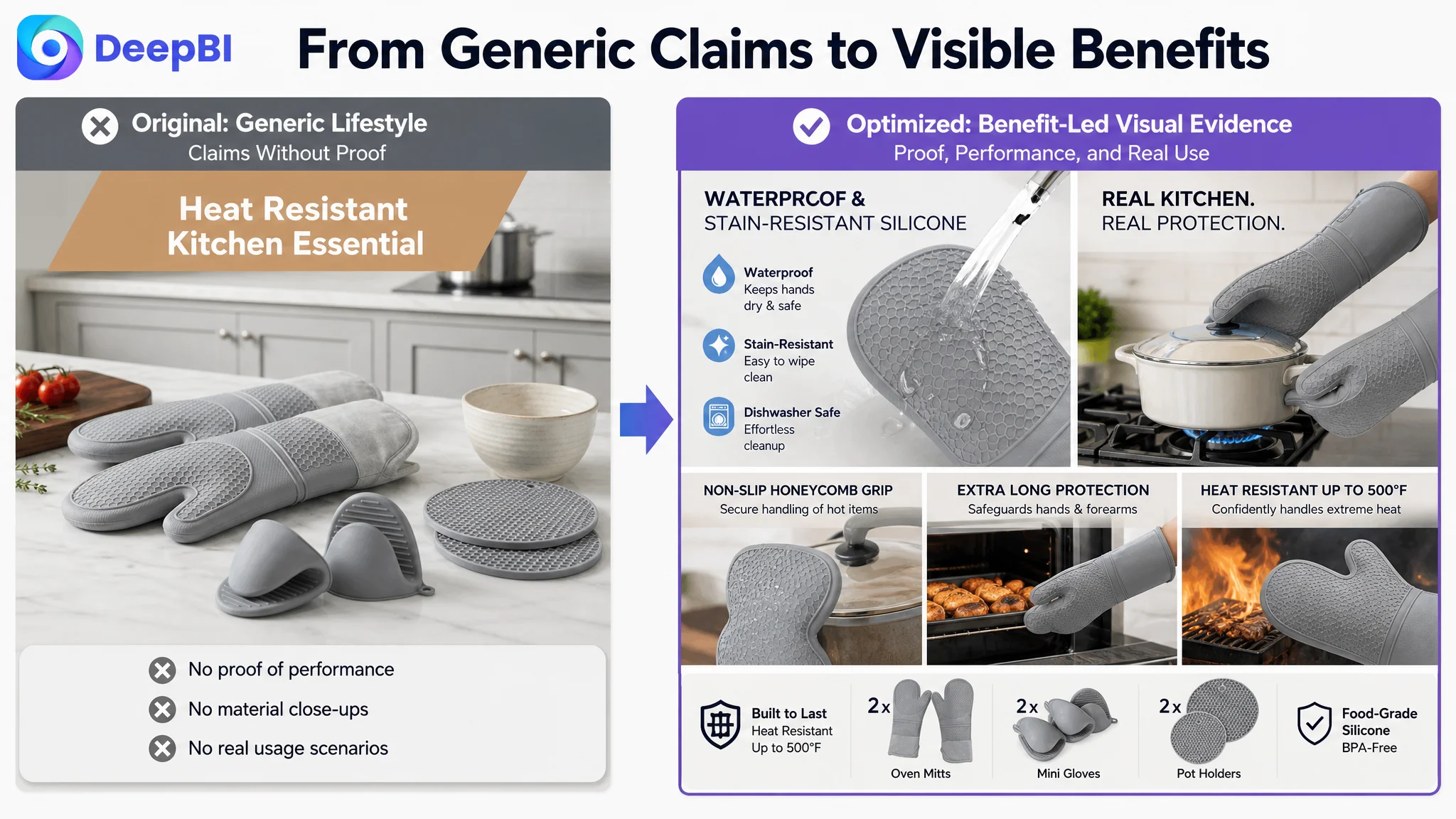
The proposed image direction therefore moved away from generic labels such as “Heat Resistant Kitchen Essential.” It favored clearer communication around:
- A complete six-piece protection set
- Extra-long coverage
- Non-slip textured silicone
- Cooking situations involving hot cookware
- Waterproof and stain-resistant material
- Cotton lining and construction details
The point was not to make the product look more dramatic than it was. It was to make the actual product benefits easier to verify.
The bullet points had information, but not enough buying logic
The customer’s bullets described the product, but they were less specific and less comparative than the benchmark Listing.
The stronger structure followed a simple progression:
Protection should begin with measurable evidence
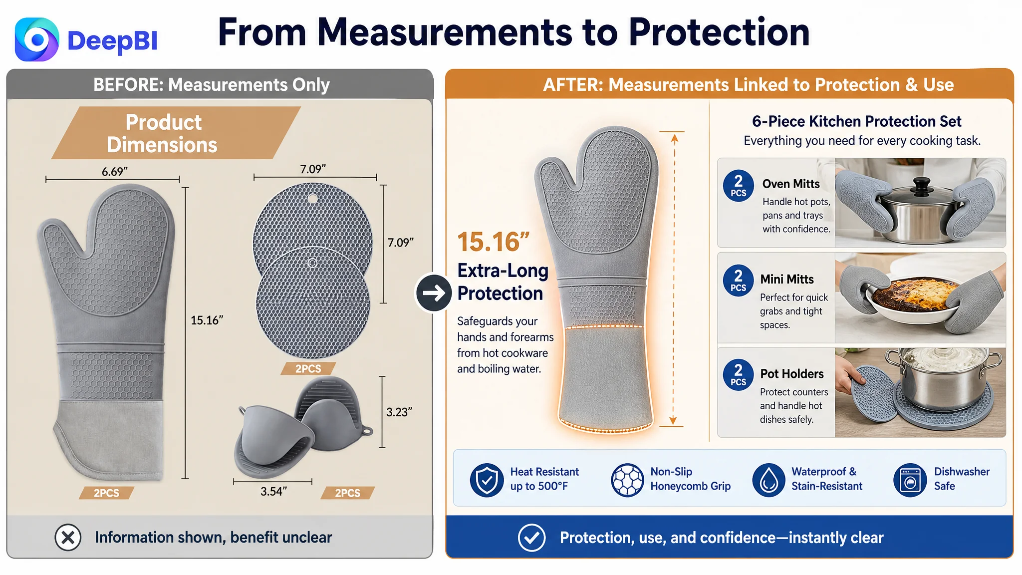
Rather than leading with a broad claim such as “complete protection,” the first bullet could connect the six-piece set, 15-inch length, honeycomb texture, and different item types to specific kitchen tasks.
This helps shoppers understand both the physical product and the reason each component exists.
Material claims should answer practical concerns
“Silicone” alone is not a complete value proposition.
The bullet strategy connected the confirmed product attributes—food-grade silicone, BPA-free material, waterproofing, and heat resistance up to 500°F—to concerns about steam, hot liquids, stains, and kitchen hygiene.
The most important improvement was the relationship between claim and concern:
- Waterproof material addresses steam and hot liquids
- Stain resistance addresses grease and cleanup
- A non-slip surface addresses handling confidence
- The heat rating provides a concrete reference point
Comfort should not be left out of a protection product
Silicone oven mitts can raise an obvious concern: will they feel rigid, uncomfortable, or difficult to control?
The proposed wording brought the quilted cotton lining, comfort, breathability, and dexterity into the discussion. This gave the page a way to address the tradeoff between protection and usability.
Cleaning and storage are conversion details
The customer’s Listing mentioned cleaning, but the information could be organized around the shopper’s routine:
- Rinse or wipe the silicone surface
- Use dishwasher or washing-machine compatibility where accurate
- Hang the pieces using the loops
- Keep the set accessible and quick to dry
These details may not create the first click, but they can reduce hesitation before purchase.
The package should be counted, not merely described
A six-piece set has value only when shoppers can visualize what they receive.
The final bullet direction made the components and sizes explicit:
- Two extra-long mitts
- Two silicone trivets or pot holders
- Two mini pinch mitts
It also positioned the set as a practical gift for people who bake, cook, or host outdoor meals—without relying on gift messaging as the primary sales argument.
Missing A+ content removed the final layer of persuasion
The most consequential issue was the absence of a true A+ content story.
A repeated text block cannot perform the same job as a structured visual sequence. It forces shoppers to imagine the product’s use, construction, and advantages on their own.
DeepBI’s diagnosis prioritized the missing modules rather than recommending random image additions.
First, confirm what the customer receives
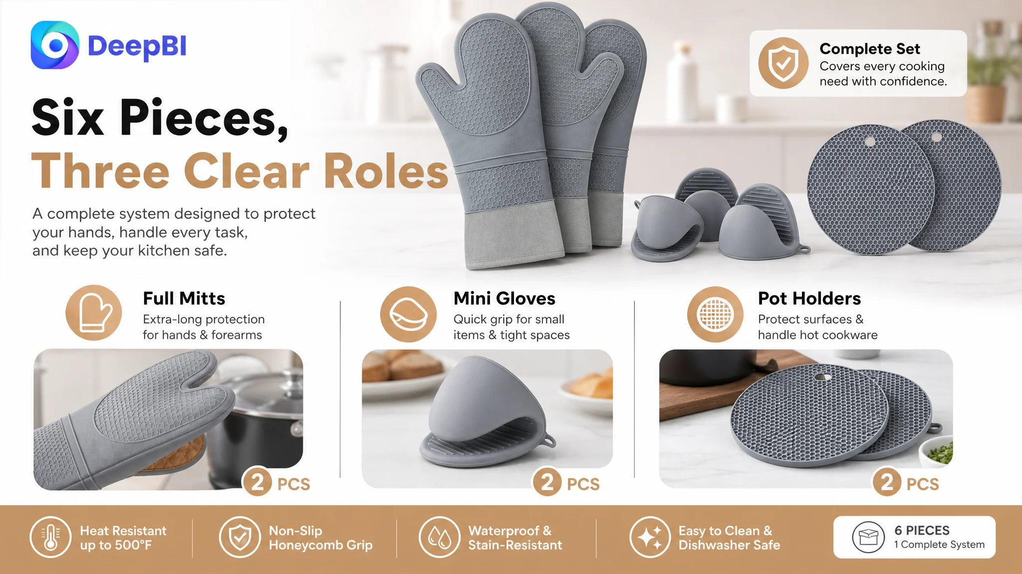
The opening A+ module needed to resolve package uncertainty immediately:
Six pieces. Multiple forms of protection. One coordinated kitchen set.
The two full-size mitts, two mini mitts, and two pot holders should be shown together so the shopper can understand the bundle before reading deeper.
Next, explain why silicone is relevant
The page needed a rational comparison with traditional cloth mitts.
The comparison should focus on confirmed differences such as:
- Waterproofing
- Stain resistance
- Ease of cleaning
- Grip texture
- Resistance to steam and hot liquids
The goal was not to make an exaggerated claim that silicone is better in every situation. It was to explain why this material addresses specific kitchen problems.
Then, prove construction quality
The customer’s original content did not provide enough visual transparency around the silicone surface, non-slip texture, and quilted lining.
Close-up and material-detail imagery could make these elements easier to trust. This was especially important because a shopper cannot physically test grip, thickness, or lining comfort through an Amazon product page.
Finally, show why each piece exists
Without use-case imagery, shoppers may question whether the mini mitts and pot holders are redundant.
A stronger A+ sequence could show:
- Full mitts reaching into deep ovens
- Mini mitts handling quick grabs or tighter spaces
- Pot holders supporting baking trays, cast-iron cookware, or hot surfaces
- The set being cleaned and stored after use
This turns “six pieces” from a quantity claim into a practical system.
A+ content was not an optional decoration in this case. It was the missing explanation for why the set deserved consideration.
Reviews were a separate trust barrier
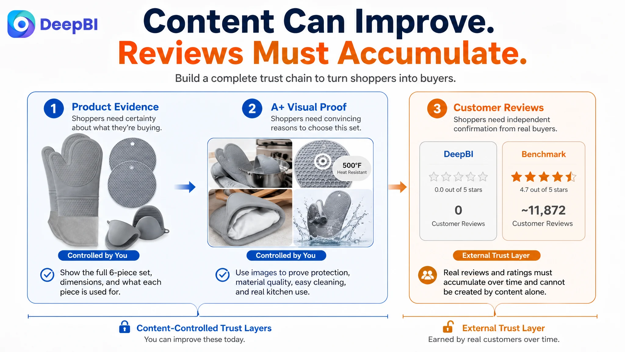
The customer Listing had no reviews and no rating data on the first page. The benchmark had approximately 11,872 reviews and a 4.7-star rating, including detailed image and video feedback.
This difference could not be solved through title rewriting or image production alone.
Reviews function as independent reassurance. They help shoppers judge whether the product performs in real kitchens, whether the sizing is accurate, whether the material feels comfortable, and whether the pieces are useful in practice.
The appropriate business judgment was therefore to separate what could be repaired immediately from what could only improve through actual customer experience over time.
The page could strengthen its own evidence through:
- Clearer product specifications
- More credible visual demonstrations
- Better explanation of material and use cases
- Stronger A+ structure
But it could not manufacture the social proof that the benchmark had accumulated.
That distinction prevented the team from treating every score gap as a creative problem.
Why DeepBI did not recommend tuning everything at once
When several Listing dimensions are below a competitor, the natural response is to optimize all of them simultaneously.
That approach creates two risks.
First, the team may spend time polishing relatively small gaps while leaving the dominant constraint untouched. In this case, the title gap was one point, the main-image gap was one point, and the bullet-point gap was two points. The detail-page gap was twenty points.
Second, sending more Amazon ad traffic to an underdeveloped page can amplify the page’s weaknesses. More impressions and clicks do not automatically create more orders. If shoppers arrive and still cannot verify the product’s quality or relevance, ad spend may increase without solving the conversion problem.
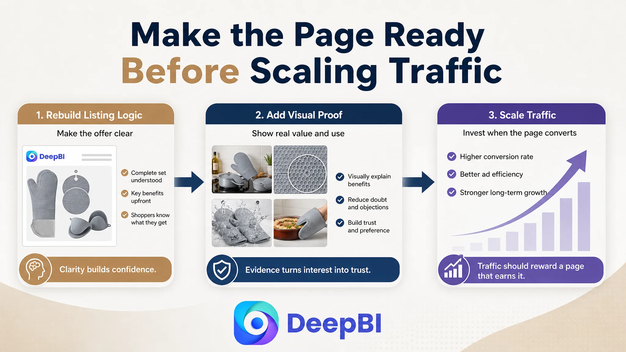
The decision order was therefore clear:
1. Rebuild the page’s conversion logic.
2. Make the product set and core benefits immediately understandable.
3. Add visual evidence for protection, material, construction, and use.
4. Improve the title and bullets so they reinforce the same message.
5. Treat review acquisition as a separate trust-building process.
6. Only then judge whether additional Amazon ad optimization is likely to be productive.
This was not a rejection of advertising. It was a decision about readiness.
The page needed to earn more traffic before traffic could become more useful
The customer’s Listing did not require a completely different product story. It required a more complete expression of the story already supported by the product.
The six-piece configuration was real. The 15-inch extra-long mitts were real. The 500°F heat-resistance claim, food-grade silicone, waterproof surface, textured grip, cotton lining, and cleaning benefits were all available as decision drivers in the source material.
The issue was that these points were not coordinated across the Amazon title, images, bullets, and A+ content.
A stronger page would allow each element to perform a distinct role:
- Title: capture category relevance and concrete product differentiators
- Main image: clarify the set and create a reason to click
- Bullet points: connect specifications to kitchen concerns
- A+ content: provide visual proof and a complete usage narrative
- Reviews: add independent confirmation as customer feedback accumulates
When these layers support one another, paid traffic has a better chance of becoming useful traffic rather than simply more traffic.
The business understanding changed
The most important change in this case was not a reported ACOS decline or CVR increase; the source material does not provide post-optimization performance data. The meaningful change was in how the Listing was evaluated and how the optimization sequence was chosen.
The customer’s problem was no longer framed as:
- “The title needs more keywords.”
- “The images need to look better.”
- “The bullets need stronger wording.”
- “The ads need more adjustment.”
It was reframed as:
The Amazon product page does not yet provide enough evidence for shoppers to trust, understand, and choose the six-piece set.
That judgment creates a more controllable operating path. It reduces the risk of letting advertising amplify a low-conversion page, clarifies which content gaps matter most, and gives each future asset a defined role in the buying journey.
For Amazon sellers, this case offers a durable operating principle:
Before scaling Amazon ads, determine whether the Listing can convert the traffic it is about to receive.
In this case, the largest opportunity was not another isolated keyword adjustment. It was rebuilding the page so that product completeness, measurable protection, material quality, practical use, and trust could be understood in one connected story.