

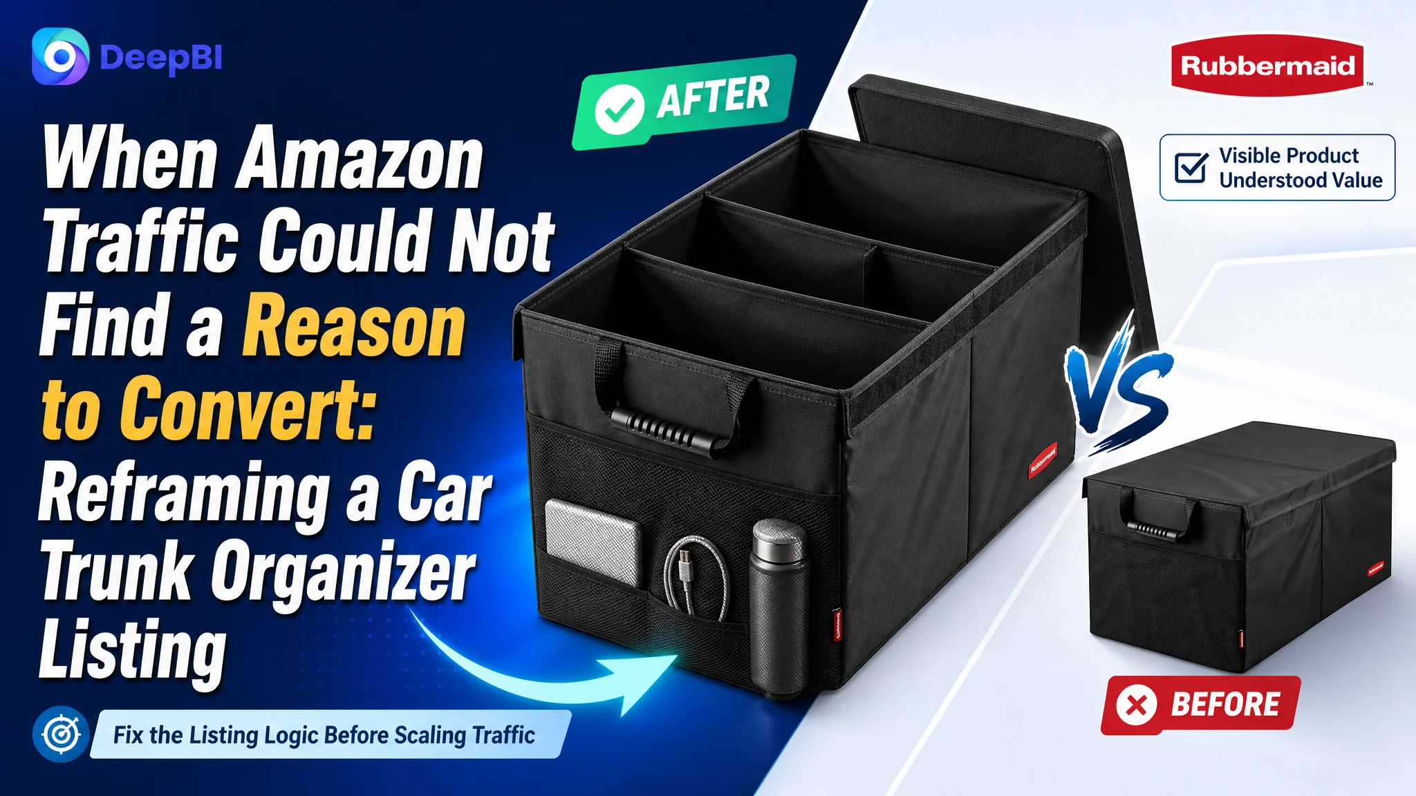
The customer was an Amazon seller in the automotive accessories category, managing a car trunk organizer Listing on the US marketplace. The product page had a familiar problem: the product was visible, but its value was not being understood quickly enough. As paid traffic became harder to justify, the natural temptation was to look first at advertising settings, keywords, or bids.
The deeper issue was on the Amazon product page. The customer initially treated the Listing as a basic storage product and emphasized brand history, general durability, and broad usage scenarios. DeepBI’s comparison showed that the more urgent gap was not a lack of information. It was a lack of persuasive logic: the page did not clearly show what the organizer could hold, how its compartments worked, how it fit different vehicles, or why shoppers should trust it.
The later optimization therefore focused on Listing conversion capacity before further traffic expansion. The title, main image, bullet points, and A+ content were reorganized around visible proof, functional clarity, and real usage scenarios. For other Amazon sellers, the case offers a practical reminder: before asking Amazon ads to generate more traffic, first determine whether the product page gives that traffic a convincing reason to buy.
The Listing Had Traffic Potential, but Its Sales Logic Was Weak
At first glance, the page did not appear to be missing every basic element. It had a recognizable brand position, a collapsible storage design, multiple compartments, vehicle-use scenarios, and supporting A+ content.
But the Listing’s overall score was 68 out of 100, compared with 88 out of 100 for a closely comparable high-performing listing.
That 20-point gap was not distributed evenly:
- Title: Target Listing: 14/20, Comparable high-performing Listing: 17/20, Gap: -3
- Main image: Target Listing: 21/30, Comparable high-performing Listing: 26/30, Gap: -5
- Bullet points: Target Listing: 7/10, Comparable high-performing Listing: 8/10, Gap: -1
- A+ content: Target Listing: 21/25, Comparable high-performing Listing: 23/25, Gap: -2
- Reviews: Target Listing: 5/15, Comparable high-performing Listing: 14/15, Gap: -9
- Total: Target Listing: 68/100, Comparable high-performing Listing: 88/100, Gap: -20
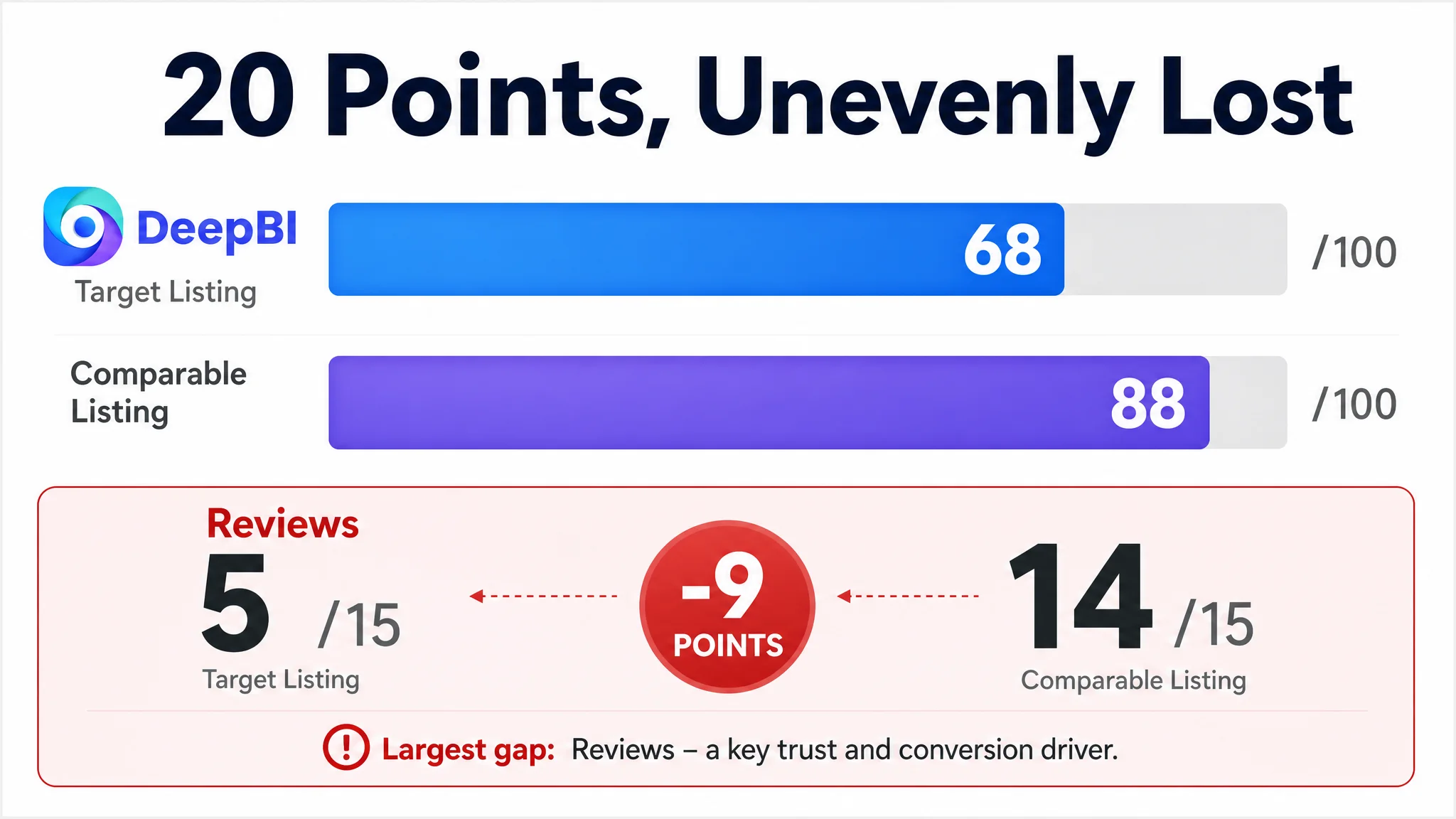
The largest numerical gap was in reviews. The Listing had a 3.9-star rating and 20 total reviews, while the comparable listing had 4.7 stars and 2,149 reviews.
That difference mattered. However, it was not the only issue DeepBI identified, and it was not the part the customer could immediately fix through page editing.
The more actionable problem was that the page underperformed in the areas that shape shopper understanding before a review gap can be overcome.
The Listing did not merely need more traffic. It needed to make its value legible before the shopper reached the decision point.
The Original Diagnosis Focused on Trust, but Not Enough on Proof
The customer’s initial page direction leaned heavily on brand credibility and general product attributes.
The title began with brand and category wording rather than a strong functional hook. The bullet points opened with brand history and broad quality claims. The A+ content used brand-led visual modules and general lifestyle scenes. Several images showed the organizer’s structure, but often without the items it was meant to organize.
This approach was understandable. The product came from an established brand with more than 90 years of history, so using that heritage as a trust signal was commercially reasonable.
The problem was sequencing.
A shopper searching Amazon for a car trunk organizer is usually trying to answer concrete questions quickly:
- What can this hold?
- How many compartments are included?
- Can the size adapt to my vehicle?
- Will it fold away when I do not need it?
- Will it slide or collapse while driving?
- Is the material durable enough for groceries, tools, or emergency supplies?
- Does the product offer anything beyond a basic storage box?
The page often answered these questions indirectly. It described features, but did not consistently convert those features into visible proof.
A logo image could reinforce recognition, but it could not demonstrate capacity. A close-up of a mesh pocket could show construction, but not explain why that pocket mattered in daily use. A general statement about premium materials could sound positive, but it was weaker than a specific visual or measurable demonstration.
The customer was not necessarily optimizing the wrong elements. The issue was that the elements were being asked to perform the wrong job.
The Main Image Was Showing the Product, Not the Outcome
The main image was one of the clearest gaps.
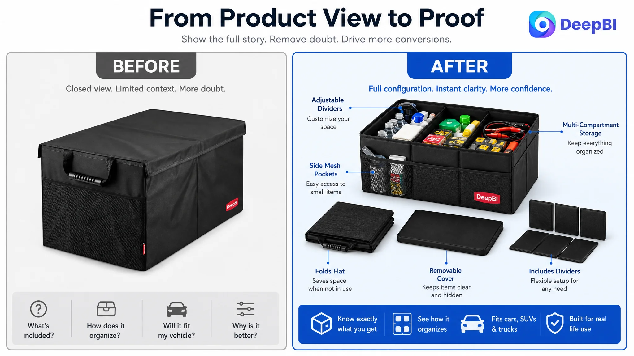
The existing visual direction presented a relatively closed product with a cover and mesh pocket. It established what the organizer looked like, but left important questions unanswered:
- What components are included?
- How is the interior divided?
- What does the product look like when fully opened?
- How much can it hold?
- Why is it more useful than an ordinary storage bin?
The comparable listing used a more immediate visual language. Its main image showed chilled drinks, tools, and visible internal separation. Without requiring the shopper to read a long description, the image communicated multi-functionality and immediate usefulness.
The difference was not simply that one image was more attractive.
It was that the two images played different commercial roles.
The existing image served as a product introduction. The stronger image served as an answer to the shopper’s first practical question: “What problem will this solve for me?”
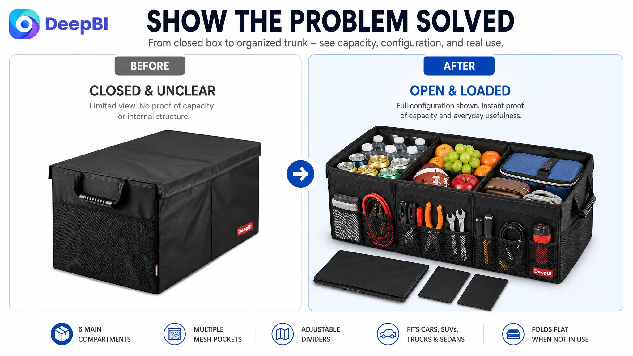
The main-image direction needed to change
DeepBI’s diagnosis pointed toward a full-configuration and usage-oriented presentation:
- Show the main organizer, cover, and adjustable dividers clearly.
- Make the internal structure visible rather than hiding it behind a closed exterior.
- Use a trunk, back-seat, or travel context where appropriate.
- Show realistic contents such as groceries, emergency kits, sports gear, or daily essentials.
- Pair dimensions with the spatial-suitability story instead of placing them only at the end.
- Remove redundant brand-only imagery that adds no new decision information.
The goal was not to add visual decoration. It was to turn the image into evidence.
A main image should not only confirm what the product is. It should help the shopper recognize why the product belongs in the cart.
The Title Was Losing Click Value Through Structure
The title score was 14 out of 20, three points below the comparable listing.
The target title used brand and category wording at the beginning, followed by a long phrase describing multi-compartment car storage organization. That structure created several problems:
- The opening lacked a strong functional hook.
- “Car Organizer” and “Car Storage Organization” created unnecessary repetition.
- The core differentiator was not placed early enough.
- Vehicle and use-context terms were limited.
- The sentence was less compact and less scannable than the competing title.
The comparable listing began with “4 in 1” and quickly introduced a leakproof cooler bag, using a concrete feature combination to create a reason to stop scrolling.
The target product did not necessarily have the same cooler-bag function, so the correct response was not to imitate that claim. The useful lesson was structural: lead with the strongest verified value, then state the product form, compatibility, and supporting detail.
The proposed direction therefore emphasized terms such as:
- Collapsible trunk organizer
- Multi-compartment car storage bin
- Foldable cargo storage
- Car, SUV, truck, and sedan compatibility
- Cover and dimensions
This was not keyword accumulation for its own sake. It was an attempt to make the title perform two jobs at once:
1. Help Amazon understand the product’s search relevance.
2. Help shoppers understand the product’s practical value.
The Bullet Points Had Information, but Not a Buying Sequence
The bullet-point gap was smaller numerically—7 out of 10 versus 8 out of 10—but the structural difference was important.
The target Listing’s bullet points broadly followed this sequence:
- Brand credibility and core value
- Folding and space-saving design
- Multi-compartment organization
- Durability and load-bearing ability
- Broad vehicle and lifestyle compatibility
The comparable listing led with material and waterproofing, then moved through functional configuration, folding behavior, stability, and portability.
That sequence was more closely aligned with the shopper’s decision path.
A stronger bullet-point structure for this product would move from immediate product confidence to practical use:
Durability should be concrete
The product could retain the brand’s heritage, but the claim needed support from visible construction details such as reinforced fabric, reinforced base plates, and stitching.
“Trusted quality” is a useful starting point. “Water-resistant fabric with reinforced base plates that helps the organizer maintain its shape under heavier loads” is more persuasive because it connects the claim to a physical reason.
Folding should be connected to ownership
“Collapsible” is not only a design attribute. It answers what happens when the organizer is not needed.
The shopper needs to picture it folding flat, being stored under a seat or in a side panel, and expanding again when groceries, travel items, or emergency supplies need to be separated.
Compartments should solve a sorting problem
The page described compartments, but a stronger expression would connect adjustable dividers and mesh pockets to different item sizes:
- Small electronics and snacks
- Tools and emergency supplies
- Groceries and travel essentials
- Sports equipment and daily-use items
The point is not to list every possible object. It is to show that the storage system adapts to the contents.
Stability should reduce regret risk
For a product used in a moving vehicle, shoppers may worry about sliding, tipping, or spilling.
Claims about fixing belts, non-slip structure, reinforced stitching, or staying secure during turns should appear as part of the core value proposition—not as an afterthought.
Portability should extend beyond the trunk
Comfortable reinforced handles can show that the product moves from the vehicle to the home, campsite, picnic area, or shopping trip. This helps the organizer feel like a useful carrying system rather than a stationary box.
The A+ Content Was Full, but the Persuasion Sequence Was Incomplete
The A+ content score was 21 out of 25, only two points behind the comparable listing. That relatively strong score could have made the problem easy to overlook.
The issue was not a total lack of content. It was the order and role of the modules.
The target page used:
- Brand visual positioning
- Lifestyle and emotional scenes
- Feature breakdowns
- Vehicle installation scenes
- Multi-scenario applications
The comparable listing used a more progressive sequence:
- Product installed in a vehicle
- Cooler-function proof
- Folded and expanded dimensions
- Multiple configurations
- Accessory and construction details
- Seasonal or gift-oriented lifestyle context
The stronger sequence moved from recognition to capacity, then to fit, function, stability, and finally broader lifestyle value.
The target page often introduced brand and general organization before fully resolving the shopper’s primary functional doubts.
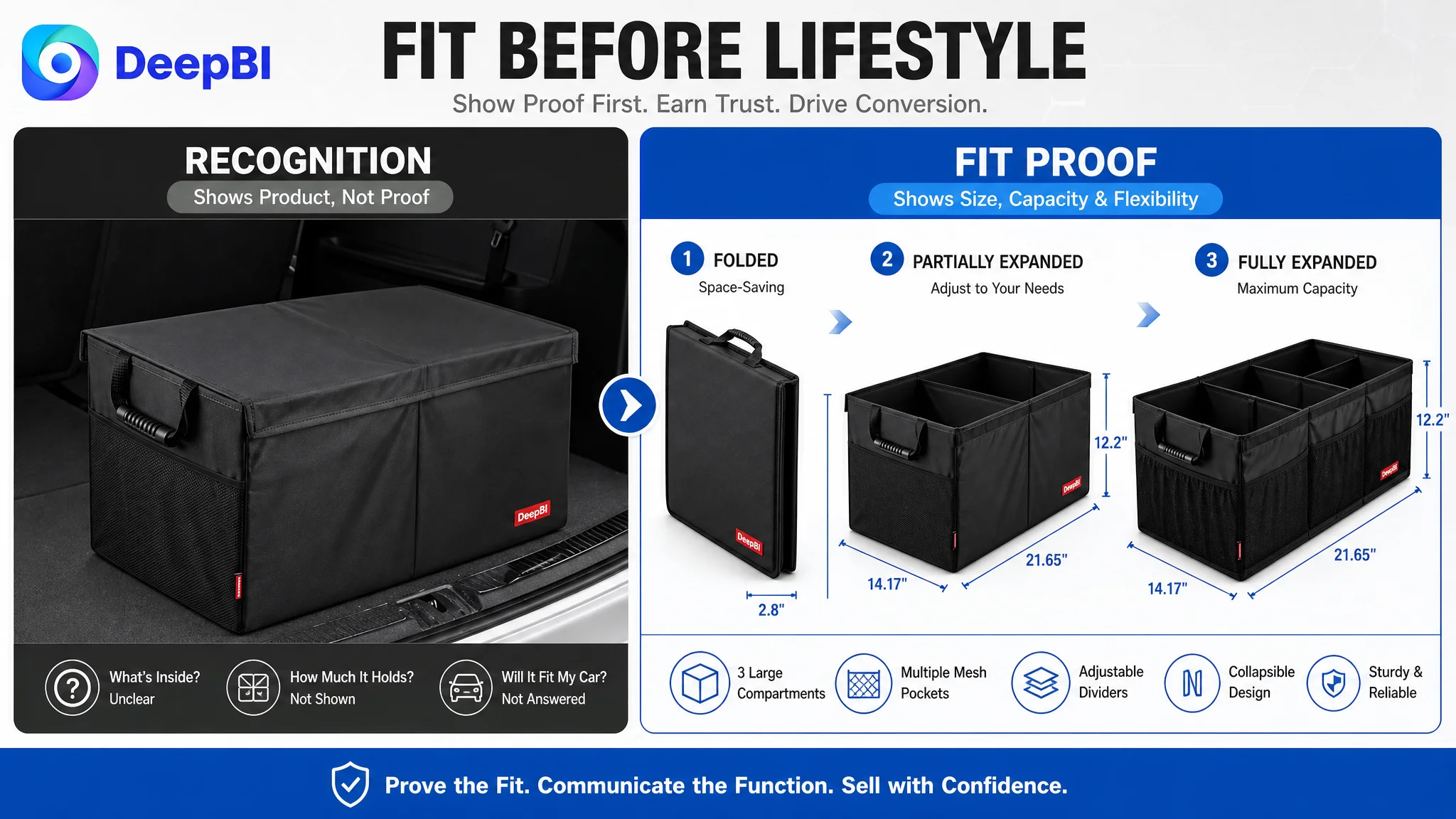
The first A+ module needed to answer the capacity question
Instead of opening with a broad brand promise, the first module could show the organizer loaded in a trunk with realistic items.
This would immediately answer: “Will this hold the things I actually carry?”
The existing product materials could remain central, but the visual context needed to make the product’s utility visible.
The folding module needed to show transformation
The comparable listing’s folded-to-expanded presentation made space flexibility easy to understand.
The target page had a suitable use scenario, but did not provide the same state-change logic. Showing the organizer collapsed and fully expanded, together with the confirmed dimensions of 21.65 x 14.17 x 12.2 inches, would address fit anxiety earlier in the page.
Technical details needed to become proof
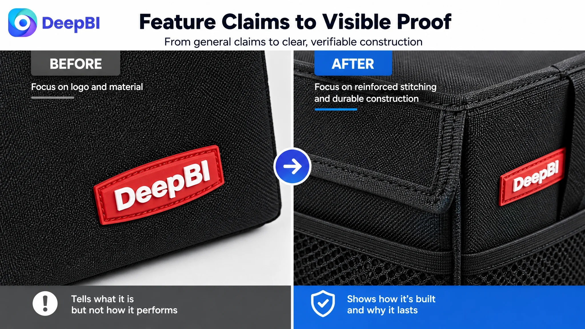
The target A+ content showed pockets, handles, and structural features. But descriptive close-ups alone can leave the shopper asking why those details matter.
The revised direction was to connect each detail to a concern:
- Reinforced fabric and stitching support durability.
- Adjustable dividers support flexible packing.
- Fixing features support stability in motion.
- Easy-clean surfaces support ongoing ownership.
- Handles support movement between the vehicle and other locations.
This is the difference between showing a feature and proving its relevance.
Lifestyle content belonged later
The page’s home, workshop, bedroom, and camping scenes helped expand the product’s potential use. But these scenes were secondary to the primary car-storage problem.
They were more effective after the page had already established:
1. What the organizer holds.
2. How it fits.
3. How it folds.
4. How it stays secure.
5. Why its construction can support repeated use.
Lifestyle content can broaden demand, but it should not interrupt the proof of the product’s primary job.
The Review Gap Was Real, but It Could Not Be Solved by Copy Alone
The review dimension scored 5 out of 15, compared with 14 out of 15 for the comparable listing.
The difference was substantial:
- Target Listing: 3.9 stars, 20 total reviews
- Comparable listing: 4.7 stars, 2,149 total reviews
- Target Listing homepage review sample: 9 reviews
- Comparable listing homepage review sample: 15 reviews
- The target sample included one-star and two-star reviews, representing a visible negative signal.
- The comparable listing’s homepage sample contained no reviews rated three stars or below.
This gap affected trust before a shopper read every product detail.
However, it also clarified the operating priority.
Reviews are an important part of conversion, but changing the title, main image, bullet points, or A+ content cannot manufacture review volume or erase existing customer feedback. The Listing team therefore needed to distinguish between:
- Structural page problems that could be repaired immediately
- Reputation and review problems that required product and customer-experience work over time
The correct decision was not to ignore reviews. It was to avoid treating reviews as the only explanation for weak conversion.
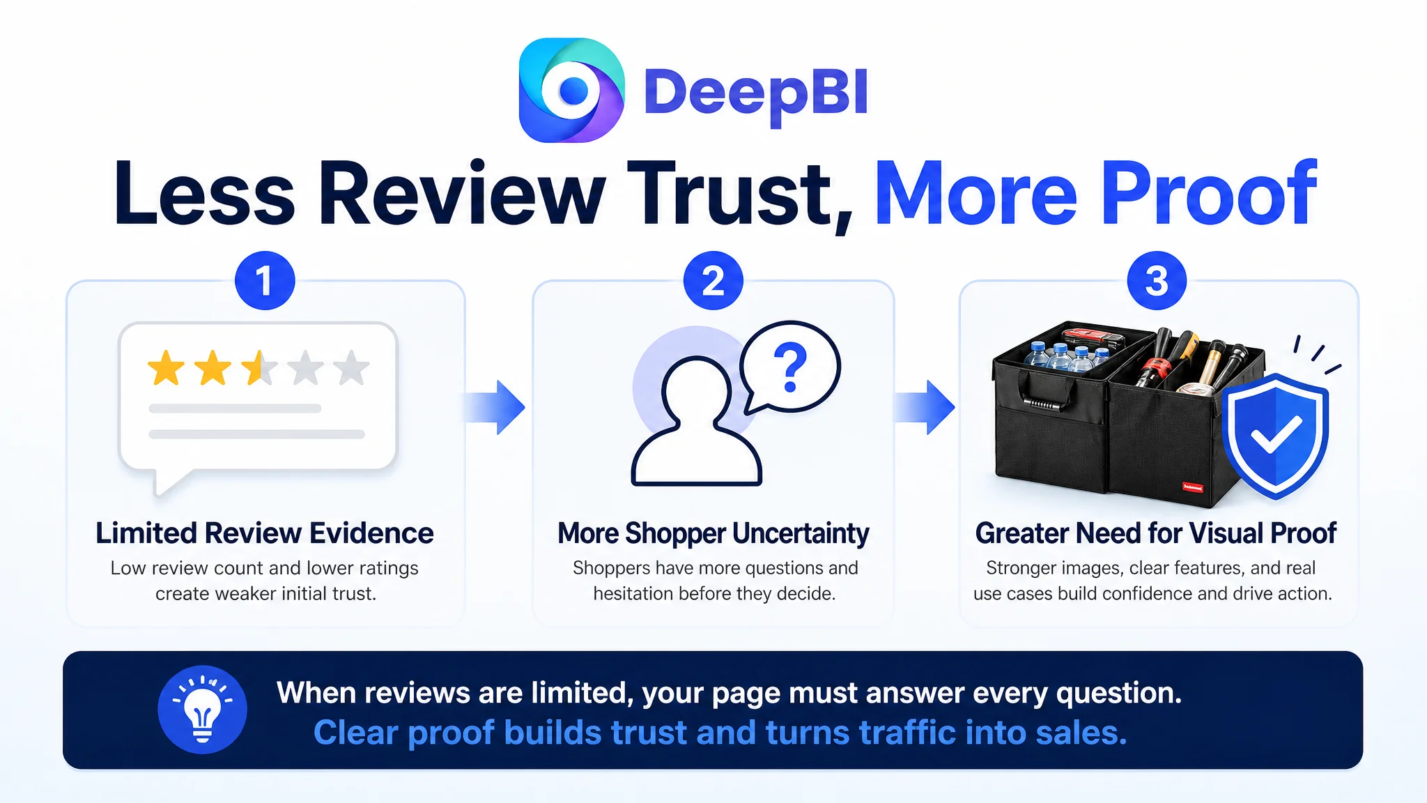
A low-review Listing has less margin for unclear communication. When the page lacks strong visual proof and the review base is small, shoppers have fewer reasons to overcome uncertainty.
That made page clarity even more important.
Why DeepBI Did Not Recommend Tuning Ads First
For an Amazon seller under pressure from advertising efficiency, the natural response is often to adjust:
- Keyword bids
- Match types
- Search-term harvesting
- Campaign segmentation
- Placement settings
- Budget allocation
Those actions can matter when traffic quality or campaign structure is the primary constraint.
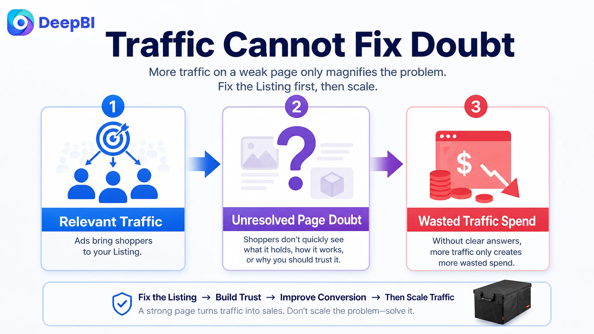
But they cannot repair a product page that fails to convert relevant traffic.
The diagnosis in this case was built around a simple sequence:
Listing score gap → visible content gap → shopper doubt → weak conversion capacity → inefficient use of paid traffic
The score comparison did not merely say that the page was “less attractive.” It showed where the page was losing persuasive force:
- The title was less direct.
- The main image did not establish full configuration or immediate use.
- The bullet points opened with less commercially urgent information.
- The A+ sequence delayed capacity, fit, and performance proof.
- The review profile created a significant trust disadvantage.
If ads were scaled before these issues were addressed, the store risked paying to send more shoppers into the same unresolved decision path.
Advertising can amplify a strong page, but it can also amplify the page’s existing conversion defects.
That was why Listing conversion capacity had to be addressed first. The objective was not to stop advertising permanently. It was to make future traffic more useful.
The Optimization Direction Was a Rebuild of Decision Logic
The proposed changes were not a collection of isolated edits. They followed a deliberate order.
First: make the product understandable
The title and main image needed to establish the product’s form, configuration, compatibility, and core use more quickly.
Then: make the function visible
The image sequence and first A+ modules needed to show capacity, compartments, folding behavior, and vehicle placement using concrete visual evidence.
Next: reduce fit and stability anxiety
Dimensions, collapsed-versus-expanded states, fixing features, and grounded usage scenes needed to appear before broader lifestyle content.
Finally: reinforce brand and wider use
Brand history, portability, cleaning, and non-vehicle scenarios could support the decision after the core car-storage problem had been resolved.
This sequence also respected the limits of the available product information. The optimization could improve composition, context, hierarchy, and storytelling without inventing a cooler bag, material grade, performance test, or other unsupported attribute.
That distinction matters. A stronger Listing is not created by borrowing every successful competitor claim. It is created by presenting the target product’s verified advantages with greater clarity.
What Changed in the Business Understanding
The case did not provide post-optimization CVR, ACOS, CTR, or organic-order data, so no numerical performance outcome should be claimed.
The meaningful change was in the operating diagnosis.
The customer’s initial view placed more weight on brand trust, general quality, and broad usage. The revised view recognized that the product page needed to guide the shopper through a more practical sequence:
- See the full product configuration.
- Understand what it can hold.
- Recognize how the compartments adapt.
- Confirm that it fits the vehicle.
- See how it folds away.
- Understand how it stays secure.
- Believe that it can support repeated use.
- Then consider the broader lifestyle value.
That reframing reduced the risk of making advertising responsible for a page-level problem.
It also created a more controllable optimization path. Instead of repeatedly adjusting traffic inputs without resolving the conversion constraint, the team could repair the page’s sales logic and then evaluate whether paid and organic traffic were being converted more effectively.
The Lesson for Amazon Sellers
An Amazon Listing can contain plenty of information and still fail to persuade.
A product may have a credible brand, multiple images, detailed bullets, and a full A+ page. Yet if those elements do not work together, the shopper may still leave with unanswered questions.
For this car trunk organizer, the central issue was not that the page had no content. It was that the content did not move in the same order as the shopper’s decision:
capacity before aspiration, proof before general claims, fit before expanded lifestyle use.
The most important judgment was therefore not “change the image” or “rewrite the title.”
It was this:
Before increasing Amazon ad traffic, determine whether the Listing has enough conversion capacity to deserve that traffic.
That is where the value of DeepBI’s analysis appeared—not as a list of features, but as a way to connect competitive evidence, Listing structure, shopper doubt, and operating priority.
When the product page becomes clearer, advertising has a better chance to do its real job: bring qualified shoppers to a page that is ready to convert them.