

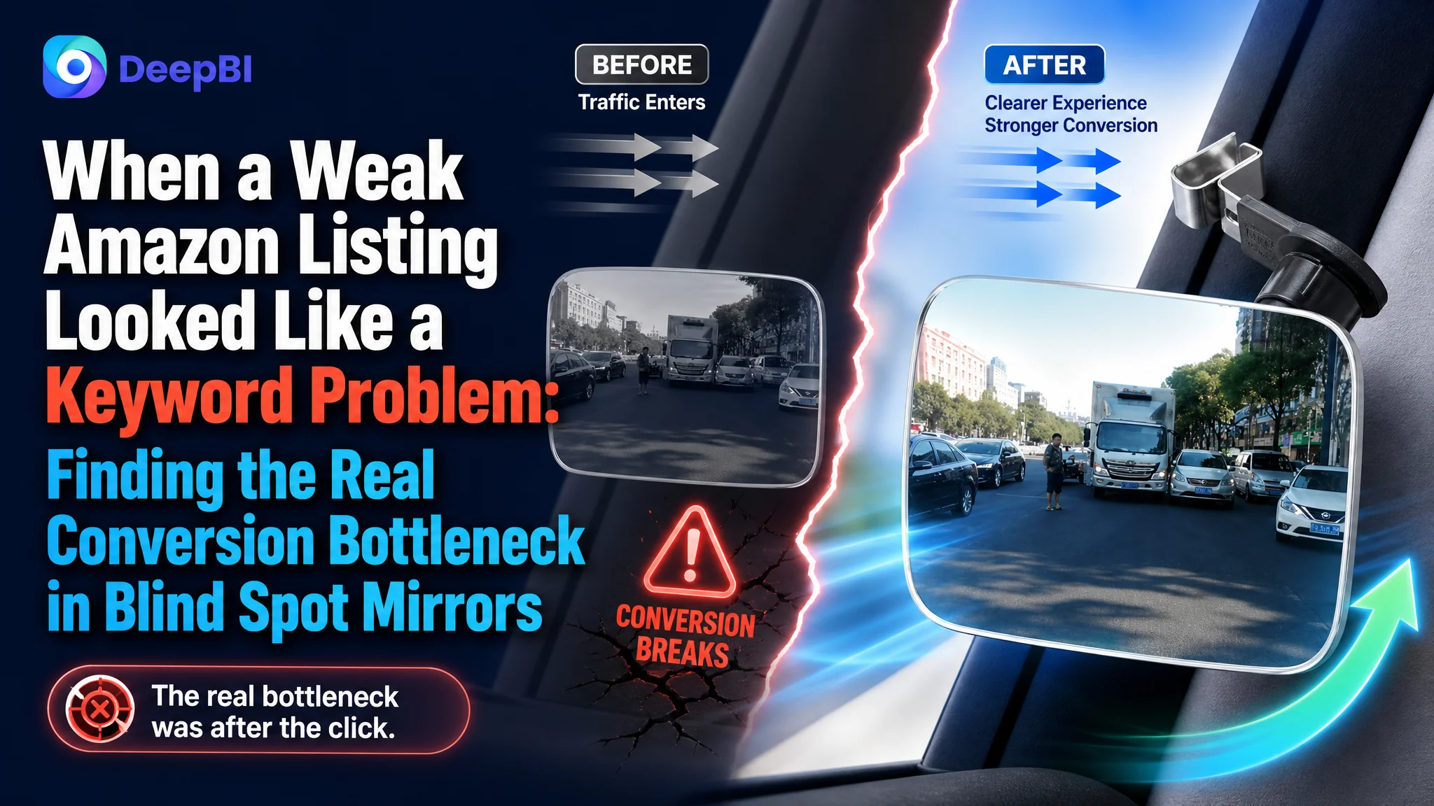
An Amazon seller in the automotive accessories category was trying to improve a product page for car blind spot mirrors on the US marketplace. The initial optimization direction centered on familiar Listing concerns: move the core keyword forward, add vehicle types, clarify the material, and make the main images more attractive.
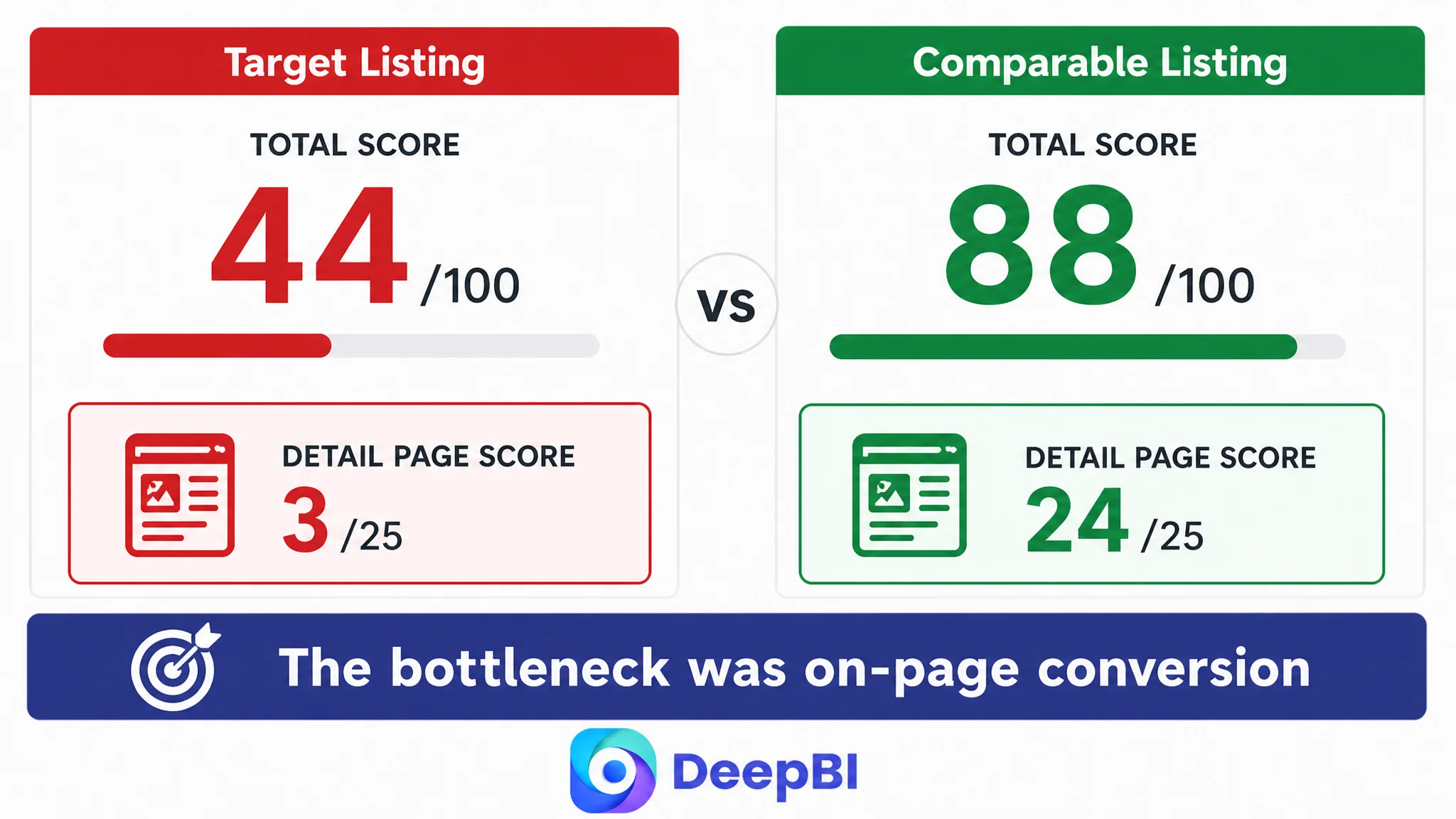
Those changes were relevant, but they did not explain the full business problem. DeepBI’s comparison showed that the Listing was not losing only at the search-entry level. Its overall score was 44 out of 100, compared with 88 for a comparable high-performing listing. The largest gap was not the title or even the main image. It was the product-page experience after the click: weak A+ content, thin benefit communication, limited installation guidance, and a much smaller review foundation.
The later optimization therefore focused on rebuilding the Amazon product page’s sales logic. The goal was to show the blind-spot problem clearly, demonstrate how the mirror improves visibility, reduce fitment and installation doubts, and create a more credible path from paid or organic traffic to purchase.
For other Amazon sellers, the lesson is direct: when a product page receives attention but does not create enough confidence to buy, continuing to tune keywords or ads first may only send more traffic into the same conversion leak.
The First Diagnosis Focused on the Visible Parts
Car blind spot mirrors are easy to describe in functional terms. They are small, convex mirrors designed to expand the driver’s field of view. They can be positioned on vehicle side mirrors and may support different cars, SUVs, and trucks.
That simplicity can create a diagnostic trap.
The customer’s Listing already mentioned basic product information, including material, compatibility, and safety use. The initial improvement direction naturally concentrated on making those elements more competitive:
- Place “Car Blind Spot Mirror” closer to the beginning of the title.
- Add concrete vehicle terms such as cars, SUVs, and trucks.
- Clarify the ABS plastic material.
- Include product characteristics such as frameless and convex design.
- Improve the visual presentation of the images.
These were reasonable actions because the title was weaker than the benchmark. Its core keyword was positioned too late, some selling points were abstract, and the structure did not clearly communicate product form, material, function, compatibility, and pack information.
But the title gap was only four points.
The main-image gap was five points.
The five-point gap was three points.
The deeper problem was elsewhere.
The Listing was not merely struggling to attract the right click. It was failing to give the click enough reasons to continue toward purchase.
The Score Gap Pointed to a Page-Level Constraint
DeepBI’s comparison produced a total score of 44 for the target Listing versus 88 for the comparable high-performing Listing.
The distribution of the scores mattered more than the total:
- Title: Target Listing: 13/20, Comparable Listing: 17/20, Gap: -4
- Main image: Target Listing: 21/30, Comparable Listing: 26/30, Gap: -5
- Bullet points: Target Listing: 4/10, Comparable Listing: 7/10, Gap: -3
- Detail page: Target Listing: 3/25, Comparable Listing: 24/25, Gap: -21
- Reviews: Target Listing: 3/15, Comparable Listing: 14/15, Gap: -11
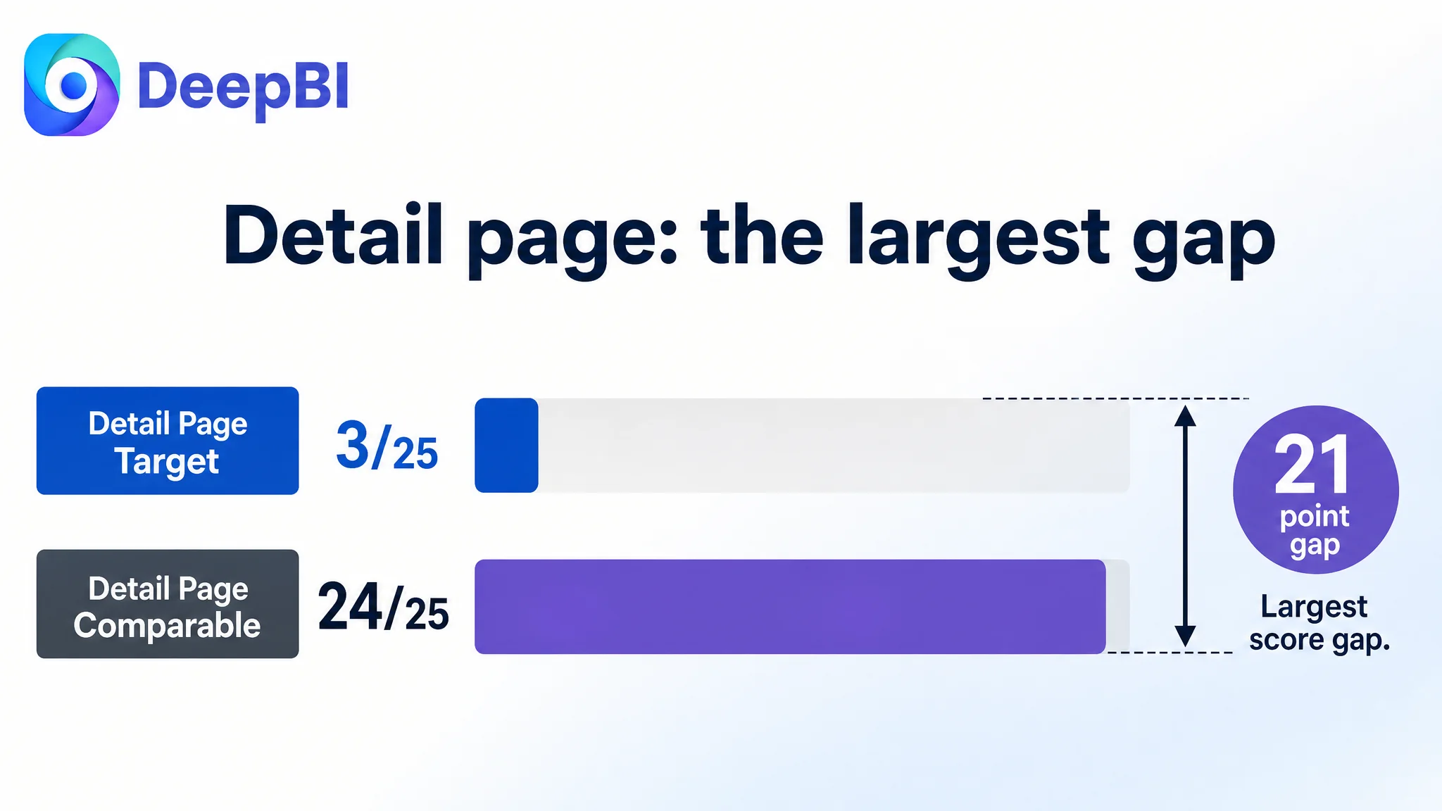
The detail-page difference alone accounted for a 21-point gap. That changed the order of priorities.
If the team had continued to focus mainly on keyword placement or image styling, it might have improved the entry points without repairing the page that had to convert the resulting traffic. The Listing needed a stronger commercial explanation of the product, not just a more searchable description.
The review gap also created a trust constraint. The target page had a 3.6-star rating from three reviews, while the comparable listing had a 4.5-star rating from thousands of reviews. That difference could not be solved through copywriting alone. It meant the content had to work harder to establish product understanding and reduce uncertainty before the buyer reached the review section.
The Detail Page Was Not Completing the Buying Argument
The existing detail section relied primarily on text. Features, specifications, material, and compatibility were repeated without being organized into a persuasive sequence.
The comparable Listing used a much fuller visual structure:
- Product-in-use imagery
- Blind-spot comparison visuals
- Installation steps
- Multiple viewing angles
- Close-ups of adjustability and attachment
- Weather or durability communication
- Icon-based benefit summaries
This was not simply a difference in design quality. It was a difference in decision logic.
A buyer considering a blind spot mirror may have several questions before purchasing:
- Will this actually improve visibility?
- Will it fit my vehicle?
- Is the viewing angle adjustable?
- Can I install it correctly?
- Will the attachment hold?
- Can the mirror remain useful in outdoor conditions?
- What exactly is included in the package?
The target page stated some of the answers, but it did not present them in the order buyers needed. The page described the product. It did not sufficiently demonstrate the outcome.
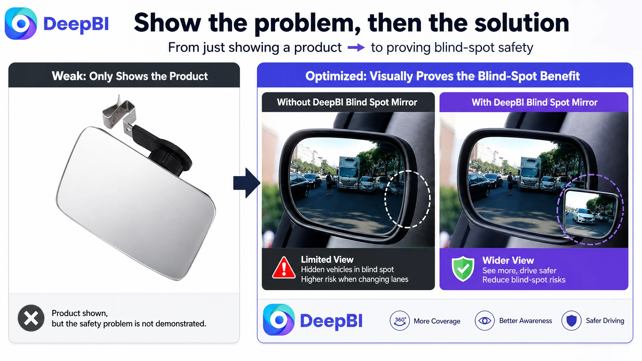
The product was shown, but the safety problem was not demonstrated
The core value of a blind spot mirror is not the mirror itself. It is the additional field of view it provides when passing or changing lanes.
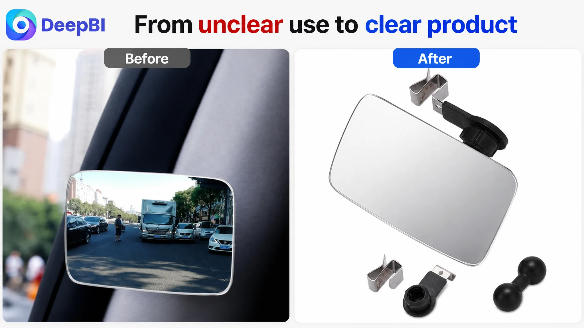
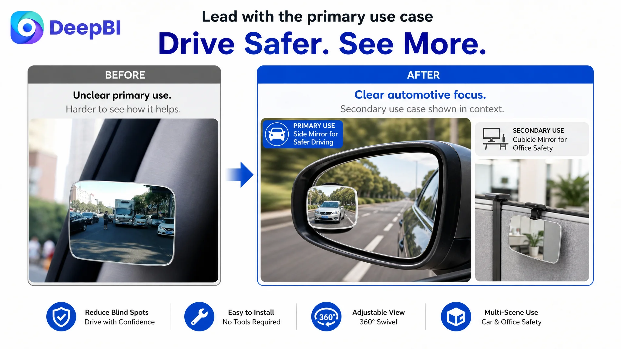
The existing image sequence did not establish this quickly enough. The first image used an unconventional interior scenario, which could make buyers question the product’s primary use. Other images repeated product views or dimensions without creating a stronger understanding of how the mirror solves the blind-spot problem.
The recommended direction was to move the visual story toward:
1. The vehicle side mirror in a realistic driving context.
2. A clear “without versus with” blind-spot comparison.
3. The complete product assembly or kit.
4. Installation and attachment guidance.
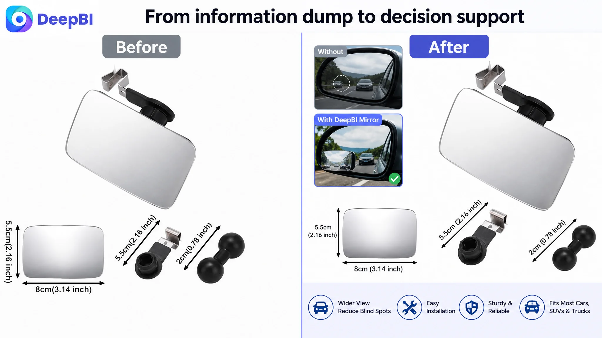
5. Dimension and compatibility confirmation.
6. Secondary applications only after the main automotive use case was clear.
This sequencing mattered. The Listing needed to lead with the problem and visible result, then provide proof and practical details.
The bullet points contained information, but not a buying path
The target bullet points were comparatively thin. They mentioned material, general compatibility, and safety, but did not build a clear progression from concern to solution.
The stronger structure was:
- Adjustable viewing angle and wider field of view
- Safer visibility for passing and lane changes
- Material and optical characteristics
- Installation process
- Customer service reassurance
This is more than a copywriting preference. Each point addresses a different purchase barrier.
The first point explains what the product does. The second connects it to the driving problem. The third supports perceived quality. The fourth reduces effort-related hesitation. The fifth lowers the perceived risk of purchase.
A bullet such as “suitable for most cars” is broad, but it leaves the buyer to do the reasoning. A stronger bullet connects compatibility to the specific use context and tells the buyer why the product is relevant to a car, SUV, van, or truck.
Why DeepBI Did Not Keep Tuning the Ads First
The case material does not provide post-optimization advertising results, so it would be inaccurate to claim a specific ACOS decline, CVR increase, or recovery in organic orders.
The decision logic is still clear.
When the page has a 21-point detail-page gap and an 11-point review gap, sending more traffic to the page before improving its conversion capacity creates a meaningful business risk. Advertising can generate impressions and clicks, but it cannot compensate for unclear product communication, weak visual proof, or unresolved installation concerns.
Advertising does not only amplify a strong Listing. It can also amplify the page’s existing defects.
For this product, the correct sequence was therefore not “increase traffic, then see what happens.” It was:
- Clarify the primary automotive use case.
- Make the blind-spot improvement visible.
- Explain compatibility and installation.
- Present the real product and its components clearly.
- Strengthen the title and bullets around concrete search and buying language.
- Use A+ content to close the remaining trust gaps.
- Then evaluate whether paid traffic is being converted more effectively.
This does not mean ads were irrelevant. It means ad optimization should not be treated as the first or only lever when the product page itself is underprepared.
The Main Image Needed a Job, Not Just a Better Look
The main-image recommendations were based on the role each image should play in the buyer journey.
The first visual should establish what is being purchased. A clean product or complete-kit presentation would create a reliable baseline and remove uncertainty caused by the unconventional interior placement.
The next important visual should communicate the central outcome: a wider field of view and reduced blind-spot risk. A “with versus without” comparison would make the safety value easier to understand than a general statement such as “drive safe.”
Dimensions should remain available, but they should not dominate the early sequence. They are validation information, not the primary reason to click.
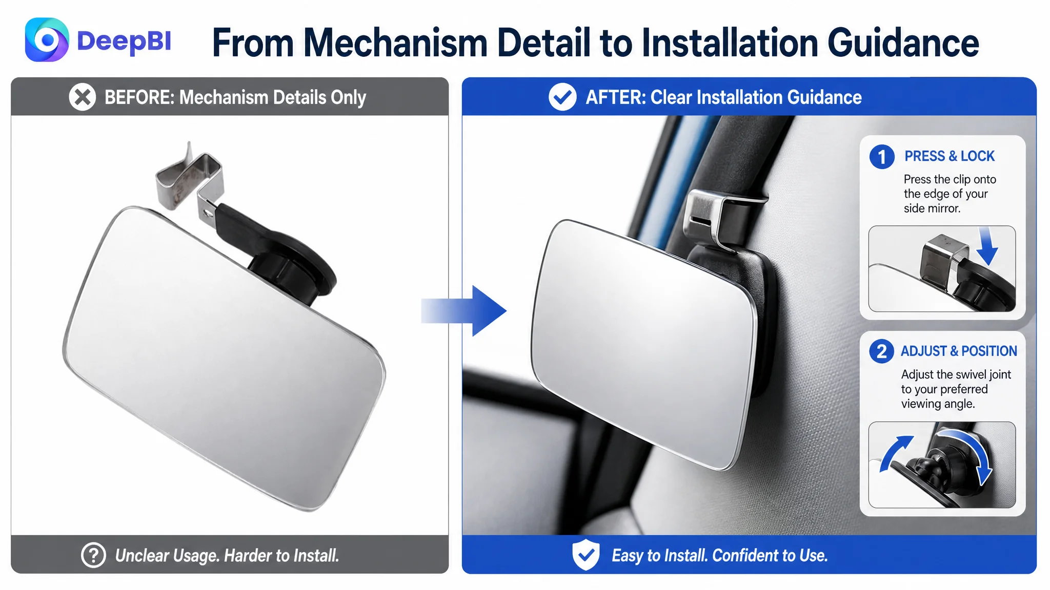
Installation imagery should also be more purposeful. A close-up of an attachment mechanism without context does not necessarily reduce hesitation. A short visual sequence showing where to place, attach, and adjust the mirror is more useful because it addresses the buyer’s concern about making a mistake.
Secondary use cases, such as a desk or cubicle rear-view application, should appear later. They may broaden applicability, but placing them too early risks weakening the product’s primary automotive identity.
The visual priority became clear
First show the blind-spot problem. Then show the product solution. After that, confirm fitment, installation, and specifications.
That order helps the page communicate value before asking the buyer to process technical detail.
A+ Content Had to Rebuild Trust Through Demonstration
The most important change was not adding more text to the existing detail section. It was creating a structured A+ narrative.
A stronger A+ sequence for this Amazon Listing would include:
Start with the expanded field of view
The opening module should show the mirror mounted in a vehicle context and make the product’s primary benefit immediately understandable.
Address vehicle compatibility
The page should explain the intended fit across common vehicle types, including cars, SUVs, vans, and trucks where supported by the product information. This directly addresses the buyer’s concern that the mirror may not work with a particular side mirror.
Demonstrate the blind-spot problem
A visual comparison between a restricted viewing area and an expanded viewing area would turn the safety claim into something the buyer can evaluate.
Explain installation in practical steps
The buyer should be able to understand the attachment process before ordering. Clear steps can reduce uncertainty around cleaning the original side mirror, attaching the mirror or mounting component, and securing the final position.
The exact attachment method must remain aligned with the actual product materials and configuration. The page should not promise suction cups, adhesive performance, or a specific mounting mechanism unless those details are verified.
Present material and environmental suitability carefully
The product is identified as flexible ABS plastic. Any claims about waterproofing, weather resistance, or all-weather durability should be supported by confirmed product capability or testing. The improvement is not to add impressive-sounding specifications; it is to communicate verified characteristics with enough visual and textual clarity to build confidence.
Show adjustability as a practical benefit
If the product includes a swivel or adjustable mounting mechanism, the page should show how the viewing angle can be personalized for the driver’s position. This is more persuasive than mentioning adjustability without demonstrating its use.
End with rational reassurance
The final module should consolidate verified benefits such as material, secure attachment, product contents, and customer support. It should answer the buyer’s remaining practical questions without introducing unsupported guarantees.
The Title and Bullets Still Needed Work—but They Were Not the Whole Case
The title required a clearer Amazon search and buying structure. The recommended direction was to place the core product term earlier, specify the convex and frameless form, identify ABS plastic, include relevant vehicle types, and organize secondary applications after the main automotive use case.
The bullets needed the same shift from general description to concrete decision support.
For example, the first bullet could connect adjustable rotation with a wider viewing angle. Another could connect convex mirror design with passing and lane-change visibility. A material-focused bullet could describe the flexible ABS plastic and HD glass only where those properties are confirmed. The installation bullet could explain the actual process rather than simply calling it easy.
The important point is that these improvements should support the page’s central story. They should not become a disconnected collection of keywords and specifications.
The title brings the product into the search conversation. The images and A+ content must then prove why the product deserves the click.
The Diagnosis Changed the Order of Operations
Before the comparison, it would have been easy to see a familiar Amazon Listing problem: the title was not fully optimized, the images were not visually strong enough, and the bullets lacked detail.
After the comparison, the business priority became more precise.
The Listing’s main constraint was its conversion capacity. It had not built enough visual trust or decision clarity around the product’s core use case. The weak A+ content was not a cosmetic gap. It removed the part of the page responsible for explaining the problem, demonstrating the solution, and reducing purchase risk.
That is why DeepBI’s role in this case was not simply to produce a new title or generate more attractive images. The useful judgment was identifying which gap mattered most and which improvements had to come first.
The score comparison, competitor structure, content roles, and product-boundary checks together produced a more disciplined path:
- Do not treat the title as the entire traffic problem.
- Do not treat the main image as an isolated creative problem.
- Do not add claims that the product cannot substantiate.
- Do not keep increasing traffic before the page can explain and support the purchase.
- Rebuild the Listing around the buyer’s actual sequence of doubts.
What Other Amazon Sellers Can Take From This Case
This blind spot mirror Listing illustrates a broader Amazon operating principle.
A page can have recognizable keywords and basic product information while still being commercially weak. The difference between a low-conversion Listing and a stronger one is often not the amount of information. It is whether the information works together as a decision system.
For this Amazon seller, the key change in understanding was:
- A searchable title does not guarantee a convincing product page.
- A product image does not automatically communicate product value.
- General compatibility language does not remove fitment anxiety.
- Functional claims are weaker when they are not demonstrated visually.
- A+ content is not optional decoration when the product requires explanation.
- Review volume cannot be created through page editing, but weak reviews make clear content even more important.
- Ad traffic becomes more useful only when the Listing can convert the attention it receives.
The case did not end with a claimed performance number, because no post-optimization data was provided. Its value lies in the diagnosis: a 44-point overall score, a 21-point detail-page gap, and a substantial review disadvantage showed that the page needed to be repaired before traffic optimization could be judged fairly.
The real question was not how to send more people to the Amazon Listing. It was whether the Listing had earned the right to receive more traffic.