

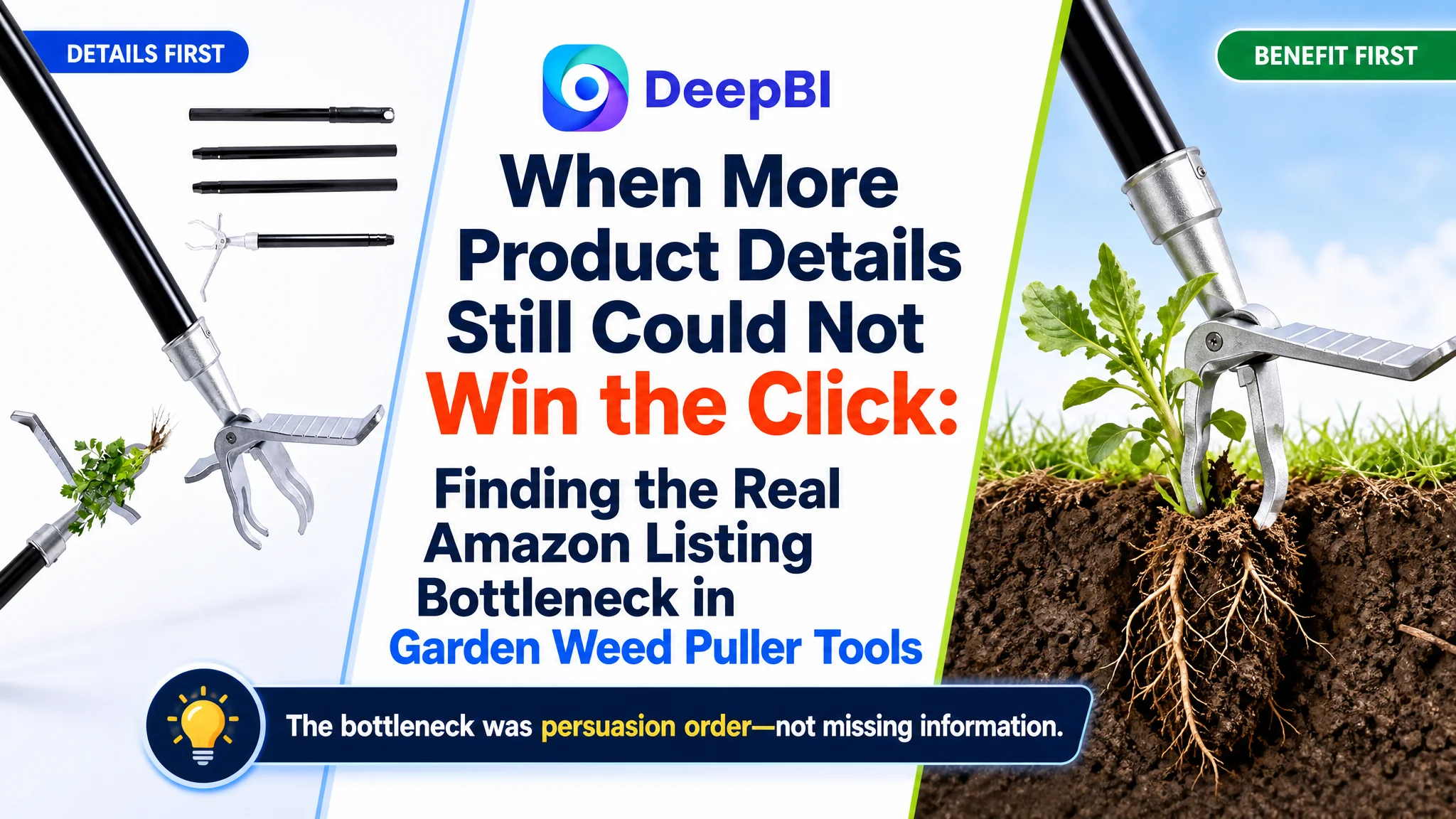
An Amazon seller of long-handle weed puller tools had a familiar problem: the product page contained plenty of information, yet it remained less convincing than a comparable high-performing Amazon Listing. The initial direction focused on adding specifications, explaining installation, and presenting more product details. But the page was still not giving shoppers a strong enough reason to click or trust the product.
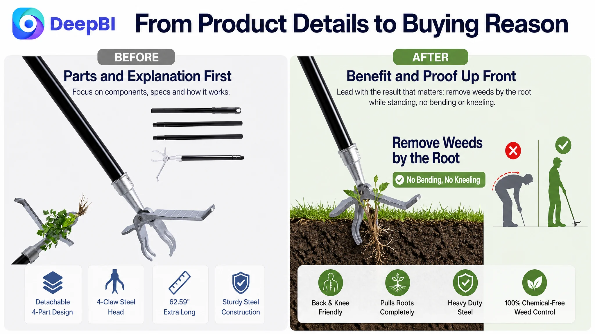
DeepBI’s comparison showed that the issue was not a lack of content. It was a lack of persuasion order. The Amazon Listing was explaining how the tool worked before clearly showing why the shopper should care: no bending, less strain on the back and knees, durable steel construction, and reliable root removal.
The later optimization therefore shifted toward Amazon product-page conversion. The title, main images, bullet points, and A+ content were reorganized around the customer’s main pain point and buying concerns. For other Amazon sellers, the lesson is direct: before increasing traffic or adding more information, determine whether the product page is helping traffic move toward a purchase—or merely giving shoppers more reasons to hesitate.
The page looked complete. The buying logic was incomplete.
The product page was not empty or obviously unfinished.
It already included:
- Product scenes
- Functional diagrams
- Usage steps
- Weed-type references
- Structural details
- Size information
- A+ content
From an internal production perspective, this can create a misleading sense of completeness. The team has invested in images and copy, so the next instinct is often to refine wording, add another specification, or explain the product in greater detail.
But Amazon shoppers do not evaluate a Listing by counting its modules.
They decide whether the product appears relevant, credible, and easy to use—often before they have read everything on the page.
The problem was not that the Listing lacked information. It was that the most important buying reason was not appearing early enough.
The product’s strongest commercial idea was straightforward: it allows users to remove weeds while standing upright, without bending or kneeling. Yet this benefit was not consistently positioned as the central promise across the title, main images, bullet points, and A+ content.
Instead, the page often moved through the product’s structure and usage conditions first. That created an information path, but not a strong decision path.
The original assumption focused on explanation, not conversion
The customer’s working direction was understandable.
For a garden tool, it seemed reasonable to explain:
- How the claw mechanism works
- How the handle is assembled
- What soil conditions are suitable
- Which weeds the tool can remove
- What the dimensions are
- How to use and store the product
Those details matter. But they should not all have equal weight, and they should not appear in an arbitrary sequence.
The page was treating several secondary questions as if they were the first questions in the shopper’s mind. In practice, the buyer was more likely to be asking:
- Can I remove weeds without hurting my back or knees?
- Will the tool be strong enough for repeated use?
- Can it pull weeds out by the root?
- Is it simple to operate?
- Will it work for the weeds and soil in my yard?
The Listing answered some of these questions, but the answers were dispersed across technical descriptions, usage instructions, and parameter panels. The customer was describing the product. The stronger Amazon Listing was framing the product as a solution to a physical problem.
That difference explains why adding more information did not necessarily strengthen conversion.
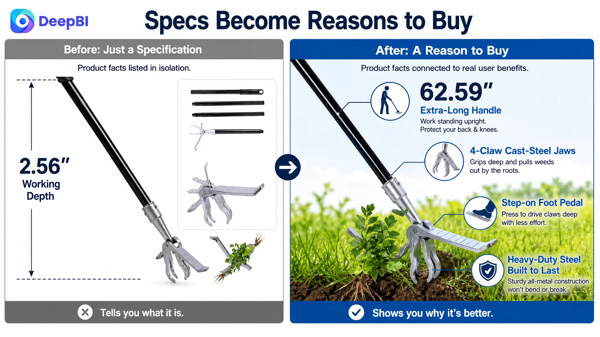
A product specification is not automatically a customer benefit
A 62.59-inch handle is a meaningful product fact.
But the commercial value is not the number itself. It is the user outcome associated with the number: a taller user may be able to work while standing upright instead of repeatedly bending over.
Likewise, a four-claw steel head is more than a construction detail. It should support a confidence judgment about grip, torque, and root removal.
The page needed to translate specifications into reasons to buy.
The benchmark exposed an 18-point Listing gap
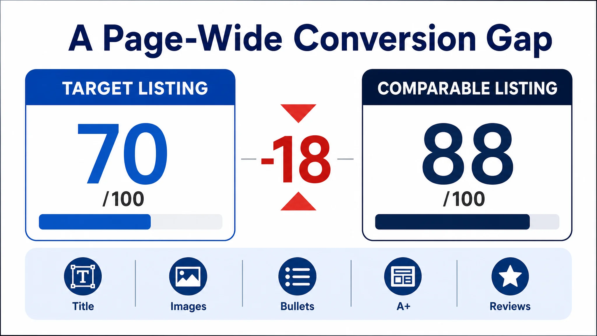
DeepBI’s structured comparison placed the target Amazon Listing at 70 out of 100, compared with 88 out of 100 for a comparable high-performing Listing in the same category.
The gap was not concentrated in one isolated element:
- Title: Target Listing: 14/20, Comparable Listing: 18/20, Gap: -4
- Main image: Target Listing: 24/30, Comparable Listing: 26/30, Gap: -2
- Bullet points: Target Listing: 5/10, Comparable Listing: 8/10, Gap: -3
- A+ content: Target Listing: 19/25, Comparable Listing: 23/25, Gap: -4
- Reviews: Target Listing: 8/15, Comparable Listing: 13/15, Gap: -5
- Total: Target Listing: 70/100, Comparable Listing: 88/100, Gap: -18
This was important because the Listing did not have only a “bad image” problem or only a “weak title” problem.
The weaker score reflected a connected conversion issue:
- The title did not lead with the strongest search and value proposition
- The main images did not create an immediate reason to click
- The bullets contained information but lacked a clear persuasion sequence
- The A+ content explained the product without strongly dramatizing the problem it solved
- The review profile created a substantial trust disadvantage
The correct judgment was therefore not to optimize one asset in isolation.
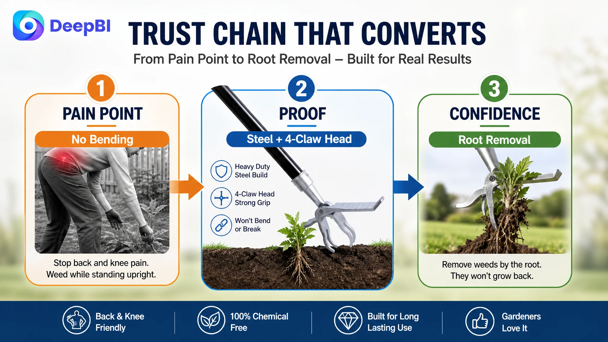
The product page needed a coordinated shift from product explanation to pain point, proof, and confidence.
The title was searchable, but not strategically arranged
The comparable Listing led with the core category phrase, followed by a concrete length and high-value product attributes. Its structure was easy to scan:
Core keyword → size or feature → function → user benefit
The target title opened with a brand name and repeated closely related terms such as “weed puller tool” and “weeder tool.” It also used a long string of functional descriptions, including a length figure without a clear unit presentation.
The result was a title that contained relevant information but did not prioritize it effectively.
The recommended direction retained the confirmed 62.59-inch length and four-claw steel head while bringing the core phrase, durability, root-removal function, and back-and-knee benefit into a cleaner structure.
The objective was not to stuff in more keywords.
It was to make the title answer two questions quickly:
1. What is the product?
2. Why is this version relevant to me?
For an Amazon Listing in this category, “stand-up weed puller” identifies the product. “Without bending or kneeling” connects it to the shopper’s problem. “Heavy-duty steel” addresses durability. These elements work better when they are arranged as a hierarchy rather than accumulated as synonyms.
The main image showed the tool, but not the reason to choose it
The current image set placed too much emphasis on what was included and how the components were arranged.
That is useful later in the decision process. It is weaker as an opening message.
The main visual opportunity was to make the claw mechanism and upright operating position more immediately understandable. The shopper should be able to see the relationship between the tool’s long handle, the foot pedal, the four-claw head, and root removal without studying a dense diagram.
The first image needed a stronger commercial role
The first supporting image should not simply confirm that the package contains a tool and several structural parts.
It should communicate:
- Upright weed removal
- The four-claw steel head
- The mechanism that grips the root
- The practical benefit of avoiding repeated bending
This does not require changing the product itself. It requires changing the visual priority.
The soil image introduced doubt too early
One image placed considerable emphasis on soil limitations. Usage guidance is necessary, especially because the tool performs best in moist, loose soil or after watering or rainfall and may be less effective in extremely hard clay or rocky surfaces.
However, presenting the limitation too prominently before establishing product value can make the shopper focus on failure conditions rather than successful use.
The better sequence is:
1. Show the foot pedal driving the claws into the soil
2. Show the depth and root-gripping action
3. Explain the conditions that support effective use
4. State the limitations clearly but constructively
This turns a warning into usage guidance instead of allowing it to become the first trust signal.
The image sequence needed less text and more action
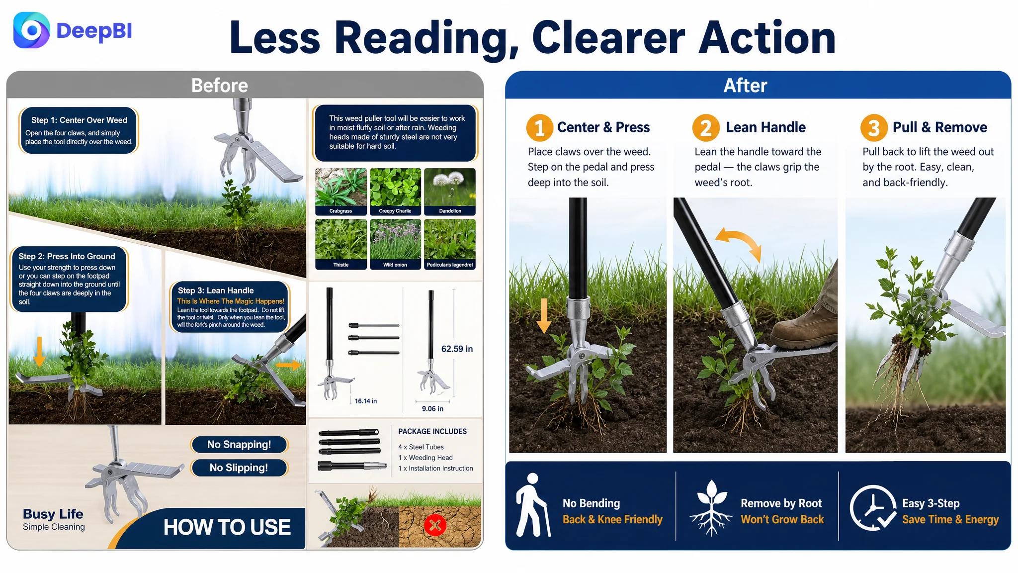
The existing instruction-heavy visuals required shoppers to read too much before understanding the operation.
A simpler visual sequence could show:
Step on the pedal → grip the weed → tilt the handle → pull out the root
The purpose is not to make the process look effortless in an unsupported way. It is to remove ambiguity. Shoppers should understand what they need to do and why the tool’s structure supports the movement.
The bullet points contained facts, but not a persuasive path
The bullet points were one of the clearest gaps in the comparison.
The target copy moved between usage conditions, materials, ergonomics, application scenarios, and root-removal claims. Some information was repeated, while important benefits were not given enough priority.
The comparable Listing used a more decisive structure:
- Lead with back and knee pain
- Establish durability
- Explain adjustable or user-oriented handling
- Present root-removal performance
- Confirm application and storage convenience
For the target Listing, the same logic needed to be adapted to the confirmed product facts—especially its fixed 62.59-inch handle rather than an adjustable length.
First: lead with the physical problem
The first bullet should begin with the reason many shoppers are considering a long-handle weeder in the first place.
A message such as “stand-up weeding without bending or kneeling” is stronger than opening with a usage condition. It immediately positions the product for seniors, gardeners with back discomfort, taller users, and anyone seeking a less strenuous way to maintain a lawn or garden.
Second: turn steel construction into confidence
The four-claw steel head and high-strength steel construction should be presented as evidence of reliable use, not just as material terminology.
The shopper needs to understand why the construction matters:
- Stronger clamping force
- Better support during root removal
- Less concern about bending during ordinary heavy-duty use
- Greater confidence in repeated garden maintenance
Any performance claim must remain within the confirmed product boundaries. The objective is to reduce rational doubt, not to promise that the tool works equally well in every soil condition.
Third: explain the operating logic
The foot pedal is a useful differentiator because it explains how the user can insert the claws more deeply.
The copy should show a clear action sequence: step, insert, tilt, and pull. The emphasis should be on control and reduced ambiguity rather than exaggerated ease.
Fourth: make root removal concrete
“Removes weeds” is a generic claim.
The stronger message is that the four-claw design is intended to grip individual taproot weeds such as dandelions and crabgrass and pull them from the root under suitable conditions.
This is more persuasive because it connects the mechanism to the desired result.
Fifth: clarify where and when the product performs best
The Listing should confirm suitable applications while keeping the guidance practical:
- Lawns
- Garden beds
- Common taproot weeds
- Moist or loosened soil
- Soil after watering or rainfall
It should also be honest about extremely hard clay or rocky surfaces. Accurate expectation-setting protects conversion quality after purchase. A page that wins the order by overstating suitability may create a later review problem.
A+ content was explaining the product instead of resolving hesitation
The A+ content contained several useful modules, but the order and emphasis were not aligned tightly enough with the buyer’s decision process.
The current structure leaned toward:
- Product scenes
- Functional diagrams
- Installation
- Weed compatibility
- Structural details
- Dimensions
- Brand or family imagery
The comparable Listing built a stronger sequence around:
- Pain point and solution
- Product and size validation
- Simple operation
- Result comparison
- Use-case confirmation
- Emotional brand reinforcement
- Video access
The difference was not simply visual polish. It was the type of uncertainty each module addressed.
A+ content should not repeat the product page. It should answer the reasons a cautious shopper might still hesitate.
The opening module needed to address back and knee strain
The first A+ section should establish the central benefit: a long-handle tool designed for upright use.
The existing family-oriented scene created warmth but did not immediately connect the product to the pain point. That emotional content could remain secondary, but it should not carry the opening burden.
The durability module needed to prove more than dimensions
A size diagram tells shoppers how long the tool is.
It does not, by itself, reassure them that the head is sturdy or that the product can withstand normal garden use.
The A+ structure should bring together:
- The 62.59-inch long handle
- High-strength steel construction
- Four-tooth cast-steel jaws
- The removable-part design for compact storage, where supported by the existing material
This creates a more useful trust node than a specification list alone.
The operating module needed to reduce perceived effort
The detailed tutorial should not be removed simply because it contains several steps.
Its role should be reframed. The sequence should demonstrate controlled operation and explain why the foot pedal helps the claws enter the soil. The tilt-and-pull motion should be shown as a way to complete extraction without requiring unnecessary force.
The page should make the process understandable before asking the shopper to believe it is easy.
The suitability module needed to connect weeds, soil, and results
The weed-type and soil-condition content should function as a confirmation layer.
Instead of presenting isolated diagrams, it should connect:
Suitable conditions → claw engagement → root extraction
This is especially important because the product is not positioned as a universal solution for every surface. Clear guidance makes the performance claim more credible.
The brand scene was not the first priority
The family image and logo can support brand familiarity, but they do not resolve the primary purchase objections:
- Will it reduce bending?
- Will the steel head hold up?
- Can it pull the weed from the root?
- Will I understand how to use it?
- Is it suitable for my garden?
Those questions needed to be answered before emotional brand content received prominent space.
Reviews created a trust gap that content alone could not erase
The review comparison showed another significant disadvantage:
- Target Listing: 3.8 stars, 66 total reviews
- Comparable Listing: 4.5 stars, 420 total reviews
The target Listing also had a one-star review among the eight reviews visible on the first page, while the comparable Listing had no review at three stars or below in that visible set. The target reviews were described as shorter and contained fewer trust-enhancing photo or video elements.
This matters because a product page can improve its title and images while still facing a credibility gap at the moment of purchase.
DeepBI therefore treated reviews as part of the conversion diagnosis, not as an isolated reputation metric.
The content strategy could not simply hide the rating difference. It needed to make the product’s operating conditions and core benefits more precise so that new shoppers formed realistic expectations. Clearer communication around upright use, root removal, suitable soil, and operating steps can help reduce the mismatch between promise and experience.
Why DeepBI did not recommend tuning ads first
This case did not call for treating Amazon advertising as the only lever.
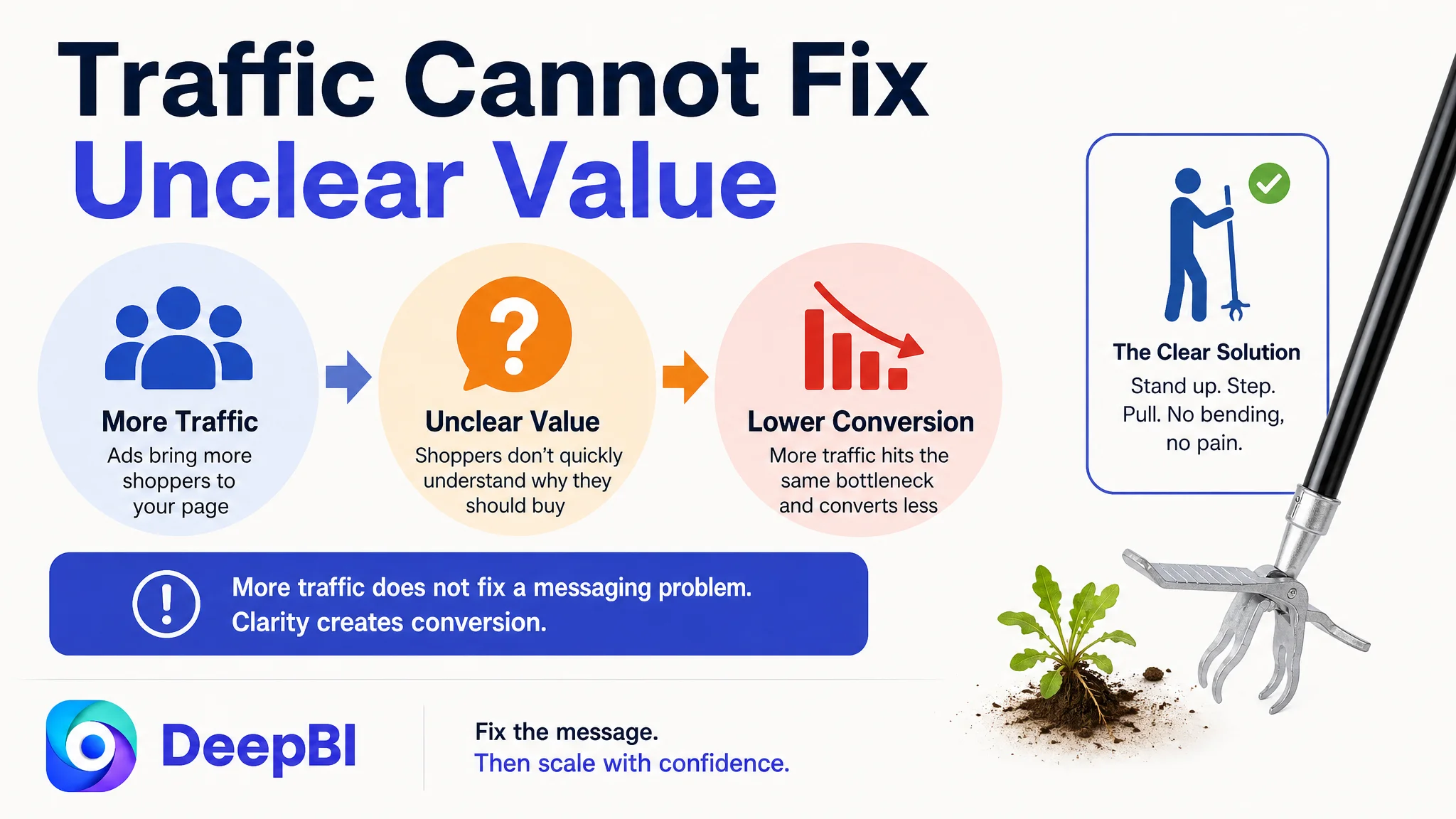
If paid traffic is sent to a page that does not establish relevance and trust quickly, advertising can expose the weakness at greater scale. More impressions may produce more clicks that fail to convert. More clicks may then increase the cost of learning without correcting the product-page constraint.
That is why the first decision was not to add more promotional pressure to the Listing.
It was to repair the page’s conversion capacity.
The priority order was:
1. Make the upright, back-friendly use case visible
2. Clarify the product’s durability and root-removal mechanism
3. Simplify the operating story
4. Reorder A+ content around pain point, proof, and suitability
5. Set expectations around soil conditions
6. Then evaluate how paid and organic traffic respond
This order reduces the risk of amplifying a low-conversion page.
Advertising can bring a shopper to the product page. It cannot decide for the shopper whether the product looks relevant, credible, and usable.
The real shift was from asset improvement to decision improvement
The most important change in this Amazon case was not a single rewritten bullet or a new image concept.
It was the change in the team’s understanding of what the Listing was supposed to do.
The page did not need more disconnected explanations. It needed a unified sales logic:
Physical pain point → upright solution → strong mechanism → simple operation → root-removal result → suitable-use confirmation
That logic could then be carried consistently across every major page element.
- The title identifies the product and its core benefit
- The main image creates a reason to stop and click
- The bullets build confidence in sequence
- The A+ content resolves practical and rational objections
- The review context is addressed through clearer expectation-setting
- The advertising traffic arrives at a page better prepared to convert it
Because the case material does not include post-optimization CVR, ACOS, organic-order, or keyword-ranking results, the outcome should not be overstated as a confirmed numerical improvement.
What can be stated clearly is the operating change: the Listing moved from specification-heavy presentation toward a more focused conversion structure, with less risk that ads would continue directing shoppers into an unclear or weakly prioritized buying experience.
The lesson for Amazon sellers
When an Amazon Listing contains many images, detailed specifications, and complete usage instructions, it is easy to assume the conversion problem must be elsewhere.
Perhaps the bids are wrong. Perhaps the keywords are not precise enough. Perhaps the campaign structure needs another round of adjustment.
But the more important question is often earlier in the funnel:
Does the product page make the product’s value obvious before the shopper has to work to understand it?
In this garden tool case, the answer was not strong enough. The page showed the product, but it did not consistently lead with the reason the product mattered. It explained operation before fully establishing the problem being solved. It presented specifications without always converting them into user benefits. And it carried a review disadvantage that made trust even more important.
DeepBI’s role was to connect those signals into one business judgment.
The key conclusion was not “change the main image” or “rewrite the bullets.”
It was this:
Before an Amazon seller scales ads, the Listing must prove that it can convert the traffic it is asking Amazon to deliver.