

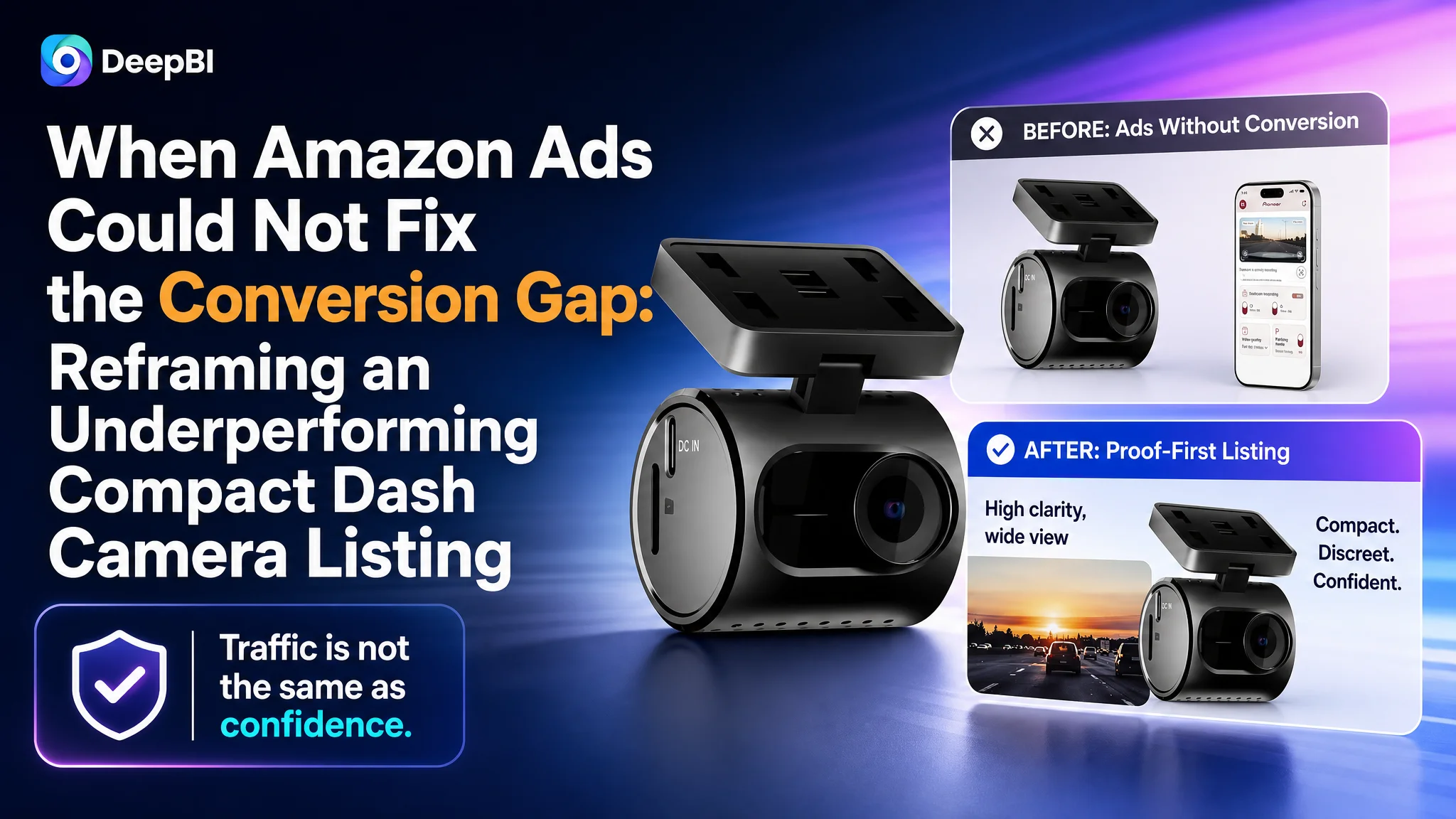
The customer was an Amazon seller in automotive accessories, operating a US marketplace Listing for a compact 1.5K front dash camera. The product had relevant features, including a discreet design, built-in Wi-Fi, app control, impact detection, loop recording, and a 64GB memory card. Yet its product page remained noticeably weaker than a comparable high-performing Amazon Listing.
The initial direction was easy to understand: strengthen the title, add more technical specifications, and make the feature set more competitive. But the deeper issue was not a shortage of information. DeepBI found that the page was not turning its information into enough confidence. The title lacked a strong value hierarchy, the images described capabilities without proving them, and the A+ content stopped before answering important purchase questions.
That changed the optimization priority. Instead of treating the Listing as a collection of keywords, icons, and product views, the team needed to rebuild the sales logic around immediate usability, visual evidence, installation simplicity, storage transparency, and risk reduction. For other Amazon sellers, the case offers a practical reminder: before scaling Amazon ads or rewriting isolated modules, determine whether the product page is ready to convert the traffic it receives.
The Amazon Listing Was Not Missing Features. It Was Losing the Buying Decision.
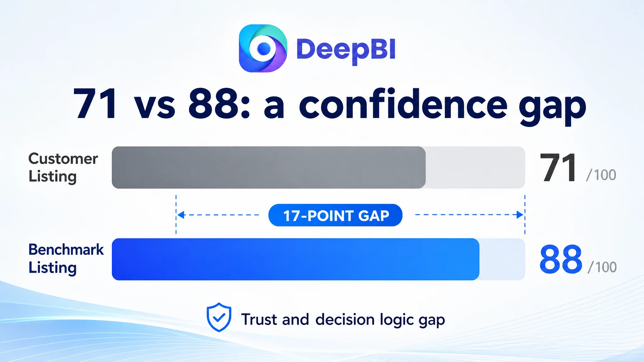
The customer’s Listing received an overall score of 71 out of 100, while the comparable benchmark Listing scored 88.
That 17-point gap was not concentrated in one cosmetic detail. It appeared across the parts of an Amazon product page that guide a buyer from search to confidence:
- Title: Customer Listing: 15/20, Benchmark Listing: 18/20
- Main image: Customer Listing: 25/30, Benchmark Listing: 26/30
- Bullet points: Customer Listing: 6/10, Benchmark Listing: 8/10
- Detail page and A+ content: Customer Listing: 19/25, Benchmark Listing: 23/25
- Reviews: Customer Listing: 6/15, Benchmark Listing: 13/15
- Total: Customer Listing: 71/100, Benchmark Listing: 88/100
The score did not mean that the product was fundamentally uncompetitive. It showed something more commercially important: the Listing was leaving too much of the product’s value for the buyer to infer.
That distinction matters in Amazon operations. A product may have the right functions, but if the title does not establish the strongest reason to click, the images do not demonstrate the result, and the A+ content does not remove purchase concerns, paid traffic can arrive at a page that is still difficult to buy from.
The real gap was not simply product capability. It was the Listing’s ability to convert capability into confidence.
The Original Diagnosis Focused on More Detail
The customer’s first optimization direction was not unreasonable. The title already placed “Compact Dash Camera” near the front and included specifications such as 1.5K resolution and a 120-degree viewing angle. The page also mentioned Wi-Fi, app control, loop recording, impact detection, and other relevant functions.
The natural response was to improve keyword coverage and make the technical information more competitive.
The benchmark Listing, however, used its information differently. It led with strong performance language, such as 4K, front-and-rear recording, and a specific sensor. It also included concrete numbers related to download speed, viewing angle, and parking mode. Its title created a clear hierarchy:
- What the product is
- What major result it delivers
- Which technical specifications support that result
- Which use cases and accessories reduce hesitation
The customer’s title was more like a feature inventory. It communicated the product category, but its selling points were not organized around a strong purchase reason.
The same pattern appeared in the bullet points. The customer began with the compact form factor, while the benchmark began with resolution, front-and-rear coverage, and sensor performance. That does not mean compactness was unimportant. It means the page opened with a softer benefit before establishing the strongest functional reason to choose the product.
The initial diagnosis therefore treated the problem as a matter of adding or rearranging information.
DeepBI reframed it as a decision-sequence problem.
DeepBI Found a Trust Gap Across the Listing
DeepBI’s diagnosis compared the customer Listing with a closely matched benchmark across title structure, image purpose, bullet-point logic, A+ content, and review strength. The result was not a recommendation to copy the competitor’s specifications. It was a clearer view of where the customer page was asking the buyer to do too much work.
The title contained keywords, but not enough buying force
The customer title included the product category and core specifications, but several high-value ideas were either weakly expressed or missing:
- Storage was not prominent enough
- The companion app was described broadly
- The title did not create a strong “ready to use” impression
- The benefits of the compact design were not immediately clear
- The structure leaned toward feature listing rather than value hierarchy
The recommended direction was to bring the product identity, 1.5K resolution, compact design, Wi-Fi, app control, and USB-C installation into a more readable structure.
The purpose was not to make the title longer. It was to make the first several words do more commercial work on Amazon search results, especially on mobile screens.
The main images explained instead of proving
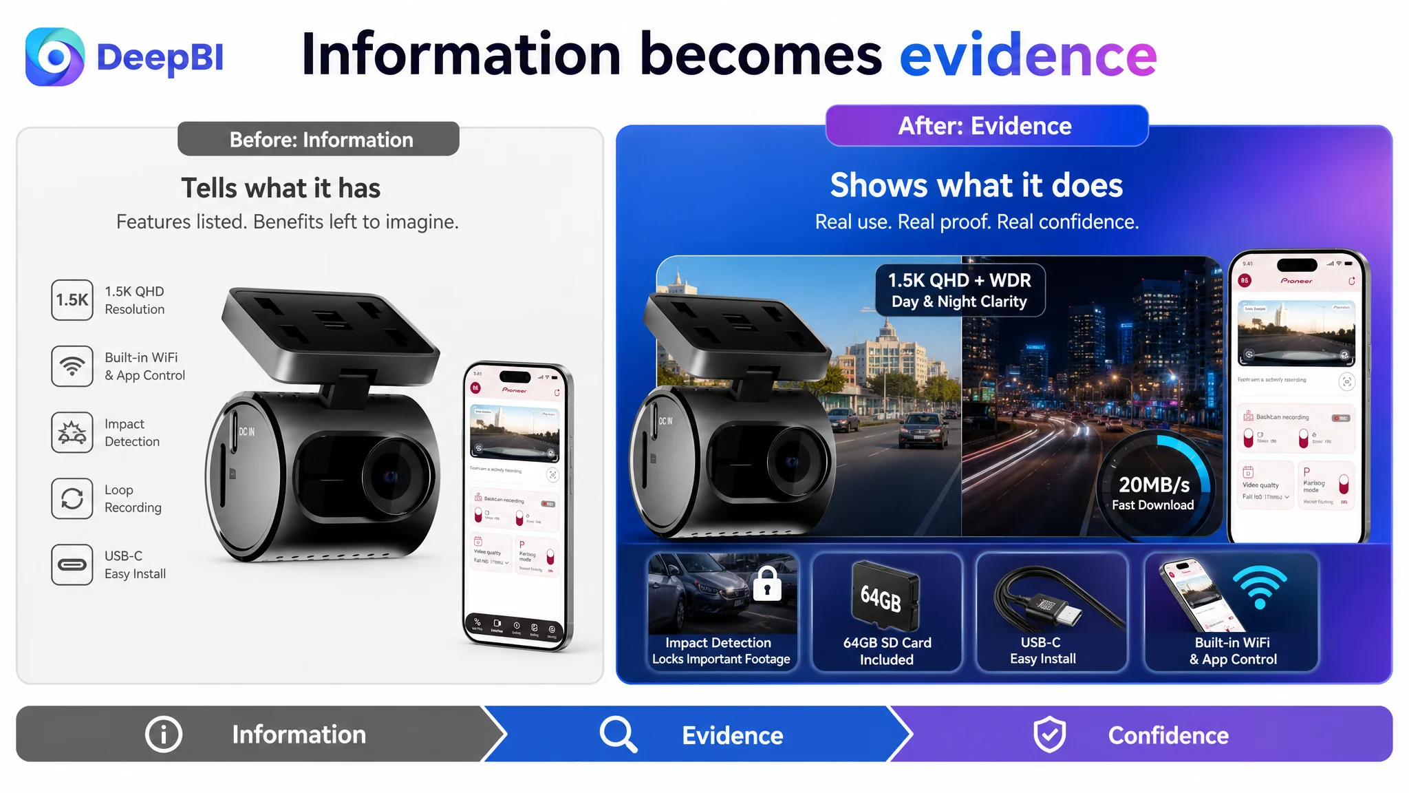
The customer’s image set relied heavily on text, icons, and generic product presentation. It showed what the camera had, but it did not consistently show why those features mattered in real driving situations.
Several useful product advantages were available but underused:
- The low-profile design behind the rearview mirror
- The included 64GB memory card
- The 1.5K recording quality
- WDR performance in bright and low-light conditions
- App-based playback and downloads
- Automatic preservation of important footage
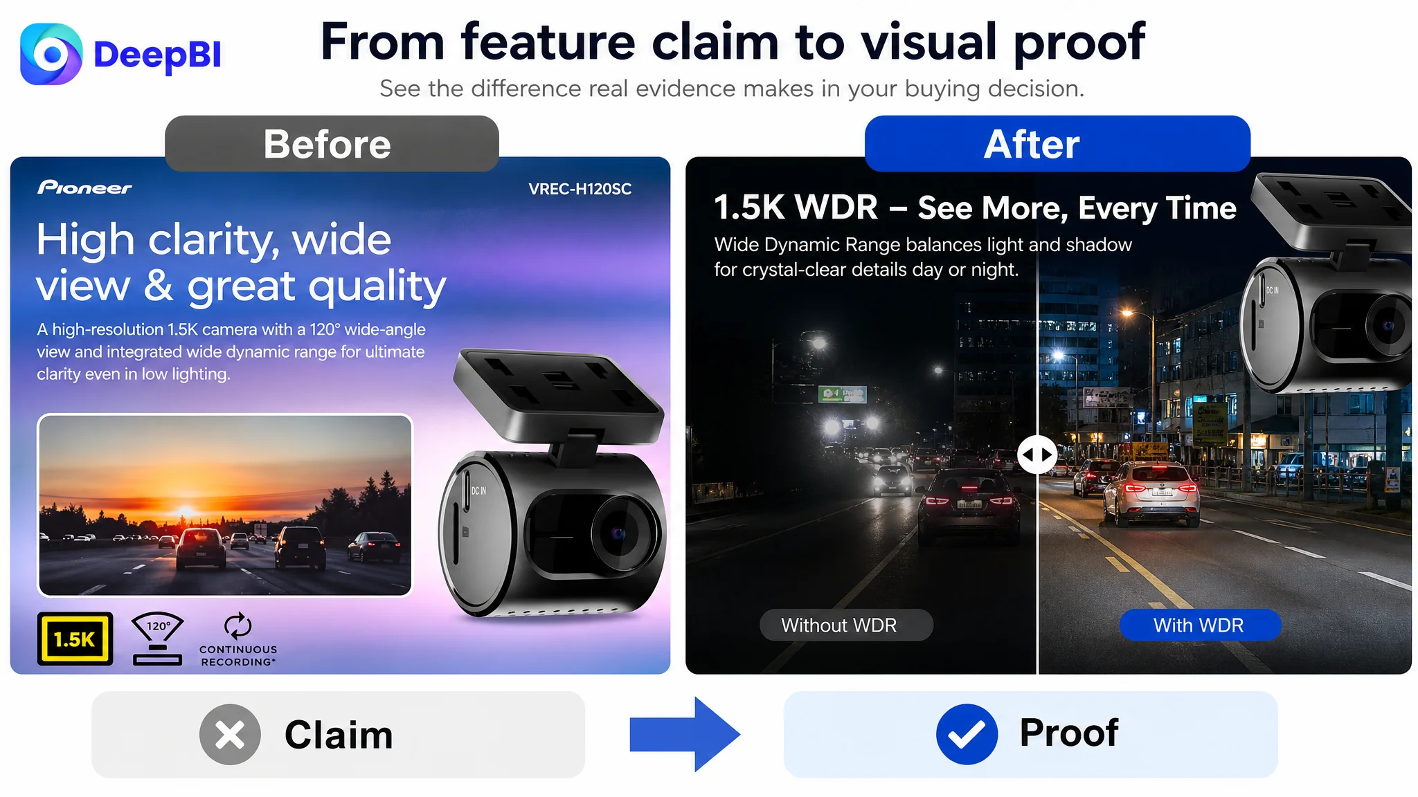
A generic landscape image cannot fully prove dash camera clarity. A feature icon cannot fully answer whether a buyer will be able to review evidence easily after an incident.
The revised visual logic therefore moved toward evidence:
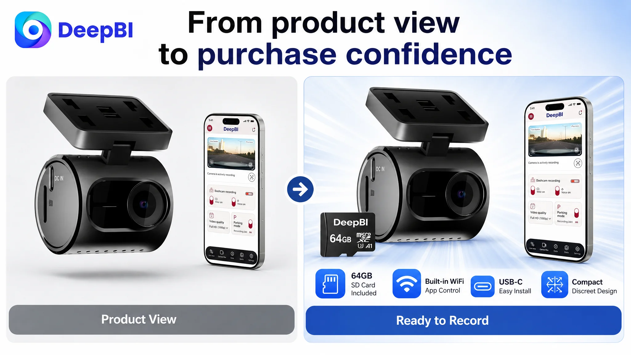
- Show the camera as a complete, immediately usable kit
- Show how discreetly it fits into a vehicle
- Use realistic light-condition comparisons to demonstrate image quality
- Present the app as a practical way to view and download footage
- Make continuous recording and impact protection easier to understand
This is a meaningful shift in Amazon Listing optimization. The objective is not to make every image more decorative. It is to give each image a specific role in the buyer’s decision.
The bullet points listed specifications without forming a persuasive path
The customer’s bullets covered the product’s functions, but the sequence did not consistently follow the buyer’s concerns.
A stronger structure would connect:
Product benefit → supporting specification → user concern resolved
For this Listing, that meant:
- Compact and discreet design → low-profile swivel form → does not obstruct the driver’s view
- 1.5K and WDR → clearer footage in bright and low-light conditions → more useful evidence
- Built-in Wi-Fi and the Ai-Sense app → live view, playback, and downloads without removing the card → less transfer friction
- Loop recording and the 64GB card → automatic overwriting and included storage → ready to use out of the box
- Impact detection → critical clips locked against overwriting → easier incident and insurance review
The change was not merely stylistic. It gave each bullet a job in the conversion process.
The Biggest Weakness Was Not the Main Image Alone
The score gap in the main image was relatively small: 25 compared with 26. That could easily lead a team to focus on the image first and assume the rest of the page was close enough.
DeepBI’s broader diagnosis showed why that would have been incomplete.
The larger gaps appeared in:
- Reviews: 6 versus 13
- A+ and detail content: 19 versus 23
- Bullet points: 6 versus 8
- Title: 15 versus 18
The page was not being held back by one unattractive image. It was being held back by a connected trust problem.
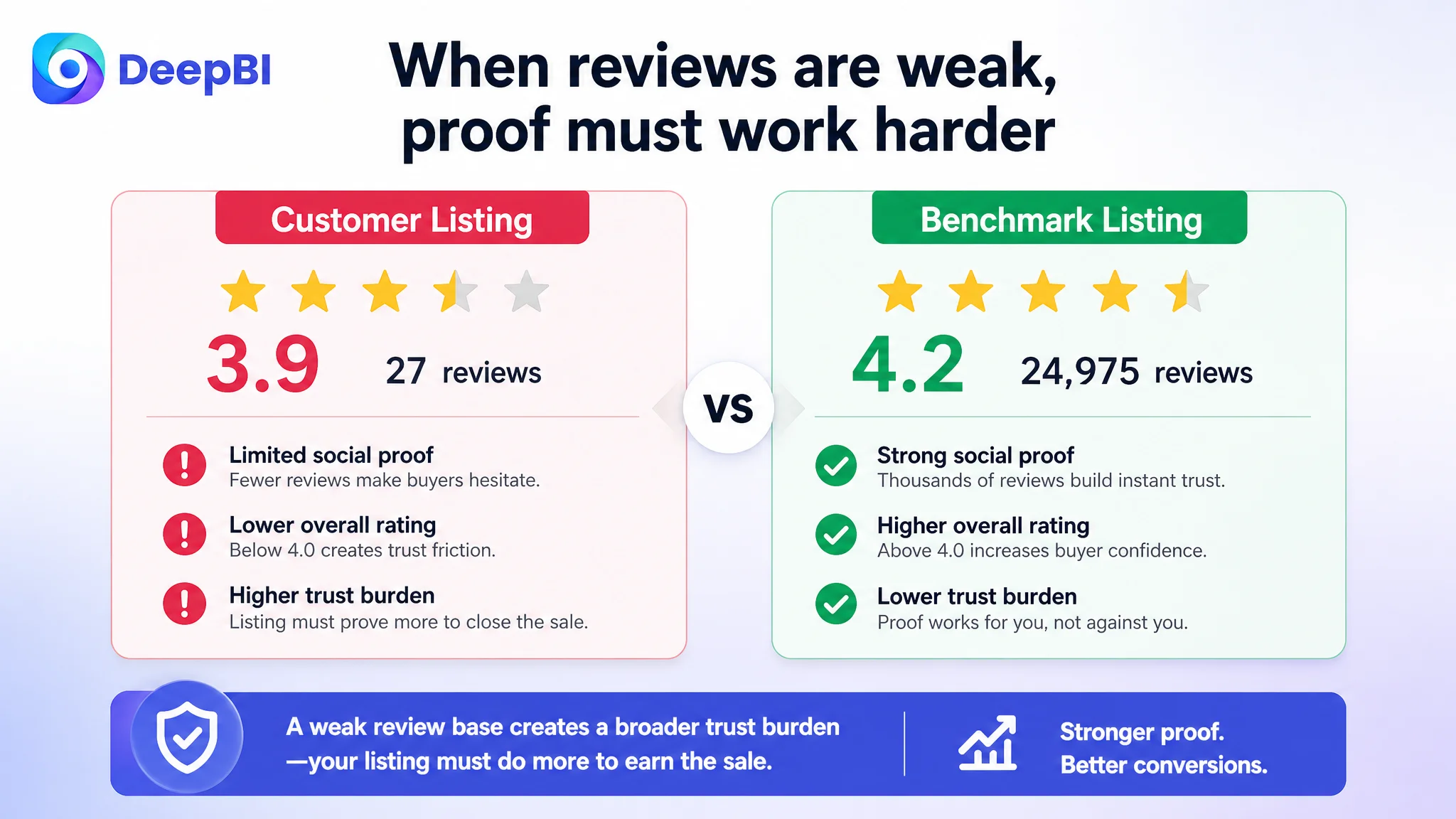
The review profile made that problem more visible. The customer Listing had:
- A 3.9-star rating
- 27 total reviews
- 10 reviews visible on the first page
- Three one-star reviews and one three-star review among the visible reviews
The benchmark had:
- A 4.2-star rating
- 24,975 total reviews
- 12 reviews visible on the first page
The difference was not something that title or image edits could erase immediately. It represented a major credibility disadvantage, particularly for a product where buyers care about recording reliability, installation, footage quality, storage, and performance after a collision.
That is why the page needed more than stronger claims. It needed clearer evidence and more transparent expectations.
When review strength is limited, the rest of the Listing has to work harder to make the product feel understandable, complete, and dependable.
The A+ Content Stopped Before the Buyer’s Remaining Questions
The customer’s A+ content covered several relevant topics:
- Brand and product positioning
- Core selling points
- Resolution and night vision
- G-Sensor protection
- App control
- Product-line comparison
But the sequence moved too quickly from feature explanation to comparison. It did not fully address the practical questions that remain after a shopper already understands the basic product.
The benchmark Listing used more modules to reduce uncertainty:
- Front and rear recording scenarios
- Sensor and night vision performance
- Download and transfer experience
- Loop recording
- Parking monitoring
- G-Sensor protection
- Package contents
- Installation guidance
- Weather and durability context
- External media references
The customer did not need to reproduce those modules exactly. The important lesson was that the page needed to answer more of the buyer’s final questions.
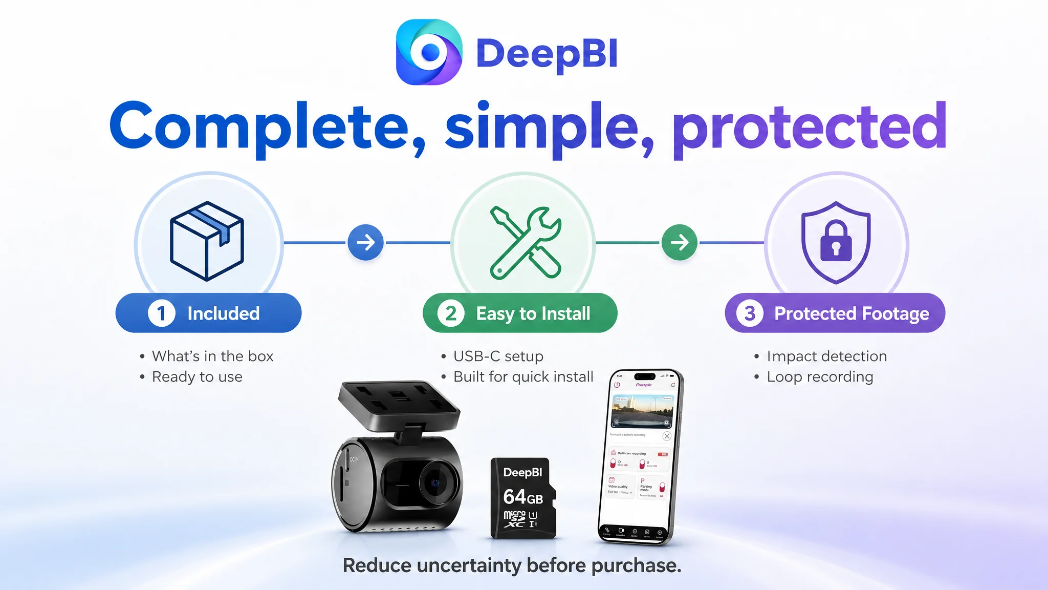
What is actually included?
The 64GB memory card was a meaningful value point, but it was not given enough visual prominence. A buyer should be able to understand that the camera can be used immediately after unboxing.
How much footage can the storage hold?
A 64GB card is more useful when the page explains its recording logic and approximate usable footage time under the product’s actual recording settings. This is a transparency issue, not just a storage feature.
What is needed for parking monitoring?
If a hardwire kit or other accessory is required for a parking mode, the page should state that clearly before purchase. Proactive disclosure reduces confusion and protects trust.
Is installation genuinely simple?
“USB-C easy install” is a claim. A short visual installation sequence is evidence. Showing cable routing, mounting position, and the discreet fit behind the mirror would lower the technical barrier more effectively than another paragraph of copy.
What happens after an impact?
The page should connect G-Sensor activation with the user outcome: important clips are locked and protected from being overwritten. That is a more useful explanation than describing the sensor as a standalone function.
Why DeepBI Did Not Recommend Tuning Ads First
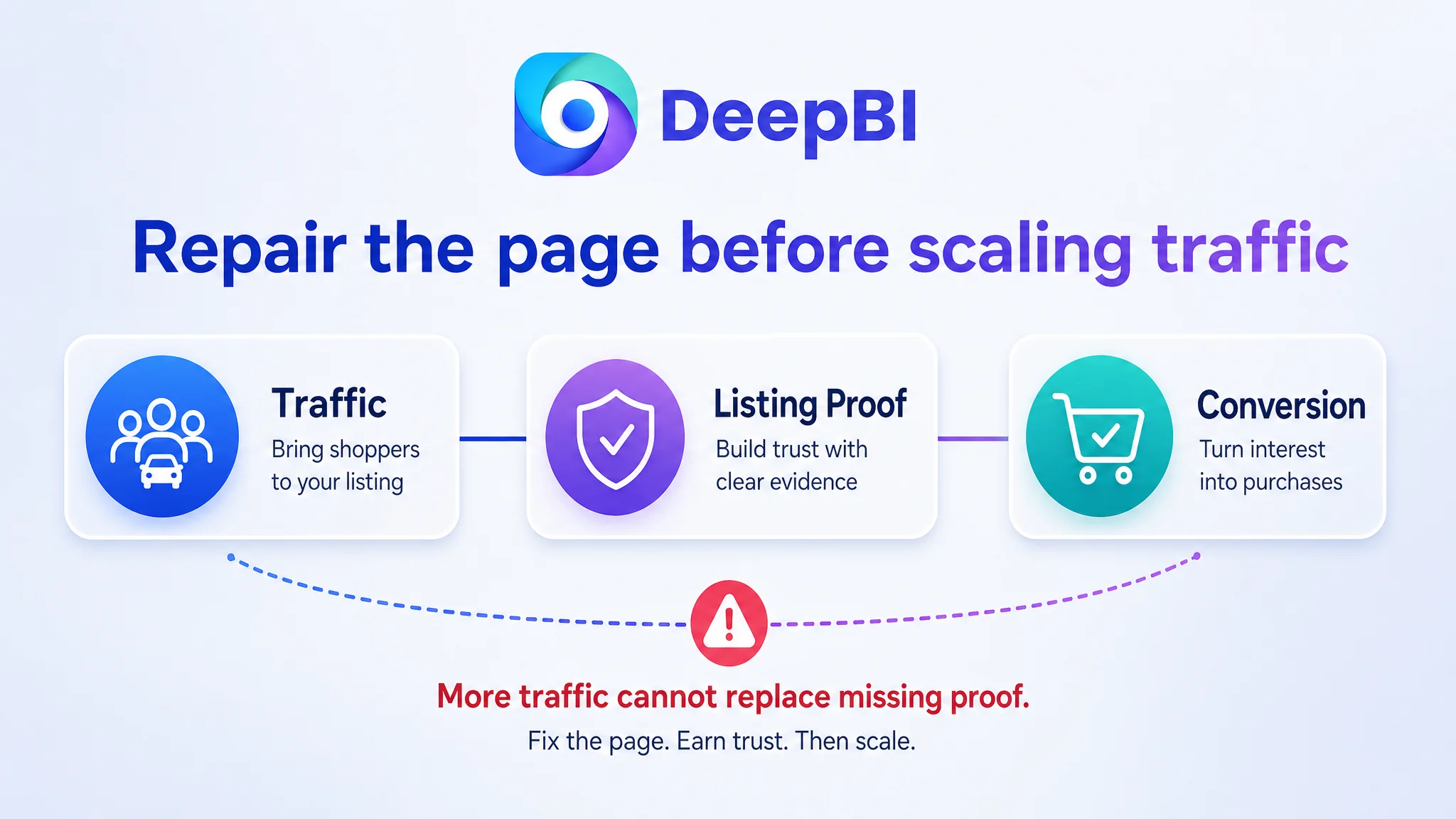
The case did not support treating Amazon advertising as the only source of the problem. The Listing already had enough traffic-facing elements to attract relevant shoppers, but its page content was not consistently completing the conversion argument.
That creates a dangerous operating pattern.
If a seller responds by pushing bids, expanding keywords, or increasing campaign volume before repairing the product page, advertising may amplify the page’s existing weaknesses:
- More shoppers arrive but remain uncertain
- More clicks produce limited conversion
- ACOS becomes harder to control
- The team blames keyword quality or campaign structure
- Additional ad adjustments create more noise without resolving the page-level constraint
This is why Listing conversion capacity had to be addressed first.
The business risk was not merely wasted ad spend. It was the possibility of interpreting a weak product-page response as evidence that the market did not want the product, when the deeper issue was that the page had not presented the product convincingly enough.
The correct decision order was:
1. Clarify the Listing’s competitive gap
2. Repair the page’s trust and decision logic
3. Make the product’s actual benefits easier to verify
4. Then evaluate whether paid traffic is being converted more effectively
Advertising can bring a shopper to the page. It cannot make an unclear value proposition, incomplete installation guidance, or weak evidence disappear.
The Optimization Direction Shifted From Features to Proof
The revised strategy focused on making each Listing element answer a specific buyer concern.
A more decisive title structure
The title should establish the product category, primary performance level, compact form, and practical usability early. The goal is not to imitate the benchmark’s 4K positioning. The product should remain factually grounded in its own 1.5K front-camera capability.
A clearer structure would emphasize:
- Compact 1.5K front dash camera
- Discreet design
- Impact detection
- 120-degree coverage
- Built-in Wi-Fi and app control
- USB-C installation
This gives both Amazon search and human readers a more coherent first impression.
A main-image sequence with a job at every stage
The image strategy should move from passive information to visual proof:
- Immediate usability: camera, 64GB card, and included accessories shown as a complete kit
- Discreet installation: low-profile form shown behind the rearview mirror
- Recording evidence: realistic bright-to-dark or low-light comparison
- App convenience: playback and download path shown without requiring cable or card removal
- Protection logic: loop recording and impact detection presented as a system that preserves important footage
The product itself must remain accurate. The goal is to improve context, hierarchy, and evidence without changing its physical design or inventing capabilities.
Bullet points that follow the buyer’s questions
The revised bullets should not begin with whichever feature is easiest to describe. They should begin with the concerns most likely to influence the purchase:
- Will it obstruct my view?
- Will the footage be clear enough?
- Can I access clips easily?
- Can I use it immediately?
- Will important footage be overwritten?
That sequence makes the copy more useful without adding unsupported specifications.
A+ content that completes the decision
The A+ page should add the missing proof points rather than repeat the bullets:
- Model identity and compact design
- Visual 1.5K and WDR evidence
- Loop recording and storage logic
- Clear parking-mode accessory disclosure
- Wi-Fi and app workflow
- What is included in the box
- USB-C installation steps
- A practical explanation of impact detection
The existing model-comparison module should be moved later or replaced with installation and completeness proof. At this stage, the buyer’s concern is not which other camera to purchase. It is whether this camera is complete, understandable, and easy to use.
What Changed in the Business Understanding
The case material does not provide confirmed post-optimization CVR, ACOS, CTR, or organic-order results. Those outcomes should not be invented.
What can be stated clearly is that the operating diagnosis changed.
The customer no longer had to view the Listing as a page that merely needed more keywords or more technical detail. It became a page with a specific conversion constraint: its sales logic was weaker than its product capability.
That change in understanding affects later decisions:
- Amazon ads should not be used to compensate for an unclear product page
- Title optimization should establish a hierarchy, not create a longer feature list
- Main images should demonstrate outcomes and use cases, not only display the device
- Bullet points should connect specifications to buyer concerns
- A+ content should reduce installation, storage, and completeness anxiety
- Review weakness should be treated as a trust risk that the page must acknowledge and offset with better evidence
- Before increasing ad traffic, the team should determine whether the Listing deserves more traffic
For the compact dash camera, the most important correction was therefore not a single rewritten sentence or a new image style. It was the decision to repair the page’s ability to persuade before asking advertising to work harder.
The Lesson for Amazon Sellers
Many Amazon sellers diagnose underperformance at the level of the metric: low CVR, high ACOS, weak click-through, or insufficient order volume.
Those metrics matter, but they do not always identify the constraint.
Sometimes the real problem is that:
- The title does not make the product’s strongest reason to choose it clear
- The images show features without proving results
- The bullet points contain information without a buying sequence
- The A+ page does not answer practical objections
- The review base is too weak to carry trust by itself
- Advertising is sending more shoppers into a page that has not earned their confidence
DeepBI’s role in this case was not to produce a longer feature list or a more decorative product page. It was to connect competitive evidence with Amazon Listing decision logic, identify the constraint that mattered most, and put the optimization work in the right order.
Before an Amazon seller asks how to bring more traffic, the more important question is whether the product page is ready to convert the traffic it already seeks.