

This case follows an Amazon US seller whose digital fishing scale and fish lip gripper Listing appeared to have a messaging problem. The team had already emphasized search terms, capacity, display functions, dimensions, and operating instructions. The product information was present, but the Amazon product page was still not building enough confidence to turn attention into purchase intent.
The initial direction leaned toward making the product more technically explicit: strengthen keyword placement, explain the scale functions, and clarify how the tool worked. DeepBI’s diagnosis revealed a more important constraint. The Listing was not primarily losing because its specifications were unclear. It was losing because its page-level sales logic was incomplete, especially in the A+ content, bullet points, visual proof, and review foundation.
The later optimization therefore focused on rebuilding the Amazon Listing around the buyer’s decision sequence: show the complete scale-and-gripper solution, make precision and capacity visible, answer concerns about dropping or damaging fish, demonstrate comfort and portability, and use the A+ page to explain why the product deserved to be chosen. Other Amazon sellers can learn from the case that more traffic or more specifications cannot compensate for a product page that has not yet earned trust.
The Amazon Listing Was Not Empty. It Was Under-convincing.
At first glance, the Listing had several credible strengths.
The title placed the core terms “Digital Fishing Weight Scale” and “Fish Lip Gripper” near the front. It also communicated a 100-pound capacity, a 4.6-inch size, multi-unit measurement, and an LCD display. Compared with the benchmark Listing, the product page was not suffering from a complete lack of keyword coverage or basic specification information.
The main image set also showed the product clearly. The page included images explaining the scale, its functions, operation, battery replacement, and tare function.
But those assets were performing more like an instruction manual than a sales system.
The score comparison made the gap visible:
- Title: Customer Listing: 17/20, Benchmark Listing: 15/20, Gap: +2
- Main image: Customer Listing: 24/30, Benchmark Listing: 26/30, Gap: -2
- Bullet points: Customer Listing: 6/10, Benchmark Listing: 9/10, Gap: -3
- A+ and detail content: Customer Listing: 8/25, Benchmark Listing: 24/25, Gap: -16
- Reviews: Customer Listing: 2/15, Benchmark Listing: 14/15, Gap: -12
- Total: Customer Listing: 57/100, Benchmark Listing: 88/100, Gap: -31
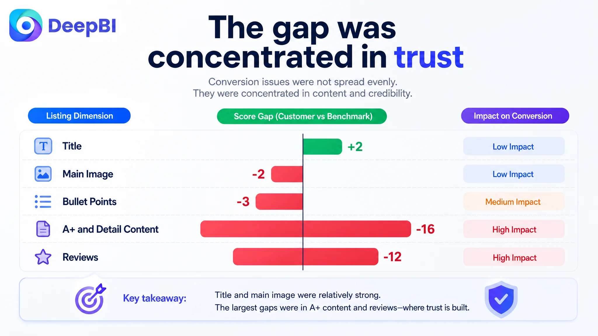
The most important fact was not that the total score was low. It was where the score was being lost.
The Listing was relatively close on title and main-image fundamentals, but severely behind in the content that builds confidence after the click.
That distinction changed the optimization priority.
The Working Assumption Was “Make the Product Information Clearer”
The original Listing direction was understandable.
For a fishing tool, sellers naturally want to communicate:
- Measuring capacity
- Measurement accuracy
- Unit switching
- LCD visibility
- Tare functionality
- Battery operation
- Product dimensions
- Included accessories
These details matter. A serious angler may want to know whether the device can handle a large catch, whether the reading is precise, and whether it can be carried easily.
The problem was not the presence of these details. The problem was their position in the buying logic.
The title and bullet points were doing much of the work at the specification level. The A+ content continued in the same direction, with specification graphics, function callouts, operating instructions, and battery replacement information.
This created a page that explained how the product worked, but did not sufficiently answer:
- Why should an angler trust this tool in a wet environment?
- Why is the combination of a digital scale and fish gripper more useful than a basic gripper?
- How does the product make handling a fish easier?
- What happens if the gripper is dropped in water?
- How does the design support safe catch-and-release handling?
- What makes the tool comfortable during extended use?
- Why should a buyer choose this product rather than a comparable fishing tool?
The original optimization instinct was therefore aimed at clarity and search relevance. DeepBI found that the larger commercial issue was conversion capacity after the click.
The product page did not lack information. It lacked a persuasive order for that information.
A 31-Point Gap Revealed the Real Constraint
DeepBI’s diagnosis did not treat the Listing score as a single verdict. It examined which parts of the customer’s page were failing to carry their share of the conversion process.
The title was actually two points ahead of the benchmark. It led with the core product terms and communicated concrete figures such as 100 pounds and 4.6 inches. It also identified the intended audience through fishing and angler language.
The main-image score was only two points behind. There was room to improve the first impression, especially by making the complete product set and its functional advantage more immediately visible. But this was not the largest leak.
The bullet points were three points behind because they were structured mainly as feature and parameter descriptions. The benchmark Listing, by contrast, opened with problems that anglers recognize: corrosion, wrist fatigue, slippery handling, and the need for safer fish control.
The decisive gap appeared in the A+ and detail content: 8 points versus 24.
That difference was not a cosmetic issue. It showed that the page had not yet developed the visual and narrative layers needed to convert a considered purchase.
The review gap reinforced the same conclusion. The customer Listing had no effective review history on the first page and no review count to support trust. The benchmark had 29 reviews, a 4.9-star average, several visible reviews, and Verified Purchase signals.
The result was a trust structure in which the customer page had to persuade almost entirely through its own content, while the benchmark could rely on both content and accumulated customer evidence.
The Missing Piece Was Not Another Specification
The customer’s existing A+ structure covered:
- Specification graphics
- Function callouts
- Operating instructions
- Battery replacement
These modules were rational, but they arrived too early and asked too much of the shopper.
Before a buyer studies battery replacement or unit switching, the page needs to establish that the product is complete, durable enough for its use case, safe to handle, and worth considering.
The benchmark Listing used a broader conversion path:
- Brand and product presentation
- Real fishing scenarios
- One-hand operation
- Structural details
- Grip and handling experience
- Real-person usage
- Gift positioning
This did not simply make the competitor’s page more attractive. It gave shoppers more reasons to believe the product would work in real conditions.
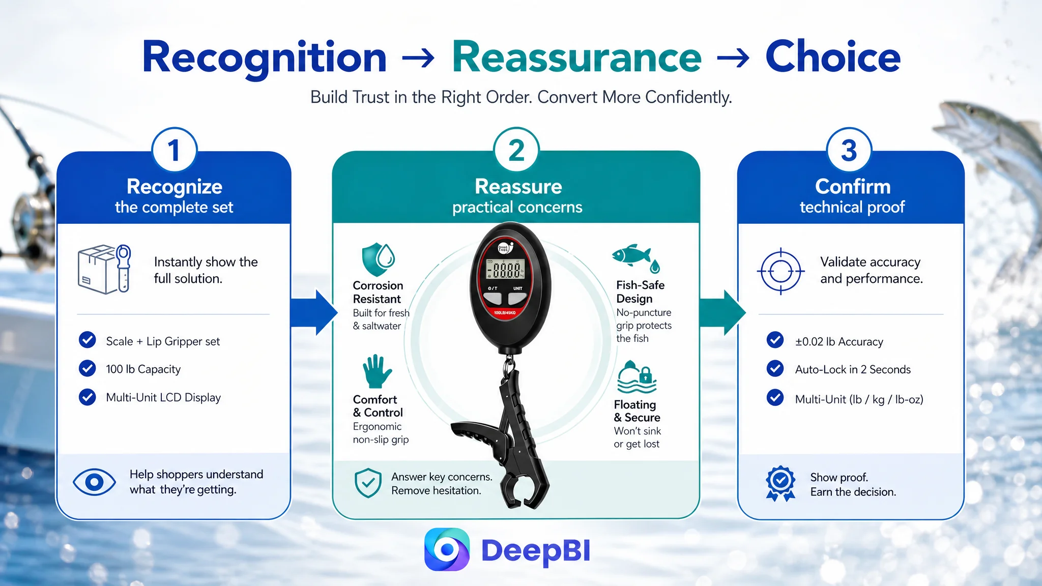
The customer’s A+ content stayed close to operation. The benchmark moved through recognition, relevance, reassurance, and choice.
The product set needed to be understood as a complete solution
The Listing was centered heavily on the fish scale. The fish lip gripper, however, was an important part of the product’s value and needed a clearer role.
If shoppers did not immediately understand that the set included both a digital fishing scale and a fish lip gripper, they could question what they were actually buying. If the gripper received little explanation, they could also wonder about durability, fish-mouth protection, or the risk of losing it in water.
The first content layer therefore needed to establish the complete set and its practical purpose, rather than beginning with dense technical information.
The page needed to answer the product’s highest-risk concerns
For this product category, the strongest concerns were not limited to measurement accuracy.
They also included:
- Whether the gripper is comfortable to hold
- Whether it remains secure in wet conditions
- Whether it can be dropped and lost in water
- Whether it harms the fish’s mouth
- Whether it is compact enough to carry
- Whether the scale can handle larger catches
- Whether the product feels dependable during actual fishing
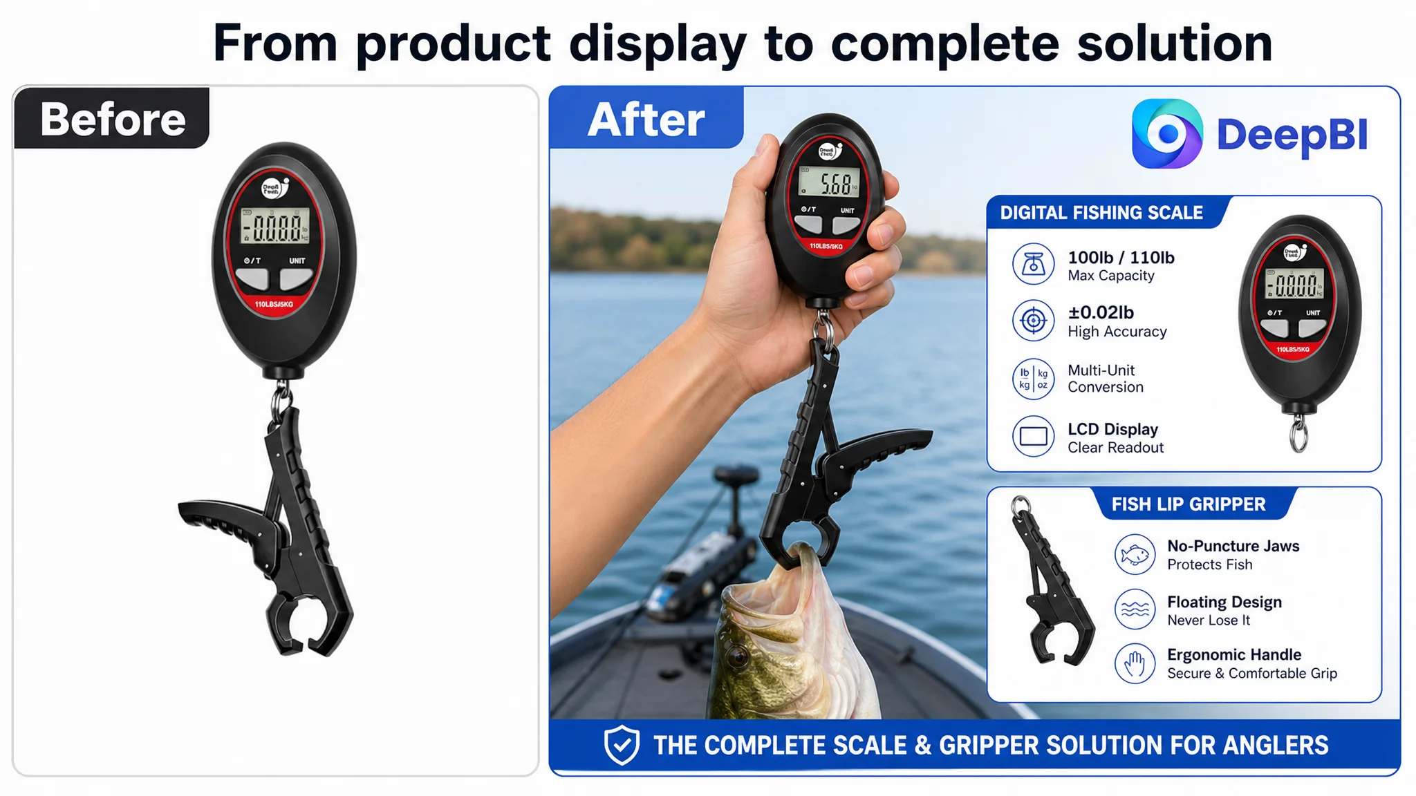
The proposed direction used the product’s supported attributes to answer those concerns: an ergonomic ABS body, a floating 4.6-inch gripper, a no-puncture jaw, a 100-pound capacity, multi-unit switching, and automatic weight lock.
These were not random selling points. They were selected because they connected product facts to recognizable fishing situations.
The Main Image Needed to Create a Reason to Click
The first image already communicated the product, but it did not make the complete solution feel sufficiently distinctive.
For a combination fishing tool, recognition alone is not enough. The shopper needs to understand quickly that the product offers more than a basic analog gripper or a standalone scale.
The recommended visual sequence therefore shifted from repeated function explanations toward a more deliberate decision path.
The first image: show the complete value
The opening image should make the combination of the digital fishing scale and fish lip gripper unmistakable. The goal is not to add visual noise, but to make the full set feel complete, professional, and immediately relevant to anglers.
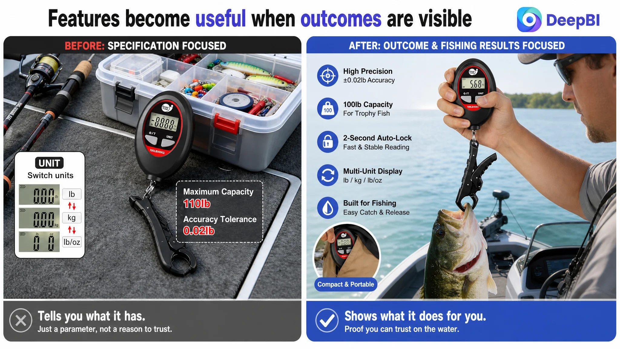
The second image: make the digital advantage visible
The current scenario image had useful context but did not directly prove why the digital combination was preferable.
The new direction was to make the distinction clear:
- Digital precision rather than analog estimation
- Up to 100-pound capacity
- ±0.02-pound precision
- Multi-unit switching
- Relevance to bass and tournament-style fishing
The purpose was not to overload the image with specifications. It was to connect the most valuable specifications to a clear reason for choosing this product.
The third image: connect compactness to comfort
The mini size and oval design were already useful attributes. They simply needed to be connected to the angler’s experience.
A compact tool that fits comfortably in the hand and does not become an unwanted burden during fishing is more persuasive than a product described only as “small.”
The fourth image: introduce the missing fish-handling proof
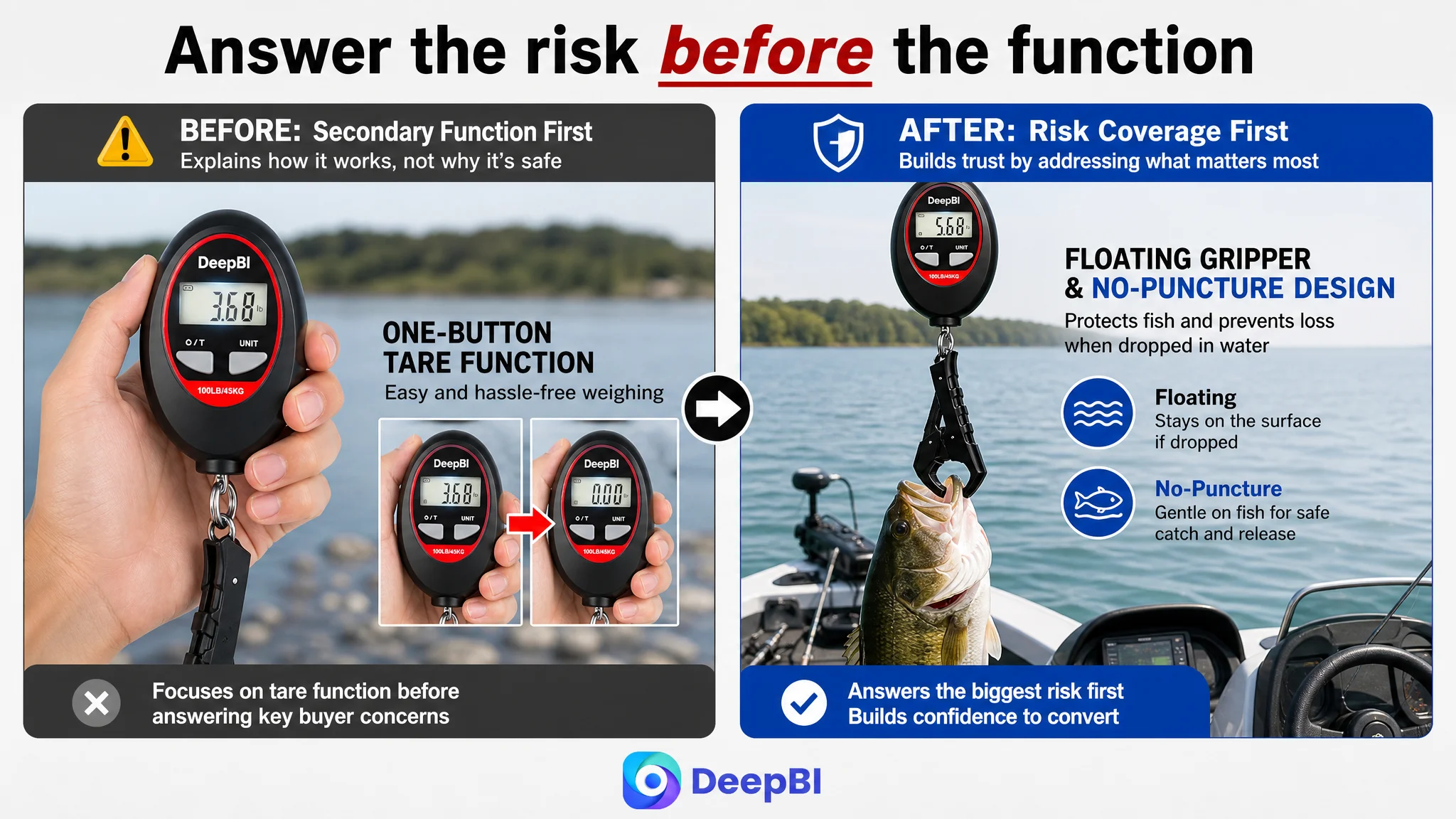
The tare function was useful but had been placed too early in the visual sequence. It explained a secondary operation before the page had addressed the more important trust questions around the gripper.
A new image should instead explain the floating and no-puncture fish gripper, including its role in preventing loss and supporting safer handling.
The fifth image: move secondary functionality later
The tare function and other detailed operational explanations still had a place. They simply did not need to lead the shopper’s decision.
This ordering reflects a central Amazon Listing principle:
A secondary function should not occupy a high-value image slot while a major buyer concern remains unanswered.
The Bullet Points Needed a Buying Logic, Not More Parameters
The six-point gap between the customer’s bullet points and the benchmark was not caused by missing product facts alone. It came from how those facts were organized.
The customer’s bullets leaned toward:
- Accuracy
- Materials
- Power management
- Accessories
- Unit switching
The benchmark used a more persuasive structure:
- Problem
- Product response
- Practical result
- Usage context
- Confidence and reassurance
The revised direction followed the same logic while remaining grounded in the product’s confirmed attributes.
Accuracy became a practical outcome
Rather than presenting capacity and precision as isolated numbers, the first bullet connected them to the act of recording a catch. The 100-pound capacity, ±0.02-pound precision, and two-second auto-lock were positioned as tools for faster, more reliable weighing.
The body design became a fatigue and grip solution
The oval-shaped ABS body and textured surface were reframed around secure handling in wet environments and reduced hand fatigue during boat or shore fishing.
Power management became an outing benefit
Multi-unit switching and automatic shutoff were not presented merely as button functions. They were connected to different measurement preferences and battery conservation during longer trips.
The gripper became part of the product’s professional value
The floating, no-puncture 4.6-inch gripper addressed two concrete concerns: avoiding loss in water and supporting safer fish handling.
The set gained a complete-use and gifting context
The final bullet helped position the combination as a practical tool for both experienced anglers and beginners, while also supporting its role as a fishing gift.
This did not turn the bullets into exaggerated advertising copy. It gave each technical detail a reason to matter.
Why DeepBI Did Not Recommend Tuning the Listing in Isolation
DeepBI’s judgment was not that the title or advertising-related search logic was irrelevant. The title already had strengths, and keyword placement still mattered.
The judgment was about sequence.
If the product page continues to receive attention before its trust and persuasion layers are repaired, additional exposure may only make the weakness more visible. Paid traffic can bring shoppers to the page, but it cannot independently create:
- A clear product identity
- Confidence in the complete set
- Proof of practical use
- A reason to trust the gripper
- Reassurance against loss or damage
- Social validation from reviews
This is why the first priority had to be the Amazon Listing itself.
Advertising can amplify traffic, but it cannot replace the page’s job of converting that traffic.
The customer Listing had a particularly difficult combination: a 31-point competitive gap, a 16-point A+ gap, and no effective review foundation. Under those conditions, continuing to focus first on more technical detail or further traffic generation would leave the primary constraint untouched.
The most important business risk was not merely inefficient traffic. It was allowing more traffic to encounter the same low-confidence product page.
A+ Content Had to Become the Missing Trust Layer
The revised A+ structure was designed to answer buyer questions in a deliberate order.
Establish the product and its completeness
The opening module should clearly present the 100-pound digital fishing scale and the 4.6-inch fish lip gripper as one complete set. It should establish quality and product completeness before introducing dense specifications.
Address the risk of losing the tool
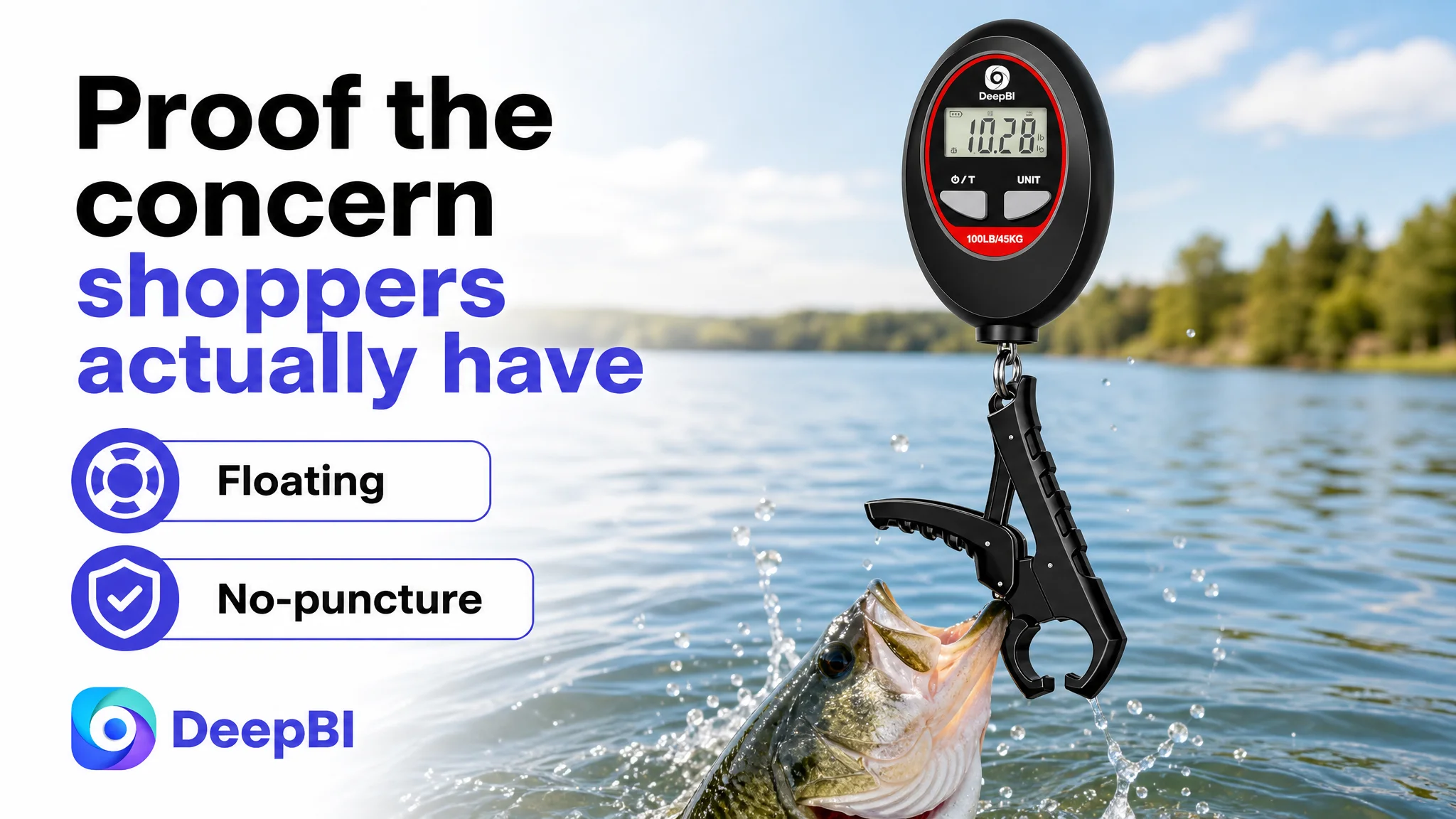
The floating gripper was a high-value differentiator because it answered a real fishing failure scenario: dropping the tool into the water.
This concern deserved a dedicated visual treatment rather than being buried inside a general function panel.
Demonstrate safe and easy handling
The no-puncture gripper needed its own operational proof. A shopper should be able to understand how the gripper supports catch-and-release handling and why the fish’s mouth is not treated as an afterthought.
Confirm the structure and supported functions
Only after the page established relevance and trust should it move into:
- 0.04- to 100-pound measurement range
- ±0.02-pound precision
- Multi-unit switching
- Ergonomic oval-shaped design
- Floating gripper inclusion
Validate accuracy in a practical context
The accuracy claim needed more than a number. Showing how the product locks a weight in two seconds and how it is held vertically during measurement would give the specification a clearer operational meaning.
Show the gripper in a realistic fishing context
A tournament-bass-style visual could help confirm that the gripper is designed for the intended type of use and is not merely a small accessory shown in isolation.
Close with technical reassurance
The final module should provide rational closure for detail-oriented anglers, bringing together the supported technical specifications after the page has already answered the more emotional and practical concerns.
This structure turned A+ content from a manual into a sequence of evidence.
The Review Gap Could Not Be Designed Away
DeepBI also identified a boundary that Listing optimization alone cannot erase.
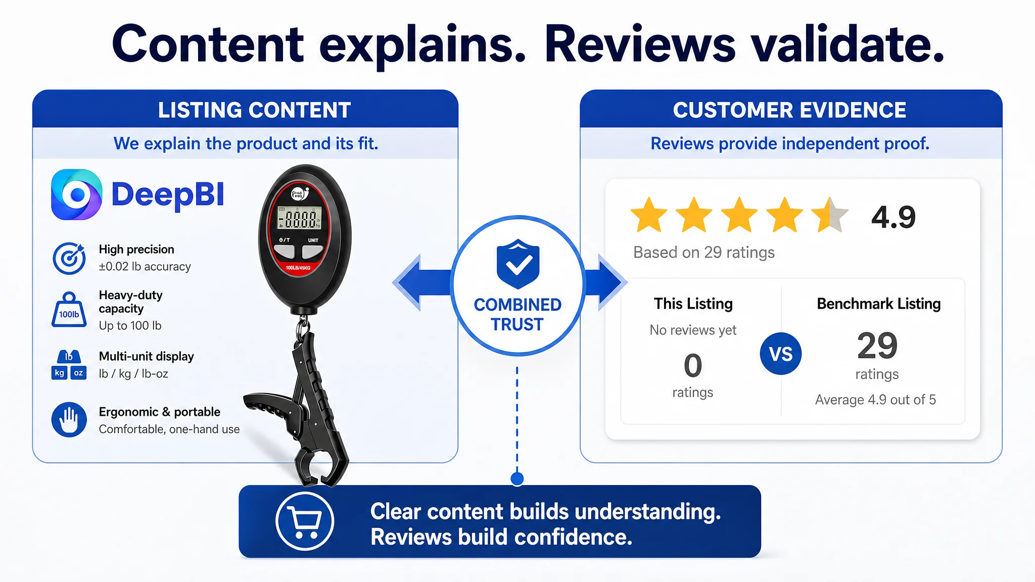
The customer page had zero effective reviews, while the benchmark had 29 reviews and a 4.9-star average, including visible usage feedback and Verified Purchase labels.
Better images and stronger copy can reduce uncertainty, but they cannot substitute for accumulated customer evidence. The review gap therefore had to be treated as a separate business risk rather than hidden inside a creative discussion.
That distinction matters for Amazon sellers. A product page may have strong content and still face conversion pressure when shoppers compare it with a Listing that has a mature review base.
The appropriate response is not to make unsupported claims or imitate competitor reviews. It is to recognize that content quality and review development serve different trust functions:
- Listing content explains what the product is and why it may fit.
- Reviews show how the product has performed for other buyers.
Both are necessary for a new or under-validated Amazon product.
The Real Optimization Was a Change in Decision Order
The case was not ultimately about replacing one title or generating a more polished set of images.
It was about changing the order in which the team evaluated the business problem.
The earlier logic placed emphasis on:
1. Search terms
2. Product specifications
3. Function instructions
4. Basic operational clarity
DeepBI’s reframed logic placed emphasis on:
1. Make the complete solution immediately understandable
2. Establish practical relevance for anglers
3. Address the highest-risk handling concerns
4. Show why the digital scale is meaningfully useful
5. Use bullet points to connect features with fishing outcomes
6. Build A+ content as a trust and proof sequence
7. Continue developing the review foundation
8. Only then judge whether additional traffic and advertising changes can be evaluated fairly
That order protects the seller from confusing traffic activity with business progress.
It also makes later testing more informative. Once the page has a coherent sales logic, changes in CTR, CVR, ACOS, organic-order share, or advertising dependence can be interpreted with greater confidence. Before that point, the team risks attributing page-level conversion failure to bids, keywords, or campaign structure.
What This Amazon Seller Could Learn
The case does not provide verified post-optimization performance data, so it would be inappropriate to claim a specific CVR increase, ACOS decline, or organic-order recovery.
The measurable outcome available here is the diagnosis itself: the team moved from treating the Listing as a specification and search-clarity problem to treating it as a trust and conversion-capacity problem.
That shift changed what needed to happen next.
The Amazon product page had to become capable of converting both paid and organic traffic. Its title could attract relevant searches, but the page also needed to carry shoppers through a sequence of recognition, relevance, confidence, and choice.
The broader lessons are clear:
- A strong title does not compensate for weak A+ content.
- A visible product does not automatically create a reason to click.
- Technical specifications convert better when connected to user outcomes.
- Bullet points should answer buyer concerns, not merely list functions.
- A combination product must explain the value of the complete set.
- Secondary functions should not displace high-risk trust questions.
- Reviews are a separate source of credibility and cannot be replaced by design.
- Advertising should not be asked to solve a product-page conversion problem.
- Before scaling Amazon ads, sellers need to judge whether the Listing deserves more traffic.
The central question was not, “How do we explain this fishing tool more completely?” It was, “Has the Amazon product page given anglers enough reasons to trust and choose it?”
That was the judgment that redirected the case. The page did not need more information piled onto the existing structure. It needed a clearer commercial sequence—one in which the title, main images, bullet points, A+ content, and review foundation worked together to make traffic useful.