

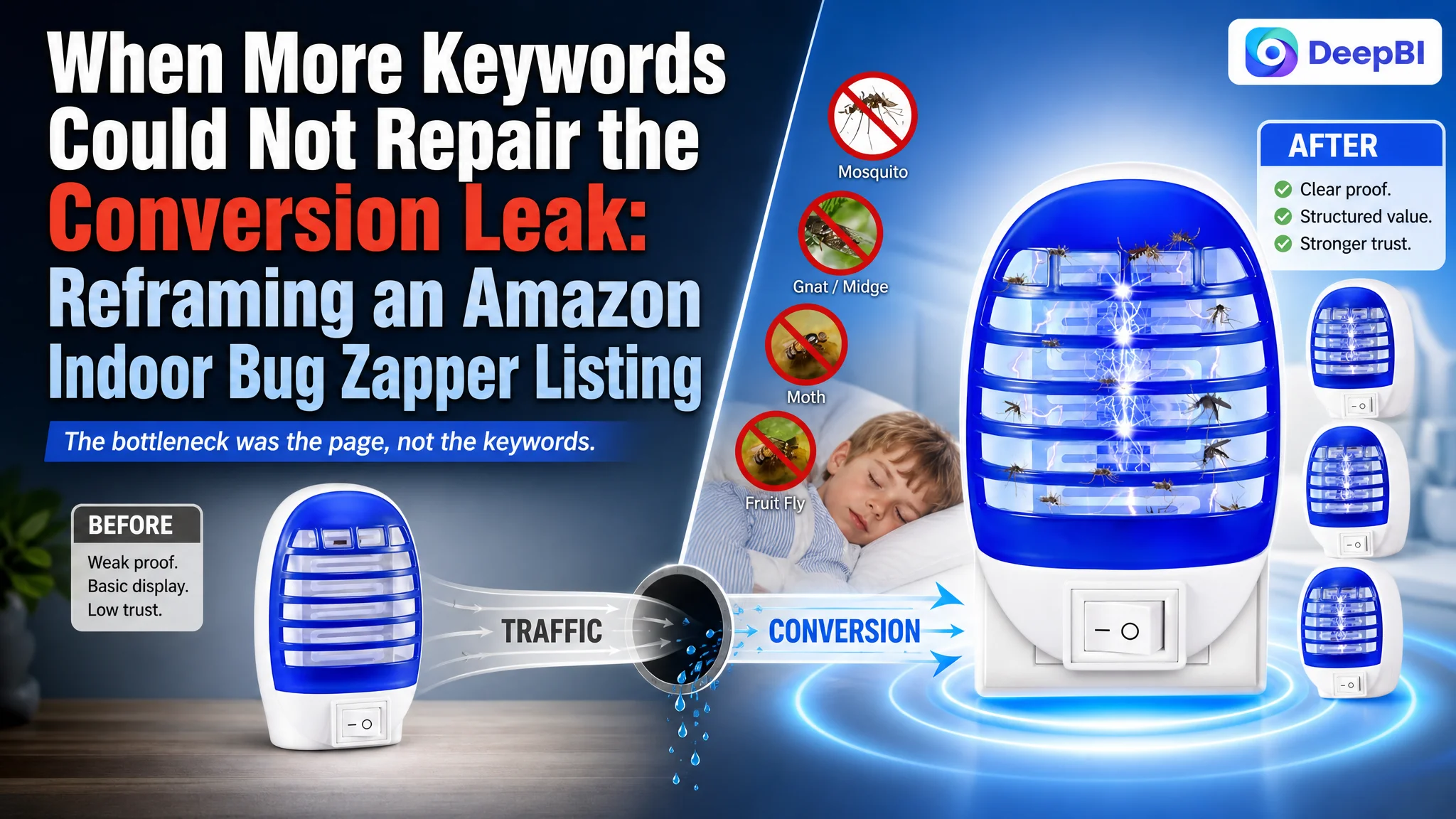
The customer was an Amazon US seller of plug-in indoor bug zappers. The Listing was receiving attention, but its product-page conversion foundation was weak. The initial optimization direction leaned toward keyword coverage, stronger immediate-effect language, and more explicit product benefits—reasonable moves, but not enough to explain why the page remained commercially fragile.
DeepBI’s comparison with a closely matched category-leading Amazon Listing changed the diagnosis. The title was only slightly behind, and the bullet points were not the weakest area. The largest gap was in the product page itself: a 48/100 overall Listing score versus 88/100 for the benchmark, with the detail-page dimension scoring just 1/25.
The later optimization therefore focused less on adding more claims and more on rebuilding the buyer’s decision path. The work centered on visual proof, safety and noise concerns, technical explanation, multi-room use cases, A+ structure, and review-driven trust. For other Amazon sellers, the lesson is clear: before pushing more traffic through Amazon ads, determine whether the product page can convert that traffic.
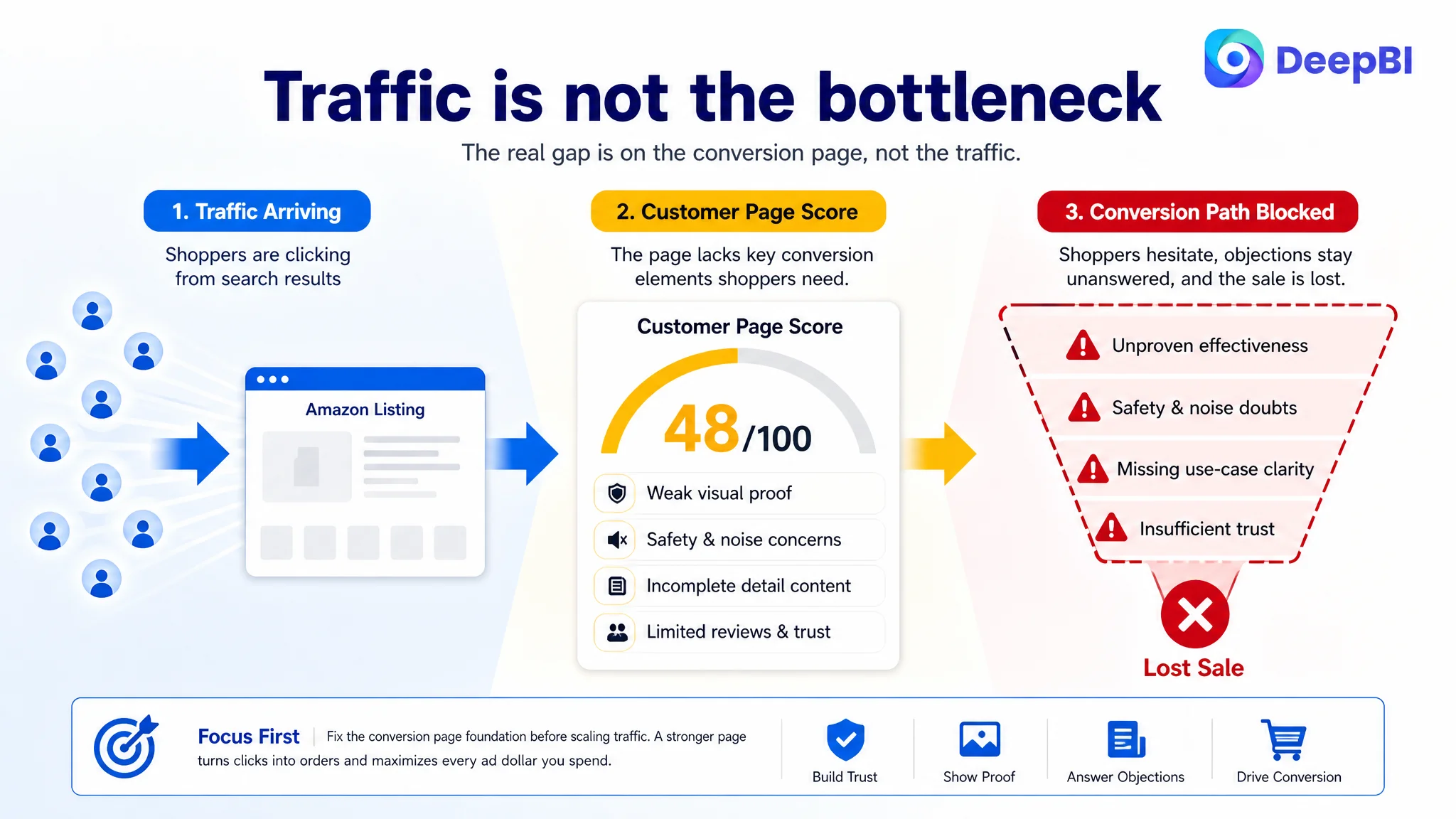
The first signal looked like a traffic problem
Indoor pest-control products compete in a crowded Amazon search environment. A shopper may see several similar plug-in devices in the same results page, often with comparable pack sizes, blue-light visuals, and claims around mosquitoes, gnats, and fruit flies.
In that environment, the seller’s natural response was to look for stronger traffic signals:
- More complete keyword coverage
- Clearer product-form keywords
- Stronger claims around instant or continuous protection
- More use-case terms such as nursery, kitchen, bedroom, office, and plant areas
The title analysis supported part of this direction. The benchmark placed “Baby Safe” near the beginning, specified “365nm Blue Light,” and included the long-tail term “Gnat Killer.” The customer’s title used “Baby Room” as a scene descriptor and mentioned blue light without the specific wavelength.
Those were real gaps. But they were not the main reason the Listing was underpowered.
A keyword gap can limit discovery. A missing sales argument limits what happens after the click.
The distinction mattered because the title score was 15/20, only one point below the benchmark’s 16/20. The bullet-point score was 8/10, even slightly ahead of the benchmark’s 7/10.
The page was not failing because every content element was weak. It was failing because the strongest conversion burden was concentrated in the areas the Listing had not developed: visual proof, structured detail content, and customer trust.
The score exposed where the conversion capacity was being lost
DeepBI’s diagnosis compared the Listing across five dimensions rather than judging the page by overall appearance or isolated keyword density.
- Title: Customer Listing: 15/20, Benchmark Listing: 16/20, Main implication: Some keyword and value-order gaps, but not the primary constraint
- Main image: Customer Listing: 21/30, Benchmark Listing: 26/30, Main implication: The product was visible, but effectiveness was not demonstrated strongly enough
- Bullet points: Customer Listing: 8/10, Benchmark Listing: 7/10, Main implication: The customer had useful pain-point language, but trust logic could be strengthened
- Detail page: Customer Listing: 1/25, Benchmark Listing: 24/25, Main implication: The largest structural conversion gap
- Reviews: Customer Listing: 3/15, Benchmark Listing: 15/15, Main implication: Low rating, limited volume, and weak visible proof created a major trust barrier
- Total: Customer Listing: 48/100, Benchmark Listing: 88/100, Main implication: The Listing was materially behind the category benchmark
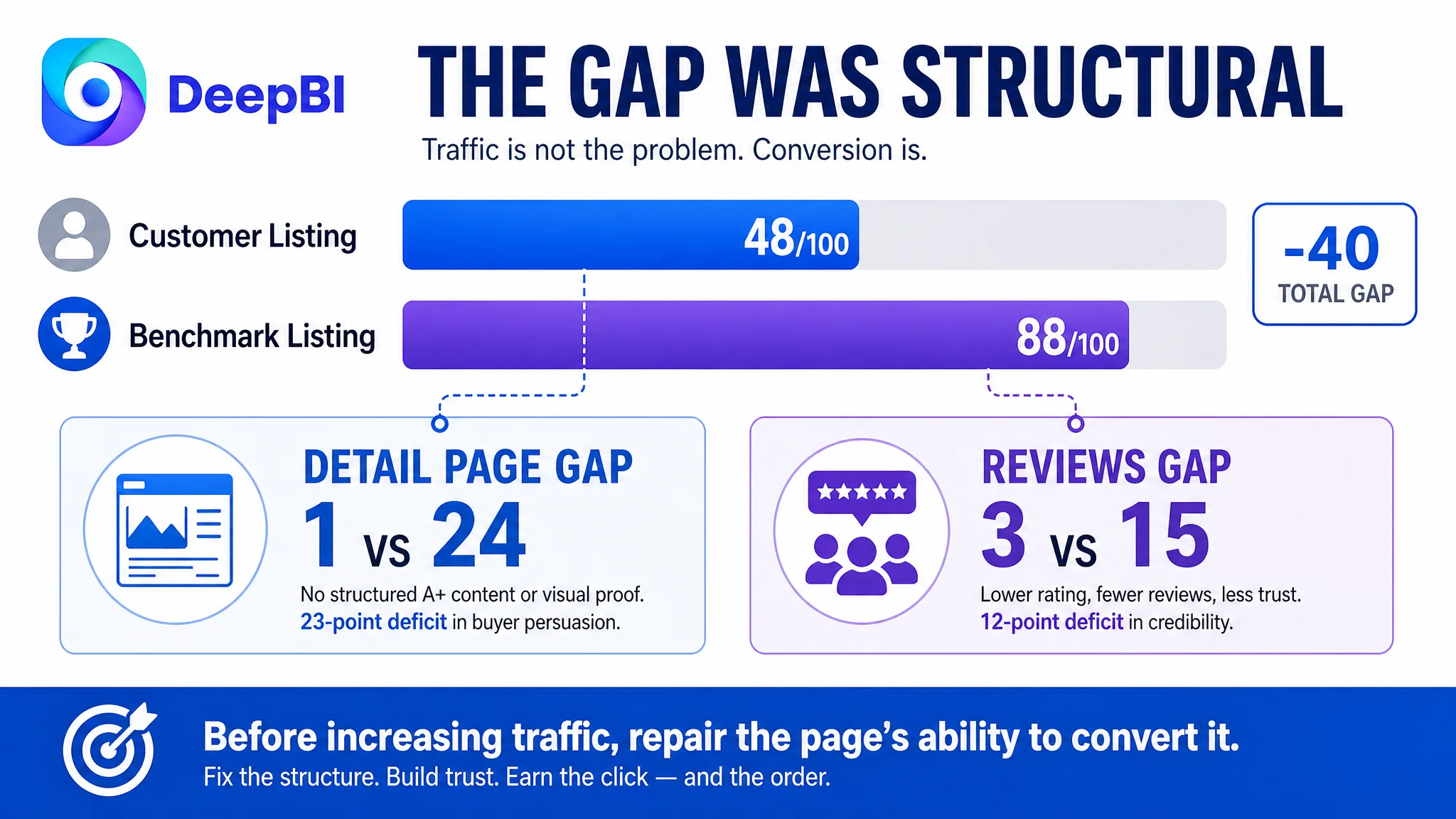
The most important finding was not the 40-point total difference by itself. It was the distribution of that difference.
The customer’s Listing had a usable title foundation and relatively strong bullet-point coverage. In contrast, the detail page contained no meaningful image-led A+ structure and relied largely on repeated title text. The benchmark Listing used a sequence of visual modules covering:
- The customer problem
- Core product benefits
- Technical explanation
- Usage guidance
- Product comparison
- Multi-room deployment
This was not a cosmetic difference. It represented two different approaches to selling.
The customer’s page described the product.
The benchmark Listing helped shoppers decide whether the product was credible, safe, suitable for their home, and worth buying in a multi-pack.
The real bottleneck was not the title. It was the page’s ability to prove its promise.
The main image showed the product, but not enough of the outcome
The first image communicated what the product was and how many units were included. It did not communicate effectiveness with the same force as the benchmark.
For an indoor bug zapper, the first click often depends on a fast judgment:
- Does this look capable of handling the problem?
- Is the working mechanism understandable?
- Does it appear suitable for indoor use?
- Is the multi-pack valuable enough to justify consideration?
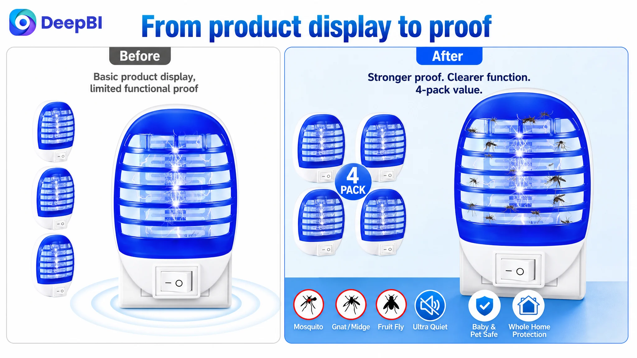
The customer’s main image used a general zapping effect, but the visual evidence of insects being captured on the grid was less direct. That weakened functional confirmation at the search-page stage.
The later recommendation was not simply “make the image more attractive.” It was to make the product’s operating result easier to understand while retaining the four-pack value presentation.
That distinction is important. Amazon main-image optimization should not be reduced to visual polish. The image must earn the click by making the product’s reason to exist immediately legible.
The image sequence spent space on lower-priority information
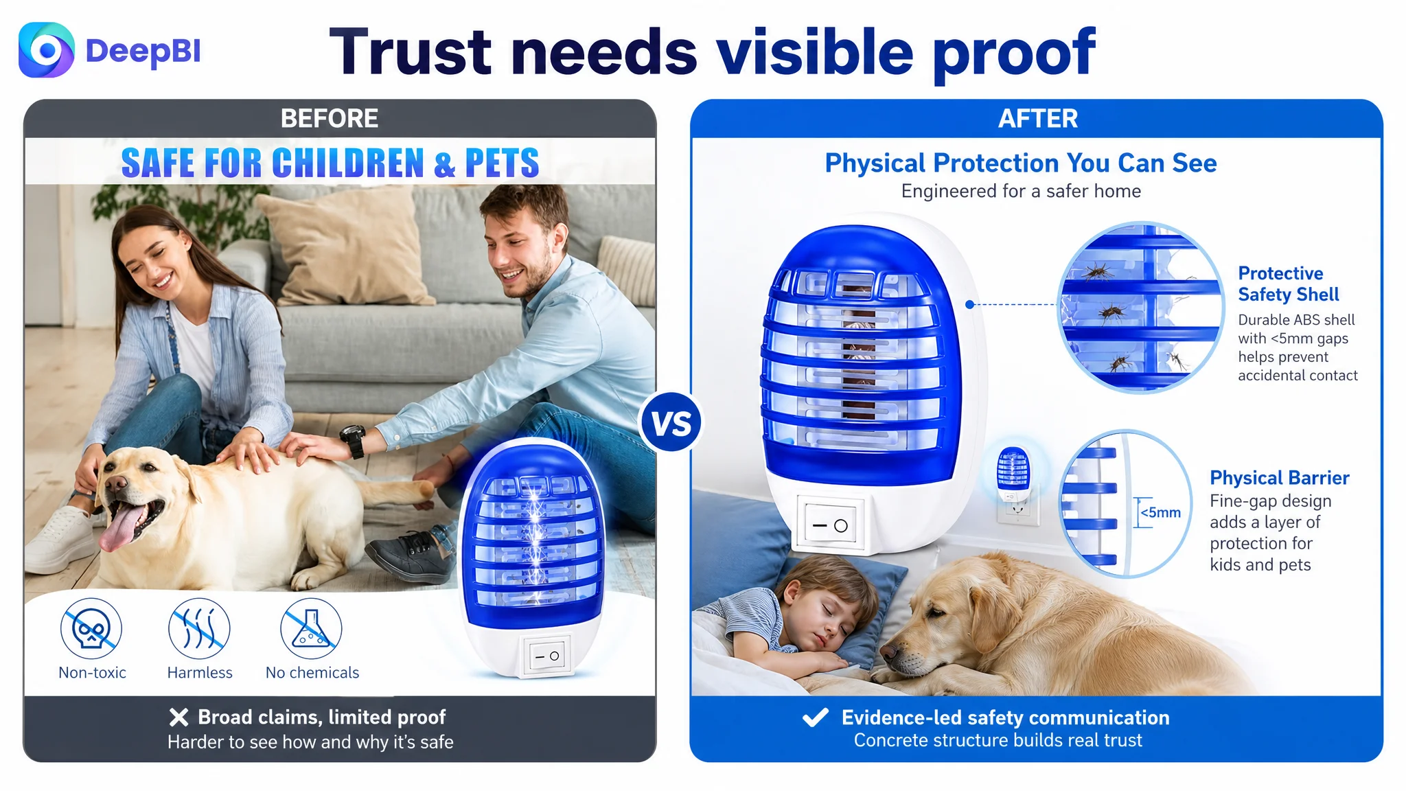
One image was primarily used to confirm product size. For a small plug-in device, size was not the most urgent hesitation point. The benchmark used an earlier image position to address a more consequential concern: whether the device could operate quietly in bedrooms and nurseries.
The diagnosis therefore shifted the sequence toward decision priority:
1. Make effectiveness more visible
2. Address quiet operation early, if the claim is verified
3. Show why a four-pack supports multiple rooms
4. Build safety trust with concrete product structure
5. Explain the working principle instead of repeating target insect names
This was a sequencing decision, not an image-count decision.
The Listing did not need more images for their own sake. It needed each image to remove a different purchase objection.
The bullet points had energy, but not enough trust architecture
The customer’s bullet points were not empty. They emphasized immediate protection, continuous defense, room coverage, and action-oriented language such as “Stop before it starts.”
That gave the copy a direct commercial tone. However, the benchmark’s bullet points concentrated more heavily on the concerns that matter in family spaces:
- Safety around children and pets
- No sprays, harsh chemicals, smoke, or strong odors, where factually supported
- Quiet operation
- Specific wavelength explanation
- Easy maintenance
- Clear placement across bedrooms, nurseries, kitchens, and other areas
The issue was not that the customer needed to abandon pain-point language. It was that the page was emphasizing speed and defense before fully establishing trust.
For this product category, a stronger bullet-point path would connect each claim to a buyer concern:
- What problem does the device address?
- How does the mechanism work?
- Where can it be used?
- What makes indoor use more reassuring?
- What does maintenance involve?
Any technical number or safety statement would still need to be confirmed before publication. DeepBI’s role in the diagnosis was to identify the missing proof structure—not to invent specifications.
The review gap made every content weakness more expensive
The review comparison intensified the page-level problem.
The customer Listing showed:
- 3.8 stars
- Five total reviews
- No effective review content visible on the first page
- A meaningful share of one-star feedback
- No image or video reviews providing additional product context
The benchmark showed:
- 5.0 stars
- 22 total reviews
- Eight effective reviews visible on the first page
- Real customer feedback, including visual reviews
- No one-star reviews in the compared sample
This gap could not be solved through A+ content alone. A stronger page cannot replace authentic customer experience. But it can determine whether shoppers understand the product accurately before purchase, which affects expectation management and the risk of disappointment.
That is why the detail-page recommendations included clearer guidance around nocturnal use, the role of specific light wavelengths, and simple cleaning steps. If shoppers expect the same performance in every lighting condition or misunderstand maintenance requirements, the resulting dissatisfaction can become a review problem.
The page needed to do two things at once:
- Build confidence before purchase
- Reduce avoidable misunderstanding after purchase
Why DeepBI did not keep tuning the Listing in isolated pieces
A conventional optimization process might treat the title, images, bullet points, A+, and reviews as separate tasks. The comparison showed that this would produce the wrong priority order.
The title had a modest gap. The bullet points were already competitive in score. The detail page was nearly empty, while reviews created a separate trust deficit.
That led to a more disciplined decision path:
First, repair the missing conversion layer
The A+ content needed to move from repeated text to a structured explanation of the product:
- Define the product as a quiet indoor defense system, using only verified claims
- Explain the light-attraction and physical-control mechanism
- Show the protective structure and maintenance process
- Clarify expected use conditions
- Compare plug-in continuity with battery-dependent alternatives only where accurate
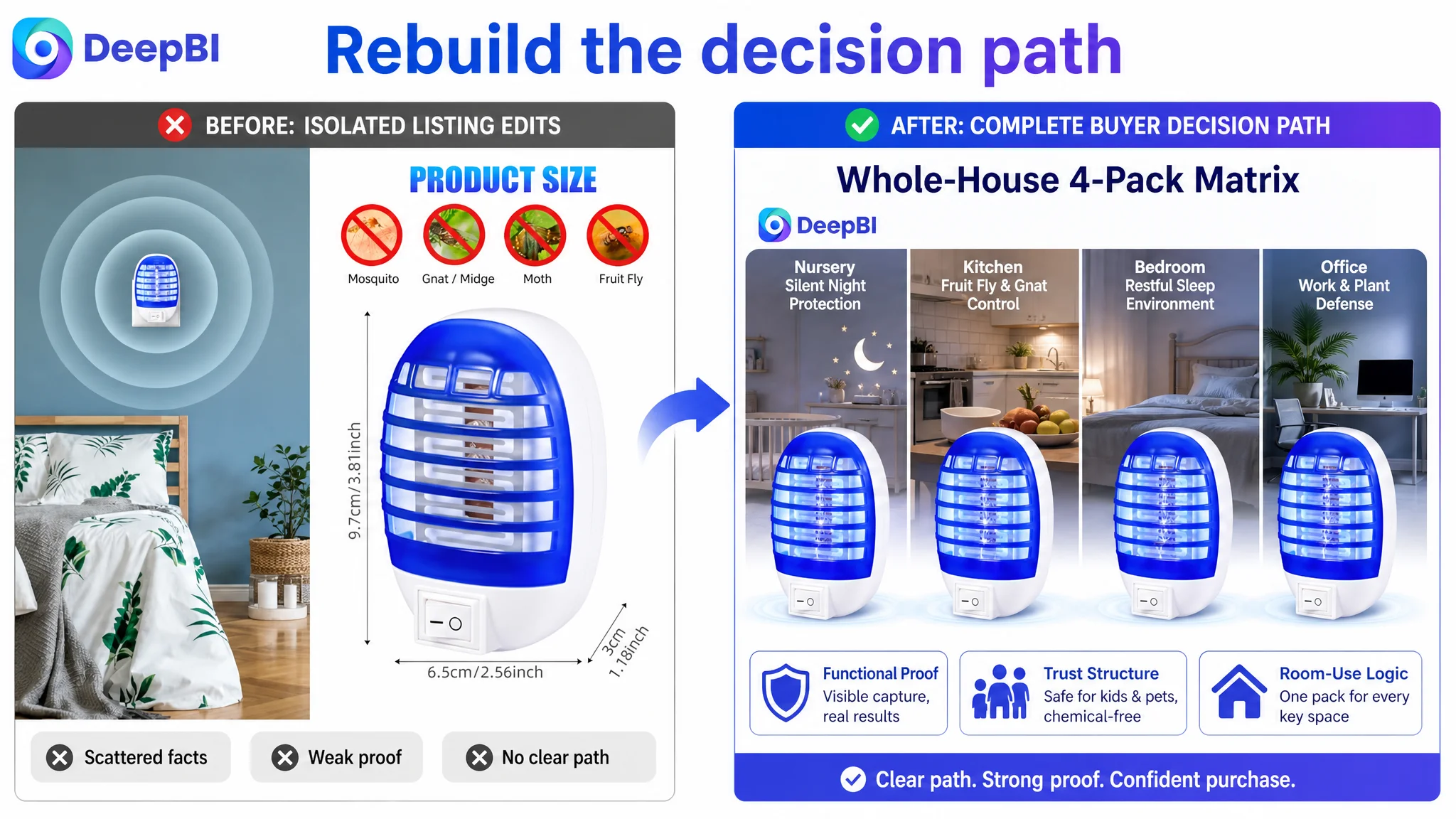
- Map the four-pack to practical room deployment
- Reinforce the concerns of silence and household safety
The goal was to create a complete decision path rather than a collection of promotional statements.
Then, reorganize the image logic around buyer hesitation
The proposed image changes focused on five different questions:
- Does it work?
- Can it be used in a bedroom or nursery?
- Why does a four-pack make sense?
- Is the design safe and clean for household use?
- How does the device attract and control flying insects?
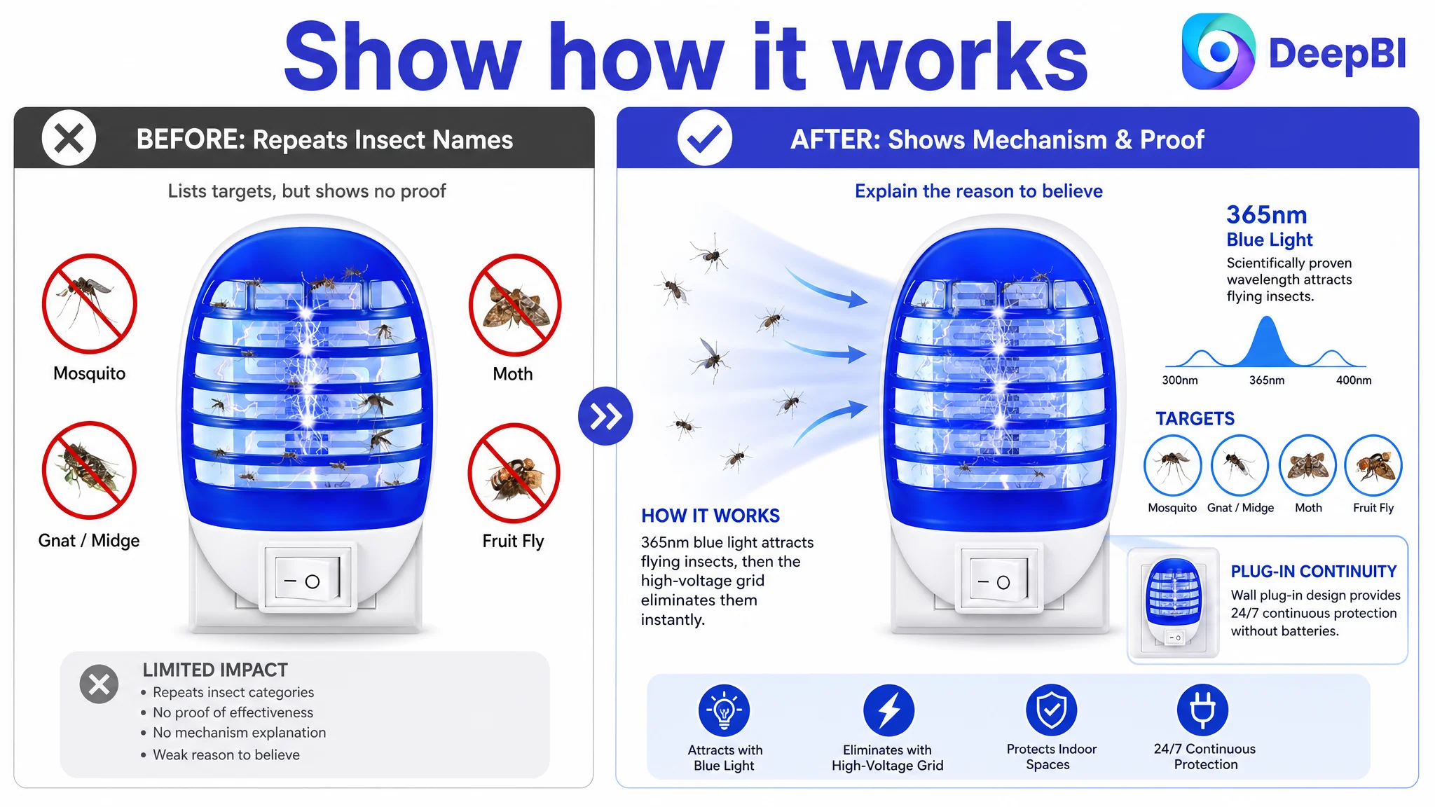
This approach also reduced repetition. Listing image five, for example, repeated the types of insects the device targets without adding much proof. Replacing that repetition with a visual explanation of the light wavelength and operating mechanism would give the shopper a reason to believe the claim.
Only then, refine the traffic-facing language
The title could be improved by bringing the core product form and relevant search terms forward, adding a verified wavelength, and using more precise scene terms. “Baby Safe” could replace the weaker “Baby Room” wording only if the product and compliance basis support that claim.
The proposed title direction also added “Gnat Killer,” “Nursery,” and “Plant” to broaden relevant search coverage while keeping the structure within Amazon’s title constraints.
These changes were valuable, but they were deliberately placed after the larger conversion diagnosis. More precise traffic targeting would not compensate for a page that still lacked visual proof and trust structure.
The A+ page had to become the missing middle of the funnel
The customer’s A+ content was the clearest sign that the Listing was not ready to absorb more traffic efficiently.
Without meaningful visuals, the page lacked a place to answer the questions that appear after the click:
- How does the device work?
- Is the safety design understandable?
- Where should the four units be placed?
- Is it suitable for quiet zones?
- What happens during maintenance?
- What should the shopper expect at night compared with daylight?
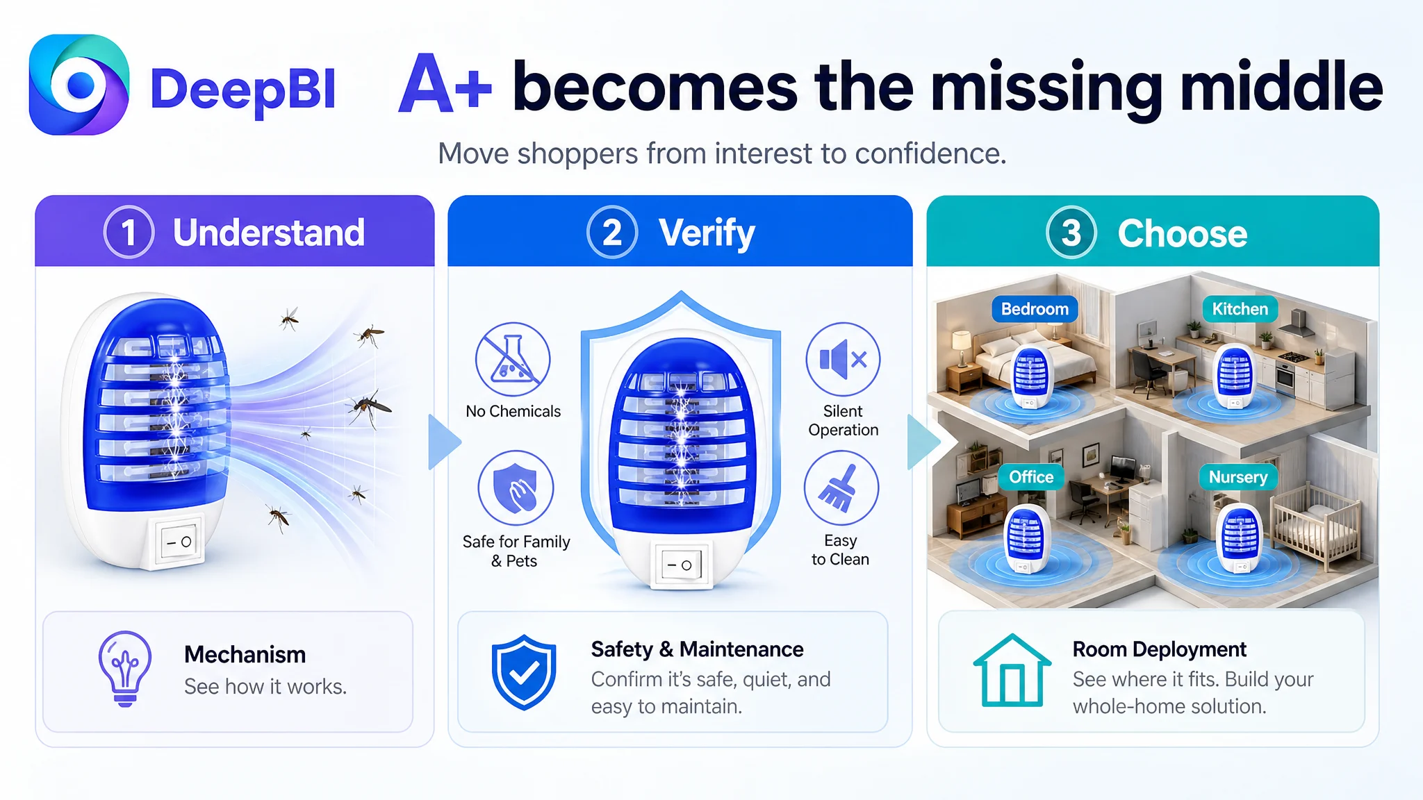
The recommended A+ sequence was designed to move from interest to confidence:
1. Product definition
Establish the device’s purpose and target insect categories without overclaiming.
2. Technical and safety explanation
Show the physical control mechanism and protective shell through concrete visuals.
3. Expectation management
Explain the role of nocturnal use and specific light attraction so shoppers do not assume unlimited performance in every condition.
4. Rational comparison
Explain the practical difference between a wall-plugged device and models dependent on changing batteries, where the comparison is factually valid.
5. Whole-home deployment
Turn the four-pack from a quantity claim into a room-by-room placement plan.
6. Silence and household trust
Give these high-sensitivity concerns their own visual treatment rather than burying them in copy.
7. Maintenance reassurance
Show the unplug-and-brush cleaning process clearly.
This structure reflected a broader Amazon Listing principle: the A+ page should not repeat the bullets in a larger format. It should resolve the doubts that the bullets cannot fully answer.
The optimization direction was visual, but not purely creative
The proposed image and A+ changes required more than better design taste. They required a controlled translation from diagnosis to production.
The visual direction had to preserve the actual product while improving:
- Composition
- Information hierarchy
- Scene relevance
- Technical explanation
- Functional proof
- Buyer-objection coverage
That is where DeepBI’s reasoning mattered. The system did not treat the benchmark as a template to copy. It used the benchmark to identify the visual jobs the customer’s Listing was not performing.
For example:
- A benchmark image’s stronger insect evidence became a direction to improve functional confirmation.
- Its bedroom setting became a reason to address quiet operation earlier.
- Its multi-room presentation became a way to support the value of the four-pack.
- Its technical breakdown became a model for making safety and mechanism more concrete.
- Its comparison and maintenance modules became ways to reduce rational and post-purchase risk.
Any generated visual would still need to remain faithful to the product’s real structure and verified claims. The point was not to create a more dramatic product than the customer sold. It was to make the actual product easier to understand and trust.
Good Amazon Listing optimization does not add imagination where evidence is missing. It makes the available evidence easier to see.
What changed in the business judgment
The case material does not provide post-optimization CTR, CVR, ACOS, TACOS, or organic-order data, so no numerical performance result should be claimed.
The meaningful change was the operating diagnosis.
Before the comparison, the Listing could be approached as a keyword and messaging problem. After the comparison, the priority became clearer:
- The title needed refinement, but was not the main constraint.
- The bullet points had useful commercial language, but needed stronger trust sequencing.
- The main images needed to prove function and remove objections in the right order.
- The A+ page needed to be rebuilt rather than lightly edited.
- The review weakness increased the need for clear, honest, expectation-setting content.
- Advertising should not be treated as the first lever when the product page is still unable to convert traffic reliably.
This reframing also changed how future Amazon ads decisions should be evaluated. If paid traffic is sent to a page with weak functional proof, incomplete safety communication, and limited trust signals, advertising can amplify the page’s defects as efficiently as it amplifies its strengths.
The lesson for Amazon sellers
This indoor bug zapper case was not ultimately about whether one title had more keywords than another. It was about whether the Amazon product page gave shoppers enough reasons to believe, understand, and choose the product.
The score difference made that visible:
- A relatively modest title gap
- A manageable main-image gap
- Competitive bullet-point coverage
- A 23-point detail-page deficit
- A 12-point review and trust deficit
That distribution made the decision order commercially clear.
Before increasing traffic, repair the page’s ability to convert it.
For Amazon sellers, the broader lesson is not to stop optimizing ads or keywords. It is to avoid using them as substitutes for Listing fundamentals. When the product page lacks proof, structure, and trust, more traffic may only produce more expensive uncertainty.
The stronger operating question is:
Does this Listing deserve more traffic yet—and does it give that traffic a clear reason to become an order?
In this case, DeepBI’s value was not a longer list of edits. It was identifying that the most important work had to happen inside the Amazon product page before further traffic amplification could become useful.