

This case follows an Amazon seller in the US baby-care category whose collapsible baby bathtub Listing was attracting attention but was not presenting its strongest reasons to buy. The team initially treated the problem as one of product explanation: add more functions, clarify folding, show the thermometer, and describe the accessories more thoroughly.
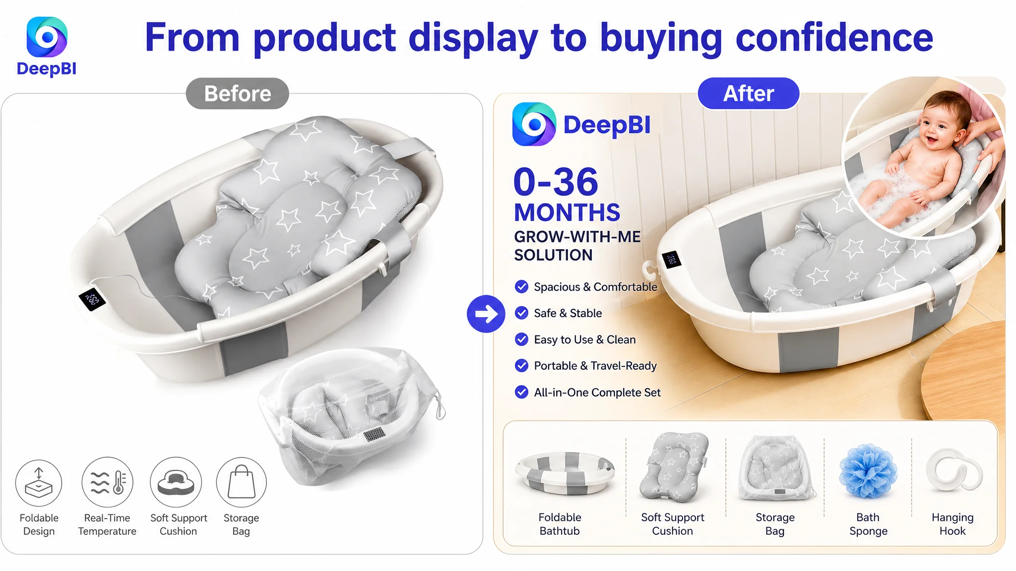
DeepBI’s diagnosis pointed to a deeper issue. The Listing was not short of information; it was short of persuasive order. The title, main images, bullet points, A+ content, and reviews were not working together to answer the buyer’s most important questions early enough: Will it fit my growing baby? Is it safe and stable? Is it genuinely convenient? Can I trust it?
The later optimization therefore focused on Listing conversion capacity before pushing for more traffic: lead with spacious 0–36-month usability, establish safety earlier, turn the image sequence into a decision path, and use real-life scenarios to make portability and convenience credible. For other Amazon sellers, the lesson is practical: before asking Amazon ads to scale, first determine whether the product page is ready to convert the traffic it receives.
The Listing Had Information. It Did Not Yet Have a Buying Sequence.
The customer’s Amazon product page belonged to a category where buyers are rarely choosing on one specification alone.
Parents comparing baby bathtubs are evaluating several risks at once:
- Whether the tub will feel cramped as the child grows
- Whether it is stable on a sink, tile surface, or countertop
- Whether the water temperature can be judged safely
- Whether the product will dry cleanly
- Whether folding and drainage will create more work
- Whether the product is genuinely portable
- Whether the Listing provides enough proof to justify trust
The customer’s Listing addressed many of these points. It showed a temperature display, a support cushion, a foldable structure, drainage, anti-slip details, age stages, storage, and multiple colors.
But the information was presented mainly as a collection of functions.
The competing high-performing Listing organized the same category decision more deliberately. It started with spaciousness, established durability with a testing claim, made temperature control feel reassuring, expanded the use cases, and used emotional and visual proof to reduce hesitation.
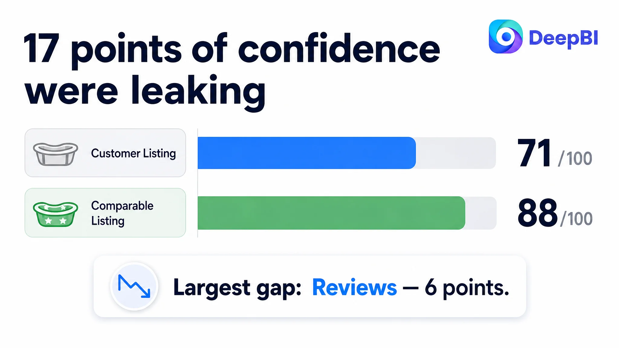
That difference appeared clearly in the comparative score.
- Title: Customer Listing: 15/20, Comparable high-performing Listing: 17/20, Gap: -2
- Main image: Customer Listing: 24/30, Comparable high-performing Listing: 27/30, Gap: -3
- Bullet points: Customer Listing: 6/10, Comparable high-performing Listing: 8/10, Gap: -2
- A+ content: Customer Listing: 19/25, Comparable high-performing Listing: 23/25, Gap: -4
- Reviews: Customer Listing: 7/15, Comparable high-performing Listing: 13/15, Gap: -6
- Total: Customer Listing: 71/100, Comparable high-performing Listing: 88/100, Gap: -17
The important point was not simply that the Listing scored 17 points lower.
The score showed where conversion confidence was leaking.
The page was not missing every important selling point. It was failing to make the strongest selling point unmistakable at each stage of the Amazon buying journey.
The Original Diagnosis Focused on Features Instead of Decision Risk
The customer’s existing content was not careless. It was trying to be comprehensive.
The page explained:
- The integrated thermometer
- The three-stage design
- Foldability and portability
- Anti-slip construction
- Material and drainage details
- Storage and hanging
- Cleaning convenience
The practical assumption behind this structure was understandable: if the Listing clearly explains enough features, shoppers should have enough reasons to purchase.
That assumption was incomplete.
On Amazon, more explanation does not automatically create more conversion. Buyers do not process every feature with equal weight. They notice certain risks first, and the Listing has to resolve those risks in the right order.
For this baby bathtub, the most consequential question was not whether it had a thermometer. It was whether the product could become a reliable, spacious bathing solution from newborn use through toddler use.
The page emphasized functions individually, while the stronger Listing communicated an integrated promise:
- More room for the child to stretch
- A product that remains useful through 36 months
- A stable and safe setup
- A simpler routine at home or away
- A complete solution rather than a folding basin with accessories
This was the case’s central misdiagnosis. The team was treating the page as if it needed more feature coverage. DeepBI’s analysis showed that it needed a clearer hierarchy of buyer reassurance.
The Amazon Ads Question Was Actually a Product-Page Question
When an Amazon Listing contains paid traffic but does not convert efficiently, the natural response is often to inspect the ads first:
- Are the bids too high?
- Are the keywords too broad?
- Is the campaign structure inefficient?
- Should budgets be shifted?
- Should weak search terms be paused?
Those questions can be valid. But they are not always the first questions to answer.
If the product page does not communicate its core value quickly, advertising can increase exposure without repairing the conversion problem. More clicks may simply create more opportunities for shoppers to encounter uncertainty.
In this case, the Listing’s weaknesses were distributed across the full page:
- The title did not lead with the most compelling product form and benefit.
- The main image identified the product but did not make it feel like a complete solution.
- The bullet points described functions without consistently connecting them to parent concerns.
- The A+ content stayed close to a single bathroom setting.
- The review profile created a material trust gap.
That made continued ad-first optimization risky. It could amplify a page that was still asking shoppers to assemble the buying logic for themselves.
Advertising can amplify a product page’s strengths, but it can also amplify the friction already built into the page.
The Title Was Relevant, but It Did Not Lead With the Strongest Reason to Click
The title scored 15 out of 20, only two points behind the comparison Listing. This was not a keyword absence problem.
The customer’s title already communicated that the product was a baby bathtub. The issue was how the information was ordered and differentiated.
The stronger title led with “Collapsible Baby Bathtub,” then surfaced “Large” and “Easy Fold.” It also combined age-stage terms and included a Spanish-language search phrase to broaden search coverage.
The customer’s title began with a more general “Baby Bathtub” expression and presented its benefits in a flatter sequence. The product was relevant, but the strongest reasons to consider it were not immediately prominent.
The recommended direction was to bring the following elements forward:
- Collapsible form
- Temperature display
- Soft cushion
- Infant-to-toddler use
- 0–36-month coverage
- Portable travel use
- The relevant Spanish-language search term
This was not a request to fill the title with repeated keywords. It was a restructuring of the entry point so that search relevance and buyer interest could reinforce each other.
The title needed to answer two questions quickly:
What is this product?
Why might it be a better choice than another compact baby tub?
The Main Image Identified the Product, but Did Not Establish Confidence
The main image score was 24 out of 30. The gap was relatively small, but its position in the customer journey made it important.
The customer’s image set showed the product and its components. However, the first visual impression did not create the same level of confidence or information density as the comparable Listing.
The competing image strategy used more than product identification. It signaled:
- A real baby using the product
- Comfort and spaciousness
- A complete set of accessories
- A stronger emotional context
- A clearer reason to believe the product solves a real bathing problem
The customer’s first image was more functional and static. It showed what the product was, but not as strongly what the product enabled.
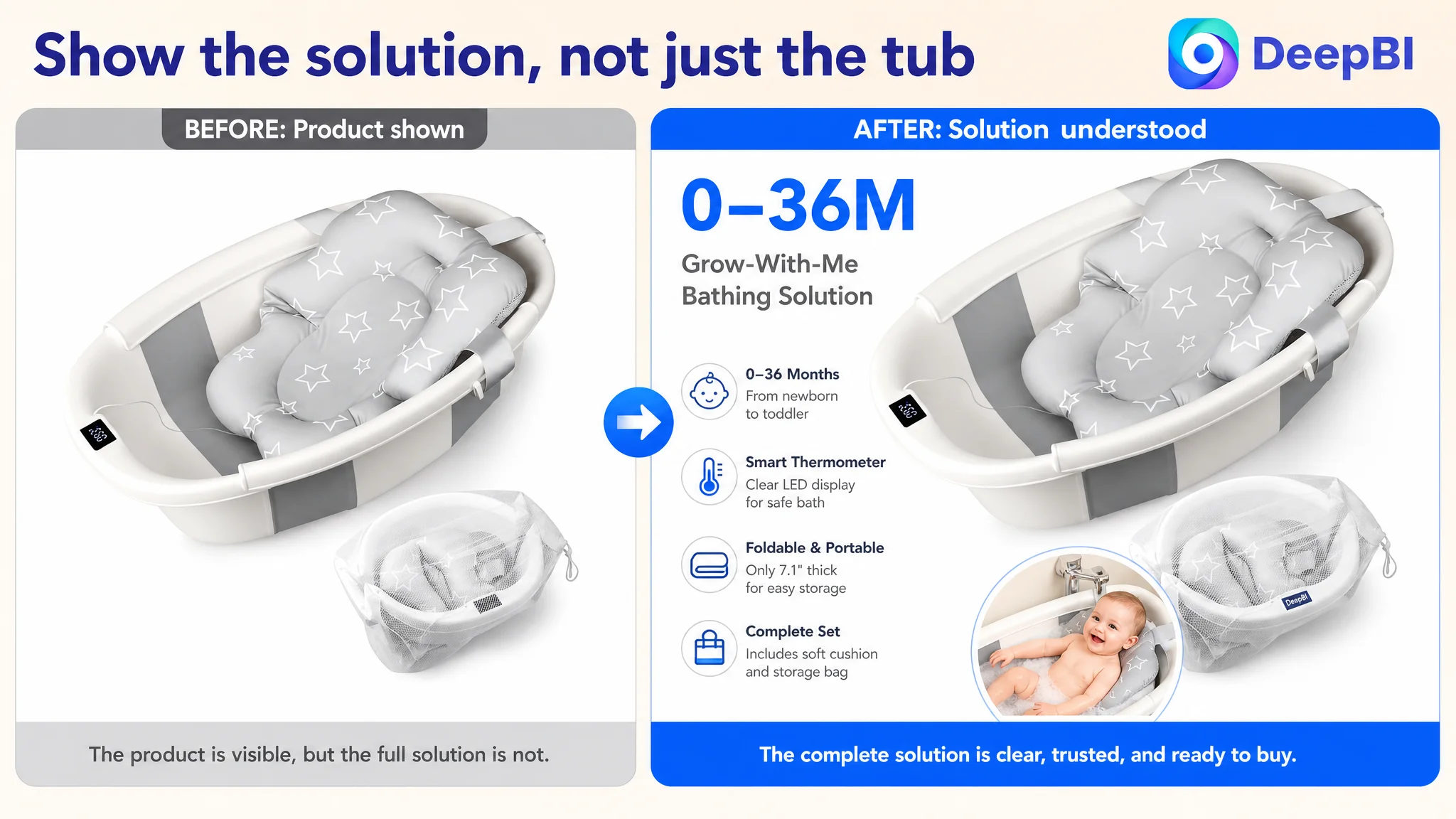
The first visual had to sell the complete solution
The recommended direction was to retain the product and accessory composition while adding a carefully controlled inset showing a baby using the tub comfortably.
The purpose was not decoration. It was to answer an immediate concern:
Does this look like a usable, comfortable bathing system, or merely a folded plastic product?
The second image had to prove usable space earlier
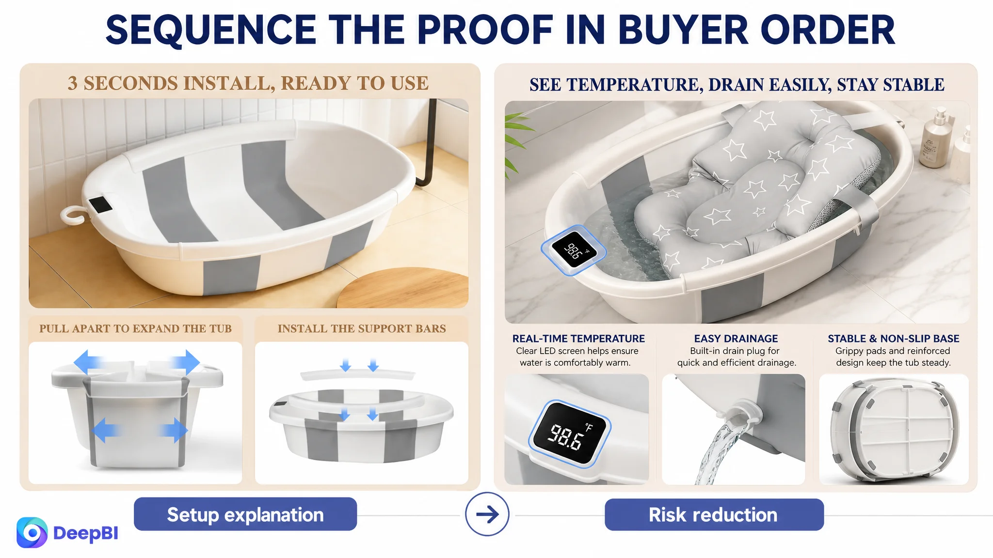
The existing folding diagram explained setup, but folding speed was not the strongest early-stage differentiator.
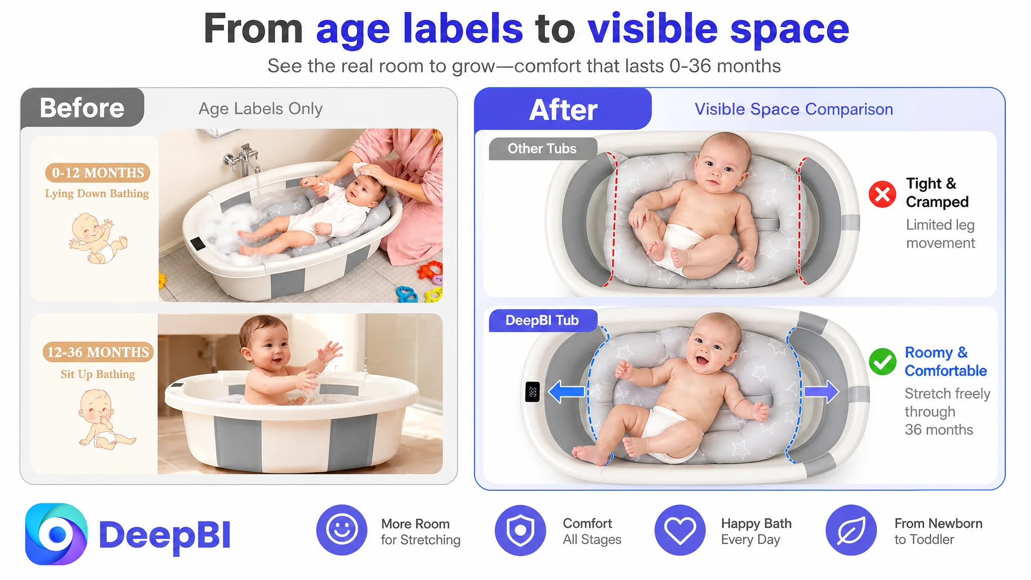
The higher-value question was whether a toddler could actually sit, stretch, and bathe comfortably inside the tub.
The revised image logic therefore prioritized:
- Toddler-stage usage
- Spacious interior proportions
- 0–36-month positioning
- A clear view of the child’s usable space
- A comparison that makes cramped alternatives easier to recognize
The third image had to turn “large” into visible evidence
A written claim of spaciousness is weaker than a visual demonstration.
The proposed comparison showed a baby stretching their legs in the customer’s roomy tub beside a generic standard tub where the posture appeared more constrained. This made the core physical advantage easier to verify without relying on a long paragraph.
Later images could then validate safety and convenience
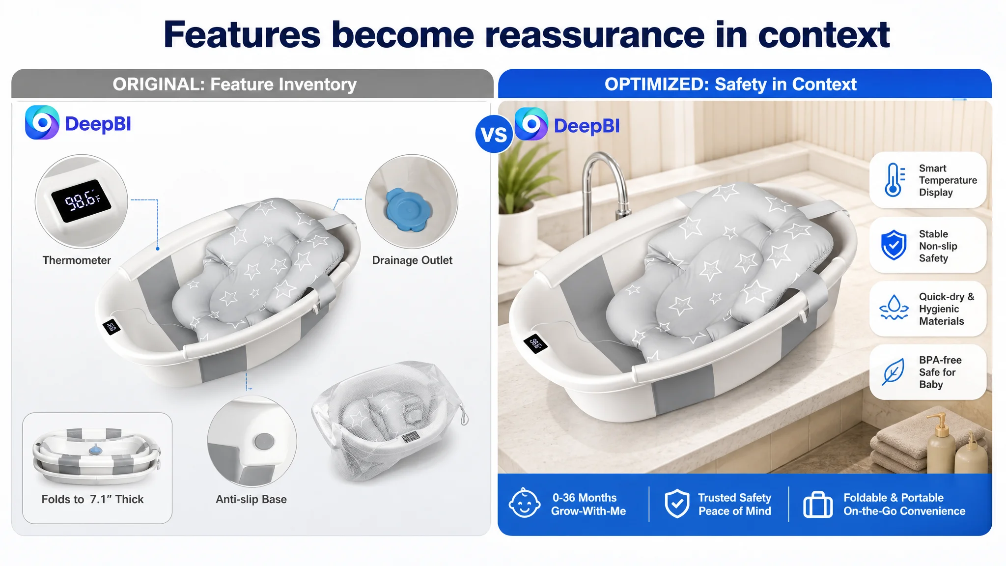
Once the page established the main value, the remaining images could support it with:
- BPA-free material messaging
- Reinforced corners
- Grippy rubber pads
- Stable use on sinks, tiles, or countertops
- The LED temperature display
- The built-in drain plug
- Pop-and-lock setup
The sequence mattered. Technical details were not removed; they were moved behind the core reason to care.
The Bullet Points Explained Features, but the Competitor Organized Pain and Proof
The bullet-point score was 6 out of 10. The gap came from structure more than from missing product facts.
The customer’s bullets tended to follow the product’s feature inventory:
- Temperature display
- Multi-stage use
- Folding and storage
- Safety and material
- Drainage and cleaning
The comparable Listing used a more persuasive progression:
1. Start with a recognizable user pain
2. Introduce a specific solution
3. Add proof or credibility
4. Clarify the practical outcome
5. Close with a more complete ownership promise
That structure reduced the amount of interpretation required from the shopper.
Temperature control needed to become peace of mind
“Built-in thermometer” is a feature.
“Clear, real-time temperature information that removes guesswork during baby bath time” is a buying reason.
The recommended copy connected the LED display to a specific parental concern: avoiding uncertainty when preparing comfortably warm water.
The growth-stage message needed to lead with space
The customer already communicated multi-stage use. But age coverage alone does not prove that the product remains comfortable as the child grows.
The revised direction paired 0–36-month use with actual leg-stretching space and ergonomic support. That made the growth claim more tangible.
Folding needed reliability, not only compactness
The page communicated that the tub folded flat to approximately 7.1 inches. That supported apartment storage and travel.
But foldability can also create a durability concern. The wording therefore needed to connect compact storage with repeated-use confidence, without inventing a laboratory test or unsupported durability figure.
Hygiene and stability needed to work as one reassurance
For a baby bathtub, anti-slip stability and drying behavior are connected in the buyer’s mind. Parents want a product that feels secure during use and does not create damp, difficult-to-clean corners afterward.
The proposed direction combined:
- BPA-free materials
- Reinforced corners
- Grippy rubber pads
- Easy-wipe surfaces
- Quick-dry materials
- Reduced moisture buildup
Drainage and portability needed to reduce routine friction
The built-in drain plug and pop-and-lock design were not merely convenience features. They addressed the repeated burden of setup, lifting, draining, and cleanup.
Positioned correctly, these details supported a broader promise: less equipment friction and more predictable bath-time routines.
The A+ Page Was the Largest Content Gap After Reviews
The A+ score was 19 out of 25, four points below the comparison Listing. This was one of the clearest strategic gaps.
The customer’s A+ content contained substantial information:
- Lifestyle imagery
- Feature icons
- Cushion details
- Material and structural explanations
- Temperature display
- Growth stages
- Storage and hanging
- Folding steps
- A comparison table
- Color presentation
The issue was not lack of content volume.
The issue was that the content remained too concentrated on functional description and a single household bathroom context.
The stronger Listing used A+ content to widen the product’s perceived usefulness and deepen trust.
Trust proof needed to move earlier
Safety certification and other hard evidence were not treated as an early persuasion anchor on the customer’s page.
DeepBI’s recommendation was to bring verified certification evidence forward, using the actual documentation available to the brand rather than relying on generic safety labels.
That change would address a high-priority parental question before the page spent too much space on accessories.
The page needed to show more than one bathroom
A collapsible tub has an inherent portability advantage, but the customer’s A+ content did not fully convert that advantage into usage imagination.
The revised content direction expanded the context to include:
- Kitchen countertops
- Weekend travel
- Visits to grandparents
- Car travel with luggage
- Compact apartments
- Outdoor or temporary bathing situations where appropriate
The objective was not to claim unlimited use. It was to make the product’s portable design meaningful in the situations where parents actually experience space and logistics constraints.
Visual comparison had to replace passive specification tables
The customer used a comparison table, but the competing page created more immediate impact through repeated visual comparison modules.
The recommended comparisons focused on:
- Available space
- Temperature visibility
- Folding and setup
- Storage efficiency
- Practical use contexts
A table asks the shopper to read and interpret. A strong visual comparison can make the difference recognizable before the shopper analyzes every word.
Emotional trust had to sit alongside technical proof
The competing Listing combined certification imagery with parent-child moments, baby expressions, and gift-oriented scenes. This created a three-part trust chain:
- The product appears safe
- The experience appears positive
- The product feels suitable for an important family moment
The customer’s page leaned more heavily on functions. That made it informative, but less emotionally convincing.
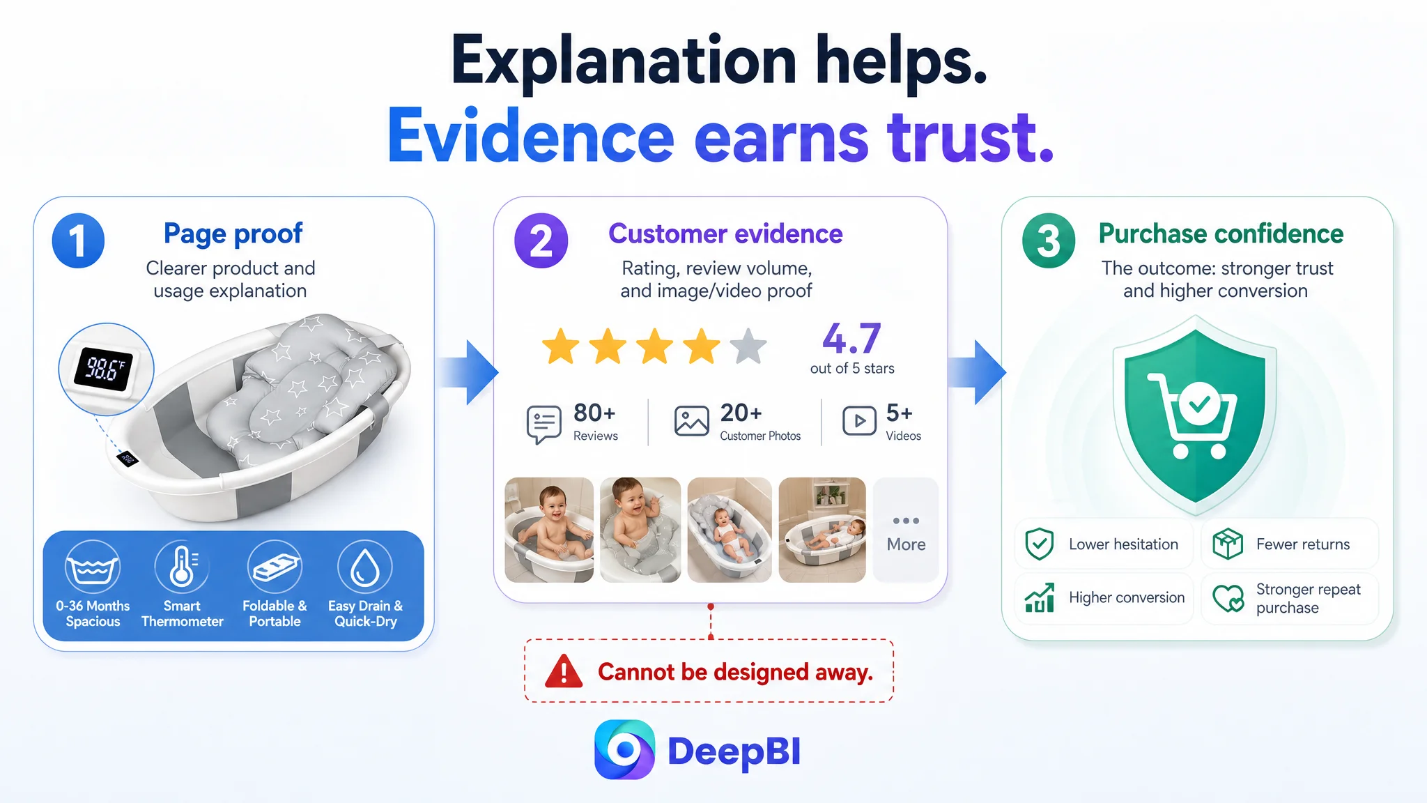
Reviews Were Not a Secondary Detail
The review dimension scored 7 out of 15, the largest single gap in the comparison.
The customer’s Listing showed:
- 3.8 stars
- 32 total reviews
- 8 reviews visible on the first page
- No image or video content among the visible reviews
The comparable Listing showed:
- 4.7 stars
- 81 total reviews
- 13 reviews visible on the first page
- Multiple Vine reviews
- Reviews with images or videos
- No reported negative-review presence in the comparison material
The star difference was 0.9 points. For a baby-care product, that is not a minor visual discrepancy. It directly affects first-purchase confidence.
The review content also contained negative feedback related to durability and functional defects. Those concerns were especially damaging because they challenged the product’s core promise, not an incidental accessory.
This created a constraint that page design alone could not fully remove.
A stronger main image could improve attention. A better A+ page could explain the product more clearly. But neither can replace the credibility of consistent customer evidence.
That meant the Listing optimization had to do two things at once:
1. Present the product’s real strengths more convincingly.
2. Treat review quality and recurring product concerns as a separate business risk requiring operational attention.
A Listing can improve its explanation, but it cannot design its way around unresolved trust signals.
Why DeepBI Did Not Recommend Tuning Ads First
The decision order followed the evidence.
The customer Listing was 17 points behind the comparable benchmark overall, with the largest gaps in reviews and A+ content. The page also showed visible weaknesses in the first-click experience and the order of its core value communication.
That made the priority clear:
Repair the page’s ability to convert before asking advertising to carry more of the burden.
This did not mean Amazon ads were irrelevant. Ads remained important for testing, traffic acquisition, and measuring whether the revised page could convert relevant shoppers.
But ads should not be used as a substitute for:
- A clear value proposition
- A credible visual demonstration
- A persuasive bullet-point sequence
- Early safety evidence
- A stronger trust environment
- A page structure that makes the product’s main advantage easy to understand
The immediate business risk was not simply wasted ad spend. It was allowing paid traffic to reinforce a misleading diagnosis. If traffic underperformed, the team might continue changing keywords and bids while the more durable conversion constraint remained untouched.
DeepBI’s role in this case was therefore not to recommend more changes at once. It was to establish what needed to be fixed first.
The New Page Logic: From Product Inventory to Parent Confidence
The recommended Listing direction can be summarized as a new sequence:
First: Show the product’s main reason to exist
Lead with a spacious, collapsible baby bathtub that can support use from newborn through toddler stages.
Then: Prove that the space is usable
Show leg-stretching room and toddler comfort rather than relying only on age labels or measurements.
Next: Establish safety and stability
Bring forward verified certification, BPA-free material claims, reinforced construction, and anti-slip support where supported by the product facts.
Then: Remove daily-use anxiety
Use the temperature display to address water-temperature guesswork. Use the drain plug, quick-dry material, and pop-and-lock design to address cleanup and setup friction.
Finally: Expand the ownership context
Show storage in small spaces, travel, visits to family, and the included accessories as part of a complete bathing solution.
This ordering gave each page asset a distinct job instead of asking every image and paragraph to describe everything simultaneously.
What the Diagnosis Changed
The case material does not include confirmed post-optimization CVR, ACOS, CTR, organic-order, or ranking results. It would therefore be inaccurate to claim that the revised Listing had already delivered specific numerical gains.
What changed was the operating diagnosis and the decision path.
The Listing was no longer treated as a page that merely needed more features or more traffic. It was treated as a conversion system with identifiable constraints:
- The title needed sharper keyword and benefit prioritization.
- The main image needed a stronger confidence and usage signal.
- The image sequence needed to prove spaciousness earlier.
- The bullets needed to move from feature inventory to pain-solution-proof logic.
- The A+ page needed earlier trust evidence and broader scenario validation.
- The review gap needed to be recognized as a separate trust and product-quality risk.
- Advertising needed to support the repaired page rather than compensate for it.
The expected operating benefit of this sequence was greater control over future testing. Once the page had a clearer sales logic, changes in Amazon ad performance would be easier to interpret. A weak result would be less likely to hide unresolved page-level confusion.
The Broader Lesson for Amazon Sellers
This baby bathtub Listing illustrates a common Amazon operating trap.
A seller sees underperformance and assumes the next adjustment should happen in the campaign:
- Change bids
- Expand keywords
- Rebuild targeting
- Shift budgets
- Add more traffic
But traffic is only useful when the product page can convert the buyer’s attention into confidence.
For this Listing, the most important question was not whether the product had enough features. It was whether the page made the right feature matter at the right moment.
The customer had a spacious, portable, multi-stage product with a temperature display, support cushion, drainage system, and storage advantages. Yet those strengths were not arranged into a sufficiently strong decision path.
DeepBI’s diagnosis reframed the problem from:
“Which advertising lever should we adjust next?”
to:
“Does this Amazon Listing give a parent enough reason to click, trust, and choose before the ad system is asked to scale it?”
That is the more durable judgment.
Amazon ads can bring a shopper to the product page. The Listing still has to earn the order.