

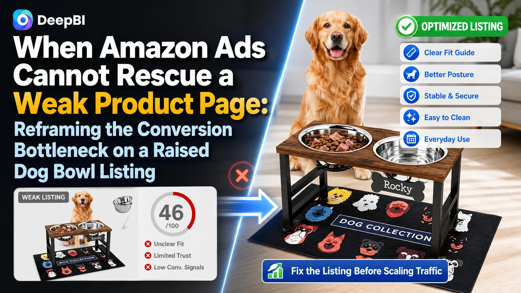
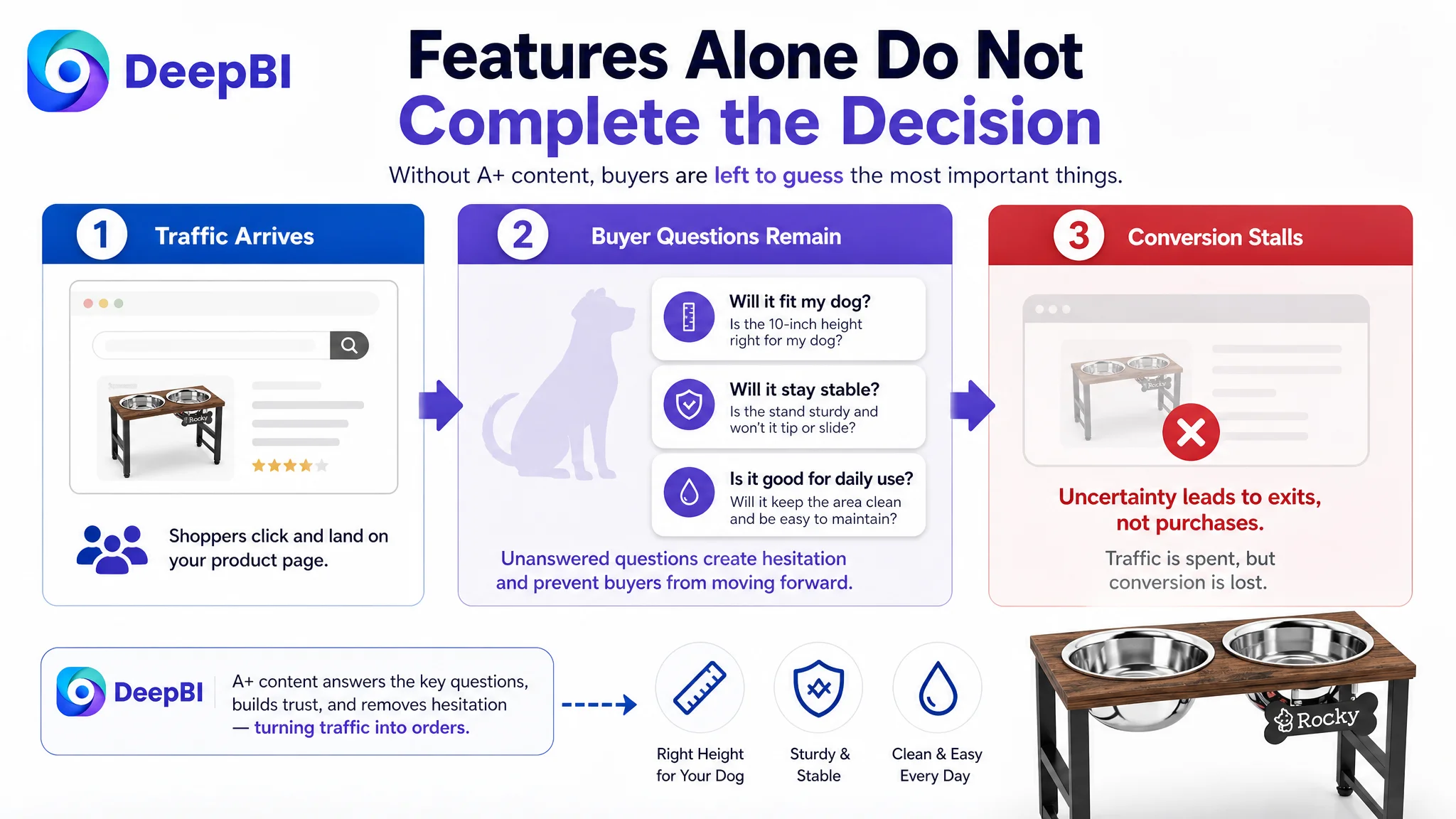
The customer was an Amazon seller in the US pet-supplies market, operating a raised dog bowl stand for medium and large dogs. The Listing was not simply missing traffic. Its product page was asking shoppers to make too many decisions on their own: whether the fixed 10-inch height would fit their dog, whether the stand would remain stable, and whether the product could solve everyday problems such as spills and difficult cleaning.
The initial optimization direction focused on familiar Listing improvements: refining the title, adding functional information, and making the product images more attractive. Those changes addressed individual elements, but they did not resolve the larger conversion problem. DeepBI’s diagnosis showed that the page lacked the complete decision logic needed to turn Amazon traffic into orders.
The later optimization therefore focused on rebuilding the product page around suitability, comfort, stability, cleanliness, and installation evidence. The lesson for other Amazon sellers is straightforward but easy to miss: before investing more heavily in Amazon ads, determine whether the Listing has enough clarity and trust to convert the traffic it receives.
The Listing Was Not Losing on One Detail
The first comparison produced an uncomfortable result.
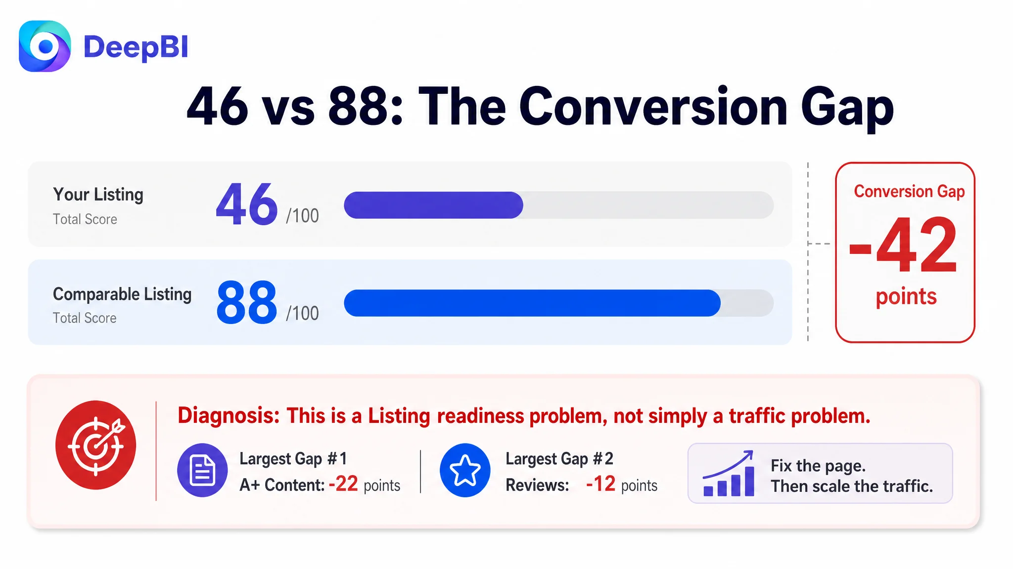
The target Listing scored 46 out of 100, while a comparable high-performing Listing in the same Amazon category scored 88.
- Title: Target Listing: 14/20, Comparable Listing: 17/20, Gap: -3
- Main image: Target Listing: 23/30, Comparable Listing: 27/30, Gap: -4
- Bullet points: Target Listing: 7/10, Comparable Listing: 8/10, Gap: -1
- A+ content: Target Listing: 0/25, Comparable Listing: 22/25, Gap: -22
- Reviews: Target Listing: 2/15, Comparable Listing: 14/15, Gap: -12
- Total: Target Listing: 46/100, Comparable Listing: 88/100, Gap: -42
The score gap was not evenly distributed.
The title was weaker, but not disastrously so. The main image needed clearer suitability guidance, but it was not the largest defect. The bullet points lacked some scenario-based persuasion, yet they still communicated the basic product functions.
The decisive weakness was elsewhere: the page had no A+ content at all, while the comparable Listing used a complete set of explanatory modules.
That changed the diagnosis.
The real problem was not a lack of product features. It was a lack of conversion structure on the Amazon product page.
The Original Optimization Direction Was Too Fragmented
For a product such as a raised dog bowl stand, it is natural to begin with visible Listing elements.
The title can be improved by moving the category keyword closer to the front. The image sequence can be made cleaner. Bullet points can mention the all-metal construction, 10-inch height, stainless steel bowls, 1,700 ml capacity, splash-proof mat, and quick assembly.
All of those actions are reasonable.
But they remain incomplete when handled as isolated edits.
The customer’s Listing was describing the product mainly through a list of functions:
- Metal construction
- Fixed height
- Bowl capacity
- Non-slip mat
- Easy installation
The comparable Listing was doing something more commercially important. It was helping shoppers answer the questions that stand between interest and purchase:
- Is this height suitable for my dog?
- Why is elevated feeding relevant?
- Will the stand remain stable during use?
- Can it reduce mess around the feeding area?
- How difficult is assembly?
- Will the bowls be easy to remove and clean?
- Can I trust this product enough to choose it over a better-established alternative?
The original direction treated the Listing as a collection of content fields. DeepBI reframed it as a decision path.
That distinction matters on Amazon because paid traffic and organic traffic arrive with different levels of certainty. A shopper who clicks an ad may be curious, but curiosity is not yet purchase intent. The product page must complete the explanation that the search result began.
The A+ Gap Revealed the Real Constraint
The target Listing had no A+ content modules. The comparable page used them to build a sequence of evidence:
- A visual explanation of the problems associated with feeding at an unsuitable height
- Product detail close-ups
- A height and suitability guide
- Installation instructions
- Cleaning and daily-use scenes
- Video guidance
- Additional product credibility content
This was not merely a difference in visual richness.
It was a difference in how much uncertainty each page removed.
The target Listing required shoppers to infer the product’s form, use, fit, and benefits from the standard image and text areas. The comparable Listing showed the logic directly. It connected the product’s raised design to a use case, then connected the structure to stability, the bowls to hygiene, and the height to dog suitability.
Without A+ content, the target page had no effective space to explain why a fixed-height feeder could be the right choice.
The product needed a reason to matter
A raised bowl stand is not automatically valuable just because it lifts the bowls off the floor. The page must explain what problem the design is intended to address.
For this product, the proposed positioning was not “more adjustable than the competition.” The stand uses a fixed 10-inch height. Its stronger route was to present that height as a deliberate comfort choice for appropriate medium and large dogs, supported by a clear measurement guide.
The page also needed to connect the product’s structure with practical outcomes:
- A more upright eating position
- Less bending during feeding
- A stable all-metal frame
- Reduced movement and tipping during use
- A splash-proof mat for spilled food and water
- Removable stainless steel bowls for routine cleaning
The point was not to add more claims. It was to make the existing product attributes work together.
The missing content was also missing trust
The page had only one 3.0-star rating and no meaningful review presence on the first page. The comparable Listing had a 4.5-star rating supported by thousands of reviews and a substantial amount of user-generated content.
That gap could not be solved through copywriting alone.
A+ content could not manufacture review history, but it could prevent the page from losing every other trust-building opportunity. Close-ups, dimensions, installation steps, cleaning evidence, and realistic usage scenes could make the product easier to understand while the review base remained limited.
This was an important prioritization judgment: the review gap was a structural disadvantage, but the absence of A+ content was a controllable weakness that could be addressed immediately.
The Title Was Not Wrong. It Was Poorly Prioritized
The existing title opened with a specific measurement, “10-inch tall,” before establishing the broader category and target audience.
That approach communicated precision, but it risked narrowing the first search connection. The comparable title led with the core category phrase, then added audience, adjustability, material, use context, and other quantified details.
The proposed direction reorganized the title around:
- The core category: elevated dog bowls
- The intended audience: medium and large dogs
- The fixed 10-inch height
- The wooden and metal construction
- Two stainless steel bowls
- The 1,700 ml capacity
- The non-slip mat
- The feeder-station category term
This was not keyword accumulation for its own sake. It was an attempt to make the title answer two questions earlier:
1. What is the product?
2. Who is it for?
The title also needed to balance search coverage with shopper comprehension. A title can contain relevant terms and still fail if its structure makes the product’s main value difficult to identify.
The Main Image Sequence Needed to Reduce Suitability Doubt
The image diagnosis was not that the product was unusable or visually unacceptable. The problem was that the first visual impressions did not answer the buyer’s most important question:
Will this feeder fit my dog?
The existing image direction placed attention on general product presentation and secondary details, including a DIY nameplate. Those details may be useful after purchase consideration has begun, but they are not the strongest first answer for a shopper comparing raised feeders.
The revised image strategy prioritized:
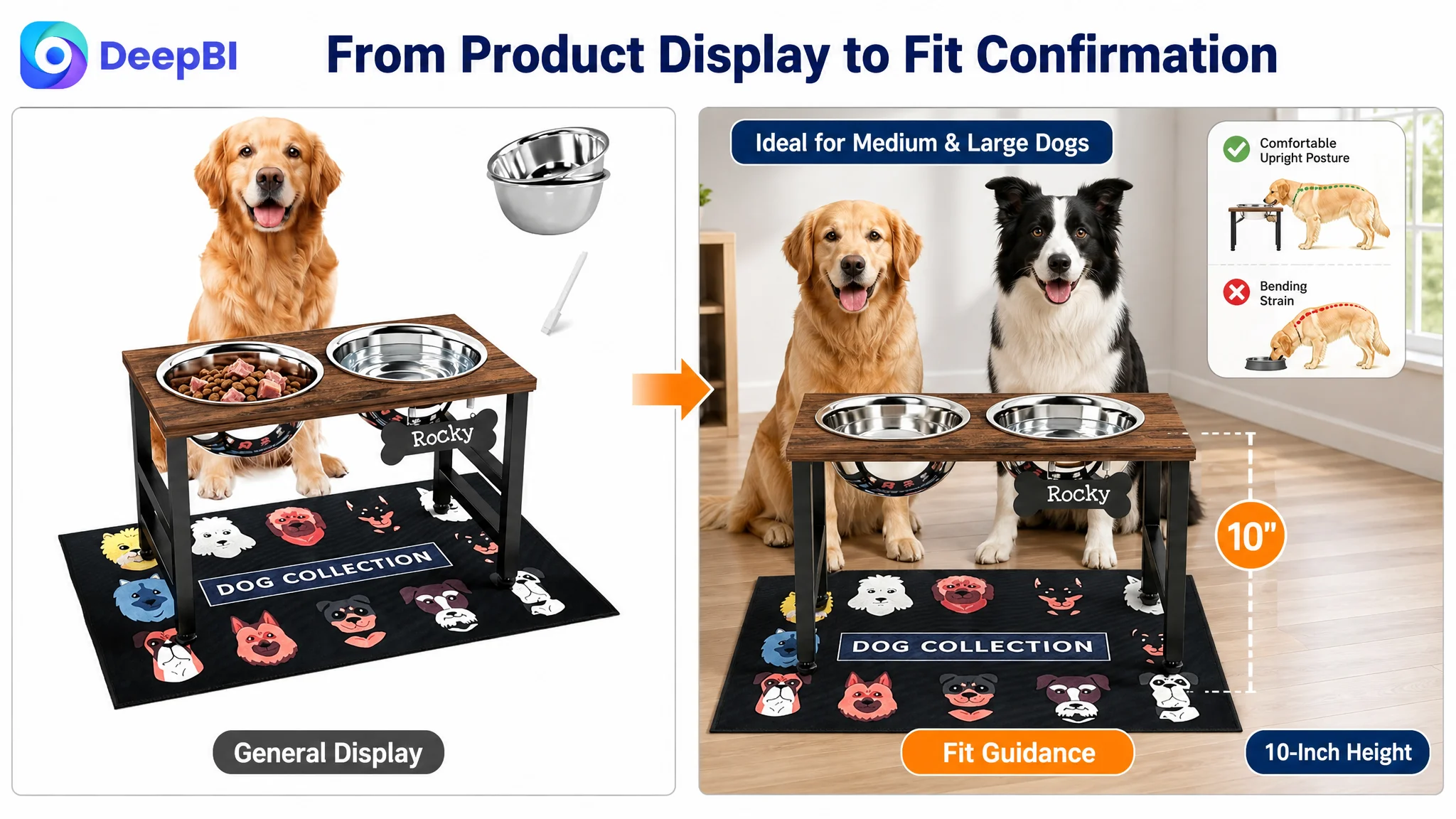
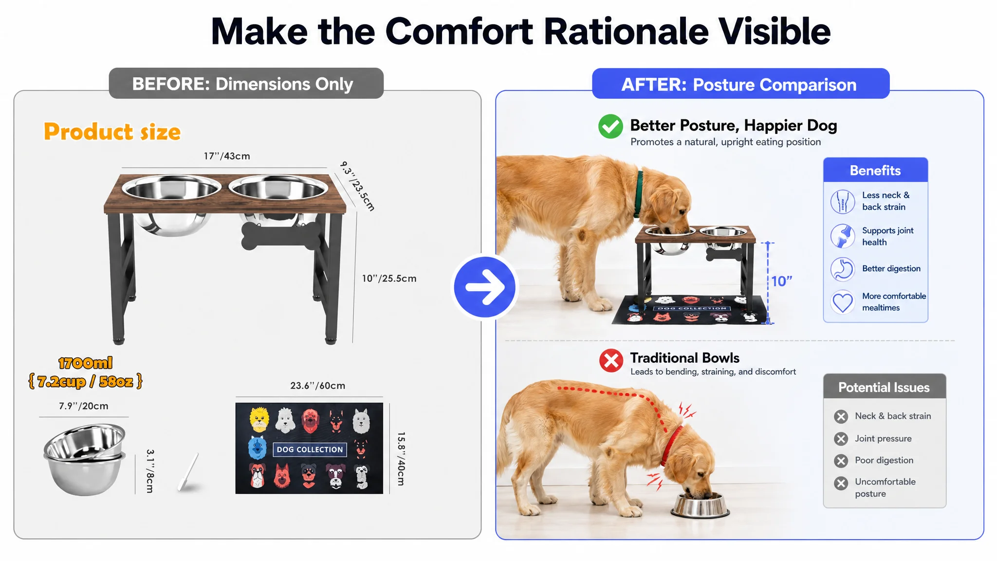
- Clear suitability for medium and large dogs
- A visible 10-inch height reference
- A measurement guide that helps shoppers judge fit
- A direct contrast between floor-level feeding and raised feeding posture
- A stronger visual explanation of neck and joint position
- Close-ups of the metal frame, bowl removal, mat, and stability-related details
The image sequence was therefore assigned different decision jobs instead of treating every image as another product photograph.
The first visual should confirm relevance
The product should be shown in a context that helps shoppers recognize the intended dog size and use case.
The measurement image should guide selection
Numbers alone are not decision support. A 10-inch measurement becomes useful when the page explains how shoppers should measure their dog and what range the product is intended to serve.
The health-related image should show posture, not rely on abstract language
The proposed visual contrast focused on the dog’s neck, back, and joint posture while eating. The goal was to make the comfort rationale easier to understand without asking shoppers to decode a technical claim.
The durability image should connect material to daily use
The all-metal construction needed to be shown as a solution to movement, impact, and tipping concerns—not simply presented as a material upgrade.
The Bullet Points Had Information, But Not Enough Buying Logic
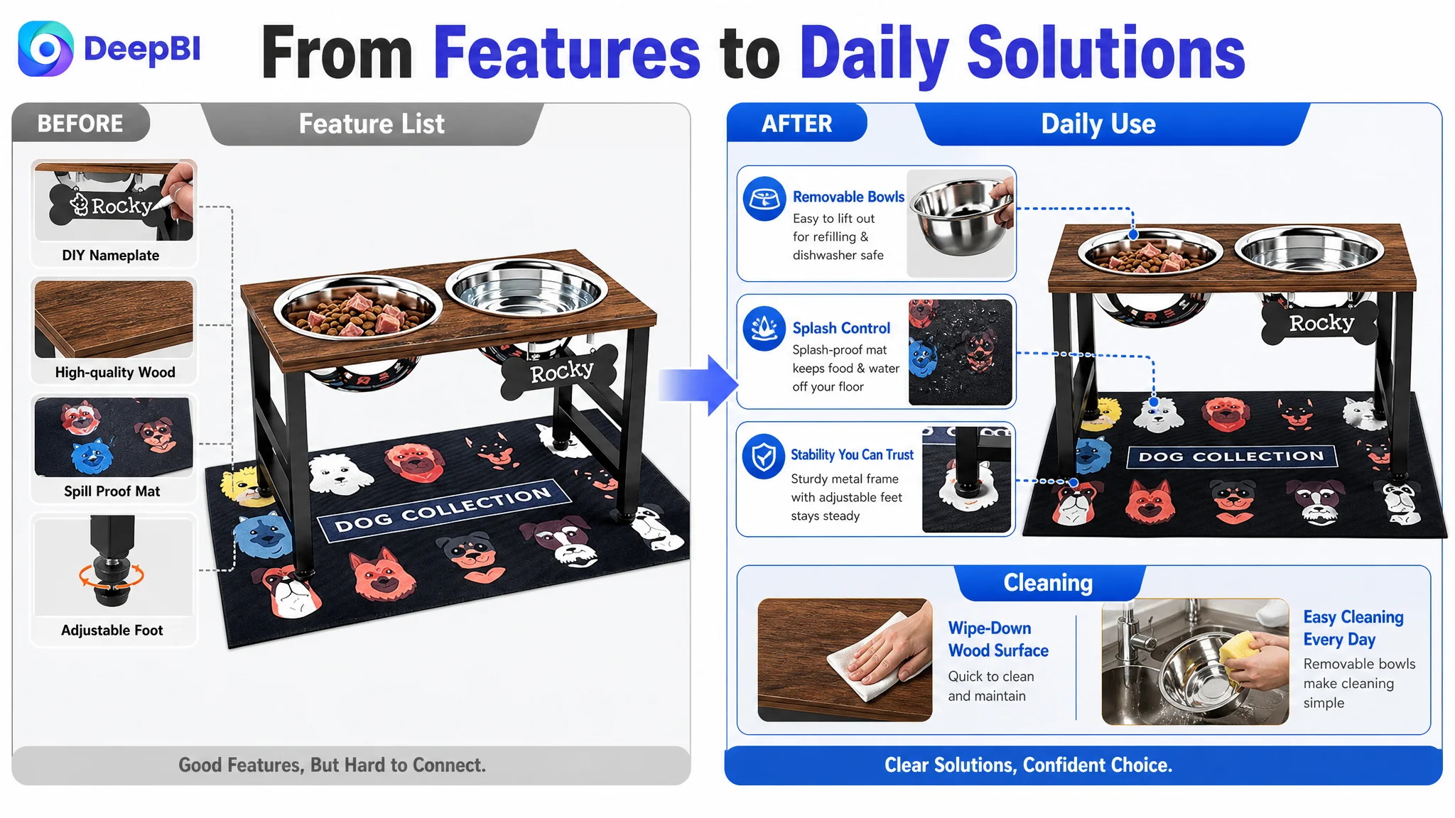
The bullet points contained relevant specifications, but they were organized primarily around product attributes.
DeepBI’s reframing was to make each bullet answer a practical buyer concern.
Suitability before purchase
Because the stand has a fixed 10-inch height, the page should clearly ask shoppers to measure their dog and confirm the fit before ordering. This is not a minor disclaimer. It reduces uncertainty and can help prevent avoidable dissatisfaction.
Stability for active dogs
The all-metal construction should be connected to a stable feeding experience. The value is not just that metal sounds durable; it is that the stand is intended to remain secure when a dog eats actively.
Comfort-oriented feeding position
The fixed height should be presented as an ergonomic choice for suitable medium and large dogs, with careful wording around comfort and posture rather than unsupported medical promises.
Capacity and cleaning
The two stainless steel bowls provide a combined capacity of 1,700 ml, or 58 ounces, for food and water. The page should connect this specification to daily feeding and cleaning convenience, including dishwasher compatibility only where the product information supports it.
A cleaner feeding area
The splash-proof mat is one of the product’s more practical differentiators. It should be positioned as part of a mess-management solution, helping catch spilled food and water while adding grip beneath the frame.
Installation and long-term use
A two-minute assembly message can reduce setup anxiety, but only when supported by the actual included hardware and instructions. The same principle applies to durability claims: the Listing should show what the customer receives and how it is used, rather than relying on broad quality language.
This is the difference between a specification list and a conversion-oriented bullet structure.
A bullet point earns its place when it connects a product attribute to a buyer concern and then to a usable outcome.
Why DeepBI Did Not Recommend Tuning Ads First
The case material does not include post-optimization advertising metrics such as CTR, CVR, ACOS, or TACOS, so no numerical advertising outcome should be claimed.
The decision logic, however, was clear.
If the page has a 46-point Listing score, no A+ content, almost no review-based trust, and weak suitability guidance, sending more traffic to it creates a dangerous operating pattern. Advertising may increase exposure and clicks, but it cannot independently explain the product, confirm fit, demonstrate stability, or compensate for an empty A+ section.
In that situation, additional ad tuning risks becoming a way to manage symptoms.
Changing bids, expanding keywords, or rebuilding campaign structure would not answer the central question:
Can this product page convert the traffic it is being asked to receive?
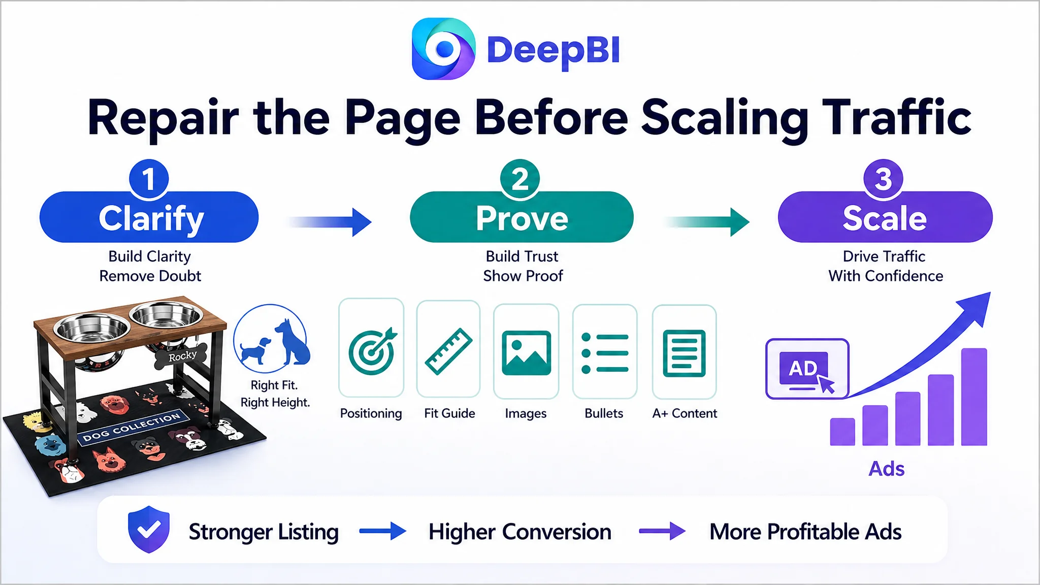
The correct order was therefore:
1. Clarify the target audience and product positioning.
2. Repair the title and bullet-point decision logic.
3. Rebuild the image sequence around fit, posture, stability, cleanliness, and use.
4. Add A+ content that explains the category need and supports the product’s fixed-height positioning.
5. Only then evaluate how Amazon ads are performing against a more capable product page.
This sequence does not mean advertising is unimportant. It means advertising should not be used to amplify a page whose conversion foundation is incomplete.
The A+ Page Had to Tell One Consistent Story
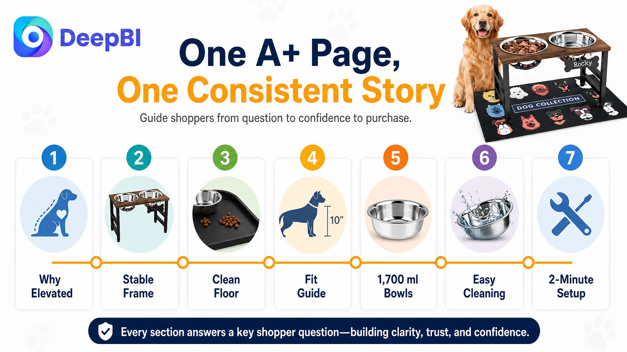
The proposed A+ structure was designed to move from category understanding to product proof.
Why elevated feeding matters
The first module should establish the reason for considering a raised feeder and introduce the fixed comfort-height positioning.
Why this structure is stable
The next modules should show the all-metal frame, impact-resistant construction, and stability details in a way that addresses concerns about wobbling or tipping.
How the product handles daily mess
The splash-proof mat should be shown under the stand, making the floor-cleaning benefit visible rather than leaving it as a vague statement.
How the fixed height fits the intended user
A clear measurement guide should explain how to judge suitability for medium and large dogs. This is especially important because the product does not offer multiple adjustable heights.
Why the bowls are practical for daily use
The 1,700 ml stainless steel bowls should be presented through capacity, removability, and cleaning information supported by the actual product specifications.
How quickly the feeder can be assembled
A short visual installation sequence should show the provided hardware and instructions, reducing the fear of missing parts or complicated setup.
The strength of this structure was not the number of modules. It was the order. Each section addressed a different hesitation, and together they formed a more complete path to purchase.
What Changed in the Business Understanding
The case did not begin with a dramatic advertising failure supported by a clear before-and-after metric. It began with a page that was materially behind its category benchmark and an optimization direction that was too focused on individual Listing components.
DeepBI’s contribution was to identify which weakness constrained the others.
The title needed work, but title work alone would not create trust. The main images needed stronger decision guidance, but better images alone would not replace the missing page narrative. The bullet points needed more scenario coverage, but more copy would not solve the lack of visual proof. Reviews were far behind the benchmark, but that gap could not be repaired instantly through content editing.
The controllable bottleneck was the product page’s conversion capacity.
Once that was recognized, the optimization became more disciplined:
- Search relevance was improved without losing audience clarity.
- The image sequence was organized around shopper decisions.
- Bullet points moved from isolated features toward problem-solution logic.
- A+ content was treated as a missing conversion layer, not an optional design upgrade.
- The fixed 10-inch height was positioned honestly rather than imitating the competitor’s adjustable-height strategy.
- The all-metal frame, stainless steel bowls, splash-proof mat, and quick assembly were combined into a coherent product proposition.
Before asking Amazon ads to scale, the team first had to decide whether the Listing had earned the right to receive more traffic.
That is the broader lesson for Amazon sellers. A weak ACOS result may be an advertising problem, but it may also be the visible consequence of a product page that cannot complete the buyer’s decision. When traffic is being delivered to a page with unclear fit, limited trust, missing A+ content, and disconnected selling points, more campaign adjustments may only make the underlying inefficiency harder to see.
The more useful question is not whether the ads are active.
It is whether the Amazon Listing is ready to convert what the ads bring.