

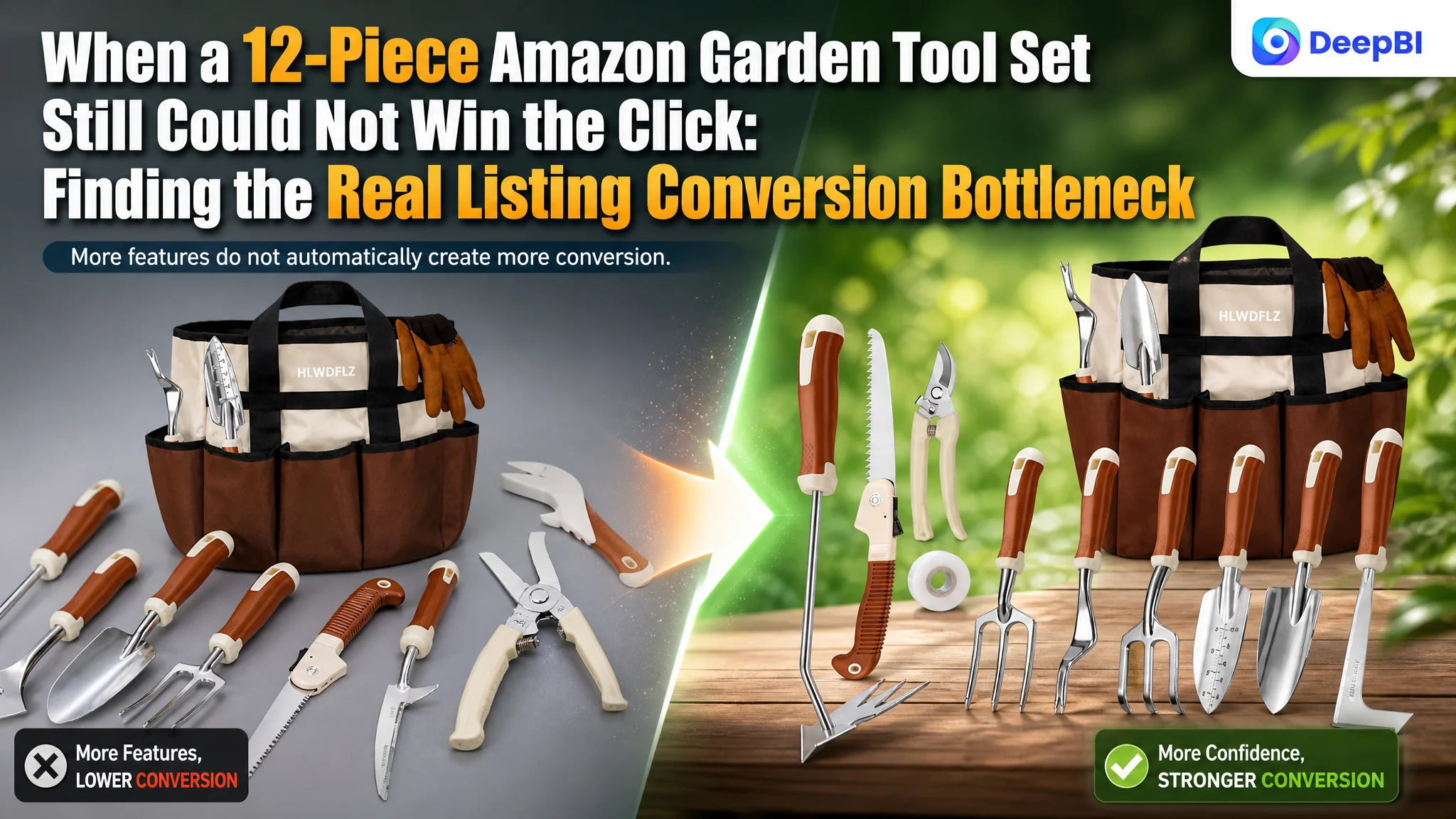
The customer was an Amazon seller in the US gardening tools category, managing a 12-piece garden tool set with a storage tote, gloves, pruning tools, and specialized weeding accessories. The Listing had more components than a comparable high-performing listing, yet its page did not communicate that advantage clearly enough to turn product-page visits into confidence and purchase intent.
The initial assumption was that the Listing needed to emphasize its functional upgrades more aggressively: the dual-head weed puller, the larger tool count, the aluminum construction, and the storage bag. That direction was reasonable, but incomplete. DeepBI’s comparison showed that the deeper problem was not a shortage of features. It was the Listing’s ability to organize those features into a convincing Amazon buying path.
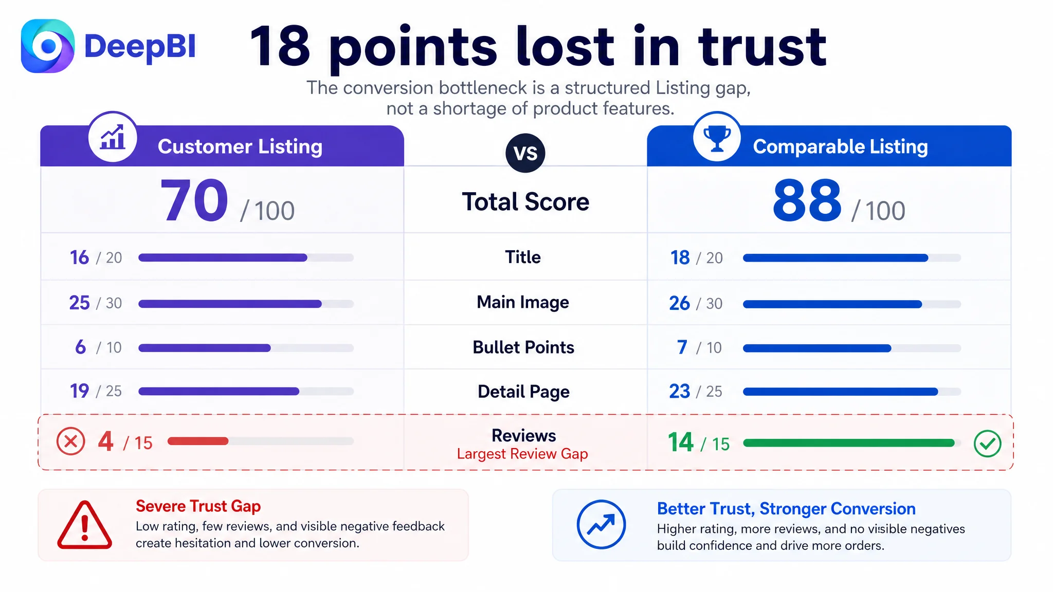
The real gap appeared across trust, visual clarity, and decision logic. The customer’s Listing scored 70 out of 100 against the comparable listing’s 88, with the largest weakness in reviews and the clearest content gap in the detail page. The later optimization therefore focused on rebuilding the title, main-image sequence, bullet-point structure, and A+ storytelling around completeness, durability, use cases, and gifting intent. For other Amazon sellers, the lesson is direct: before trying to push more traffic through Amazon ads, determine whether the product page gives that traffic enough reasons to believe, understand, and buy.
The Listing Had More Tools. That Was Not the Same as Having More Value.
On paper, the customer’s product had a strong proposition.
It included 12 pieces, compared with the benchmark listing’s 9-piece set. It offered a dual-head weed puller, a crack weeder, a folding saw, trowels, a cultivator, a hand rake, pruning shears, grafting tape, gloves, and a self-standing tote bag.
The product was not obviously under-equipped.
But Amazon shoppers do not evaluate a product from the inventory count alone. They ask whether the set will solve their gardening tasks, whether the tools will hold up, whether the product is suitable for the person receiving it, and whether the page feels trustworthy enough to justify the purchase.
That was where the Listing began to lose ground.
- Title: Customer Listing: 16/20, Comparable high-performing Listing: 18/20
- Main image: Customer Listing: 25/30, Comparable high-performing Listing: 26/30
- Bullet points: Customer Listing: 6/10, Comparable high-performing Listing: 7/10
- Detail page: Customer Listing: 19/25, Comparable high-performing Listing: 23/25
- Reviews: Customer Listing: 4/15, Comparable high-performing Listing: 14/15
- Total: Customer Listing: 70/100, Comparable high-performing Listing: 88/100
The total gap was 18 points, but the score itself was only the starting point. The more important question was where those points were being lost and how those losses affected Amazon Listing conversion.
The First Diagnosis Focused on Features
The customer’s existing content leaned toward product capability.
The opening bullet point emphasized the upgraded dual-head design and efficiency. Other sections listed tools, materials, ergonomic features, and portability. The page had plenty of information, but much of it appeared as isolated product facts.
That created a familiar Amazon seller problem: the Listing described what the product contained, but did not always make clear why that combination mattered to the buyer.
The customer’s likely competitive advantage was quantity and functional completeness. Yet the title did not make that advantage easy to process on the search page. The bullets listed the tools but did not consistently connect each tool to a gardening task or user concern. The A+ content showed products and scenarios, but its first impression was built around brand reassurance and feature presentation rather than a clear purchase motivation.
The natural response would have been to add more specifications, emphasize the upgrade language, or continue refining the product’s functional claims.
DeepBI took a different view.
The problem was not a lack of product information. It was a lack of buying logic connecting the information.
This distinction matters for Amazon ads as well. Advertising can bring a shopper to the product page, but it cannot decide whether the page looks durable, giftable, complete, and appropriate for the intended user. If the page does not answer those questions in the right order, more traffic only exposes the same conversion weakness to more shoppers.
The Biggest Gap Was Not the Main Image. It Was Trust.
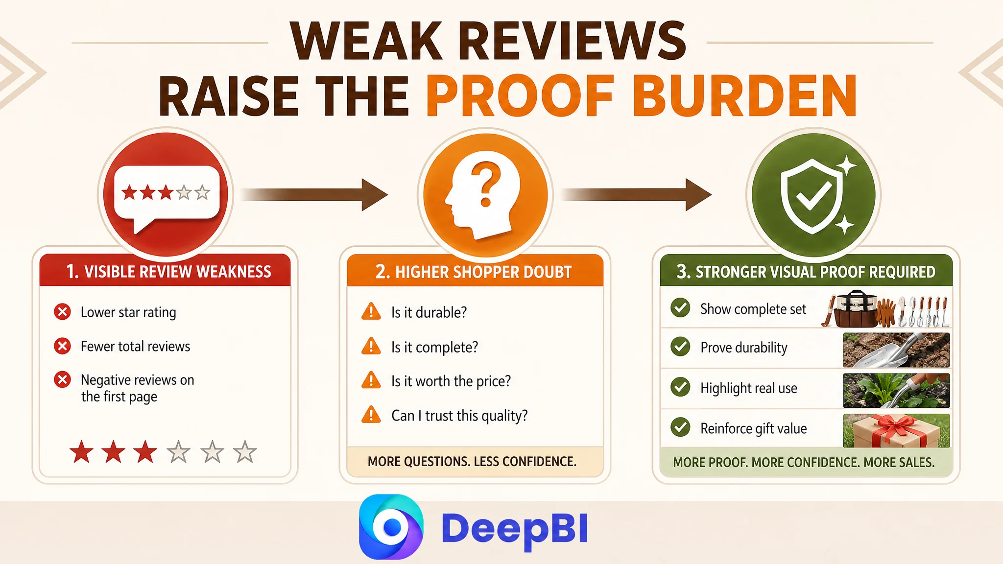
The score comparison showed that the review dimension was the most severe weakness.
The customer Listing had:
- A 3.7-star rating
- 14 total reviews
- Two negative reviews among the five shown on the first page, including one 1-star and one 2-star review
The comparable listing had:
- A 4.7-star rating
- 335 total reviews
- No negative review among the visible first-page reviews
The review difference alone created a substantial trust gap. Positive feedback on the comparable listing repeatedly reinforced three ideas: the tools were sturdy, the appearance was attractive, and the set worked well as a gift. The customer’s visible negative feedback raised concerns about tool quality, including reports of a hand rake breaking and pruning shears feeling low quality.
That meant the page was not operating in a neutral environment. It was asking its images and copy to overcome a visible credibility problem.
The customer could still improve the Listing content, but content optimization could not erase the review history. DeepBI therefore treated the review weakness as a major business risk and used it to shape the page strategy:
- Durability needed to be demonstrated earlier.
- The tool set needed to look complete and organized.
- The page had to avoid creating a toy-like impression.
- The heavy-duty positioning needed stronger visual proof.
- Gift suitability had to be supported by credible scenarios, not just a generic claim.
This is why the review score was not treated as an isolated reputation issue. It changed the burden placed on every other Listing element.
The Title Was Spending Space Without Building Enough Advantage
The customer’s title began with “Garden Tool Set” and repeated related terms such as “Gardening Hand Weeder Tools.” That created two problems.
First, the most important product and category information was not arranged as efficiently as it could be for Amazon search visibility and mobile browsing. Second, the title used space on repetition while leaving several persuasive details underdeveloped.
The comparable listing made stronger use of:
- The category phrase “Gardening Tools”
- “Repotting Mat” as a differentiated accessory
- “Stainless Steel” as a material and durability cue
- “Purple Floral Tote Bag” as a visual and gifting signal
The proposed title direction moved the customer’s strongest factual advantages forward:
12 Pcs Heavy Duty Garden Tool Set with Storage Bag & Gardening Gloves, Floral Hand Tool Kit including Weeder, Gardening Gifts for Women and Men, Brown
The point was not to imitate the competitor’s wording. It was to make the customer’s own value proposition easier to understand:
- 12-piece completeness
- Heavy-duty positioning
- Storage and gloves
- Floral appearance
- Gardening gift relevance
- Use for women and men
The title needed to perform two jobs at once: support Amazon search coverage and give shoppers a quick reason to continue reading.
The Main Image Sequence Was Showing Products, Not Building Confidence
The main-image set was clear enough to communicate the product category, but its visual roles were not sufficiently differentiated.
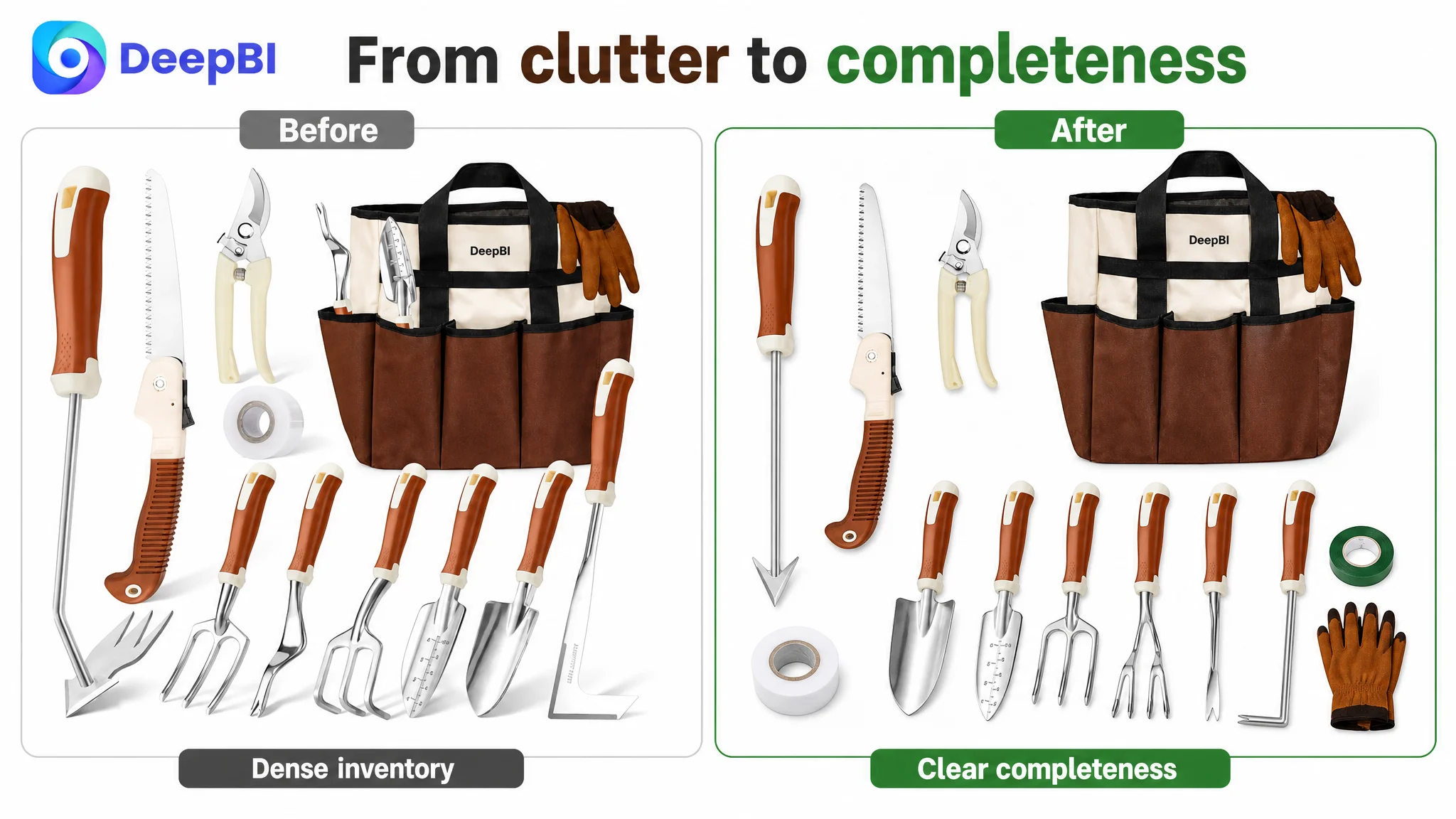
The first image tried to communicate broad value through the number of components. However, the arrangement appeared more cluttered than the comparable listing’s cleaner, more orderly presentation. A 12-piece set should feel more complete because it contains more tools, not more confusing because there are more objects competing for attention.
DeepBI reframed the image sequence around the questions shoppers were most likely to ask.
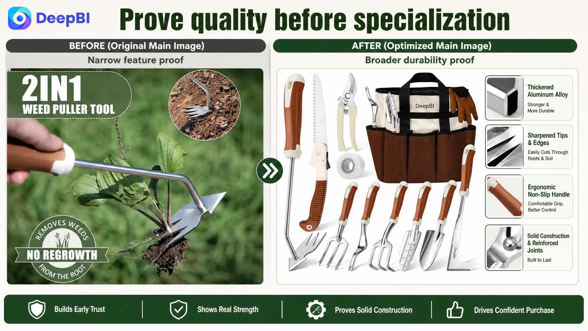
First: What exactly is included?
The opening visual needed to present the full 12-piece kit in an organized, easy-to-verify arrangement. The goal was to make the product feel complete and capable at a glance.
Second: Will the tools hold up?
The next visual should establish general durability and rust resistance before focusing on a specialized weed-pulling function. Close-up views of the aluminum tool heads and key construction details could address concerns about bending or breaking more effectively than an isolated technical claim.
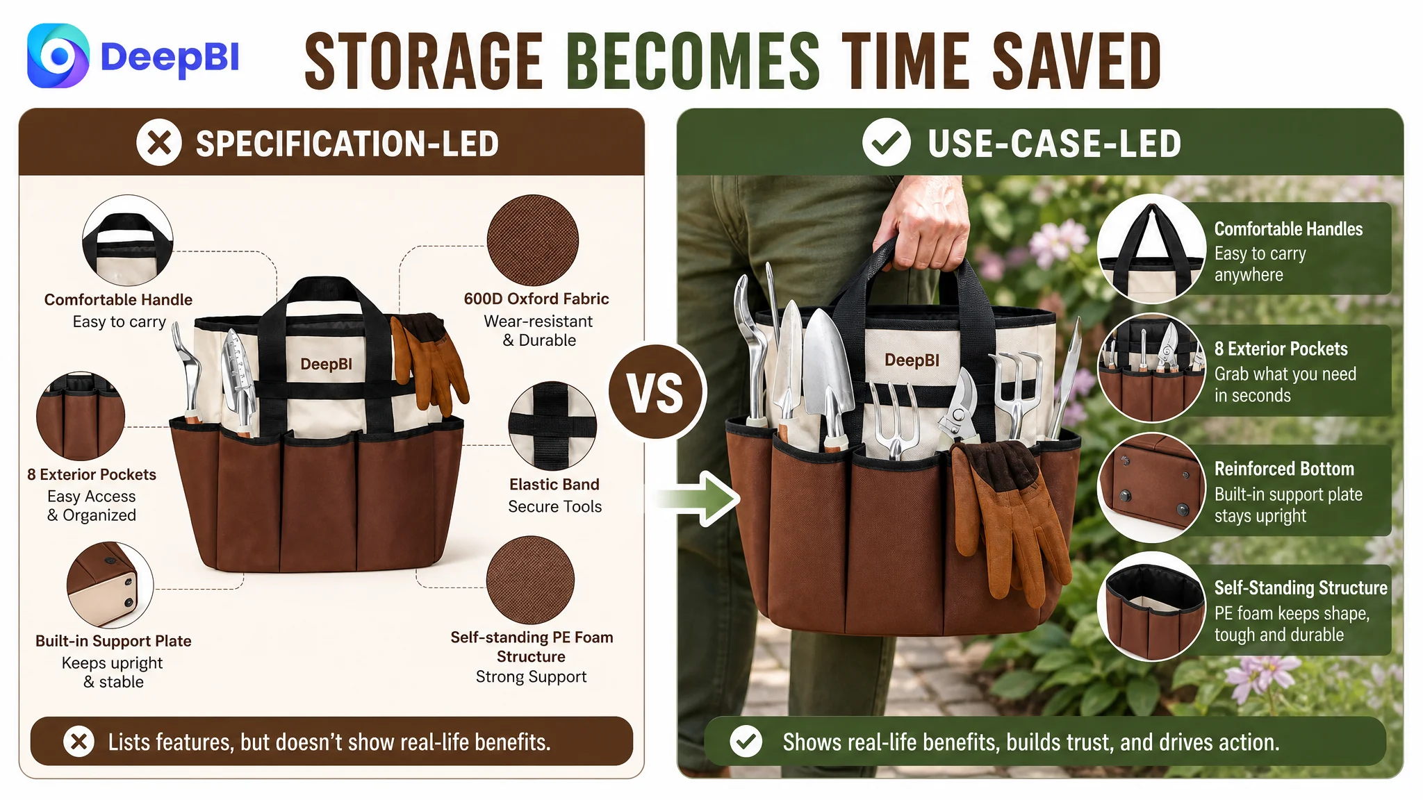
Third: Is the storage bag genuinely useful?
The existing image leaned too heavily on material language such as 600D Terylene. That is a rational specification, but it is less persuasive than showing the bag being carried, standing upright, keeping tools accessible, and supporting real gardening work.
Fourth: What does each tool actually do?
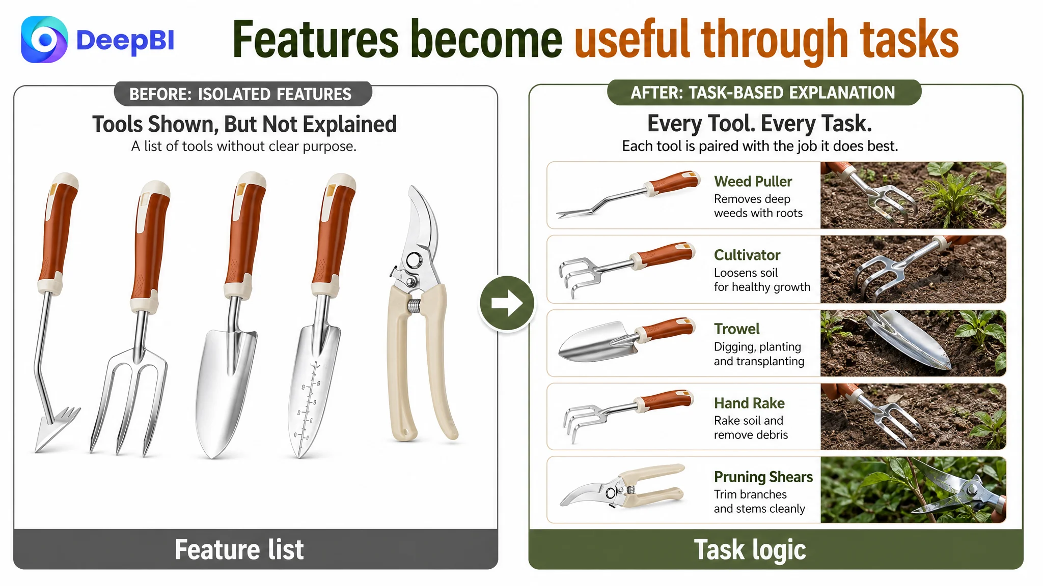
Instead of placing too many tools into one undifferentiated composition, the visual path should connect specific tools to specific tasks:
- Large trowel for digging holes
- Small trowel for transplanting and detailed work
- Cultivator for breaking up soil
- Hand rake for leveling soil and gathering debris
- Weeder for removing dandelions and stubborn weeds
Fifth: Does the set protect the user and support more tasks?
The pruning shears’ safety lock, the gloves’ protective role, the crack weeder, grafting tape, and folding saw could complete the story around safe, practical, multi-task gardening.
The main image problem was not simply that the product looked less attractive. It was that the visual sequence did not answer the buyer’s questions in the order those questions arise.
The Bullets Had Information, but Not Enough Conversion Structure
The customer’s bullet points included useful facts, but the structure was more feature-led than task-led.
The first bullet began with functional upgrades and the dual-head tool. The comparable listing began with the complete kit and its gardening applications. That difference affected the opening frame of the product.
For a gardening tool set, the first bullet should establish coverage: planting, weeding, digging, pruning, transplanting, and maintenance. After shoppers understand that the set covers their work, the page can explain why the individual tools are durable or specialized.
DeepBI’s proposed direction rearranged the logic:
Completeness before specialization
The 12-piece set should be presented as a complete solution, with the key tools named and their broader use established. This makes the larger tool count commercially meaningful rather than merely numerical.
Pain point before technical detail
The dual-head weed puller should then be tied to specific tasks: penetrating deep-rooted weeds, cutting roots, and handling stubborn vegetation. “Dual-head” is a feature; reducing the need to switch tools is a benefit.
Durability with comfort
The material and ergonomic bullet should connect aluminum construction, rust resistance, a non-slip grip, and reduced hand strain to extended gardening sessions. The wording must remain grounded in the product’s actual attributes rather than making unsupported performance promises.
Storage as time saved
The tote bag’s self-standing structure, reinforced bottom, and inner pockets should be explained through the problem they solve: tools remain organized, visible, and easier to access.
Use across people and seasons
The final bullet could broaden the product’s relevance to beginners, hobbyists, and experienced gardeners, while also supporting its role as a gift for women and men. The important change was to make “gift” and “all-season use” part of a credible product story rather than a generic closing claim.
The objective was not to make the copy longer. It was to make every bullet complete a small persuasion loop:
gardening task → product feature → practical result.
The A+ Page Was the Clearest Conversion Leak
The detail-page score was 19 out of 25, compared with 23 for the benchmark listing. The difference was not caused by missing product assets alone. It came from how the modules were arranged.
The customer’s A+ page included:
- A brand promise section
- A feature close-up of the dual-head weeder
- A five-tool usage scene
- An additional tool image
- A family or child-oriented scene
- A gifting scene
The comparable listing used a more mature commercial sequence:
- An emotional gift-positioning opening
- Multiple product and packaging views
- A complete tool layout
- Six gardening scenarios
- Family interaction scenes
- Individual tool close-ups
- A separate accessory module
The competitor’s page was building an emotion, function, and trust funnel. The customer’s page introduced brand reassurance and product features before clearly answering why the product was relevant to the buyer.
DeepBI’s priority was therefore to change the order of persuasion.
Open with the buyer’s reason to purchase
The first module should target gift buyers and gardening hobbyists through aspirational, diverse scenarios. “Gardening gifts for women and men” becomes more credible when the visual language shows the product in a thoughtful gifting and gardening context.
Confirm the full contents early
The complete 12-piece inventory should appear near the front of the page. Shoppers should not have to infer what comes in the bag from several usage images.
Establish adult-sized, heavy-duty credibility
The page needed to avoid any unintended toy-like impression. Existing family or child imagery could be retained only if the copy and surrounding visuals made clear that the tools were lightweight to handle but robust in function.
Move specialized engineering proof later
The dual-head weed puller was a genuine differentiator, but it did not need to lead the page. It would be more persuasive after the shopper already understood the full kit and its intended use.
Build a structured tool-by-tool explanation
The crack weeder, folding saw, pruning shears, and grafting tape deserved dedicated explanations because they demonstrated functional completeness. The fundamental tools—trowels, cultivator, hand rake, and weeder—also needed their own structured module rather than being compressed into a crowded collage.
Give the tote bag its own rational proof
The storage bag was not merely packaging. Its reinforced bottom, self-supporting structure, and exterior pockets could support the portability and organization story, but only if shown as part of real use.
A+ content should not be a gallery of attractive images. It should be the page’s answer to every serious purchase objection.
Why DeepBI Did Not Recommend More Ad Tuning First
When an Amazon Listing has a conversion problem, sellers often look first at bids, keywords, placements, or campaign structure. Those levers matter when the traffic is wrong or the ad economics are misaligned.
But they cannot repair a page that fails to establish value and trust.
This case showed several page-level constraints:
- A review profile that created immediate quality concerns
- A title that did not make the product’s strongest advantages sufficiently visible
- A main-image sequence that prioritized quantity and technical information without enough visual hierarchy
- Bullet points that listed tools more effectively than they explained outcomes
- A+ content that introduced functions before building a strong reason to buy
- A positioning risk created by family imagery that could weaken the heavy-duty perception
Continuing to optimize Amazon ads before addressing those constraints would risk amplifying the wrong outcome. More clicks would not automatically make the product look more durable. More impressions would not resolve uncertainty about what comes in the set. More precise targeting would not replace the trust normally supplied by a strong rating and substantial review volume.
The decision order therefore became clear:
1. Repair the Listing’s conversion logic.
2. Make the product’s completeness and durability easier to verify.
3. Strengthen the relationship between features and gardening tasks.
4. Rebuild the A+ page around gifting, use cases, and trust.
5. Then evaluate whether paid traffic is being converted more efficiently.
This was not a claim that advertising was irrelevant. It was a recognition that advertising should not be asked to compensate for a product page that has not yet earned the traffic.
The Change Was From Feature Accumulation to Decision Support
The proposed optimization did not change the product itself. It changed how the Listing helped shoppers evaluate the product.
The title was reorganized around the product’s strongest search and purchase signals.
The main images were assigned clearer roles: complete kit, durability, portability, task coverage, and safety.
The bullet points were rewritten to connect features with gardening problems and outcomes.
The A+ page was restructured to move from emotional relevance to inventory confirmation, then to durability proof, specialized tools, core gardening tasks, and storage.
The page also became more disciplined about what it should not claim. No new material, performance specification, or product function should be invented merely to match a competitor. Visual improvement had to preserve the product’s real structure and attributes.
That constraint is commercially important. A more polished image that overstates the product can increase short-term clicks while creating returns, negative reviews, and deeper trust damage later.
The source case does not provide verified post-optimization CVR, ACOS, CTR, or organic-order data. The defensible conclusion is therefore not that the Listing achieved a specific numerical improvement. The meaningful change was the operating direction: the team stopped treating more features as the answer and began rebuilding the page around the buyer’s decision process.
What Amazon Sellers Should Take From This Case
A 12-piece set can still look less complete than a 9-piece set if the page does not organize the information clearly.
A specialized tool can still weaken conversion if it appears before the shopper understands the overall value of the kit.
A storage bag can be a selling point, but only when its design is translated into easier access, better organization, and more practical use.
A family or gifting image can broaden the audience, but it can also create a positioning risk if it makes heavy-duty tools feel like toys.
And a weak review profile can change the job of every other Listing element. When third-party trust is limited, the page must work harder to provide visual proof, clear inventory confirmation, believable use cases, and a coherent reason to buy.
The broader Amazon lesson is simple:
Ads determine how much traffic reaches the Listing. The Listing determines whether that traffic becomes a business result.
For this gardening tool seller, DeepBI’s value was not in producing more isolated edits. It was in identifying the constraint beneath the visible symptoms: the product had enough components, but the Amazon product page did not yet convert those components into a sufficiently trusted buying decision.