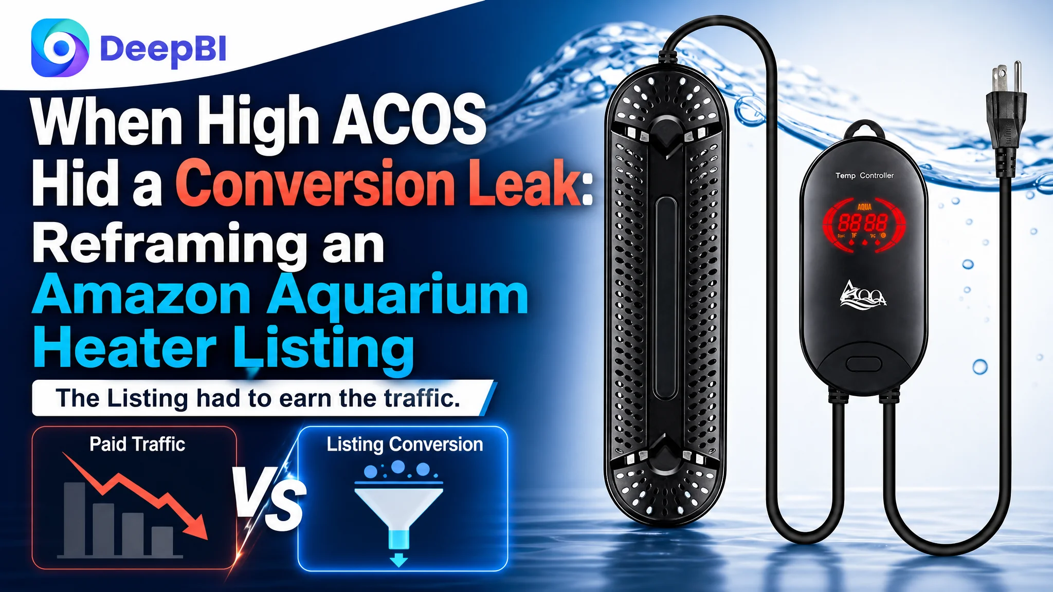
The customer was an Amazon US seller operating in the aquarium equipment category. The immediate concern appeared to be familiar: paid traffic was becoming harder to justify, while orders were not keeping pace with the traffic being purchased. The team initially treated the situation as an Amazon ads problem—one that might be solved through better targeting, bids, or campaign structure.
DeepBI’s Listing diagnosis pointed to a different constraint. The product page scored 70 out of 100, compared with 87 for a closely matched high-performing competitor. The gap was not concentrated in one isolated image or keyword. It ran through the title, main image, bullet points, A+ content, and review trust layer. The Amazon Listing was receiving traffic, but it was not giving shoppers enough confidence to convert.
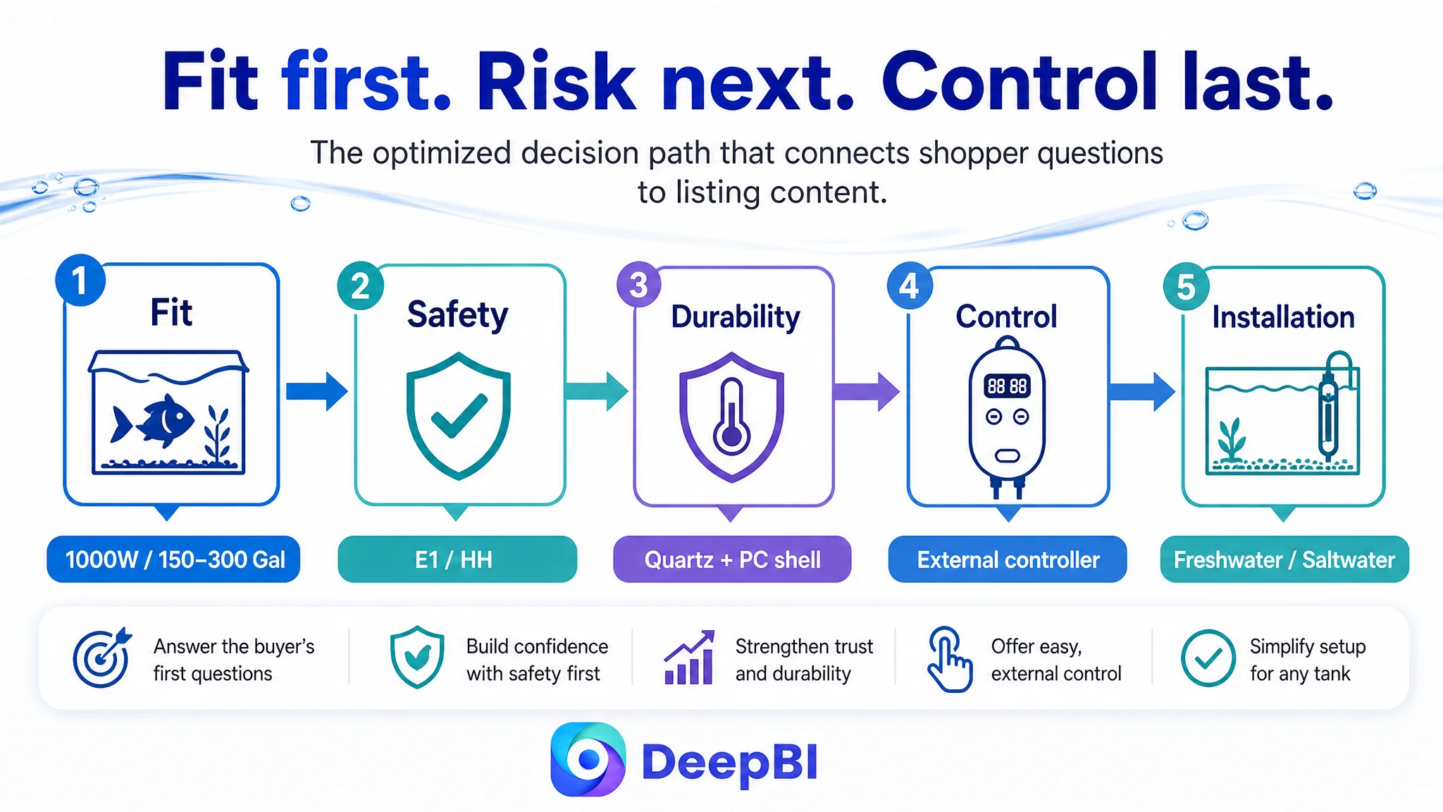
The later optimization therefore focused on rebuilding the page’s decision logic: clarify tank-size suitability first, make safety protection concrete, strengthen the product’s large-tank use case, and connect the title, images, bullets, and A+ content into one trust-building path. The broader lesson for Amazon sellers is direct: before pushing more traffic into a listing, determine whether the product page is capable of converting that traffic.
The Amazon Ads Diagnosis Was Understandable—and Incomplete
When advertising efficiency weakens, sellers usually look at the advertising account first.
They review:
- Search terms
- Match types
- Bid levels
- Placement performance
- Campaign structure
- ACOS and TACOS movement
That response is reasonable when the main problem is traffic quality. But it becomes misleading when the page itself is failing to convert relevant shoppers.
In this case, the customer’s initial assumption was that the Amazon ads were not working efficiently enough. The likely operating logic was familiar:
If ACOS is too high, the campaigns need more precise optimization.
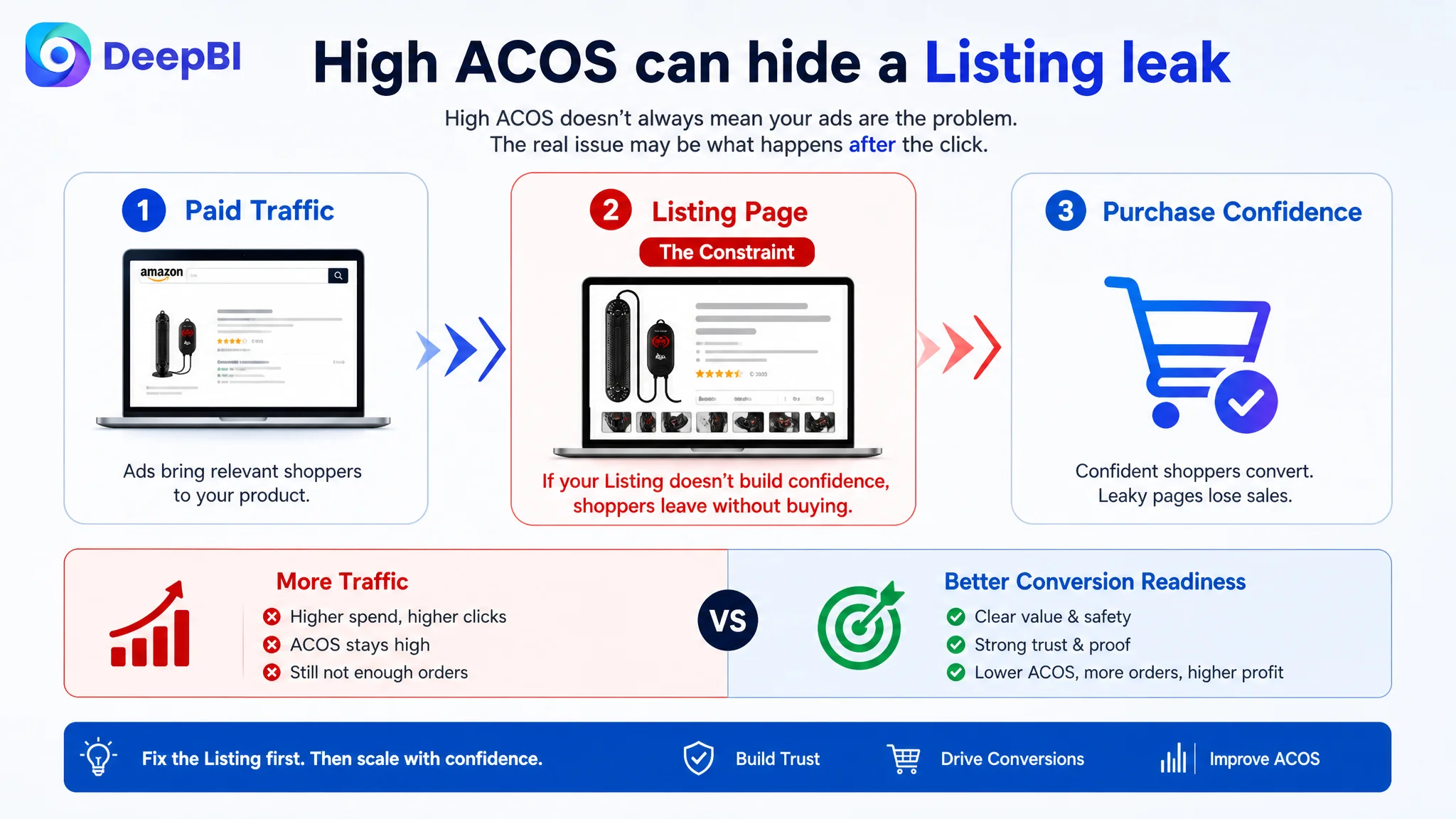
The problem was that this diagnosis treated the ad account as the beginning and end of the conversion path. It did not sufficiently account for what happened after the click.
For an aquarium heater, a shopper is not only looking for wattage. They are also evaluating risk:
- Is 1000W suitable for my tank size?
- Can the heater operate safely in a large aquarium?
- What happens if the unit is not fully submerged?
- How does it respond to overheating?
- Can I monitor and adjust the temperature easily?
- Will the heater protect fish from accidental contact or burns?
- Does the page provide enough evidence to trust the product?
If the Amazon Listing leaves these questions unresolved, more advertising can increase exposure without improving the probability of purchase.
Advertising does not only amplify a product’s strengths. It can also amplify the weaknesses of the page receiving the traffic.
The Listing Had a 17-Point Competitive Gap
DeepBI’s first useful judgment came from putting the Listing into a competitive context rather than reviewing each asset in isolation.
The customer’s Listing scored 70 out of 100. The matched competitor scored 87, creating a 17-point gap.
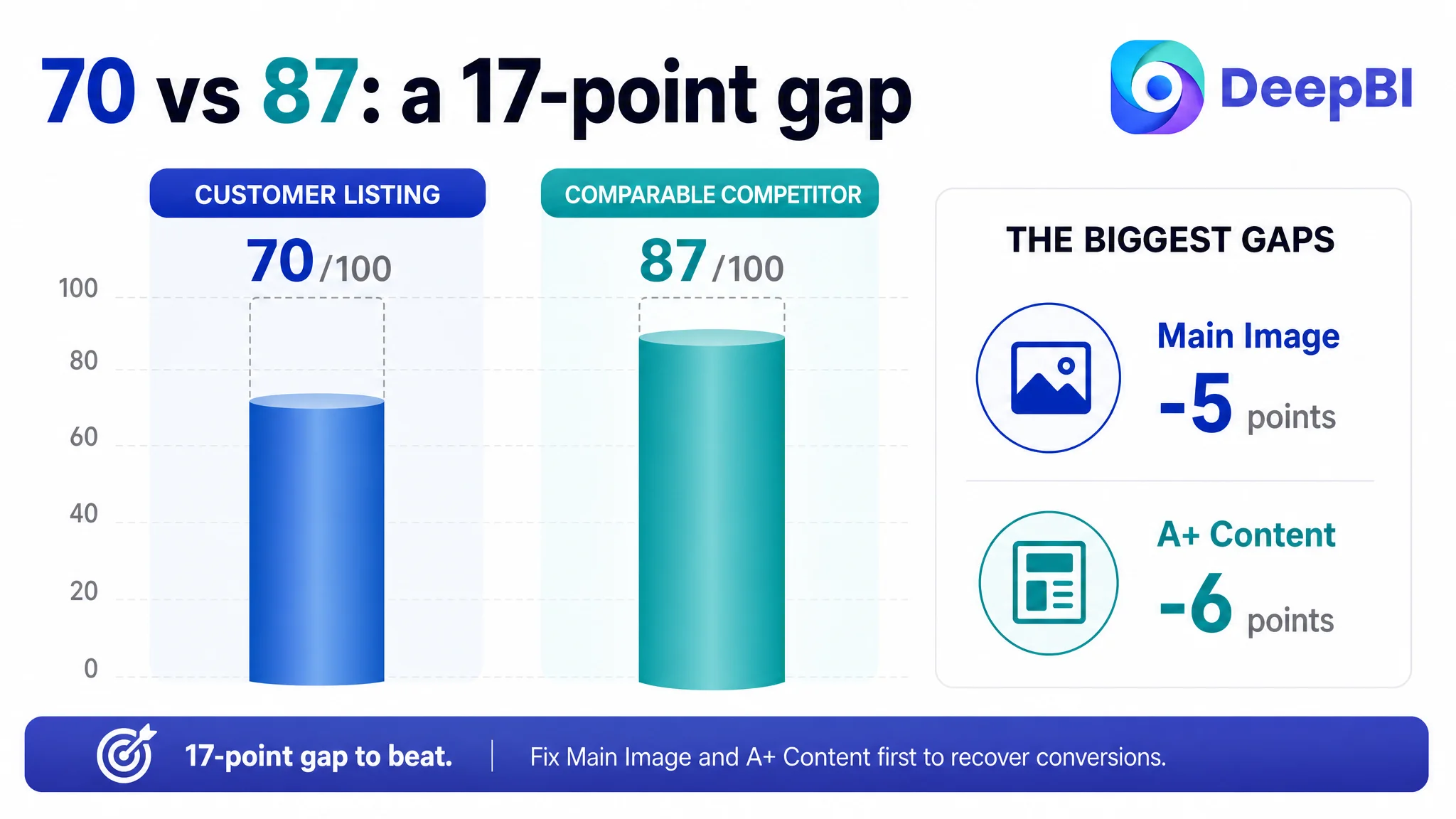
- Title: Customer Listing: 16/20, Comparable competitor: 18/20, Gap: -2
- Main image: Customer Listing: 21/30, Comparable competitor: 26/30, Gap: -5
- Bullet points: Customer Listing: 7/10, Comparable competitor: 8/10, Gap: -1
- A+ content: Customer Listing: 17/25, Comparable competitor: 23/25, Gap: -6
- Reviews: Customer Listing: 9/15, Comparable competitor: 12/15, Gap: -3
- Total: Customer Listing: 70/100, Comparable competitor: 87/100, Gap: -17
The score did not mean that every element of the page was unusable. It showed that the Listing was behind the category benchmark across several parts of the buying journey.
The most important gaps were in the main image and A+ content. Those two areas accounted for an 11-point difference between the Listings. That mattered because the main image influences the first decision to investigate, while A+ content helps resolve the deeper questions that determine whether a shopper continues toward purchase.
The review layer added another risk. The customer Listing had a 3.9-star rating from 66 reviews, while the competitor had 4.3 stars from 27 reviews. More review volume did not compensate for weaker review quality. The customer Listing’s negative-review rate was reported at 25%, compared with 12.5% for the competitor. Two visible one-star reviews raised concerns about explosion and short-circuiting—issues that could directly undermine confidence in an aquarium heating product.
This was not simply a matter of needing more reviews.
It was a trust problem that the rest of the page needed to handle with greater clarity and evidence.
The Title Contained Keywords, but Not Enough Buying Logic
The title was only two points behind the competitor, so it was not the largest weakness. But it still showed how a Listing can contain relevant terms without presenting them in the most useful order.
The customer’s title repeated related phrases such as “Aquarium Heater” and “Fish Tank Heater,” while the main product details were positioned less efficiently. The result was a title that contained information but did not immediately establish the product’s role for the shopper.
The competitor led with a clearer structure:
- Core category term
- Wattage options
- Tank-capacity range
- Safety functions
- Water-type compatibility
The proposed direction for the customer’s title was to foreground the actual use case:
- 1000W aquarium heater
- 150–300 gallon tank suitability
- Submersible design
- Overheating protection
- Automatic stop
- Freshwater and saltwater use
- Hydroponic compatibility where relevant
The change was not about adding more keyword volume. It was about reducing the distance between the search term and the customer’s first question:
Is this heater appropriate for my tank, and does it appear safe enough to consider?
The original title also leaned on broad descriptors such as “Submersible” and “Thermostat.” Those terms describe the product, but they do not create much differentiation. Safety-related functions such as automatic stop and overheating protection carried greater decision value because they connected the product to the risks shoppers were already considering.
The Main Image Showed the Product, but Did Not Establish Its Role
The main-image gap was more commercially important.
The customer’s image set focused heavily on product recognition, components, specifications, and operating details. That made the Listing look technically informed, but it did not create a strong first impression of a powerful heating system designed for a large aquarium.
The competitor’s visual sequence communicated more quickly:
- Large-tank suitability
- Heating power
- Safety protection
- Product structure
- Functional control
- Practical use
The customer’s main visual treatment was closer to a product inventory display. It showed the heater, but it did not sufficiently answer why this particular heater deserved attention in a crowded Amazon search result.
The first visual problem was context
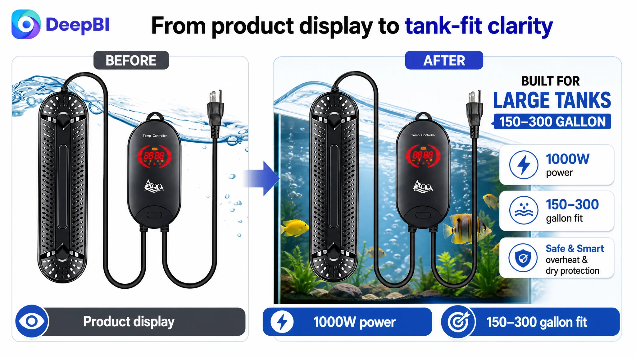
A 1000W heater for a 150–300 gallon tank should not look like a small accessory presented without scale.
The proposed direction was to show the large heater guard submerged in a large aquarium environment, with the product clearly visible and the scale of the tank easier to understand. The purpose was not decorative lifestyle imagery. It was to make the product’s intended operating context immediately legible.
That distinction matters.
A scene is useful when it clarifies suitability. It is not useful merely because it makes the image more attractive.
The second problem was abstract safety communication
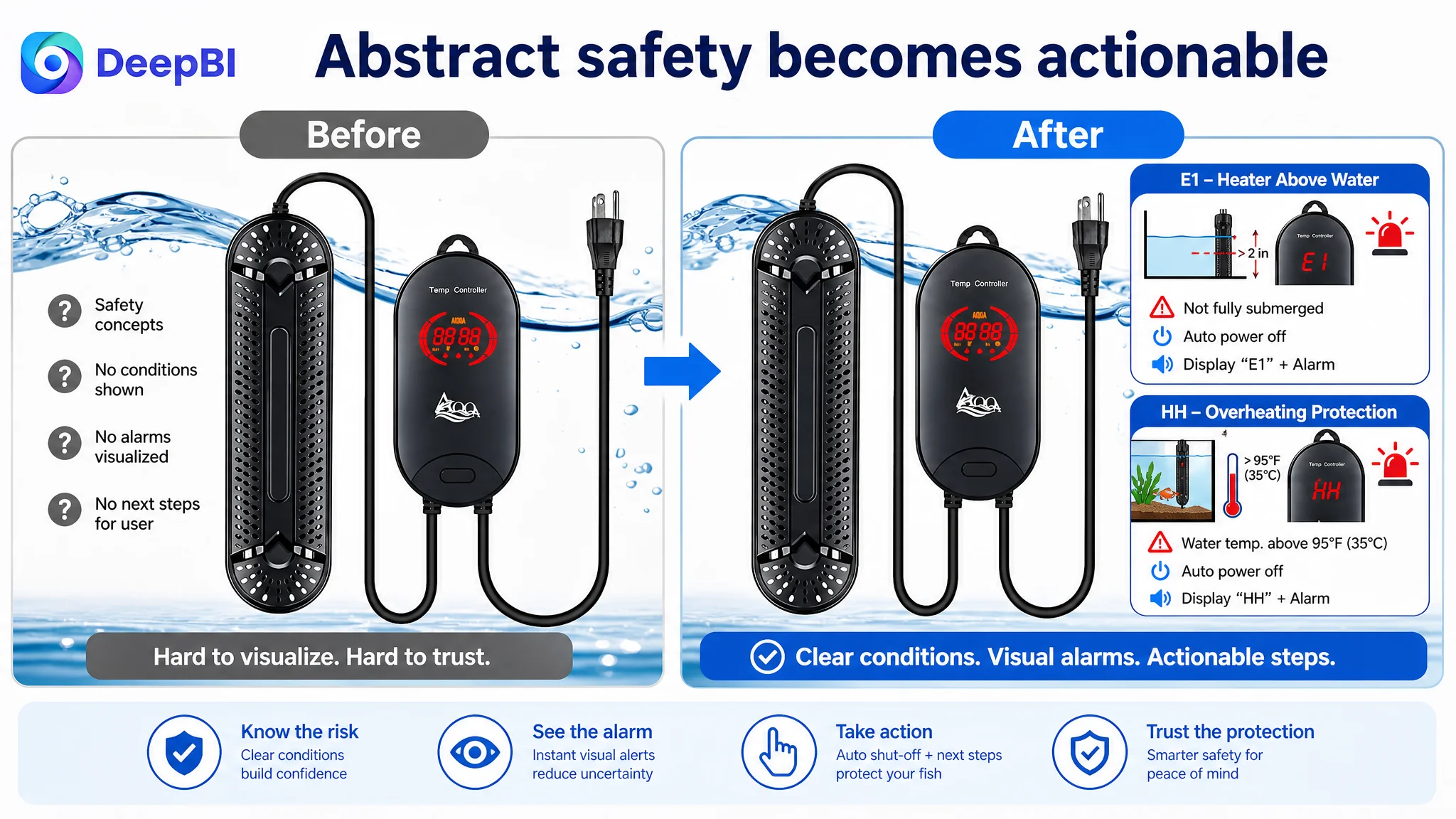
The existing visual treatment relied too much on general labels and error-code references. The important safety functions were present in the product information, but they were not presented with enough visual force.
The optimization direction made the protection logic more concrete:
- If the heater is not fully submerged, it automatically stops heating and displays E1
- If the water temperature exceeds 95°F / 35°C, it stops heating and displays HH
- The controller communicates the operating state through the display and indicator light
Specific triggers are more persuasive than broad statements such as “smart protection.” They allow shoppers to understand what the product will do in situations that create anxiety.
The third problem was sequencing
The dense specification image appeared too early. Technical information can support trust, but it should not interrupt the initial path from recognition to risk reduction.
The revised sequence placed greater emphasis on:
1. Large-tank fit and power
2. Anti-dry-heating protection
3. Overheating protection
4. Visible internal heating components
5. Intelligent temperature control
6. Detailed specifications and operation
The decision was not to remove technical content. It was to place each explanation where it could answer the next likely question.
The Bullet Points Described Functions Without Completing the Argument
The bullet points were another example of a page that contained useful information but did not organize it around the customer’s decision process.
The customer’s original bullets focused on:
- Materials
- Temperature range
- Installation
- Protection systems
- Usage warnings
The competitor’s bullets more consistently followed a pain-point structure:
- What concern does the buyer have?
- What product feature addresses it?
- What happens in actual use?
- Why does that reduce risk?
That difference made the competitor’s copy more persuasive even where the underlying product information was similar.
Material became a fish-safety argument
The proposed first bullet connected the product’s physical construction to the user’s concern about durability and fish safety.
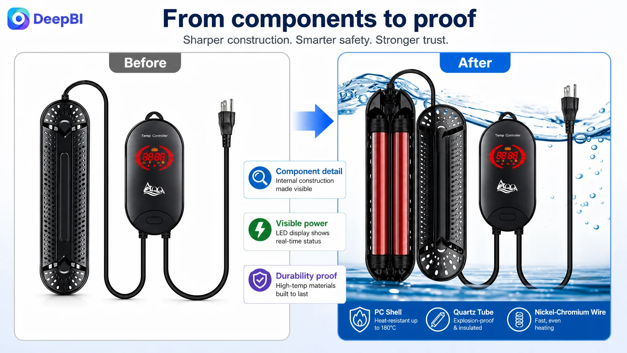
Instead of presenting quartz glass, nickel-chromium wire, and a PC plastic shell as separate specifications, the revised logic linked them:
- Explosion-proof quartz glass and nickel-chromium heating wire support rapid, even heating
- A V0-rated, heat-resistant PC shell provides protection around the heating element
- The guarded design helps reduce the risk of fish contacting a hot surface
The point was not to make a stronger material claim than the product could support. It was to explain why the materials mattered in the aquarium.
Error codes became actionable protection
The original protection information was more difficult to interpret quickly. The revised structure tied each code to a condition and a response:
- E1: the heater is not fully submerged; place it completely in water
- HH: the water temperature is above the stated threshold; check the water temperature
This converted an abstract safety claim into a recognizable operating scenario.
The external controller became a control benefit
The controller was initially described mainly through its functions. The revised direction presented it as a way to reduce operating anxiety:
- Adjust temperature without placing hands in the water
- View the real-time water temperature
- Switch between Fahrenheit and Celsius
- Adjust the setting through the external control
- Understand when the heater is actively heating or has reached the target temperature
This is a small but important shift. Buyers do not purchase a display merely because it displays information. They value the control and visibility it gives them.
The final bullet reduced suitability uncertainty
The last bullet was repositioned from a warning-heavy instruction into a clearer application and installation message.
It could address:
- Freshwater and saltwater compatibility
- Aquarium and turtle-tank use where supported
- Full-submersion requirements
- Placement near water flow for more even heating
- Unplugging before water changes or cleaning
This helped answer the practical question that often blocks conversion:
Can I install and use this heater correctly in my setup?
The A+ Page Was the Largest Conversion Constraint
The A+ content showed the largest single score gap: 17 out of 25, compared with 23 out of 25 for the competitor.
The customer’s A+ page already contained several useful assets:
- Controller operation
- Temperature logic
- Heating components
- Safety warnings
- Installation scenes
- Packaging
- Product angles
The issue was not the absence of content. It was the order and role of that content.
The modules were more descriptive than persuasive. They explained what the product looked like and how some functions worked, but they did not consistently guide the shopper through the most important purchase concerns.
The competitor’s A+ structure was stronger because it followed a more deliberate sequence:
1. Establish the product’s power and tank suitability
2. Show what happens during dry operation
3. Explain overheating protection
4. Clarify error codes and solutions
5. Connect materials to durability and fish safety
6. Demonstrate controller visibility and use
7. Confirm freshwater and saltwater compatibility
This created a progression from fit to risk to control.
Start with tank-size confirmation
The first module should answer the most immediate question:
Is this 1000W heater suitable for a 150–300 gallon tank?
That information was more valuable at the beginning than an explanation of how to set the temperature. A shopper who is uncertain about suitability may not continue far enough to read the operating instructions.
Address dry-running risk early
Anti-dry-heating protection should appear before secondary technical explanations.
The page needed to show that when the heater is not fully immersed, it can stop heating and display the E1 alert. This gives the shopper a clear response to a specific fear rather than asking them to trust a general safety phrase.
Follow with overheating protection
Overheating is a more serious concern for an aquarium product because it can affect livestock and the entire tank environment.
The proposed module used the actual product logic: when the water temperature exceeds 95°F / 35°C, the heater stops heating and displays HH. Presenting the trigger, action, and alert together creates a more credible safety explanation.
Turn troubleshooting into reassurance
A troubleshooting table was not merely a support element. It could also function as a trust module.
Showing:
- The error code
- The condition that causes it
- The action the user should take
helps convert uncertainty into control. A product does not appear safer simply because it claims to be intelligent. It appears more manageable when the user can understand how it responds to abnormal conditions.
Combine material and protection evidence
The heating rod and protective shell had been presented too separately. The revised structure connected them into one persuasion node:
- Explosion-proof, insulated quartz glass
- Heat-resistant PC plastic shell
- Protection against accidental contact with the heated surface
- A more durable structure for continued aquarium use
This was a more useful story than showing the components without explaining their combined role.
Make the controller visibly usable
The controller module should show the distinction between current water temperature and the set temperature. It should also show how the user changes units and adjusts temperature without placing hands into the tank.
The goal was not to add more interface detail. It was to make the product’s control system feel understandable before purchase.
Why DeepBI Did Not Recommend Tuning Ads First
The decision order was the central part of the diagnosis.
If the main constraint had been weak keyword relevance or poor traffic quality, continued Amazon ads optimization could have been the correct first move. But the evidence pointed to a page-level problem:
- The Listing was 17 points behind the benchmark
- Main-image performance was materially weaker
- A+ content had the largest content gap
- Review quality created a trust risk
- Safety concerns were visible in the review section
- The product page did not organize its information around suitability, risk, and control
In that situation, sending more traffic to the page would not address the constraint. It could make the inefficiency more visible while increasing the cost of each failed visit.
The question was not “How can the ads buy more traffic?” It was “What will that traffic see after the click?”
DeepBI’s judgment came from connecting the Listing score to the buyer’s decision path rather than treating the score as a collection of independent recommendations.
The title affected search matching and initial clarity. The main image affected attention and product positioning. The bullets translated specifications into benefits and risk reduction. A+ content handled deeper objections. Reviews influenced whether the customer trusted the claims.
Those elements needed to work together before ad traffic could become more productive.
The Optimization Direction Shifted From More Information to Better Order
The customer did not need to fill the page with every available specification.
The page needed to place the right information at the right decision point.
The revised logic was:
First: confirm fit
Show the 1000W power level and 150–300 gallon suitability early. This reduces the basic compatibility question.
Next: reduce safety anxiety
Make anti-dry-heating and overheating protection visible, with actual triggers and error codes rather than broad promises.
Then: establish durability and fish protection
Connect quartz heating components and the protective PC shell to the product’s use in an aquarium.
After that: demonstrate control
Show the external LED controller, temperature readings, unit switching, adjustment method, and heating status.
Finally: confirm use cases and installation
Clarify freshwater and saltwater compatibility, full-submersion requirements, placement, and maintenance precautions.
This was not a cosmetic refresh. It was a reordering of the sales argument.
What Changed in the Business Understanding
The case material does not include verified post-optimization results, so it would be inappropriate to claim a specific CTR increase, CVR recovery, ACOS decline, or organic-order improvement.
The meaningful change at this stage was the operating diagnosis.
The customer’s problem was no longer framed as:
The ads need more adjustment.
It became:
The Amazon Listing needs to earn the traffic before the account is scaled further.
That reframing changes the next business decisions.
Instead of repeatedly adjusting bids against a low-conversion page, the team can evaluate whether:
- The main image creates a reason to click
- The title communicates the product’s core use case quickly
- The bullets answer the buyer’s safety and installation concerns
- The A+ page follows a logical persuasion sequence
- The review risk is being offset by credible product evidence
- The Listing can convert both paid and organic visitors
Only after those conditions improve does advertising data become easier to interpret. A weak page can make good traffic look bad. A clearer page gives the seller a better chance of distinguishing traffic problems from conversion problems.
The Broader Lesson for Amazon Sellers
A high ACOS number is a symptom, not always a diagnosis.
For an Amazon aquarium heater Listing, the real bottleneck may sit between the click and the purchase:
- The product appears unsuitable for the shopper’s tank
- The main image does not communicate power or context
- Safety claims remain abstract
- Bullet points list features without resolving concerns
- A+ content explains the product in the wrong order
- Reviews introduce risks that the rest of the page does not address
DeepBI’s value in this case was not producing a longer checklist. It was identifying which weakness was most likely limiting the next business outcome, then explaining why that weakness had to be addressed before further ad tuning.
The practical principle is simple:
Before buying more Amazon traffic, confirm that the Listing has enough clarity, evidence, and trust to convert it.
For this customer’s aquarium heater, the page had useful product facts. What it lacked was a sufficiently strong path from search result to confidence. Rebuilding that path was the necessary first step before Amazon ads could be judged fairly.