

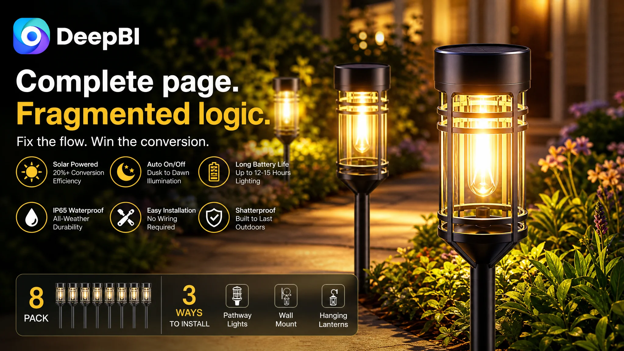
An Amazon seller in the outdoor lighting category had a product page that appeared to cover the basics: an eight-pack of solar pathway lights, IP65 weather resistance, automatic on/off operation, warm white illumination, installation guidance, and several lifestyle images. Yet the Listing still lagged behind a comparable high-performing Amazon product page.
The first instinct was to treat the problem as a collection of smaller weaknesses: improve the title, add more specifications, strengthen the weather-resistance claims, and make the images more attractive. DeepBI’s diagnosis pointed to a deeper issue. The page was not short of information; it lacked a persuasive order that could help shoppers understand why the product would perform reliably outdoors.
The customer’s original direction focused on individual features and isolated visual improvements. DeepBI reframed the problem as Listing conversion capacity: the title delayed the core search value, the main images presented technical facts without enough proof, the bullet points listed functions without building a buying logic, and the A+ content did not move the shopper smoothly from atmosphere to evidence to confidence.
The later optimization therefore focused on rebuilding the Amazon product page as a complete decision path—not simply making the images more polished. The case offers a practical lesson for Amazon sellers: before adding more traffic or refining isolated claims, determine whether the Listing gives paid and organic visitors a clear reason to click, trust, and buy.
The Amazon Listing Was Not Empty. Its Sales Logic Was Fragmented.
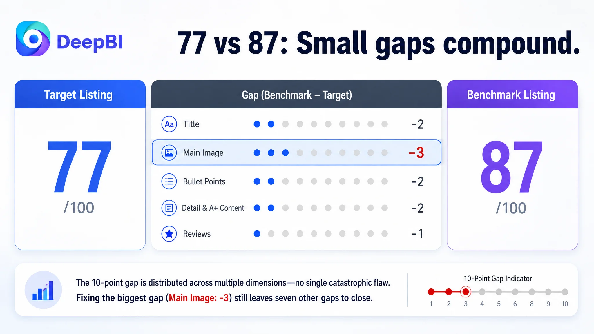
The product page received an overall Listing score of 77 out of 100, compared with 87 out of 100 for the comparable benchmark Listing.
The ten-point gap was not concentrated in one catastrophic failure:
- Title: Target Listing: 15/20, Benchmark Listing: 17/20, Gap: -2
- Main image: Target Listing: 24/30, Benchmark Listing: 27/30, Gap: -3
- Bullet points: Target Listing: 6/10, Benchmark Listing: 8/10, Gap: -2
- Detail page and A+ content: Target Listing: 21/25, Benchmark Listing: 23/25, Gap: -2
- Reviews: Target Listing: 11/15, Benchmark Listing: 12/15, Gap: -1
- Total: Target Listing: 77/100, Benchmark Listing: 87/100, Gap: -10
This distribution mattered.
The Listing was not suffering from one obvious defect such as missing images, an unusable title, or a severe review problem. Instead, several parts were slightly weaker than the benchmark. Those small gaps accumulated at the exact moments when an Amazon shopper was deciding whether to continue:
- Search relevance and click motivation in the title
- Immediate product understanding in the main image
- Benefit interpretation in the bullet points
- Proof and confidence in the A+ content
- Scale and reassurance in the review section
That made the page difficult to repair through isolated edits. Adding one more specification would not solve the order problem. Replacing one decorative scene would not solve the trust problem.
The Listing did not lack content. It lacked a clear sequence for turning content into confidence.
The Initial Diagnosis Treated the Problem as a List of Small Defects
The original optimization direction was understandable. The page contained many useful claims:
- Warm white lighting
- Solar charging
- Automatic operation
- IP65 water resistance
- Shatter-resistant construction
- Multiple installation possibilities
- Outdoor garden and pathway applications
- Eight lights in one package
From an operational perspective, the page seemed to need refinement rather than reconstruction. The title could be tightened. The specifications could be made more prominent. The image order could be adjusted. The lifestyle scenes could be made more appealing.
But this approach treated the Listing as a checklist.
The deeper problem was that the page asked shoppers to assemble the buying argument for themselves. It showed technical elements, but did not always explain what each element meant for the customer’s decision:
- What makes the light bright enough for daily use?
- How does the solar system support overnight operation?
- Why should shoppers trust the stated runtime?
- How simple is installation in practice?
- What does IP65 durability mean for outdoor use?
- How does the product improve the atmosphere of a yard or walkway?
For an Amazon product page, these questions are not separate. They form a conversion chain. If the title attracts the right searcher but the images do not establish confidence, the click becomes less valuable. If the main image creates interest but the bullet points remain parameter-heavy, the shopper may not understand the product’s practical value. If the page explains the product but the A+ content does not create a believable use outcome, the final decision remains incomplete.
The initial misdiagnosis was therefore not that the team had chosen the wrong features. It was that the team was treating each feature as an independent optimization task rather than as part of one Amazon product-page argument.
The Real Constraint Was Listing Conversion Capacity
DeepBI’s assessment located the most important constraint in the relationship between page content and shopper decision-making.
The benchmark Listing did not merely contain more claims. It organized those claims around recognizable customer concerns:
1. Is the product brighter or more capable than standard alternatives?
2. Can it manage energy efficiently?
3. Can it be used in more than one outdoor setting?
4. Is installation straightforward?
5. Will it hold up in changing weather?
6. What should the buyer know before installation?
The target Listing had many of the same underlying product attributes, but its presentation leaned more toward feature declaration:
- Brightness and light effects
- Automatic charging and switching
- Waterproof materials
- Installation methods
- Decorative and gift use
That distinction changed the diagnosis.
The page was not primarily losing because it lacked a selling point. It was losing because its selling points were not sufficiently connected to the shopper’s concerns. The Listing needed to move from “what the product has” to “what problem each feature resolves.”
This is why DeepBI’s assessment was based on more than an overall score. The score comparison showed where the page fell behind; the content comparison showed why those gaps mattered. The most commercially important weakness was the page’s ability to convert technical information into a credible outdoor-use decision.
The Title Delayed the Search Argument
The title scored 15 out of 20, two points below the benchmark.
The benchmark title led with the core phrase “8 Pack Solar Pathway Lights” and quickly added high-value product information such as motion sensing, brightness, operating modes, outdoor use, and installation flexibility.
The target title began with a brand reference and placed the main category phrase later. It also relied more heavily on a sequence of descriptive features without the same level of keyword prioritization or quantified communication.
This created two problems on Amazon.
First, the most important product identity was not presented early enough. A shopper scanning search results should quickly understand that the product is an eight-pack of solar pathway lights. Second, the title did not create as strong a bridge between search intent and product value. Terms such as waterproof, shatterproof, automatic operation, warm white, and outdoor landscape lighting were present or available, but the structure did not make their relative importance immediately clear.
The title recommendation therefore did not call for adding every possible phrase. It called for hierarchy:
- Put the core product phrase near the front
- Retain verified durability and operating claims
- Use specific attributes such as color temperature where supported
- Add relevant outdoor-use contexts
- Remove ornamental wording that consumes space without improving search or decision clarity
The goal was not keyword accumulation. It was to make the title work as both an Amazon search entrance and a concise product promise.
The Main Image Was Technical, but Not Yet Persuasive
The main image dimension had the largest score gap: 24 out of 30, compared with 27 out of 30 for the benchmark.
The target page already included product photography, technical diagrams, runtime information, solar-panel details, durability visuals, dimensions, and installation references. The issue was not an absence of effort. The issue was the role assigned to each image and the sequence in which the shopper encountered it.
The first image showed the product, but not enough of its practical value
The first image established the warm lighting effect and showed the product form. However, it did not fully distinguish the product’s core lighting capability from competing products with more advanced features.
The correct response was not to imply a function the product did not have. The source material specifically ruled out suggesting motion sensing where it was not confirmed. The image strategy instead needed to make the product’s real advantages more legible:
- Eight consistent lights
- Warm white illumination
- The visible LED filament design
- High-transparency covers
- A natural, attractive outdoor presentation
This is an important boundary in Amazon Listing optimization. A page should not imitate a competitor’s feature simply because that feature is visually effective. The visual strategy must strengthen the actual product proposition.
The performance image used numbers without enough proof
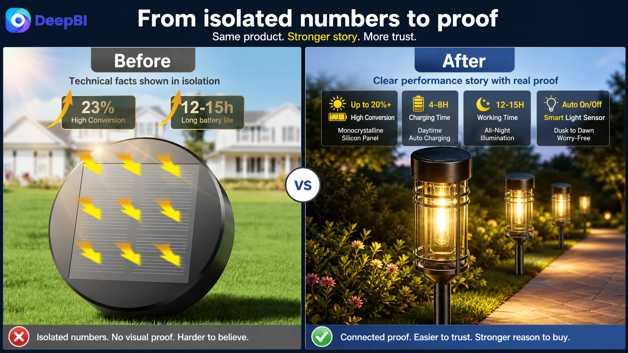
The target page communicated solar conversion and runtime figures, but isolated numbers such as conversion rates or operating hours could feel abstract when they were not connected to a visible cause-and-effect explanation.
The recommended direction was to connect:
Solar charging → stored energy → automatic operation → overnight illumination
A simple visual cycle could communicate this more efficiently than several disconnected labels. The shopper should be able to understand how a four-to-eight-hour charging period supports illumination from dusk through the night, based on the stated product information.
This is not the same as adding more numbers. It is about giving numbers a reason to be believed.
The installation and dimension image appeared too early
The original sequence introduced quantity, dimensions, switch details, and component lengths before the page had fully established performance and durability. That created a cognitive jump from “Why should I want this product?” to “How long is the pole?”
DeepBI recommended moving this information later, where it could serve as operational confirmation. Dimensions and assembly steps are valuable, but they are more effective after the shopper understands the product’s lighting and outdoor-use proposition.
The weather image needed a stricter evidence boundary
The page used weather-related visuals and durability language, but some temperature claims exceeded the confirmed selling points. The safer and more credible direction was to focus on supported attributes:
- IP65 water resistance
- High-quality ABS construction
- High-impact resistance
- A sturdy, explosion-resistant pole
- A lamp cover designed not to yellow or corrode
- Resistance to common outdoor weather conditions
DeepBI’s role in this judgment was not to make the claim sound more impressive at any cost. It was to prevent the Listing from using unsupported specifications that could create a mismatch between the page and the actual product.
The Bullet Points Listed Features Without Completing the Buying Logic
The bullet-point score was 6 out of 10, compared with 8 out of 10 for the benchmark.
The benchmark’s bullets were more persuasive because they consistently followed a problem-to-solution structure.
For example, instead of only presenting a component, the benchmark framed an upgraded design against a standard alternative and then described the practical result. Instead of merely stating that the product supported multiple uses, it named specific outdoor situations and showed how the product fit those situations.
The target bullets were more parameter-led:
- Brightness
- Charging
- Waterproofing
- Installation
- Decoration and gifting
These topics were relevant, but the structure did not always answer the shopper’s next question.
From specification to outcome
A stronger bullet structure for this product would connect:
- LED filament and transparent cover to warm, usable illumination
- Solar panel and rechargeable battery to longer operation with automatic control
- Light sensor to hands-free dusk-to-dawn use
- Eight-pack format and stakes to flexible yard, garden, driveway, and walkway placement
- IP65 construction and durable materials to reduced concern about outdoor exposure
- Installation guidance to more reliable charging and operation
The optimization recommendations followed this logic without adding unsupported product capabilities.
The proposed first bullet emphasized the upgraded LED filament, 3000K warm white output, and light transmission. The second connected solar charging, battery capacity, automatic operation, and stated charging time. The third clarified the role of the light sensor and all-season use. The fourth combined simple installation with specific outdoor settings. The fifth strengthened the weather-resistance explanation. A final note addressed direct sunlight, shaded locations, and interference from nearby lights.
That final note was strategically important. It did more than provide instructions. It showed that the seller understood the conditions required for the product to perform well. On Amazon, this kind of operational clarity can support trust and reduce avoidable dissatisfaction.
The bullet points needed to behave less like a specification sheet and more like a sequence of answers to purchase objections.
The A+ Content Had Plenty of Scenes but Not Enough Narrative Progression
The detail-page score was 21 out of 25, two points below the benchmark.
The target A+ content contained a broad range of assets:
- Outdoor atmosphere
- Weather resistance
- Runtime
- Solar conversion
- Filament details
- Structural breakdown
- Installation guidance
- Garden, pool, garage, yard, and pathway scenes
The problem was not a shortage of visual material. It was that several modules performed similar decorative or explanatory roles without creating a clear progression.
The benchmark content used a more deliberate sequence:
1. Establish the product atmosphere
2. Demonstrate brightness and runtime
3. Explain weather protection
4. Show broader outdoor use
5. Reinforce lifestyle value
6. Clarify component details
7. Compare operating modes and functional behavior
The recommended restructuring for the target page was therefore based on decision order.
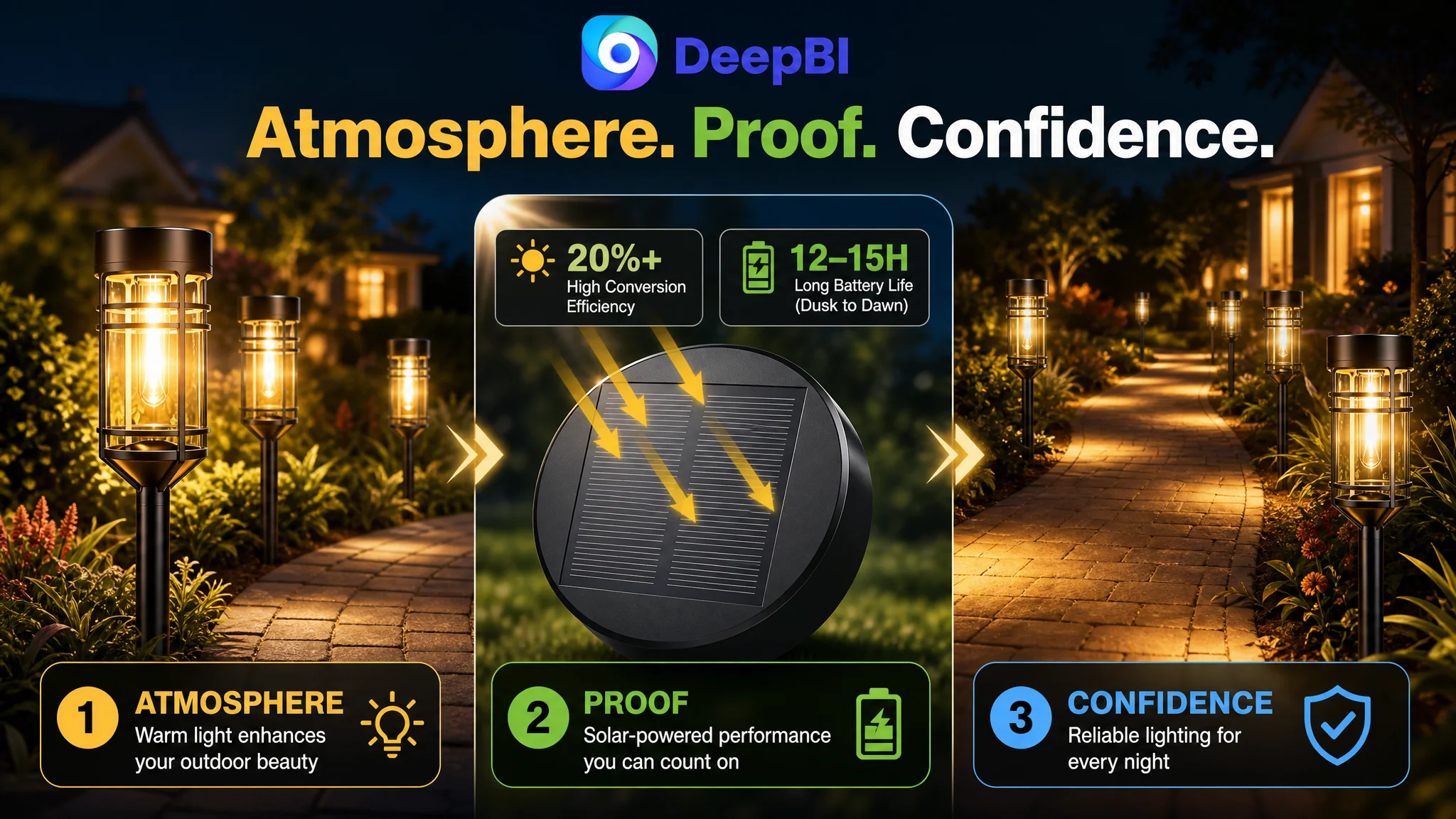
First, establish the desired outcome
The opening lifestyle image had a useful role. It showed the warm atmosphere the product was intended to create and gave shoppers a reason to imagine it in their own outdoor space.
That emotional entry point should remain, but it needed to lead into proof rather than stand alone as decoration.
Next, answer the solar-performance concern
Solar products carry a built-in shopper question: will the product actually collect and retain enough energy to perform consistently?
For that reason, the solar-conversion and battery explanation should move closer to the beginning of the A+ sequence. The page could then connect:
- Monocrystalline solar panels
- PET lamination
- Stated conversion performance
- Rechargeable battery capacity
- Four-to-eight-hour charging
- Dusk-to-dawn illumination
The purpose was not to overwhelm the shopper with engineering terms. It was to give the lighting promise a rational foundation.
Then, prove the light output
The LED filament and transparent cover module should follow the solar-performance explanation. This creates a complete hardware chain:
Energy capture → stored power → light output
The product page’s claims become easier to understand when the shopper can see how the parts work together.
After that, confirm installation
The existing component imagery could be repurposed into a simple installation guide. This was more useful than leaving the parts as a close-up or placing installation information before the main performance argument.
The shopper needed to see that the components fit together logically and that no extra wiring was required. Installation should reduce friction, not introduce another technical puzzle.
Finish with one strong outdoor result
The target page included many scenes, but repeating several functional settings could dilute their impact. A more efficient approach was to retain one high-quality, high-impact garden or pathway scene as the final outcome image.
That final module would answer the emotional question left after the technical explanations:
What will the space look and feel like after installation?
The result is a more complete A+ narrative:
Atmosphere first, proof next, operation after that, and the finished outdoor experience at the end.
Reviews Were Not the Main Problem, but They Limited the Trust Ceiling
The review dimension was only one point below the benchmark.
Both Listings showed a 4.4-star rating. The target Listing had 35 total reviews, while the benchmark had 46. The target page’s visible reviews were highly positive, including eight five-star reviews on the first page. The benchmark had a larger review base but also exposed a one-star complaint related to product lifespan.
This made the review situation more nuanced than a simple “more reviews is better” conclusion.
The target Listing had positive review quality and useful customer language around brightness, durability, and appearance. Its weakness was mainly scale: a smaller review base provides less social proof, even when the visible feedback is strong.
DeepBI therefore did not treat review quantity as the first repair priority. Compared with the title, images, bullets, and A+ content, the review gap was smaller and less directly controllable through Listing restructuring.
That prioritization matters. Amazon sellers can easily overreact to competitor review counts and divert attention from page-level conversion defects they can address immediately. Here, the more urgent task was to make the existing product evidence work harder.
Why DeepBI Did Not Recommend More Ad Tuning First
The case material did not indicate that the seller’s primary problem was campaign structure, bids, or keyword management. That distinction was central to the diagnosis.
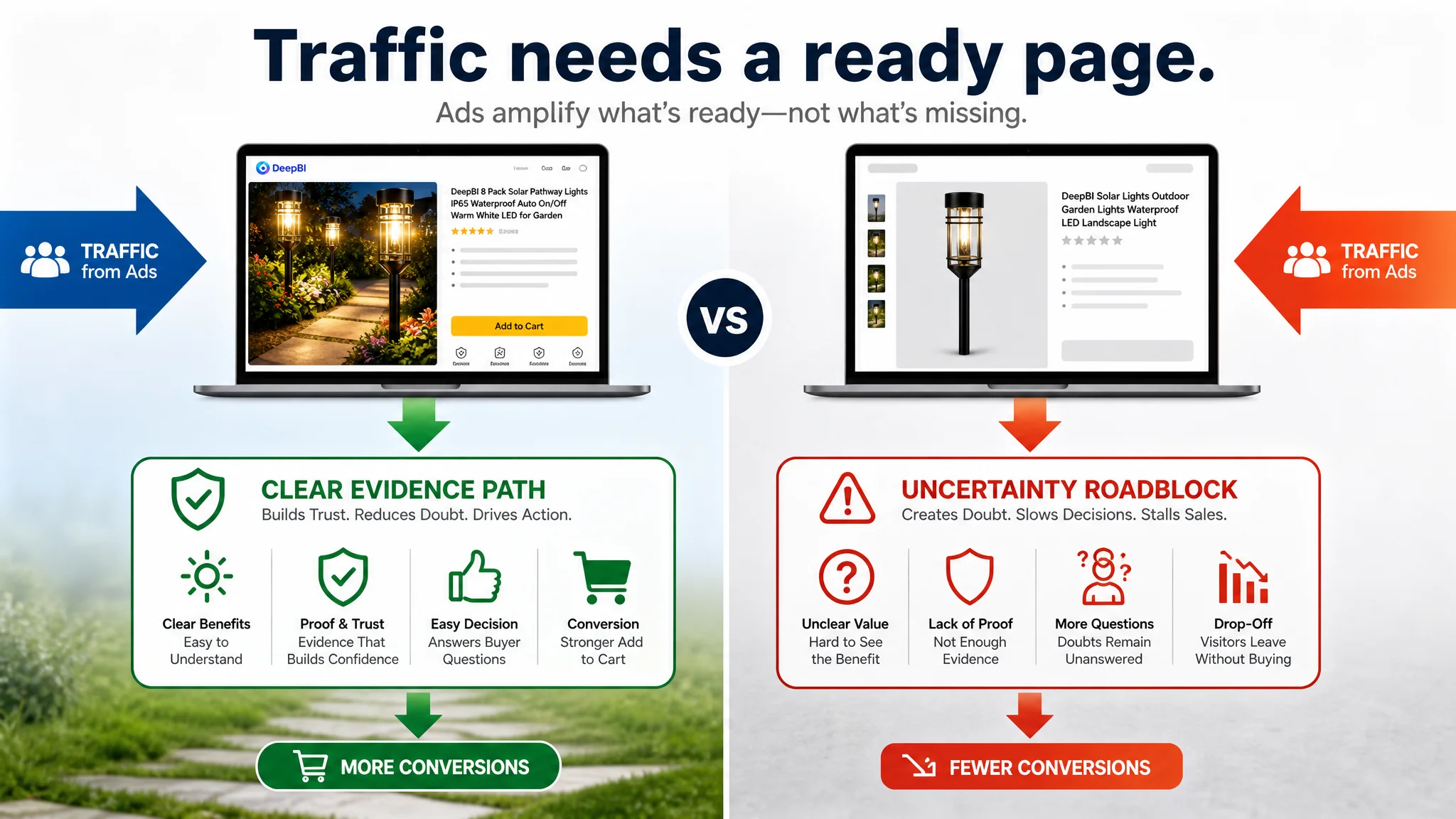
For an Amazon seller, advertising can bring a shopper to the product page, but it cannot repair a page that fails to explain or prove the product’s value. If the title attracts the wrong expectation, the images communicate disconnected facts, and the A+ content delays the strongest evidence, additional traffic can simply expose more shoppers to the same conversion friction.
The correct decision order was therefore:
1. Clarify the product’s search and value proposition in the title
2. Make the first images communicate the real product advantage
3. Connect technical claims to practical outcomes
4. Rebuild the bullet points around buyer concerns
5. Reorder A+ content into a proof sequence
6. Only then evaluate whether more traffic should be directed to the page
This does not mean advertising is unimportant. It means the Listing must be ready to receive the traffic.
Advertising can amplify a strong page, but it can also amplify the uncertainty already present on a weak one.
This was the central business judgment. The seller did not need a larger list of isolated optimizations. The seller needed to reduce the risk that paid and organic traffic would arrive at a page unable to convert its attention into confidence.
The Optimization Direction Changed from “More Information” to “Better Evidence”
The later direction did not depend on inventing a new product claim or copying the benchmark’s feature set. It focused on making the target product’s existing strengths easier to understand and trust.
Title direction
The title was reorganized around:
- The core phrase “8 Pack Solar Pathway Lights”
- Verified durability attributes
- Automatic on/off operation
- 3000K warm white lighting
- Relevant yard, walkway, driveway, and backyard contexts
This improved both Amazon search clarity and shopper comprehension.
Main-image direction
The image sequence was redesigned around shopper questions:
- What does the product look like when lit?
- How does the solar system support operation?
- How long does charging support illumination?
- What makes the product suitable for outdoor conditions?
- How is it installed and what are its dimensions?
This also required moving some images rather than producing more of them. Image order became part of the conversion strategy.
Bullet-point direction
The bullets were revised to connect:
- Product attribute
- Practical benefit
- Use situation
- Trust or operating guidance
This gave the page a more coherent reading rhythm and reduced the burden on shoppers to interpret technical specifications on their own.
A+ direction
The A+ modules were reorganized so that the page would:
- Open with the desired outdoor atmosphere
- Justify solar performance earlier
- Explain the light-output components
- Confirm operating expectations
- Clarify installation
- End with a strong aesthetic result
The direction was not “add more lifestyle images.” It was “assign each image a distinct decision-making role.”
What This Case Changes in Amazon Seller Thinking
Because the source material does not include post-optimization performance data, the case does not support claims about a specific CVR increase, ACOS reduction, or organic-order recovery. The measurable outcome available here is the diagnosis itself: a ten-point gap was traced to a fragmented conversion structure rather than to one isolated missing feature.
That distinction still creates several meaningful changes in operating risk.
A more coherent Amazon Listing can make it easier to:
- Judge whether paid traffic is being wasted on page-level confusion
- Separate a click problem from a product-page problem
- Prioritize title, main-image, bullet-point, and A+ work by business impact
- Avoid adding unsupported specifications
- Use competitor comparison as evidence rather than imitation
- Create a clearer test plan for future Listing changes
- Evaluate advertising performance after the page has a stronger conversion foundation
The customer’s understanding also shifts.
The question is no longer:
“Which individual image or phrase should we improve next?”
It becomes:
“Does this Amazon product page give the shopper a complete reason to choose the product?”
That is a more useful operating question because it connects Listing quality with traffic efficiency, customer expectations, and long-term store controllability.
The Broader Lesson: A Better Amazon Listing Is a Better Decision System
This solar pathway lights case did not reveal a product with no marketable strengths. It revealed a page where the strengths were not working together efficiently.
The target Listing had:
- A clear outdoor use case
- Warm white lighting
- Solar charging
- Automatic operation
- Weather-resistance claims
- Durable material claims
- Installation assets
- Positive customer feedback
But those assets were distributed across the page without a sufficiently strong order of persuasion.
DeepBI’s contribution was to identify the constraint behind the individual gaps:
- The title needed to prioritize search and value clarity
- The main images needed to establish attraction and proof
- The bullet points needed to translate features into solutions
- The A+ page needed to move from atmosphere to technical justification to use confidence
- The review section needed more scale, but was not the first bottleneck to address
For Amazon sellers, that is the practical takeaway. Listing optimization is not a contest to add more claims, more scenes, or more technical labels. It is the work of deciding which concern to answer first, what evidence should follow, and how every page element contributes to the final buying decision.
Before scaling Amazon ads, ask whether the product page deserves the traffic.
If the answer is not yet clear, the next optimization may not be in the campaign. It may be in the logic of the Listing itself.