

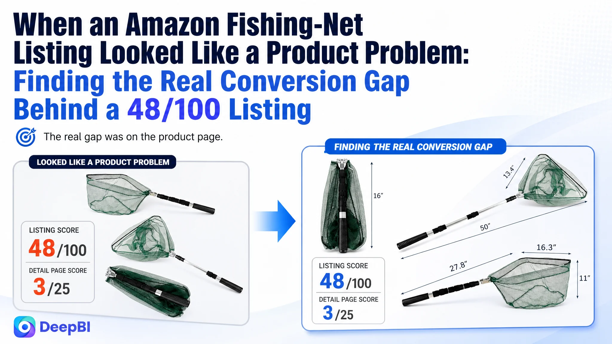
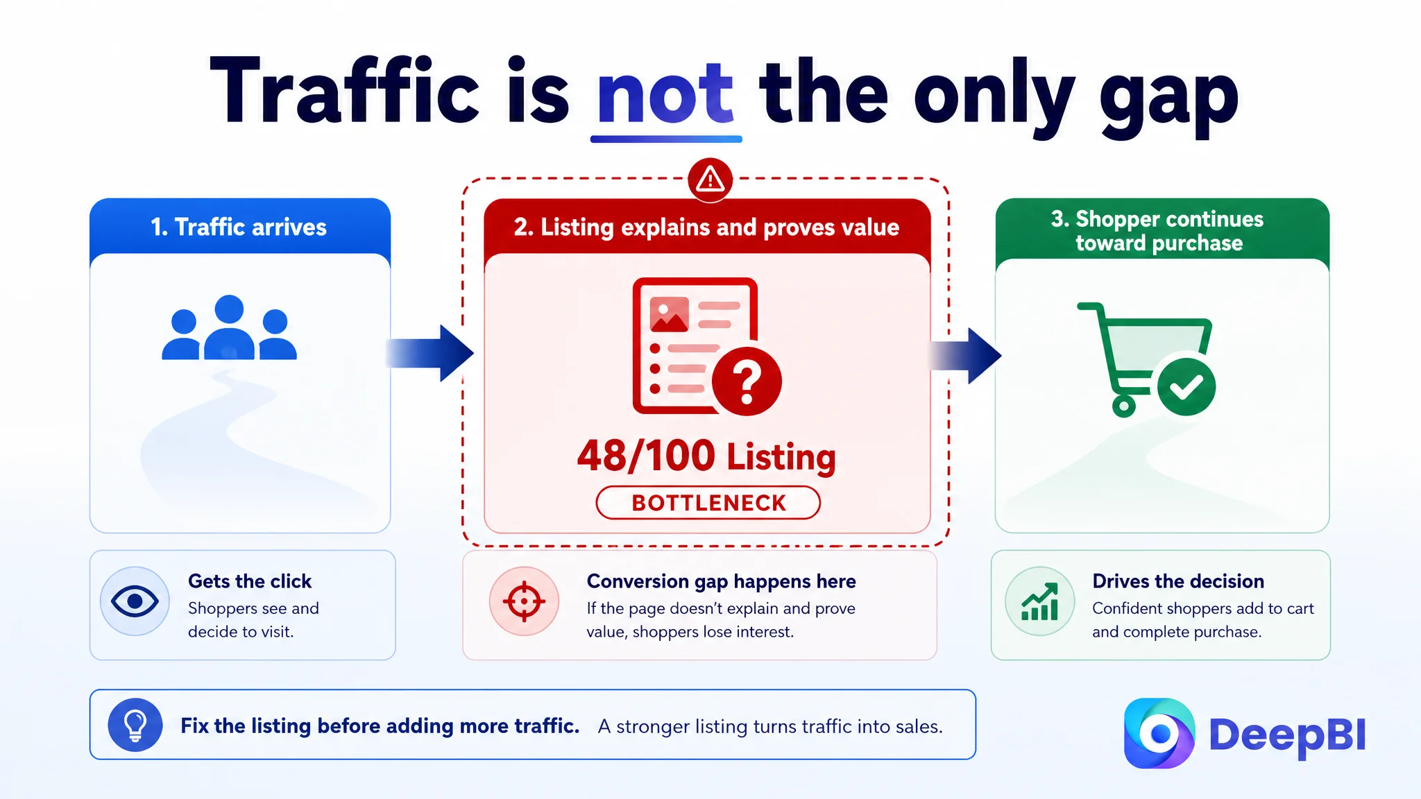
An Amazon seller in the fishing and outdoor category was not dealing with a simple traffic shortage. The product page had a functional fishing net, but its Listing was not giving shoppers enough reasons to click, trust the product, or understand how it would fit into a real fishing trip. The initial direction centered on describing functions such as portability, folding, materials, and general outdoor use.
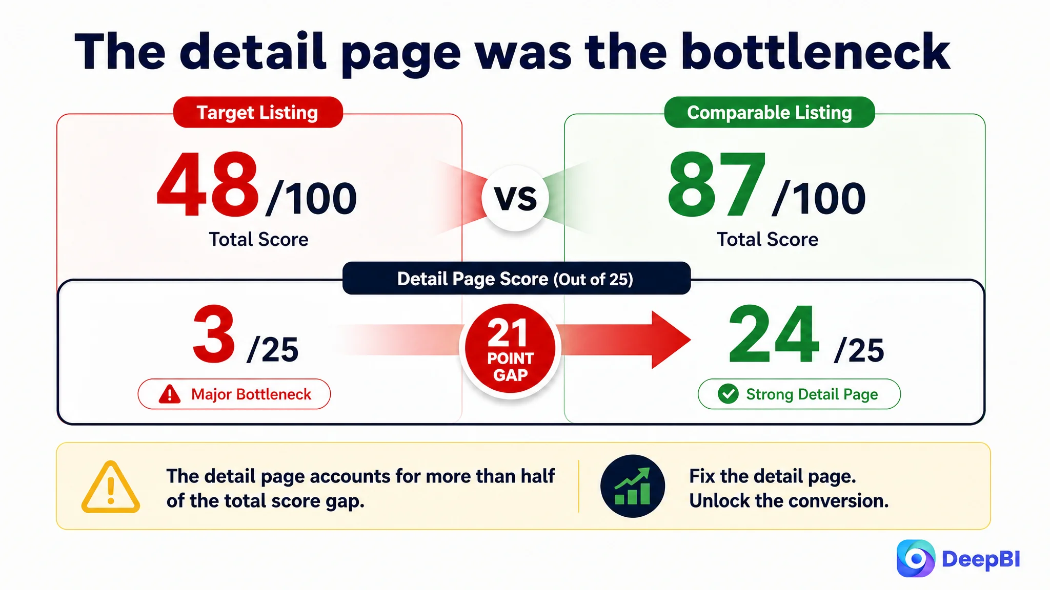
DeepBI’s diagnosis showed that the larger problem was not a single missing keyword or isolated image issue. The Amazon Listing scored 48/100 against 87/100 for a comparable high-performing listing, with the most serious gap in the detail page: 3/25 versus 24/25. The page had product information, but it lacked the visual and persuasive structure needed to convert traffic.
The later optimization therefore focused on rebuilding the product-page decision path: make the portable fishing setup easier to understand, present material and size information more precisely, connect features to fishing situations, and replace repetitive text with credible visual proof. The lesson for other Amazon sellers is direct: before pushing more traffic or repeatedly adjusting keywords, determine whether the Listing is ready to receive and convert that traffic.
The Amazon Listing Was Not Empty. It Was Under-Explaining the Product.
At first glance, the fishing net Listing contained the expected information:
- A telescoping handle
- A folding design
- Aluminum construction
- A dark-toned appearance
- Defined dimensions
- Use across river, lake, and sea fishing
- A general portability message
The problem was not the total absence of features. The problem was that the features were presented as separate facts rather than as a connected buying argument.
A shopper evaluating a fishing net is not only asking, “What is this product made of?”
They are also asking:
- Will it be strong enough when landing a catch?
- Can I carry it easily on a kayak, boat, or shore?
- Will the dimensions suit the fish I normally target?
- Can I understand how it folds and stores?
- Does the page look credible enough to trust the product?
- What makes this net more useful than another similar option?
The existing Amazon product page did not answer these questions in a strong sequence. It described the product, but it did not consistently guide the shopper toward a purchase decision.
The Listing did not lack information. It lacked a persuasive order for that information.
The Original Direction Focused on Functions, Not Conversion Friction
The Listing’s presentation leaned heavily on functional descriptions such as portability, concealed appearance, material reliability, dimensions, and multiple use scenarios.
Those points were not irrelevant. They were simply not prioritized according to the customer’s decision process.
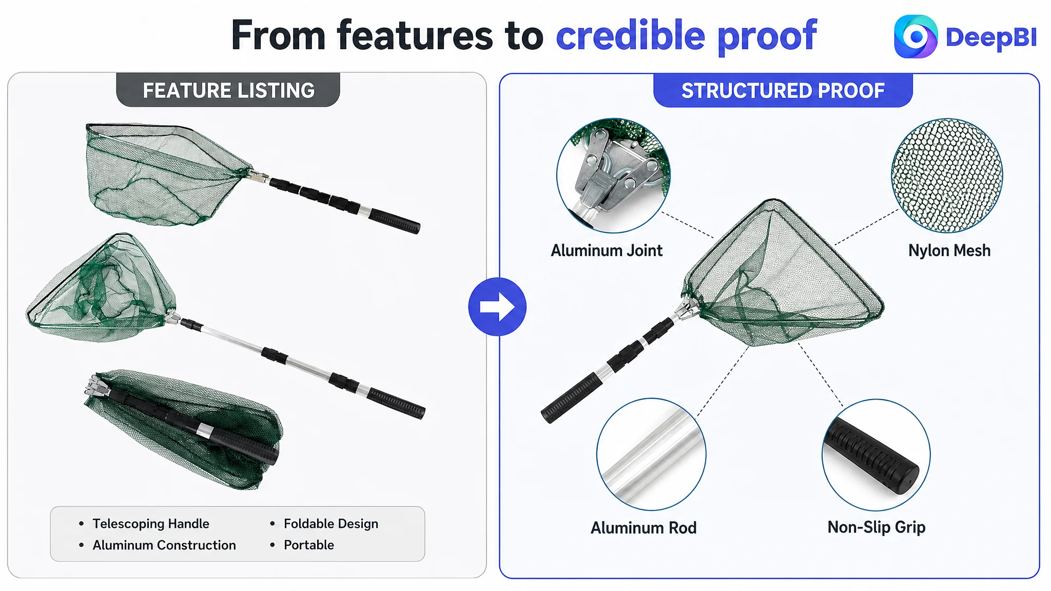
For example, “portable design” is weaker when presented as a general statement. It becomes more useful when the page shows what portability means in practice: a net that folds small, fits into fishing or camping gear, and can be taken between different environments.
Likewise, “reliable material” has limited persuasive power when it remains a broad claim. It becomes more credible when the page explains the aluminum construction, connects it to lightweight handling and corrosion resistance, and shows the relevant structural components clearly.
The original direction also treated several details as if they carried equal importance. Folding instructions appeared early in the visual logic, even though a shopper first needs to understand the product’s core value, fit, and reliability.
This created a common Amazon Listing problem: the page explained how the product works before it established why the product deserves consideration.
The Score Gap Made the Bottleneck Visible
DeepBI’s comparison separated general impressions from specific gaps.
- Title: Target Listing: 12/20, Comparable High-Performing Listing: 15/20, Gap: -3
- Main image: Target Listing: 24/30, Comparable High-Performing Listing: 27/30, Gap: -3
- Bullet points: Target Listing: 5/10, Comparable High-Performing Listing: 8/10, Gap: -3
- Detail page: Target Listing: 3/25, Comparable High-Performing Listing: 24/25, Gap: -21
- Reviews: Target Listing: 4/15, Comparable High-Performing Listing: 13/15, Gap: -9
- Total: Target Listing: 48/100, Comparable High-Performing Listing: 87/100, Gap: -39
The most important finding was not that every dimension underperformed.
It was that the detail page accounted for more than half of the total score gap.
That changed the operating priority. The title and main image needed improvement, and the bullet points needed a clearer structure. But the largest conversion constraint was the absence of a convincing, image-supported product story below the core Listing content.
A small title adjustment could improve relevance. A stronger main image could improve initial attention. Better bullet points could clarify the value proposition.
None of those changes could fully compensate for an A+ experience that relied mainly on repeated text and did not visually prove the product’s dimensions, construction, use cases, or storage advantages.
The Real Constraint Was Listing Conversion Capacity
The comparable listing used a much more complete conversion structure:
- Size and dimension comparisons
- Real-use fishing scenes
- Component breakdowns
- Material and construction explanations
- Folding and storage demonstrations
- Multiple scenario images
- A more developed A+ page
By contrast, the target Listing’s detail page was primarily text-based and lacked a modular visual sequence.
This gap mattered because Amazon shoppers often make a fast judgment from several layers at once:
1. The main image creates the initial reason to click.
2. The title confirms what the product is and where it fits.
3. The bullet points connect features to user concerns.
4. The A+ content provides deeper proof and reduces remaining uncertainty.
5. Reviews reinforce or weaken trust.
The target Listing had partial support at the first three layers, but the fourth layer was almost absent.
That meant the page was asking the title, images, bullets, and reviews to carry more trust than they could reasonably provide.
The Main Image Showed the Product, but Not the Complete Use Proposition
The first visual comparison revealed a difference in positioning.
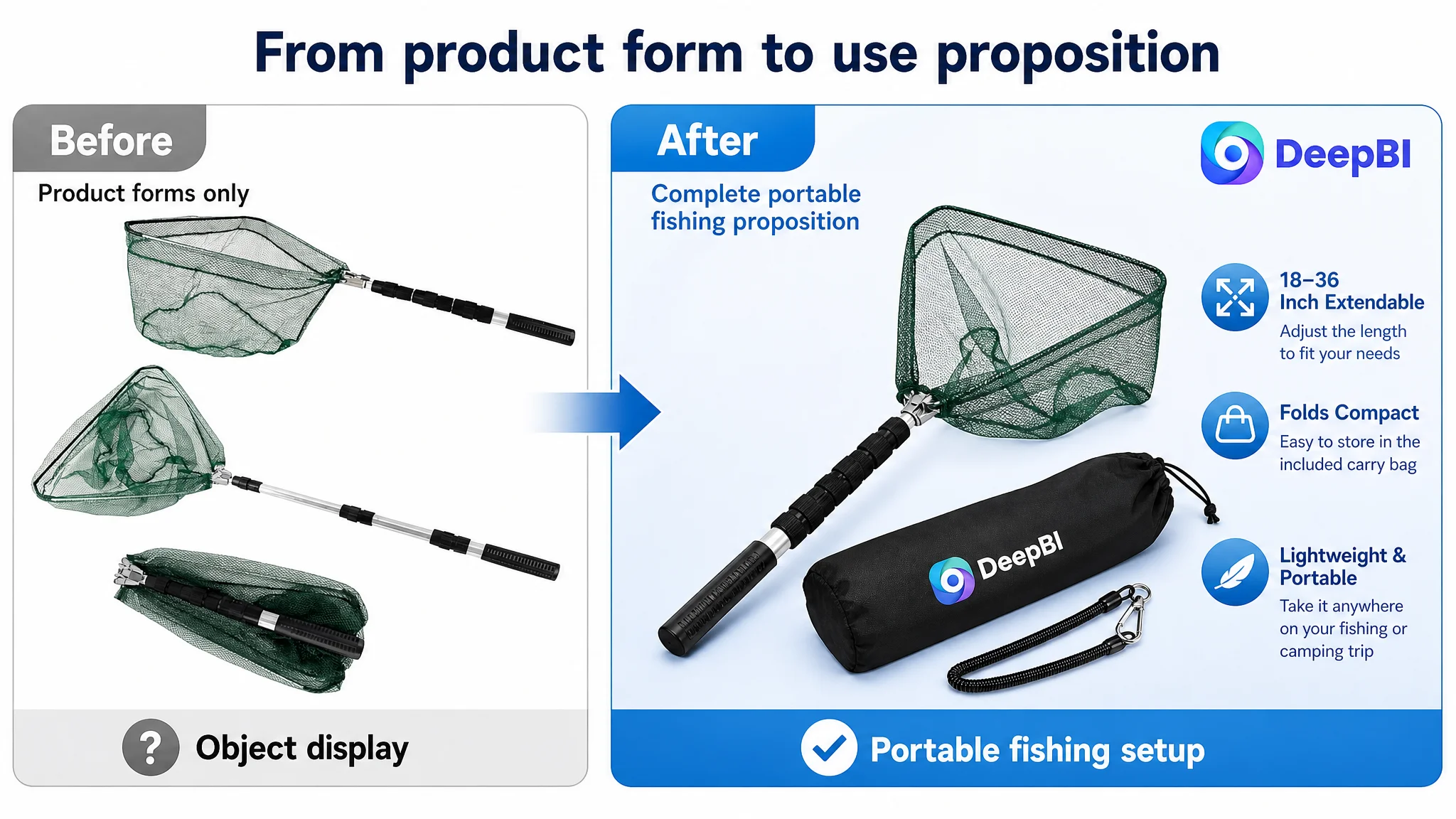
The target image focused on showing the net in several physical forms: open, extended, and folded. This helped communicate basic function. But it presented the product mainly as an object.
The stronger comparison direction presented a more complete outdoor-use proposition. It made the product feel ready for fishing and travel rather than merely displayed for inspection.
For this fishing-net Listing, the main image and supporting images should prioritize three messages:
A portable fishing setup
The product should be presented as a practical tool for fishing and camping. If a storage bag or lanyard is not confirmed as part of the product, the page should not imply that those accessories are included. The visual story can still emphasize compact packing and travel readiness using only confirmed product attributes.
Reliable construction
The aluminum handle and structural connection points should be presented with clear, accurate detail. Broad phrases such as “thick aluminum” are less persuasive than precise, supported descriptions of the material and telescoping range.
A useful size for real fishing situations
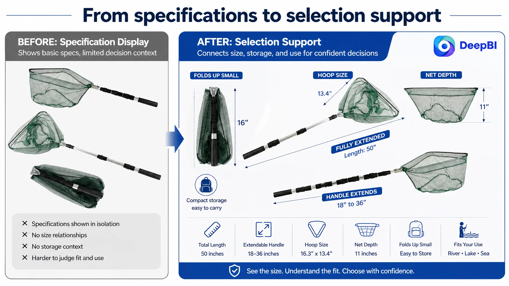
The dimensions should not appear only as isolated numbers. The page should help shoppers understand how the 50-inch total length, 11-inch net depth, and 16.3-by-13.4-inch hoop relate to use.
The goal is not to add decoration. It is to answer the question behind the specification: Will this net work for my fishing situation?
The Title Needed a More Precise Search and Decision Structure
The title gap was smaller than the detail-page gap, but it still reflected a broader issue: the Listing did not communicate its strongest buying information with enough precision.
The recommended direction was:
Triangular Fishing Net with Telescoping Aluminum Handle, 18-36 Inches Extendable Landing Net for Kayak, Lake and River Fishing, Non-Slip Grip, Portable Design for Fishing and Camping
This structure improves the title in several ways:
- It identifies the product form early.
- It brings the aluminum handle into the searchable value proposition.
- It specifies the telescoping range.
- It uses concrete fishing environments such as kayak, lake, and river fishing.
- It adds a practical feature, non-slip grip.
- It retains the portable and camping use case without relying on repeated generic wording.
The important change is not simply adding more keywords.
It is moving from broad category language toward a clearer combination of product type, construction, use scenario, and practical benefit.
A title such as “Fishing and Camping” is wide but indistinct. Specific scenarios give both Amazon search relevance and shoppers a faster way to identify whether the product fits their needs.
The Bullet Points Had Features, but Not a Buying Logic
The five bullet points were another example of information without enough decision structure.
The existing direction described portability, appearance, material, dimensions, and general versatility. The stronger structure needed to connect each feature to a recognizable fishing concern.
The handle should lead with strength and control
Instead of presenting portability first, the opening bullet should establish the role of the telescoping aluminum handle.
Confirmed details include:
- Aluminum construction
- An 18-to-36-inch extension range
- Folding and compact storage
- A secure hold during use
The copy should explain these details in the context of landing a catch and carrying the product, without introducing unsupported claims about load capacity or performance.
The net should connect its dark tone to the fishing environment
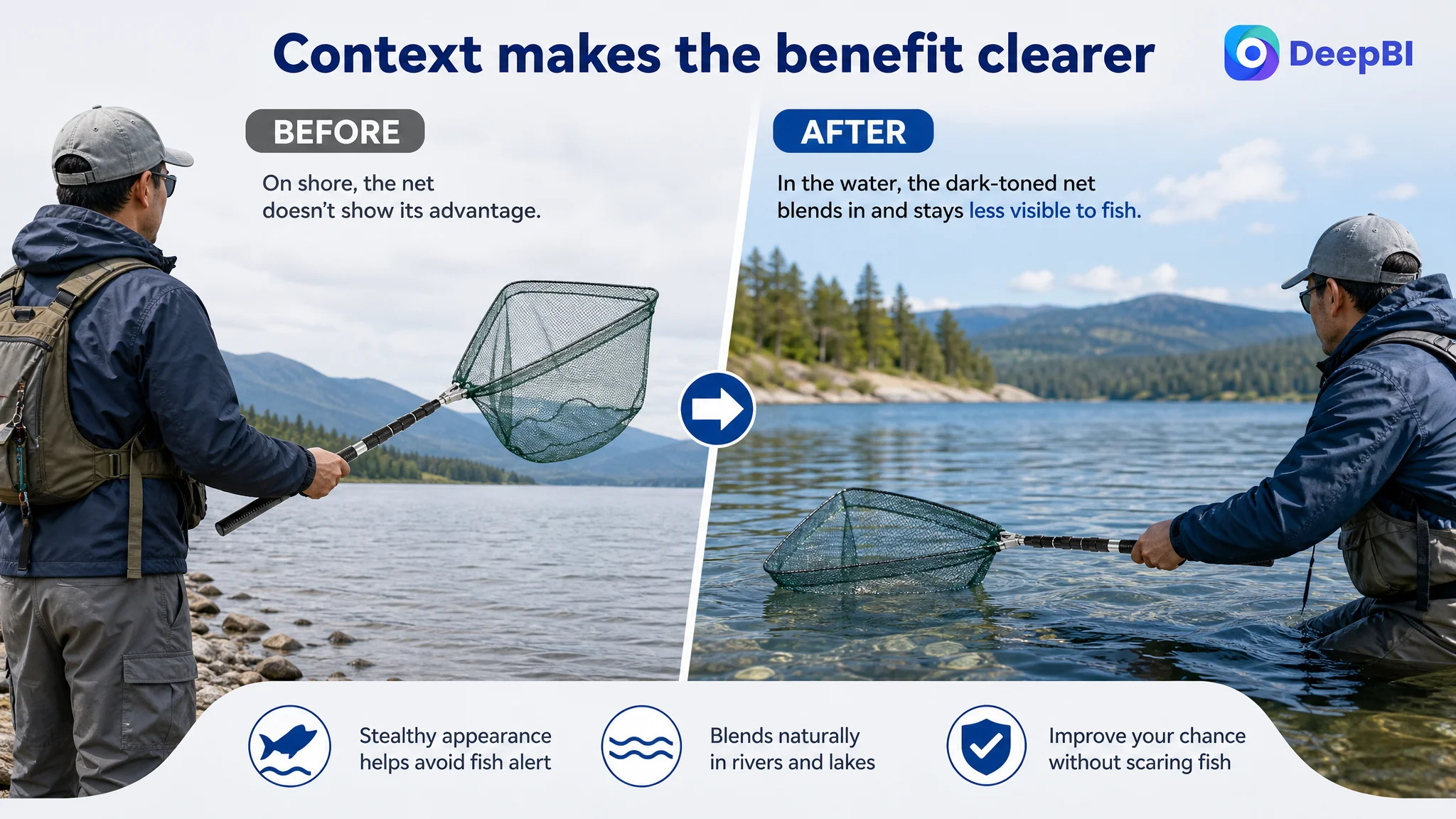
The Listing explicitly supports a concealed-look message. That claim can be developed carefully around the dark tone blending into the water and reducing visual distraction.
However, the page should not invent unconfirmed net materials, fish-safety certifications, or technical properties such as PVC coating, silicone construction, or specialized catch-and-release performance.
The material message should be specific but factual
The aluminum frame can be positioned around lightweight handling and resistance to rust and corrosion, as supported by the case material.
This is more useful than describing the product only as “reliable.” It gives shoppers a reason to care about the material in freshwater or saltwater environments.
The size bullet should answer fit concerns
The Listing already had detailed dimensions. That was a strength that needed better presentation.
The relevant information includes:
- 50-inch total length
- 11-inch net depth
- 16.3-by-13.4-inch hoop
- An 18-to-36-inch telescoping handle
These measurements should be presented as a practical sizing decision, not a technical data dump.
The final bullet should organize the use cases
River, lake, sea, kayak, fly, bank, and camping contexts should be used only where they accurately reflect the product’s intended use.
The purpose is to help shoppers recognize a fit quickly, rather than claiming universal suitability for every fishing method or species.
The A+ Gap Was the Central Trust Problem
The detail-page score of 3/25 was the clearest signal in the diagnosis.
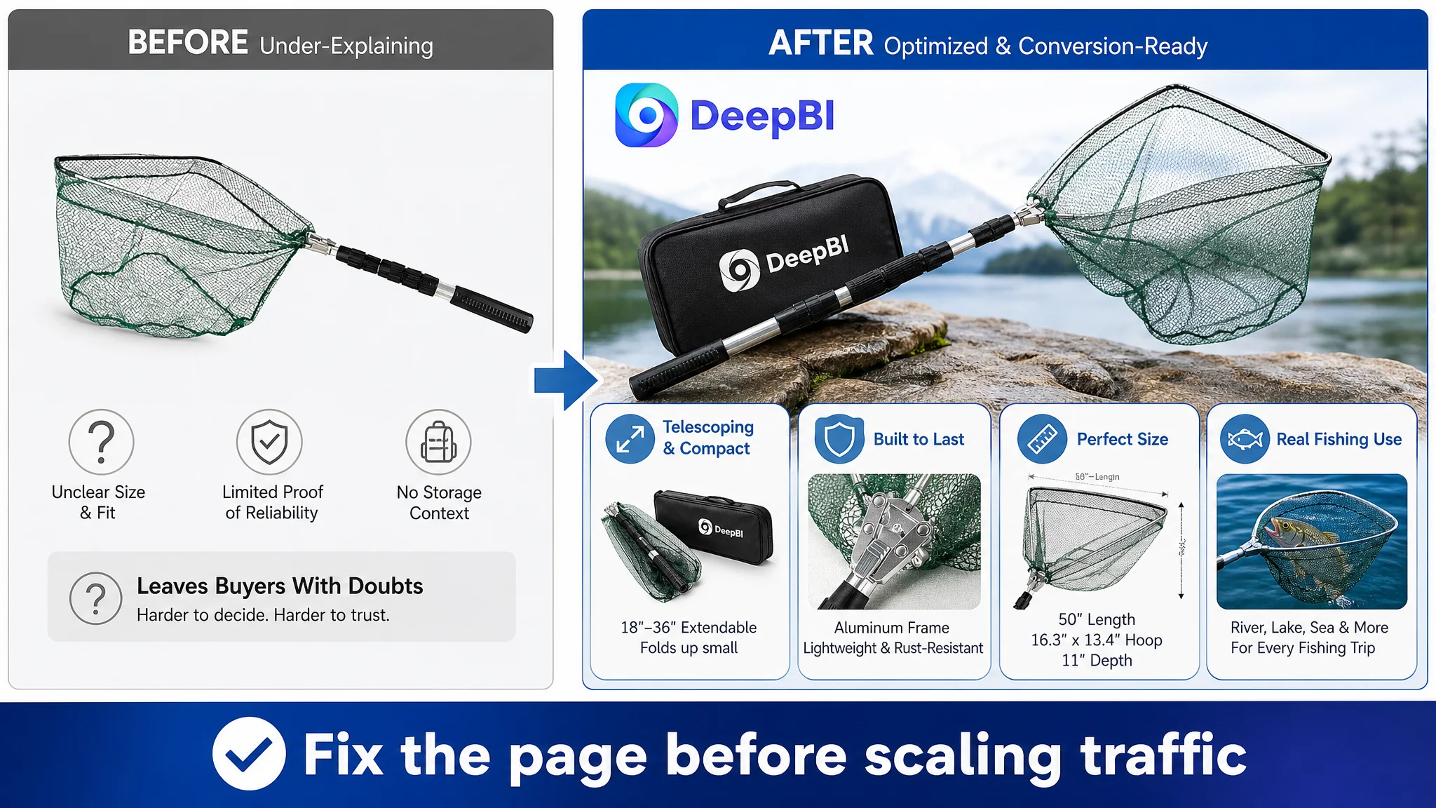
The target Listing used mostly repeated text and did not provide the visual structure needed to support the product claims. The comparable listing used several high-value modules that created a progression from basic understanding to purchase confidence.
A stronger A+ sequence for this product would begin with fit and move toward proof.
Start with precise size verification
The first module should make it easy to confirm:
- Extended handle length
- Total length
- Hoop dimensions
- Net depth
- Folded storage form
This immediately reduces uncertainty about whether the net is appropriate for the shopper’s equipment and fishing context.
Then prove practical use across environments
The page should show the product in relevant river, lake, sea, or fishing-trip contexts, provided the visuals accurately represent the actual telescoping mechanism and product form.
A generic person standing near water is not enough. The scene should help demonstrate why the net is useful in that environment.
Break down the construction
The handle, locking switch, frame, and mesh should be shown only with claims supported by the product information.
This is where the page can explain aluminum construction, folding design, telescoping operation, and the practical role of the major components.
Address carrying and packing without inventing accessories
The case material confirms that the net folds small and is easy to pack for fishing or camping. That is sufficient to build a useful portability module.
The page should not add a belt clip, carabiner, leash, floating function, EVA material, or other accessory unless the customer verifies that the product actually includes it.
This constraint is commercially important. Adding a competitor’s feature to the visual story may make the page look stronger temporarily, but it creates a direct risk of misleading shoppers and generating negative reviews.
Rationalize the concealed-look benefit
The dark tone can be shown in a realistic water environment to explain how it blends into the surroundings.
This is not a reason to overclaim that the feature guarantees more catches. It is a way to make an existing product attribute easier to understand.
Reviews Were Not a Copywriting Problem
The review score reinforced the trust gap:
- Target Listing: 3.9 stars and 9 total reviews
- Comparable listing: 4.6 stars and 222 total reviews
- Target Listing homepage: 2 visible reviews
- Comparable listing homepage: 8 visible reviews
The difference was not something a title rewrite or A+ redesign could immediately remove.
A 3.9-star rating, a small review base, and a high proportion of negative visible feedback create a trust disadvantage before shoppers reach the deeper page content. The better Listing had a larger quantity of reviews, a higher average rating, and more review content capable of showing product use.
This finding affected the decision order.
The page still needed optimization, but the team should not expect improved visuals alone to erase the review deficit. The correct approach was to make the Listing more precise and credible while treating review development and product experience as a separate, longer-term business issue.
Better content can reduce uncertainty. It cannot manufacture market proof that the Listing has not yet earned.
Why DeepBI Did Not Recommend Tuning Ads First
When an Amazon seller sees weak sales or inefficient traffic, the natural reaction is often to adjust bids, keywords, or campaign structure.
Those actions may be necessary in some situations. But they should not automatically come first.
In this case, the Listing showed a clear page-level conversion constraint:
- The total score was 48/100.
- The detail page scored only 3/25.
- The title, main image, and bullet points were behind the benchmark in decision clarity.
- The review profile provided limited trust support.
- The A+ content did not visually prove the product’s main value.
Sending more traffic to that page before repairing its conversion logic could amplify the weaknesses rather than solve them.
The decision was therefore not “ignore advertising.”
It was: do not use advertising adjustments to compensate for a product page that is not yet explaining and proving its value effectively.
Once the page can communicate size, portability, construction, and use context more clearly, advertising traffic has a better chance of producing useful signals. Until then, it becomes harder to distinguish a traffic problem from a page problem.
The Optimization Direction Shifted From Decoration to Evidence
The later plan did not ask the team to make the Listing more elaborate for its own sake.
It shifted the page toward evidence:
- Show the complete confirmed product form.
- Present dimensions in a way that supports selection.
- Explain the aluminum structure through practical benefits.
- Connect the folding mechanism to storage and transport.
- Use real fishing environments to validate intended scenarios.
- Organize bullet points around user concerns.
- Build an A+ sequence that moves from fit to use to construction to portability.
- Avoid unverified floating, mesh, accessory, or material claims.
This is where DeepBI’s diagnosis became commercially useful. The system did not treat every difference from the benchmark as an instruction to copy the competitor. It separated transferable decision logic from unsupported product attributes.
The comparable listing’s use of accessories, floating-related positioning, and specific net materials could reveal what shoppers care about. It could not justify adding those claims to a different product.
That distinction protects both conversion quality and product truth.
The Business Change Was a Better Operating Judgment
The case material does not provide confirmed post-optimization metrics such as CVR, ACOS, organic orders, or keyword recovery. Those outcomes should not be invented.
The measurable change available in the case is the change in diagnosis and operating priority.
Before the diagnosis, the Listing could be viewed as a collection of product features that needed better wording or better images.
After the diagnosis, the business problem became clearer:
- The title needed more precise search and use-case language.
- The main image system needed to present a stronger portable fishing proposition.
- The bullet points needed a pain-point-to-solution structure.
- The A+ page needed to become a visual trust and decision layer.
- Reviews represented a separate credibility constraint.
- Unverified competitor attributes had to remain outside the optimization plan.
- Advertising should not be expected to repair a low-conversion product page.
That is a more controllable way to operate an Amazon Listing.
Instead of repeatedly changing isolated assets, the team can ask whether the full page now gives shoppers enough evidence to click, understand, trust, and choose.
The Lesson for Amazon Sellers
A fishing net is a specific product, but the operating pattern appears across many Amazon categories.
A Listing may have:
- The right broad keywords
- A technically correct product
- Several useful features
- A reasonable main image
- Some existing traffic
And still fail to convert because the page does not turn those elements into a coherent decision path.
The most important question is not always, “How can we get more traffic?”
It is often:
If the traffic arrives today, does the product page give shoppers a strong enough reason to continue?
For this Amazon fishing-net Listing, the answer was weakened by a 48/100 competitive score, a 3/25 detail-page score, limited review support, and a product story that explained functions without building enough trust.
The right next step was not to keep adding pressure to the traffic layer.
It was to rebuild the page so that the product’s real strengths—telescoping reach, aluminum construction, compact storage, defined dimensions, and practical fishing use—could be understood quickly and supported accurately.
That is the difference between optimizing an Amazon Listing cosmetically and diagnosing the business constraint that prevents it from converting.