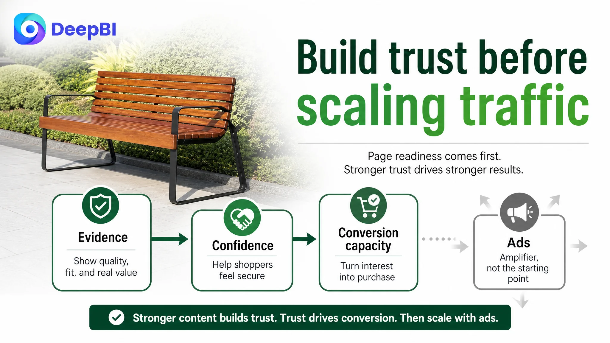
An Amazon seller in the outdoor furniture category was facing a product-page conversion problem. The initial instinct was to refine the visible parts of the Listing: adjust the title, improve the image sequence, add stronger feature language, and make the bench appear more competitive in search results.
That direction was not entirely wrong, but it missed the largest constraint. DeepBI’s comparison showed that the Listing’s main weakness was not a lack of product information. It was a lack of trust-building content after the initial click. The product page had no A+ visual modules and no customer reviews, while a comparable high-performing listing used its page structure to turn specifications, materials, comfort, and stability into a complete buying argument.
The later optimization therefore focused on restoring the Amazon Listing’s conversion capacity before treating Amazon ads as the main lever. The title and image sequence still mattered, but the priority became clearer: help shoppers confirm fit, understand quality, visualize use, and feel confident about stability and assembly. For other Amazon sellers, the case is a reminder that more traffic cannot compensate for a product page that leaves key purchase questions unanswered.
The Listing Did Not Have an Information Problem. It Had a Trust Sequence Problem.
The customer’s Amazon Listing received a total score of 55 out of 100, compared with 73 for the benchmark listing.
At first glance, the gap could easily be interpreted as a broad content-quality issue:
- The title was slightly behind the benchmark.
- The main image section needed better sequencing.
- The five bullet points required more specification and decision support.
- The detail page had almost no visual content.
- The Listing had no reviews.
But these gaps did not carry equal business weight.
- Title: Customer Listing: 15/20, Benchmark Listing: 17/20, Gap: -2
- Main image: Customer Listing: 26/30, Benchmark Listing: 19/30, Gap: +7
- Bullet points: Customer Listing: 8/10, Benchmark Listing: 6/10, Gap: +2
- Detail page: Customer Listing: 4/25, Benchmark Listing: 21/25, Gap: -17
- Reviews: Customer Listing: 2/15, Benchmark Listing: 10/15, Gap: -8
- Total: Customer Listing: 55/100, Benchmark Listing: 73/100, Gap: -18
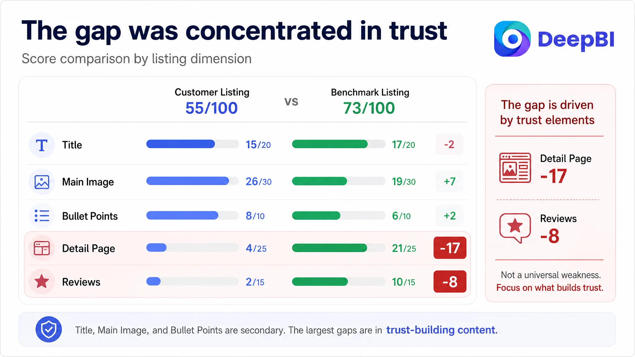
The most important signal was not that every part of the Listing was weak. It was that the customer’s Listing was relatively strong in its image coverage and bullet-point logic, yet still lacked the content needed to convert confidence into purchase intent.
The critical weakness was not the absence of product claims. It was the absence of a persuasive path connecting those claims.
This distinction matters for Amazon sellers because a page can contain dimensions, materials, comfort claims, and assembly information while still leaving shoppers uncertain about whether the product is right for them.
The Original Direction Focused on the Parts That Were Easiest to See
The customer’s existing content was not without strengths.
The bullet points addressed practical concerns such as:
- Comfort
- Outdoor durability
- Appearance
- Stability
- Assembly and maintenance
They also used scenarios such as reading on a patio or waiting in a public space. That gave the copy more commercial relevance than a simple list of technical specifications.
The Listing’s image system also contained useful assets. It showed:
- Product dimensions
- Structural details
- Double-bolt fixation
- Reinforced components
- Flat-pack and assembly information
- Material details
- Ground-fixation options
From an operational perspective, these were reasonable areas to continue refining. The title could be made more search-friendly. The image order could address size and assembly earlier. The bullet points could include more concrete measurements and decision-support details.
That created a natural but incomplete diagnosis: if the page already had many useful selling points, the remaining task seemed to be polishing the title, images, and bullets until the Listing became more competitive.
For Amazon ads teams, this is a familiar trap. When ACOS or conversion performance becomes difficult to improve, the response often shifts toward the most visible controllable variables:
- Bid adjustments
- Keyword refinement
- Campaign restructuring
- Main-image changes
- Title rewriting
- More feature language
Those actions can be valid. But they do not answer a more important question:
When a shopper has already clicked, what makes the page credible enough to support the purchase decision?
In this case, the answer was not strong enough.
The Benchmark Was Not Winning Because Every Asset Was Better
The comparison produced a useful reversal.
The benchmark listing scored lower on the main image dimension: 19 out of 30, compared with 26 out of 30 for the customer Listing. It also scored lower on bullet points: 6 out of 10, compared with 8 out of 10.
That meant the benchmark was not simply superior in every visible area.
The customer Listing had several content advantages:
- More structured visual selling points
- Stronger problem-to-solution bullet logic
- More scenario-based copy
- Better presentation of fixation and assembly details
- More developed material and durability claims
Yet the benchmark still led by 18 points overall.
The difference came from the areas that support trust after the first impression:
- Detail page: 21 versus 4
- Reviews: 10 versus 2
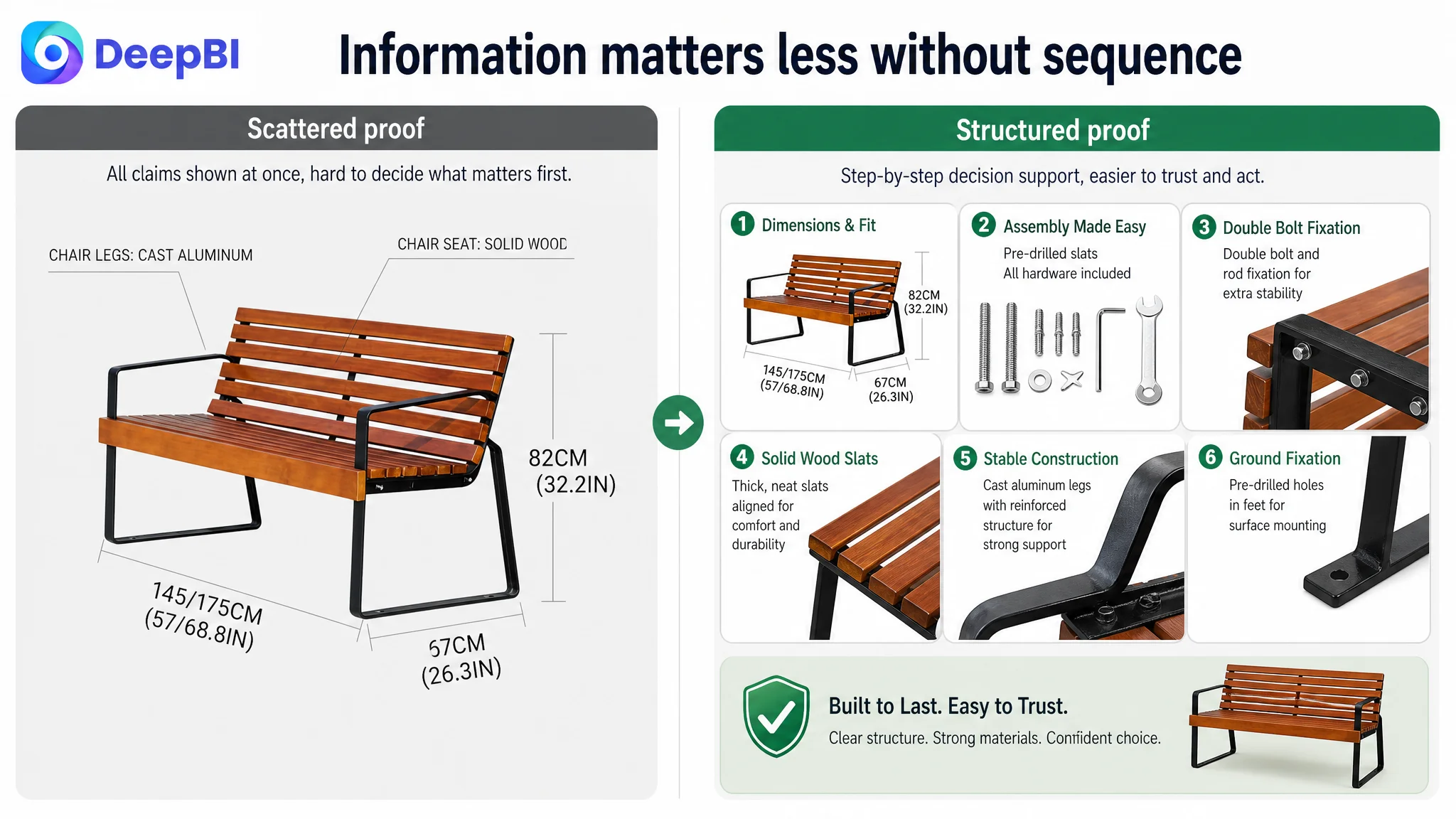
The benchmark used a brand header, outdoor application scenes, multiple product angles, material close-ups, and human-use imagery. The customer Listing relied almost entirely on plain text in the detail section.
This was not a simple question of adding more images. It was a question of whether the Amazon product page helped shoppers move through the decisions that matter for a larger outdoor seating product:
1. Will the bench fit the intended space?
2. Does it look comfortable for actual use?
3. Can the materials withstand outdoor conditions?
4. Is the structure stable enough?
5. Will assembly become a problem?
6. Does the product feel credible enough to justify the purchase?
The customer Listing addressed some of these questions in scattered places. The benchmark arranged them into a more complete conversion sequence.
The Largest Gap Was on the Product Page, Not in the Search-Term Layer
The detail-page score created the clearest diagnosis.
The customer Listing had 4 out of 25 points in the detail dimension. Its detail section was essentially text-based, with no A+ visual modules.
The benchmark listing used a sequence that included:
- Brand and value positioning
- Outdoor use scenarios
- Product views from multiple angles
- Human seating imagery
- Material close-ups
- Structural details
- Brand-level reassurance
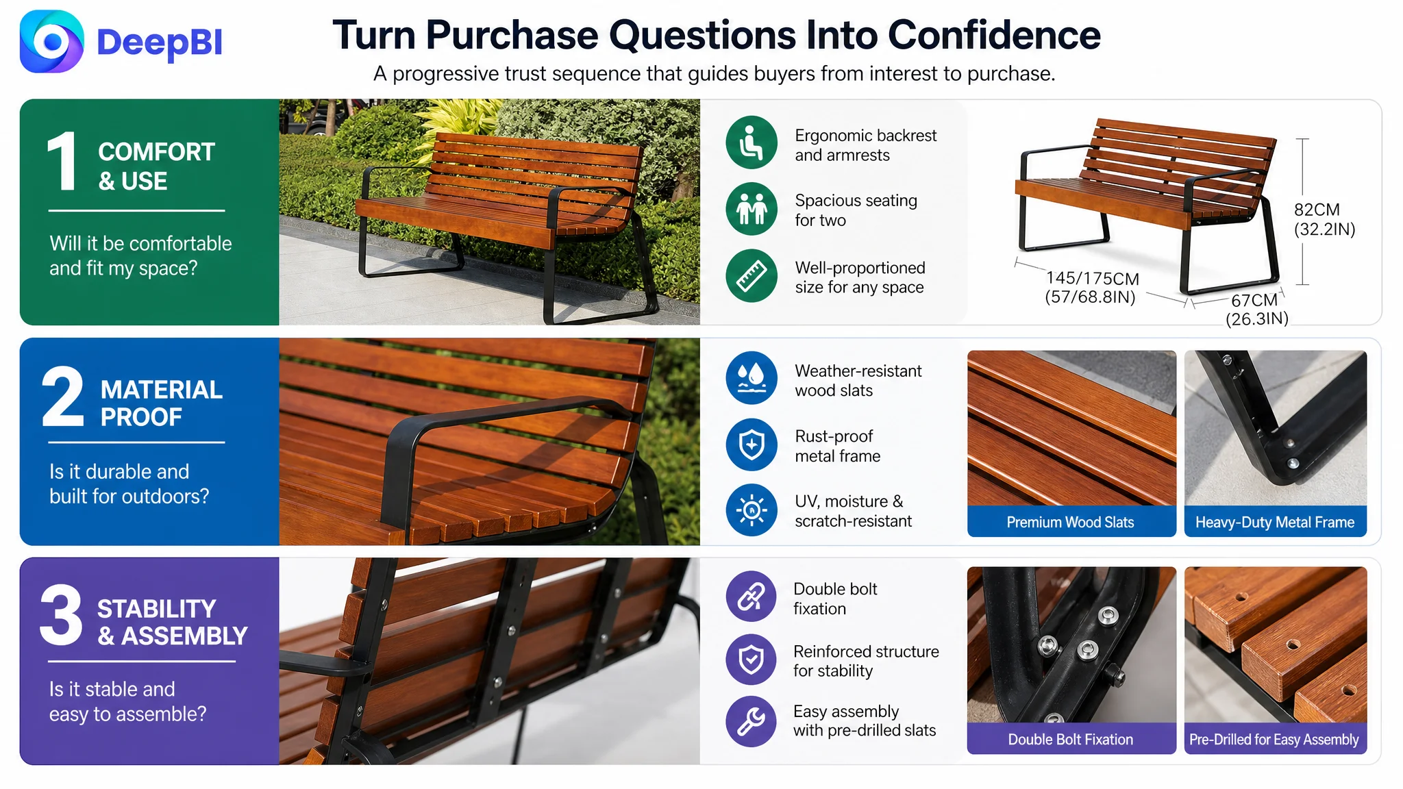
This structure mattered because outdoor furniture is difficult to evaluate from a single product image. Shoppers cannot directly feel the backrest curve, test the frame, inspect the wood texture, or judge the stability of the legs through text alone.
Claims such as “comfortable,” “weather-resistant,” “heavy-duty,” and “stable” require visual evidence to become persuasive.
Comfort needed to become visible
The customer’s copy described comfort and support, but the page did not provide a deeper visual explanation of the ergonomic backrest, armrests, or slat structure.
A dedicated comfort module could show:
- The backrest curve from a side angle
- The relationship between seat height and back support
- The armrest structure
- The slat thickness and seating profile
The objective was not to create a more decorative image. It was to make a claim easier to verify.
Outdoor durability needed material evidence
The Listing described a weather-resistant combination of metal and wood. However, without close-up material imagery, shoppers had limited visual evidence for the frame finish, wood texture, or treated surface.
A material module could bring forward:
- The rust-resistant metal frame
- The wood grain and surface finish
- The relationship between outdoor use and maintenance
- The product’s resistance claims without relying on broad promotional wording
This would help distinguish a real construction story from generic “premium” language.
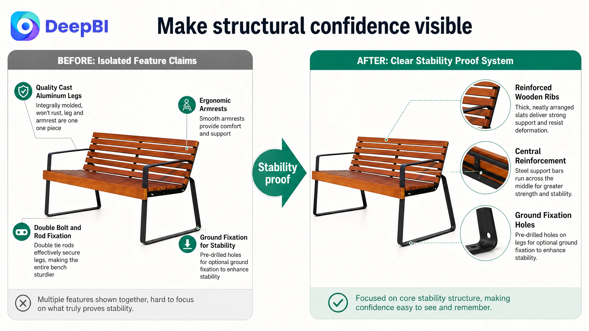
Stability needed its own proof layer
The customer Listing had useful structural details, including reinforced connections and optional ground fixation. But these were distributed across the image sequence rather than organized as a clear stability argument.
A dedicated construction module could focus only on:
- Frame thickness
- Reinforced connection points
- Double tie rods or fixation details
- Ground-fixation holes where applicable
- The resulting stable, wobble-resistant seating experience
This separation is important. When comfort, materials, assembly, and stability are crowded into one image, none of them receives enough attention.
Assembly needed to be treated as a purchase risk
For a larger outdoor bench, assembly is not a minor afterthought. It can be a source of hesitation before purchase and dissatisfaction after delivery.
The customer Listing already had flat-pack and assembly content. The problem was the order and framing. The page needed to show that assembly was manageable, not merely mention that it was possible.
A stronger module would connect:
- Pre-drilled components
- Included hardware
- Clear instructions
- A simple setup process
- Easy maintenance after installation
The goal was to remove a specific psychological risk before the shopper had to raise it themselves.
The Review Gap Made Every Other Claim Work Harder
The customer Listing had no effective review foundation:
- No star rating
- No review count
- No comments on the first page
The benchmark had 20 reviews, an average rating of 4.0 stars, and eight comments visible on the first page. It also had a photo review, which gave the Listing an additional layer of user-generated credibility.
This difference could not be solved through copywriting alone.
When a Listing has no reviews, shoppers have to rely more heavily on:
- Product imagery
- A+ content
- Clear specifications
- Structural proof
- Brand credibility
- The consistency of the entire page
That is why the missing A+ content was particularly damaging. The customer Listing lacked both the third-party validation of reviews and the first-party visual reassurance of a mature detail page.
DeepBI therefore treated the review gap as an important conversion risk, but not as a reason to stop all other work. Reviews could not be manufactured through Listing optimization. The controllable priority was to strengthen the page itself so that paid and organic traffic would encounter a more credible buying environment.
Why DeepBI Did Not Recommend Tuning Amazon Ads First
The available case material does not include post-optimization Amazon ad metrics such as CTR, CVR, ACOS, or TACOS. It also does not establish a completed advertising experiment.
The decision was therefore not based on a claimed ad-cost reduction. It was based on the relationship between traffic and page readiness.
If Amazon ads send more shoppers to a page with:
- No reviews
- No A+ visual content
- Weak scenario immersion
- Limited material proof
- Unclear stability evidence
then advertising may increase exposure without resolving the conversion barrier.
Advertising can amplify a product page’s strengths, but it can also amplify the cost of its unanswered questions.
This was the central business judgment. The Listing did not first need more traffic at any cost. It needed greater conversion capacity.
That did not make ad optimization irrelevant. It changed the order of operations:
1. Repair the page’s trust and decision structure.
2. Make the most important attributes easier to verify.
3. Ensure the visual and textual messages work together.
4. Then evaluate how Amazon paid traffic responds to the revised page.
This sequence reduces the risk of using advertising to test a page before the page is ready to receive that traffic.
The Title Needed Reordering, Not Reinvention
The title gap was relatively small: 15 versus 17.
That meant the title was not the core problem, but it still had room to support better search visibility and faster comprehension.
The existing structure placed material wording such as “Metal and Wood” early, while the benchmark led with the more direct category phrase:
“Outdoor Park Bench with Backrest”
The recommended direction was to bring the core product identity and high-value attributes forward:
- Outdoor park bench
- Backrest and armrests
- Size
- Weather-resistant construction
- Intended environments
- Easy assembly
The point was not to imitate the benchmark’s wording or add unsupported claims. It was to make the title easier to scan and more aligned with the way Amazon shoppers identify a product.
The proposed structure also gave the 57-inch size and walnut color clearer positions, while consolidating repetitive location terms such as patio, backyard, deck, and porch.
This was a supporting correction, not the primary solution.
The Image Sequence Needed to Follow the Buyer’s Questions
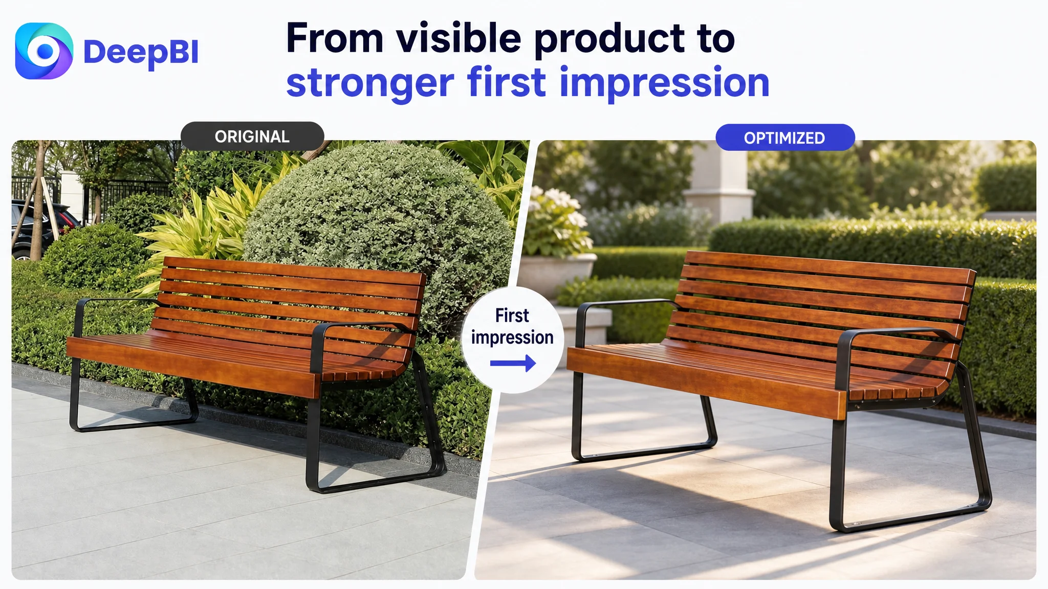
The customer Listing’s main image score was already stronger than the benchmark’s. The task was therefore not to replace its visual system wholesale, but to improve the decision order.
The recommended sequence followed a more deliberate path.
First: establish category and quality
The opening image should make the product immediately recognizable as an outdoor park bench with a backrest and armrests. It should also communicate the combination of classic comfort and modern industrial styling.
Second: resolve fit and size
The dimensions should appear earlier, with a clean diagram focused on length, height, and depth. Material labels and technical details should not compete with the basic question of whether the bench fits the intended space.
Third: remove assembly anxiety
The assembly image should combine the flat-pack format, included hardware, clear setup logic, and durable fixation. The message should answer whether the product can be assembled reliably, not merely display individual components.
Fourth: prove outdoor material quality
The page should bring together the weather-resistant wood surface and rust-resistant metal frame. The visual emphasis should be on long-term outdoor use, resistance to fading and moisture, and practical maintenance.
Fifth: close the stability question
The final reassurance image should focus on the reinforced frame, connection points, and optional ground fixation. It should leave the shopper with a clear understanding of why the bench is stable.
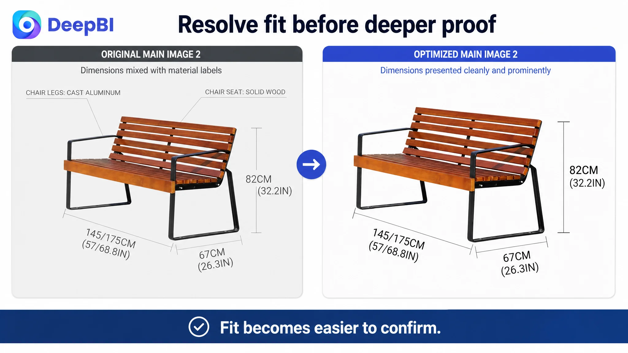
This is a good example of why image optimization should not be treated as a sequence of isolated creative tasks. Each image has a role in the buyer’s decision process.
The Bullet Points Were a Strength to Preserve
The customer’s bullet points scored higher than the benchmark’s, and the analysis found several useful characteristics:
- They addressed customer pain points.
- They connected features to use situations.
- They described comfort and appearance in commercial language.
- They framed durability and assembly around user outcomes.
The optimization direction was therefore additive rather than corrective.
The proposed improvements introduced more concrete details, such as:
- Seat width and height
- Overall dimensions
- UV, moisture, and scratch resistance where supported
- Reinforced construction
- Assembly hardware
- Maintenance requirements
- Weight capacity only where verified by product data
This last point is important. The benchmark emphasized a 1,100-pound capacity, but the customer Listing should not adopt that number unless the product’s actual specification supports it.
DeepBI’s role in this kind of diagnosis is not to copy the strongest-looking competitor claim. It is to identify why the claim is persuasive and then determine which parts can be truthfully applied to the customer’s own product.
The Real Change Was a Shift in Operating Judgment
No completed post-optimization performance data was provided in the case material. It would therefore be inaccurate to claim that ACOS declined, CVR increased, or organic orders recovered.
What can be established is the change in operating logic.
Before the diagnosis, the page could be treated as a collection of reasonably strong assets that needed more polishing. After the comparison, the problem was understood as a structural conversion gap:
- The Listing had useful information, but weak information sequencing.
- The main image set had strong technical content, but needed a clearer buyer-question order.
- The bullet points had persuasive potential, but required stronger specification support.
- The detail page lacked the visual modules needed to make quality and comfort believable.
- The absence of reviews increased the importance of first-party trust content.
- Advertising should not be used as the first response to a page-level trust deficit.
This reframing made the optimization path more controllable.
What Amazon Sellers Can Take From This Case
An Amazon Listing does not become conversion-ready simply because it contains more features or more images.
The stronger question is whether the page helps a shopper complete the decision.
For an outdoor park bench, that means making the following visible and easy to confirm:
- Product size and space fit
- Comfort and support
- Material quality
- Weather resistance
- Structural stability
- Assembly effort
- Maintenance requirements
- Real-world use context
DeepBI’s contribution in this case was not a list of isolated title, image, or A+ recommendations. It was the ability to rank the gaps by commercial consequence.
The title needed refinement, but it was not the main constraint. The main image sequence needed reordering, but it was already a relative strength. The bullet points needed more concrete support, but their customer-oriented logic was worth preserving.
The largest opportunity was the product page itself.
Before asking Amazon ads to scale traffic, sellers need to judge whether the Listing has enough evidence, clarity, and trust to deserve that traffic.
For this customer, the next stage was therefore not “make everything better.” It was to restore the missing conversion structure: build the A+ story, strengthen visual proof, preserve the useful parts of the existing content, and let each page element answer one important purchase question.
That is how Listing optimization moves beyond surface-level polishing. It begins with identifying which weakness is actually limiting the Amazon business.