

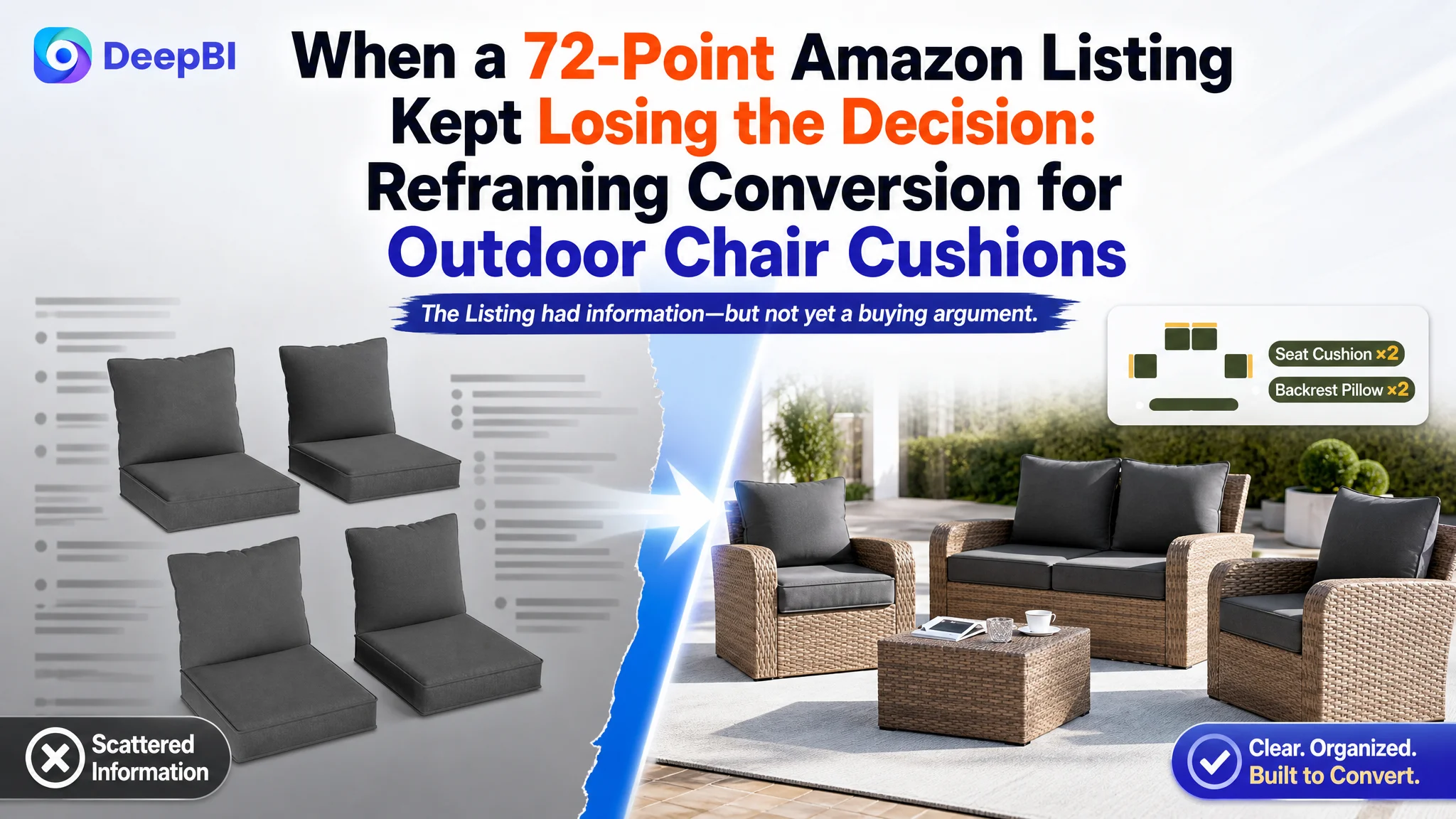
The customer was an Amazon seller in the US outdoor furniture accessories category. Its four-piece outdoor chair cushion Listing had the expected product information—dimensions, materials, foam, care instructions, and installation guidance—but the page was not building enough confidence for shoppers to complete the purchase.
The initial direction treated the problem as a set of isolated content issues: adjust the title, clarify the dimensions, improve the images, and add more functional details. DeepBI found a more important pattern. The Listing was not merely missing keywords or visual polish; it was asking shoppers to assemble the buying logic for themselves.
The deeper constraint was Listing conversion capacity. The page did not establish comfort, weather resistance, stability, fit, durability, and product credibility in the order Amazon shoppers needed. The later optimization therefore focused on rebuilding the product-page decision path—from what is included, to why it is comfortable, to how it stays secure, to whether it will fit and withstand outdoor use.
For other Amazon sellers, the lesson is commercially practical: before pushing more traffic or repeatedly adjusting Amazon ads, determine whether the product page can convert that traffic. A page with weak trust signals can turn additional traffic into additional inefficiency.
The Amazon Listing Had a Product, but Not Yet a Strong Buying Argument
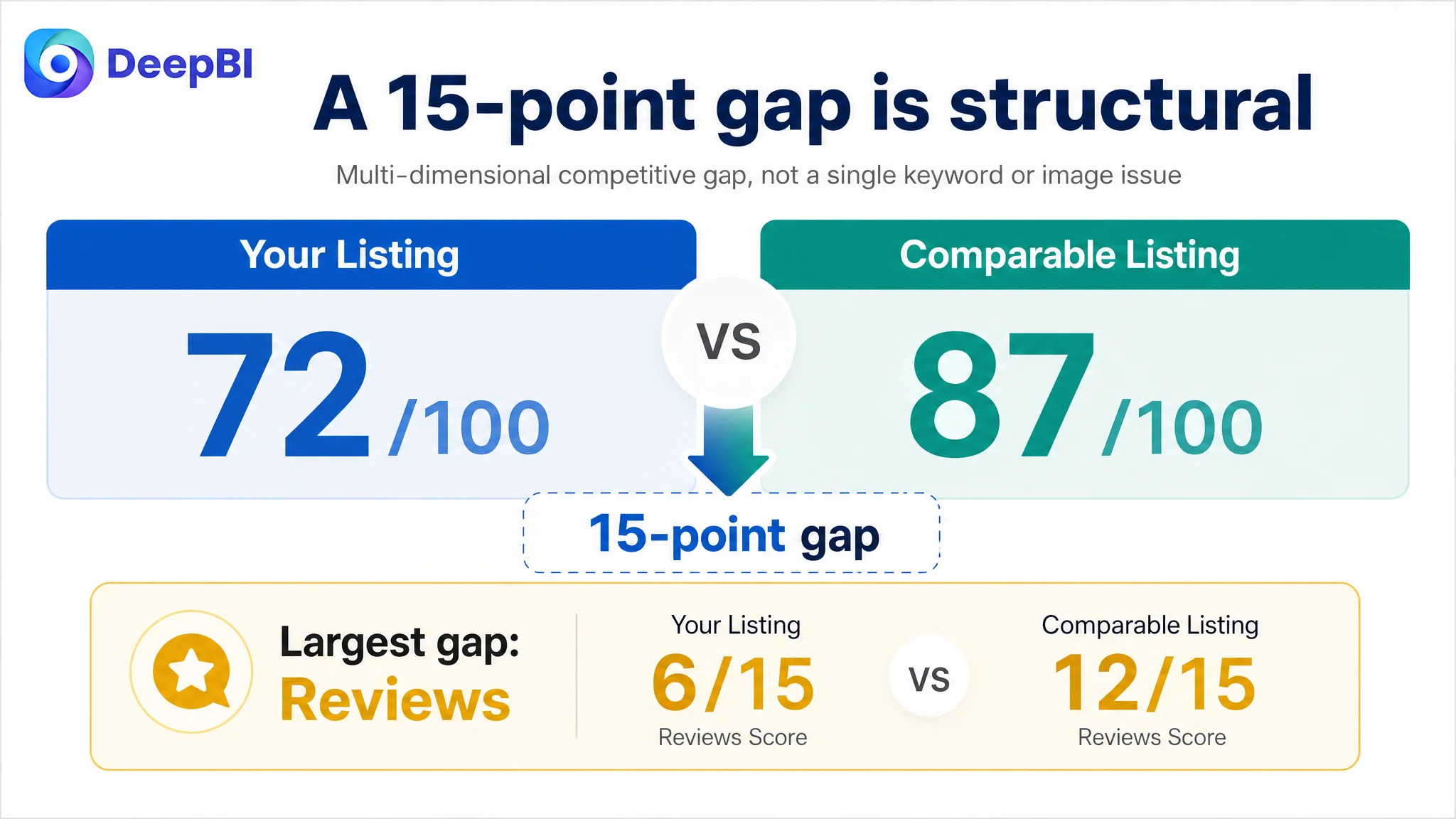
The Listing received a total score of 72 out of 100, compared with 87 for a comparable high-performing outdoor cushion Listing.
A 15-point gap is not explained by one missing phrase or one unattractive image. It indicates that several parts of the page were working below the category standard at the same time:
- Title: Target Listing: 15/20, Comparable Listing: 18/20, Gap: -3
- Main image: Target Listing: 25/30, Comparable Listing: 26/30, Gap: -1
- Bullet points: Target Listing: 7/10, Comparable Listing: 8/10, Gap: -1
- Detail page and A+ content: Target Listing: 19/25, Comparable Listing: 23/25, Gap: -4
- Reviews: Target Listing: 6/15, Comparable Listing: 12/15, Gap: -6
- Total: Target Listing: 72/100, Comparable Listing: 87/100, Gap: -15
The important judgment was not that every area needed equal attention.
The Listing’s largest business risk was that shoppers could see the product but still hesitate over the questions that determine conversion:
- Will the cushions fit my furniture?
- Will they stay in place?
- Are they comfortable enough for extended use?
- Can they handle light outdoor exposure?
- Will the color and fabric hold up?
- What exactly is included in the four-piece set?
- What should I expect when the vacuum-packed cushions arrive?
- Can I trust this product despite the limited review history?
This is a product-page conversion problem before it is an advertising problem.
The Listing did not lack information. It lacked a persuasive order for that information.
The Original Direction Focused on Components, Not Decision Sequence
The existing page was not empty. It already included:
- A lifestyle image
- Product and component visuals
- Foam and comfort information
- Fabric details
- Dimensions
- Installation guidance
- Cleaning and maintenance information
That made the problem easy to misread. When a Listing contains many useful elements, the natural reaction is often to add more detail or make small corrections.
The working direction followed that pattern:
- Clarify the size and package contents
- Explain the material and foam
- Add functional callouts
- Improve the image layout
- Rearrange the bullet points
- Strengthen the title with more keywords
These were reasonable actions, but they did not yet address the central issue: the page was presenting product attributes without consistently translating them into buyer outcomes.
For example, “water-resistant polyester fabric” communicates a material property. It does not automatically answer whether the cushion is suitable for a deck, garden, or poolside setting. “Non-slip silicone dots” identifies a component. It does not immediately show how that feature prevents shifting during regular use. A dimension chart gives measurements. It does not necessarily help a shopper measure a chair frame correctly.
The problem was therefore not a lack of effort. It was a lack of hierarchy.
DeepBI Found the Real Constraint in the Cross-Page Pattern
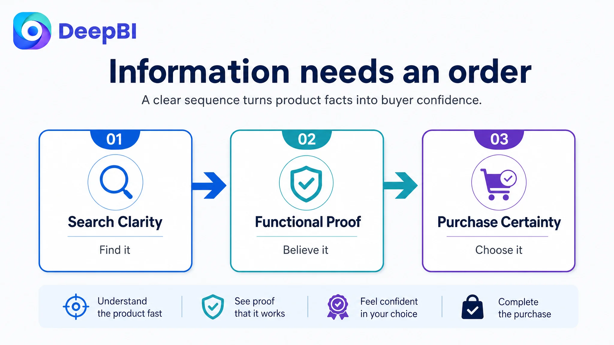
DeepBI’s diagnosis did not rely on one visual preference. It compared the Listing across the title, images, bullet points, A+ content, and customer feedback, then examined how those elements worked together against a relevant category benchmark.
The result showed a page that was behind in three connected areas:
1. Search and click clarity
2. Functional proof
3. Trust and purchase certainty
The title gap was relatively modest, but it still affected the first stage of the funnel. The existing title emphasized “replacement cushions” and a less common furniture phrase, while the comparable Listing led with a more recognizable product expression: outdoor chair cushions, set of four, size, material, ties, removable cover, and non-slip bottom.
The issue was not to copy a competitor’s wording. It was to make the product identity and its strongest buying reasons visible earlier.
The A+ and detail-page gap was more consequential. The page had relevant modules, but the sequence did not build confidence as efficiently as it could. Important concerns such as secure placement, washable covers, zipper construction, weather resistance, and fit guidance appeared too late or were not demonstrated strongly enough.
The review dimension was the largest gap of all:
- Target Listing: 3.4 stars, 40 total reviews
- Comparable Listing: 4.2 stars, 142 total reviews
The target Listing also had a higher concentration of serious negative feedback, including complaints related to shipping errors, product defects, and lack of customer service. This could not be solved by rewriting a bullet point. It was a structural trust disadvantage that needed to be acknowledged in the operating judgment.
That distinction matters. A stronger A+ page can improve explanation and reduce uncertainty, but it cannot erase a weak rating history. The right response is to repair the controllable parts of the Listing while treating review credibility as a separate business risk.
The Main Image Was Not Simply a Design Problem
The main image score was only one point behind the benchmark, but the image analysis showed missed opportunities in the buying sequence.
The first image did not quantify the package quickly enough
The four-piece set was visible, but shoppers had to count and interpret the arrangement. A clearer composition would show:
- Two seat cushions
- Two backrest cushions
- The combined set
- The four-inch thickness
- The gray color
This is not merely a matter of making the image more attractive. It reduces the mental work required to understand what the customer will receive.
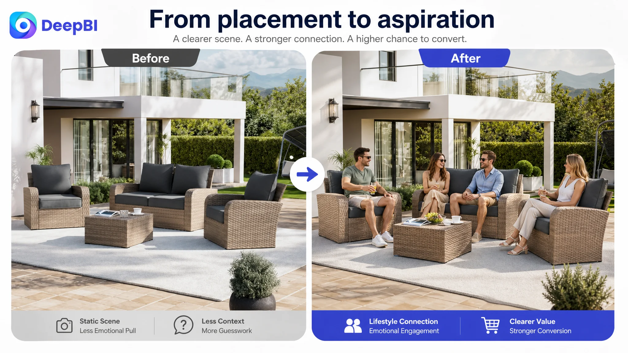
The lifestyle image created atmosphere but limited emotional connection
The existing outdoor scene placed the cushions near a pool, which supported the product’s intended use. However, it was relatively static and muted compared with stronger category imagery.
The improvement direction was not to invent a different product or exaggerate its performance. It was to make the setting more aspirational and relatable while preserving the actual gray cushions and patio context. A lifestyle image should help shoppers imagine lounging, entertaining, or relaxing—not just confirm that the product can be placed outdoors.
The dimensions image occupied a valuable persuasion position
One image focused on dimensions and component information. That information was necessary, but its position delayed more important functional proof.
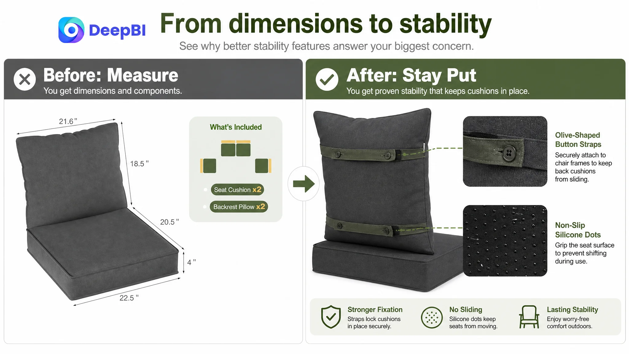
The recommendation was to move stability into that position:
- Olive-shaped button straps
- Non-slip silicone-dot bottom
- Reduced lateral movement
- Better resistance to shifting or being blown away
This reframed the image from “here are the measurements” to “here is how the cushions stay in place.”
Durability claims needed consistent visual language
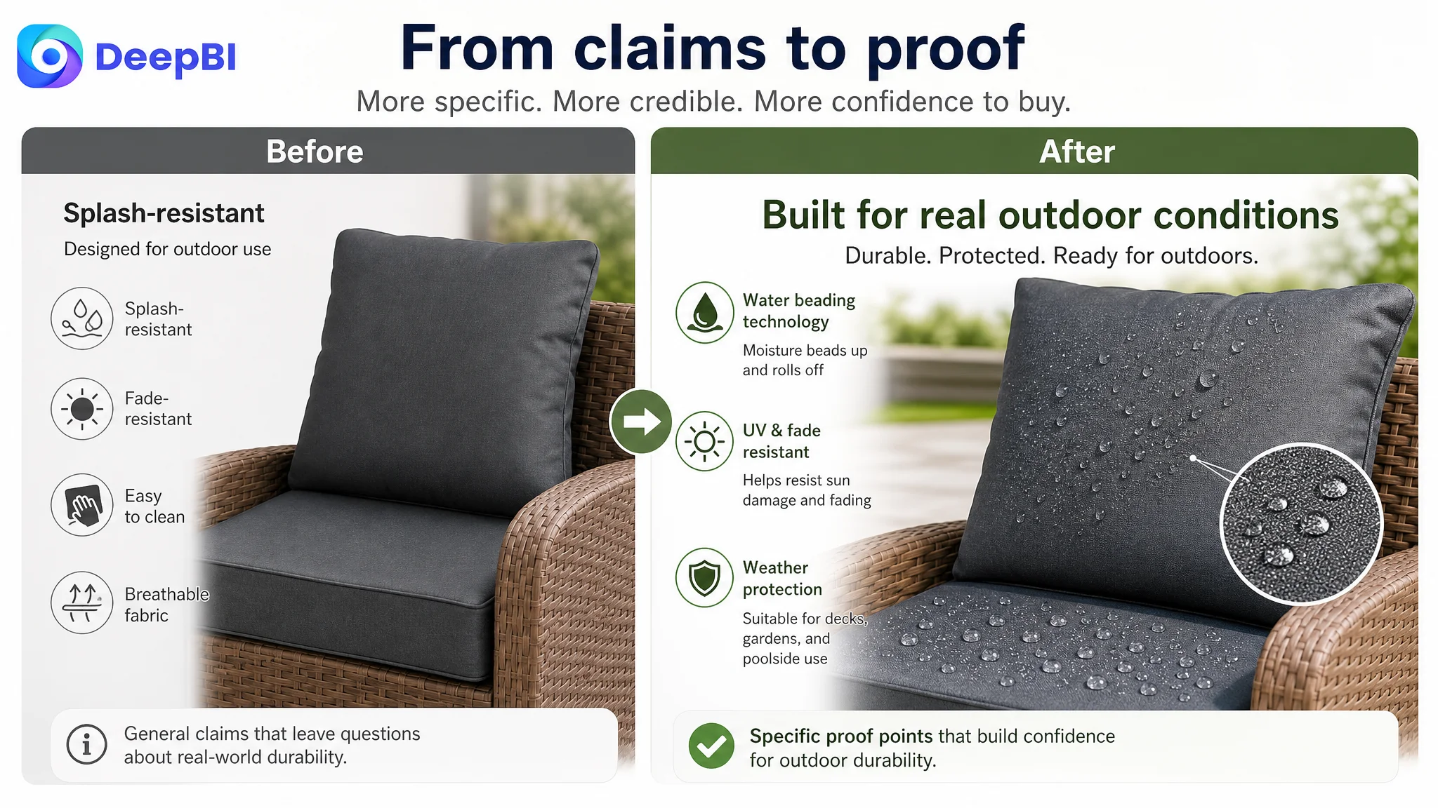
The page used terms such as “splash-resistant” and “water-resistant” inconsistently. That created ambiguity around the level of protection being communicated.
The better direction was to use one accurate expression consistently and support it visually with:
- Water beading on the fabric
- UV and fade-resistance cues
- A close-up of the polyester texture
- Reinforced stitching
- A hidden zipper
The purpose was not to make the product appear stronger than it was. It was to make existing material and construction claims easier to understand.
The Bullet Points Had Features, but Not Enough Consequences
The bullet points were another example of a page containing correct information without always building a complete argument.
The first bullet began with size and package guidance. That is useful near the end of the decision path, but it is not the strongest opening for a shopper deciding whether the cushions are worth considering.
The revised order began with the customer outcome: comfort and support.
The page could then connect the product’s actual specifications to that outcome:
- Four-inch, 24D high-density foam
- Resilient seat support
- Fluffy PP cotton backrest filling
- A softer, more comfortable backrest experience
The same logic applied to weather protection. Instead of listing “water-resistant fabric” as a standalone property, the bullet structure connected:
- Water-repellent coating
- Moisture beading and rolling off
- Protection against light rain and UV exposure
- A clear maintenance note for heavy rain or storms
This created a more credible relationship between material, use condition, and care expectation.
The durability bullet similarly moved from material description to long-term use:
- UV-related fading resistance
- Reinforced stitching
- Hidden zipper construction
- Suitability for outdoor sofa and patio furniture settings
The stability bullet made the security system easier to visualize by combining the non-slip bottom and attached ties into one “stay-put” benefit.
Finally, dimensions and vacuum packaging were moved later, where they could close the purchase loop:
- Two seat cushions
- Two backrest cushions
- Precise piece dimensions
- 48–72 hours for full expansion
- Removable, machine-washable covers
- A reminder to measure furniture before ordering
The change was not simply a copy refresh. It was a shift from attribute listing to pain point, evidence, and outcome.
The A+ Page Was Missing the Final Layer of Trust
The A+ content was where the conversion gap became most visible.
The target page already had a lifestyle image, comfort information, material details, dimensions, and setup guidance. But the comparable Listing built a denser trust chain around the same category concerns:
- Material close-ups
- Foam structure
- Water protection
- Anti-slip construction
- UV and fade resistance
- A measurement guide
- Package contents
- Unboxing and setup
- Multiple outdoor use scenes
The issue was not that the target Listing needed to imitate every module. The issue was that its A+ content did not sufficiently answer the customer’s rational objections before asking for the order.
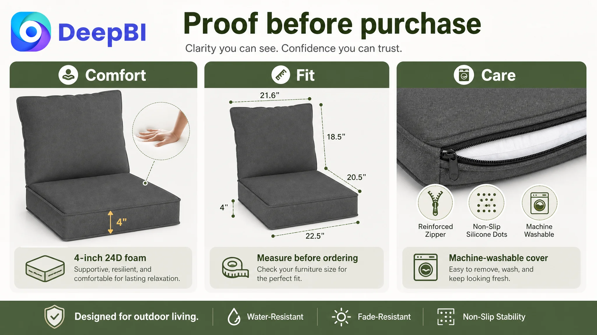
Comfort needed to become visible support
The 24D foam specification appeared in the content, but it was not given enough visual prominence. The four-inch thickness was repeated without fully showing what it meant.
The improved structure would connect:
- Four-inch thickness
- High-density foam
- Support without early collapse
- A supportive seat core
- A softer PP cotton backrest
This would turn a technical specification into a recognizable use benefit.
Critical functional details appeared too late
The washable cover, reinforced zipper, and non-slip bottom were meaningful purchase drivers. They were grouped too far into the page instead of appearing earlier as part of the product’s trust foundation.
For an outdoor cushion, these are not secondary details. They address maintenance, stability, and ownership concerns.
The fit section needed to guide, not merely measure
A static dimensions list leaves the shopper to perform the interpretation.
A stronger Fit Guide would show:
1. Measure the furniture frame
2. Compare the seat width and depth
3. Check the backrest area
4. Match the measurements to the two seat cushions and two backrest cushions
This reduces fit uncertainty and can also help limit avoidable returns.
The unboxing section needed to set expectations
Vacuum compression is a predictable source of customer concern. A statement that the cushion will rebound within 24 hours is not as complete as a transparent setup path.
The improved module should explain:
- What the customer receives
- How many seat and backrest cushions are included
- How the covers and foam are arranged
- Why the product arrives compressed
- When the cushions should reach their full four-inch thickness
This makes the delivery experience part of the product explanation rather than leaving it to customer service.
Outdoor durability needed direct proof
The page discussed weather resistance, but it lacked a dedicated module that made water and UV concerns easy to evaluate.
A focused module could connect:
- Heavy-duty polyester fabric
- Water resistance
- UV and fade resistance
- Appropriate outdoor settings such as decks, gardens, and poolside areas
The goal was not to promise all-weather permanence. It was to set a clear, credible expectation for the product’s actual use conditions.
Why DeepBI Did Not Recommend Tuning Amazon Ads First
There was no reliable evidence in the case material to claim a specific ACOS decline, CVR increase, or organic-order recovery. That limitation is important. A responsible diagnosis should not attach unsupported performance numbers to a Listing change.
But the operating decision was still clear.
When a product page has a 15-point competitive gap, weak A+ persuasion, incomplete fit guidance, and a 3.4-star review profile, additional traffic should be treated carefully. More Amazon ad traffic may increase exposure, but it does not automatically improve the page’s ability to convert.
In this situation, continuing to adjust bids, keywords, or campaign structures before repairing the page creates a specific risk:
Advertising may amplify the Listing’s existing conversion defects instead of solving them.
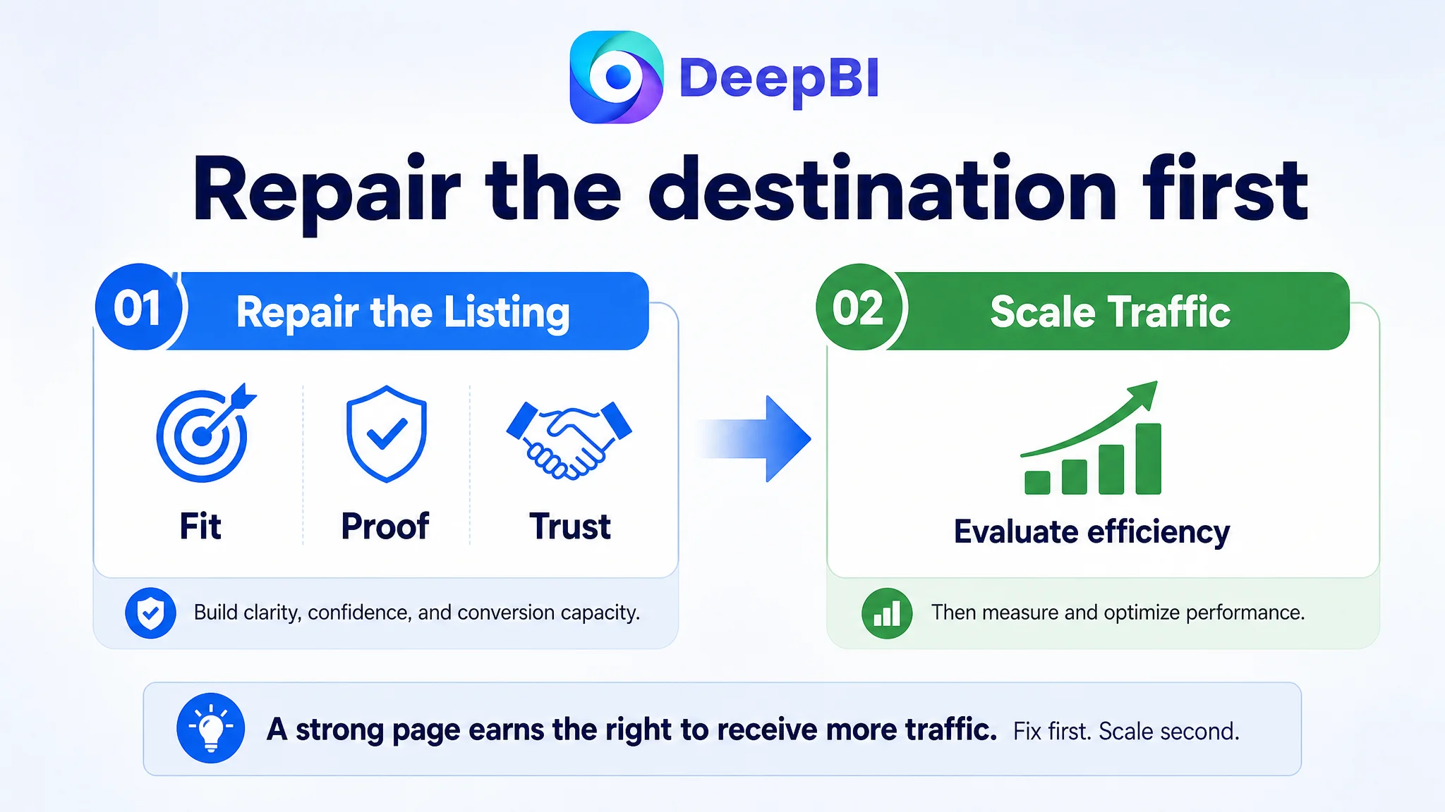
The decision order was therefore:
1. Repair the page’s core buying logic.
2. Make the product’s actual benefits easier to understand.
3. Reduce fit, setup, stability, maintenance, and durability uncertainty.
4. Address review and service-related trust risks separately.
5. Then evaluate whether Amazon ad traffic is being converted efficiently.
This does not mean ads are unimportant. It means advertising efficiency depends partly on the destination. If shoppers click but cannot establish enough confidence, the campaign is being asked to compensate for a product-page problem.
The Optimization Direction Became More Focused
Once the root cause was reframed, the recommended changes became more disciplined.
The title was reorganized around a clearer Amazon search and shopping structure:
- Four-piece outdoor replacement cushions
- Patio furniture use
- Deep-seat format
- Waterproof or water-resistant wording used accurately
- Fade resistance
- Removable covers
- Four-seat conversation-set compatibility
The main image sequence was redesigned around the customer’s questions:
- What is included?
- What does it look like in use?
- How does it stay secure?
- How does the fabric handle outdoor conditions?
- How easy is it to clean?
The bullet points followed the same progression:
- Comfort and support
- Weather protection
- Color and durability
- Stability
- Fit, setup, and maintenance
The A+ page then reinforced the claims with a more complete structure:
- Material confirmation
- Foam support
- Seat and backrest filling
- Washable covers and non-slip construction
- Furniture measurement guidance
- Package contents and expansion timeline
- Outdoor water and UV considerations
The product itself did not need to become something else. The page needed to make its existing value easier to verify.
What Changed in the Business Understanding
The case did not produce a supported numeric result in the available material, so it would be misleading to claim a specific improvement in ACOS, CVR, CTR, or organic sales.
The more defensible change was in operating judgment.
The customer’s Amazon Listing was no longer viewed as a collection of isolated assets that needed cosmetic improvement. It was understood as a conversion system with a sequence:
- Identify the product immediately.
- Show what the set includes.
- Establish comfort and support.
- Resolve stability concerns.
- Explain outdoor durability.
- Help the shopper confirm fit.
- Set expectations for unboxing and care.
- Build enough credibility to justify the purchase.
That sequence also clarified the role of Amazon ads. Ads can bring a shopper to the page, but the Listing must complete the argument.
Before scaling traffic, Amazon sellers need to judge whether the page has earned the right to receive more of it.
For this outdoor chair cushion seller, the real opportunity was not another isolated keyword adjustment or another decorative image. It was to rebuild the connection between product facts and customer confidence.
That is where Listing optimization becomes business diagnosis: not asking which element looks weakest in isolation, but determining which missing piece prevents the entire Amazon product page from converting the traffic it receives.