

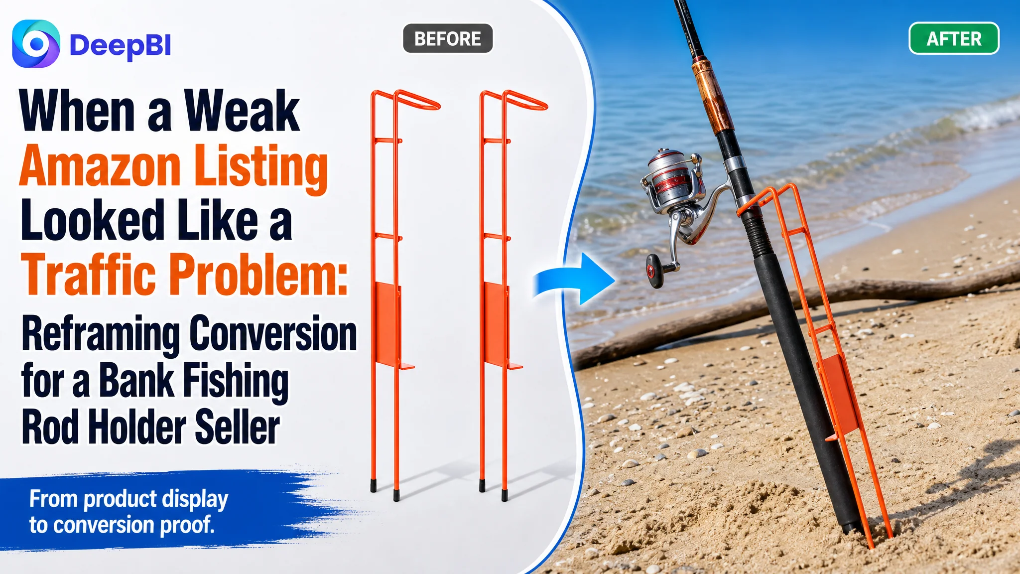
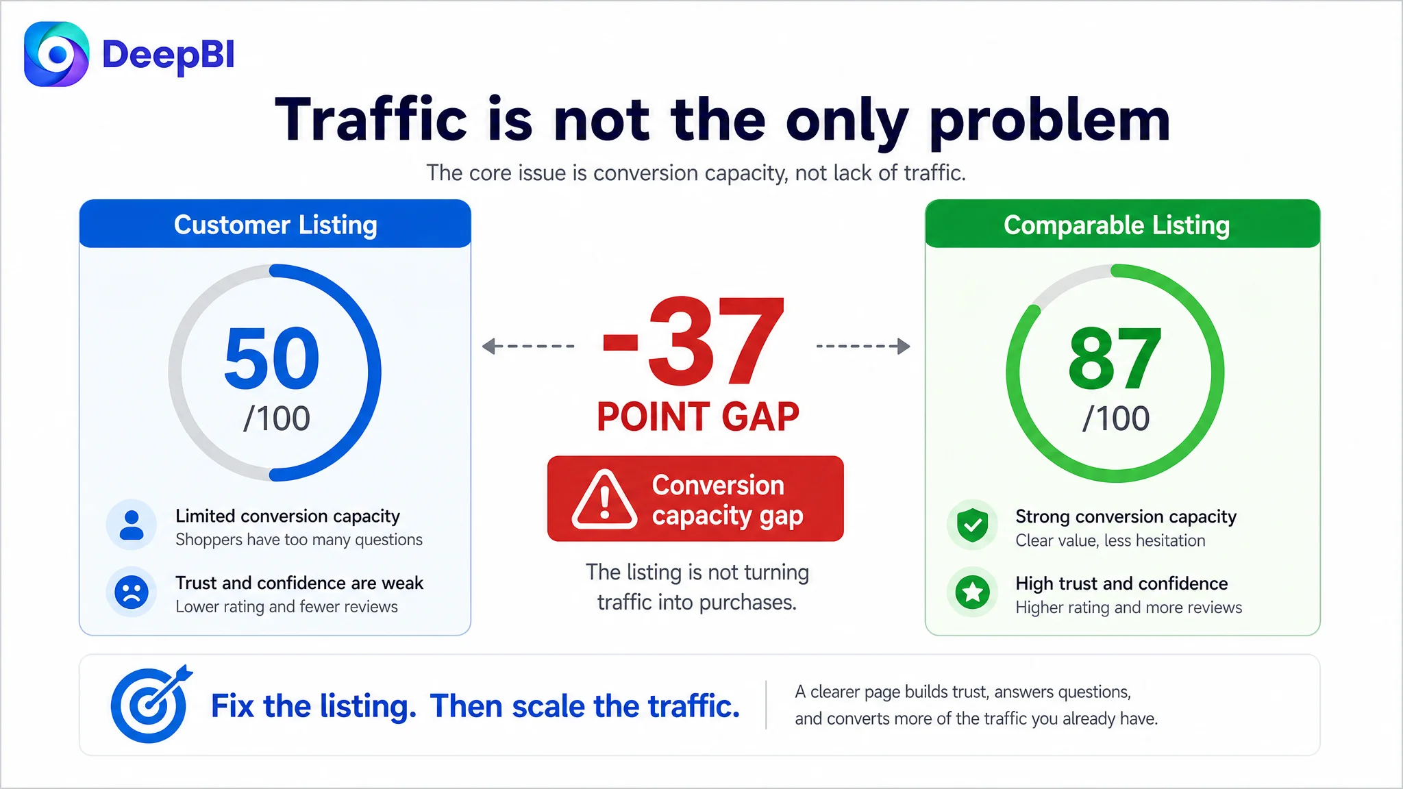
An Amazon seller in the US fishing accessories category was trying to improve a product page for bank fishing rod holders. The Listing was receiving a clear competitive signal: its total score was 50 out of 100, while a comparable high-performing Listing reached 87. Yet the initial direction remained focused on displaying more product information and making small content adjustments.
The deeper issue was not a lack of specifications. It was that the Amazon product page did not help shoppers understand the product quickly, trust its construction, or picture it working in real fishing conditions. The customer’s Listing showed the item, but it did not build a convincing path from search result to purchase decision.
DeepBI reframed the problem around Listing conversion capacity. The later optimization focused on moving the page from passive display to functional proof: clarify the title, connect bullet points to fishing scenarios, show material and adjustment mechanisms, rebuild the A+ content, and use the main images to answer buyer concerns in the right order.
For other Amazon sellers, the case offers a practical warning: before increasing ad pressure or continuing to adjust isolated images, determine whether the product page is ready to convert the traffic it receives. Advertising can bring shoppers to an Amazon Listing, but the Listing still has to explain, reassure, and persuade.
The Amazon Listing Was Not Empty. It Was Underperforming at the Decision Points
At first glance, the product page had the basic components expected of an Amazon Listing:
- A title
- Five bullet points
- Product images
- A+ content
- Customer reviews
- Core specifications
The problem was not the absence of content. It was the weakness of the page’s commercial sequence.
The product page communicated that the seller had a fishing rod holder. It did not communicate strongly enough:
- Why this holder was built for demanding shore fishing
- How it remained stable in different terrain
- How its adjustment mechanism worked
- Why the materials supported long-term outdoor use
- What the buyer would receive in the package
- How the product looked in an actual fishing situation
That distinction matters on Amazon. A Listing can contain a considerable amount of information and still leave the buyer with too many unanswered questions.
The page was presenting product facts, but it was not converting those facts into purchase confidence.
The Customer’s First Diagnosis Focused on Presentation, Not Conversion Logic
The original page direction was largely passive.
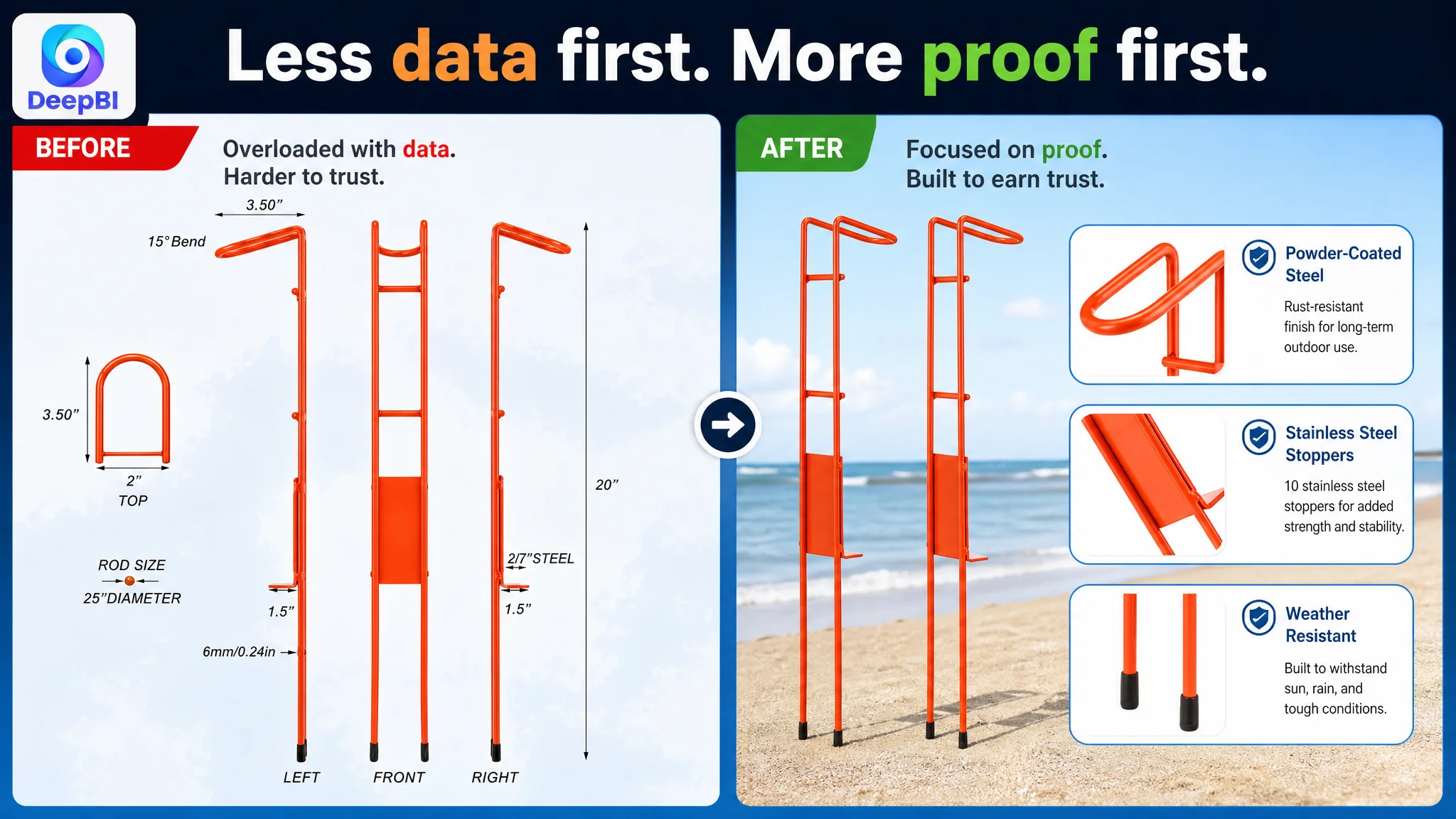
The main images showed the product from a studio perspective, included dimensions, repeated product details, and used general lifestyle imagery. The A+ section contained four static product images, including one missing image placeholder. The bullet points described structure, dimensions, materials, and visibility, but many of those points remained at the level of technical attributes.
This created an understandable but incomplete diagnosis: the Listing appeared to need more information and more polished presentation.
That diagnosis led toward actions such as:
- Adding or repeating specifications
- Showing product dimensions earlier
- Retaining general product views
- Explaining material properties in technical language
- Using lifestyle scenes without assigning each image a specific buyer question
These actions were not useless. They were simply not ordered around the customer’s decision process.
A shopper does not first ask for every dimension. The first questions are usually more basic:
1. What is this product used for?
2. Will it work with my fishing setup?
3. Will it stay stable on my terrain?
4. Is it durable enough for outdoor conditions?
5. Can I understand how to adjust and use it?
6. Does the package include what I expect?
The Amazon Listing did not answer those questions in a clear progression.
The Score Gap Revealed Where the Conversion Capacity Was Being Lost
DeepBI’s comparison did not stop at the overall score. The 50-point Listing was decomposed against a comparable 87-point competitor Listing.
- Title: Customer Listing: 12/20, Comparable Listing: 18/20, Gap: -6
- Main image: Customer Listing: 24/30, Comparable Listing: 26/30, Gap: -2
- Bullet points: Customer Listing: 6/10, Comparable Listing: 8/10, Gap: -2
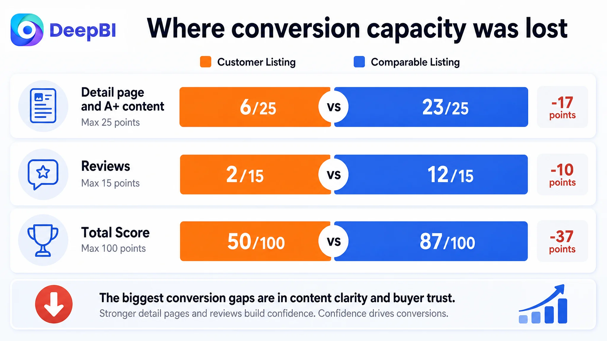
- Detail page and A+ content: Customer Listing: 6/25, Comparable Listing: 23/25, Gap: -17
- Reviews: Customer Listing: 2/15, Comparable Listing: 12/15, Gap: -10
- Total: Customer Listing: 50/100, Comparable Listing: 87/100, Gap: -37
The most important finding was not that every dimension was weaker. It was that the gaps were highly concentrated.
The detail-page gap was the largest. The customer Listing scored only 6 out of 25, compared with 23 out of 25 for the comparable Listing. The review dimension also created a major trust disadvantage: the product had a 3.1-star rating from five reviews, while the comparable Listing had 4.8 stars from 50 reviews.
This changed the optimization priority.
The title and bullet points needed improvement. The main image also needed a clearer functional role. But the largest controllable content problem was the absence of a complete product-page story.
The Real Constraint Was Listing Conversion Capacity
The Amazon seller did not simply need more traffic or more attractive images. The Listing needed to become more capable of converting attention into confidence.
The main weakness appeared across several connected layers.
The title delayed the core search term
The title placed “Fishing Rod Holders” later in the sequence instead of leading with the primary product category. It also lacked several concrete buying signals, including:
- Heavy-duty positioning
- The two-pack quantity
- More direct use cases
- Stronger material communication
- Relevant shore-fishing scenarios
The suggested direction moved the core phrase and product identity forward:
Heavy Duty Steel Fishing Rod Holders 2 Pack, Blaze Bank Fishing Pole Stands for Bank Fishing, Shore, Ground, Beach and Mud, Sturdy Rod Holders for Catfish
The purpose was not to fill the title with keywords. It was to make the product’s identity, material positioning, quantity, and application visible earlier.
The comparable Listing also covered use cases such as catfish fishing, beaches, mud, and ground fishing. These terms helped connect search intent with actual use conditions.
The main image showed the object but not the function
The first image primarily communicated that the package contained two orange holders. It did not immediately show what the product did.
For a fishing accessory, that creates friction. The buyer has to infer how the rod enters the holder, how the holder sits in the ground, and how the product contributes to a hands-free fishing setup.
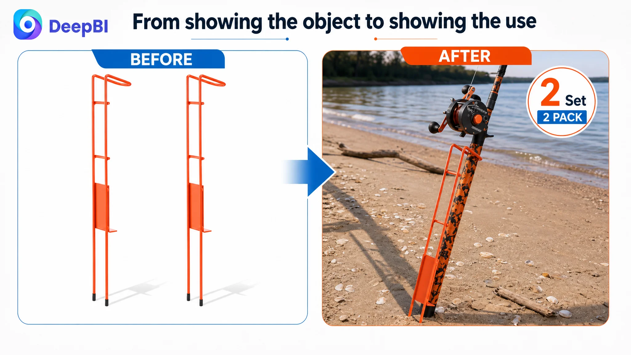
The recommended shift was from passive display to immediate function confirmation:
- Retain the product’s true structure and color
- Show a rod handle inserted into the holder
- Make the use relationship instantly understandable
- Replace early information overload with a clearer visual hook
The other image changes followed the same principle. Instead of presenting dimensions and repeated close-ups too early, the image sequence should answer buyer concerns in order:
1. What is the product and how is it used?
2. What is it made of?
3. Why is it heavy-duty?
4. How does it adapt to different terrain and rod angles?
5. How does the high-visibility orange coating support safety and quick positioning?
This is not merely a visual redesign. It is a reallocation of persuasion.
The bullet points listed attributes without completing the buyer’s reasoning
The original bullets contained useful information, but several of them remained technical rather than outcome-oriented.
For example, dimensions and compatibility were presented as measurements. The stronger direction connected those details to the buyer’s concern: whether the holder can withstand strong pulls and demanding shore-fishing conditions.
The revised bullet logic was built around five buyer concerns:
- Structural strength for large-fish impact
- Stable support across different ground conditions
- Three-angle adjustment for varied terrain
- Corrosion resistance for outdoor exposure
- High visibility for low-light safety and quick positioning
This structure gave each bullet a clear commercial job.
Structural strength should explain why it matters
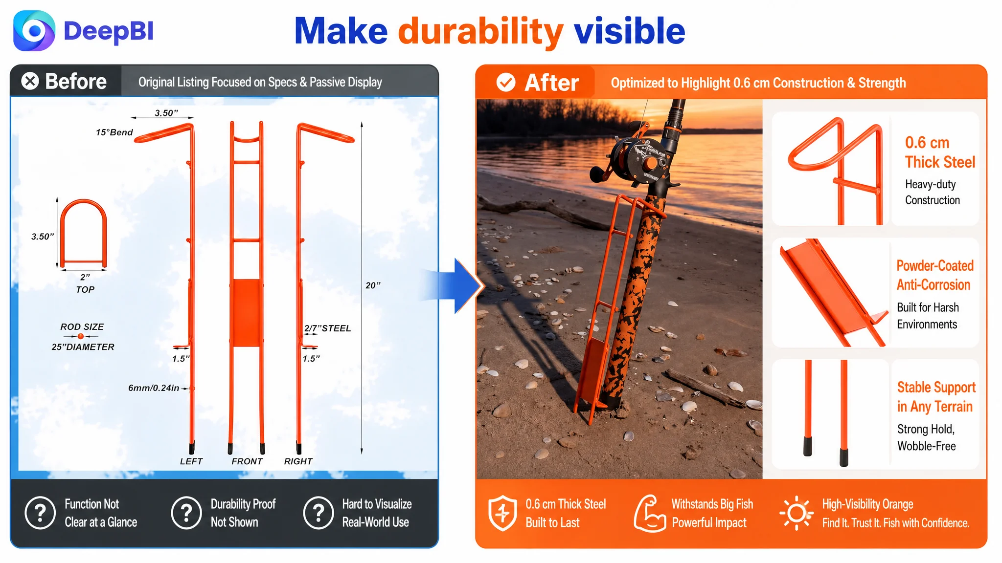
The Listing could state that the product uses 0.6 cm thick powder-coated steel and 10 stainless steel stoppers. But those specifications become more persuasive when connected to the buyer’s concern: whether the holder can withstand strong pulls and demanding shore-fishing conditions.
Portability and compatibility should be tied to real use
A tapered design measuring 20 inches in length, with dimensions of 3.5 inches at the top and 2 inches at the base, should not appear as an isolated measurement block.
It should help the buyer understand how the holder supports common spinning and casting setups and remains stable across different ground conditions.
Adjustment should be shown as a fishing advantage
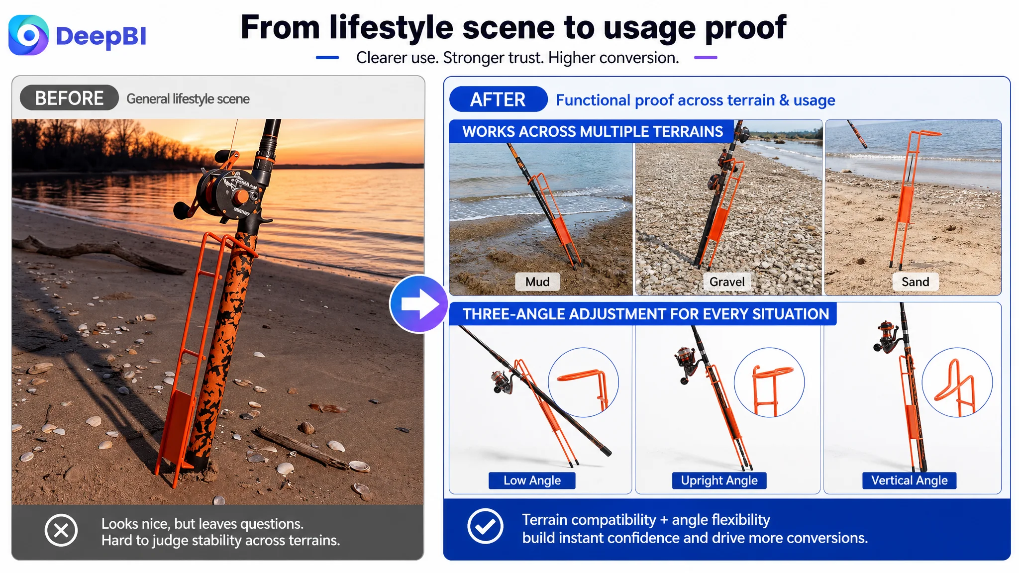
The three settings—low, upright, and vertical—should be framed around how anglers position a rod on a slope, rocky crack, or flat beach.
The important message is not just that the holder adjusts. It is that the adjustment helps the angler select a suitable rod angle for different techniques and terrain.
Durability should address outdoor exposure
Powder coating and corrosion resistance matter because bank fishing can involve saltwater, sun, rain, mud, and repeated outdoor handling. The bullet point should connect the treatment to reliable use rather than leaving it as a material statement.
High visibility should reduce a practical risk
The orange coating is not only a color choice. It can help the holder remain visible in daylight, dusk, and low-light conditions, reducing the chance of accidental contact or loss while supporting hands-free fishing.
Why DeepBI Did Not Recommend Continuing to Tune Ads First
The case material does not provide post-optimization advertising data, so no claim can be made about a specific ACOS decline, CVR increase, or organic-order recovery.
But the Listing diagnosis establishes an important decision principle: traffic should not be scaled aggressively before the page can convert that traffic with sufficient clarity and trust.
When a product page lacks:
- A clear product identity
- A functional main-image explanation
- A complete A+ story
- Strong material proof
- Usable adjustment guidance
- Scenario-based validation
- Sufficient review trust
additional traffic may simply expose more shoppers to the same conversion barriers.
That is why continuing to adjust bids, keywords, or campaign structures first would risk treating the symptom instead of the constraint. Advertising may increase visits, but it cannot independently repair an unclear product page or compensate for missing purchase evidence.
Ads can amplify traffic. They cannot decide whether the page deserves the buyer’s confidence.
The correct decision order for this Listing was therefore:
1. Clarify the product’s identity and use case.
2. Rebuild the visual and textual decision path.
3. Strengthen functional and material proof.
4. Make the A+ page answer practical buyer concerns.
5. Only then evaluate how additional Amazon ad traffic performs against the improved page.
The A+ Content Was the Largest Missed Conversion Opportunity
The existing A+ content was essentially a small collection of product images. It lacked the modules needed to help a rational buyer complete the decision.
The comparable Listing used a broader sequence:
- A scene-led introduction
- Material close-ups
- Structural breakdowns
- Functional callouts
- Multiple fishing scenarios
- Package and quantity clarification
The recommended A+ structure followed the same decision logic while staying grounded in the product’s confirmed attributes.
Start with immediate product confirmation
The opening module should identify the product as heavy-duty steel bank fishing rod holders and present core specifications such as:
- Powder-coated steel construction
- 20-inch length
- Two-piece set
- Three-angle adjustment
This answers the first question: “Is this the product I am looking for?”
Prove the material claim
A dedicated material module should show:
- Powder-coated steel
- 0.6 cm thickness
- Stainless steel stoppers
- Anti-corrosion treatment
The purpose is not to decorate the page with technical labels. It is to substantiate the heavy-duty positioning.
Demonstrate how adjustment works
A visualizer should show the low, upright, and vertical positions. The page should make it clear how those settings correspond to different shore-fishing terrains and rod-placement needs.
This is more persuasive than simply stating that the product is adjustable.
Reinforce durability with concrete evidence
A durability module should connect the material construction to the real operating environment:
- Shore fishing
- Sun and rain exposure
- Wet or challenging terrain
- Strong pulls from large fish
The goal is to replace general durability language with a clearer reason to believe the product can withstand outdoor use.
Validate the product in a real fishing scene
The product should be shown installed on a bank or beach, holding a rod in a stable position. The scene should prove compatibility and terrain use, not function as a generic lifestyle backdrop.
Address visibility and safety
The high-visibility orange coating deserved its own visual role. The page should demonstrate how the holder can be located during daylight, dusk, and low-light fishing conditions.
Remove package ambiguity
The page should clearly state what “2 Pack” or “2 Set” means and confirm the exact quantity included. This small clarification can remove unnecessary hesitation before purchase.
Reviews Were a Trust Constraint, Not a Copywriting Problem
The review dimension scored only 2 out of 15.
The Listing had five total reviews, a 3.1-star rating, and a high proportion of one- and two-star feedback. Those reviews raised specific concerns about:
- The product being too small
- Poor welding
- The visibility feature not working as expected
The comparable Listing had 50 reviews and a 4.8-star rating, with positive feedback focused on sturdiness, adjustability, and practical use.
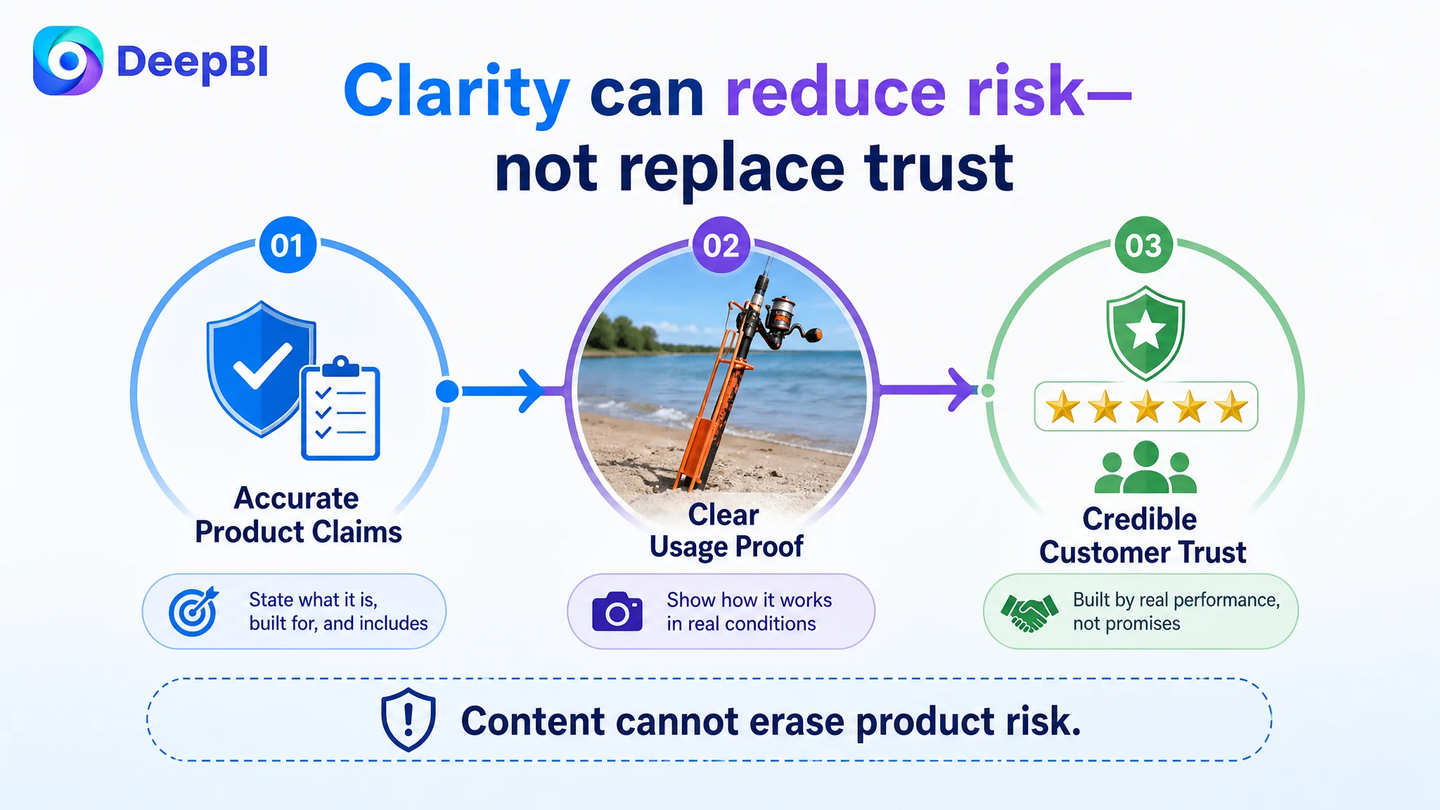
This gap could not be solved through A+ content alone. A stronger page can explain the product more clearly, but it cannot erase existing customer feedback.
That distinction is important for Amazon sellers. Listing optimization can improve the information architecture and reduce avoidable misunderstanding. It cannot substitute for product quality, fulfillment reliability, or a credible review history.
The appropriate approach was to treat reviews as a risk signal:
- Ensure the stated dimensions match the physical product
- Make the material and construction claims accurate
- Clarify visibility expectations
- Show real usage conditions
- Avoid presenting unsupported durability promises
- Use the improved page to reduce confusion before purchase
The product page should become more honest and more useful, not merely more persuasive.
The New Direction Repaired the Page’s Sales Logic
The recommended changes formed one connected path rather than a collection of isolated edits.
The title established the product category, material, quantity, and use cases earlier.
The main image confirmed the function immediately.
The secondary images moved through material proof, heavy-duty construction, adjustment, terrain use, and visibility.
The bullet points translated specifications into practical outcomes.
The A+ content expanded that logic into a complete sequence:
Product confirmation → material proof → operating mechanism → durability → real-world use → safety → package clarity
This sequence reduced the buyer’s cognitive workload. Instead of asking shoppers to assemble the product’s value from disconnected facts, it guided them through the same questions they would naturally ask before buying.
That is the central judgment in the case.
The Amazon Listing did not primarily need more content. It needed better coordination among title, images, bullets, A+, and reviews.
What Amazon Sellers Can Take From This Case
This fishing accessory Listing illustrates a broader Amazon operating principle.
A low Listing score is not automatically an advertising problem
If traffic reaches a page with weak product explanation and limited trust, the next optimization priority may be the page rather than the campaign.
A technical specification has to earn its place
Dimensions, thickness, materials, and adjustment angles matter only when shoppers understand how those details affect use.
The main image should clarify the product’s role
For products whose function is not obvious at thumbnail size, passive studio display can create unnecessary interpretation work. The visual sequence should make the product’s use immediately legible while staying within Amazon image requirements.
A+ content should complete the purchase argument
A+ content is not a storage area for extra product pictures. It should answer the remaining questions that prevent a buyer from committing.
Reviews define the trust ceiling
Content improvements can reduce confusion and present the product more accurately. They cannot replace genuine product performance and customer confidence.
Ads should scale a page that can convert
Before increasing ad pressure, sellers should ask whether the product page has earned more traffic through clear positioning, functional proof, material credibility, scenario validation, and risk reduction.
The Customer’s Understanding Had to Change First
The most important change in this case was not a single rewritten bullet point or a new image concept.
It was the shift from asking:
“How can we add more information to this Amazon Listing?”
to asking:
“What must a shopper understand and believe before this product can convert?”
That question changed the order of work.
The title was no longer treated as a keyword container. The main image was no longer treated as a product photograph. The bullet points were no longer treated as a specification list. The A+ page was no longer treated as a collection of supporting graphics.
Each element had to perform a role in the same conversion system.
For this Amazon bank fishing rod holder seller, the next stage was not to keep pushing traffic toward an under-explained page. It was to rebuild the Listing’s ability to explain the product, prove its value, and reduce purchase risk.
Before Amazon ads can work harder, the product page has to give the traffic a reason to convert.