

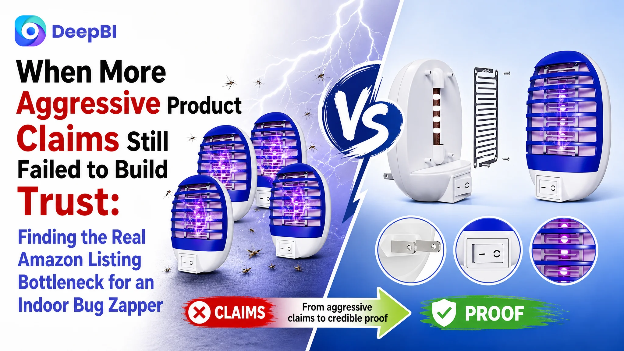
This case involves an Amazon US seller whose indoor bug zapper Listing looked complete on the surface: it had product images, functional claims, usage instructions, and a four-pack offer. The initial optimization direction focused on making the product appear more powerful and improving individual elements such as keywords, features, and visual effects.
DeepBI found that this diagnosis was incomplete. The central problem was not a lack of product information, but a lack of convincing product-page logic. The Listing was asking shoppers to believe that the device was effective and safe without giving them enough visual proof, structured reassurance, or credible reasons to trust the product.
The later optimization therefore shifted from “make the zapper look more aggressive” to rebuilding the Amazon Listing around performance evidence, physical safety, cleaning transparency, realistic household scenarios, and the value of the four-pack. The case offers a useful reminder for Amazon sellers: before increasing traffic or intensifying claims, first ask whether the product page can convert that traffic with confidence.
The Listing Did Not Have an Information Problem. It Had a Trust Problem.
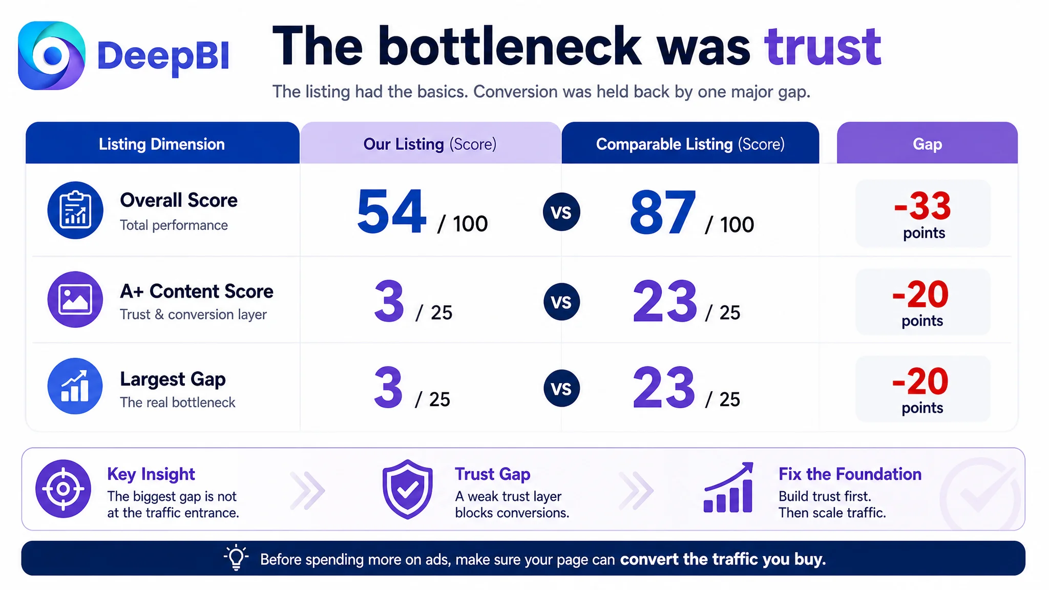
The customer’s Listing received an overall score of 54 out of 100, compared with 87 out of 100 for a comparable high-performing Amazon Listing.
At first glance, the gap could have been treated as a collection of small content issues:
- The title needed stronger keyword ordering
- The main images needed clearer communication
- The bullet points needed tighter structure
- Reviews needed to improve
- Product benefits needed to appear more prominently
But the score distribution showed something more important.
- Title: Target Listing: 16/20, Comparable Listing: 17/20, Gap: -1
- Main images: Target Listing: 24/30, Comparable Listing: 26/30, Gap: -2
- Bullet points: Target Listing: 6/10, Comparable Listing: 7/10, Gap: -1
- A+ content: Target Listing: 3/25, Comparable Listing: 23/25, Gap: -20
- Reviews: Target Listing: 5/15, Comparable Listing: 14/15, Gap: -9
- Total: Target Listing: 54/100, Comparable Listing: 87/100, Gap: -33
The title, images, and bullets were behind, but not dramatically. The largest weakness was the A+ content, where the Listing scored only 3 out of 25.
That changed the business diagnosis.
The page was not simply missing a stronger keyword or a more attractive image. It was missing the part of the product story that helps shoppers move from interest to confidence.
The biggest gap was not at the traffic entrance. It was in the page’s ability to complete the buying decision.
The Initial Diagnosis Focused on Product Claims and Visual Impact
The product category creates a specific conversion challenge. An indoor bug zapper must communicate at least four things quickly:
1. Will it attract and eliminate flying insects?
2. Is it safe enough for a household environment?
3. Is it easy to clean and maintain?
4. Will it work naturally in the rooms where the shopper plans to use it?
The customer’s Listing addressed these topics, but mainly through direct claims and instructions.
The first image emphasized the four-pack configuration while also using stylized lightning effects and dead insects to signal killing power. Another image used dense text callouts to explain the internal structure. The bullets described high-voltage operation, chemical-free use, cleaning, and multi-room coverage.
This created a reasonable but limited product presentation: the Listing explained what the product did, but did not consistently prove why shoppers should feel comfortable buying it.
The working assumption was that the page needed stronger performance messaging. More visible power, more direct functional language, and more aggressive claims appeared to be the natural answer.
DeepBI reframed the issue differently.
The product did not primarily need to look more forceful. It needed to look more believable.
The Real Bottleneck Was Listing Conversion Capacity
The largest gap appeared in the A+ section.
The target Listing used a text-only detail area covering specifications, usage, features, and warnings. The comparable Listing used a broader visual structure:
- A performance-oriented product introduction
- A dedicated safety explanation
- A step-by-step cleaning guide
- Multiple household usage scenarios
- Lifestyle imagery connected to family settings
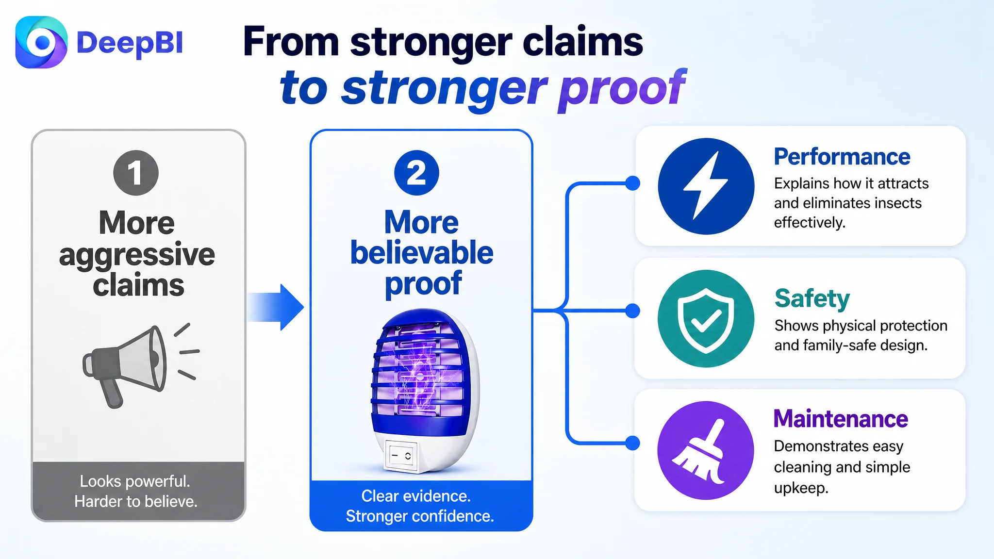
This was not merely a difference in design quality. It was a difference in decision coverage.
The comparable Listing moved through a more complete sequence:
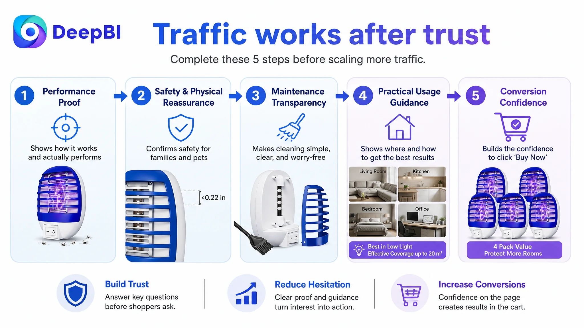
Performance claim → safety reassurance → maintenance transparency → usage guidance → household relevance
The target Listing left much of that sequence to plain text.
For an indoor bug zapper, that matters because shoppers are not evaluating performance in isolation. They are also evaluating electrical risk, chemical exposure, cleaning difficulty, noise, placement, and suitability for bedrooms, kitchens, children, and pets.
A product page that only says “safe” or “chemical-free” asks the shopper to accept the claim. A product page that shows the protective cover, explains the physical barrier, visualizes cleaning steps, and clarifies usage conditions gives the shopper more reasons to believe it.
A+ Content Was Not an Extra Brand Layer
The A+ gap was the clearest reason not to begin with more aggressive advertising or surface-level copy changes.
The Listing had no image-based A+ modules. That removed several opportunities to answer questions that the title and bullet points could not fully resolve:
Performance needed a concrete explanation
The product could be presented around its actual operating logic:
- Light attracts flying insects
- The electrically charged metal mesh eliminates them on contact
- The device operates quietly
- It can be used by plugging it into an AC outlet
The goal was not to invent a multiplier or unsupported technical advantage. It was to make the existing product logic easier to understand.
Safety needed physical evidence
The customer’s Listing used safety language, but the visual proof was weak. The product page needed to show the protective cover and explain how it separates users from the high-voltage mesh.
This was particularly important because the Listing contained a contradiction: some claims described the product as safe for children and pets, while other instructions told users to keep children and pets away from the device.
That contradiction could not be solved by adding another safety slogan. It needed to be reconciled in the page’s messaging and visual presentation.
The correct direction was to distinguish between:
- A physical protective design
- Responsible placement and supervision
- Safe cleaning procedures
- The need to keep children and pets from handling or approaching the device
Trust depends not only on making a safety claim, but also on ensuring that every image, bullet, and warning supports the same interpretation.
Cleaning needed to become a visible process
The current cleaning guidance was functional but text-heavy. A clearer module could show the sequence:
1. Unplug the unit
2. Open the protective shell
3. Release residual static electricity as instructed
4. Remove dead insects with a tissue or small brush
This would reduce uncertainty around maintenance and make the product feel easier to manage.
Usage scenarios needed guidance, not just a room list
The Listing mentioned rooms such as the kitchen, living room, bedroom, bathroom, warehouse, and basement. But listing rooms alone does not tell shoppers how to use the product effectively.
The proposed direction was to connect scenarios with practical guidance:
- Place the unit where flying insects are active
- Turn off competing lights when appropriate
- Turn on the device in advance
- Keep expectations within the stated effective coverage of approximately 20 square meters
This converts a generic room list into usable purchase information.
The Main Image Was Not Simply “Bad.” It Was Doing the Wrong Job.
The main images scored 24 out of 30, only two points behind the comparable Listing. That meant the images were not the primary failure, but they were reinforcing the broader trust gap.
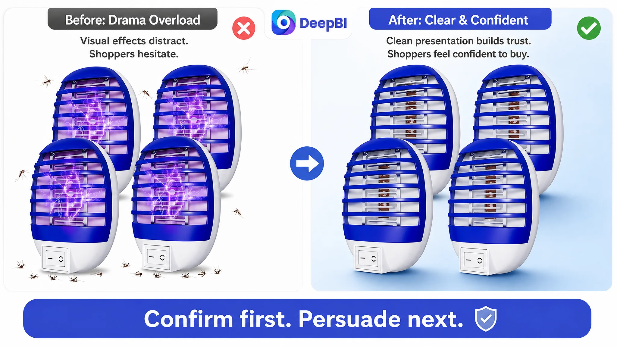
The first image emphasized drama over confirmation
The four-pack configuration was visible, but stylized lightning arcs and dead insects made the image focus on aggressive performance.
That creates two risks:
- The shopper may notice the visual effect before understanding the product itself
- The presentation may feel exaggerated before trust has been established
A better first-image direction was to confirm the actual product clearly:
- Show the four-pack configuration
- Make the product form easy to verify
- Reduce excessive visual effects
- Present the product as a credible household device rather than a dramatic graphic
The first image should earn the click through clarity before the rest of the Listing develops the performance story.
The functional image relied too heavily on text
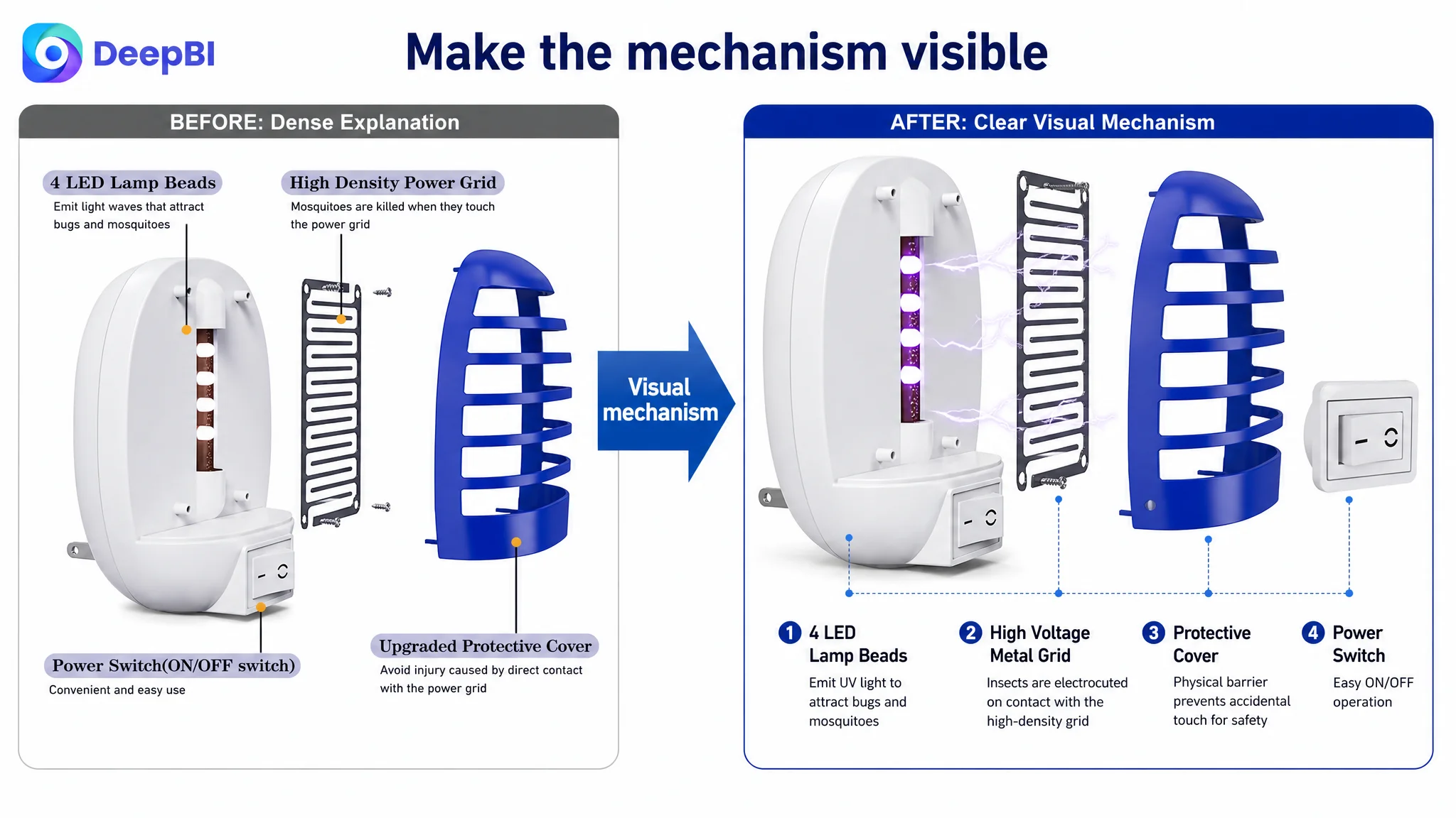
The image explaining the internal structure used dense labels and lines. The content was present, but the shopper had to read through it to understand how the device worked.
The recommended direction was a simpler visual explanation of:
- The light-emitting components
- The protective cover
- The electrically charged metal mesh
- The relationship between attraction and elimination
This is where visual logic matters. The shopper should be able to understand the mechanism from the arrangement of the image, not from a paragraph of annotations.
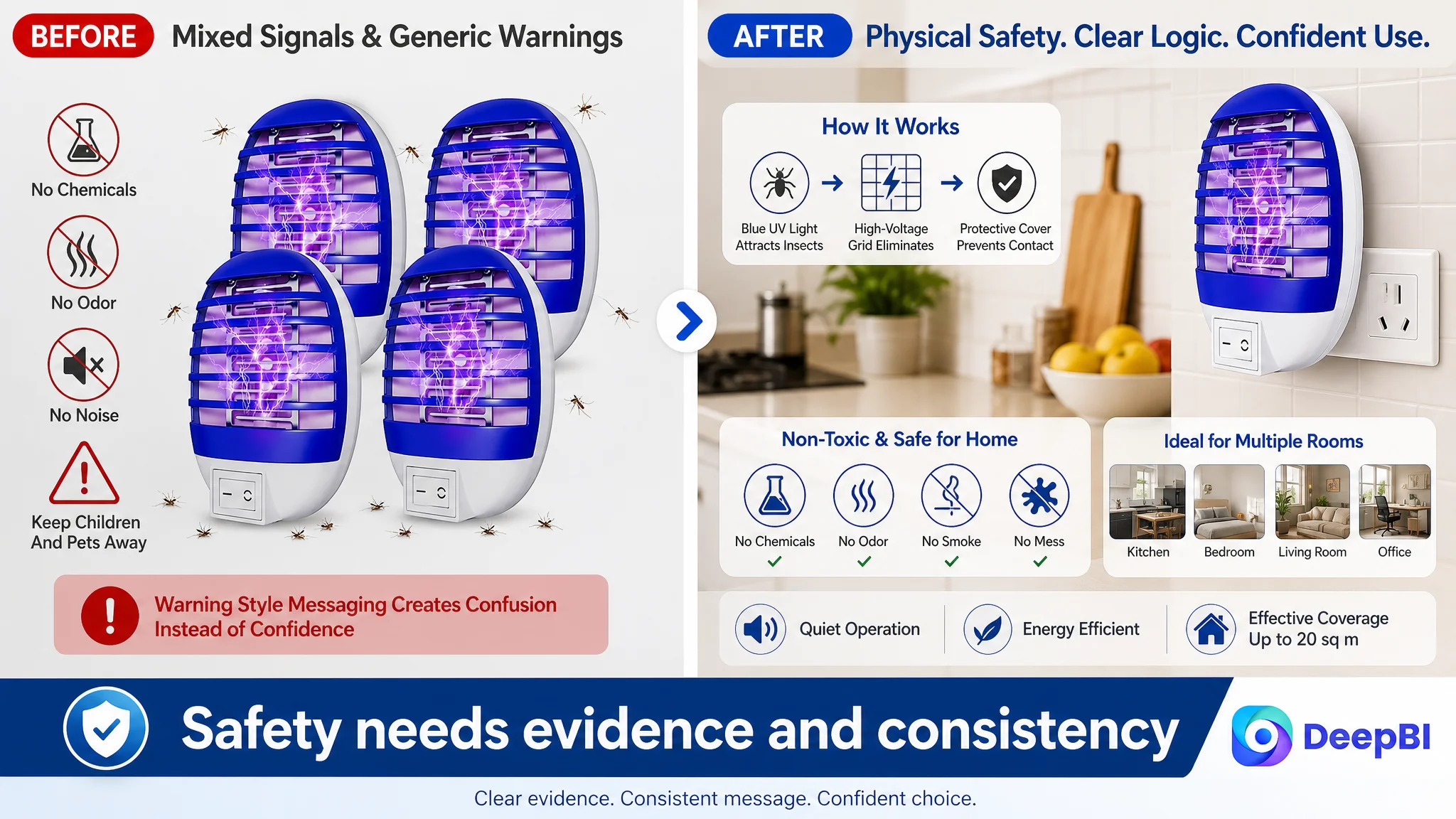
The safety image needed proof instead of icons
Generic icons such as “Safe for Human & Pets” are not enough when the product contains a high-voltage grid.
The page needed to show the protective barrier and explain its role. At the same time, the safety message had to remain consistent with the instruction to keep children and pets away from the device.
This was a high-priority issue because an inconsistent safety message can damage trust even when the underlying product may be suitable for household use.
For products involving electricity, “safe” is not a design decoration. It is a proof requirement.
The Title and Bullet Points Were Secondary, but Still Important
The title gap was relatively small: 16 versus 17. That did not mean the title should be ignored. It meant the title was not the first problem to solve.
The proposed title structure moved the core phrase closer to the beginning and added relevant search language such as:
- Plug-in bug zapper
- Indoor flying insect trap
- UV light
- Electronic mosquito zapper
- Fly killer
- Home
- Kitchen
- Bedroom
- Baby room
- Office
It also retained the four-pack advantage.
The purpose was not to copy the comparable Listing. It was to improve search clarity and shopper understanding at the same time. The title could communicate product form, core function, pack size, and relevant settings without relying on vague performance language.
The bullet points required a similar restructuring.
The original bullets contained useful information, but their logic was loose and somewhat repetitive. The revised direction gave each point a distinct job:
1. Explain attraction and operation
The first bullet should connect light attraction, the metal mesh, quiet operation, and immediate use.
2. Explain physical protection
The second bullet should focus on the protective cover and any verified housing interval information, rather than relying on a general statement that the product is safe.
3. Clarify chemical-free use
The third bullet should explain that the device uses a physical method rather than sticky traps, sprays, or poisons, while avoiding unsupported absolute claims.
4. Make cleaning easy to understand
The fourth bullet should present the cleaning sequence clearly and responsibly.
5. Make the four-pack meaningful
The fifth bullet should explain why four units are useful across multiple rooms, while retaining the stated coverage information and practical placement guidance.
The aim was not to add more words. It was to make each bullet answer a different buyer concern.
Why DeepBI Did Not Prioritize Advertising Adjustments First
The case material does not include post-optimization ad metrics such as CTR, CVR, ACOS, or TACOS. Therefore, it would be incorrect to claim that advertising costs had already risen or that a specific campaign structure had failed.
But the Listing diagnosis still establishes an important operating principle.
If paid traffic is sent to a page with a 3 out of 25 A+ score, weak review proof, and unresolved safety communication, the traffic may expose the page’s weaknesses rather than solve them.
Advertising can create impressions and clicks. It cannot make a text-only A+ section feel visually complete. It cannot turn a vague safety statement into physical evidence. It cannot compensate for a 3.5-star rating and only 18 total reviews when a comparable Listing has a 5.0-star rating and 142 reviews.
That is why the recommended decision order was:
1. Repair the product page’s trust and conversion structure
2. Align the title and bullets with the actual product strengths
3. Rebuild the visual explanation of performance, safety, cleaning, and usage
4. Resolve contradictory claims before increasing promotional pressure
5. Then evaluate whether additional traffic can be converted more effectively
This is not an argument that Amazon ads are unimportant. It is an argument that ads should not be asked to carry a page that has not yet earned the shopper’s confidence.
Reviews Confirmed the Same Business Risk
The review dimension reinforced the Listing diagnosis.
The target product had:
- A 3.5-star rating
- 18 total reviews
- 8 reviews visible on the first page
- At least one one-star review among the visible reviews
The comparable Listing had:
- A 5.0-star rating
- 142 total reviews
- 8 visible first-page reviews with five-star ratings
This gap affects the entire page. Even a stronger title or cleaner image may not fully overcome weak social proof, especially in a category involving electrical products and household safety.
That does not mean the immediate answer is to pursue reviews as an isolated project. The more useful conclusion is that the content must avoid creating expectations the product cannot support.
Clearer safety instructions, more realistic performance communication, and transparent maintenance guidance can help reduce misunderstanding. Listing optimization cannot manufacture a better rating, but it can prevent the page from adding more uncertainty to an already fragile trust position.
The Optimization Direction Changed From Decoration to Decision Support
The proposed changes across the Amazon Listing were connected by one principle: every asset should help the shopper make a specific decision.
- The first image should confirm what will arrive.
- The functional image should show how the product works.
- The safety image should explain the physical barrier.
- The lifestyle image should connect the product to real household concerns.
- The A+ section should complete the performance, safety, maintenance, and usage story.
- The title should improve search clarity without overstating capability.
- The bullets should organize the product’s evidence into a clear buying path.
DeepBI’s role in this case was not to produce a longer list of creative suggestions. It was to identify which weakness mattered most and prevent the team from treating every gap as equally urgent.
The score comparison made the priority visible. A two-point main-image gap did not deserve the same immediate attention as a twenty-point A+ gap. A one-point title gap did not justify delaying the repair of missing safety and maintenance content.
That distinction is where business judgment enters Listing optimization.
What Amazon Sellers Can Take From This Case
This indoor bug zapper case points to several broader lessons for Amazon sellers.
A nearly acceptable title does not mean the Listing is ready
A Listing can have relevant keywords and still fail to convert if the product page does not build confidence after the click.
Visual drama is not the same as persuasive evidence
Lightning effects and aggressive performance imagery may attract attention, but they can also raise skepticism if the product itself is not clearly confirmed.
Safety claims must be consistent and demonstrable
For household electrical products, the page must show how safety is achieved and ensure that claims, images, and warnings do not contradict one another.
A+ content can be a conversion layer, not a decorative add-on
When A+ content is reduced to plain text, the Listing loses opportunities to explain mechanisms, show maintenance steps, present household scenarios, and build emotional reassurance.
Paid traffic should be judged against page readiness
Before scaling Amazon ads, sellers should ask whether the Listing can convert the traffic they intend to buy. If the page lacks trust, advertising may only make the weakness more visible.
One large bottleneck matters more than many small edits
In this case, the decisive gap was not a missing synonym or an isolated image detail. It was the Listing’s inability to move shoppers from product awareness to confident purchase.
The first question is not “How can we drive more traffic?” It is “What will the shopper believe after arriving on the page?”
For this Amazon seller, the answer began with rebuilding the Listing’s sales logic: clearer proof of performance, more credible physical safety communication, transparent cleaning guidance, practical usage context, and a fuller A+ experience. Only after that foundation is repaired can additional traffic become a reliable growth input rather than another way to amplify conversion risk.