

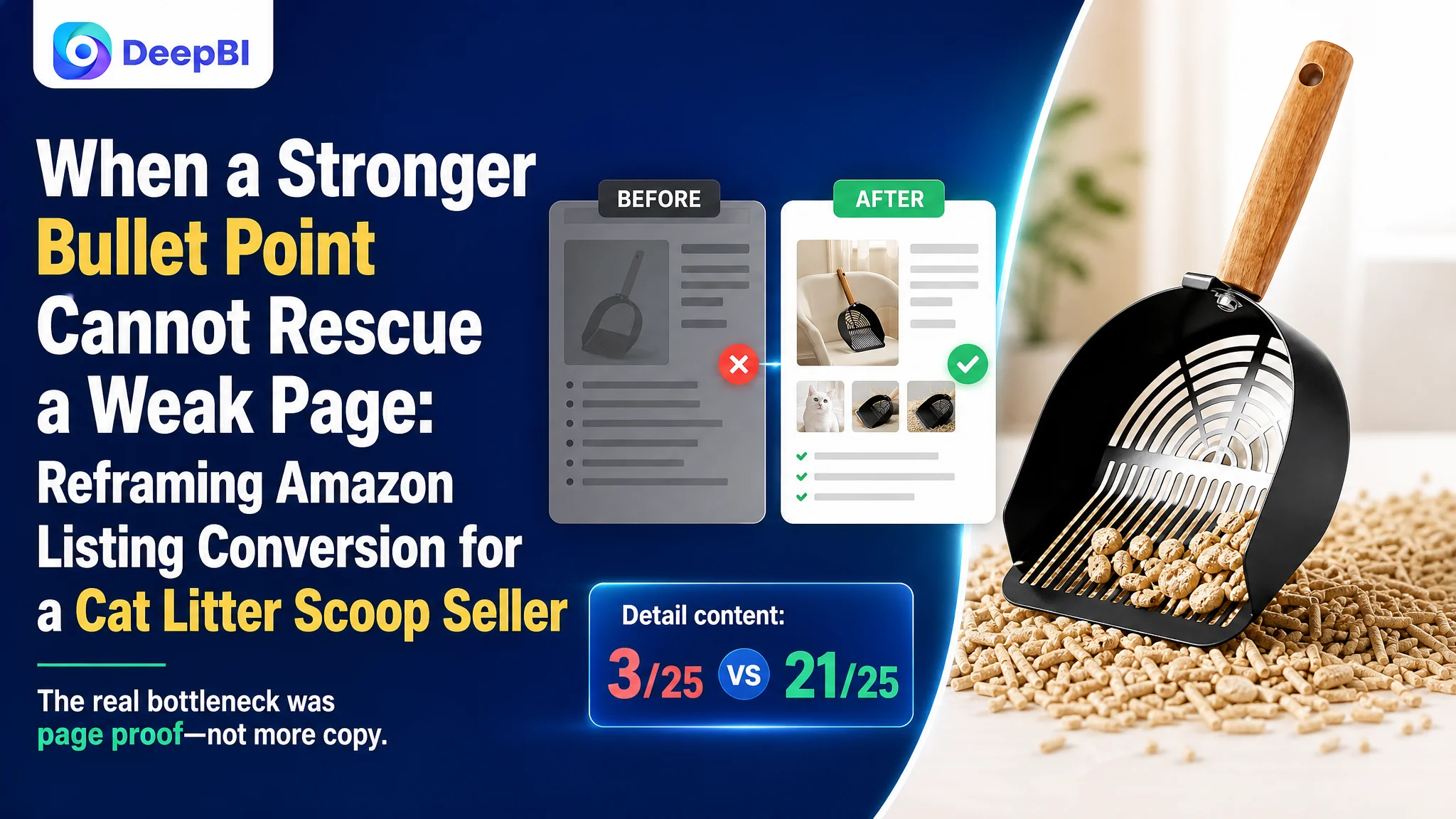
An Amazon seller in the cat-care accessories category believed the Listing needed stronger keyword placement, clearer product benefits, and more persuasive feature descriptions. Those areas did matter, but they were not the main reason the product page was underperforming.
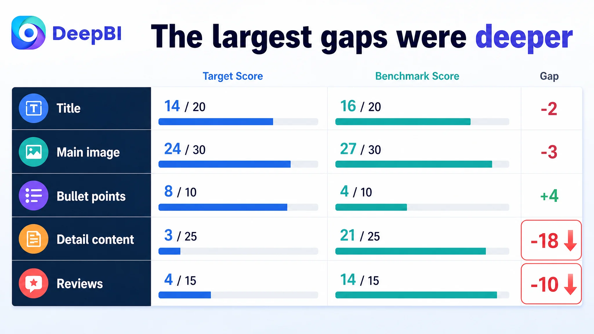
A competitive comparison showed a different pattern. The title and main image were behind the benchmark, yet the five-point section was already stronger. The largest gaps were in the product-page detail experience and customer trust: the Listing scored only 3 out of 25 for detail content and 4 out of 15 for reviews, while the comparable high-performing Listing scored 21 and 14.
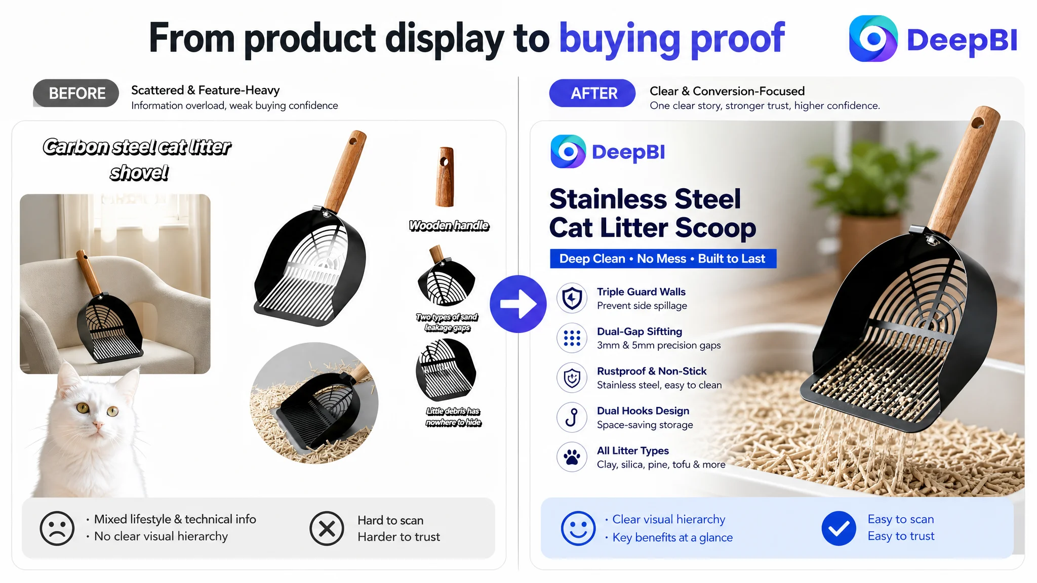
DeepBI therefore reframed the problem from “improve the copy and images” to “repair the page’s ability to support a buying decision.” The later optimization focused on a clearer Amazon product-page story: prove mess prevention, material quality, sifting performance, comfort, compatibility, and storage through structured visuals and A+ content.
For other Amazon sellers, the lesson is direct: before increasing Amazon ad traffic or repeatedly rewriting a Listing, identify whether the page can convert the traffic it already receives. A small weakness in the title is not always the largest commercial constraint. Sometimes the real leak sits deeper in the product page.
The Amazon Listing Did Not Have One Problem. It Had One Dominant Constraint.
The target Listing received an overall score of 53 out of 100, compared with 82 out of 100 for a closely comparable high-performing Listing.
At first glance, the gap could have been interpreted as a broad content-quality problem:
- The title was less search-oriented.
- The main images were less persuasive.
- The product page lacked visual depth.
- The review profile was much weaker.
But the dimension-level data gave a more useful diagnosis.
- Title: Target Listing: 14/20, Benchmark Listing: 16/20, Gap: -2
- Main image: Target Listing: 24/30, Benchmark Listing: 27/30, Gap: -3
- Bullet points: Target Listing: 8/10, Benchmark Listing: 4/10, Gap: +4
- Detail content: Target Listing: 3/25, Benchmark Listing: 21/25, Gap: -18
- Reviews: Target Listing: 4/15, Benchmark Listing: 14/15, Gap: -10
The largest gap was not in the bullet points. It was not even primarily in the title or main image.
It was in the page’s ability to create trust and guide the customer through the purchase decision.
The Listing did not mainly lack information. It lacked a convincing way to organize and prove that information.
That distinction changed the order of operations.
The Initial Diagnosis Focused on the Visible Parts of the Listing
The most obvious weaknesses were easy to notice.
The title began with the brand name instead of placing the core search phrase near the front. It contained multiple dimensions and color details, making the structure longer and less fluid. Important selling points such as the long-handle format, rust-resistant construction, non-slip grip, and broad litter compatibility were not presented with the same clarity as the benchmark.
The main image set also contained useful information, but the visual focus was scattered. Several images repeated product descriptions without clearly demonstrating what the scoop did in use.
That created a natural optimization direction:
- Reorder the title keywords.
- Simplify the title structure.
- Improve the visual hierarchy of the images.
- Explain the dual-gap design more clearly.
- Highlight the stainless steel construction.
- Strengthen the five-point copy.
All of these actions were reasonable. None of them addressed the largest gap by themselves.
The five-point section already scored 8 out of 10, higher than the benchmark’s 4 out of 10. It included pain-point language, measurable claims, use scenarios, and a clear sequence from material to sifting, handling, storage, and compatibility.
That meant the seller did not have a simple “weak copy” problem.
The more important issue was that the stronger claims in the bullet points were not supported by an equally strong visual and trust layer below them.
The Real Constraint Was Listing Conversion Capacity
An Amazon product page has to do more than describe a product. It has to help the shopper answer a series of practical questions:
- Will this reduce mess?
- Will it work with my type of litter?
- Will it bend, rust, or retain odor?
- Can I control it comfortably?
- Will it fit my litter box?
- Where will I store it?
- Do other buyers trust it?
The target Listing answered some of these questions in text, but left too many of them unsupported visually.
The detail-content score was the clearest signal. The target page used mainly repeated text, while the benchmark used a fuller visual structure:
- A leading product banner
- Feature-focused images
- Real-use scenes
- Product close-ups
- Size and specification graphics
- Storage and usage demonstrations
The gap was not merely aesthetic. It affected how quickly a shopper could understand the product and how confidently they could believe its claims.
A statement such as “triple guard walls prevent side spillage” is more persuasive when the shopper can see the product working inside a litter box. A claim about a non-stick finish becomes more credible when the page shows the shovel surface, the material detail, and the cleanup result. A dual-gap sifting design needs more than a measurement; it needs a visible explanation of what each gap does.
This is where DeepBI’s diagnosis moved beyond surface comparison. The question was not which Listing looked better. The question was which decision stage the page was failing to support.
The Biggest Missing Layer Was Not More Copy. It Was Proof.
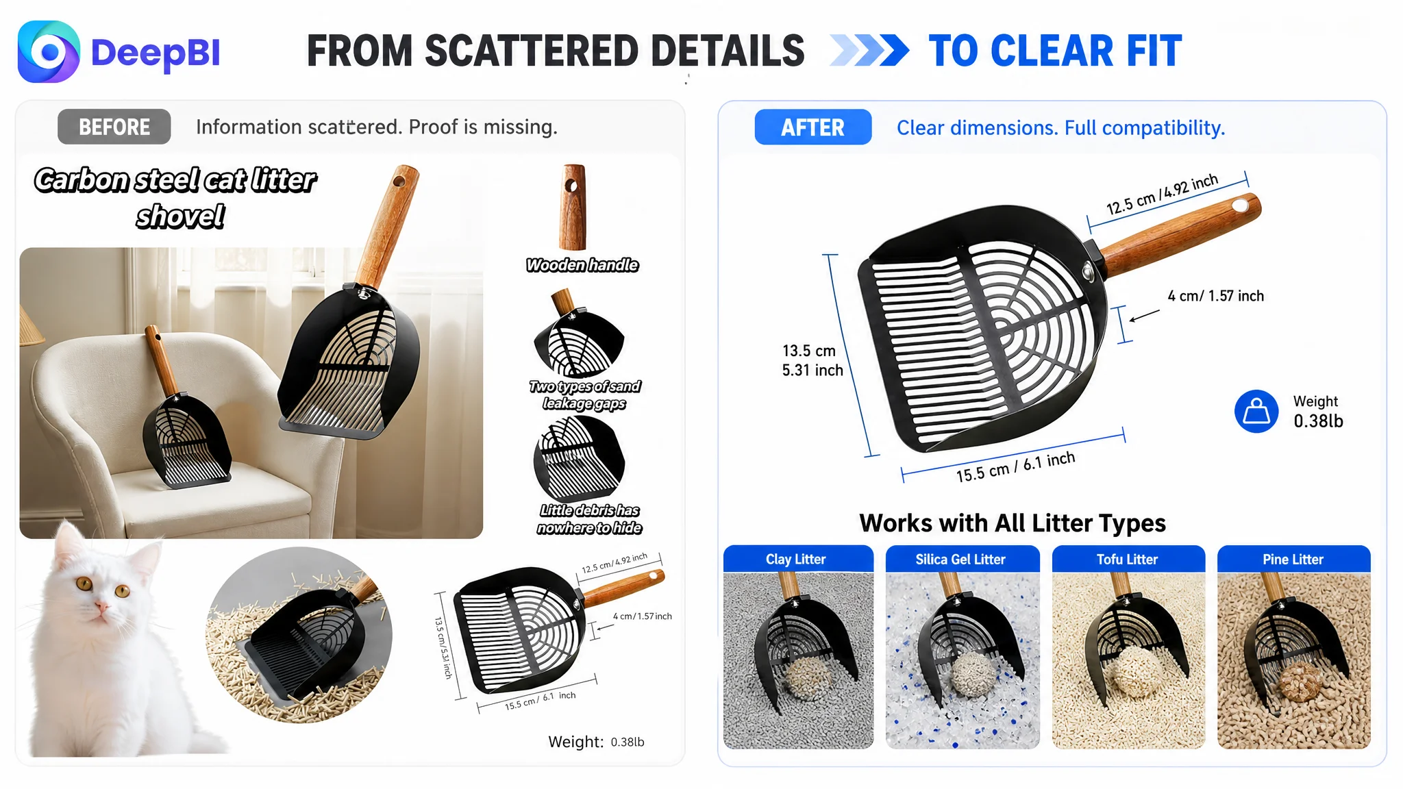
The target Listing’s A+ content was largely text-based and repeated information already present elsewhere. It did not provide enough visual evidence of the product’s structure, use, or outcome.
That weakened several important trust signals at once.
The page did not make mess prevention immediately believable
The triple-wall structure was a meaningful product difference. It was designed to reduce side spillage from corners and deeper litter boxes.
But without a clear usage scene or visual comparison, shoppers had to imagine the benefit themselves. That increases decision friction, especially in a category where the primary frustration is already associated with mess and cleanup.
The material advantage was not fully established
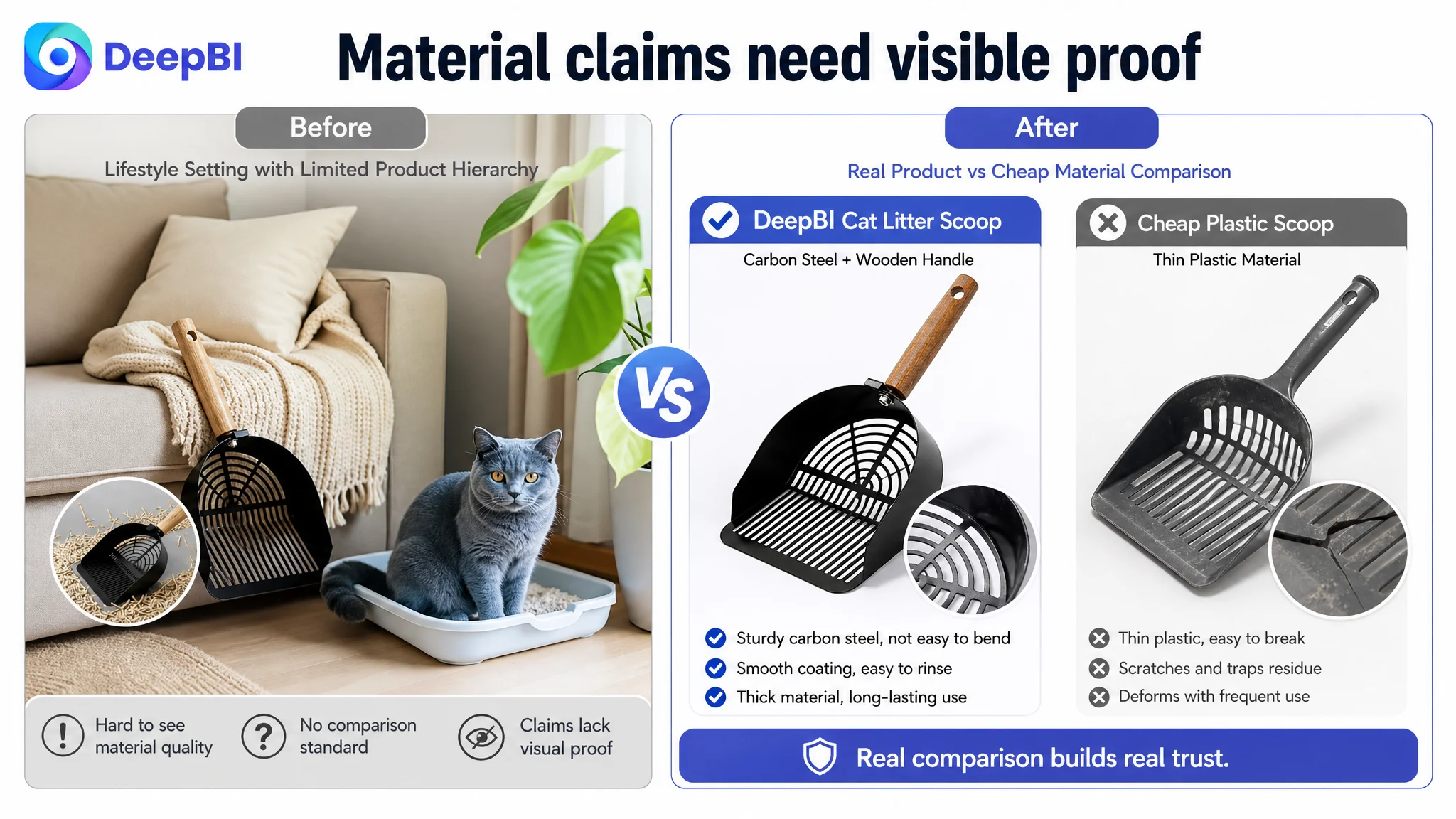
The product used a stainless steel scoop with a wooden handle and a polished, non-stick surface. Yet the page did not sufficiently show why those details mattered.
The shopper needed to connect the material to a practical outcome:
- Less bending
- Better resistance to rust and odor
- Less residue after scooping
- Easier rinsing
- A more durable tool for repeated use
Without that connection, the product could be mistaken for a basic scoop rather than a more durable, purpose-built tool.
The sifting design was described but not demonstrated
The dual gaps, identified as 3 mm and 5 mm, were a central functional feature. They were intended to separate clumps of different sizes and reduce unnecessary litter loss.
However, the existing presentation did not show the sifting process clearly enough. A technical statement without a visible action sequence leaves the shopper to translate the feature into a result.
The page did not complete the lifestyle decision
The wooden handle, short design, flat edge, and dual hooks addressed everyday usability. They could reduce hand fatigue, improve control in tight spaces, and make storage easier.
But these benefits were not organized into a coherent experience. The page described individual features instead of showing how the product fits into the daily routine of cleaning and storing a litter box.
Why DeepBI Did Not Prioritize More Ad Tuning First
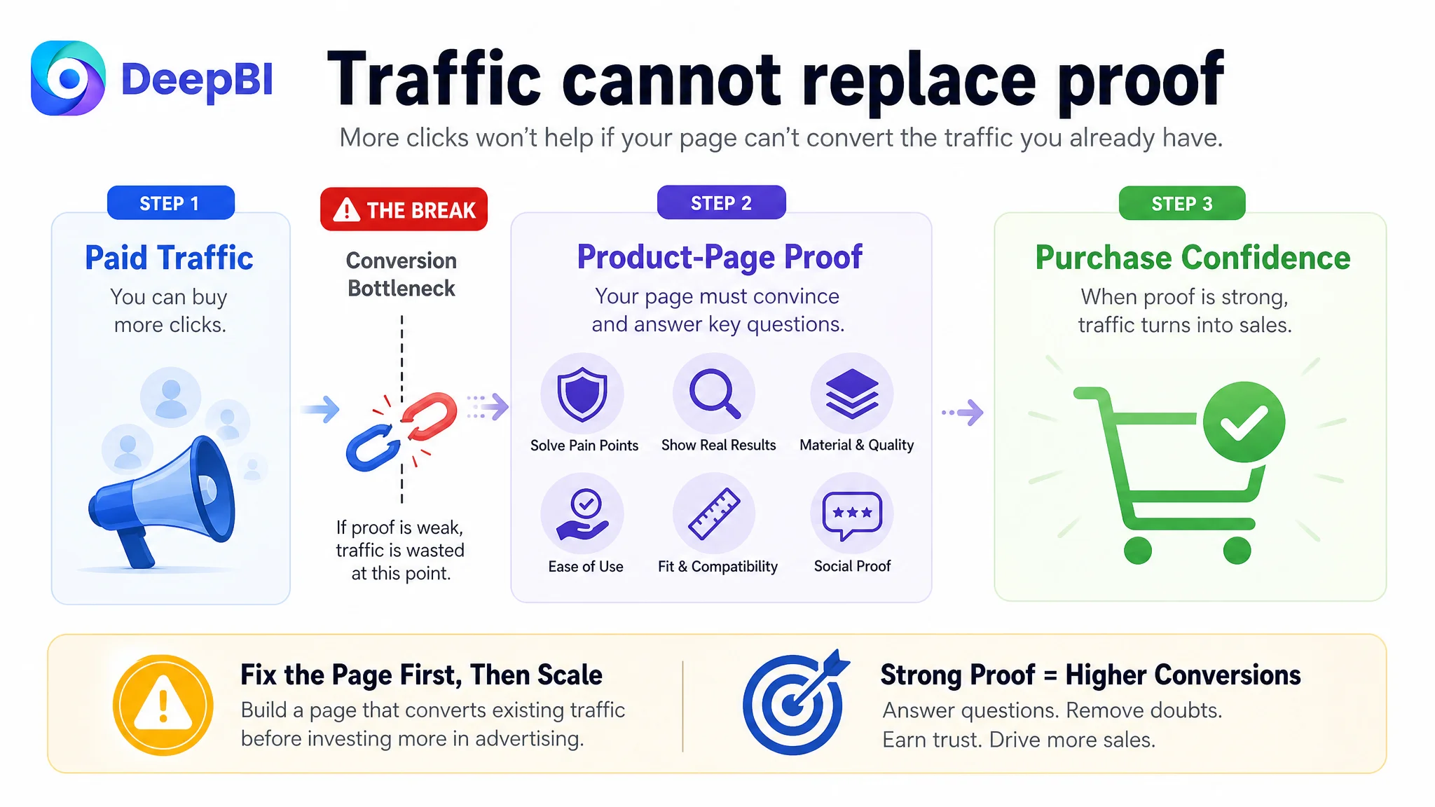
When an Amazon Listing has a conversion bottleneck, increasing traffic can make the problem more expensive rather than solve it.
Paid traffic may bring shoppers to the page, but it cannot replace:
- A clear product promise
- Visual proof of the core function
- A credible material story
- Sufficient review confidence
- A structured path from problem to solution
If the page cannot convert that traffic, additional ad exposure mainly creates more opportunities for shoppers to leave without purchasing.
This does not mean advertising is irrelevant. Amazon ads can reveal demand, search intent, and traffic quality. But ads are most useful when the product page is ready to receive and convert that demand.
In this case, the Listing’s score distribution suggested that the priority was not to keep adjusting every campaign variable in isolation. The priority was to strengthen the conversion environment first.
Advertising can amplify a strong Listing, but it can also amplify the cost of a weak one.
The business risk was therefore not only wasted traffic. It was continued dependence on paid traffic while the product page remained unable to build enough confidence.
The Review Gap Made the Content Problem More Serious
The review dimension added another layer of pressure.
The target Listing had:
- A 3.5-star rating
- 89 total reviews
- No effective written reviews visible in the first-page review area
- A high share of negative ratings, including 1-star and 2-star reviews
The benchmark Listing had:
- A 4.5-star rating
- 516 total reviews
- Multiple visible reviews with ratings and written content
- Customer-submitted images and videos
This was not a gap that a title rewrite could erase.
A shopper who is uncertain about material durability, litter compatibility, or ease of cleaning will naturally look for external confirmation. When the page has weak review volume, lower average ratings, and little useful review content, every unsupported product claim becomes more difficult to accept.
That made the detail-content problem more urgent. The A+ experience had to compensate as much as possible by making the product logic unusually clear and credible.
It could not manufacture customer trust, but it could reduce avoidable uncertainty.
The New Page Logic Started With the Customer’s Mess Problem
The recommended direction was to rebuild the detail page as a sequence of buying questions rather than a list of product specifications.
First: establish the product and its quality cue
The opening section needed to identify the product quickly while signaling its stainless steel construction, solid wood handle, and deep-edge shovel design.
The objective was not to add more decorative branding. It was to give the shopper an immediate reason to view the scoop as a durable, purpose-built tool.
Second: address spillage before discussing secondary benefits
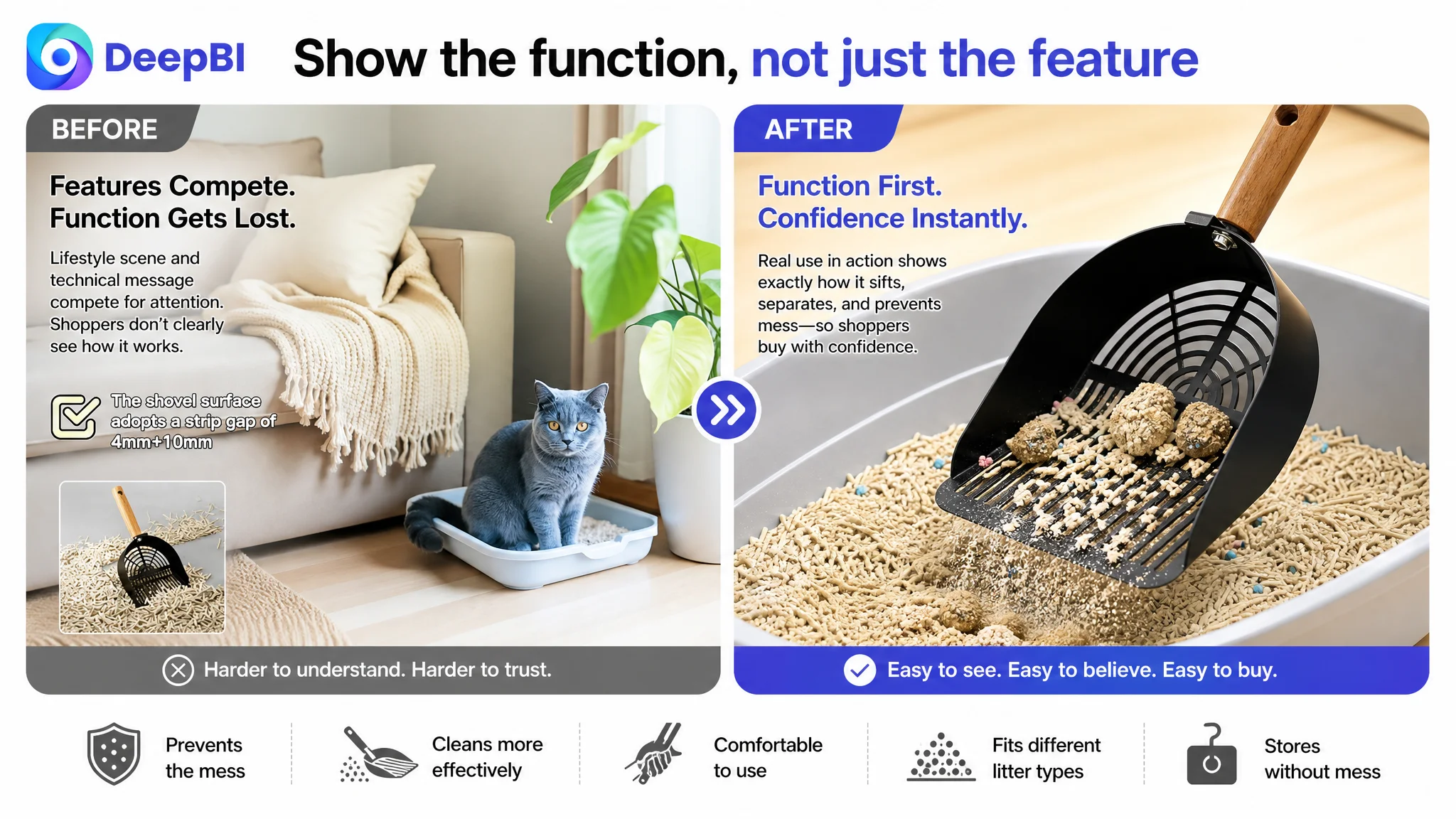
The next section focused on the triple-wall design and the problem of litter scattering during use.
This was an important change in decision order. The page should first resolve the most frustrating use concern, then move into material, sifting, and comfort.
Third: connect material to cleanup confidence
The stainless steel and polished surface needed to be presented as practical advantages, not isolated specifications.
The visual story should make it easier to understand that the scoop is intended to resist rust, odor retention, bending, and sticky residue, while allowing simpler rinsing after use.
Fourth: demonstrate dual-gap sifting
The 3 mm and 5 mm gaps should be shown in an action-oriented way, with the page explaining how they support different clump sizes and help reduce unnecessary litter loss.
The goal was to turn an unfamiliar specification into a visible operating result.
Fifth: prove control and comfort
The wooden handle and flat shovel edge needed to be shown in use. This section could address grip comfort, hand fatigue, wrist strain, and the ability to reach the bottom of the box or tight corners.
Sixth: remove compatibility and fit concerns
The page should confirm the 6.1 by 5.3 inch head size, standard litter-box suitability, and compatibility with clay, silica, pine, and tofu litter.
This information belonged near the point where the shopper was deciding whether the product would fit their specific routine.
Seventh: finish with storage and hygiene
The dual-hook design provided a final convenience argument. Showing how the scoop could be stored vertically or horizontally, on a litter box edge, wall, or cabinet, would close the loop from use to cleanup and storage.
This created a complete product-page narrative:
Prevent the mess → clean more effectively → use the tool comfortably → fit different litter types → store it without creating another mess.
The Title and Main Images Still Needed Repair, but They Were Not the First Constraint
The diagnosis did not ignore the title or main image.
The title needed a clearer structure, with the core phrase “stainless steel cat litter scoop” appearing earlier and secondary benefits arranged around the customer’s search intent. Unnecessary variation details and confusing color references needed to be removed or clarified.
The main image sequence also needed to work harder. The recommended direction was to:
- Lead with the product’s actual material and construction
- Show the scoop in a credible working context
- Make compatibility easier to understand
- Visualize the dual-gap sifting function
- Highlight the flat edge, deep walls, wood handle, and storage hooks
- Use close-up views to support durability and finish claims
But the role of these assets was specific.
The title and main image had to improve discovery and click confidence. The A+ and detail content had to sustain the decision after the click.
Those are related problems, but they are not the same problem.
The Five Points Were Reorganized Around the Page’s Strongest Proof
Because the five-point section was already relatively strong, the goal was not to rewrite it for the sake of rewriting.
Instead, the bullets were treated as the verbal backbone of the new visual story:
- Heavy-duty stainless steel and non-stick cleanup
- Dual-gap sifting and three-sided spill control
- Solid wood handle and precision control
- Dual-hook storage
- Universal litter compatibility and reduced mess
Each point connected a product attribute to a practical outcome.
The important change was alignment. The image sequence and A+ modules needed to prove the same claims in the same order, rather than presenting unrelated facts in different parts of the page.
That alignment is where Listing optimization becomes a business decision rather than a collection of isolated edits.
What Changed in the Operating Logic
The case did not yet provide confirmed post-optimization results, so it would be misleading to claim a specific CVR increase, ACOS decline, or organic-order recovery.
The meaningful change was the decision path.
Before the diagnosis, the visible weaknesses could have led the team toward repeated title edits, more feature copy, or continued traffic adjustments. After the diagnosis, the priority became clearer:
- Repair the product page’s trust and proof layer.
- Use the main images to demonstrate function rather than repeat text.
- Build A+ content around customer pain points and decision stages.
- Keep the stronger bullet-point logic while aligning it with the visuals.
- Treat reviews as a trust constraint rather than a copywriting issue.
- Avoid scaling Amazon ads before the page is ready to convert the traffic.
This reduced the risk of using paid traffic to test a page that had not yet resolved its central conversion barriers.
The Lesson for Amazon Sellers
A Listing score is useful only when it changes the order in which the business acts.
This case showed why a seller can make several reasonable improvements and still miss the main constraint. The title had a search-structure problem. The main image had a visual-proof problem. But the dominant gap was the absence of a complete product-page story, reinforced by a weak review profile.
The most important judgment was therefore not “rewrite the Listing.”
It was:
Do not treat every gap as equally urgent. Find the gap that prevents the page from converting all the other work.
For Amazon sellers, the practical sequence is straightforward:
1. Compare the Listing against a truly comparable market benchmark.
2. Separate discovery problems from conversion problems.
3. Check whether the strongest product claims are visually proven.
4. Identify whether A+ content supports the customer’s buying questions.
5. Account for review quality before assuming copy alone can create trust.
6. Only then decide whether more Amazon ad traffic is the right next move.
The cat litter scoop seller did not need more activity across every Listing element. It needed a clearer diagnosis of where the buying decision was breaking down.
Once that constraint became visible, the optimization direction became more disciplined: not more information, but better proof; not more traffic first, but a product page capable of converting it.