

An Amazon seller in the wall-decor and picture-hanging category was not facing a simple keyword problem. Its product page described a useful 3-in-1 tool, but the Listing was not making that value easy to recognize, trust, or apply. The customer’s visible optimization direction leaned toward adding more functional descriptions and presenting more product information.
DeepBI’s diagnosis showed a deeper issue. The Listing scored 48 out of 100 against 87 for a comparable high-performing Amazon Listing, with the largest gap concentrated in the detail-page experience and customer trust signals. The product had features to communicate, but the page did not yet turn those features into a persuasive buying path.
The later optimization therefore focused on conversion capacity rather than continued feature accumulation: clarify the title, make the main images prove the use case, restructure the bullet points around real installation decisions, and build an A+ content sequence around outcome, operation, fit, and storage. For other Amazon sellers, the lesson is direct: before sending more Amazon ads to a product page, judge whether the page can convert the traffic it already has.
The Amazon Seller Saw a Product That Was Described, but Not Yet Sold
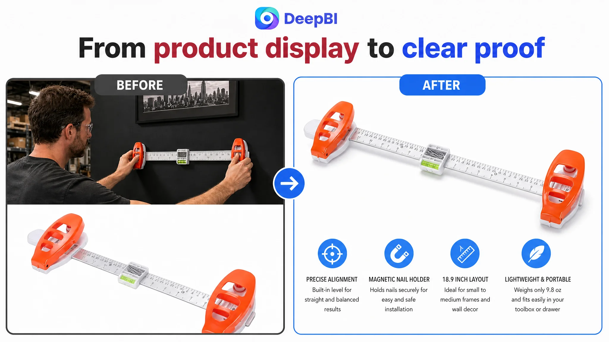
The product was a compact wall-hanging tool designed to combine measuring, leveling, position marking, and nail placement. Its confirmed specifications included an 18.9-inch layout, a weight of 9.8 ounces, a modular structure, a built-in bubble level, and a magnetic nail holder.
On paper, the product had several useful selling points.
The problem was that the Amazon Listing presented those points mainly as a collection of functions. It did not consistently show how the product helped a buyer complete a real wall-decor project with less measuring, less adjustment, and less uncertainty.
That difference matters on Amazon.
A shopper does not evaluate a picture-hanging tool by reading a technical inventory alone. The shopper is trying to answer practical questions:
- Will this help me position a frame correctly?
- Can it handle the size of project I have in mind?
- How does the nail holder work?
- Can I understand the installation process quickly?
- Is this useful for both small decor and wider frame layouts?
- Can I trust the page if the product has little or no review history?
The Listing did not answer those questions in a clear sequence.
The page had product information, but it lacked a complete reason for the buyer to move from interest to confidence.
The Initial Direction Focused on Features Instead of Decision Friction
The case material does not record a direct statement from the customer describing the original diagnosis. However, the existing Listing structure and the proposed copy reveal the likely operating assumption: if the product’s functions were explained more fully, the page would become more persuasive.
That assumption is understandable. The tool has several components and modes, so adding descriptions about the ruler, level, magnetic nail holder, modular design, and portability appears logical.
But this approach treats the Amazon product page as an information container.
The real issue was that the information was not organized around the buyer’s decision. The customer’s bullet points were primarily functional, while the stronger comparable Listing used a more practical sequence:
- Set up the tool
- Adjust the spacing
- Confirm level
- Drive the nails
- Switch between larger and smaller projects
- Complete the task without professional experience
The difference was not simply better wording. It was a different sales logic.
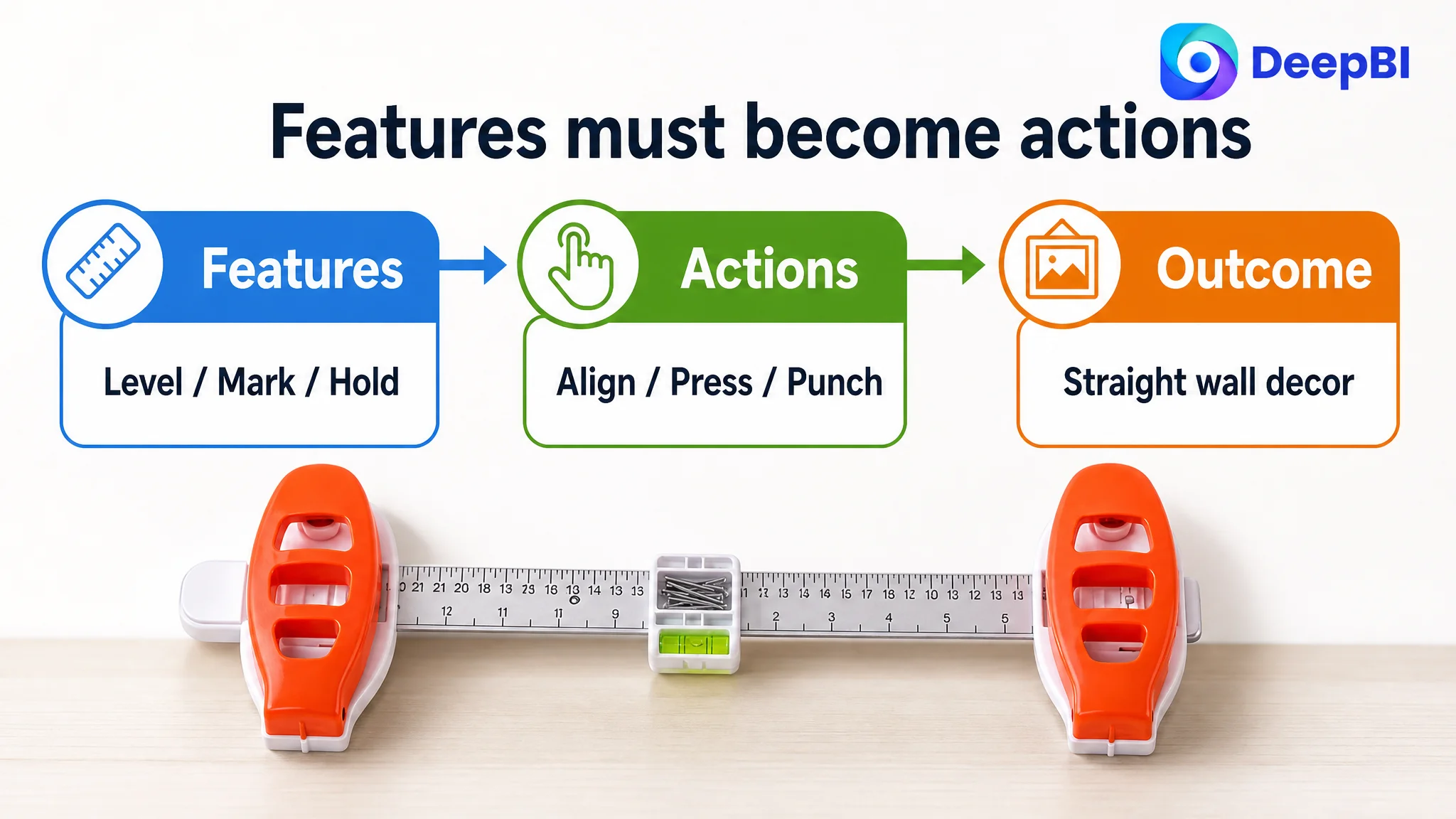
The comparable Listing translated product functions into actions and outcomes. The customer’s Listing described what the tool contained, but less clearly showed what the shopper could accomplish with it.
This is where traditional Listing editing can stall. Each individual sentence may be accurate, yet the page still fails to reduce the buyer’s uncertainty.
The Score Gap Located the Constraint
DeepBI’s comparison produced a total score of 48 out of 100 for the target Listing, compared with 87 for a comparable high-performing Listing.
- Title: Target Listing: 13/20, Comparable Listing: 18/20, Gap: -5
- Main image: Target Listing: 24/30, Comparable Listing: 26/30, Gap: -2
- Bullet points: Target Listing: 6/10, Comparable Listing: 8/10, Gap: -2
- Detail page: Target Listing: 3/25, Comparable Listing: 22/25, Gap: -19
- Reviews: Target Listing: 2/15, Comparable Listing: 13/15, Gap: -11
The most important finding was not that every dimension needed improvement.
It was that the gaps were highly uneven.
The main image and bullet-point scores were behind, but not dramatically. The largest weaknesses were in the detail page and review foundation. That changed the order of operations.
If the team had continued polishing the title or adjusting advertising inputs first, it would have been working on relatively smaller gaps while leaving the page’s largest conversion constraints in place.
The detail page was the clearest structural weakness
The target Listing had no meaningful visual content module beyond repeated text. The comparable Listing used:
- Real wall-hanging scenes
- Function-specific visual sections
- A three-step operation guide
- Close-up explanations of how the tool works
- Different use cases for wider frames and smaller decor
For an unfamiliar household tool, this absence creates a serious conversion problem. The buyer cannot easily visualize the product in use, understand its operating sequence, or connect its structure with a successful outcome.
The issue was not that the product needed more decoration.
It needed visual proof.
The review gap amplified every other weakness
The target Listing had no valid rating or review count on the page. The comparable Listing had a 4.3-star rating, 28 reviews, and several detailed customer comments visible on the first page.
This created a trust disadvantage that content alone could not completely erase.
A shopper encountering a new product with no review history has to rely more heavily on the page itself. That makes the title, images, bullets, A+ content, and product explanations work harder. When those elements are also incomplete, the page has few mechanisms left to reduce hesitation.
DeepBI did not treat the review gap as a reason to make unsupported trust claims. Instead, it treated the absence of reviews as a reason to strengthen the parts of the Listing the seller could control immediately: clarity, demonstration, scope, and operational confidence.
The Title Had Keywords, but Not a Strong Opening Reason to Click
The target title began with a generic product description such as “Picture Hanging Tool” and “Level.” The comparable title led with “3-in-1” and “All-in-One,” then connected the product to leveling, position marking, nail placement, frame size, and wall decor.
The issue was not simply keyword volume.
The opening words of an Amazon title influence how quickly a shopper understands the product’s difference. A generic category description identifies the product, but it does not necessarily create a reason to consider it.
The revised direction kept the core search phrase near the front while making the product’s combined value more visible:
Picture Hanging Tool with Built-In Level and Magnetic Nail Holder, All-in-One Art Hanging Kit with Position Marking for Frames and Wall Decor, Easy Alignment Solution for Home Decor
This structure does three jobs at once:
- Identifies the product category
- Makes the built-in functions concrete
- Connects the tool to the user’s wall-decor task
It also avoids relying on vague claims such as “professional” or “effortless” without explaining what creates the benefit.
The Main Image Needed to Reduce Questions Before the Click
The main image gap was smaller than the detail-page gap, but it still affected the first stage of the Amazon funnel.
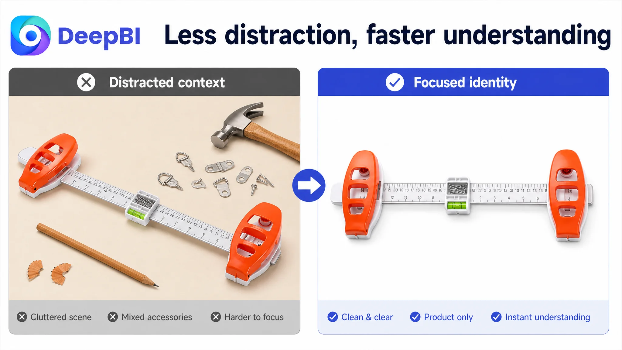
The existing visual direction included distracting or unconfirmed accessories, such as a hammer, pencil, or extra hooks. That creates two risks. First, the image may suggest that accessories are included when they are not. Second, the product itself becomes less immediately identifiable.
The revised visual sequence therefore began with a narrower objective: establish exactly what the product is and what essential capability it provides.
The first image should focus on the isolated tool and confirmed information such as its expansion capacity, measuring function, leveling function, and nail-placement role. The next image should demonstrate the actual process: slide or mark, level, and punch.
This sequence is more useful than opening with a lifestyle scene.
A lifestyle image can make a product look attractive, but it cannot replace functional proof when the buyer still does not understand how the product works.
The first visual task was not to make the tool look more aspirational. It was to make the tool immediately understandable.
The later images could then address:
- The difference between cumbersome manual measuring and a more direct process
- The tool’s wider layout for medium projects
- Its compact form and storage convenience
- The distinction between small decor tasks and broader frame arrangements
Each image needed one clear job rather than several competing messages.
The Bullet Points Needed a Use Sequence
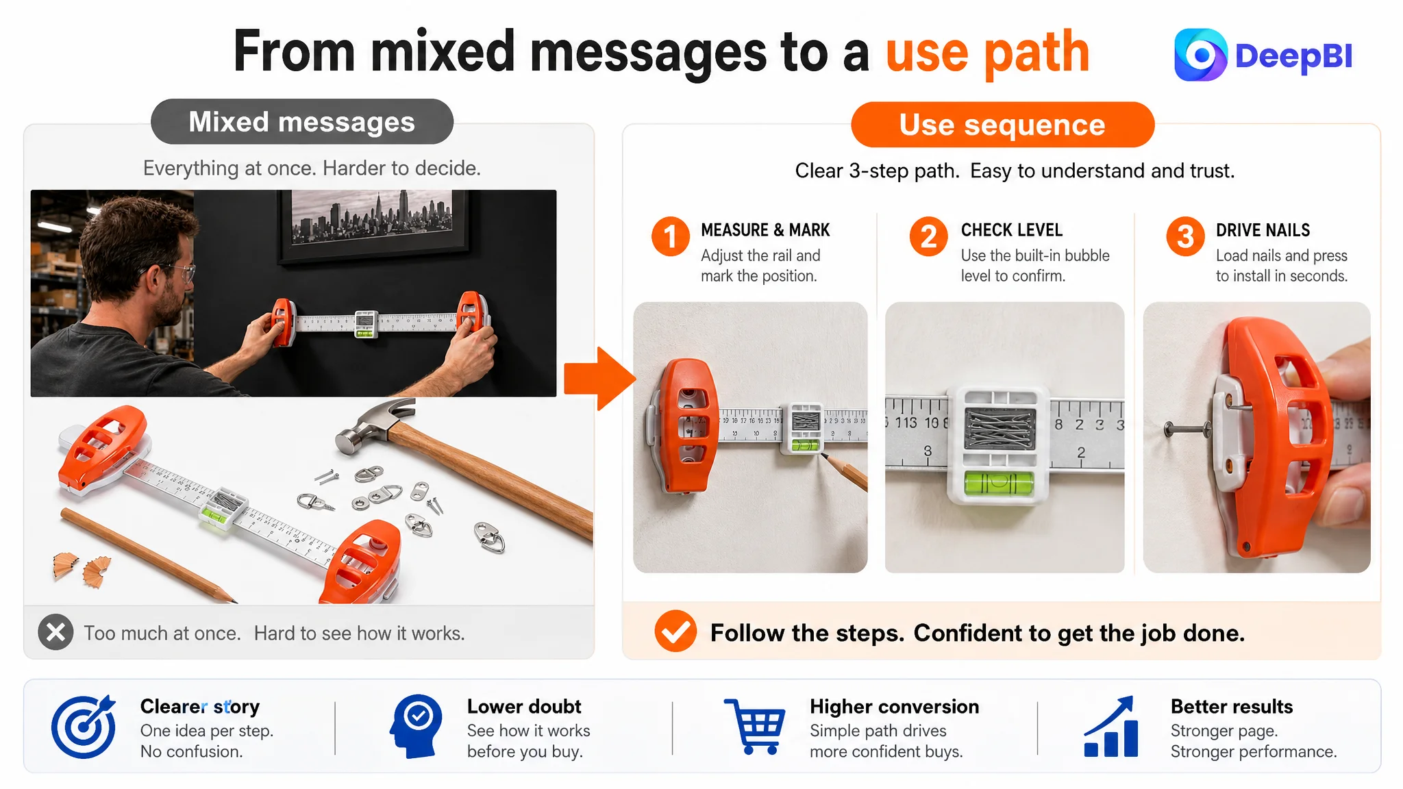
The target bullet points described features such as modularity, leveling, magnetic nail holding, portability, and suitability for different users. Those features were relevant, but the structure did not consistently connect them to a buyer’s actual project.
The revised bullet-point direction followed a more practical order.
From product components to a complete hanging task
The first point positioned the product as a combined measuring, leveling, and nail-holding solution. This establishes why the tool exists and what separate tasks it brings together.
From alignment claims to a confirmed project range
The second point used the confirmed 18.9-inch layout and connected it to small gallery pieces and medium wall decor. This gives the buyer a clearer sense of fit without claiming that the tool handles every possible frame size.
From magnetic structure to installation confidence
The third point explained how the magnetic cylinders help hold nails in place during setup. This is more persuasive than merely naming the magnetic feature because it connects the mechanism with a specific installation concern.
From modularity to different project sizes
The fourth point presented the compact and modular structure as useful for different hanging tasks. It also retained the confirmed 9.8-ounce weight and storage benefit rather than overstating the product’s capabilities.
From technical description to audience relevance
The fifth point addressed homeowners, renters, decorators, and professionals. Its purpose was not to claim universal suitability, but to lower the perceived skill requirement for ordinary wall-decor projects.
This is the difference between listing features and building a buying path.
The customer did not necessarily need more claims. The page needed better sequencing.
Why DeepBI Did Not Keep Tuning Amazon Ads First
No advertising performance figures were provided in the case material, so this case does not claim a specific ACOS reduction, CVR increase, or paid-traffic result.
The business logic is still clear.
If Amazon ads send traffic to a page with weak visual proof, limited operating guidance, and no review foundation, more traffic does not solve the underlying issue. It exposes the issue to more shoppers.
Advertising can amplify a strong page. It can also amplify a page that asks buyers to do too much interpretation.
That is why the Listing had to be repaired before treating additional ad optimization as the main answer. The page’s largest weakness was not a lack of product information. It was an inability to convert information into confidence.
The priority order became:
1. Establish the product’s identity and core capability.
2. Show the result the buyer wants: straight, balanced wall decor.
3. Demonstrate how the tool is used.
4. Clarify which project sizes and situations it suits.
5. Explain the mechanism behind leveling and nail placement.
6. Reduce ownership concerns through portability and storage.
7. Only then evaluate how additional Amazon traffic performs.
This order protects the seller from using paid traffic to test a page that has not yet completed its own sales logic.
The A+ Content Needed to Start With the Outcome
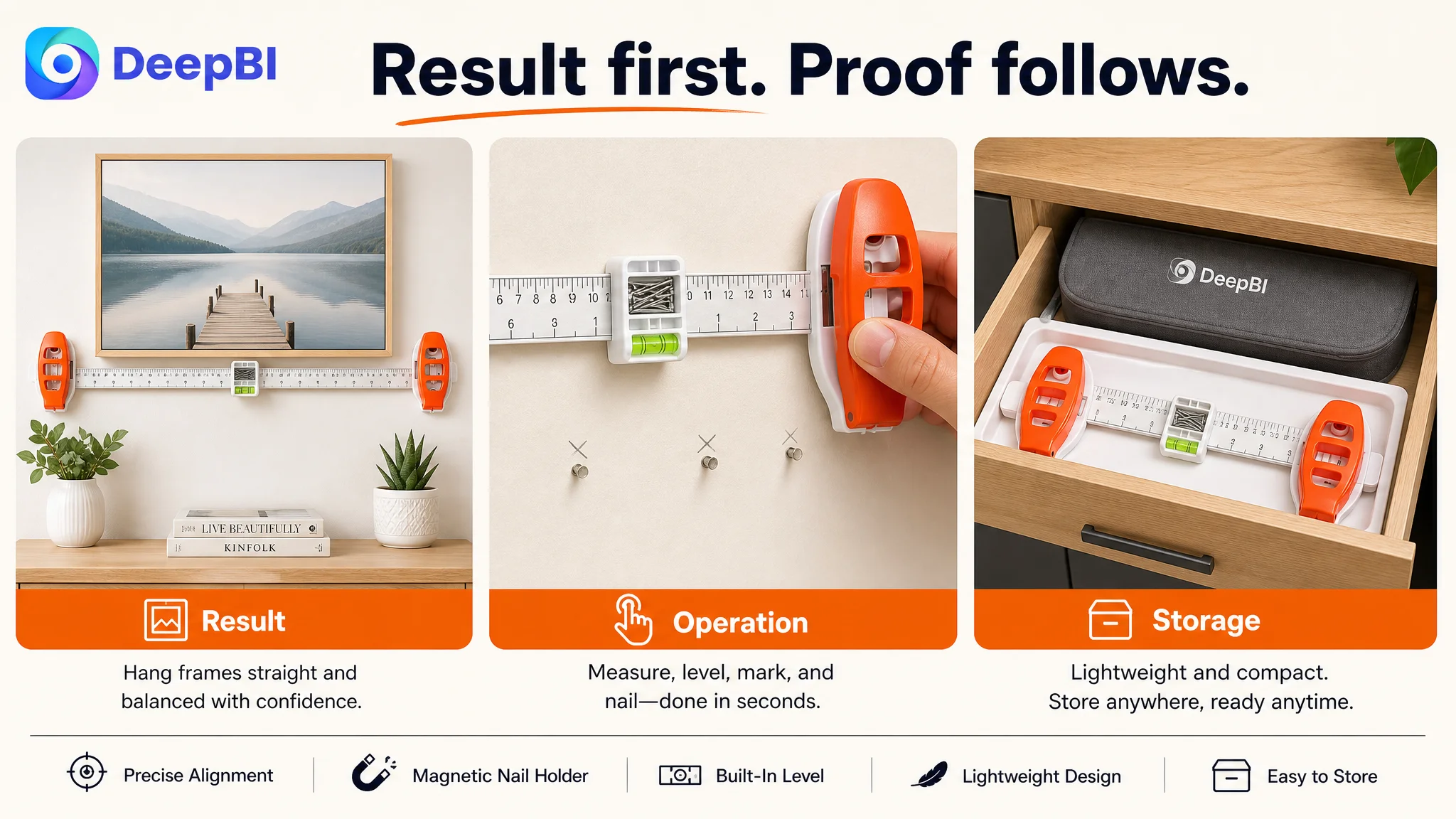
The new detail-page direction began with a visual result: frames and decor aligned on a wall, with the tool present in the scene.
That opening matters because the buyer is not purchasing a ruler for its own sake. The desired result is a cleaner, straighter, more manageable wall-decor project.
The following modules could then develop the logic in sequence.
Show the range without overstating it
One module would distinguish smaller items from wider frame layouts and show how the modular structure adapts to both. The purpose is to clarify the product’s practical boundaries, not to imply an unconfirmed maximum capacity.
Explain the operating principle
A close-up module would show the magnetic nail holder and built-in bubble level in use. This closes the gap between a feature claim and a believable mechanism.
Build practical confidence
A clean home, office, apartment, or dorm setting would show how the tool supports marking, aligning, and hanging. The emphasis would remain on practical utility rather than unsupported safety or damage-free claims.
Make handling and storage part of the ownership decision
The 9.8-ounce weight and slim structure are useful because they address friction after purchase. A tool that is easy to carry and store is easier to imagine using for occasional home projects.
End with a consolidated value proposition
The final module would bring the functions back to the central use case: a compact 3-in-1 hanging tool for everyday wall decor in different locations and project sizes.
This creates a complete trust chain:
desired result → project fit → operating principle → practical use → storage convenience → purchase confidence
The Review Gap Could Not Be Designed Away
The absence of reviews remained a commercial risk.
A stronger title and better images can improve understanding, but they cannot create customer history. The comparable Listing’s 4.3-star rating, 28 reviews, and detailed user comments gave it a trust advantage that the target page did not have.
That does not make content optimization irrelevant. It makes content optimization more disciplined.
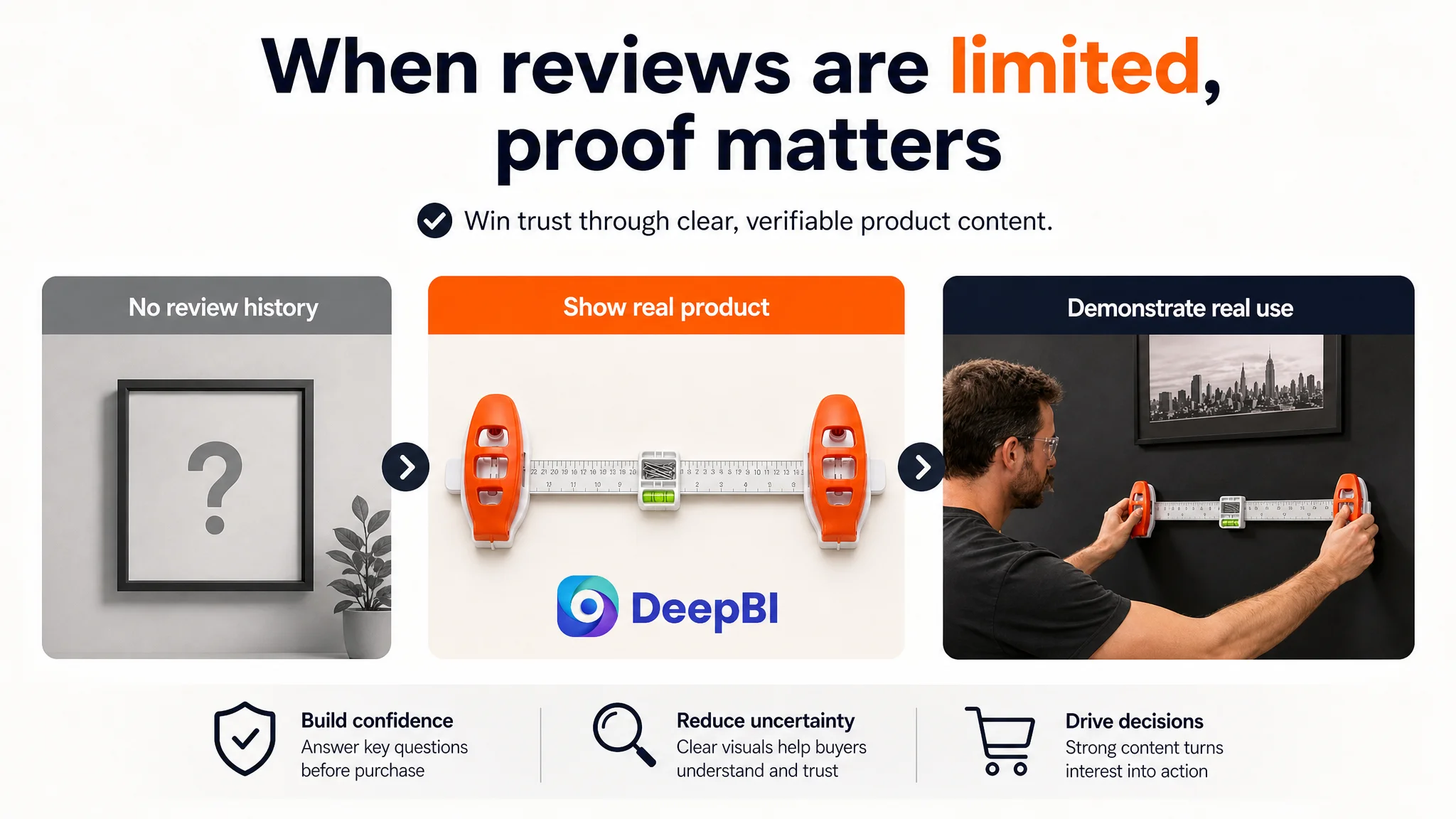
Without reviews, the Listing should avoid inflated social-proof language and unsupported authority claims. Instead, it should make every controllable element verifiable:
- Show the real product
- Use only confirmed measurements and weight
- Demonstrate the actual operating process
- Avoid depicting accessories that are not included
- Clarify the intended project range
- Use one visual message per image
- Explain how the built-in features support the task
The goal is not to imitate the competitor’s review position. It is to prevent the page from adding avoidable doubt on top of an existing trust disadvantage.
What Changed in the Seller’s Business Understanding
The case did not end with a documented post-optimization metric set, so it would be inappropriate to claim that ACOS, CVR, organic orders, or keyword rankings had already improved.
The meaningful change was in the decision model.
The seller could now distinguish between several problems that had previously been blended together:
- A title can contain relevant keywords and still fail to create a strong click reason.
- A product can have useful functions and still fail to communicate a usable outcome.
- A main image can show the item and still leave the buyer unsure how it works.
- Bullet points can be accurate and still lack a persuasive sequence.
- A product page can receive traffic and still lack the trust structure needed to convert it.
- More Amazon ads cannot compensate for an Amazon Listing that has not established its own logic.
DeepBI’s role in this case was not to produce more content for its own sake. It was to identify where the score gap was concentrated, connect that gap to buyer uncertainty, and set the order in which the page should be rebuilt.
Before asking Amazon ads to scale a product, the seller has to decide whether the product page deserves more traffic.
The Broader Lesson for Amazon Sellers
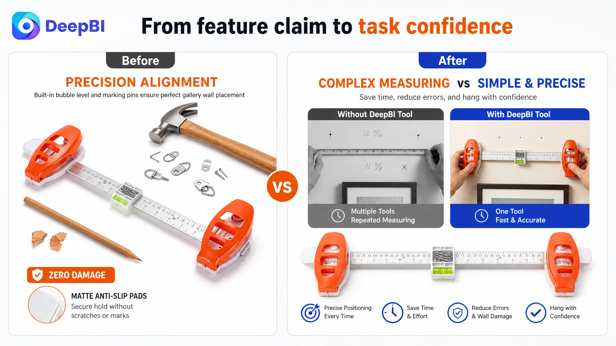
For tools, accessories, and other practical household products, conversion often depends on showing the relationship between the product and the task.
The strongest Listing is not always the one with the most specifications. It is the one that helps the shopper understand:
- What problem the product addresses
- What the first step looks like
- What result to expect
- Where the product fits
- Why its design supports the task
- What uncertainty remains before purchase
In this Amazon case, the largest opportunity was not hidden in another keyword or another isolated image treatment. It was in the missing connection between product function and buyer confidence.
The page needed to move from “this tool has several features” to “this is how the tool helps me complete my wall-hanging project.”
That is the difference between a Listing that merely describes a product and a Listing that is ready to convert both organic traffic and paid Amazon traffic.