

An Amazon seller in the US yoga and fitness category believed its compact yoga mat mainly needed better keyword coverage and clearer benefit statements. The Listing included terms related to travel, Pilates, kneeling support, and floor exercise, but its competitive position remained weak.
DeepBI’s comparison showed that the larger issue was not simply title wording or bullet-point coverage. The Listing scored 32 out of 100 against 87 for a comparable high-performing Amazon Listing, with the widest gaps appearing in the main image, A+ content, and review proof.
The later optimization direction therefore moved from adding more claims to making the product easier to understand and trust. The focus became visual proof of portability, cushioning, anti-slip performance, cleaning, and multi-scene use—while restructuring the Amazon product page around the questions buyers were most likely to ask.
For other Amazon sellers, the case offers a practical reminder: before sending more paid or organic traffic to a Listing, first determine whether the page can explain the product, resolve objections, and provide enough evidence for a purchase decision.
The Amazon Listing Looked Like a Keyword Problem
The product was a compact yoga mat positioned around portability, floor exercise, joint support, and flexible use at home, in studios, or while traveling.
At first glance, the Listing had several relevant terms. It referenced yoga, Pilates, travel, kneeling support, planks, and floor exercise. The team’s initial optimization direction was therefore close to a familiar Amazon operating pattern:
- Refine the title around high-value search terms
- Add more use cases to the bullet points
- Emphasize portability and joint protection
- Improve the product’s keyword reach
That direction was not entirely wrong. The title did need restructuring, and the bullet points could communicate the product more clearly.
But it treated the Listing mainly as a text-relevance problem.
The score comparison suggested that the more serious constraint was the product page’s ability to create confidence after the click.
The Listing did not lack product claims. It lacked enough visual and commercial proof to make those claims believable.
The Score Gap Was Concentrated in the Page Experience
The overall comparison was difficult to explain through title quality alone.
- Overall score: Target Listing: 32/100, Comparable high-performing Listing: 87/100
- Title: Target Listing: 14/20, Comparable high-performing Listing: 17/20
- Main image: Target Listing: 6/30, Comparable high-performing Listing: 27/30
- Bullet points: Target Listing: 7/10, Comparable high-performing Listing: 6/10
- A+ content: Target Listing: 4/25, Comparable high-performing Listing: 23/25
- Reviews: Target Listing: 1/15, Comparable high-performing Listing: 14/15
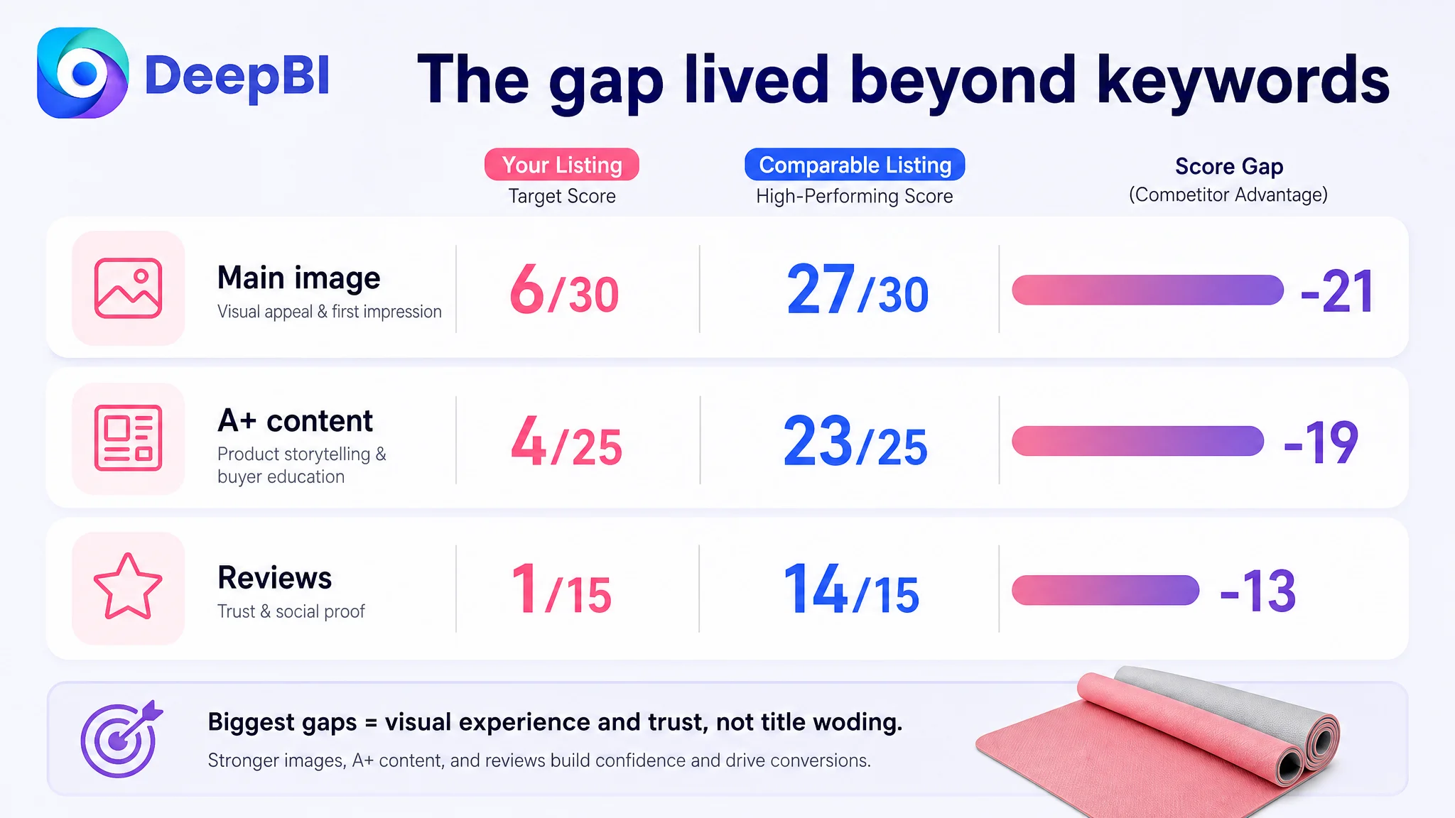
The title gap was only three points. The bullet-point score was actually slightly higher for the target Listing.
The largest differences were elsewhere:
- A 21-point gap in the main-image dimension
- A 19-point gap in A+ content
- A 13-point gap in review proof
This changed the order of priorities.
If the main problem had been keyword relevance, the title difference would have been the dominant signal. Instead, the Listing was losing much more of its competitive position in the places where Amazon shoppers evaluate appearance, usability, credibility, and risk.
That matters for both organic and paid traffic. A title may help a product appear in a relevant search, but the product page still has to earn the click and support the purchase decision.
The Main Image Made the Product Look Less Portable Than It Was
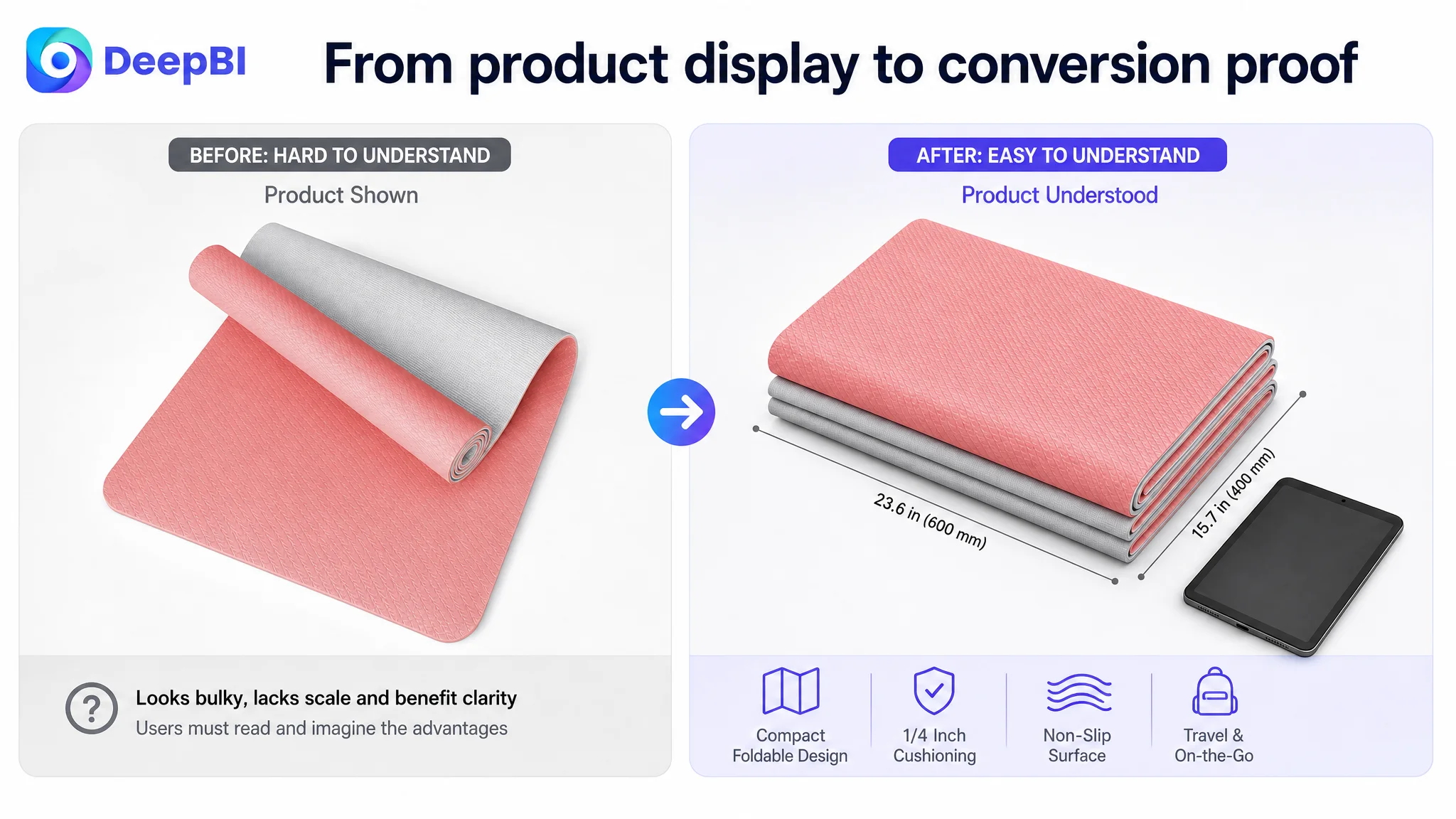
The existing main image presented the mat in a rolled form. That showed the product existed, but it did not immediately communicate the strongest positioning: compact, portable, and suitable for travel.
For shoppers searching for a small exercise mat, the visual impression could create an unintended problem. The product risked looking like a conventional bulky mat rather than a specialized travel-oriented option.
The issue was not simply that the image was unattractive.
It failed to answer a more commercially important question:
Why is this mat easier to carry than a standard full-size mat?
A comparable high-performing Amazon Listing made its foldable form visible immediately. That visual choice connected the product’s appearance to a practical benefit before the shopper needed to read the title or bullets.
For the target Listing, the main image and supporting image sequence needed to establish a clearer product logic:
1. Show the compact form clearly
2. Make the travel size understandable
3. Confirm that the product still provides meaningful cushioning
4. Demonstrate stability on hard floors
5. Connect portability with everyday use
The main image itself would still need to follow Amazon’s image requirements. More explanatory content—such as dimensions, thickness, texture, and usage scenarios—belonged in the secondary image sequence and A+ content.
Portability needed physical proof
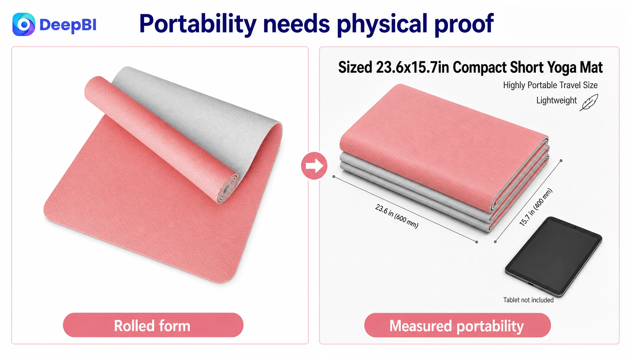
“Compact” and “travel-friendly” are abstract until shoppers can understand the scale.
The proposed image direction used the stated compact dimensions of 23.6 by 15.7 inches and suggested showing the folded or rolled form beside a relatable object such as a tablet, handbag, backpack, or car seat.
The purpose was not to add decoration. It was to answer a practical objection:
“Will this actually fit into the way I travel?”
Cushioning needed to be connected to the product’s small size
A mini mat can create a second concern: if it is compact, will it still protect the knees, elbows, and wrists?
The Listing already had a stated 1/4-inch cushioning position. But that value was not sufficiently visible in the image strategy.
A supporting image could show:
- The thickness of the foam
- The intended pressure points
- Floor exercises involving knees, elbows, or wrists
- The relationship between compact size and joint support
This would help prevent the “small means uncomfortable” interpretation.
Anti-slip claims needed visual verification
The Listing described use on hard floors and during exercises such as planks and dumbbell training. However, the existing visual presentation did not demonstrate why shoppers should trust those claims.
A close view of the textured surface, combined with a realistic exercise context, could make the anti-slip and shock-absorption message more concrete.
The point was not to imply unsupported laboratory performance. It was to show the actual product surface and the situations in which stability matters.
The A+ Page Was Not Completing the Sales Argument
The A+ content represented the sharpest structural weakness.
The target Listing used no image-based A+ modules. Its content relied mainly on repeated text descriptions. By comparison, the reference Listing used a sequence of visual modules covering:
- Different usage environments
- Product positioning
- Color and appearance
- Functional guidance
- Folding or carrying behavior
- Dimensions
- Brand-level presentation
This created a major difference in how the two pages communicated.
The target page asked shoppers to imagine the product from text. The comparable Listing showed shoppers how the product fit into real activities and daily routines.
A+ content was not an extra decoration on the Amazon product page. It was the missing layer between product claims and buyer confidence.
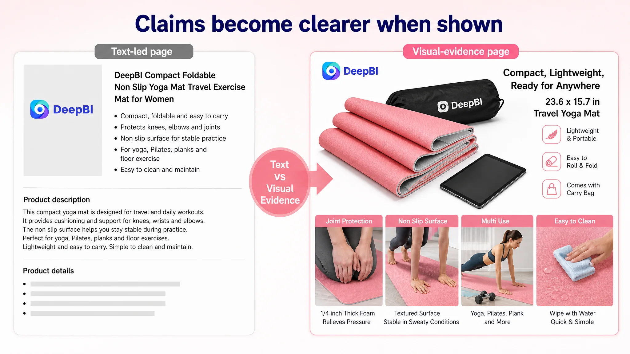
The A+ rebuild therefore needed to follow the shopper’s decision path rather than repeat the bullet points.
First, resolve the fear of an uncomfortable folded mat
A compact or foldable mat can make shoppers worry about creases, unevenness, or an unpleasant surface during floor exercises.
The first A+ module should show the mat fully opened and lying flat in a credible lifestyle setting. The visual objective is to demonstrate that portability does not automatically mean an unusable surface.
The module should focus on the actual product appearance and avoid implying performance that has not been verified.
Then show performance under active use
The next module should move from appearance to function.
Rather than repeating “non-slip” in another paragraph, it should show the mat being used during active exercise, including situations where grip and stability matter. A realistic hard-floor environment would connect the product to the customer’s intended use.
This would make the performance message easier to evaluate:
- Is the surface visibly textured?
- Does the mat appear stable during movement?
- Does the use case match the product’s stated purpose?
- Is the visual consistent with the actual product?
Joint protection should be treated as a central buying reason
For this product, cushioning was not a secondary feature. It was one of the reasons a shopper might choose a compact mat instead of exercising directly on a hard floor.
The A+ content should therefore give joint support its own visual explanation, showing:
- The 1/4-inch thickness
- Kneeling or floor-based exercise
- Support for knees, elbows, and wrists
- The role of cushioning during longer sessions
This converts a specification into a reason to buy.
Travel portability should become a rational proposition
“Travel yoga mat” can mean different things to different shoppers. The A+ content should make the claim measurable and relatable by showing the product’s compact form next to familiar travel items.
The point is not to position the mat as a camping product if that is not the product’s primary evidence. The stronger direction is to show how it works for:
- Home workouts
- Studio sessions
- Office breaks
- Outdoor fitness
- Trips where space is limited
The Title Needed Reordering, Not More Keywords
The title was weaker than the visual dimensions, but it still contained several issues that could reduce clarity.
The original structure led with “Small Mini Yoga Mat” and included multiple overlapping or loosely connected terms. Variations such as “Small,” “Mini,” and “Travel” created repetition, while terms such as “Kneeling Pad” and “Knee Cushion” risked pulling the product toward adjacent use cases without clearly establishing the core product identity.
The comparable Listing followed a more readable structure:
- Brand or product identity
- Core product type
- Specific dimensions
- Primary use context
- Portability or accessory
- Secondary use cases
The recommended direction was to place the main product and its most important value proposition earlier, then organize supporting terms around clear use cases.
The goal was not to imitate the competitor’s wording. It was to make the Amazon title easier to scan and more commercially coherent.
A stronger title structure would clarify:
- What the product is
- Why it is different from a standard yoga mat
- Who it is for
- Where it can be used
- Which secondary functions are relevant
This is a better use of title space than repeating related descriptors or adding every possible exercise term.
The Bullet Points Had Useful Material, but Needed a Stronger Sequence
The bullet-point score did not indicate a major deficit. In fact, the target Listing’s score was slightly higher than the comparable Listing’s.
That distinction was important.
The problem was not that the bullets contained no useful information. They already addressed pain points such as:
- Joint comfort
- Portability
- Sweaty conditions
- Hard floors
- Multiple use scenarios
The opportunity was to make the bullets work together as a buying sequence.
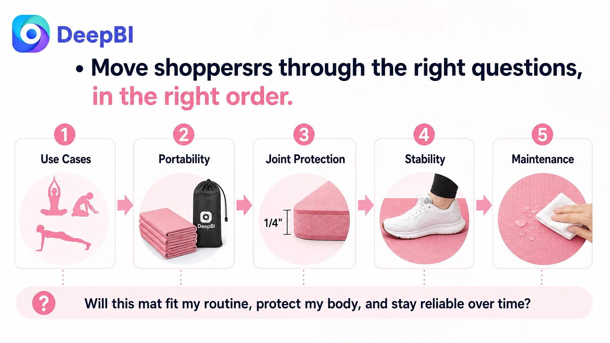
A more effective order would be:
1. Establish the product’s range of use
Explain that the mat supports yoga, meditation, Pilates, planks, push-ups, and other floor exercises, while also functioning as a kneeling pad or floor cushion in relevant situations.
2. Make portability concrete
Use the stated dimensions and explain how the compact format supports home, studio, office, outdoor, and travel use.
3. Lead with joint protection
Connect the 1/4-inch cushioning to knees, elbows, and wrists rather than leaving thickness as an isolated specification.
4. Explain stability under movement
Describe the textured surface, hard-floor use, and exercises where grip matters, without making unsupported performance guarantees.
5. Close with maintenance and long-term practicality
Show how the product can be wiped clean and used regularly, while keeping material and durability claims within the evidence available for the product.
This sequence helps each bullet answer a different buyer question instead of presenting five separate descriptions.
Reviews Created a Separate Trust Constraint
The Listing had no effective review base:
- No star rating
- No total review count
- No reviews visible on the first page
The comparable Listing had 4.5 stars and 578 reviews, including visible customer content and Verified Purchase indicators.
This difference could not be solved through copywriting or image generation alone.
It affected the shopper’s perception of product risk. Even if the title, main image, and A+ content were improved, the absence of review evidence would remain a meaningful trust constraint.
That did not mean the team should wait for reviews before improving the page. It meant the review gap needed to be treated honestly as part of the Listing’s commercial environment.
The page could reduce avoidable uncertainty through better visual proof, clearer specifications, and more useful product explanations. But it could not manufacture the social proof that the competing Listing already possessed.
Why DeepBI Did Not Prioritize More Ad Tuning First
The case did not support a conclusion that the product needed another round of bid changes or campaign restructuring before the page was repaired.
The reason was straightforward: the Listing showed a severe conversion-capacity problem in the content itself.
A product page with:
- A weak main image
- No meaningful image-based A+ content
- No visible review foundation
- Limited visual proof of portability
- No clear demonstration of cushioning or stability
could absorb traffic without giving shoppers enough evidence to continue.
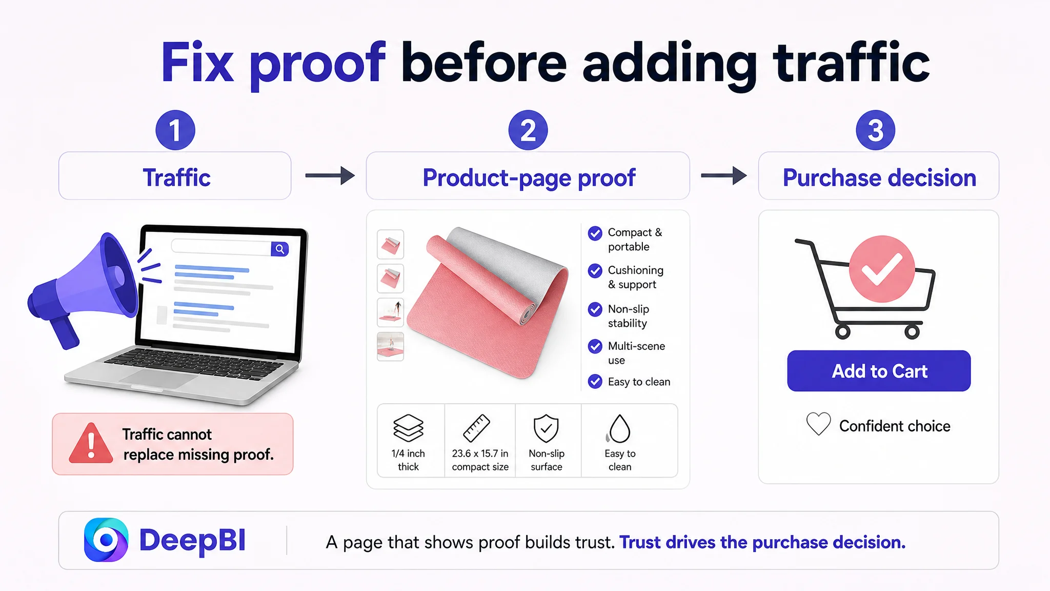
Advertising can bring a shopper to the page. It cannot make a missing product explanation appear.
This is why the recommended decision order was:
1. Repair the Listing’s most visible trust and comprehension gaps
2. Make the product’s core value easy to verify
3. Ensure the title and bullets support the same positioning
4. Then evaluate traffic quality and advertising efficiency again
The priority was not to stop Amazon ads permanently. It was to avoid using ads to amplify a page that was not yet ready to convert the traffic it received.
The Optimization Direction Became More Specific
The final direction was not “make the Listing look better.”
It was to build a connected sales logic around the product’s real attributes:
- Compact travel size
- Foldable or portable form
- 1/4-inch cushioning
- Joint support
- Textured anti-slip surface
- Hard-floor exercise use
- Multi-scene practicality
- Easy wipe-clean maintenance
- Stylish appearance
Each asset would serve a different role.
Main image
Make the compact form and product identity immediately understandable while remaining compliant with Amazon’s main-image requirements.
Secondary images
Use visual proof for:
- Dimensions
- Thickness
- Joint cushioning
- Surface texture
- Hard-floor stability
- Portability
- Cleaning and maintenance
A+ content
Create a progressive narrative:
1. Show the mat fully opened and flat
2. Demonstrate active exercise use
3. Explain joint protection
4. Validate travel portability
5. Expand the use cases beyond travel yoga
6. Show cleaning and maintenance
7. Reinforce appearance and daily-use practicality
Title and bullets
Remove repetition, clarify the core product identity, and align every statement with the same positioning.
The important change was not the number of edits. It was the sequence in which the edits addressed buyer uncertainty.
What This Amazon Case Changes About the Diagnosis
The Listing was not hopeless because it had a weak title. Nor was it ready to scale simply because it had relevant keywords and useful bullet points.
Its central problem was that the page’s sales logic was incomplete.
The product promised portability, comfort, stability, and versatility, but the Listing did not show those benefits with enough clarity. The biggest gaps were concentrated in the main image, A+ content, and trust foundation—not in keyword presence alone.
No post-optimization performance data was provided in the case material, so this review does not claim a specific CTR, CVR, ACOS, or organic-order improvement.
What can be concluded is the change in operating judgment:
- Amazon Listing conversion had to be addressed before relying more heavily on traffic expansion
- Main images should communicate the product’s strongest reason to click
- A+ content should resolve objections, not repeat bullet points
- Product specifications become more persuasive when shown in context
- Review gaps should be recognized as business constraints rather than hidden by stronger copy
- Title, images, bullets, and A+ content must tell the same product story
- Amazon ads are more useful when the product page is ready to convert the traffic they generate
For this compact yoga mat, the critical question was never only whether shoppers could find the Listing.
It was whether, after arriving on the Amazon product page, they could quickly understand why this particular mat deserved a place in their routine, their bag, and their purchase decision.