

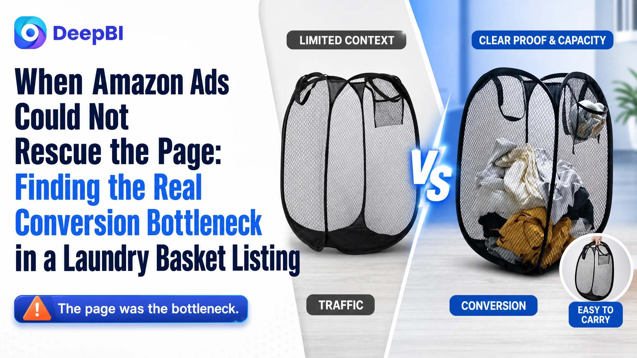
An Amazon seller in the laundry-storage category was facing a familiar problem: the product had relevant search coverage and a workable set of functions, yet the Amazon Listing was not communicating its value clearly enough. The initial instinct was to improve keywords, add more selling points, and make the product appear more competitive in search.
That diagnosis was incomplete. DeepBI’s comparison showed that the target Listing scored 55 out of 100 against 86 for a comparable high-performing Amazon Listing. The largest gap was not the title or even the bullet points. It was the product page itself: the target page had no meaningful A+ visual story, limited proof of size and usability, and a weaker trust foundation from customer reviews.
The later optimization therefore focused on Listing conversion before further traffic expansion: make capacity visible, prove portability, demonstrate the handles and folding mechanism, connect each feature to a real use case, and build a structured A+ experience. For other Amazon sellers, the lesson is direct: when ads are not producing enough orders, the first question should not always be which bid or keyword to adjust. It should be whether the product page deserves the traffic it is receiving.
The Listing Looked Like an Advertising Problem
At first glance, a laundry basket Listing can appear easy to optimize. The product has familiar search terms, clear specifications, and several practical functions: foldability, portability, breathable mesh, a side pocket, and a wide opening.
That apparent simplicity creates a common Amazon operating trap.
When traffic does not translate into enough orders, sellers often look first at:
- Search-term coverage
- Campaign structure
- Keyword bids
- Match types
- Budget allocation
- Additional product benefits
Those elements matter, but they cannot compensate for a product page that leaves basic buying questions unanswered.
For this Amazon seller, the Listing did not lack possible selling points. It lacked a persuasive order in which those selling points were presented. A shopper still had to work out:
- How much laundry the basket could actually hold
- Whether it would stand when empty
- Whether the handles could support a full load
- How small it became when folded
- Whether it was genuinely practical for travel
- Whether the side pocket had a useful purpose
- Whether the mesh construction helped with damp laundry and odors
That distinction changed the direction of the diagnosis.
The problem was not simply whether the Listing contained the right information. It was whether shoppers could understand and trust that information quickly enough to buy.
The Score Gap Was Concentrated in the Page, Not the Keyword Layer
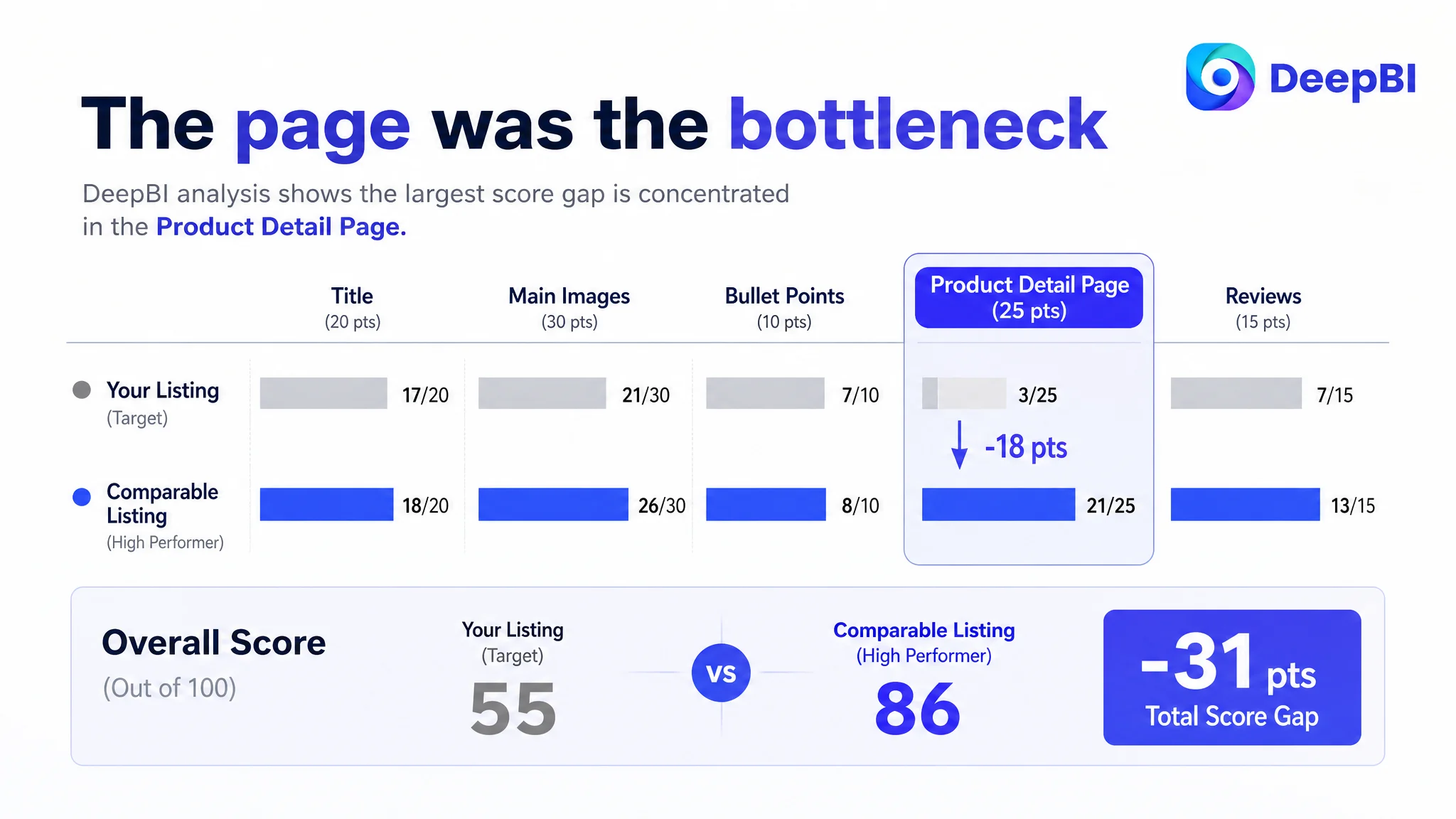
The overall comparison gave the target Listing 55 points, compared with 86 for a comparable category Listing.
The breakdown was revealing:
- Title: Target Listing: 17/20, Comparable Listing: 18/20, Gap: -1
- Main images: Target Listing: 21/30, Comparable Listing: 26/30, Gap: -5
- Bullet points: Target Listing: 7/10, Comparable Listing: 8/10, Gap: -1
- Product detail page: Target Listing: 3/25, Comparable Listing: 21/25, Gap: -18
- Reviews: Target Listing: 7/15, Comparable Listing: 13/15, Gap: -6
The title, main images, and bullet points all had room for improvement, but their gaps were relatively limited.
The detail-page gap was different. The target Listing had no effective A+ content. Its detail area largely repeated text without building a visual narrative. The comparable Listing used structured modules, usage scenes, functional demonstrations, product variations, and close-up details to answer objections before the shopper had to raise them.
This was the most important business judgment in the case:
The page-level conversion constraint was much larger than the visible keyword or copywriting gap.
If the team had continued to focus mainly on traffic acquisition, advertising would have risked sending more shoppers into the same weak conversion environment. More impressions could create more clicks, but without stronger product-page persuasion, those clicks would not necessarily create more orders.
The Original Diagnosis Focused on Search Coverage
The seller’s title was not unusable. It included relevant contexts such as dorm living, bathroom storage, travel, and cruise use. The problem was how those terms were organized.
The core category phrase appeared too late, while the strongest functional and scenario-based signals were not prioritized clearly enough. The structure felt closer to a list of terms than a buying proposition.
The comparable Listing placed the core phrase near the front and connected it with concrete benefits such as:
- Sturdy handles
- A side pocket
- Portable use
- Travel storage
- Laundry-room movement
That gave the shopper an immediate answer to two questions:
1. What is the product?
2. Why is this version useful?
The target title contained relevant search language, but its logic was less efficient. A shopper had to process more terms before understanding the product’s main value.
This was not a reason to abandon keyword optimization. It was a reason to place it in the correct role. The title needed to improve discoverability and first-glance clarity, but it was not the primary business bottleneck.
The Main Image Presented a Product, Not Enough Proof
The main-image and supporting-image gap was smaller than the A+ gap, but it still affected the top of the conversion funnel.
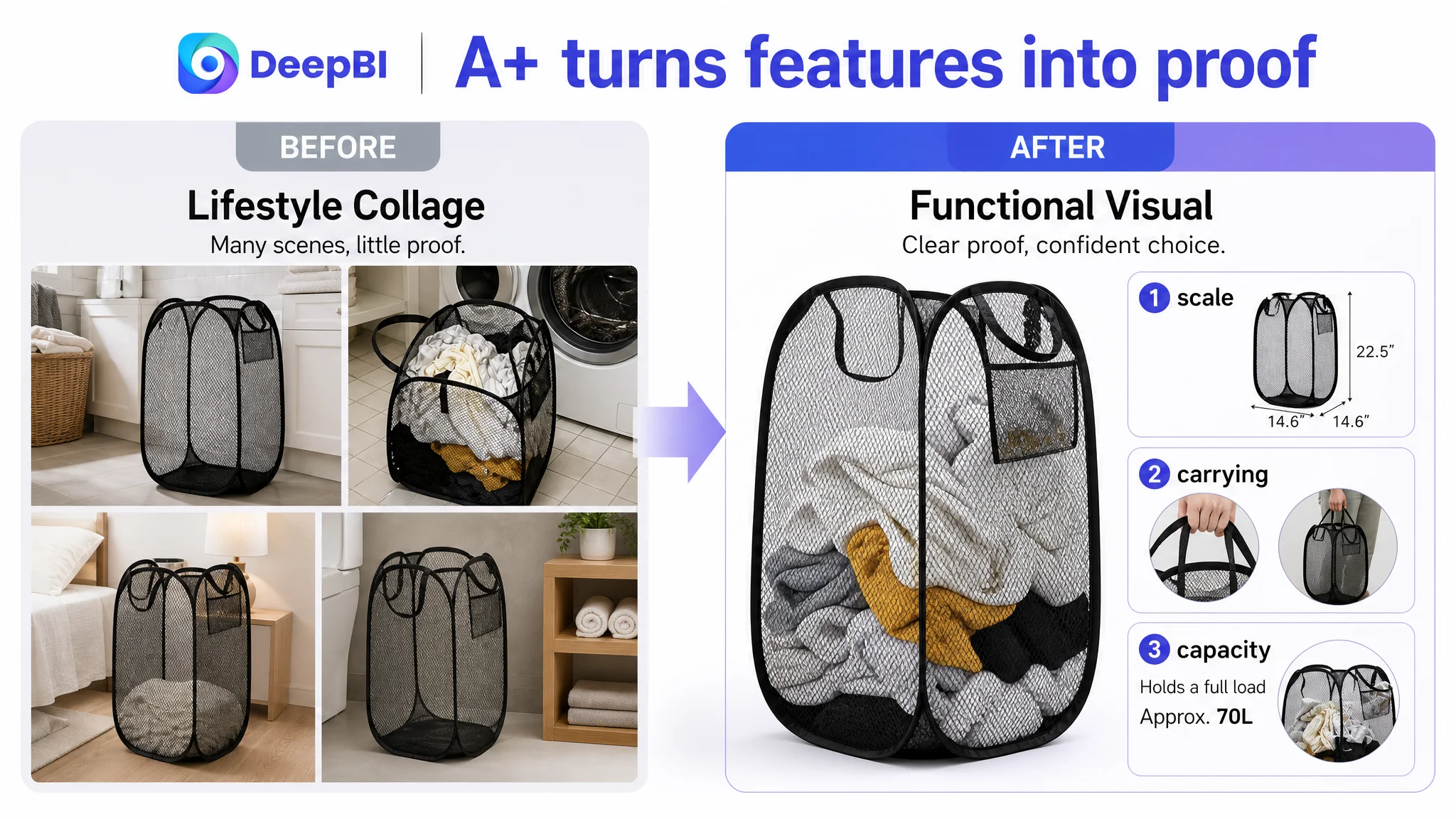
The existing image set showed the product and included technical information. However, several images depended heavily on text labels or isolated product views. They did not always turn the product’s specifications into an immediately understandable use case.
For a collapsible laundry basket, the visual questions are practical:
- Does it hold a meaningful amount of laundry?
- Does it remain upright?
- Can it be carried comfortably when full?
- Is the folded shape small enough for a drawer, suitcase, or travel bag?
- Is the stated capacity believable?
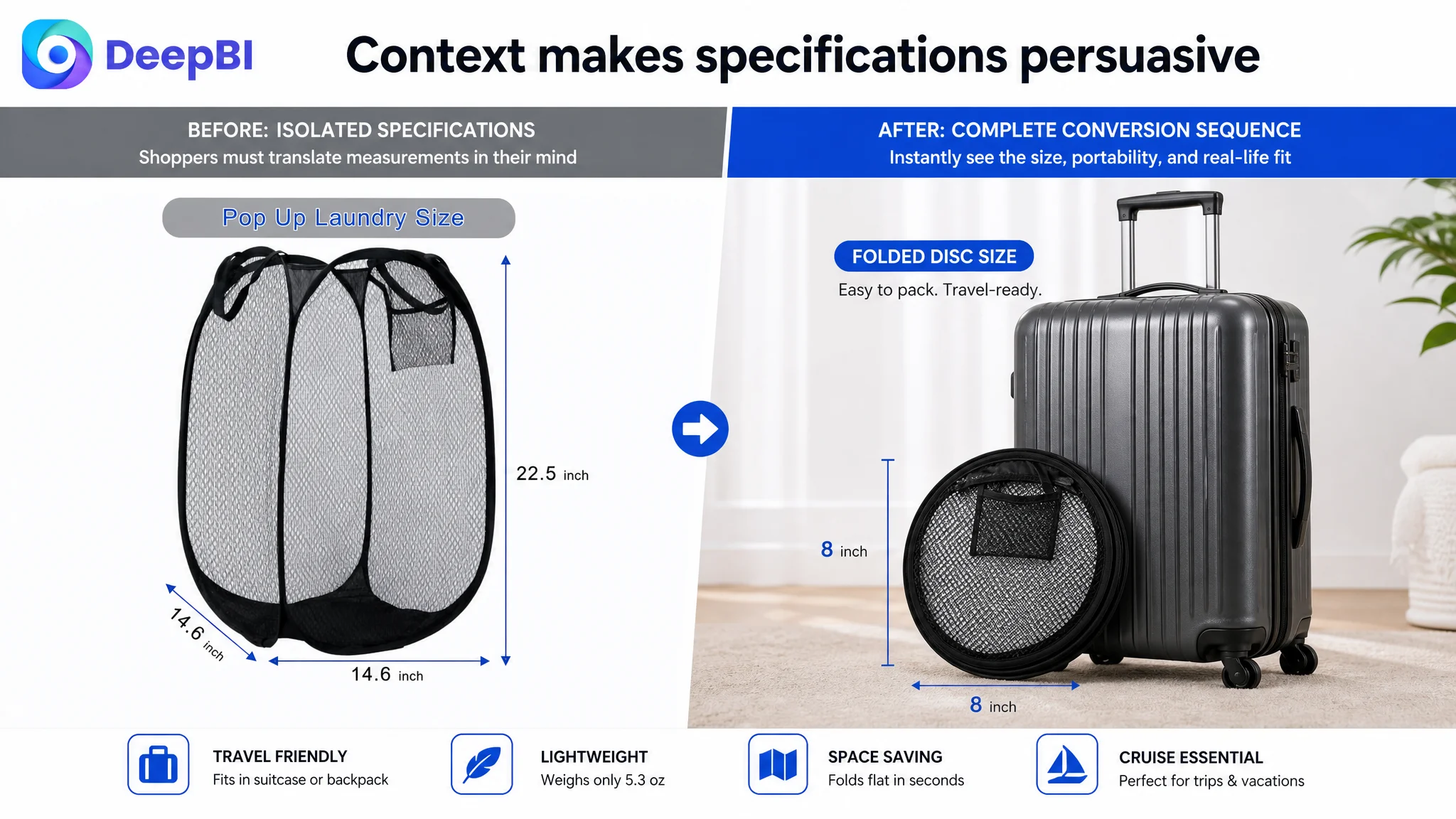
A technical dimension label such as 14.6 by 14.6 by 22.5 inches requires mental translation. A basket shown filled with clothes beside familiar furniture communicates scale more quickly.
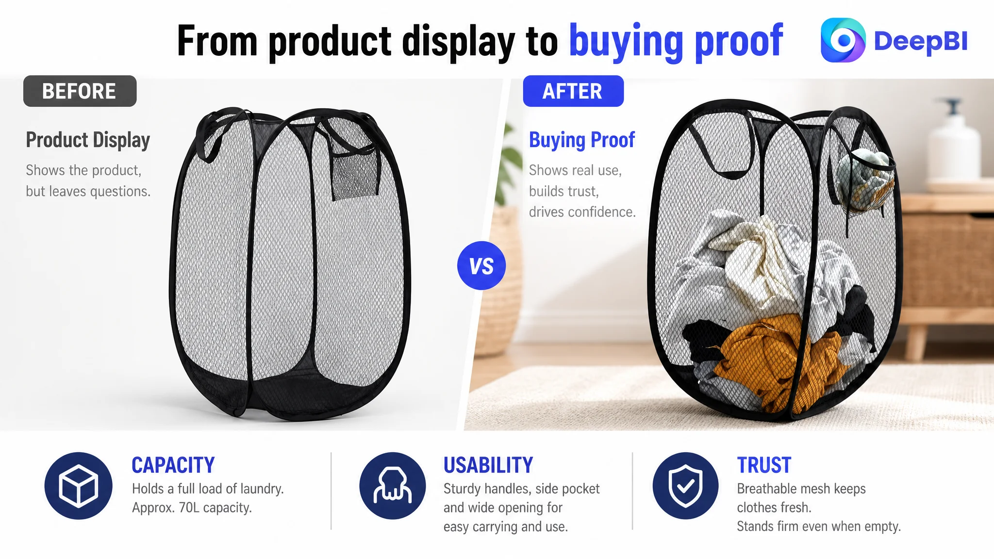
The image strategy therefore shifted from general product display to functional proof:
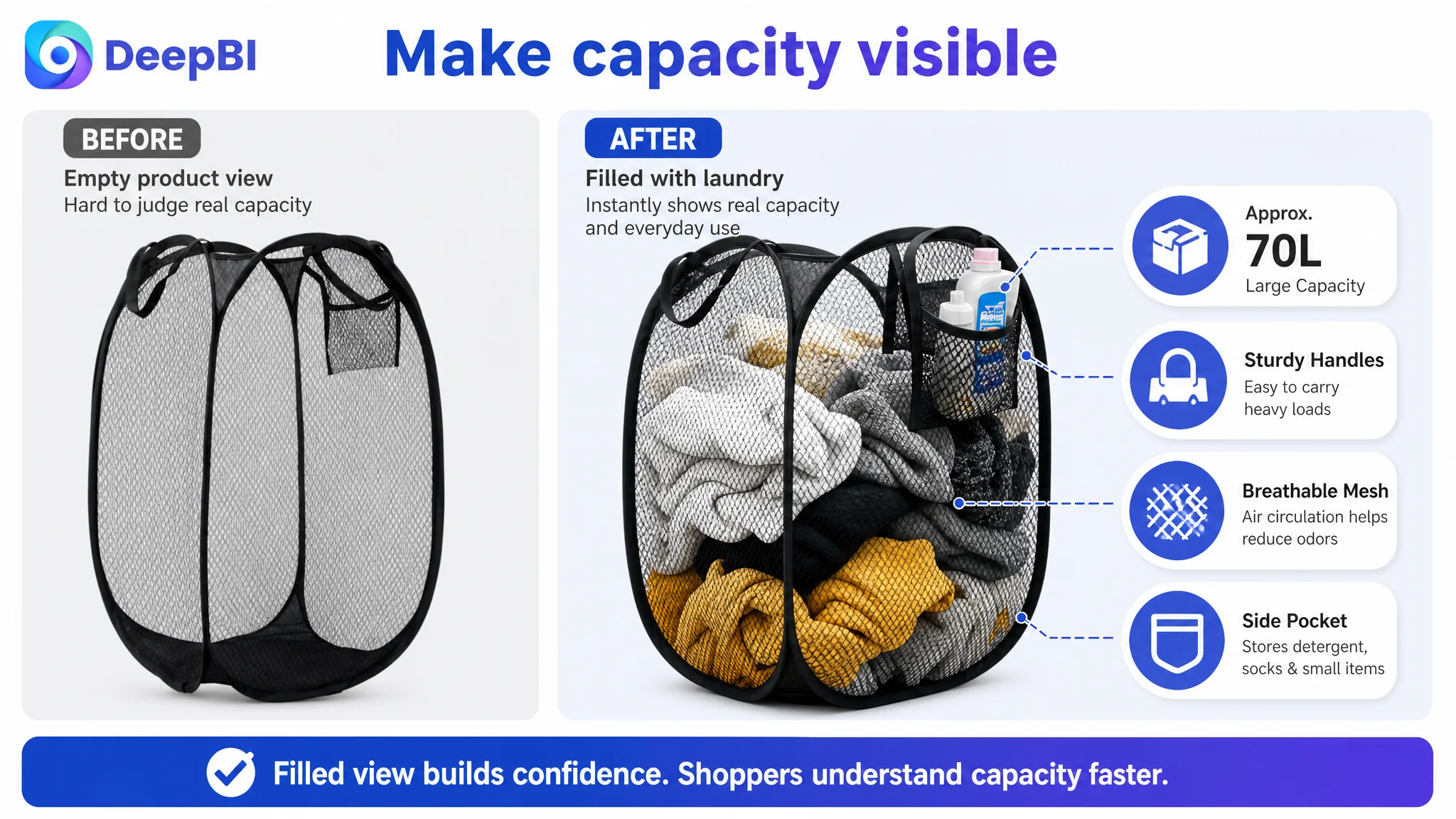
Capacity needed to be visible
The basket should be shown filled with clothing, not only standing empty. This makes the approximately 70-liter capacity more tangible and helps address the concern that a lightweight collapsible product may not handle a real laundry load.
Portability needed a physical reference
The folded product should be shown near a suitcase, travel bag, drawer, or similar object. The stated flat eight-inch disc becomes more persuasive when shoppers can compare it with something familiar.
Dimensions needed context
Instead of presenting measurements as isolated numbers, the image sequence should connect them with clothing volume, furniture, or a real storage setting.
Structure needed evidence
The product should be shown standing firmly when empty and being lifted by its reinforced nylon handles when full. This addresses the natural concern that “collapsible” might mean unstable or flimsy.
The goal was not to make the images more decorative. It was to make them answer buying objections with less interpretation.
The Bullet Points Had Features, but Not a Complete Buying Logic
The target Listing’s bullet points covered many legitimate functions, including automatic pop-up construction, breathable mesh, a wide opening, portability, and a side pocket.
The weakness was not a lack of features. It was the distance between each feature and the shopper’s daily situation.
For example, a side pocket described only as a place for small items is less persuasive than a side pocket shown as a place for detergent, dryer sheets, or socks while moving laundry from a bedroom to a laundry room.
Likewise, “breathable mesh” is a material statement. It becomes more commercially meaningful when connected to airflow, damp towels, and odor concerns while laundry waits for wash day.
The revised copy direction followed a more useful structure:
Feature → practical situation → customer benefit
That logic applied across the Listing:
- The automatic pop-up frame became a faster setup experience.
- The sturdy frame became the ability to stand independently.
- The side pocket became a way to carry detergent and small laundry items.
- The reinforced handles became easier movement between rooms or to a laundromat.
- The breathable, moisture-resistant mesh became a response to damp towels and trapped odors.
- The wide opening became easier loading for blankets, sheets, duvet covers, and coats.
- The folding structure became a storage and travel advantage.
This also clarified why an additional space-saving point could be valuable. For a dorm, small apartment, weekend trip, or cruise, the folded form is not a secondary detail. It may be the reason the product fits the shopper’s life.
A bullet point should not merely prove that the product has a feature. It should show why that feature matters in the moment the shopper is deciding.
The Missing A+ Story Created the Largest Trust Gap
The most serious weakness was the absence of a meaningful A+ content experience.
The target product page had no visual A+ structure beyond repeated text. The comparable Listing used a sequence of modules to show:
- The product in realistic environments
- Carrying and storage convenience
- The side pocket in use
- Product variations
- Folded and expanded states
- Capacity demonstrations
- Lifestyle applications
This difference matters because a shopper does not evaluate a laundry basket only by reading its specifications. They evaluate whether the product will fit their room, their storage habits, their travel plans, and their expectations of durability.
A strong A+ page would therefore need to follow the shopper’s decision path rather than repeat the title and bullets.
First, establish real size and placement
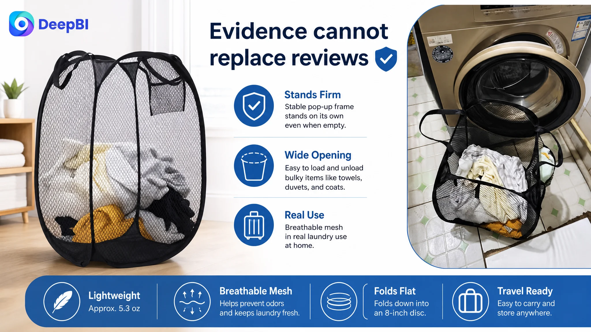
The black hamper should appear in a realistic bathroom, dorm, or home setting, filled with clothing and positioned near familiar furniture. This creates a reference for both capacity and footprint.
Then address carrying risk
A close-up of the top nylon handles being used with a full basket can make the construction easier to trust. If the product has reinforced stitching, that detail should be shown rather than left as an unsupported claim.
Prove the folding benefit
The folded basket should appear as a compact disc near a travel bag, drawer, or suitcase. The shopper should not have to imagine what “space-saving” means.
Demonstrate the setup process
A sequence from folded state to expanded form can make the three-second auto-pop-up claim more concrete. The purpose is not spectacle. It is to remove uncertainty about effort and usability.
Explain the material through its outcome
A close-up of the mesh texture can support the airflow story, especially when paired with a damp towel or washcloth use case. The visual should connect the material to the practical concern of waiting laundry, without making unsupported claims.
Show the limits of the opening
A wide opening should be demonstrated with bulky items such as bedding, blankets, or coats. This turns “ample space” into an observable use case.
Make the side pocket useful
A pocket holding detergent, dryer sheets, socks, or other small items gives the feature a job. It also makes the product feel designed around laundry movement rather than assembled from generic attributes.
This is why the A+ gap mattered more than the title gap. The title could improve the first impression, but A+ content had to carry the deeper trust and usability argument.
Reviews Added a Separate Risk Layer
The review profile further weakened the Listing’s ability to convert unfamiliar shoppers.
The target product had:
- 3.9 stars
- 55 total reviews
- 8 reviews visible on the first page
The comparable Listing had:
- 4.5 stars
- 4,664 total reviews
- 14 reviews visible on the first page
The difference was not only volume. Some of the target Listing’s negative feedback referred to tearing and broken handles, which directly touched the same durability concerns that the page needed to address visually.
This created a difficult conversion environment:
- The product page needed stronger proof of construction.
- The review profile already contained doubts about construction.
- The A+ section did not provide enough visual evidence to counter those doubts.
- The product’s lightweight and collapsible positioning could be interpreted as fragility if not explained carefully.
The solution was not to hide the review gap or claim that images alone could erase it. Review volume and rating are accumulated business assets, not elements that can be fixed instantly through copy.
But the page could become more honest and more persuasive by showing how the product is meant to be used:
- What the basket can hold
- How the handles are positioned
- How the frame stands
- How the product folds
- Which items fit the opening
- What the side pocket is designed to carry
That distinction matters. Better content does not replace product quality or customer satisfaction. It makes the product’s real attributes easier to evaluate and reduces avoidable uncertainty.
Why DeepBI Did Not Recommend Tuning Ads First
The central decision was about sequence.
The seller could continue adjusting campaigns, bids, and search terms. But the Listing comparison indicated that the largest constraint was not the ability to attract a shopper. It was the page’s ability to persuade that shopper after arrival.
Continuing to push traffic first carried three risks:
1. More traffic could expose the same conversion weakness.
If shoppers still could not understand capacity, portability, and durability, additional clicks would not solve the underlying issue.
2. Advertising performance could be judged without fixing the page experience.
A weak CVR might be treated as a campaign problem when the real limitation sat in the product content.
3. The team could spend resources optimizing around an incomplete diagnosis.
More keyword variations and bid adjustments would not replace missing visual evidence or a missing A+ narrative.
The correct order was therefore:
1. Repair the core Listing message.
2. Make the product’s practical value visible.
3. Build the A+ trust path.
4. Address the most relevant durability and usability objections.
5. Then evaluate how paid traffic responds to the improved page.
This is not an argument that Amazon ads are unimportant. It is an argument that ads and Listing conversion cannot be evaluated in isolation.
Advertising can bring a shopper to the product page. It cannot make an unclear page feel clear, or make an unproven feature feel proven.
The New Page Logic Started With Evidence, Not Decoration
The recommended changes were organized around the actual objections revealed by the comparison.
The new visual and content direction emphasized:
- A filled basket to establish capacity
- A realistic bathroom or dorm setting to establish scale
- A suitcase or travel bag to prove portability
- Reinforced handles being used with a full load
- The folded eight-inch disc to prove storage efficiency
- The three-second pop-up motion to prove ease of setup
- Mesh texture and airflow to support the material story
- Bulky laundry entering through the wide opening
- Real items placed in the side pocket
This sequence creates a more complete sales logic:
What is it? → How much does it hold? → How is it carried? → Where can it be stored? → How quickly can it be used? → Why does the material matter? → What else can it hold?
That logic is stronger than simply adding more images or adding more adjectives. It gives every module a role in reducing a specific hesitation.
It also respects the product’s real boundaries. The objective is not to make a lightweight laundry basket appear to be a heavy-duty industrial container. It is to show the actual product clearly, in the situations where its real strengths matter.
What This Case Changed About the Seller’s Diagnosis
The case did not prove that one title revision or one new image would automatically produce a specific ACOS or CVR result. No unsupported post-optimization figures should be assigned to it.
What it did establish was a more useful operating diagnosis.
The seller could see that:
- The title had a modest structural and keyword-ordering gap.
- The main images needed stronger functional proof.
- The bullet points needed clearer feature-to-benefit connections.
- The A+ section was the largest content weakness by far.
- Reviews created a separate trust constraint.
- Product-page conversion had to be addressed before traffic expansion could be evaluated fairly.
That changed the role of advertising in the decision process. Ads were no longer treated as the automatic first response to weak order performance. They became a traffic source whose value depended on the page’s ability to receive, explain, and convert that traffic.
For Amazon sellers, the broader lesson is simple but easy to miss:
Before asking whether an ad campaign deserves more budget, ask whether the Listing gives shoppers enough evidence to buy.
In this laundry basket case, the answer was not found in more aggressive traffic adjustments. It was found in the missing logic between the search result and the purchase decision: visible capacity, believable portability, demonstrated usability, stronger durability evidence, and an A+ page that finally connected the product to real life.