

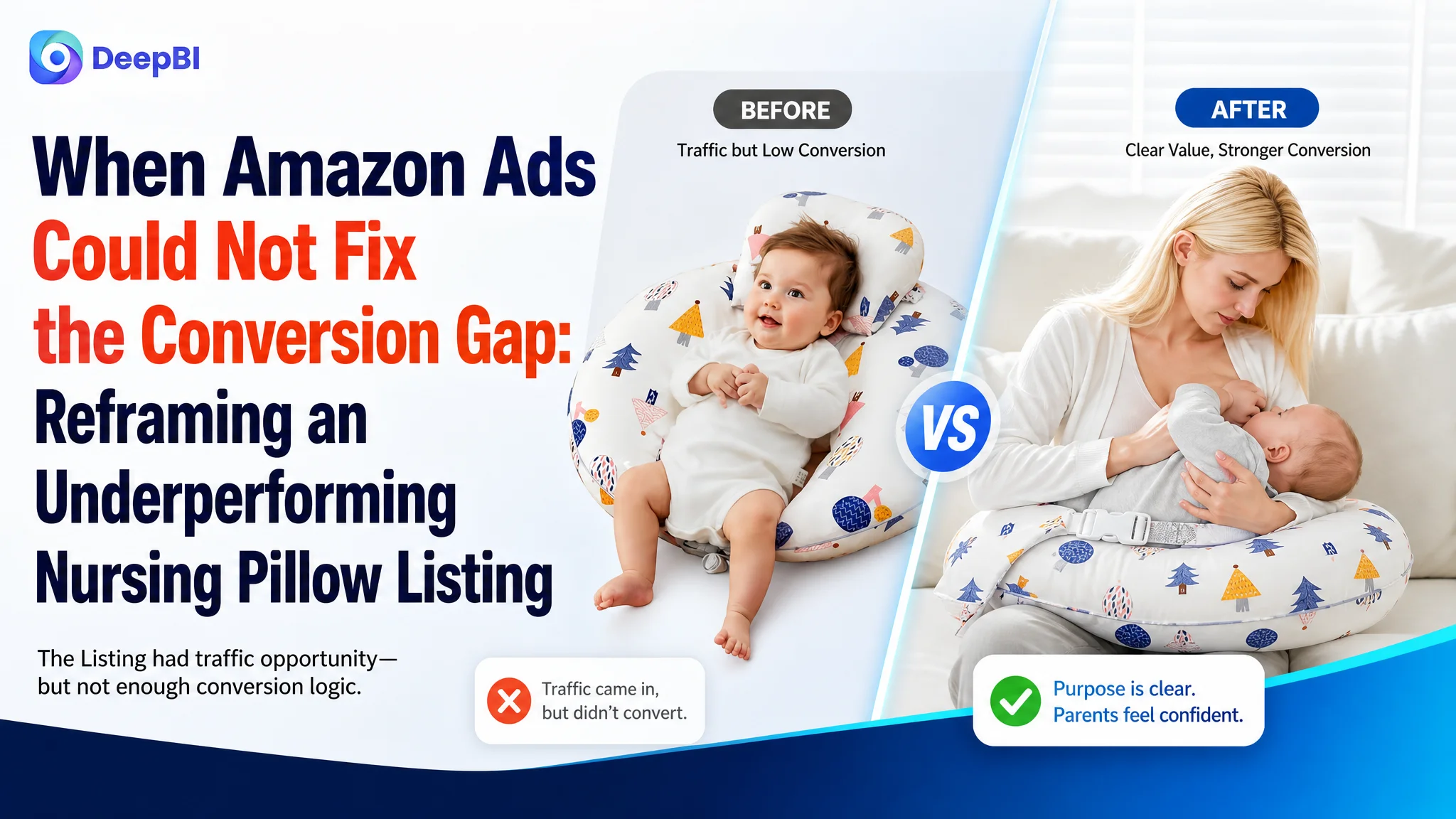
An Amazon seller in the baby-care category was not facing a simple traffic problem. The product page was receiving the opportunity to compete, but its Listing did not make the product’s most important value clear quickly enough: comfortable, secure support during breastfeeding. The team’s initial direction focused on refining keywords, showing more functions, and adding technical details.
DeepBI’s comparison with a closely matched Amazon category competitor pointed to a different constraint. The Listing scored 70 out of 100 against the benchmark’s 86, with the largest gaps in the A+ detail experience and customer reviews. The page contained useful information, but it did not build trust or guide the shopper from concern to evidence to purchase with enough force.
The later optimization therefore focused on Listing conversion rather than continued surface-level ad or keyword adjustments: repositioning the image sequence around breastfeeding, strengthening the title and bullet-point buying logic, moving physiological benefits earlier, and rebuilding A+ content around support, stability, material confidence, and use-case validation. For other Amazon sellers, the lesson is straightforward: before scaling paid traffic, confirm that the product page can convert the attention it is already earning.
The Amazon Listing Was Not Empty. It Was Under-Persuaded.
The customer’s Amazon Listing had several genuine strengths.
The bullet points included concrete product details such as a patented 15-degree incline, an adjustable waist strap, a detachable head-and-neck support pillow, breathable cotton, and machine-washable care. The page also showed multiple use cases, including feeding, tummy time, and sitting support.
From an operational perspective, this can create a familiar impression: the product is complete, the information is present, and the remaining work must be more keyword refinement or more traffic.
But the overall Listing score told a different story.
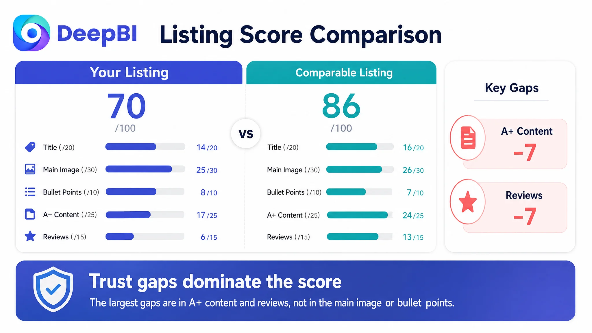
- Title: Customer Listing: 14/20, Comparable category Listing: 16/20, Gap: -2
- Main image: Customer Listing: 25/30, Comparable category Listing: 26/30, Gap: -1
- Bullet points: Customer Listing: 8/10, Comparable category Listing: 7/10, Gap: +1
- A+ detail content: Customer Listing: 17/25, Comparable category Listing: 24/25, Gap: -7
- Reviews: Customer Listing: 6/15, Comparable category Listing: 13/15, Gap: -7
- Total: Customer Listing: 70/100, Comparable category Listing: 86/100, Gap: -16
The pattern matters more than the total score.
The title and main image were not the largest weaknesses. The bullet points were even slightly stronger in structure than the comparison Listing. The most serious losses occurred where an Amazon shopper needs reassurance before purchasing a product used by both parent and baby: the A+ content and the review profile.
The Listing did not lack information. It lacked a sufficiently persuasive order of information.
The Initial Diagnosis Focused on the Visible Parts
The original optimization direction was understandable.
The title could use broader search coverage. The image sequence included functions that were useful but not necessarily the most important at the first decision point. The product page contained technical details, but some of those details appeared before the shopper had fully understood the core benefit.
That made keyword expansion, title revision, image improvement, and function clarification appear to be the natural next steps.
The team also had a reasonable basis for emphasizing technical information. The bullet points described the 15-degree angle, machine-washable cover, filling performance, and product versatility. Compared with the benchmark, the customer’s bullet structure was in some ways more orderly and specific.
The problem was not that these details were wrong.
The problem was that the page did not connect them strongly enough to the buyer’s primary concerns:
- Will the pillow support the baby securely during feeding?
- Will it reduce pressure on the parent’s neck, shoulders, and back?
- Will it stay in place?
- Can the buyer trust the materials and construction?
- Does the product work for different caregivers and feeding situations?
- Is there enough evidence to justify choosing this Listing over a more established alternative?
Traditional Amazon optimization often treats these questions separately. One person adjusts the title, another updates images, and another reviews the bullet points. Each change may be reasonable in isolation, while the page still fails to form a convincing buying path.
That was the central misdiagnosis: treating the Listing as a collection of content elements instead of a conversion system.
The Real Constraint Was Listing Conversion Capacity
DeepBI’s comparison did not stop at identifying that the benchmark looked more polished. It separated the Listing into decision roles and showed where the competitive distance became commercially meaningful.
The score gap in the A+ section was seven points. The review gap was also seven points. Together, they represented most of the 16-point difference between the two Listings.
This did not mean the customer could immediately eliminate the review disadvantage. A Listing with 45 total reviews and a 3.9-star rating cannot quickly match a comparable product with 1,436 reviews and a 4.6-star rating through copy changes alone.
It did mean the page needed to compensate more deliberately in the areas it could control.
The benchmark used a broader trust structure, including:
- Structural support explanations
- Safety-oriented presentation
- Material and care details
- Scenario-based validation
- Comparison content
- Customer-oriented reassurance
- Additional value communicated through the page experience
The customer’s A+ content, by contrast, leaned more heavily toward feature presentation and general usage scenes. Those elements confirmed that the product had multiple functions, but they did not always answer why the product was a safer, more stable, or more comfortable choice for the primary breastfeeding use case.
The result was a page that could inform a shopper without fully reducing the shopper’s hesitation.
The largest gap was not visual polish
The A+ content used modules such as:
- Usage guidance
- Product scenes
- Color selection
- Feature grids
- Problem-and-solution comparisons
- Multiple-use scenarios
These were not useless modules. Their weakness was sequencing and emphasis.
Care instructions appeared too early relative to the product’s main physiological benefits. General multi-use scenes occupied attention that could have been used to explain support and stability. The content did not consistently build a clear sequence of:
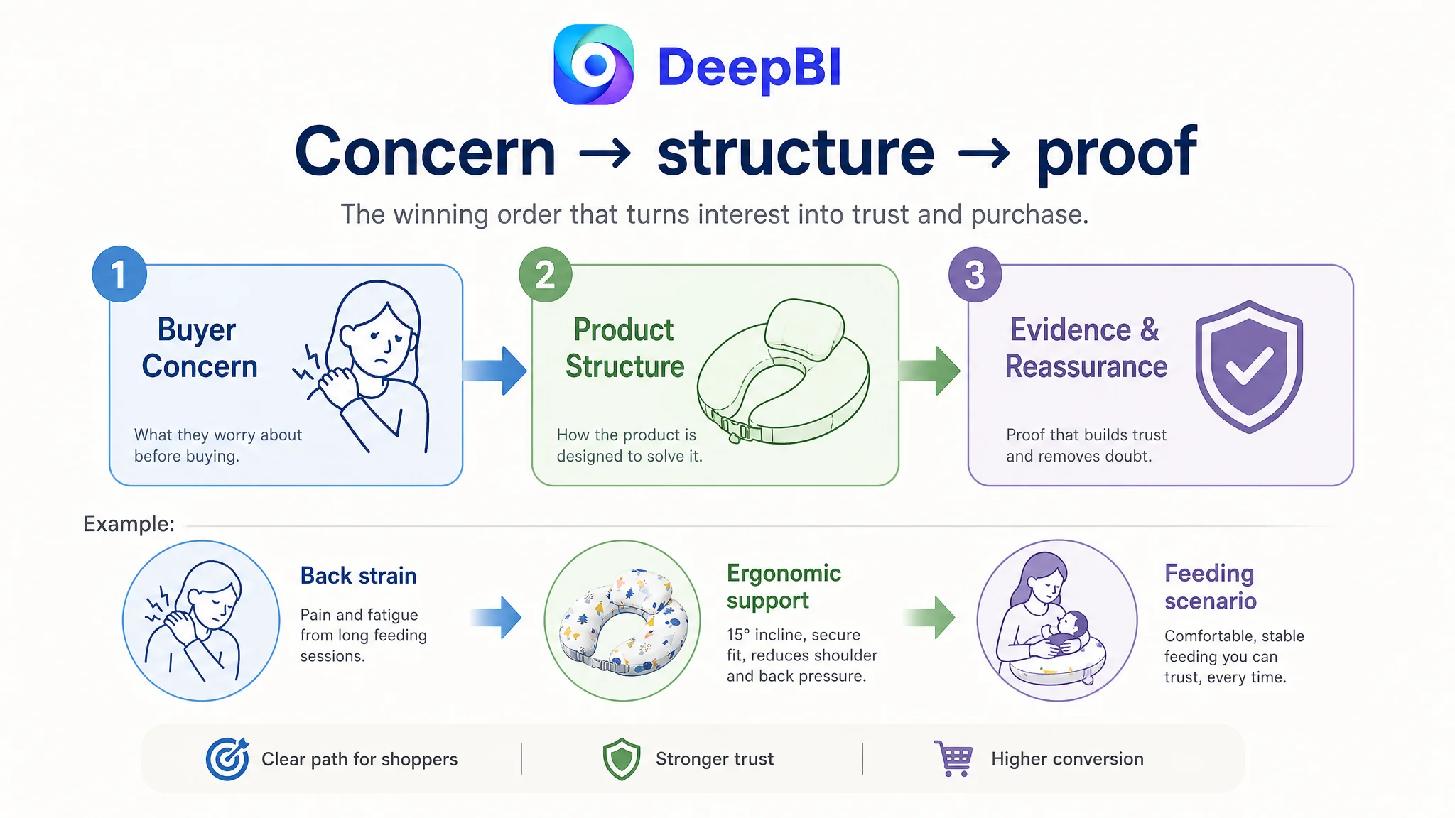
1. The parent’s physical problem
2. The product’s structural solution
3. The evidence or visual explanation
4. The reason to choose this product over a standard nursing pillow
The benchmark’s content was stronger because it connected the product to a more complete trust narrative. It did not merely say that the pillow had a feature. It showed what concern the feature addressed and why the shopper should believe the claim.
The Page Needed to Lead With the Feeding Problem
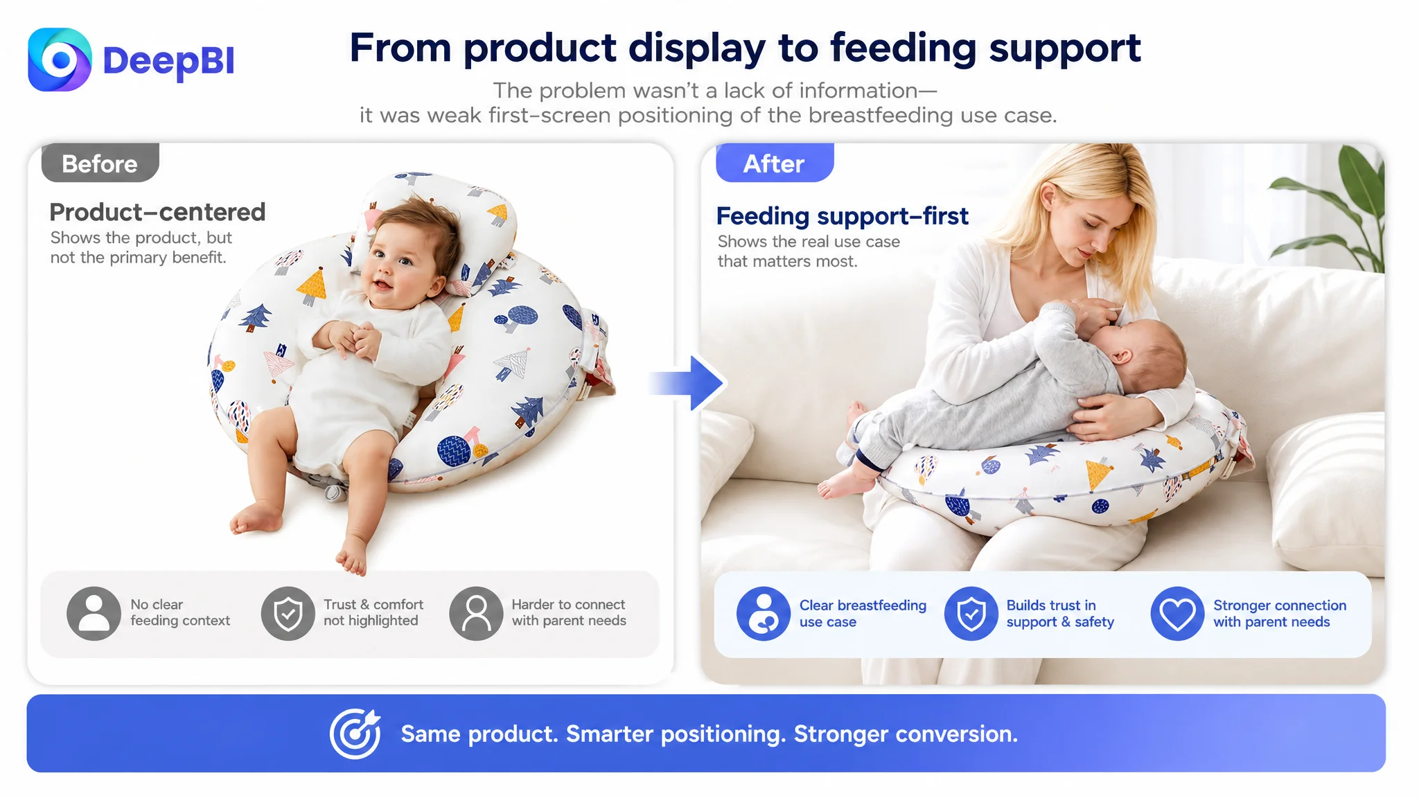
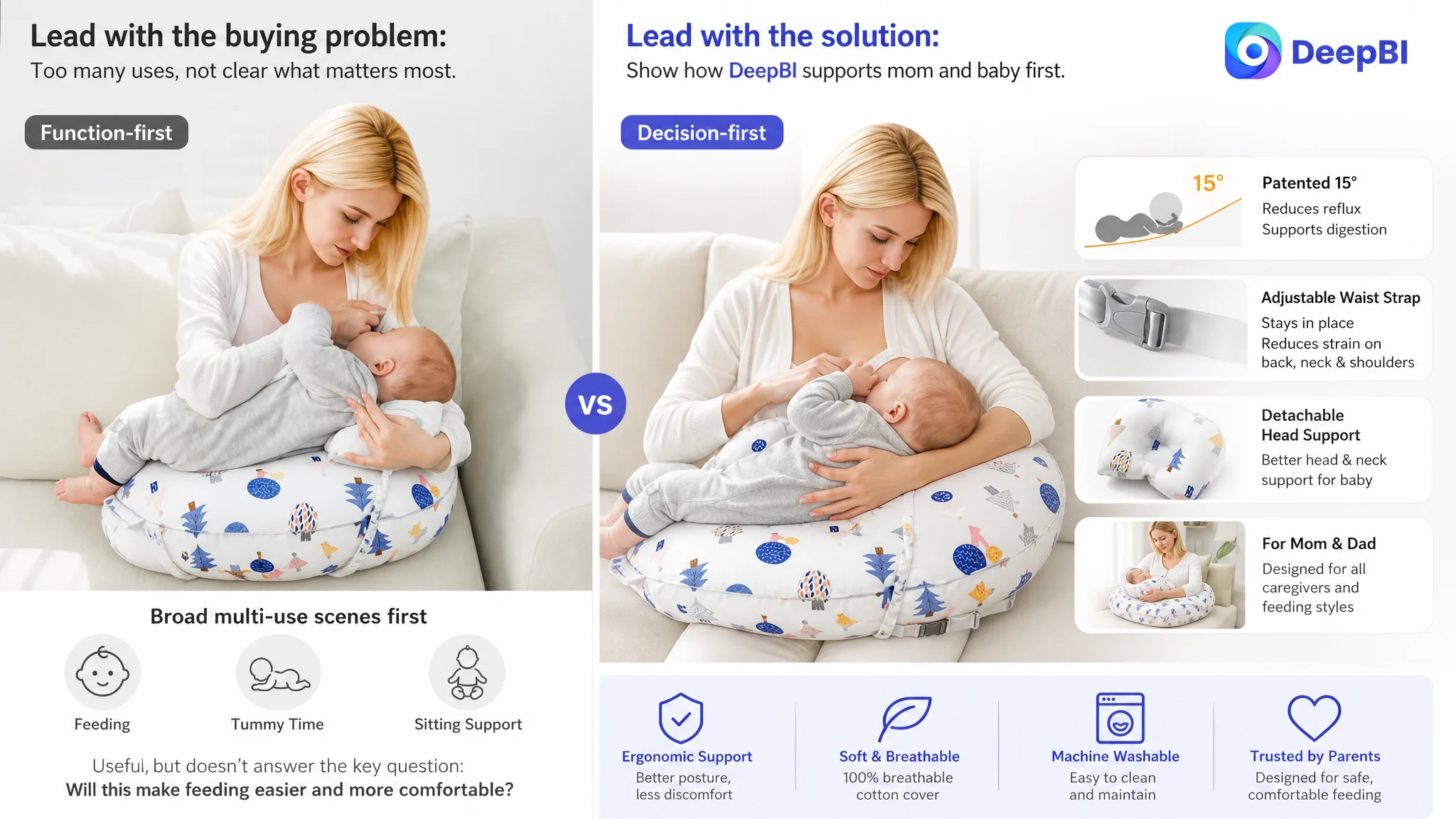
For this nursing pillow, the first visible product story should be breastfeeding support.
The existing image order gave meaningful space to tummy time and other functional uses. Those uses may contribute to the product’s overall value, but they are not the strongest reason for a shopper to click or continue evaluating the Listing.
DeepBI’s diagnosis therefore placed the breastfeeding scenario earlier in the image sequence. This does not mean hiding the product’s versatility. It means allowing the primary purchase motivation to lead.
The first visible supporting image should make the product’s central role immediately understandable:
- The baby is lifted to a more comfortable feeding height
- The parent receives support around the neck, shoulders, and back
- The adjustable waist strap helps maintain a closer fit
- The detachable support pillow helps position the baby’s head and neck
- The product is shown in a realistic nursing context rather than only as an isolated object
The current product image showing tummy time could still remain in the sequence. It simply should not carry the responsibility of introducing the product’s primary value.
The main image sequence had a persuasion problem
The image analysis identified several specific issues:
- A feeding scene was not positioned early enough
- One image focused mainly on the baby’s 15-degree angle instead of connecting that angle to the parent’s physical comfort
- Material and care information appeared without enough trust-building context
- Structural comparison appeared later than it should have
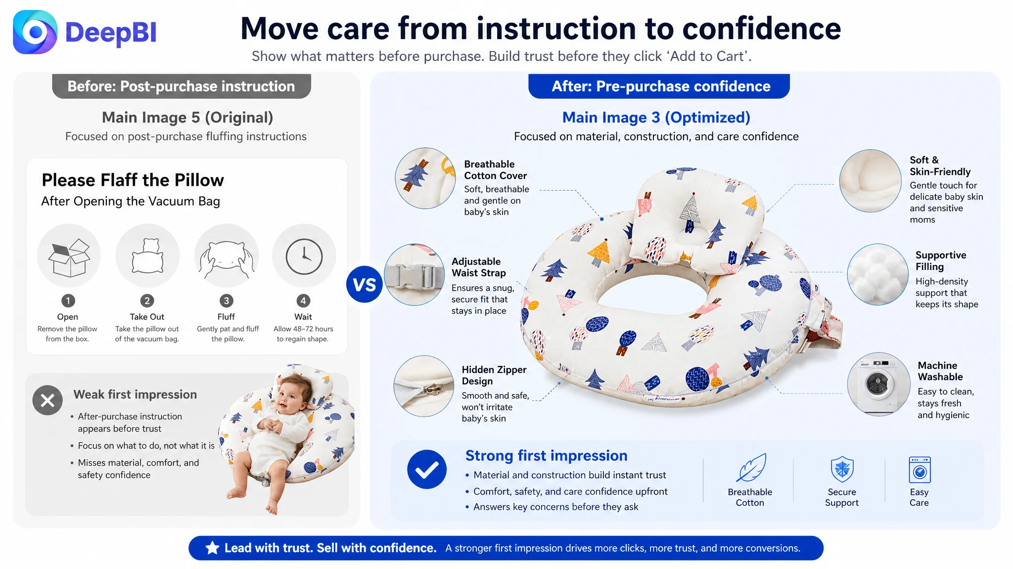
- Fluffing and care instructions occupied a visual position better used for pre-purchase persuasion
The proposed order gave the first visible positions to the information most likely to affect the decision:
1. Breastfeeding support and product purpose
2. Relief for the parent’s back, neck, and shoulders
3. Material quality and care confidence
4. Adjustable structure and support components
5. Feeding, sitting, tummy time, and other practical uses
This is not a call to add more claims indiscriminately. It is a decision about which true product attributes deserve attention first.
The Title Needed More Than Keyword Coverage
The title scored 14 out of 20, so it was not a severe weakness. But the comparison showed why a technically complete title can still underperform.
The customer’s title included core product terms, breastfeeding and bottle feeding, an adjustable waist strap, tummy time, and the forest color. It described the product, but its structure was closer to a feature list.
The benchmark placed the core keyword first, followed it with a stronger support and comfort proposition, and then connected the product to newborn essentials and baby registry searches.
The recommended direction kept the customer’s real features while improving the order:
- Lead with “Nursing Pillow”
- Preserve breastfeeding and bottle-feeding relevance
- Bring the adjustable waist strap and removable cotton cover into a cleaner structure
- Retain tummy time support as a secondary use case
- Add relevant newborn essentials and baby registry context
- Remove repetition and avoid ending with a narrow color-led message
The objective was not to imitate the benchmark’s wording. It was to make the title perform two jobs at once: help Amazon understand the product’s search relevance and help the shopper understand why the product is worth considering.
The Bullet Points Had Details, but the Page Needed a Buying Logic
The bullet points were one of the customer Listing’s stronger areas. Their score was 8 out of 10, compared with 7 out of 10 for the benchmark.
That result is important because it prevents the wrong conclusion that every part of the page needed to be rewritten from scratch.
The customer’s bullets already included:
- Neck, shoulder, and back support
- The 15-degree incline
- A detachable head-and-neck pillow
- High-density filling
- Breathable cotton
- Machine-washable care
- Multi-functional use
The improvement was to make each point complete a clearer chain:
Buyer concern → product structure → practical outcome
For example, the 15-degree incline should not appear as a standalone technical specification. It should be connected to the intended feeding position, the baby’s comfort, and the limitations of supervised use.
Likewise, the adjustable waist strap should not be presented only as a component. It should explain how the pillow is intended to fit closer to the caregiver and remain more stable during a feeding session.
The same logic applies to the filling. “High-density” matters more when the shopper understands that the purpose is consistent support and reduced sagging during repeated daily use.
The page therefore needed fewer disconnected feature statements and more connected decision cues.
The customer’s technical strengths should not be discarded
This was one of the reasons DeepBI did not recommend simply copying the competitor’s more emotional style.
The customer’s 15-degree angle, care instructions, and structural details were valuable differentiators. The issue was not excessive specificity. It was that specificity had not been consistently translated into buyer value.
A stronger bullet structure could preserve the facts while improving their commercial meaning:
- Ergonomic support for the parent’s posture
- Stable positioning for breastfeeding
- 15-degree incline and detachable head-and-neck support
- High-density filling designed to maintain support
- Breathable, machine-washable cotton cover
- Multi-functional use for feeding, sitting practice, tummy time, and pregnancy comfort
- Clear opening and care guidance
The result should be a page that feels specific without becoming mechanical.
The A+ Content Was the Most Important Repair Point
The A+ section was where the Listing most clearly lost the conversion argument.
The customer’s existing content addressed several functions, but it did not make the shopper travel through a strong enough sequence of reassurance.
DeepBI’s recommended direction was to rebuild the A+ story around the questions that remain after the shopper has seen the title, images, and bullets.
Start with the parent’s physical strain
The opening A+ module should move quickly to the product’s central ergonomic value:
- Lifting the baby to a more comfortable height
- Reducing strain on the parent’s back, neck, and shoulders
- Supporting a more aligned feeding position
This is more persuasive than beginning with packaging or fluffing instructions. Care instructions matter after purchase, but they are not the strongest reason to buy.
Explain the structural components
The detachable mini pillow should be presented as part of the support system rather than as an extra accessory.
The adjustable waist strap should be shown in relation to fit and stability.
The 15-degree incline should be explained as part of the feeding position, without turning the page into an unsupported medical promise.
The goal is to show how the product’s parts work together in the actual feeding scenario.
Use comparison to clarify the choice
A direct comparison module can help the shopper understand why this Listing is different from a standard C-shaped nursing pillow.
The comparison should remain limited to verifiable product attributes, such as:
- Adjustable waist strap versus a looser standard fit
- Firm high-density filling versus filling that may flatten more easily
- Detachable head-and-neck support versus a basic pillow structure
- A defined incline and ergonomic design versus a generic feeding surface
This is not a reason to make absolute safety claims or introduce unverified certifications. It is a way to turn product structure into a clearer purchase decision.
Add specialized use-case validation
The page should also confirm that the product is not limited to one caregiver or one feeding method.
Relevant scenarios include:
- Breastfeeding
- Bottle feeding
- Use by different caregivers
- Tummy time and sitting support
- Pregnancy comfort, where appropriate to the product’s actual design
These scenes should not become another generic feature grid. Each should answer a specific hesitation about how the product fits into real household use.
The A+ section had to become a trust path, not a storage area for leftover features.
Reviews Were a Constraint, Not a Copywriting Problem
The review data made the commercial pressure especially clear.
The customer Listing had:
- 45 total reviews
- A 3.9-star rating
- 9 reviews visible on the first page
- 2 one-star reviews and 1 two-star review among those visible reviews
The comparable Listing had:
- 1,436 total reviews
- A 4.6-star rating
- 12 reviews visible on the first page
- A much stronger overall trust profile
A stronger A+ page cannot erase this gap immediately. It can, however, prevent the rest of the Listing from making the review disadvantage more damaging.
When review strength is limited, the controllable content must work harder to provide:
- Clear product positioning
- Realistic use scenarios
- Specific structure explanations
- Transparent care information
- Consistent communication between title, images, bullets, and A+ content
The page should not claim third-party approval, certification, or expert endorsement unless those claims are verifiable and applicable to the actual product.
The correct response to weak reviews is not to create unsupported trust signals. It is to make every available, accurate signal more coherent.
Why DeepBI Did Not Recommend Tuning Amazon Ads First
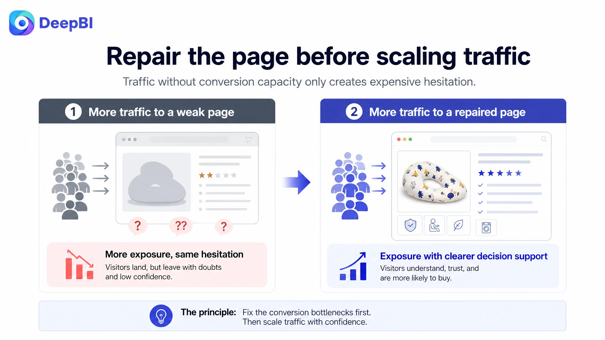
The case did not justify inventing a post-optimization ACOS or CVR result. It did, however, show why continuing to optimize traffic before repairing the page would be a poor decision order.
If an Amazon seller sends more paid traffic to a page with:
- A weaker trust structure
- A lower review rating
- A much smaller review base
- A less persuasive image sequence
- A+ content that presents features without enough evidence
- A title that describes the product more than its core outcome
then advertising may increase exposure without improving the page’s ability to convert that exposure.
The risk is not only wasted spend. It is misreading the resulting data.
A low conversion rate may lead the team to lower bids, pause useful terms, or keep restructuring campaigns when the more important question is whether the product page deserves more traffic in its current form.
The better sequence for this Amazon Listing was:
1. Identify the conversion bottleneck through category-level comparison
2. Prioritize the A+ and trust gaps
3. Reorder images around the primary breastfeeding use case
4. Rebuild the title and bullet-point logic
5. Apply the page changes within the product’s real physical and functional boundaries
6. Let later Amazon traffic and conversion data validate the new direction
This is the difference between optimizing activity and optimizing the constraint.
The Optimization Direction Changed the Seller’s Operating View
The final change was not simply “more images” or “better copy.”
It was a change in how the customer understood the Listing.
The product already had several usable assets: a meaningful ergonomic angle, an adjustable strap, removable support, breathable cotton, washable care, and multiple use cases. But those assets were not ranked according to the shopper’s decision path.
The revised direction placed the strongest competitive reasons earlier:
- Breastfeeding support before secondary use cases
- Parent comfort before general product description
- Structural explanation before care instructions
- Trust and fit reassurance before decorative presentation
- Direct comparison before repeated multi-use scenes
- Specialized scenario validation before the end of the page
The page therefore moved from feature accumulation toward guided decision-making.
No unsupported result should be attached to this change before the Amazon Listing has been tested with real traffic. The commercially meaningful improvement at this stage is that the team now has a clearer hypothesis: the product page must first recover its ability to explain, reassure, and convert before advertising can be judged fairly.
The Broader Amazon Lesson
This nursing pillow case illustrates a recurring problem in Amazon operations.
A seller may see a Listing with a complete title, several images, detailed bullets, and multiple use cases. The natural reaction is to keep adding information or to send more traffic.
But conversion is not created by the amount of information alone.
It depends on whether the Listing answers the buyer’s most important questions in the right order:
- What is this product primarily for?
- What problem does it solve?
- Why should I trust the solution?
- What makes its structure different?
- Can I see myself using it?
- What evidence reduces my hesitation?
- Why choose this product instead of a familiar alternative?
For this Amazon nursing pillow, the largest missed opportunity was not a missing keyword or a lack of functionality. It was the weak connection between product features, buyer concerns, and trust signals.
That is why DeepBI’s role in the case was not to produce a longer list of edits. It was to identify which gap was limiting the business outcome and which changes needed to happen before more traffic was treated as the answer.
Amazon ads can bring shoppers to a Listing. The Listing still has to earn the order.
The customer’s next optimization stage was therefore clear: repair the page’s sales logic first, then use advertising and organic traffic data to judge whether the repaired Listing can sustain stronger conversion.