

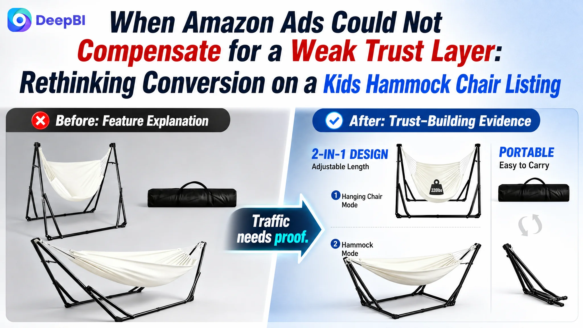
An Amazon seller in the kids’ hammock chair category was facing a familiar problem: the product had a clear 2-in-1 concept and several usable selling points, yet its Amazon Listing was not competitive enough to convert traffic consistently. The initial focus centered on making the offer more visible through keywords, product features, and image improvements.
That direction was not entirely wrong, but it was incomplete. The deeper issue was not simply that the Amazon ads or title lacked reach. The product page was asking shoppers to make a trust-heavy purchase decision without providing enough evidence at the moments when confidence mattered most.
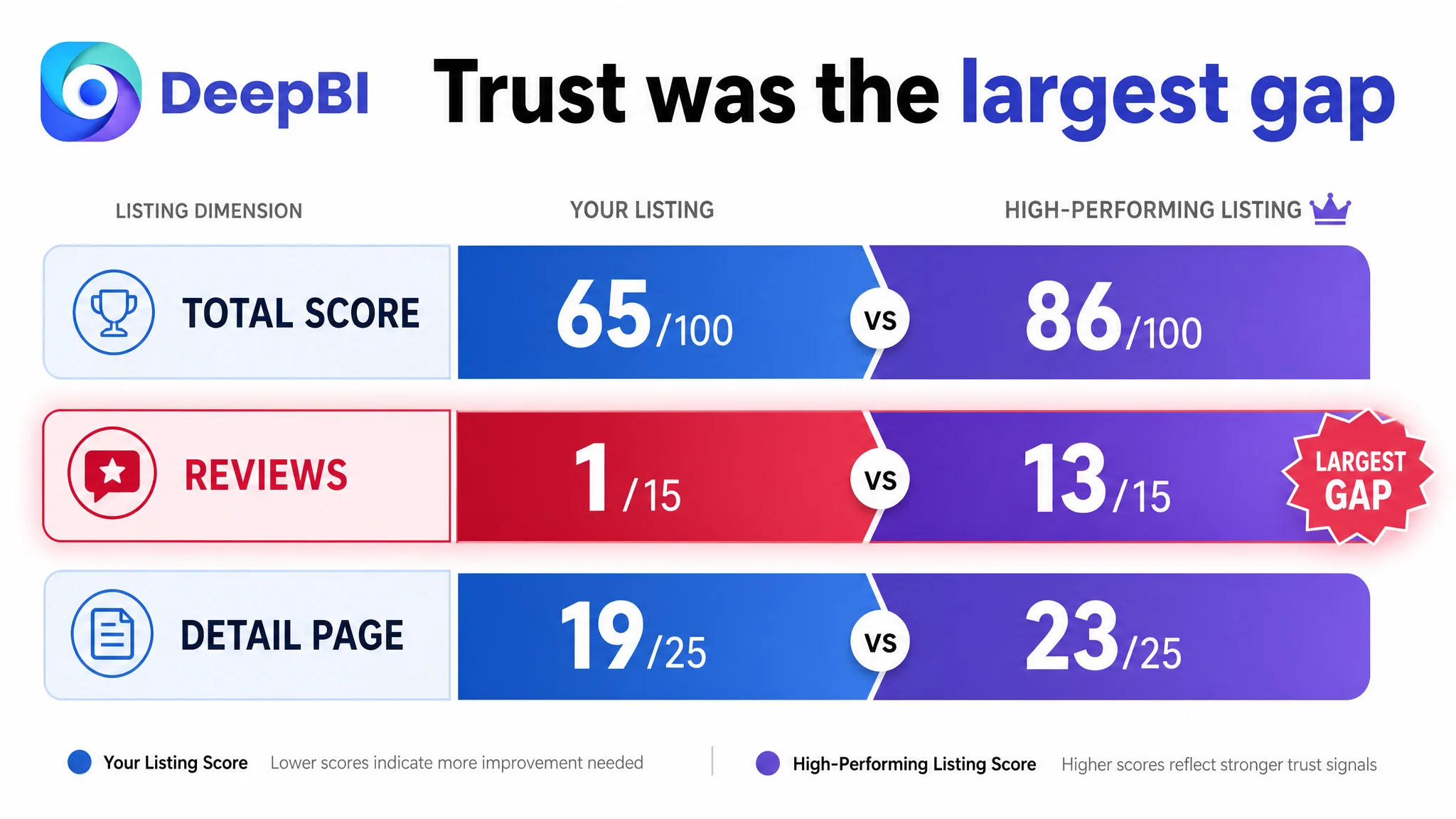
DeepBI’s comparison found a 65/100 Listing against 86/100 for a comparable high-performing Amazon listing. The largest gap was not the title or main image. It was the combination of missing review proof, incomplete A+ evidence, weak purchase logic in the bullet points, and visuals that explained the product without fully resolving concerns about safety, portability, setup, and real-world use.
For other Amazon sellers, the lesson is direct: before increasing ad pressure, determine whether the product page is ready to receive more traffic. In this case, the later optimization direction focused on rebuilding the Listing’s sales logic—especially trust, scenario clarity, operating simplicity, and evidence—rather than continuing to treat the problem as an advertising adjustment alone.
The Amazon Listing Had Traffic Potential, but Not Enough Conversion Support
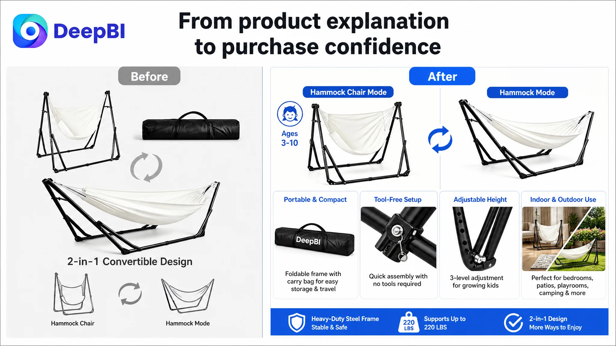
The product was positioned as a portable 2-in-1 kids’ hammock and swing chair with a collapsible steel frame. Its potential use cases were broad:
- Indoor playrooms and bedrooms
- Patios and backyards
- Camping and family travel
- Resting, reading, playing, and gentle swinging
The product also had several identifiable features:
- A convertible hammock and chair structure
- Adjustable height positions
- A steel frame
- A stated 220-pound capacity
- Indoor and outdoor use
- A portable folding design
On paper, these elements created a reasonable Amazon product proposition.
The problem was that the Listing presented many of them as separate facts rather than as a connected reason to buy. The page described what the product was, but it did not consistently show why a parent should feel confident choosing it over a more validated alternative.
The Listing did not primarily lack features. It lacked enough evidence for those features to feel dependable.
That distinction matters in Amazon operations. A product page can contain the correct keywords and still underperform if shoppers cannot quickly answer:
- Is this suitable for my child?
- Is it stable enough for everyday use?
- How difficult is it to switch between modes?
- Can I carry or store it easily?
- Does the product look real and trustworthy?
- Has anyone else already bought and used it?
The Original Diagnosis Was Too Close to “Improve the Listing Elements”
The initial optimization direction focused on recognizable Listing tasks:
- Rework the title
- Improve the main images
- Add stronger feature descriptions
- Clarify the 2-in-1 structure
- Highlight the 220-pound capacity
- Improve the five bullet points
- Add more visual explanations to the detail page
These are all valid actions. But when handled as isolated improvements, they can create the illusion of progress without fixing the conversion constraint underneath.
The title could gain better keyword coverage. The images could become more attractive. The bullets could include more benefits. Yet if the page still lacked review proof and persuasive evidence, Amazon ad traffic would continue arriving at a decision environment with unresolved doubts.
The customer’s working assumption was therefore too narrow: that better product communication would be enough to improve performance.
DeepBI reframed the question:
Was the Amazon Listing losing because shoppers could not find the product, or because they could not trust the product quickly enough after finding it?
The comparison showed that the second question deserved priority.
The Score Gap Was Not Evenly Distributed
DeepBI’s Listing comparison produced the following result:
- Title: Target Listing: 15/20, Comparable High-Performing Listing: 17/20, Gap: -2
- Main image: Target Listing: 24/30, Comparable High-Performing Listing: 26/30, Gap: -2
- Bullet points: Target Listing: 6/10, Comparable High-Performing Listing: 7/10, Gap: -1
- Detail page: Target Listing: 19/25, Comparable High-Performing Listing: 23/25, Gap: -4
- Reviews: Target Listing: 1/15, Comparable High-Performing Listing: 13/15, Gap: -12
- Total: Target Listing: 65/100, Comparable High-Performing Listing: 86/100, Gap: -21
The most important finding was not simply the total score. It was where the score was being lost.
The title, main image, and bullet points were behind, but only moderately. The review dimension created the largest difference by far:
- The target Listing had no meaningful review data and no visible customer review history.
- The comparable listing had 68 reviews, a 4.5-star average, and multiple reviews visible on the first page.
That gap changes the entire conversion environment.
A parent evaluating a children’s product does not assess the title and images in isolation. They also look for signs that other buyers have accepted the product’s safety, stability, comfort, and usefulness. When that evidence is absent, every other claim has to work harder.
The Real Constraint Was Listing Conversion Capacity
The product page was not suffering from one isolated creative flaw. It had a conversion capacity problem.
The Listing could attract attention with its product concept, but it did not complete the persuasion process strongly enough. Its content covered the basic product structure, yet several important buying questions remained insufficiently answered.
The title described the product, but did not prioritize the decision
The existing title led with a 2-in-1 concept and included phrases such as “Portable Hammock with Collapsible Steel Frame” and “Adjustable Folding Design.” However, parts of the wording repeated similar ideas without creating a clear order of importance.
The comparable listing used a tighter structure:
- Product form first
- Intended audience next
- Capacity and structural value after that
- Portability and use cases later
For the target Listing, the recommended direction was to bring the core phrase “Kids Hammock Chair with Stand” forward, retain the 2-in-1 functionality, and make the portable folding structure easier to understand.
This was not just an SEO exercise. The title needed to help shoppers identify the product and its intended use within a few seconds.
The main images showed functions, but did not resolve enough anxiety
The existing visual system communicated the product’s modes and structure, but much of the presentation remained conceptual or diagram-led.
Several gaps affected the page’s ability to build trust:
- The 2-in-1 function was not labeled clearly enough at first glance.
- The product was shown without a strong real-world setting.
- The safety concern around tipping was not addressed directly enough.
- The setup and mode-switching logic remained difficult to understand.
- The 220-pound capacity was not framed clearly for the intended age group.
- Portability was not supported by enough physical evidence, such as folded dimensions or storage context.
The issue was not that the images were unusable. It was that they often explained the product from the seller’s perspective rather than answering the shopper’s immediate questions.
A diagram can show how a product is built. A strong Amazon image must also show why the buyer should feel comfortable using it.
The bullet points contained information, but not a persuasive sequence
The bullet points leaned toward specifications and general descriptions. They mentioned product functions, materials, adjustment, comfort, and use environments, but the information did not form a strong progression.
The recommended structure followed a more deliberate order:
1. What the product does and who it is for
2. How the frame supports everyday use
3. How quickly it can be assembled or adjusted
4. What makes the experience comfortable
5. Where the product fits into family life
This structure moves from recognition to confidence, then from convenience to use-case value.
The product’s 220-pound capacity should be presented accurately and in context. It should not be positioned as a direct substitute for a competitor’s higher capacity. Instead, the page should explain why the stated capacity is appropriate for the intended age range and usage scenario.
Missing A+ Evidence Removed the Final Layer of Persuasion
The A+ content was not empty. It included:
- Scene comparisons
- Dual-mode explanations
- Adjustment details
- Safety guidance
- Multi-scenario layouts
But the content was not yet doing enough to support a high-consideration purchase.
The comparable listing used a broader evidence system:
- A side-by-side presentation of both modes
- Step-by-step operation guidance
- Adjustment-level explanations
- Indoor and outdoor usage guidance
- Size and specification diagrams
- Structural callouts
- Capacity information
- Portability demonstrations
- Seasonal and lifestyle scenarios
The target Listing’s A+ content had scenario coverage, but it lacked several forms of concrete proof.
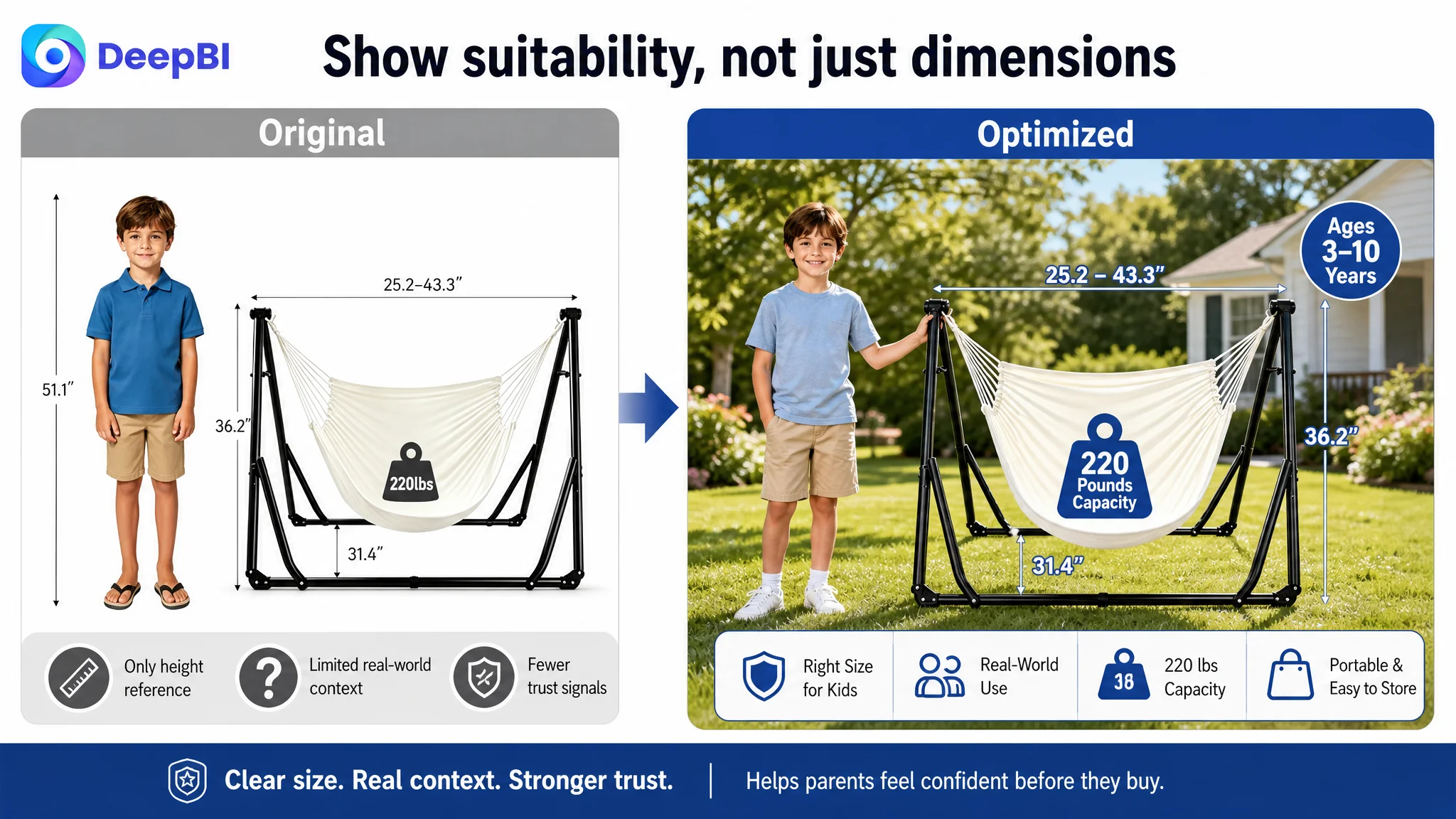
The page needed measurable evidence
The A+ content did not sufficiently visualize:
- Product dimensions in each configuration
- Folded or stored dimensions
- Capacity information
- Material specifications
- Structural details
- The physical setup sequence
For products involving children, furniture-like structures, and weight-bearing use, these details are not decorative. They help shoppers assess whether the product will fit their home, whether it appears stable, and whether it is practical to use.
The page needed to make portability believable
The Listing mentioned portability, but the A+ presentation did not make that benefit tangible enough.
A real storage context—such as the folded product placed in a vehicle trunk or prepared for a family outing—would answer a stronger question than a generic outdoor scene:
Can we realistically take this product with us?
The proposed direction was to show precise dimensions, folding evidence, and physical storage context rather than relying only on broad lifestyle imagery.
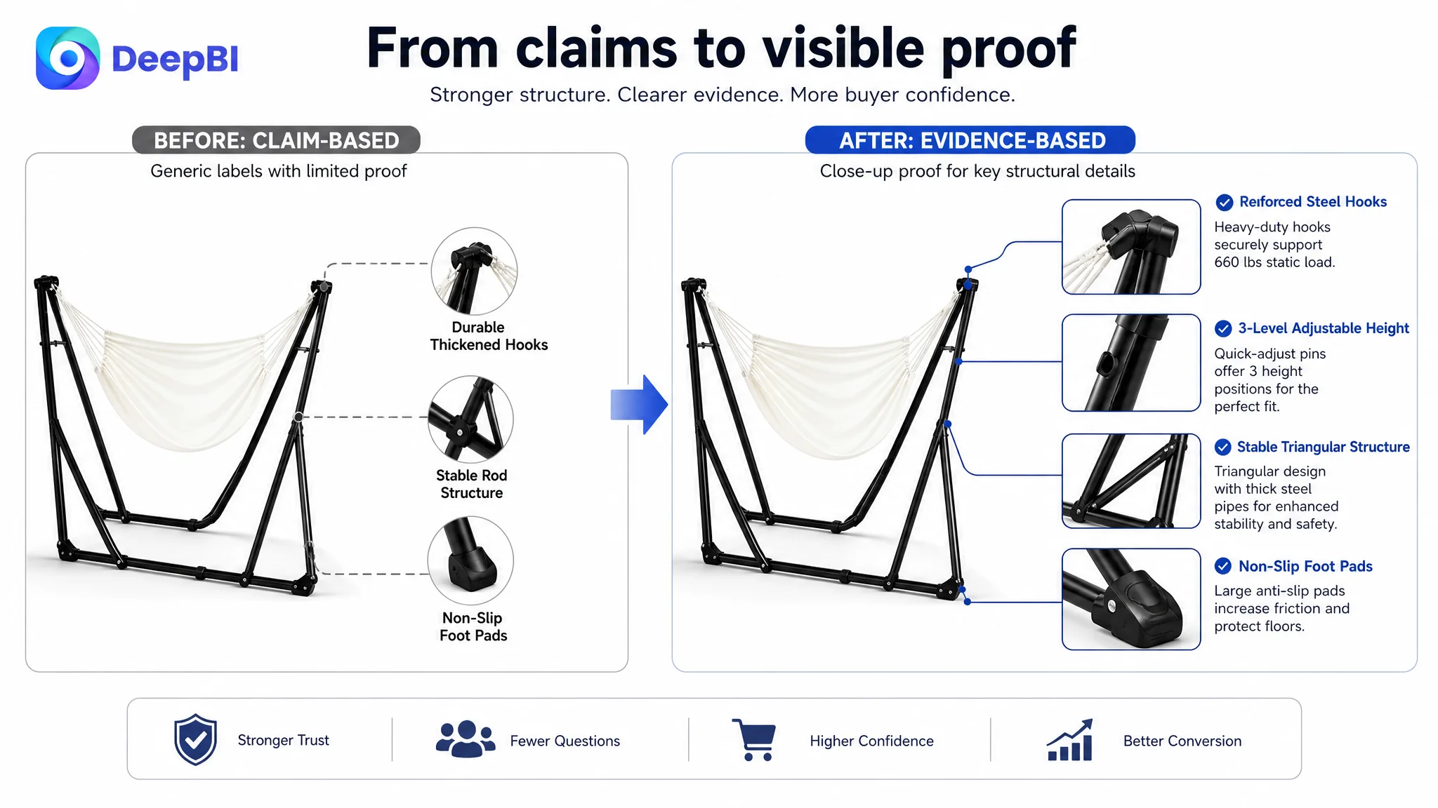
The page needed to prove structure rather than repeat claims
The content relied heavily on wording about stability and durability. The next step was to connect those claims to visible product evidence:
- Steel frame details
- Powder-coated finish, where accurate
- Hook and adjustment structure
- Fabric construction
- Proper use guidance
- Capacity information supported by confirmed specifications
Any safety-related language must remain within the product’s verified characteristics. The purpose is not to add stronger-sounding claims at any cost. It is to make existing claims easier to understand and more credible.
Why DeepBI Did Not Recommend Tuning Amazon Ads First
When an Amazon seller sees weak efficiency, it is natural to review bids, search terms, campaign structure, and keyword targeting. Those adjustments can be useful when the problem is traffic quality or traffic cost.
But they are not the first answer when the page itself cannot convert the traffic it receives.
In this case, the Listing comparison identified several page-level weaknesses that ads would not solve:
- No meaningful review proof
- A less precise title structure
- A main-image system without enough real-world trust
- Bullet points that did not build a clear decision path
- A+ content with insufficient quantitative evidence
- Portability and setup claims without enough physical demonstration
Continuing to increase ad pressure under these conditions could create a more expensive version of the same problem. More traffic would reach the page, but the page would still ask shoppers to resolve too many doubts on their own.
Advertising can amplify visibility, but it cannot manufacture review history, clarify an unclear setup process, or create trust where the product page has not provided evidence.
The priority was therefore to repair the Listing’s ability to receive traffic before asking Amazon ads to scale that traffic.
The New Optimization Direction Started With the Buyer’s Decision Sequence
DeepBI’s recommendations were not a list of cosmetic changes. They followed the way a shopper evaluates this type of product.
First: make the product immediately understandable
The opening visual should clearly present both product modes with distinct user positions:
- Hammock mode
- Chair or swing mode
Short labels should confirm what the shopper is seeing, rather than forcing them to interpret the image.
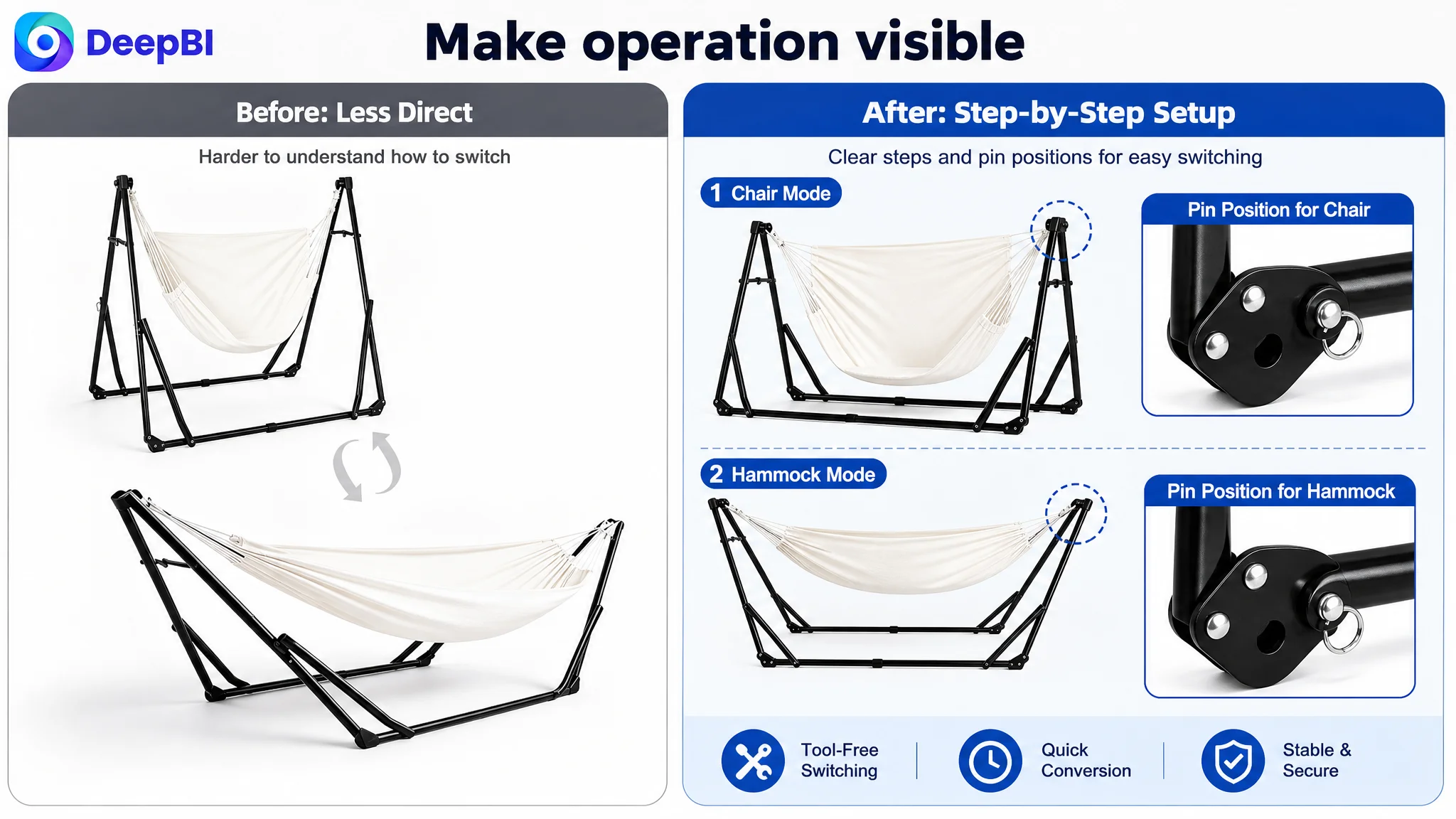
Second: reduce uncertainty about operation
The page should show the adjustment and conversion process physically.
Instead of repeating that the product is adjustable, the visual should demonstrate:
- Where the adjustment occurs
- How the hooks or pins are used
- How the mode is selected
- How the height can be changed
- Whether tools are required, if that is confirmed
This turns an abstract convenience claim into visible proof.
Third: make suitability more specific
The product should be framed for its actual intended audience, including the stated age range and 220-pound capacity where appropriate.
The page should explain suitability without implying that the product has a higher capacity or broader use case than it actually does.
A real child-centered indoor or outdoor setting would also make the intended scale easier to judge than an isolated illustration or generic white-background comparison.
Fourth: address stability through correct-use communication
Safety concerns should be handled through accurate structural information and positive usage guidance.
Rather than relying on vague labels such as “stable rod structure,” the content should make the relevant frame, hook, support, and usage details easier to see. If a specific anti-tip feature is not verified as part of the product, the Listing should not invent one. The objective is clearer evidence, not exaggerated positioning.
Fifth: make portability concrete
The product’s collapsible frame and travel use should be supported with:
- Folded dimensions
- Configuration dimensions
- Storage context
- Carrying or transport evidence
- Indoor and outdoor use scenes
This helps the shopper evaluate whether the product fits their home, vehicle, and routine.
The Main Business Risk Was Not Just Low Conversion
The Listing’s weaknesses created several connected risks.
Advertising dependence
If paid traffic is the primary source of visits but the page does not convert efficiently, the seller becomes increasingly dependent on advertising to produce each order.
Trust deficit
A product with no meaningful reviews must compensate through exceptionally clear product evidence. Without that evidence, shoppers may hesitate even when the product appears relevant.
Misunderstanding and return risk
When the two modes, setup process, dimensions, or intended audience are unclear, shoppers may buy with the wrong expectations. Better explanation can reduce this kind of mismatch.
Unstable traffic structure
A weak page can prevent paid traffic from becoming durable organic performance. If the Listing does not convert strongly enough, advertising may generate visits without creating the sales velocity and customer confidence needed for a healthier traffic mix.
These risks explain why the Listing had to be addressed before further ad expansion. The page was not merely under-optimized. It was not yet providing a stable foundation for traffic investment.
What the Case Reveals About Amazon Listing Optimization
This case does not provide post-optimization advertising or sales results, so no numerical improvement in CVR, ACOS, TACOS, or organic orders should be claimed.
The meaningful change at this stage was the change in operating judgment.
The Listing moved from a broad optimization question—“How can we make the product more visible?”—to a more useful business question:
What proof must the Amazon product page provide before additional traffic can become productive?
That change led to a more disciplined sequence:
1. Identify the largest competitive gap.
2. Separate traffic problems from page-conversion problems.
3. Repair trust and decision logic first.
4. Make the product’s use, setup, structure, and portability visible.
5. Reassess Amazon ad performance after the page is better prepared to convert.
DeepBI’s value in this process was not the number of recommendations produced. It was the ability to connect the score gap to the likely commercial constraint.
The Lesson for Amazon Sellers
A low-performing Amazon Listing is often diagnosed through the most visible symptom:
- ACOS looks too high
- Keywords seem too expensive
- The title may not rank well
- The main image may not attract enough clicks
- More ad spend appears necessary
But the more important question is whether the product page can turn attention into confidence.
For this kids’ hammock chair Listing, the largest weakness was not one missing keyword or one unattractive image. It was the absence of a complete trust path across the Amazon page:
- The title needed sharper product and audience clarity.
- The main images needed stronger real-world context and simpler functional explanation.
- The bullet points needed a more persuasive sequence.
- The A+ content needed dimensions, structure, capacity, and portability evidence.
- The review gap needed to be recognized as a major conversion constraint.
Before an Amazon seller increases advertising pressure, the Listing should be judged as a complete buying system—not as a collection of separate assets.
The right question is not whether the page contains enough information. It is whether the page gives shoppers enough reasons to proceed.
That was the central reframing in this case. Ads were not dismissed. They were placed in the correct order: after the Amazon Listing had done the work required to make traffic useful.