

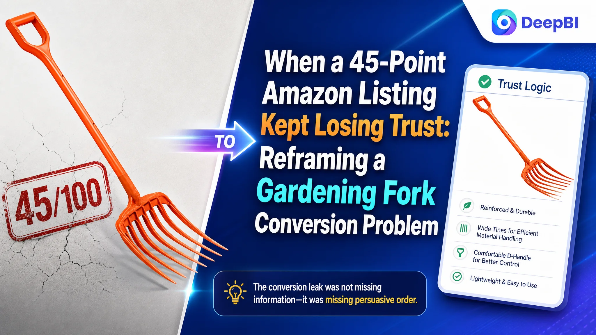
An Amazon gardening-tool seller was not facing a simple shortage of product information. The Listing already mentioned its material, handle, tine design, and intended uses. Yet the page still looked weaker than a comparable high-performing listing at the moment shoppers were deciding whether to click and whether to trust the product.
The initial working assumption was that the Listing needed isolated improvements: add more keywords to the title, refine a few images, and make the feature statements sound stronger. DeepBI found a more structural problem. The Amazon product page was presenting information, but it was not building confidence in the right order.
The customer’s Listing scored 45 out of 100, compared with 86 for the benchmark listing. The largest gap was not in one keyword or one image. It was in the page’s ability to connect product structure with user benefit through the title, main images, bullet points, A+ content, and reviews.
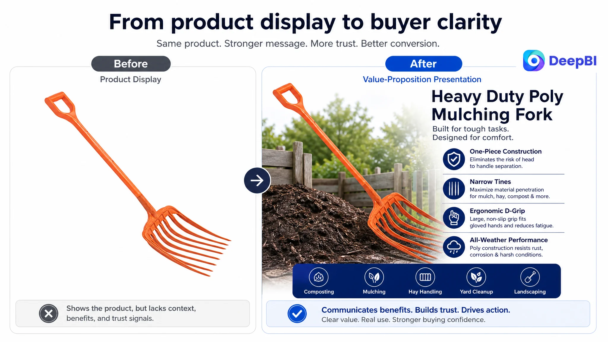
The later optimization therefore focused on rebuilding the Listing’s sales logic: make the poly material and one-piece construction easier to understand, show demanding gardening use cases earlier, explain why narrow tines matter, and use the product page to reduce doubts before additional traffic is pursued. For other Amazon sellers, the lesson is direct: when a Listing attracts attention but does not create enough trust, adding more traffic or repeating the same type of content may only expose the conversion leak more clearly.
The Amazon Listing Was Not Empty. It Was Difficult to Believe
The customer’s product was a poly mulching fork for gardening, landscaping, composting, yard cleanup, and related outdoor tasks.
At first glance, the page contained the expected components:
- A product title
- Five bullet points
- Product images
- Basic usage descriptions
- Claims about structure and performance
- A limited amount of review content
But Amazon shoppers do not evaluate these elements independently. They form a judgment quickly:
- What exactly is this tool?
- Why is it different from a standard pitchfork?
- Will the structure hold under pressure?
- Is the material durable enough?
- Can it move mulch, hay, or compost efficiently?
- Will the handle be comfortable during extended use?
- Can the seller’s claims be trusted?
The Listing did not answer these questions in a clear sequence.
The central problem was not a lack of product facts. It was a lack of persuasive order.
This distinction mattered because the page’s weaknesses were not evenly distributed. Some elements were acceptable in isolation, while the overall experience remained commercially weak.
The Original Diagnosis Focused on Individual Assets
The initial optimization direction was understandable. The title could use stronger search terms. The images could be improved. The bullet points could be rewritten. The A+ content could contain more information.
That approach treated the Listing as a set of separate assets:
- Add relevant keywords to the title
- Make the main image more attractive
- Describe the product’s material and structure
- Add more use cases
- Improve the wording of the bullet points
Each action had merit. But improving assets one by one would not necessarily solve the larger issue.
The customer’s page was still organized around product attributes rather than buyer decisions. It described what the fork had, but it did not consistently show why those features mattered during real gardening work.
For example:
- “Narrow tines” were described as a structural feature, but not clearly connected to penetration and lower effort.
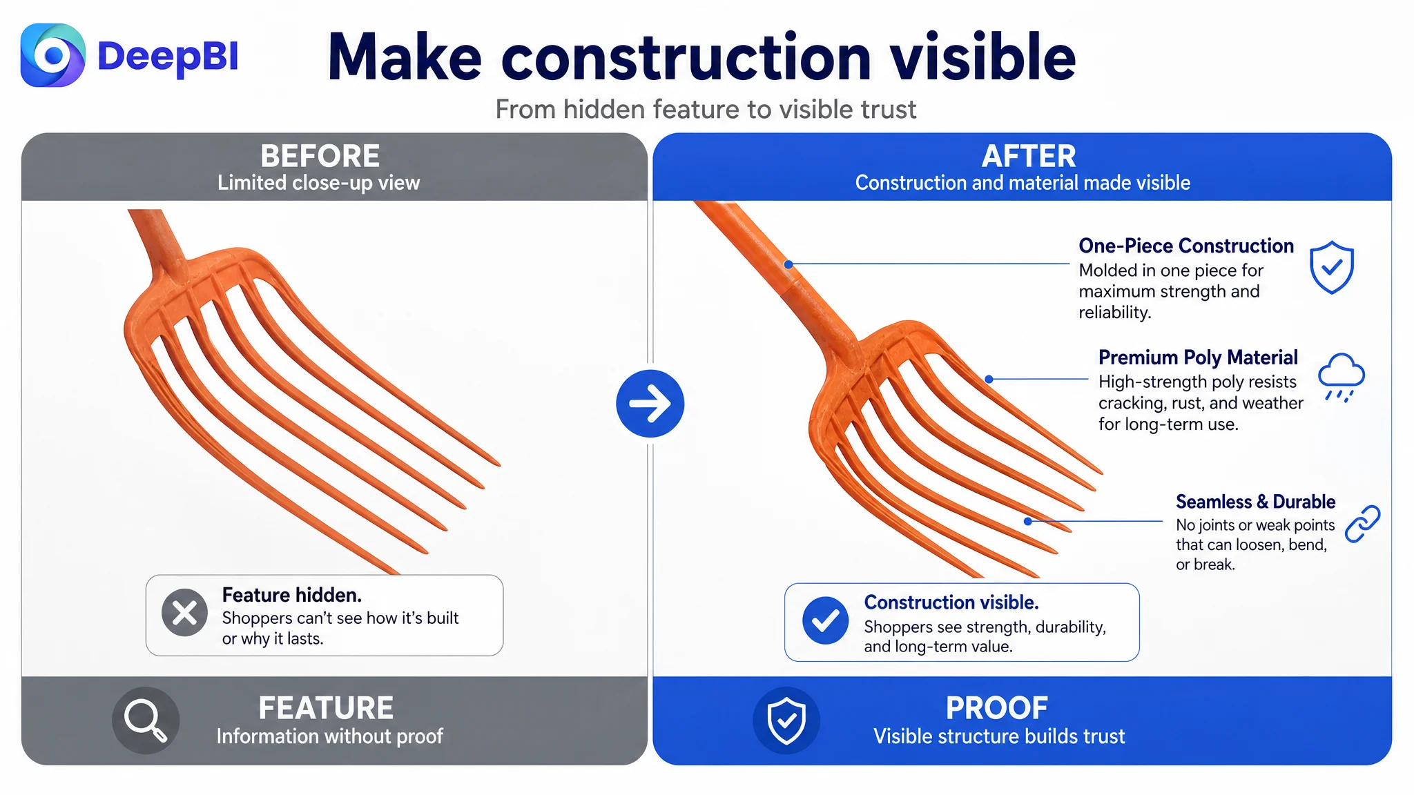
- “One-piece construction” was mentioned, but the page did not make structural reliability visually obvious.
- The poly material was present in the product identity, but its weather and durability advantages were not made central.
- Lifestyle images showed use, but did not clearly demonstrate efficiency, comfort, or demanding work.
- The A+ content repeated information rather than guiding the shopper from use case to proof.
This was the misdiagnosis: the team was looking for better individual expressions, while the deeper problem was that the page lacked a coherent trust-building path.
The Score Gap Revealed Where the Business Was Leaking
DeepBI’s comparison provided a more precise starting point than subjective design feedback.
- Title: Customer Listing: 11/20, Benchmark Listing: 16/20, Gap: -5
- Main images: Customer Listing: 21/30, Benchmark Listing: 27/30, Gap: -6
- Bullet points: Customer Listing: 5/10, Benchmark Listing: 8/10, Gap: -3
- Detail page and A+ content: Customer Listing: 3/25, Benchmark Listing: 21/25, Gap: -18
- Reviews: Customer Listing: 5/15, Benchmark Listing: 14/15, Gap: -9
- Total: Customer Listing: 45/100, Benchmark Listing: 86/100, Gap: -41
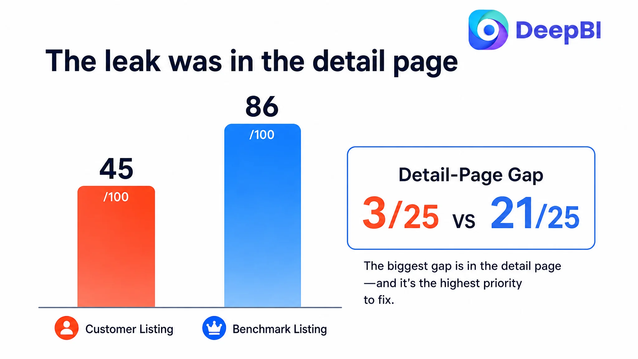
The most important signal was the 18-point difference in the detail-page dimension.
That gap changed the priority order.
The title and main images were underdeveloped, but the A+ and detail content represented the largest missed opportunity. The page had no strong visual explanation of its structure, material, use cases, or working benefits. It relied heavily on text and repeated product views, leaving shoppers to imagine the difference for themselves.
For an Amazon product page, that is a costly burden. If the shopper has to infer why the product is durable, efficient, or comfortable, the Listing is asking the customer to complete the sales argument.
The title was not doing enough work
The benchmark title placed the core category phrase near the front, then added specific product details, handle information, durability language, and use cases.
The customer’s title leaned more heavily toward the product name and general identity. It did not communicate the most important search and decision signals early enough.
The recommended structure therefore moved toward:
- Core category keyword
- Product type and material
- Tine design
- Handle type
- Durability positioning
- Mulch, compost, and landscaping use cases
The goal was not to copy a competitor’s wording. It was to make the product easier to identify and easier to qualify.
A shopper searching Amazon for a gardening pitchfork should not need to reach the bullet points to understand that the product is a poly mulching fork with narrow tines and a D-grip handle.
The main images repeated information instead of advancing the decision
The first several images were visually similar. Multiple close-ups focused on the tine head without adding a new reason to believe in the product.
That created information waste.
A shopper could see the fork, but the sequence did not answer the next questions:
1. What makes this product different?
2. Why should the structure be trusted?
3. How does it perform in mulch or compost?
4. Why do the narrow tines matter?
5. Will it be comfortable to use with gloves?
The benchmark listing used a clearer visual progression. It introduced the product with a strong visual identity, then moved through structure, material, size, and real use.
DeepBI’s recommendation was not simply to make the images more attractive. It was to give each image a distinct commercial role.
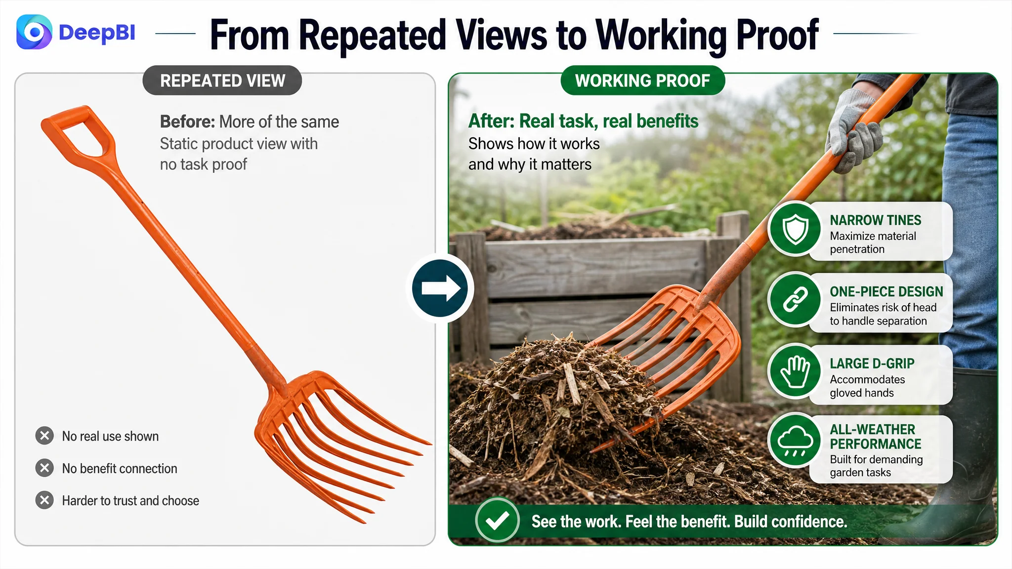
The Real Constraint Was Listing Conversion Capacity
The customer’s Listing had several credible product attributes:
- Poly material
- One-piece construction
- Narrow tines
- A large D-shaped grip
- Use across mulch, compost, cleanup, and landscaping
- An all-weather positioning
But these attributes were not connected into a persuasive chain.
The product page needed to move from:
“Here is the tool.”
to:
“Here is why this construction is reliable, how the tine design improves the work, and why the product is suited to the tasks you actually need to perform.”
That is the difference between information coverage and conversion capacity.
The product needed a clearer identity
The first content module should establish that this is not merely another generic pitchfork. It is a poly mulching fork designed around specific tasks such as moving mulch, handling compost, and completing yard cleanup.
This identity helps the shopper qualify the product quickly.
It also gives the rest of the page a clear direction. Once the product is positioned around mulching and related tasks, the narrow tines, one-piece construction, material choice, and grip can all support that use case.
The material needed to become a reason to trust
The page referenced the product’s poly construction, but the material was not being used as a clear point of differentiation.
The optimization direction was to explain the material through customer-relevant benefits:
- Durability in outdoor use
- All-weather suitability
- Resistance to concerns about structural failure
- A clear contrast with common metal or fiberglass expectations, without making unsupported claims
The material should not appear as a technical label floating beside the product. It should answer a concern: why should a shopper believe this tool can handle repeated gardening work?
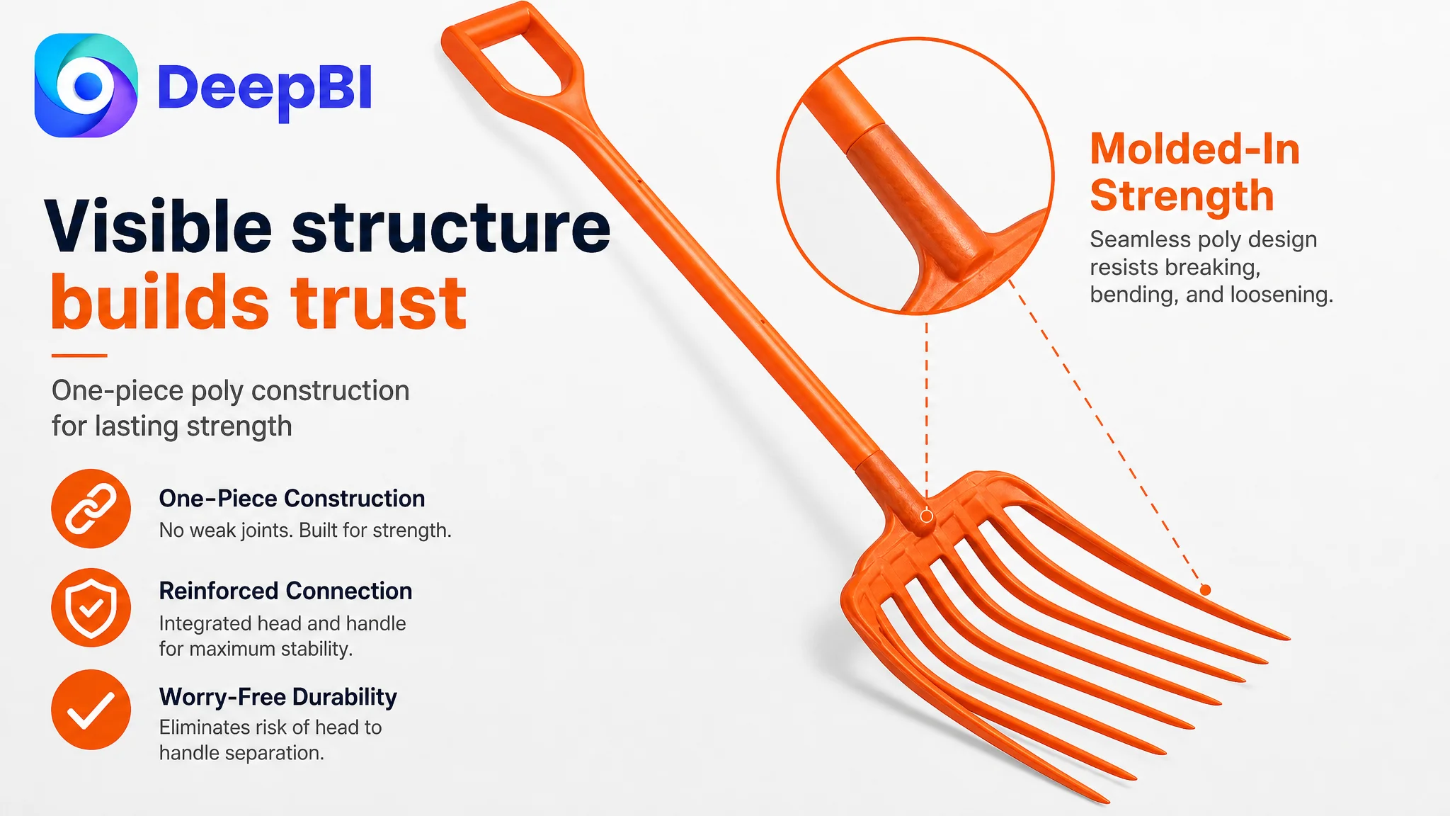
One-piece construction needed visual proof
The analysis identified structural failure as a major concern in this category. Shoppers may wonder whether the head and handle can separate, especially when the tool is used under pressure.
The Listing mentioned one-piece construction, but the page did not give that claim enough visual weight.
The revised content direction placed this benefit earlier and supported it with:
- A structural breakdown image
- A labeled view of the connection area
- A use-case image showing the tool under working pressure
- Clear copy explaining the relationship between one-piece construction and structural stability
The point was not to promise that the tool could never fail. It was to make the product’s construction easier to inspect and understand.
A durability claim becomes more credible when the shopper can see the construction that supports it.
Narrow tines needed to be translated into work efficiency
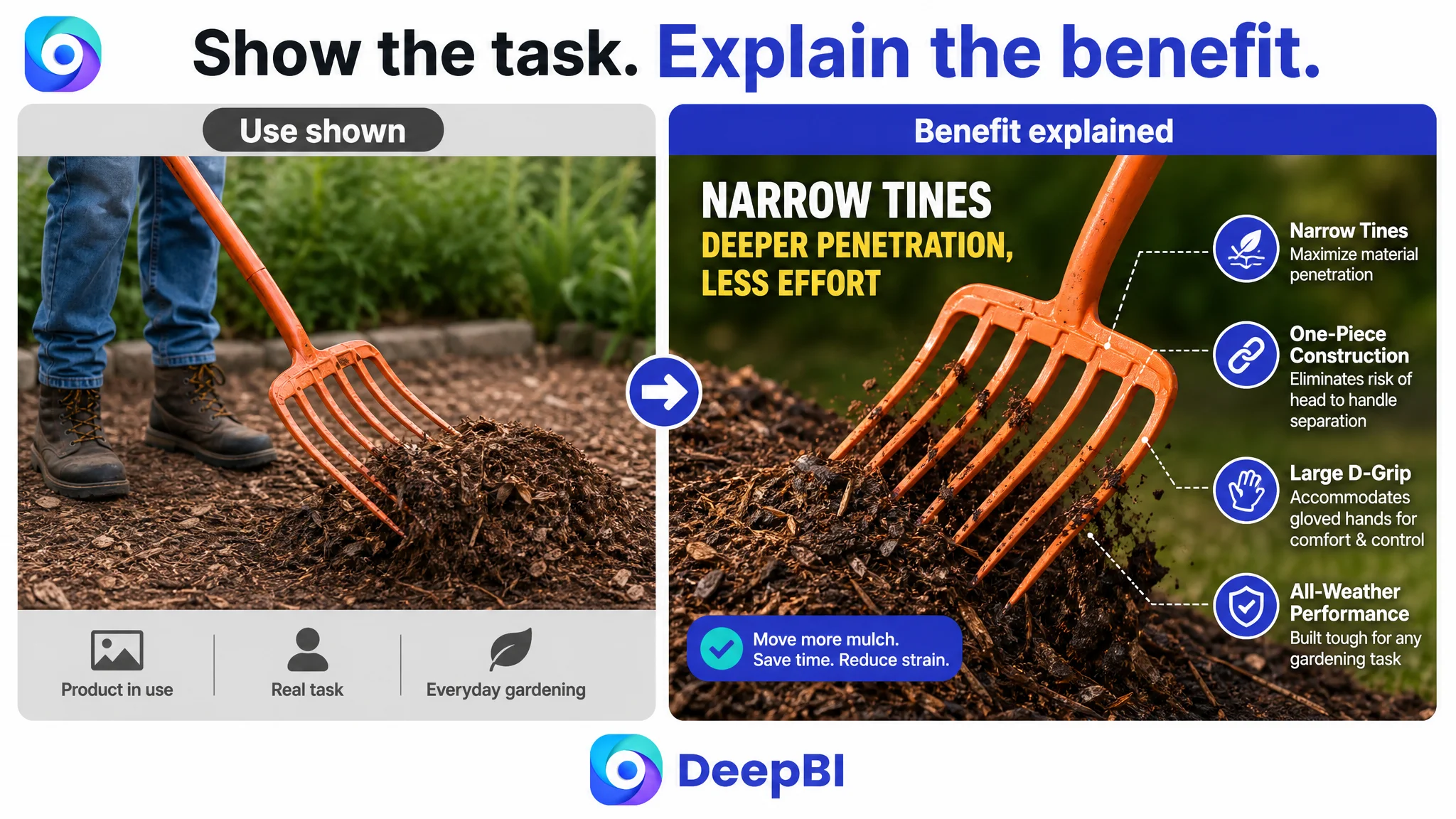
“Narrow tines” is a specification. It is not automatically a benefit.
The page needed to connect the design with practical tasks:
- Penetrating mulch and compost
- Moving material with less resistance
- Handling hay and yard debris
- Supporting more controlled pickup and movement
This is where the bullet points also needed restructuring. Instead of presenting general performance statements, each point should follow a more useful pattern:
Product feature → practical effect → relevant task
For example, the narrow tine design could be connected to penetration and material handling. The D-grip could be connected to a secure hold, including use with gloves. The product length and balance could be connected to reduced bending during regular work, provided the claim remains consistent with the actual product.
Why DeepBI Did Not Prioritize More Advertising First
This case did not provide post-optimization advertising results, so it would be inaccurate to claim a specific ACOS decline, CVR increase, or organic-ranking recovery.
The decision logic was still clear.
Before an Amazon seller increases traffic pressure, the product page must be able to make productive use of that traffic. Otherwise, more clicks can simply send more shoppers into the same unresolved doubts.
For this Listing, the largest risk was not that shoppers had no access to information. It was that the information did not arrive in a convincing sequence:
- The title did not establish the strongest identity early enough.
- The image sequence did not create enough differentiation.
- The bullet points listed features without consistently closing the user-benefit loop.
- The A+ content did not provide visual proof.
- The review profile offered limited trust support.
That meant continued traffic expansion could amplify the page’s weaknesses rather than solve them.
Advertising can bring a shopper to the product page. It cannot make an unclear product identity, weak proof, or missing trust structure disappear.
The correct order was therefore:
1. Clarify the product’s Amazon search and category identity.
2. Rebuild the visual sequence around differentiation and proof.
3. Connect product features to gardening outcomes.
4. Use A+ content to explain structure, material, comfort, and applications.
5. Strengthen the page’s ability to convert both paid and organic traffic.
6. Only then evaluate whether additional traffic investment is being absorbed efficiently.
The A+ Content Was the Largest Unused Conversion Layer
The detail-page score of 3 out of 25 showed that the page was not using A+ content as a sales argument.
The benchmark listing created a visual narrative that moved through:
- Product use
- Structural details
- Material explanation
- Ergonomic interaction
- Real working conditions
- Practical results
The customer’s page remained primarily text-based. That created three problems.
It left the product too abstract
A gardening tool is easier to trust when shoppers can see its working context. A clean product shot confirms what the item is, but it does not show how it behaves when moving mulch or compost.
It failed to show the construction logic
One-piece construction, the poly material, narrow tines, and D-grip handle are all easier to understand when shown through labeled close-ups and use-case images.
It did not build a complete decision path
A strong A+ sequence could be organized around seven roles:
1. Identify the product as a poly mulching fork.
2. Introduce the primary tasks: mulch, compost, cleanup, and landscaping.
3. Explain the material and all-weather positioning.
4. Show how one-piece construction supports structural stability.
5. Demonstrate narrow tine penetration and material handling.
6. Highlight the D-grip and compatibility with gloved use.
7. Close with a summary of the product’s material, construction, and versatility.
This is not about adding images for decoration. Each module should remove a specific doubt.
The Reviews Added Risk Instead of Resolving It
The review dimension also showed a meaningful trust gap.
The customer Listing had:
- 3.9 stars
- 8 total reviews
- 5 reviews visible on the first page
- 2 of those 5 reviews rated two stars or below
- Negative feedback concentrated on product length and strength
The benchmark listing had:
- 4.7 stars
- 130 total reviews
- 8 reviews visible on the first page
- No low-rating reviews among those visible reviews
The difference was not only volume. It was the shopper’s first impression of product risk.
A small review base with visible negative feedback gives the product page little room to make unproven claims. Statements about durability, comfort, and performance need to be particularly precise and supported by clear product evidence.
This does not mean the Listing could solve its review history through copy alone. It means the page needed to avoid making unsupported promises while using images and content to answer the exact concerns appearing in customer feedback.
The comments about length and strength also reinforced the priority of the detail-page work. The page needed to explain its construction, working posture, handle design, and intended tasks more clearly.
The Optimization Direction Became More Focused
DeepBI’s diagnosis did not produce a long list of disconnected changes. It established a hierarchy.
First: rebuild the product identity
Make the title and opening content clearly communicate:
- Poly mulching fork
- Narrow tines
- D-grip handle
- Heavy-duty gardening use
- Mulch, compost, and landscaping applications
Second: replace repeated images with proof nodes
Each image should answer a different question:
- What is the product and why is it different?
- How is it constructed?
- How does it perform in mulch or compost?
- Why do the narrow tines matter?
- How does the grip support comfortable use?
The product itself should remain accurate. The improvement should come from composition, sequence, labels, and context rather than changing the product’s physical properties.
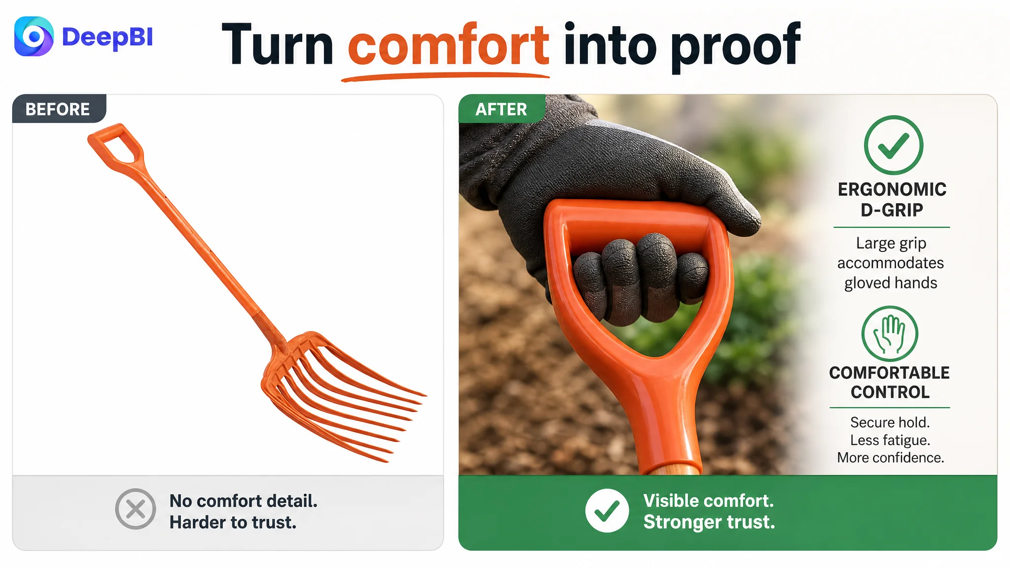
Third: turn bullet points into decision support
The revised bullet logic should connect:
- Material to durability
- Construction to structural confidence
- Narrow tines to penetration and efficiency
- D-grip to handling comfort
- Product size and balance to practical gardening posture
- Multi-task use to specific jobs rather than generic versatility
Fourth: make A+ content carry the trust burden
The detail page should show the product in demanding but truthful use cases, including mulching, composting, and cleanup. It should also visually explain the product’s construction and material advantages instead of repeating general claims.
What Changed in the Customer’s Business Understanding
Because the case material does not include post-optimization metrics, the final change should not be described as a confirmed increase in CVR, a reduction in ACOS, or a recovery of organic orders.
The more important change was in operating judgment.
The customer no longer had to treat every weak result as a request for more keywords, more traffic, or more isolated creative revisions. The Listing could be evaluated as a conversion system:
- Does the title identify the product clearly?
- Does the first image create a reason to continue?
- Do the images prove the product’s structure and use?
- Do the bullet points connect features to work outcomes?
- Does A+ content answer the main trust concerns?
- Do reviews support or undermine the page’s promises?
For this gardening fork, the answer was initially uneven. The product had usable differentiators, but they were not presented with enough evidence or sequence.
That reframed the optimization from “make the Listing look better” to:
Make the product easier to identify, easier to trust, and easier to choose on Amazon.
The Broader Lesson for Amazon Sellers
A weak Amazon Listing does not always look broken. It may contain the correct product name, a reasonable set of images, and several legitimate features.
The deeper problem may be that the page does not help the shopper move from recognition to confidence.
This case shows why Amazon sellers should not evaluate title, images, bullet points, A+ content, and reviews as independent checkboxes. Their commercial value depends on how well they work together.
A title can improve search relevance, but it must also establish the product’s identity.
A main image can show the product clearly, but the image sequence must create differentiation and proof.
A bullet point can mention a feature, but it should connect that feature to a real task or concern.
A+ content can add visual depth, but every module should help resolve a decision barrier.
And advertising can generate visits, but the Listing still has to earn the order.
For the gardening-fork seller, the decisive finding was not that the product lacked potential. It was that the page had not yet converted its real product advantages into a credible Amazon buying argument.