

This case follows an Amazon seller in the US marketplace whose collapsible wagon listing was competing in a category where traffic alone was not enough. The customer listing had the product fundamentals—heavy-duty construction, all-terrain wheels, a compact folding design, and multiple use cases—but its overall Listing score was 75, compared with 86 for a comparable high-performing listing.
The initial direction focused on familiar improvements: refine the title, add more functional details, clarify specifications, and communicate the wagon’s 280-pound load capacity. Those changes addressed visible content gaps, but they did not fully answer the more important Amazon product-page question: could a shopper quickly understand the product’s usefulness, trust its claims, and feel confident placing an order?
DeepBI ultimately identified the larger constraint as Listing conversion capacity. The main image relied too heavily on abstract numbers, the A+ content listed features without building a strong problem-to-solution story, and the review profile created a substantial trust disadvantage. The later optimization therefore shifted toward realistic use scenes, intuitive portability proof, earlier presentation of folding and cleaning benefits, clearer title structure, and stronger evidence around capacity and durability.
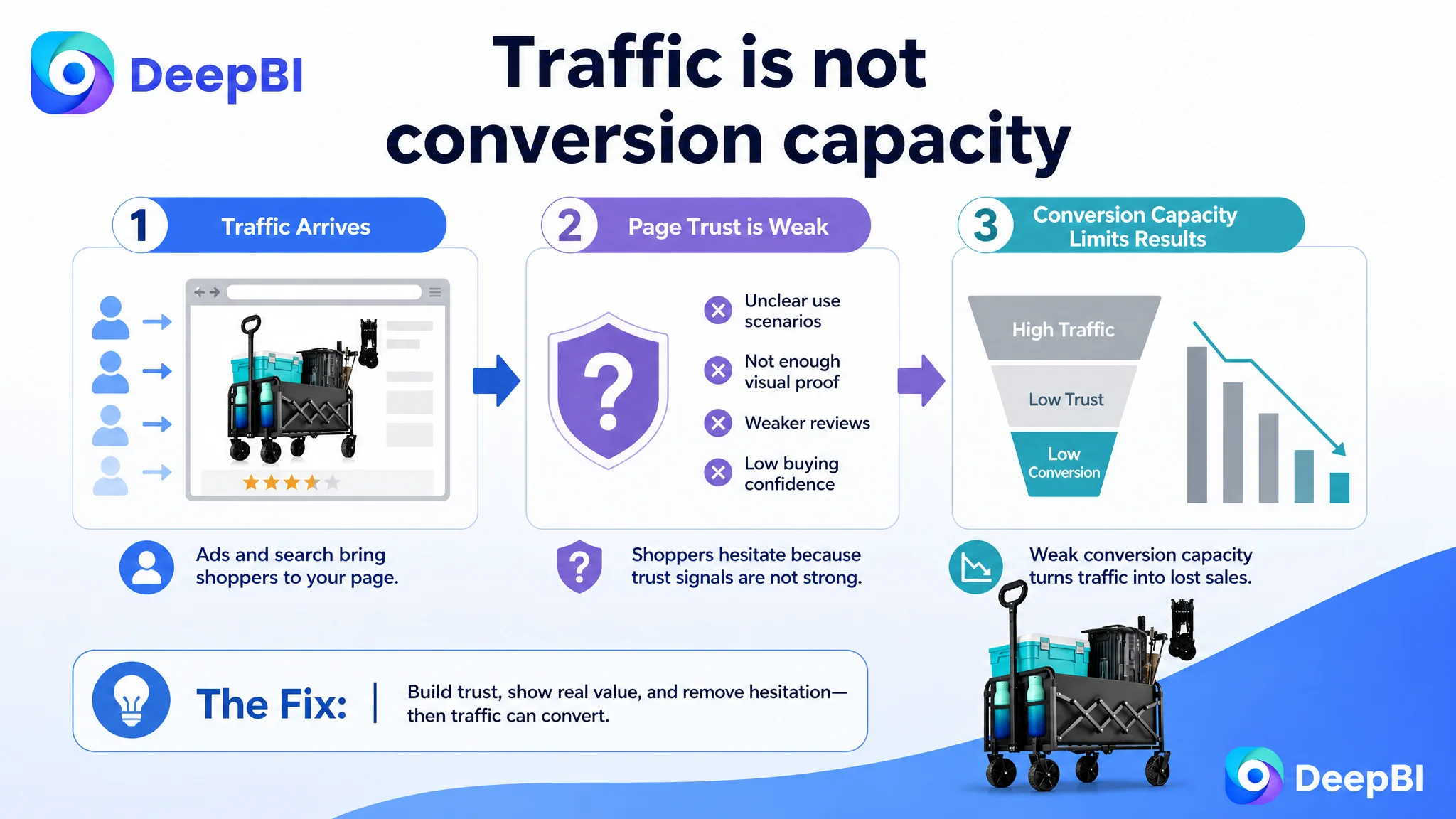
For other Amazon sellers, the lesson is direct: when advertising traffic is difficult to convert, the answer is not always more keyword or bid adjustment. Before sending more paid traffic to an Amazon product page, sellers need to determine whether the page gives shoppers a clear reason to click and enough evidence to buy.
The Listing Had Product Advantages. The Page Was Not Making Them Easy to Believe.
The customer’s Amazon Listing was not empty or poorly equipped.
It communicated:
- A 280-pound static load capacity
- A 120-liter storage space
- An 11-pound net weight
- A carbon steel frame
- 600D Oxford fabric
- All-terrain wheels
- A folding design
- Two cup holders
- Uses across gardening, camping, shopping, beaches, and sports
On paper, these were meaningful selling points. The problem was how those points were arranged and demonstrated.
The listing presented many attributes, but the buying path was not sufficiently clear. A shopper could see the specifications without immediately understanding:
- How easy the wagon would be to carry
- Whether it would remain stable on grass, gravel, or sand
- How quickly it could be folded and stored
- Whether the fabric could be cleaned conveniently
- Why this wagon deserved consideration beside a lighter, more established competitor
That distinction matters on Amazon. A page can contain the right information while still failing to convert because the information arrives in the wrong order, with too little visual evidence, or without a clear connection to the shopper’s actual concern.
The issue was not a lack of product claims. It was a lack of convincing sales logic connecting those claims to everyday use.
The First Diagnosis Focused on Content Gaps, Not Conversion Capacity
The customer team initially looked at the Listing through the lens of product information.
The title needed more relevant terms. The images needed more specifications. The bullet points needed to communicate load capacity, materials, wheel performance, and use cases. The A+ content needed to show more product details.
That diagnosis was understandable. The score comparison showed gaps in several areas:
- Title: Customer listing: 16/20, Comparable listing: 18/20, Difference: -2
- Main images: Customer listing: 24/30, Comparable listing: 26/30, Difference: -2
- Bullet points: Customer listing: 8/10, Comparable listing: 7/10, Difference: +1
- A+ content: Customer listing: 21/25, Comparable listing: 23/25, Difference: -2
- Reviews: Customer listing: 6/15, Comparable listing: 12/15, Difference: -6
- Total: Customer listing: 75/100, Comparable listing: 86/100, Difference: -11
The customer listing was not behind in every dimension. Its bullet points even scored slightly higher than the comparable listing. That made the diagnosis more complicated: simply adding more copy would not necessarily solve the business problem.
The largest visible weakness was the review dimension, followed by smaller but connected gaps in the title, main images, and A+ content. The page did not need a random collection of edits. It needed a clearer priority order.
The customer’s listing was trying to prove that the wagon was strong and versatile. The stronger listing was making the product feel easier to understand, easier to use, and safer to choose.
The Review Gap Made Every Other Conversion Problem More Expensive
The review comparison changed the way the Listing had to be evaluated.
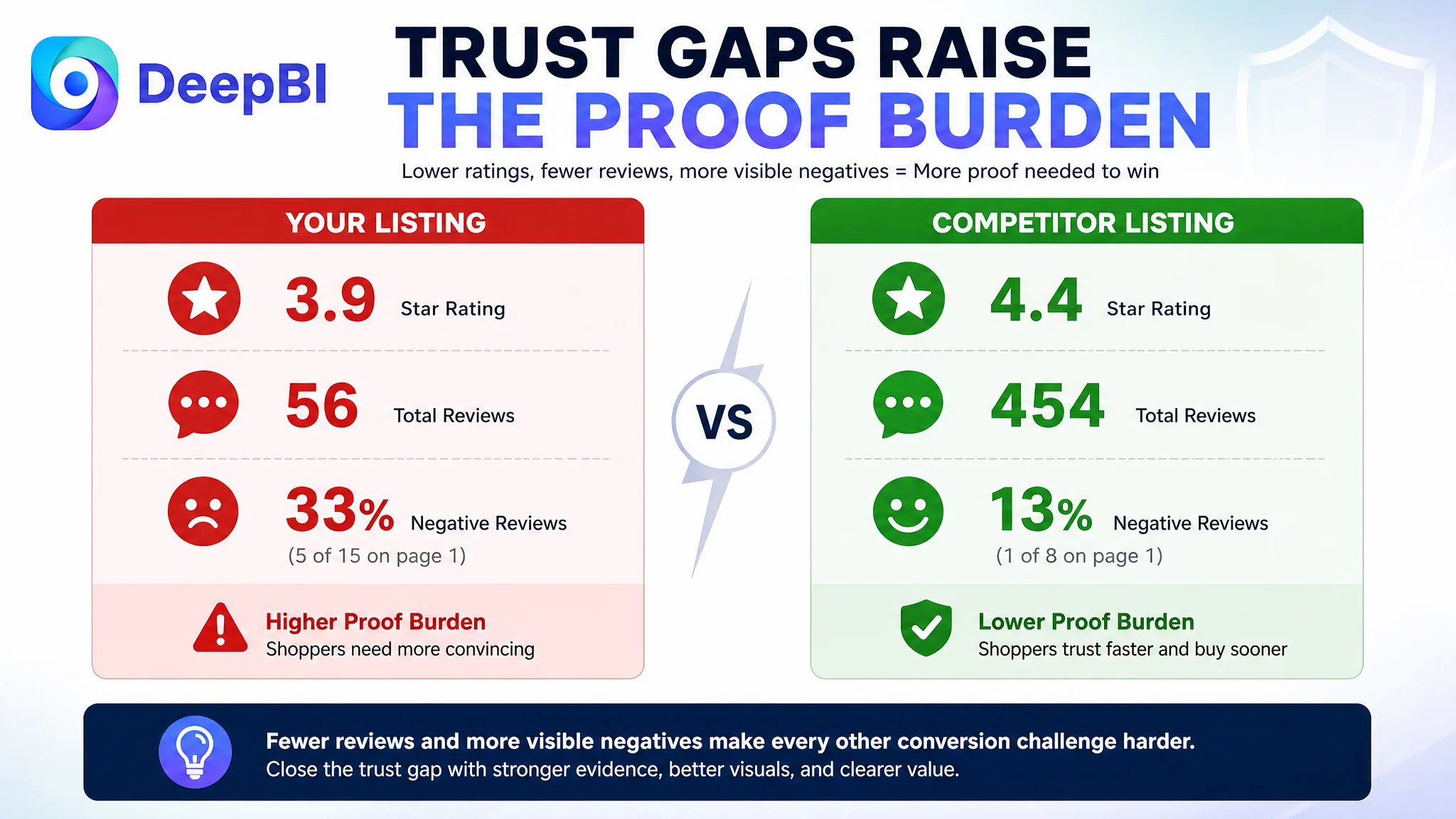
The customer listing showed:
- 3.9 stars
- 56 total reviews
- 15 reviews visible on the first page
The comparable listing showed:
- 4.4 stars
- 454 total reviews
- 8 reviews visible on the first page
The difference was not merely a matter of review count. The customer listing also had five one-star reviews among the 15 visible reviews, while the comparable listing had only one review at three stars or below among the eight visible reviews.
This created a trust burden that title and image improvements alone could not erase.
A shopper comparing two similar Amazon wagons may tolerate a small difference in wording or image style. A lower star rating, a much smaller review base, and a higher visible share of negative feedback are harder to overcome. They increase the amount of proof required elsewhere on the page.
This does not mean the team could solve the problem by waiting for more reviews. Review volume was a structural disadvantage, but it was not the only actionable issue. The page needed to compensate by becoming more concrete and more credible in the areas it could control:
- Show the product working in realistic settings
- Demonstrate how it handles weight and terrain
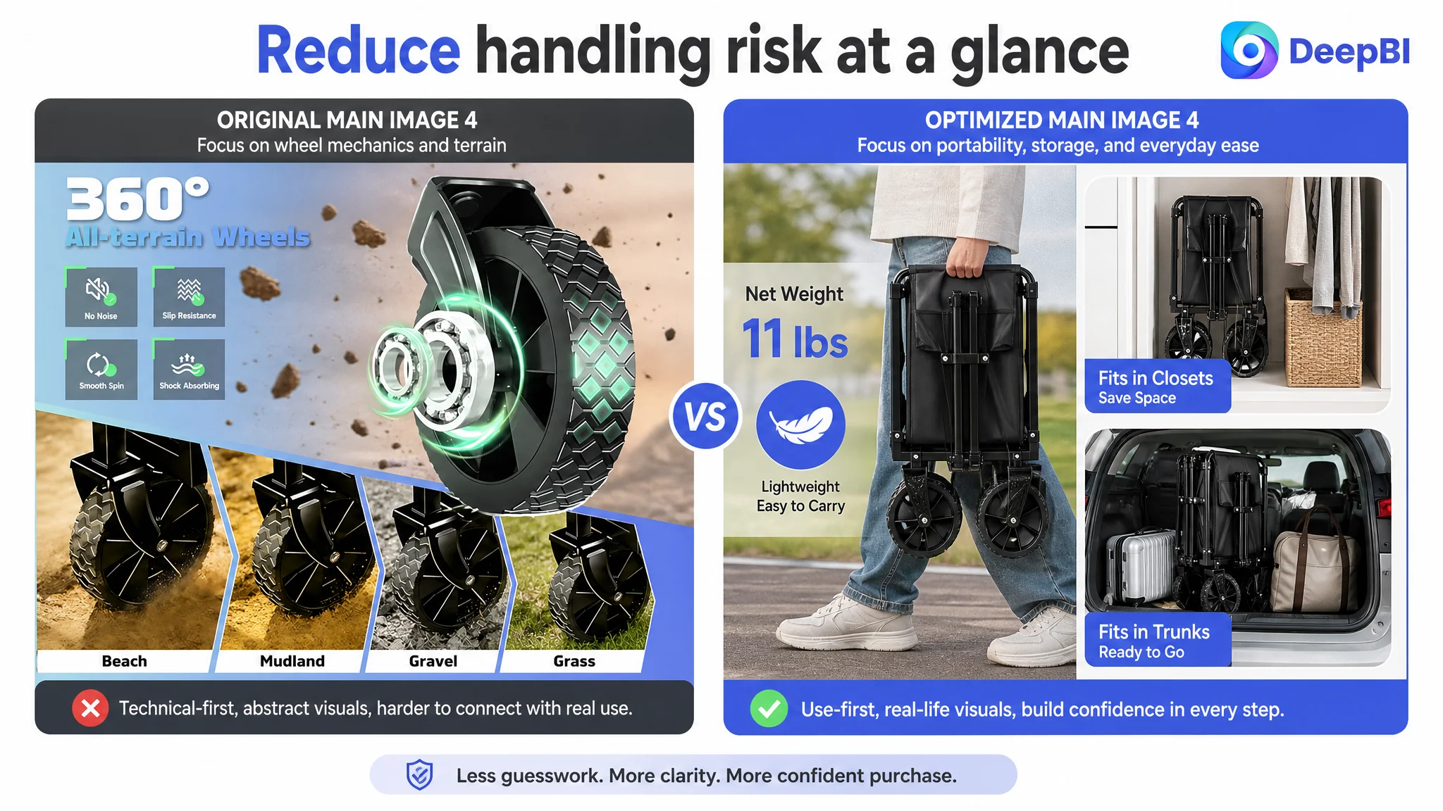
- Make portability understandable at a glance
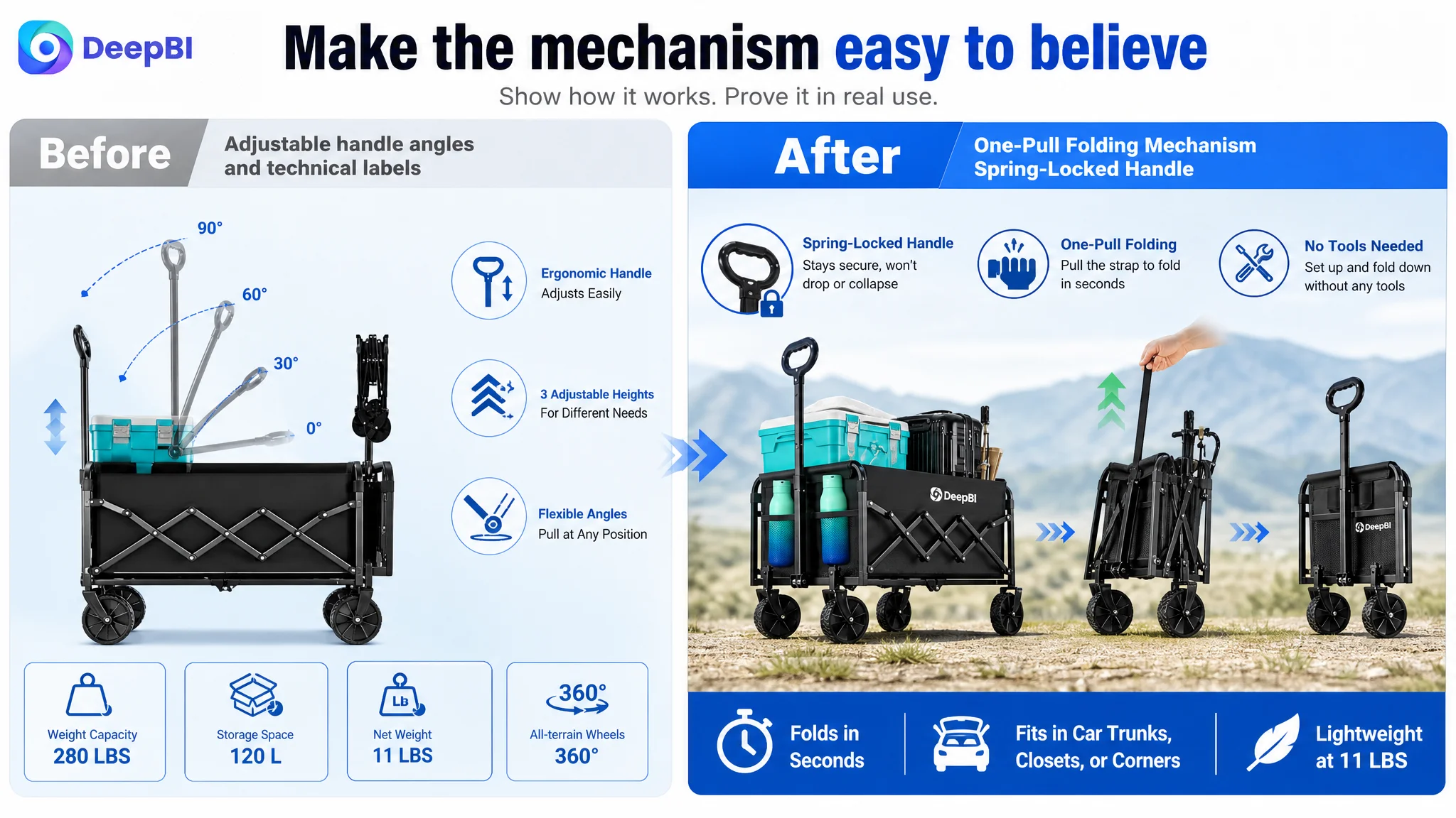
- Explain the folding mechanism clearly
- Present material and durability claims with visible evidence
- Move important doubt-resolving content earlier in the page
The review weakness made a vague page more vulnerable. It also made unsupported or purely decorative claims less useful.
The Main Image Was Showing Specifications Before Creating Desire
The main image system leaned heavily on technical communication.
It used dimensions, weight, load capacity, wheel details, and structural information to explain the wagon. Those details were relevant, but the sequence was not aligned closely enough with how shoppers make a quick Amazon decision.
The first question is often not:
“What is the complete specification set?”
It is closer to:
“Can this help me move the things I need to move, and will it be easy enough to handle?”
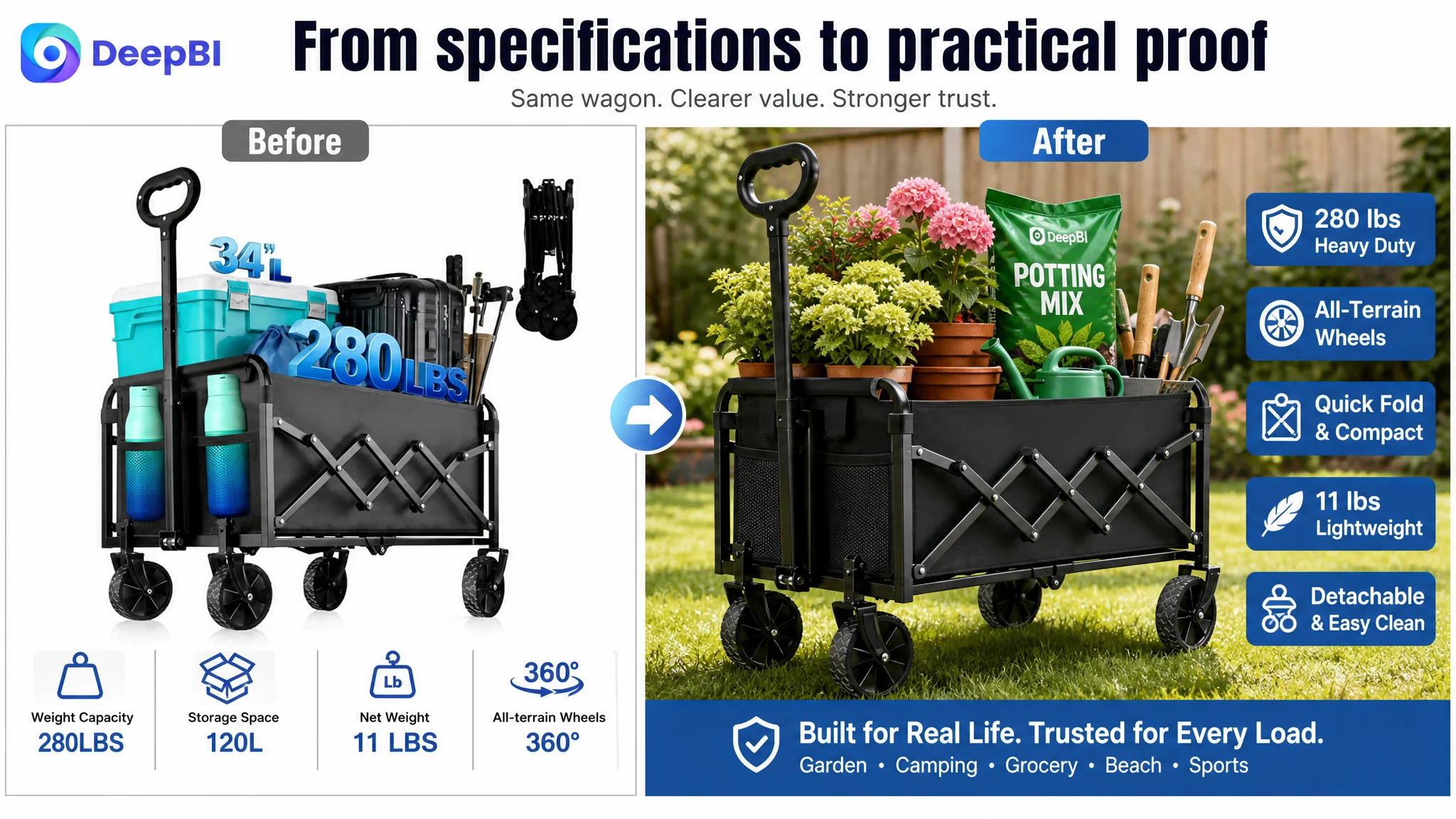
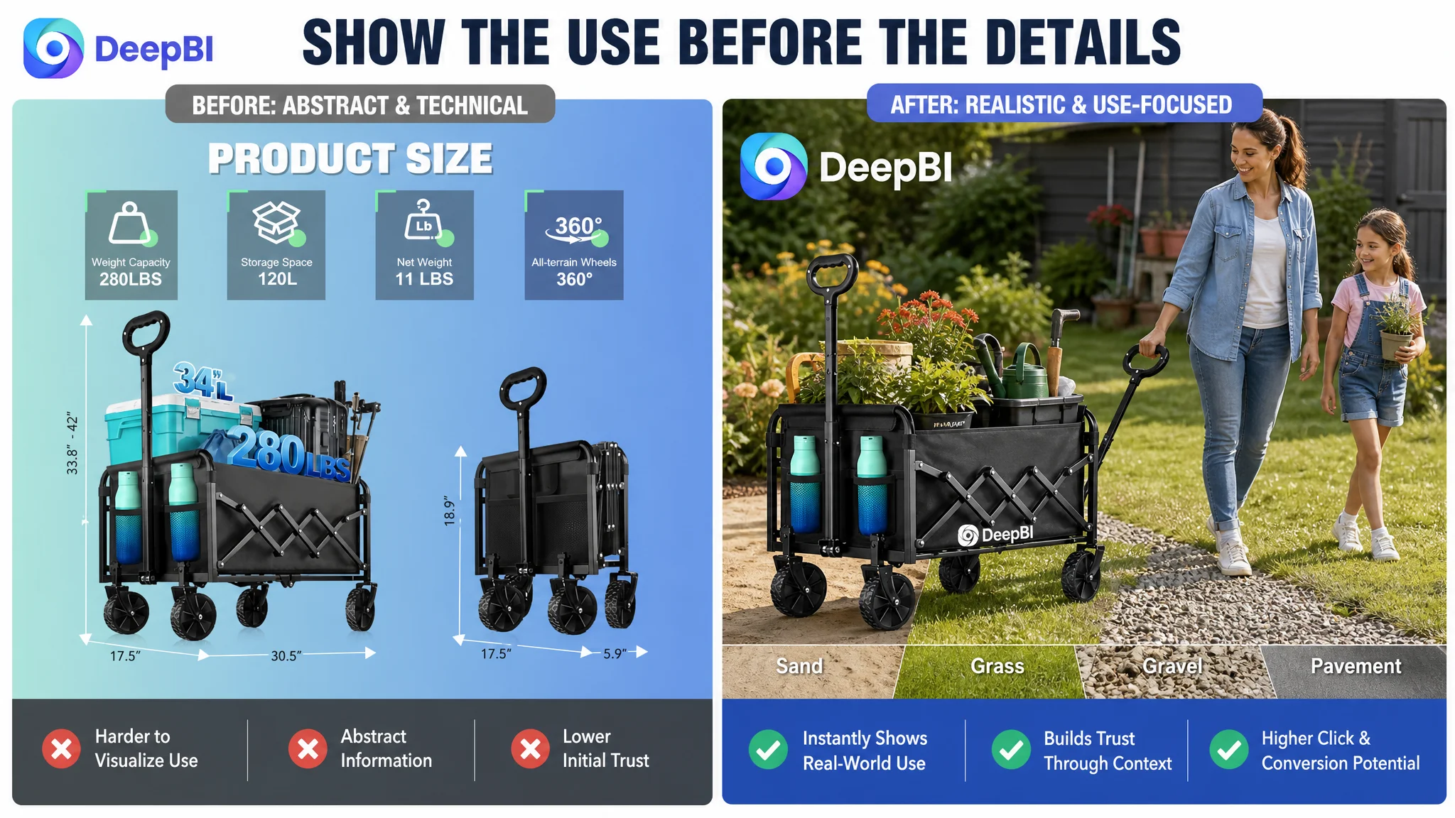
The customer’s existing image direction made the wagon look technically described rather than immediately useful. The visual treatment lacked enough realistic gardening and outdoor context to trigger instant recognition. On mobile search results, this reduced the chance that a shopper would form a clear use-case connection before moving to another listing.
The recommended direction was not to add more abstract numbers. It was to make the product’s usefulness visible.
A realistic load scene should come before a technical explanation
Instead of relying on conceptual cargo or dense data callouts, the image sequence should show the wagon carrying realistic gardening supplies or outdoor equipment. This would make the 280-pound capacity and heavy-duty positioning easier to understand as practical benefits rather than isolated claims.
Terrain should be shown as a use experience
The all-terrain wheels should be demonstrated on grass, gravel, sand, or pavement with a real outdoor setting. The objective is not to display every wheel component at once. It is to help the shopper imagine moving the wagon through the environments where it will actually be used.
Weight should be translated into an intuitive comparison
An 11-pound product weight is more meaningful when shown beside familiar objects or in a carrying scene. An everyday comparison, such as several water bottles, can help answer the immediate portability question more effectively than a number alone.
Folding should communicate simplicity
The one-pull folding mechanism and built-in spring feature should be shown as a practical handling advantage. The visual should answer whether the wagon can be folded without tools, stored in a vehicle, or placed in a compact storage area.
For this Amazon product page, the visual task was not to make the wagon look more impressive. It was to make its usefulness easier to recognize.
The Title Needed Search Clarity Without Becoming a Feature List
The title gap was relatively small—16 points versus 18—but it affected both search understanding and click confidence.
The customer title used “280LBS” at the beginning, a nonstandard form that could weaken readability and search matching compared with “280 lbs.” It also placed the core phrase “Collapsible Wagon Cart” less prominently than the comparable listing.
Other issues included:
- Missing product dimensions
- Missing color information
- A less structured combination of scenario terms
- Too much emphasis on stacked features
- Less direct presentation of the main product category
The correction was not to add every possible keyword. It was to establish a clearer order:
1. Core product phrase
2. Primary performance or construction benefit
3. Capacity and load information
4. Distinctive functional detail
5. High-value use scenarios
6. Color or other purchase-clarifying information where relevant
A stronger Amazon title would bring “Collapsible Wagon Cart with All-Terrain Wheels” closer to the front, use standard unit formatting, and organize terms such as camping, beach, garden, shopping, and grocery around recognizable use cases.
The goal was a title that supported both Amazon search interpretation and human scanning. Keyword coverage without reading logic would leave the page with the same problem in a different form.
The Bullet Points Had Useful Information, but Their Order Could Work Harder
The customer’s bullet points were not the weakest part of the Listing. In fact, they scored one point higher than the comparable listing.
They also included real strengths:
- Carbon steel construction
- Load capacity
- All-terrain wheels
- A spring-assisted handle
- Folding storage
- Side pockets
- Multiple use cases
- A 24-hour support commitment
The issue was not that the information was wrong. It was that the sequence placed durability and technical details ahead of the most immediate shopper questions.
The revised logic placed practical utility earlier:
Capacity should connect to fewer trips
The 280-pound load capacity and 120-liter storage space should be linked to groceries, gardening tools, and camping supplies. This turns specifications into a clear outcome: carrying more in fewer trips.
Lightweight folding should resolve handling concerns
At 11 pounds, the wagon is heavier than the comparable product but still positioned as portable. The copy therefore needs to avoid making an unsupported “lightest” claim and instead explain the practical value of compact folding, car-trunk storage, and easy carrying.
Removable fabric should answer cleaning and flexibility questions
The 600D Oxford fabric is not only a material specification. If the product’s removable design is supported by the source material, it can be presented as a cleaning and loading benefit. Removing the fabric also creates a more flexible open-frame use case for oversized or irregular items.
Wheel and handle benefits should be expressed through control
The 360-degree swivel wheels, all-terrain positioning, adjustable handle, and spring mechanism should be presented in terms of smoother movement, reduced strain, and better control—not as disconnected component descriptions.
Use cases should feel specific
Beach trips, grocery shopping, garden work, and sports events are more persuasive when they show how the product fits into real routines. The two mesh pockets can support this logic by explaining where small essentials or water bottles go.
The copy needed to move from “what the wagon has” toward “what problem each feature removes.”
The A+ Content Was Too Close to a Product Catalog
The customer’s A+ content covered many areas:
- Product scenes
- Dimensions
- Wheel technology
- Adjustable handle
- Folding storage
- Frame construction
- Cup holders
- Beach, garden, shopping, and camping scenarios
Coverage was not the main issue. The problem was that the modules behaved more like a feature catalog than a guided decision path.
The comparable listing used stronger contrasts and more concrete proof:
- Weight comparisons
- Capacity comparisons
- A person carrying the wagon
- Removable and washable fabric
- Open-frame use
- Close-up material evidence
- Broader household and outdoor scenarios
- Folding demonstrations
The recommended A+ structure therefore changed the order of proof.
Start with the ease of transport
The opening module should establish one clear promise: this is a portable utility wagon designed to make everyday and outdoor hauling easier.
It should not introduce every feature at once.
Validate key numbers early
Weight, storage capacity, load capacity, and folded size should appear before a deep technical explanation. These are high-impact questions that affect whether the shopper can imagine owning and storing the product.
Show terrain as a benefit, not a mechanical diagram
Wheel construction should support the broader idea of a smooth ride across grass, gravel, sand, and pavement. Technical details should remain available, but they should not dominate the first half of the decision path.
Move folding and cleaning closer to the beginning
Folding convenience and removable fabric address two high-risk objections: “Will this be difficult to store?” and “Will it be difficult to keep clean?” They deserved earlier placement than minor ergonomic details.
Connect capacity to evidence
The 280-pound claim should be presented alongside the carbon steel frame and 600D fabric. A load claim becomes more credible when the page also shows the materials and construction supporting it.
Reduce repetitive lifestyle scenes
Repeated outdoor scenes do not necessarily add more persuasion. The page needed greater variety in use cases, including shopping, moving, sports, and everyday storage, while replacing generic repetition with visible proof.
A+ content should not make shoppers work through the page to discover the answer they needed near the top.
Why DeepBI Prioritized the Listing Before More Advertising Adjustments
When an Amazon listing has traffic but weak conversion signals, continuing to increase or finely tune advertising can create a misleading sense of progress.
Ads can improve exposure. They cannot independently repair:
- A low-trust review profile
- A main image that does not create a clear use-case connection
- A title that buries the core product phrase
- A page that delays critical proof
- A feature list that does not explain practical outcomes
That is why the priority was not to keep adding traffic to the same page. The priority was to improve the page’s ability to receive traffic.
The customer listing’s 75-point score and 11-point gap against the comparable listing did not mean every element needed to be rebuilt simultaneously. The decision path was more focused:
1. Recognize the review disadvantage as a trust constraint.
2. Improve the visual hook and make use cases immediately understandable.
3. Reorder the A+ story around portability, folding, capacity, cleaning, and durability.
4. Clarify the title’s core product phrase and search structure.
5. Turn bullet points from feature inventory into problem-and-solution statements.
6. Only then evaluate how paid traffic responds to the improved page.
This sequence reduces the risk of using Amazon ads to amplify a page that is still difficult to trust or understand.
The Optimization Direction Became More Concrete, Not Merely More Attractive
DeepBI’s role in this case was not to declare that a different image style would look better.
The more important judgment was to identify what each image and content module needed to accomplish in the shopper’s decision process:
- The first image needed to create recognition and interest.
- The next scene needed to prove realistic use.
- The specification image needed to clarify weight, capacity, and size.
- The portability image needed to reduce handling risk.
- The folding image needed to prove simplicity.
- The A+ content needed to organize the remaining doubts in the right order.
- The title and bullets needed to connect search language with real customer outcomes.
This is where data-based comparison mattered. The score was not used as an isolated grade. It helped locate the gaps, while the side-by-side analysis explained why those gaps could affect clicks, trust, and conversion.
The same logic also constrained the optimization. The product’s existing structure, capacity, materials, and features had to remain accurate. The recommended direction could change composition, scene, information hierarchy, and wording. It could not invent a new product or add unsupported functions.
The Business Outcome Was a More Controllable Testing Position
The source material does not provide confirmed post-optimization results for CVR, ACOS, organic orders, or keyword ranking. Those outcomes should therefore not be presented as achieved results.
What the optimization created was a more disciplined position from which to test the Listing:
- The page could present its strongest practical benefits earlier.
- Paid traffic would be sent to a clearer conversion path.
- The title would be easier for both search systems and shoppers to interpret.
- The main images would translate numbers into visible use.
- The A+ content would resolve high-value objections before lower-priority details.
- The review disadvantage would be acknowledged rather than hidden behind more feature claims.
- Future advertising data would become easier to interpret because page-level confusion had been reduced.
After these changes, the meaningful validation points would include movement in CTR, CVR, ACOS, organic-order share, and the stability of traffic quality. The purpose of that measurement is not to prove that every content change automatically produces growth. It is to determine whether the page has become better at converting the traffic it receives.
The Real Lesson for Amazon Sellers
This collapsible wagon case began with a familiar concern: the listing was behind a stronger competitor and needed optimization.
It ended with a more precise judgment.
The core problem was not simply that the customer had fewer reviews, a weaker title, or less impressive images. It was that the Amazon product page did not yet turn its real product advantages into a clear, trustworthy buying argument.
The wagon had meaningful capabilities. But those capabilities were distributed across specifications, technical graphics, repeated scenes, and feature descriptions. The shopper had to assemble the value proposition independently.
DeepBI reframed the task around conversion capacity:
- Make the product useful before making it technical.
- Show portability instead of only stating weight.
- Show realistic terrain instead of only labeling wheel features.
- Present folding and cleaning benefits before low-priority details.
- Connect load capacity to visible construction evidence.
- Treat reviews as a trust constraint, not a detail to ignore.
- Improve the Listing before asking Amazon ads to carry more traffic.
Advertising can bring a shopper to the page. The Listing still has to give that shopper a reason to stay, trust, and buy.
For Amazon sellers, that is the broader operating lesson: before scaling traffic, judge whether the product page is ready to receive it.