

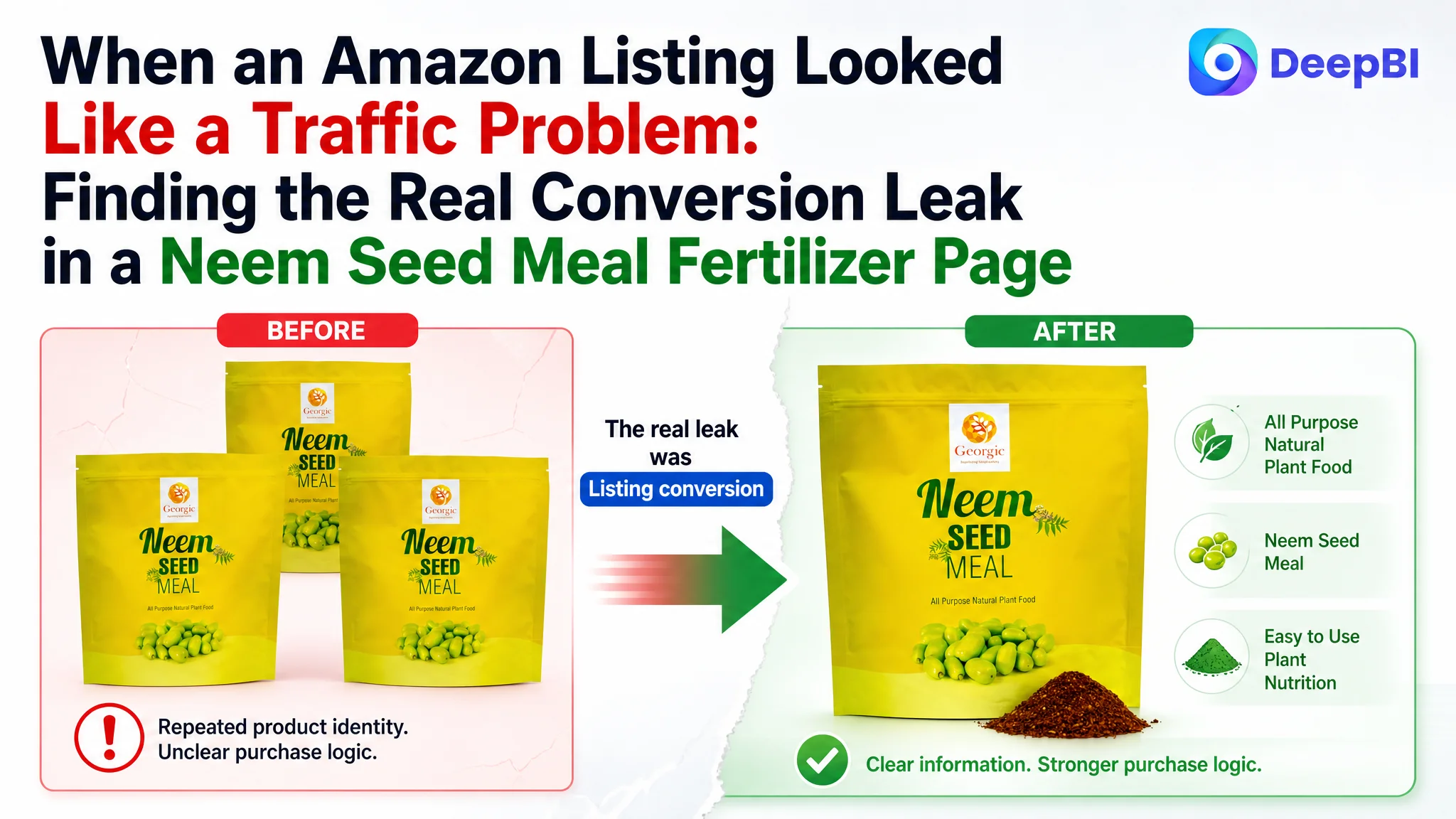
An Amazon seller in the US gardening category was facing a familiar product-page problem: the Listing had a real product, a usable set of claims, and enough customer feedback to support a purchase decision, yet its presentation was not converting as effectively as a stronger comparable Listing. The first instinct was to keep adding product information and reinforcing broad benefits.
That diagnosis was incomplete. DeepBI’s comparison showed that the gap was not simply a lack of content. The Amazon Listing was losing persuasive power at several connected points: the title delayed its most important keyword, the main images repeated product identity instead of building a reason to click, the bullet points described benefits without enough proof or process guidance, and the A+ content did not answer the buyer’s most practical questions.
The later optimization therefore focused on Listing conversion rather than continued ad adjustment: clarify what the product is, show why it is credible, explain how it works, and make application easier to understand. For other Amazon sellers, the case offers a useful reminder: before sending more paid traffic to a product page, check whether the page can turn that traffic into confidence and orders.
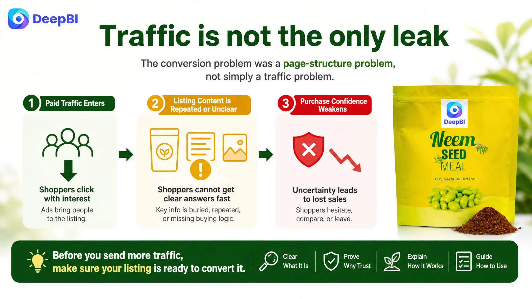
The Amazon page had information, but not enough buying logic
The product was a neem seed meal fertilizer positioned for gardening use across lawns, flowers, vegetables, fruits, landscapes, and other planting scenarios.
At first glance, the Listing was not empty. It included:
- A product identity and quantity indication
- Natural and soil-health claims
- Application-related messaging
- Product images showing the package and material
- A+ modules focused on benefits and usage
- Customer reviews that provided some purchase reference
The issue was how those elements worked together.
The Listing often told shoppers what the product was supposed to do, but did not consistently help them answer four questions:
1. What exactly am I buying?
2. Why should I trust this product?
3. How does it work in soil and around plants?
4. How should I apply it without making a mistake?
A strong Amazon Listing does not win by accumulating more claims. It wins when the title, images, bullets, A+ content, and reviews move the shopper through those questions in the right order.
The page did not lack information. It lacked a clear sequence for turning information into purchase confidence.
The original optimization direction focused on repetition
The initial problem could easily be interpreted as a need for more product explanation.
The page already showed the product in several image slots, while its A+ content repeated natural-origin and plant-growth messages across multiple modules. The response, if guided only by a surface review, would be to add more descriptions, repeat the benefits more prominently, or continue refining individual pieces of copy.
That approach treats each Listing element as an isolated asset.
DeepBI looked at the page as a connected conversion system instead. The important question was not whether another benefit could be added. It was whether each content block performed a distinct role in the buyer’s decision.
The findings pointed to a different diagnosis:
- The title did not lead with the strongest product and category terms.
- The main images repeated product identity instead of progressing from attention to proof.
- The bullet points listed functions but did not consistently connect them to buyer concerns.
- The A+ page emphasized general benefits while under-explaining physical form, application, and product credibility.
- The available reviews offered useful volume and visibility, but the lower average rating still created a trust constraint.
This changed the priority. The Listing did not primarily need more content. It needed better decision architecture.
A 19-point gap showed that the problem was structural
DeepBI’s comparison produced a total Listing score of 67 out of 100, compared with 86 out of 100 for a comparable high-performing Listing in the same Amazon category.
The overall gap was not caused by one isolated weakness.
- Title: Target Listing: 14/20, Comparable Listing: 18/20, Gap: -4
- Main images: Target Listing: 19/30, Comparable Listing: 27/30, Gap: -8
- Bullet points: Target Listing: 6/10, Comparable Listing: 8/10, Gap: -2
- Detail page and A+ content: Target Listing: 19/25, Comparable Listing: 23/25, Gap: -4
- Reviews: Target Listing: 9/15, Comparable Listing: 10/15, Gap: -1
- Total: Target Listing: 67/100, Comparable Listing: 86/100, Gap: -19
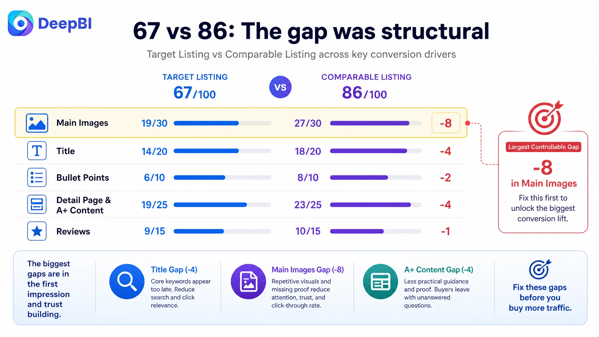
The largest weakness was the main-image system, followed by the title and A+ content.
That distribution mattered. If the Listing had been strong in its first impression but weak only in reviews, the optimization order would have been different. Here, the page was underperforming across the early click decision and the later trust decision.
The problem was therefore not simply “the product needs more traffic.” It was that additional traffic could continue arriving at a page with limited conversion capacity.
The title delayed the product’s most important meaning
The original title placed the core term “Neem Seed Meal” in a relatively late position. It also used wording such as “Pack of 3,” which could create uncertainty about the actual quantity.
A comparable Listing made several decisions more clearly:
- It placed the product type near the beginning.
- It stated the weight directly.
- It covered concrete gardening scenarios.
- It used a recognized certification reference where applicable.
- It followed a more coherent structure of product, benefit, keyword, and trust signal.
The difference was not just keyword placement. It was clarity at the search and click stage.
For this type of Amazon product, a shopper may already be comparing several similar soil amendments and fertilizers. The title needs to quickly communicate the product form, intended use, relevant plant categories, and any substantiated trust signal.
The recommended direction was to bring the core phrase closer to the front:
Organic Neem Seed Meal Fertilizer for Gardening - All Natural Soil Amendment & Plant Food for Lawns, Flowers, Vegetables and Fruits - Neem Cake (Pack of 3)
The purpose was not to copy the comparable Listing. It was to correct the page’s own information order:
- Lead with the product category and core search intent.
- Remove unnecessary repetition.
- Add relevant application scenarios.
- Preserve the available pack information.
- Replace vague promotional language with clearer product terminology.
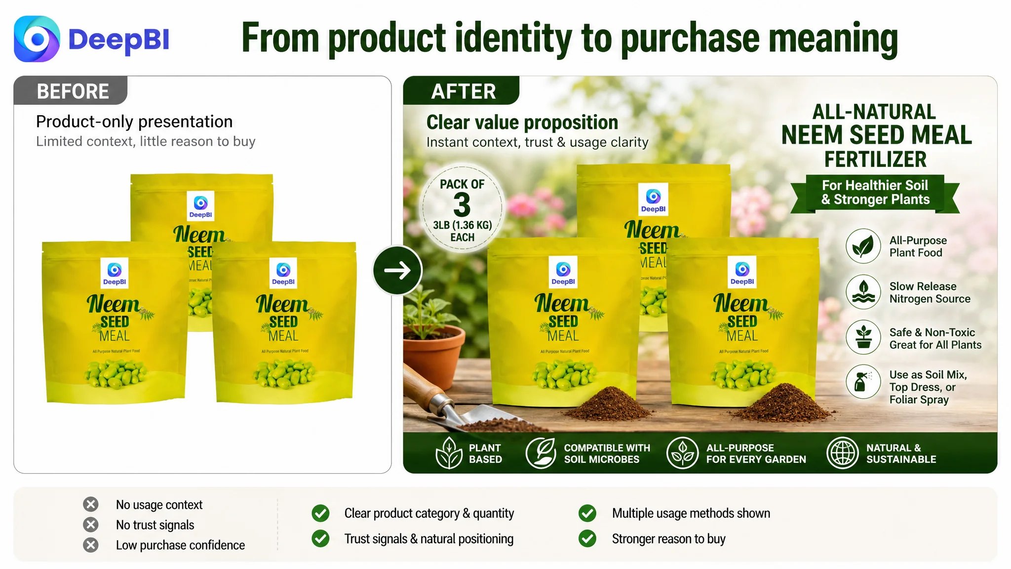
The main images were repeating identity instead of advancing persuasion
The main-image score was the largest single weakness: 19 out of 30, compared with 27 out of 30 for the comparable Listing.
The first images established that the seller had a product and a package. But several image slots continued to repeat that identity rather than answer the next buyer question.
A stronger Amazon image sequence should progress:
1. What is the product?
2. Why is it safe or credible?
3. How does it work?
4. What practical result or mechanism should the buyer understand?
5. How is it used?
The target Listing was not following that sequence consistently.
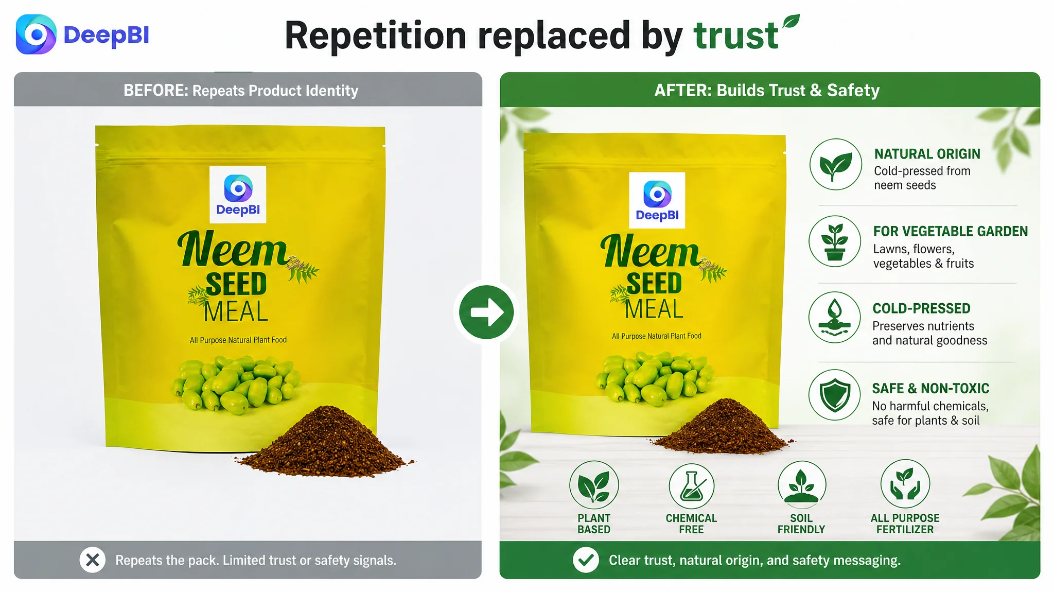
The first image needed a stronger reason to click
The opening image communicated product identity and quantity, but did not immediately express the product’s strongest confirmed value: a natural neem seed meal fertilizer intended to support soil health and plant growth.
The improvement direction was to retain the clear quantity indication while making the image’s role more commercially useful. The product should remain accurate and recognizable, but the visual hierarchy should help shoppers understand why this product deserves attention among similar gardening products.
The second image needed to build trust
The second image largely repeated the product and material presentation. It did not sufficiently answer concerns about:
- Natural origin
- Safety
- Compatibility with beneficial soil microbes
- Use around vegetable gardens, fruit trees, and ornamental plants
- The fact that the product is processed neem meal rather than simply raw seeds
This was a missed opportunity. Once the shopper understands what the product is, the next image should reduce perceived risk.
The third image needed to explain the mechanism
The third image continued to emphasize product identity instead of explaining the product’s nutrient role.
The case material supported a more rational presentation using the available guaranteed analysis:
- Total Nitrogen: 1.52%
- Available Phosphate: 0.42%
- Soluble Potash: 0.48%
Those figures should not be buried in packaging text. They can be connected to a clear explanation of what the product is intended to contribute, while avoiding claims that go beyond the confirmed product information.
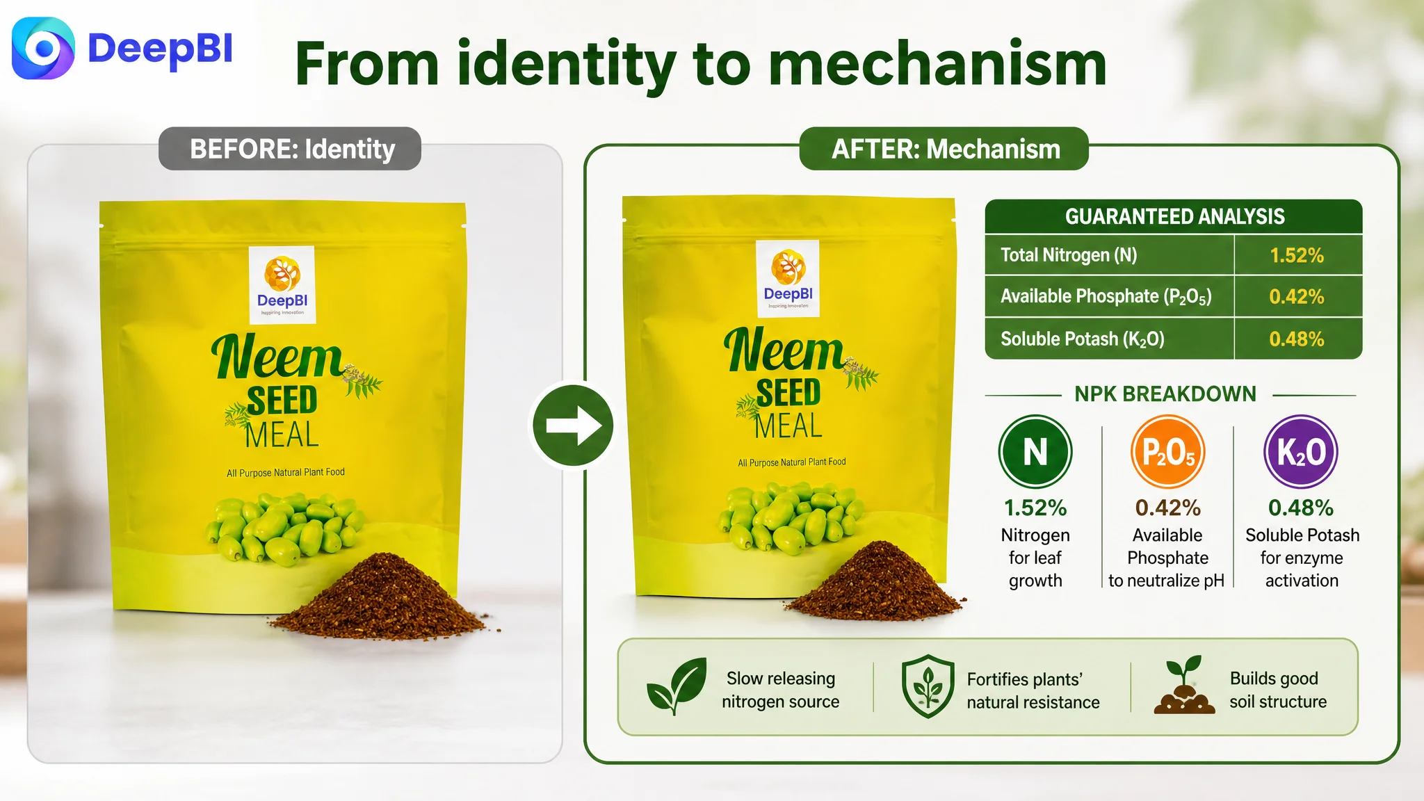
The fourth image needed to make slow release visible
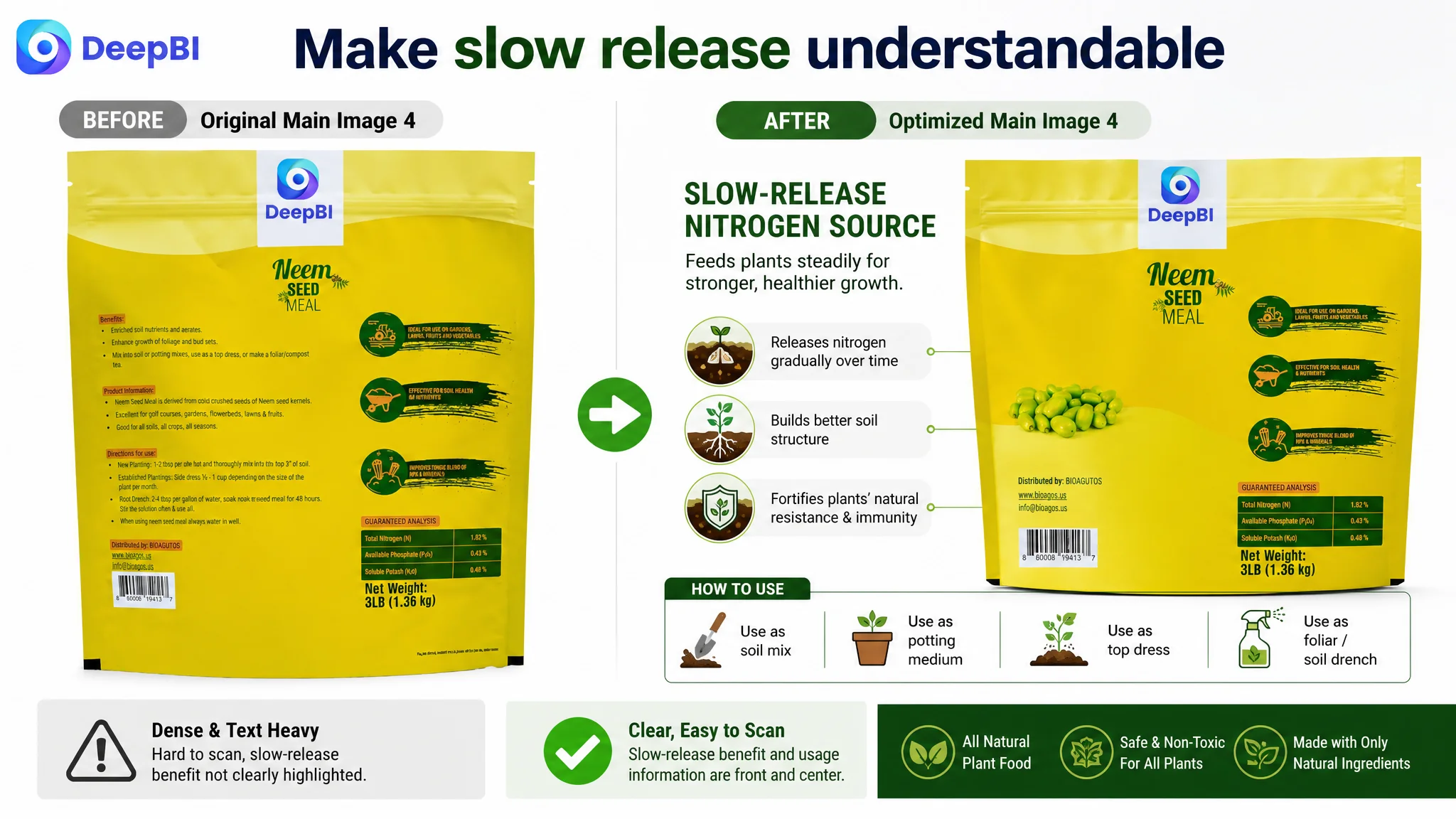
The product’s slow-release positioning was present, but it was not visually prioritized. Dense text on packaging is difficult to absorb on an Amazon product page, especially when shoppers are scanning quickly.
The revised direction was to show the slow-release concept as a practical benefit: gradual nourishment, support for soil structure, and reduced concern about excessive application or root burn. The claim must remain within the product’s confirmed positioning, but the presentation should make the operating logic easier to understand.
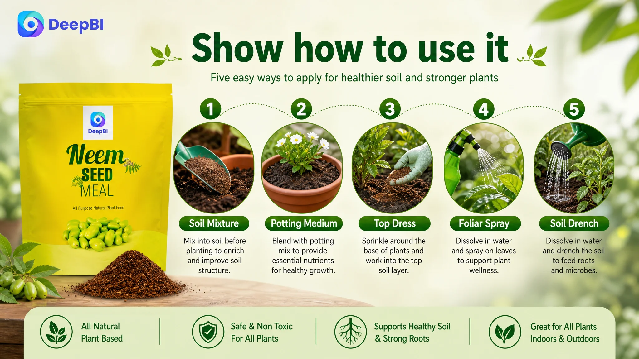
The fifth image needed to complete the usage path
The fifth position was missing or functioning as a placeholder. That left the persuasion sequence unfinished.
A practical final image could clarify the supported application methods:
- Soil mix
- Potting medium
- Top dressing
- Soil drench
- Other confirmed application methods, where properly supported
This is not merely an educational addition. It reduces the fear of using the product incorrectly.
On Amazon, a repeated image is not neutral. It occupies a valuable decision slot that could otherwise remove a buyer objection.
The bullet points had features, but not a complete argument
The bullet-point score was 6 out of 10, compared with 8 out of 10 for the comparable Listing.
The target bullets covered relevant topics, but the structure was weaker. They moved between ingredients, uses, soil benefits, slow-release properties, and application methods without always creating a clear progression.
The comparable Listing used a more deliberate sequence:
- Organic or natural trust anchor
- Brand or product mission
- Product attributes and certification
- Quantified nutrient explanation
- Detailed usage instructions
The target Listing needed a similar logic without making unsupported claims.
The first bullet should establish the product’s identity and trust
The opening bullet should quickly communicate that the product is a natural neem seed meal fertilizer and explain its intended role in soil health.
A vague opening such as “protect your garden” does not provide enough product meaning. A stronger structure connects the material, the production basis, and the practical purpose.
The middle bullets should connect attributes to outcomes
The product’s slow-release nitrogen source, soil compatibility, and broad gardening use were valuable points. But they needed to be presented as a chain:
- Product attribute
- What that attribute contributes
- Why it matters to the gardener
This is more persuasive than listing several benefits without explaining their relationship.
The final bullet should remove operational uncertainty
The original usage language named methods but did not provide enough process guidance. Gardeners may still wonder about form, mixing, placement, dilution, or application frequency.
The case material specifically identified this as a conversion barrier. The page should make the primary use method clear first, then explain alternative applications where they are genuinely supported.
This was one of the most important shifts in the copy strategy: from saying that the product is versatile to showing how that versatility works.
The A+ page promoted benefits but did not manage expectations
The detail-page score was 19 out of 25, compared with 23 out of 25 for the comparable Listing.
The target A+ content used modules such as:
- Core selling-point imagery
- Application scenes
- Functional icons
- Benefits lists
The problem was not the presence of these modules. It was the lack of progression between them.
The page did not sufficiently clarify the product’s physical form at the beginning. A shopper could still be uncertain whether the item was a processed neem meal powder, a pellet, or something closer to raw seed material.
That uncertainty affects expectations before purchase. If the product’s physical texture and application method are unclear, the buyer may hesitate even when the claimed benefits are attractive.
A stronger A+ structure would have moved through the following sequence.
Clarify what the product is
Show the processed neem seed meal or powder form directly. The image and copy should align so that the customer knows what will arrive.
Explain why the product is worth choosing
Use confirmed attributes such as natural plant-based origin, slow release, non-toxic positioning, and compatibility with beneficial soil microbes where supported by the product information.
Show how to use it
Replace repeated benefit icons with a clear primary application guide. The shopper should not have to infer the process from general gardening language.
Validate where it can be used
The content should connect the product to relevant scenarios:
- Vegetable gardens
- Lawns and landscapes
- Citrus and fruit trees
- Vines
- Ornamentals
- Flowering plants
This gives the buyer a more concrete sense of fit.
Explain the longer-term mechanism
The slow-release positioning can be used to explain how the product supports soil structure and more resilient plant growth over time. The page should avoid promising outcomes that are not directly supported, but it can still make the product logic more understandable.
Close with a final trust anchor
The final module should reinforce natural origin, safe and non-toxic positioning, and any substantiated verification available. If a third-party certification is not available for the target product, it should not be implied or added simply because a competitor uses one.
This is where DeepBI’s decision boundary matters. The correct optimization is not to imitate every competitor claim. It is to identify which trust function the competitor is serving and find a truthful way for the target Listing to serve that function.
Reviews were not the primary bottleneck, but they still affected trust
The review comparison was more nuanced than the total scores suggested.
The target Listing had:
- A 3.8-star rating
- 45 total reviews
- 28 reviews visible on the first page
- A first-page negative-review rate of 7.1%
The comparable Listing had:
- A 4.1-star rating
- 30 total reviews
- 8 reviews visible on the first page
- A first-page negative-review rate of 25%
The target Listing therefore had more visible review volume and a lower first-page negative-review rate. That was a relative strength.
However, the 3.8-star average still created a trust constraint. In addition, the comparable Listing had a higher proportion of reviews containing images, video, or detailed descriptions, making those reviews more vivid as purchase evidence.
This distinction was important.
The case did not support treating reviews as the first problem to solve. The review base was not uniformly weaker. The more urgent issue was to improve the page’s own explanation and trust structure so that shoppers could understand the product before relying heavily on review content.
Why DeepBI prioritized the Listing before ads
The case material did not provide a post-optimization advertising dataset, so it would be inaccurate to claim a specific ACOS reduction, CVR increase, or organic-order recovery.
The business logic was still clear.
When an Amazon Listing has weaknesses in its title, main images, bullet points, and A+ content, advertising can amplify the problem rather than solve it. Ads can create impressions and clicks, but they cannot compensate for:
- An unclear product form
- A weak first visual impression
- Missing proof of safety or credibility
- A product page that does not explain application
- Repeated modules that fail to answer new questions
That is why DeepBI did not frame the next step as “continue adjusting bids” or “add more keywords” in isolation.
The more important decision was to repair the page’s ability to receive and convert traffic.
The right question was not “How can the store buy more visits?” It was “What will those visits understand when they arrive?”
The priority order followed the largest conversion risks:
1. Clarify the product and search meaning in the title.
2. Rebuild the image sequence around attention, trust, mechanism, and usage.
3. Reorganize bullet points into a feature-to-reason-to-action structure.
4. Rebuild A+ modules around product form, application, scenario fit, and trust.
5. Use reviews as supporting evidence rather than as the only source of credibility.
6. Reassess advertising only after the page can better convert the traffic it receives.
From visual comparison to executable decisions
The value of DeepBI in this case was not that it produced a score of 67.
A score alone would not tell the team whether to rewrite the title, replace the main image, add a usage guide, or improve A+ trust content first.
The useful judgment came from connecting the score differences to specific buyer decisions:
- The title gap affected search clarity and click motivation.
- The main-image gap affected immediate differentiation and trust.
- The bullet gap affected proof and usability.
- The A+ gap affected expectation management and final confidence.
- The review gap affected perceived risk, but was not the largest controllable weakness.
That is the difference between a Listing audit and a business diagnosis.
DeepBI’s analysis also preserved an important boundary: competitor content could be used as a reference for structure and persuasion, but not as permission to invent certifications, nutrient claims, manufacturing details, or product capabilities.
The optimization direction therefore stayed grounded in the target product’s confirmed information:
- Neem seed meal
- Natural or plant-based positioning
- Slow-release nitrogen source
- Supported nutrient analysis
- Soil and plant applications
- Non-toxic and microbial-compatibility positioning where supported
- Practical usage methods that can be accurately explained
The change was not “make the page look better”
The recommended changes formed a coherent commercial system.
The title was to become more direct and search-friendly.
The first five images were to stop repeating product identity and instead establish:
- Product identity and quantity
- Natural origin and safety
- Nutrient and functional explanation
- Slow-release value
- Practical application flexibility
The bullet points were to move from broad statements toward a clear sequence of trust, product logic, safety, long-term value, and usage.
The A+ content was to move from repeated benefits toward:
- Material and form transparency
- Reasons to choose the product
- Primary application instructions
- Plant and soil scenario validation
- Alternative application methods
- Mechanism explanation
- Final trust reinforcement
This was a change in sales logic, not just a change in copy or visual style.
Before the optimization, the page primarily described the product.
After the recommended restructuring, the page was designed to help shoppers understand why the product fits their gardening needs, how it works, and how to use it with less uncertainty.
What Amazon sellers can take from the case
This neem seed meal fertilizer Listing illustrates a broader Amazon operating principle.
When paid traffic becomes harder to control, it is tempting to assume that the answer lies in bids, keywords, campaign structure, or budget allocation. Those levers matter, but they cannot repair a product page that does not convert confidence into action.
The first diagnostic questions should be:
- Does the title communicate the product and use case quickly?
- Does the main image give shoppers a reason to stop?
- Does each additional image provide new information?
- Do the bullets explain why the product matters, not just what it contains?
- Does the A+ page show how to use the product?
- Are trust signals real, visible, and properly supported?
- Does the page deserve the traffic the advertising team is trying to generate?
In this case, the central constraint was not a missing slogan or a lack of generic benefits. It was a weak connection between product information and buyer decision-making.
The seller did not need to keep adding content everywhere. The Listing needed to make every major content position do a distinct job.
That is the point at which Amazon ads can become more useful again: not because the ads have changed first, but because the product page is finally better prepared to receive the traffic.