

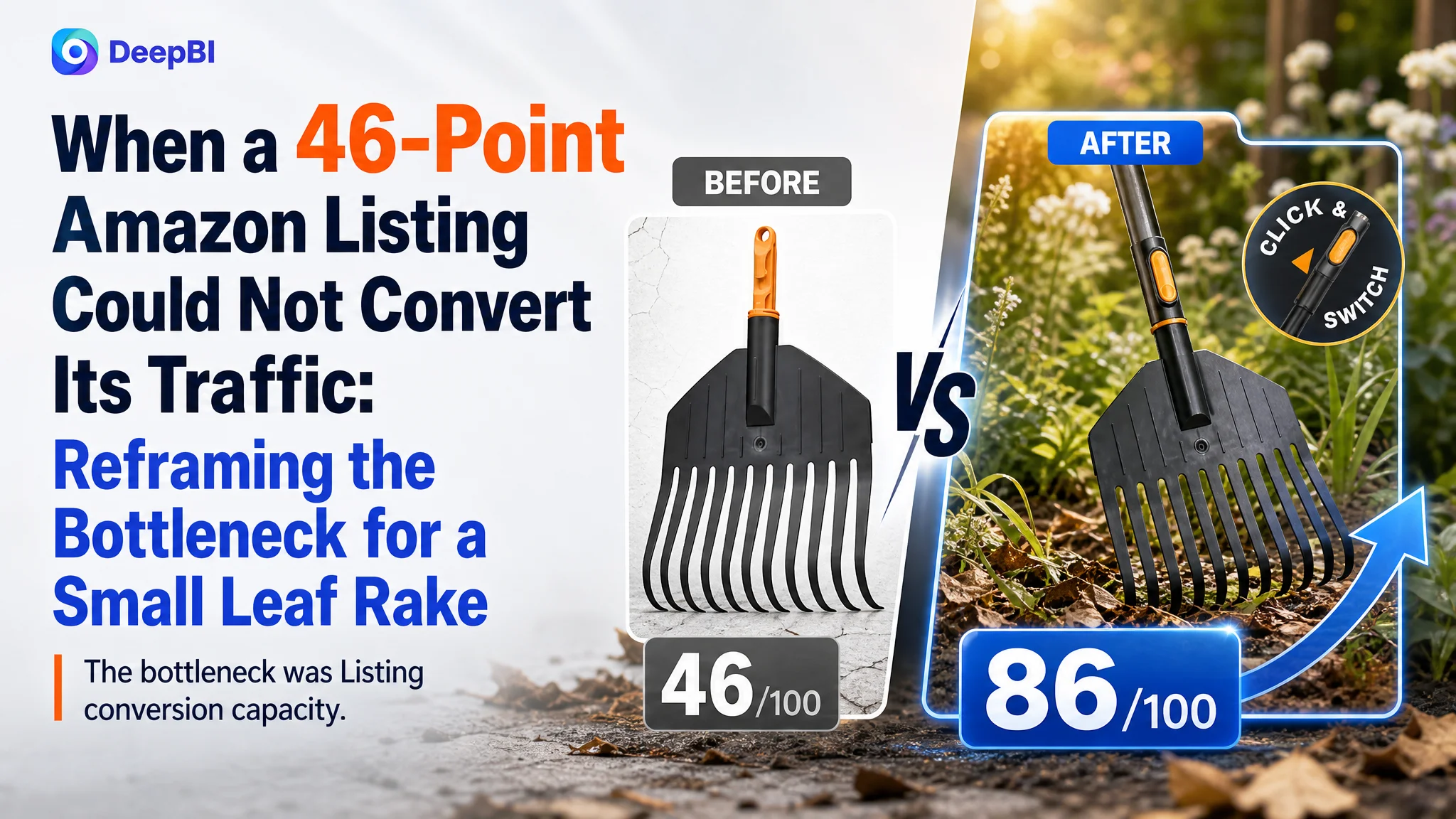
This case follows a US Amazon seller whose small leaf rake Listing was underperforming not because the product lacked a clear use case, but because the product page failed to communicate that use case convincingly. The customer’s initial direction leaned toward adding more product information, technical explanation, and general usage imagery.
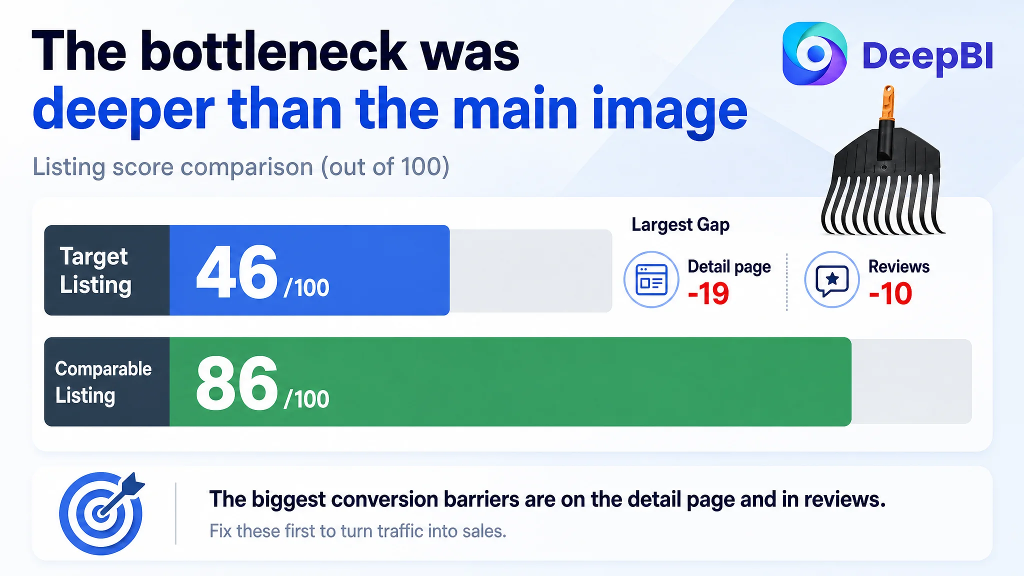
DeepBI’s diagnosis showed a deeper problem. The Listing scored 46/100 against 86/100 for a comparable high-performing Amazon Listing. The largest gap was not the title or even the main image alone. It was the product page’s inability to build a complete buying argument across the title, bullets, images, A+ content, and reviews.
The later optimization therefore focused on rebuilding the Listing’s sales logic: clarify the small rake’s role in narrow garden spaces, make the OneClick connection mechanism understandable, replace repetitive imagery with proof-oriented visuals, and use A+ content to explain how the product works and where it fits. For other Amazon sellers, the lesson is direct: before increasing Amazon ad traffic, confirm that the product page gives that traffic a clear reason to trust and buy.
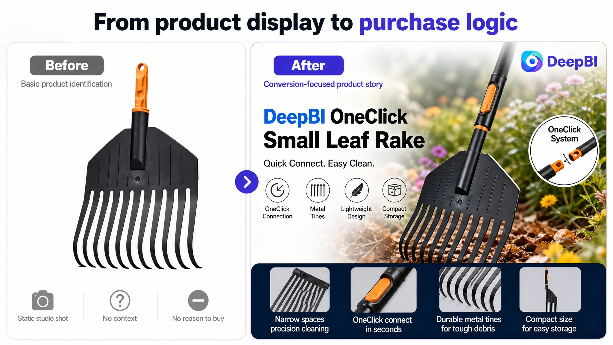
The Amazon Listing Looked Like a Product Identification Page
At first glance, the Listing communicated what the item was: a small leaf rake.
That was also the problem.
The title mainly followed a simple brand-and-product-name structure. The main images showed the product, explained some technical details, and placed it in outdoor settings. The bullet points identified the product but did not build a persuasive path from customer need to product solution. The detail page contained no meaningful visual A+ story beyond repeated product text.
In other words, the page confirmed the product category without helping shoppers answer the questions that determine conversion:
- Why is this small rake better suited to narrow areas?
- What does the OneClick mechanism actually do?
- How does the product help with garden-bed and shrub cleanup?
- Why should a shopper trust its construction?
- How is it stored when it is not being used?
- Is this the right tool for the specific job the shopper has in mind?
This distinction matters on Amazon. A Listing can be technically accurate and still fail to convert because it leaves too much decision-making work to the shopper.
The page did not lack product information entirely. It lacked a clear sequence that turned information into purchase confidence.
The Original Assumption Was Too Close to the Surface
The customer’s working direction appeared to center on visible content gaps: more images, more product details, and stronger technical explanation.
That diagnosis was understandable. The competing Listing included more dimensions, material references, usage scenarios, and functional claims. It looked more complete. The natural response was to add more information or make the existing content appear more polished.
But adding content alone would not solve the central issue.
The customer’s existing image set included a technical connection explanation, a usage context, a lifestyle close-up, and two product-identification images that were effectively duplicates. The problem was not simply that the page had too few assets. The problem was that several assets performed the same weak job.
The bullets had a similar issue. They mentioned product identity and functional areas, but they did not consistently connect a feature to a specific gardening situation. The content did not explain why a small rake would be useful under low-hanging shrubs, between flower beds, or in narrow corners where a larger rake is difficult to use.
The Listing was therefore being treated as a collection of content pieces rather than as a conversion system.
The Data Showed Where the Conversion Logic Was Breaking
DeepBI’s comparison made the imbalance visible.
- Title: Target Listing: 15/20, Comparable high-performing Listing: 17/20, Gap: -2
- Main image: Target Listing: 21/30, Comparable high-performing Listing: 26/30, Gap: -5
- Bullet points: Target Listing: 3/10, Comparable high-performing Listing: 7/10, Gap: -4
- Detail page: Target Listing: 3/25, Comparable high-performing Listing: 22/25, Gap: -19
- Reviews: Target Listing: 4/15, Comparable high-performing Listing: 14/15, Gap: -10
- Total: Target Listing: 46/100, Comparable high-performing Listing: 86/100, Gap: -40
The most important signal was the 19-point detail-page gap.
The title and main image mattered, but they were not the largest structural weakness. The Listing lacked the content depth needed to support a shopper after the initial click. That made the page vulnerable to losing both organic and paid traffic at the conversion stage.
The review position made the trust problem more serious. The target Listing had a 2.7-star rating from six reviews, while the comparable Listing had a 4.5-star rating from 1,711 reviews. The target Listing also had a much higher proportion of low-star reviews on the first page.
This did not mean that content optimization could erase the review disadvantage. It meant the Listing needed to avoid making the trust gap worse. When a product page has limited review support, every other part of the page must be clearer, more credible, and more useful.
The Real Constraint Was Listing Conversion Capacity
DeepBI’s key judgment was that the Listing’s primary weakness was not a single bad image or an isolated copy problem.
It was insufficient conversion capacity across the product page.
The page did not give the shopper a strong reason to click, a clear reason to continue reading, or enough evidence to feel confident after arriving. The weaknesses reinforced one another:
- The title lacked useful specifications and scene-based search language.
- The main image was clean but passive, with limited visual distinction.
- The image sequence repeated product identification instead of advancing the sales argument.
- The bullet points named the product without explaining its practical value.
- The A+ area lacked a visual explanation of the OneClick mechanism and use cases.
- The review profile provided little independent trust support.
This is why continued work on only one element would have been insufficient. A better main image might improve attention, but the page would still lose shoppers if the bullets and A+ content failed to explain the product. More keywords might expand visibility, but they would not fix a page that could not clearly match the shopper’s intended use.
The real business risk was not merely low visibility. It was sending more visibility to a page that had not yet earned the traffic.
The Title Needed to Sell the Use Case, Not Just Name the Product
The existing title placed the core product name early, but it did not provide enough descriptive information to help shoppers understand the tool’s role.
The recommended direction was to add functional and scene-based language such as:
- Metal tines
- Gardening
- Lawns
- Shrubs
- Garden beds
- Heavy-duty positioning where factually supportable
The purpose was not to fill the title with keywords. It was to make the product easier to find and easier to evaluate.
A shopper searching for a small rake is not only looking for the category name. They may be trying to clear leaves around flower beds, work beneath shrubs, or reach narrow spaces without using a bulky full-size rake. The title needed to reflect those situations while remaining grounded in the product’s actual function.
DeepBI’s approach treated the title as the first piece of conversion logic: search relevance and product differentiation had to work together.
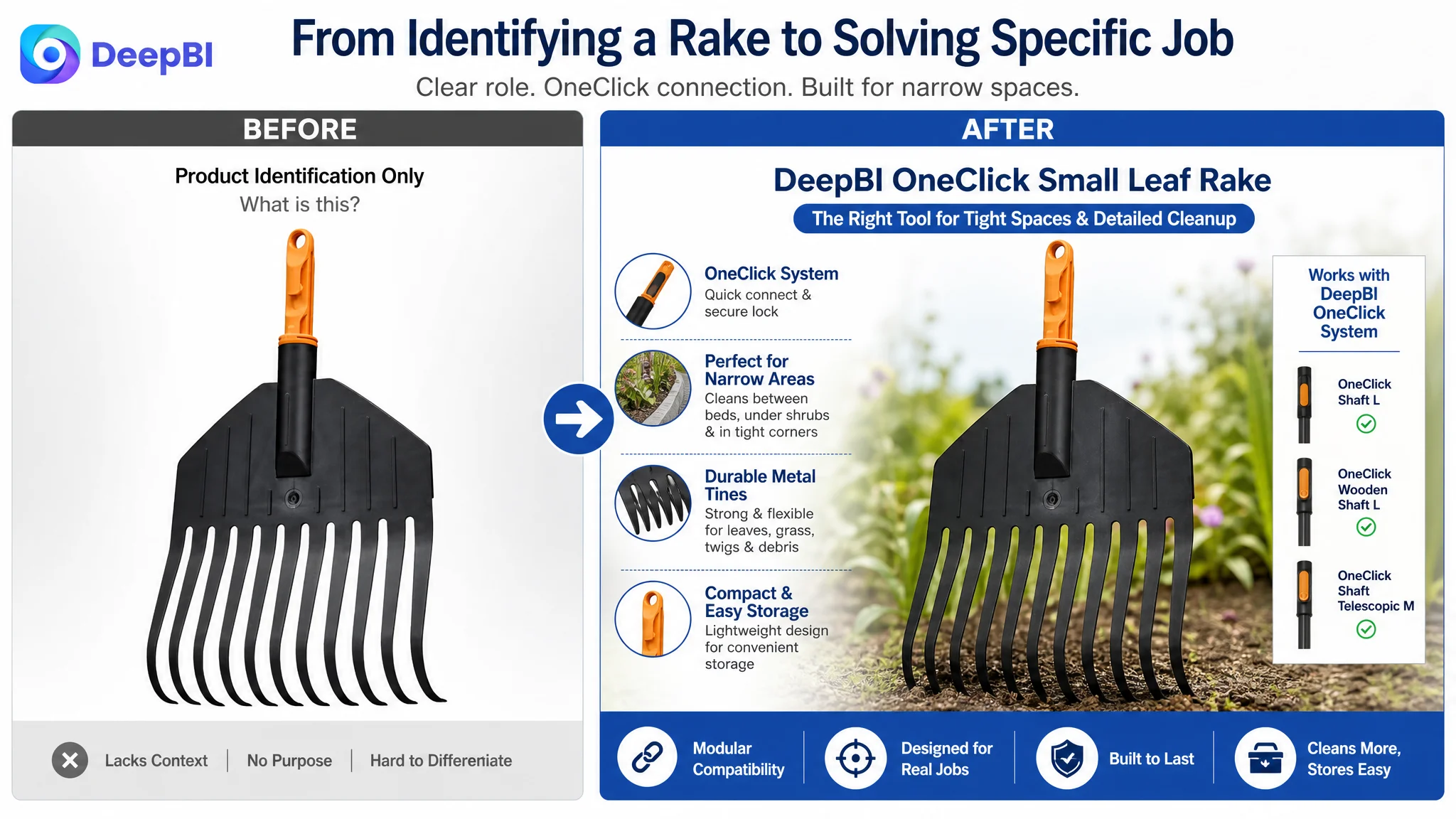
The Main Images Were Not Weak Because They Were Simple
The main image problem was more specific than “the images were not attractive enough.”
The first image primarily confirmed that the item was a rake. Another image explained the connection mechanism and dimensions in a technical way. Additional images showed usage context, but two of them were repetitive. None of the images created a strong progression from attention to proof.
DeepBI therefore reframed the image sequence around distinct decision jobs:
First, establish the product’s specialized role
The opening visual should make clear that this is a small leaf rake within a modular system, not just another generic garden tool. The product should remain accurately represented, while the composition communicates focus and purpose.
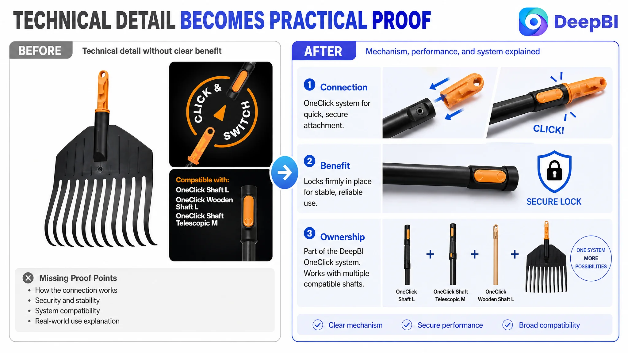
Then, explain why the connection system matters
The OneClick mechanism should not appear as an isolated technical detail. The visual should connect it to a practical benefit: quick, secure setup and less storage clutter. The shopper needs to understand not only how the connection works, but why it improves ownership.
Next, prove performance without inventing specifications
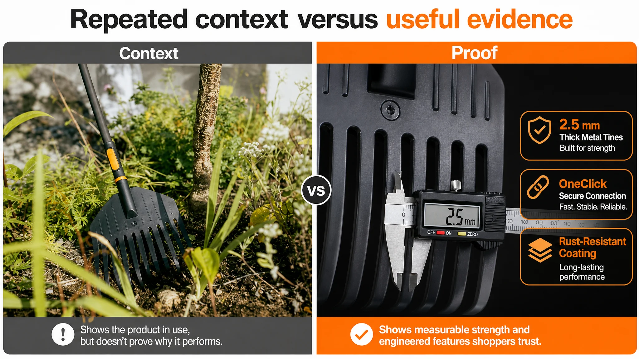
A usage image should demonstrate the tool working in its intended environment, such as around delicate garden beds or beneath shrubs. Where material or strength claims are verifiable, close-up details and measured information can support them. Where they are not confirmed, the image should not imply unsupported durability or performance figures.
Finally, address storage
The modular design creates an opportunity to show how the rake head can be detached or stored compactly, provided that the visual matches the real product. This fills a practical ownership gap that the original image set left unanswered.
The change was from repeated presentation to sequential persuasion.
The Bullet Points Had Information, but Not a Buying Logic
The five-point section was one of the clearest weaknesses. Its content did not consistently follow a “feature, situation, outcome” structure.
For this product, a more useful sequence would be:
- Explain the intended narrow-space use.
- Clarify the OneClick connection.
- Describe suitable cleanup tasks such as leaves, grass clippings, small sticks, and light garden debris, without overclaiming.
- Present confirmed material and construction information.
- Address portability, setup, and storage.
Each bullet should answer a practical question.
“Small leaf rake” identifies the product. It does not explain why the size matters.
“Quick connection” identifies a mechanism. It does not explain how that mechanism changes assembly or storage.
“Metal tines” identifies a material or construction feature. It does not automatically establish a performance benefit unless the claim is supported and connected to a real use situation.
The optimization direction was therefore not to make the bullets longer. It was to make them more useful at the moment of decision.
Missing A+ Content Removed the Final Layer of Trust
The 19-point detail-page gap was the clearest evidence that the Listing lacked a complete product story.
The comparable Listing used visual modules to show materials, structure, multiple use cases, and family usage contexts. The target Listing had no equivalent A+ content narrative. That left the shopper with no structured explanation after the initial image set.
For this small leaf rake, A+ content should not simply repeat the title or display additional lifestyle scenes. It should resolve specific doubts:
What is the product designed to do?
The page should clearly define the product as a small leaf rake for targeted cleanup rather than imply that it replaces every type of garden rake.
Where does the small format help?
Visuals should show narrow spaces, flower beds, shrub edges, and corners where a larger tool may be less convenient.
How does OneClick work?
A close-up sequence should show the connection and locking action clearly. This is more persuasive than a general family scene because it addresses the product’s actual differentiating mechanism.
What can the tool reasonably handle?
The page should communicate intended use transparently, focusing on leaves and light yard debris where supported by the product information. Trust is weakened when a Listing suggests broader capability than the evidence supports.
How is it stored?
The compact, modular nature of the product should be connected to a clear storage scenario rather than left as an implied benefit.
The purpose of A+ content here was not decoration. It was to replace uncertainty with visible explanation.
Why DeepBI Did Not Recommend Tuning Ads First
The case material does not include post-optimization advertising results, so it would be inappropriate to claim that ACOS declined or CVR increased after the changes.
The decision logic is nevertheless clear.
When a Listing scores only 3/25 on the detail-page dimension and 4/15 on reviews, increasing Amazon ad traffic first carries a meaningful risk. Ads can create exposure and clicks, but they cannot repair missing product-page logic by themselves. If shoppers arrive at a page that does not explain the product’s value, paid traffic may simply make the conversion weakness more expensive.
That does not mean advertising should stop permanently. It means the order of decisions matters:
1. Clarify what the product is best suited for.
2. Repair the title, bullets, image sequence, and A+ explanation.
3. Make sure the page can answer the most important purchase doubts.
4. Then evaluate how paid and organic traffic respond to the improved Listing.
This is the difference between optimizing traffic volume and improving the value of traffic.
Advertising can amplify a strong Listing, but it can also amplify a page that has not resolved its own conversion problems.
The Optimization Direction Shifted From “More Content” to “Better Evidence”
The later plan did not call for adding content indiscriminately.
It prioritized evidence in a specific order:
- A clear product role in the title.
- A stronger visual hook without violating Amazon main-image requirements.
- A distinct image for the OneClick mechanism.
- Performance-oriented visuals instead of repeated lifestyle scenes.
- Verifiable material and construction details.
- A compact-storage explanation.
- Bullets organized around real gardening situations.
- A+ modules that demonstrate how the product works.
This order reflects the business diagnosis. The Listing did not need every possible claim. It needed the right claims to appear in the right places.
DeepBI’s value in this case was the ability to connect the score gap to a decision sequence. The system did not treat a low score as a reason to change everything at once. It identified the largest constraint, checked how the content gaps affected the shopper journey, and then translated those gaps into specific page-level priorities.
What This Case Changes in the Seller’s Understanding
The case does not yet provide verified post-change metrics, so the final outcome should be described as a change in operating direction rather than as a claimed performance result.
The more important change was conceptual.
The seller could no longer view the Amazon Listing as a basic product display that needed a few additional images and more keywords. The page had to function as a connected sales argument:
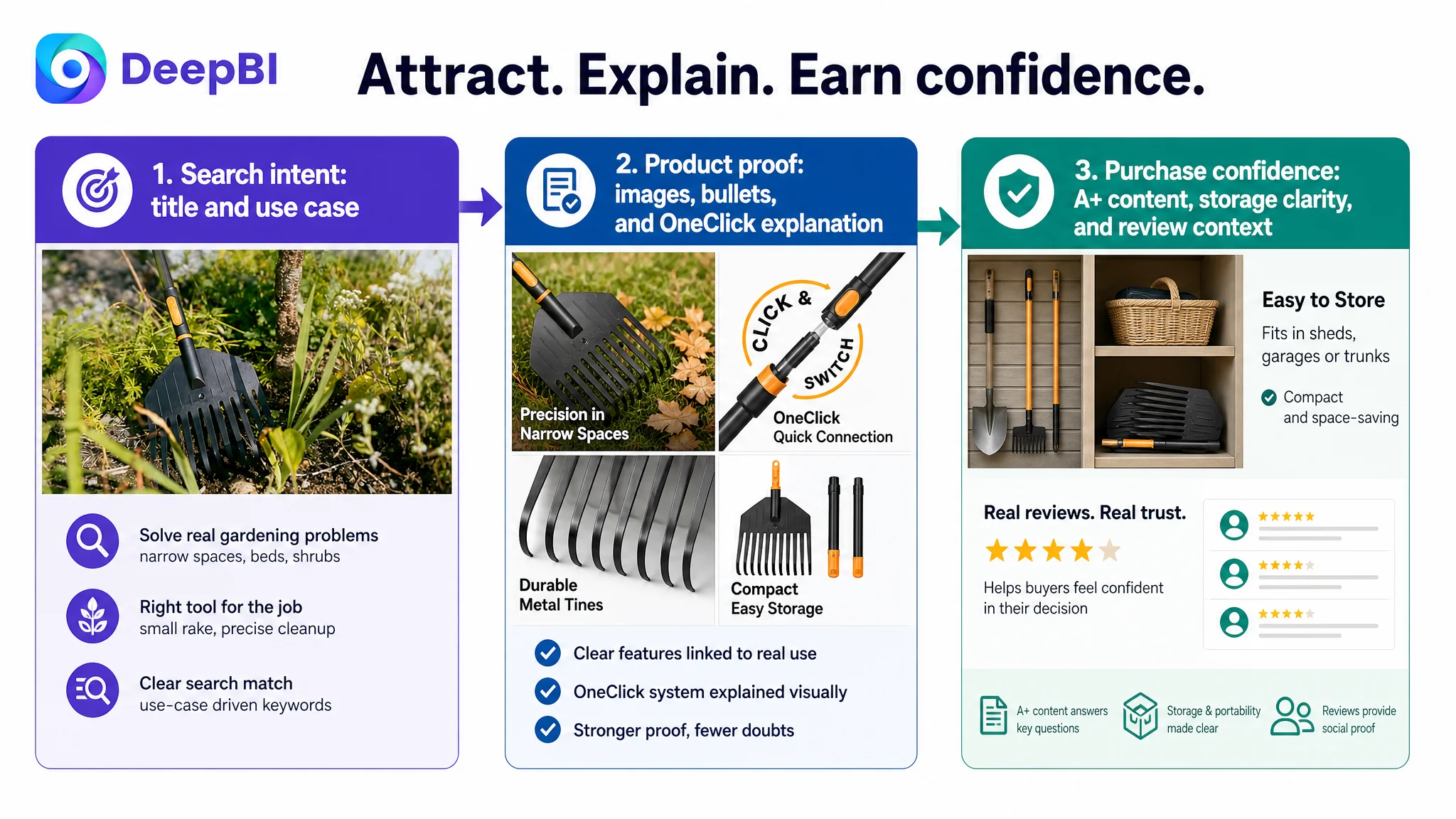
- The title attracts the right search intent.
- The main image creates a reason to stop.
- The supporting images explain the product’s practical advantage.
- The bullets connect features to real use cases.
- A+ content resolves functional and ownership doubts.
- Reviews provide independent trust, while the rest of the page avoids creating additional uncertainty.
For this small leaf rake, the winning direction was not to imitate a competitor’s heavy-duty positioning or make unsupported claims. It was to make the product’s own strengths legible: targeted cleanup, modular connection, ease of setup, and compact storage.
That is the broader lesson for Amazon sellers. When a product page is underperforming, the first question should not be, “Which ad setting should we change next?”
It should be:
Can this Listing clearly explain why the product fits the shopper’s problem, and does every page element help prove that answer?
In this case, the answer was not yet strong enough. DeepBI’s diagnosis moved the work from surface-level content additions to a more fundamental repair: rebuilding the Amazon product page so that paid and organic traffic had a better chance to convert.