

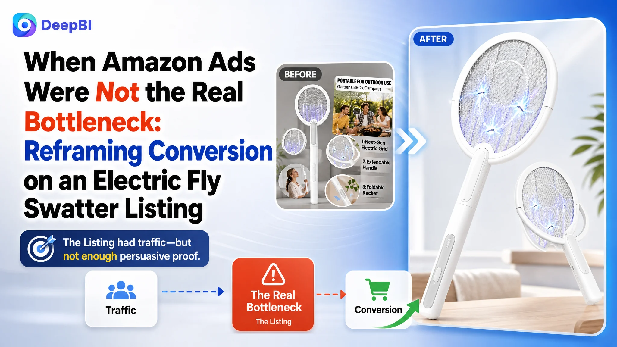
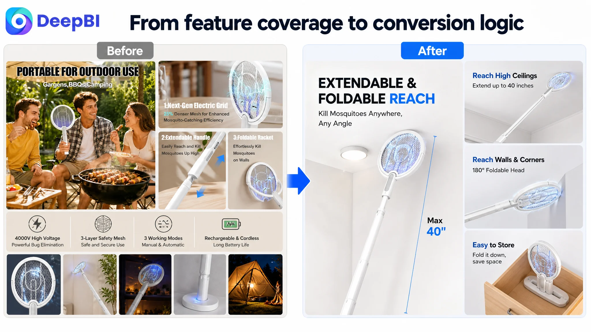
An Amazon seller in the US marketplace was facing a familiar problem: traffic could be attracted to an electric fly swatter and bug zapper Listing, but the product page did not give shoppers enough reasons to continue toward purchase. The initial instinct was to treat the issue as an advertising and keyword problem—improve targeting, refine bids, and capture more relevant searches.
DeepBI’s diagnosis pointed in a different direction. The Listing was not simply missing traffic. It was losing persuasive power across the customer journey: the title was less specific than stronger competitors, the main images did not prioritize the product’s most compelling use cases, and the A+ content repeated features without building a clear path from problem to solution.
The later optimization therefore focused first on Amazon Listing conversion: clarify the manual and automatic modes, demonstrate reach and wall-contact use cases, make the safety structure easier to understand, and reorganize the page around scenario, mechanism, and proof. For other Amazon sellers, the lesson is direct: before increasing ad pressure, determine whether the product page is ready to convert the traffic it already receives.
The Amazon seller thought the problem was traffic efficiency
The product had several meaningful selling points:
- A 4000V electric grid
- Extendable reach for ceilings and difficult areas
- A foldable or adjustable racket head for walls and corners
- Manual swatting and automatic UV attraction modes
- A rechargeable battery and charging base
- A three-layer safety mesh
On paper, this was not an ordinary electric fly swatter. It combined active pest removal with stationary automatic trapping. It also addressed common use cases such as high ceilings, wall surfaces, corners, bedrooms, kitchens, camping, and outdoor gatherings.
But those advantages were not being presented in the order shoppers needed.
The customer’s original direction leaned toward the familiar Amazon advertising diagnosis: if performance was under pressure, the answer might be more precise keyword coverage, more traffic, or more aggressive campaign adjustments. That approach was understandable. The Listing included relevant terms such as “electric fly swatter,” “bug zapper,” “mosquito zapper,” and “USB rechargeable.”
The problem was that keyword relevance could bring the shopper to the page, but it could not complete the sale.
Once the shopper arrived, the Listing had to answer several practical questions quickly:
- Can this product reach insects on ceilings and walls?
- Does it work as a handheld racket, an automatic trap, or both?
- Is the head flexible enough to make contact with flat surfaces and corners?
- Is the high-voltage grid safe to use around a household?
- How does the automatic mode work?
- What evidence supports the product’s durability and ease of use?
The page contained many of these facts. It did not consistently turn them into a persuasive buying logic.
Advertising can amplify a product page’s strengths, but it can also amplify the cost of a page that has not resolved basic conversion doubts.
The Listing score showed a page-level conversion gap
DeepBI compared the target Amazon Listing with a closely matched, stronger category Listing rather than relying on a generic visual preference.
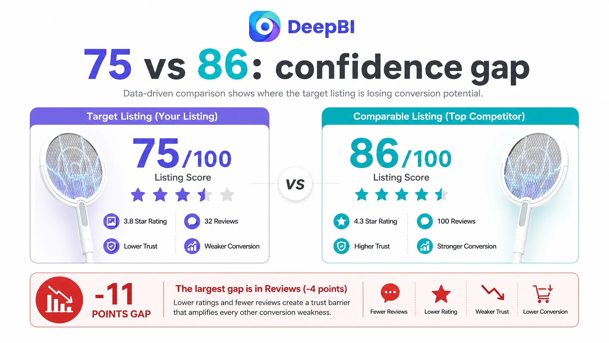
- Title: Target Listing: 15/20, Comparable Listing: 17/20, Gap: -2
- Main image: Target Listing: 24/30, Comparable Listing: 26/30, Gap: -2
- Bullet points: Target Listing: 8/10, Comparable Listing: 9/10, Gap: -1
- Detail page and A+: Target Listing: 21/25, Comparable Listing: 23/25, Gap: -2
- Reviews: Target Listing: 7/15, Comparable Listing: 11/15, Gap: -4
- Total: Target Listing: 75/100, Comparable Listing: 86/100, Gap: -11
The result was not a judgment that the product lacked features. It showed that the Listing was weaker at converting those features into confidence.
The largest gap was in reviews. The target Listing had a 3.8-star rating from 32 total reviews, while the comparable Listing had 4.3 stars from 100 reviews. The target Listing also had a higher share of low-rated reviews on the first page, including feedback about functional failure.
That review gap could not be solved through copywriting alone. It represented a trust constraint that made every other conversion weakness more costly.
At the same time, the remaining gaps were actionable. The title, main image, bullet points, and A+ content could be reorganized so that the page did a better job of explaining the product before shoppers had to rely on reviews.
The title had keywords, but not enough buying context
The target title contained the core category language, including electric fly swatter and mosquito zapper terms. However, its structure was less focused than the comparable Listing.
The stronger title brought several decision-making details forward:
- Rotating head
- Indoor use
- A specific telescopic handle range
- Two-in-one functionality
- Ceiling and wall use cases
- Automatic and manual pest control
The target title leaned more heavily on general product description and repeated terms such as “zapper” and “killer.” It mentioned a long telescopic extension but did not communicate the practical scope of that extension with the same clarity.
DeepBI’s suggested direction was not to add more words indiscriminately. It was to improve the relationship between search relevance and shopper understanding:
The title needed to move from “what the product is” toward “where and how the product solves the problem.”
The recommended structure brought “rotating head,” “telescopic extension,” “4000V,” “three modes,” and “automatic and manual” into a clearer sequence, while adding relevant contexts such as walls and ceilings.
This matters for both CTR and CVR. A clearer title can help the right shopper recognize the product in search results, while also establishing expectations that the product page must then prove.
The main images showed functions instead of winning the click
The target image set attempted to cover many strengths at once:
- Extendable reach
- Foldable or adjustable head
- Outdoor use
- Battery and charging
- High-voltage performance
- Automatic trapping
- Multiple product forms and accessories
The result was informative but visually crowded. Several images behaved more like technical summaries than persuasive stages in a buying journey.
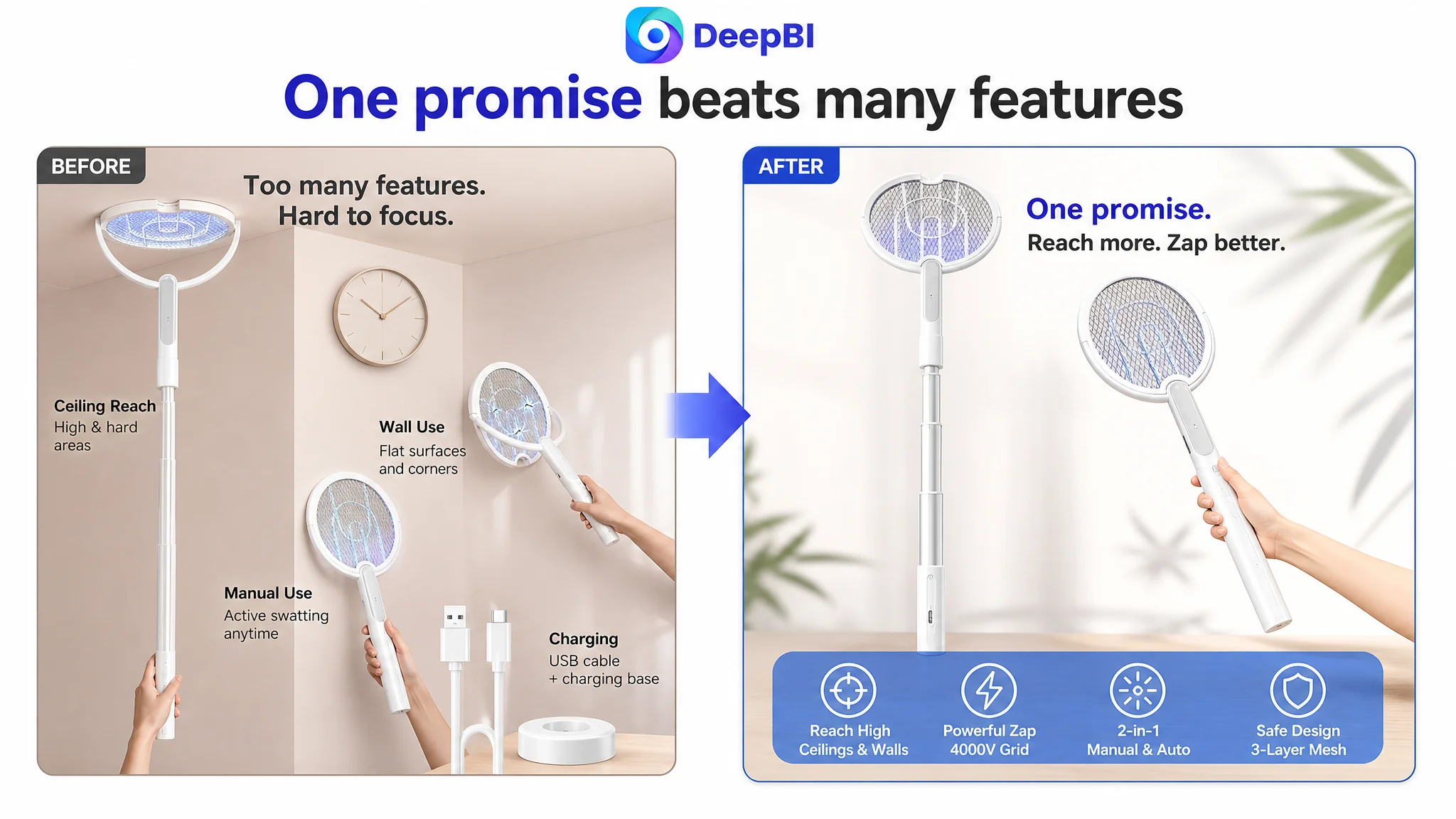
The first impression was too crowded
The opening image showed multiple product forms, high-reach use, wall interaction, manual use, and a charging cable. That suggested an all-in-one product, but it also made the shopper work to identify the primary value.
The stronger direction was to establish one clear promise first:
An extendable and foldable bug zapper designed to reach difficult places.
Ceilings, curtain tops, areas under furniture, and wall surfaces could remain part of the story, but they needed to support one dominant visual idea rather than compete with one another.
The manual-use image did not demonstrate the core action
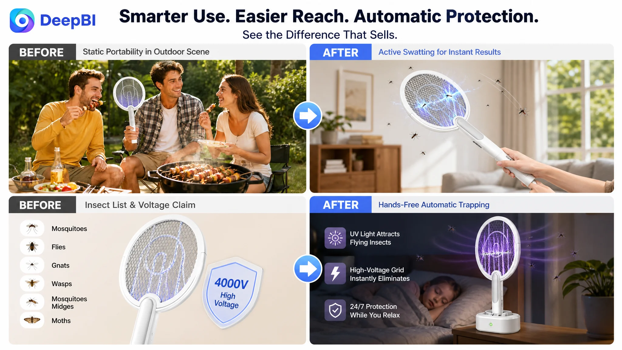
An outdoor scene communicated portability, but it did not prove the product’s most important active function: manually reaching and swatting pests.
A more useful image would show an action-oriented manual hunting scene, with the product visibly addressing a difficult pest location. The objective was not visual drama for its own sake. It was to answer the shopper’s practical question: Will this help me hit the insect I cannot easily reach?
Wall contact was buried in a complex layout
One image included technology details, handle mechanics, mesh information, and a small wall-use scene. Each element was relevant, but the combined layout diluted the benefit of the adjustable head.
The page needed a dedicated visual proof point showing the racket head making contact with a wall or furniture surface. That would make the folding or multi-angle design understandable without requiring the shopper to decode a technical diagram.
Reach was presented as a specification instead of a result
The battery and charging image used valuable visual space to explain technical convenience. That information was useful later, but it did not establish the product’s strongest physical advantage.
The stronger sequence would show the handle moving from a compact position to an extended position while reaching a high ceiling, curtain top, or ceiling corner. If exact measurement data was not available, the image should demonstrate versatility without inventing a numerical extension claim.
Automatic trapping needed to look like an operating mode
The high-voltage image listed target insects, but a list of insects did not explain the value of automatic attraction.
The stronger visual direction was to show the product placed in its charging base in a low-light setting, with the UV attraction function operating as a stationary bug zapper. This would make the difference between active manual swatting and passive automatic trapping immediately visible.
The bullet points listed features but did not build a decision path
The original bullet points covered the right general subjects:
- Extendable and foldable design
- High voltage and safety mesh
- Multiple modes
- Battery capacity and charging
- Safety and use cases
The weakness was sequencing. The descriptions often read as feature inventories, while the comparable Listing connected each feature to a situation the shopper already recognized.
A stronger bullet-point structure would have followed this order.
First: define the two product roles
The product should first be framed as both:
- A handheld racket for active swatting
- An automatic UV trap for stationary pest control
That distinction gives shoppers a usable mental model before they encounter technical details.
Second: explain the reach and head design through pain points
The extendable handle and adjustable head mattered because insects appear in high, narrow, flat, and awkward locations.
Instead of describing the mechanism in isolation, the copy should connect it to:
- Ceilings
- Walls
- Furniture
- Corners
- Areas under beds or near curtain tops
The product’s geometry becomes more persuasive when shoppers can see the problem it resolves.
Third: make automatic mode operationally clear
The page needed to show how the product becomes a stationary automatic zapper:
1. Connect the charging base to power.
2. Place the racket on the base.
3. Select the automatic mode.
4. Allow the UV light to attract insects.
This procedure already had strong source material in the original page. It should have been used as a conversion asset rather than left as a secondary instruction.
Fourth: make safety and power easy to understand
The Listing included a 4000V grid, three-layer safety mesh, and residual-electricity elimination technology. These claims needed to be explained as a system:
- The inner grid provides the high-voltage function.
- The outer safety structure helps reduce accidental contact.
- Residual-electricity elimination addresses the user’s concern after operation.
The goal was not to make the product sound more technical. It was to reduce uncertainty around using a high-voltage household device.
Fifth: address durability and charging convenience carefully
The customer material supported an 1800mAh battery and dual charging options through the handle or charging base. These details were useful, but they should be stated precisely and without adding unsupported endurance promises.
The case material also proposed a “30 days of use” claim in the revised copy. Because the supporting operating conditions were not provided, that type of statement would require verification before publication.
A+ content repeated information instead of moving the shopper forward
The target A+ content contained many useful modules:
- Product functions
- High-voltage grid details
- UV attraction
- Battery and charging
- Automatic base operation
- Family use
- Multiple scenarios
The issue was not a lack of content. It was the absence of a clear progression.
The comparable Listing made its functional boundaries easier to understand by separating:
- Manual swatting
- Automatic UV attraction
- Safety structure
- Handle reach
- Mode controls
- Status feedback
The target page mentioned these ideas, but several modules combined unrelated details. For example, a single section could include the detachable base, charging port, safety switch, battery, and rotating structure. That density made it harder to understand the central two-in-one proposition.
DeepBI’s reframing was to rebuild the page around a sequence of shopper questions.
1. Can it solve the immediate pest problem?
Lead with manual swatting in difficult locations. Show the extended handle and adjustable head in a real use situation.
2. How does the two-in-one design work?
Clearly distinguish handheld operation from automatic UV attraction on the charging base.
3. How is the product built for safer use?
Replace repeated voltage messaging with a visual explanation of the three-layer safety mesh and the relationship between the protective layers and the inner grid.
4. How flexible is the design?
Use real demonstrations of extension, folding, and multi-angle use. If exact measurements are unavailable, avoid manufacturing a number merely to match a competitor.
5. Is the product difficult to operate?
Show the OFF, manual, and automatic controls in close-up. Explain the safety lock and residual-electricity elimination in the context of everyday use.
6. Can the buyer successfully set up automatic mode?
Retain the step-by-step procedure because it was already one of the strongest proof points in the existing content.
7. Where does it fit into daily life?
Close with a scenario grid covering bedrooms, kitchens, high ceilings, walls, camping, BBQs, and stationary operation on the charging base. This final module should summarize fit, not repeat the entire product specification.
The A+ page did not need more modules. It needed each module to perform a different job in the buyer’s decision.
Why DeepBI did not recommend tuning Amazon ads first
The central judgment was about order of operations.
If the Listing had continued receiving more paid traffic before clarifying its conversion logic, the business risk was straightforward: ad spend would increase the number of shoppers encountering the same unresolved doubts.
The main image did not immediately show the strongest use case. The title did not make the product’s functional combination sufficiently clear. The bullet points did not consistently connect features to situations. The A+ content did not clearly prove the difference between active swatting and automatic trapping. Reviews provided weaker trust support than the comparable Listing.
Those were not primarily bid-management problems.
They were page-level constraints affecting the value of every visit.
DeepBI therefore treated Listing repair as the first decision, not because advertising was unimportant, but because advertising efficiency depends on what happens after the click. The practical sequence was:
1. Clarify the product’s primary value proposition.
2. Rebuild the visual order around manual reach, wall contact, and automatic trapping.
3. Convert technical specifications into understandable proof.
4. Address safety and operating concerns.
5. Align the title and bullet points with the revised buying logic.
6. Only then evaluate whether additional traffic and advertising adjustments are being converted more effectively.
This prevents the store from using advertising to compensate for a product page that has not yet earned the traffic.
The real change was a shift from feature coverage to sales logic
The case did not call for the seller to add every possible claim or imitate every visual element used by the comparable Listing.
It called for a more disciplined translation of existing product capabilities:
- “Extendable” became a solution for high and difficult locations.
- “Foldable or adjustable head” became a solution for wall and corner contact.
- “Manual and automatic modes” became two distinct pest-control paths.
- “4000V” became technical proof that needed to be balanced with visible safety design.
- “Charging base” became the operating foundation for automatic trapping.
- “Three-layer safety mesh” became a trust mechanism rather than a repeated specification.
- “Battery and charging” became convenience support rather than the opening message.
That is the difference between adding information and improving conversion logic.
The case material does not include confirmed post-optimization CTR, CVR, ACOS, TACOS, or organic-order results. The documented outcome is therefore a change in operating direction and risk judgment, not a numerical performance claim.
The intended business state is clearer: paid traffic should arrive at a page that can explain the product quickly, prove its most important functions, and reduce the trust gaps that prevent orders.
What Amazon sellers can take from this case
For Amazon sellers, the most important question is not always “Which campaign should we optimize next?”
Sometimes it is:
If the next wave of traffic arrives tomorrow, is the Listing ready to convert it?
This electric fly swatter case shows why that question matters. A product can have relevant keywords, meaningful functions, and a large amount of page content while still underperforming because the content does not guide the shopper through a decision.
DeepBI’s role in the case was to identify that constraint through structured comparison:
- The score gap showed where the Listing was weaker.
- The title analysis showed a gap in keyword priority and use-case clarity.
- The image analysis showed that functions were being displayed without a strong persuasive sequence.
- The bullet-point analysis showed that features were not consistently connected to customer situations.
- The A+ analysis showed that the page needed clearer functional boundaries and stronger proof.
- The review comparison showed that trust was already a material business risk.
The conclusion was not that Amazon ads should be abandoned. It was that Amazon ads should not be asked to solve a product-page conversion problem.
Before scaling traffic, the Listing had to make the product easier to understand, easier to trust, and easier to imagine using. Only then could advertising traffic become a more useful input to the store rather than a larger source of conversion pressure.