

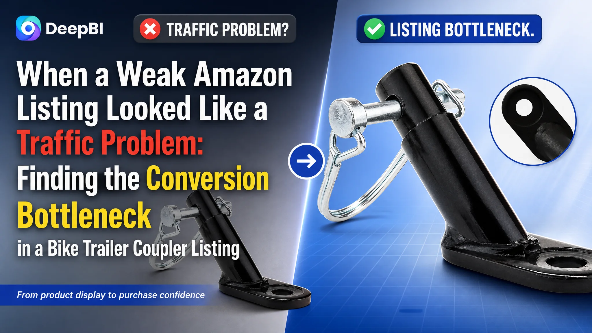
An Amazon seller in the US marketplace was facing a product-page conversion problem with a bike trailer coupler listing. The listing had a total score of 32/100, while a comparable high-performing listing reached 82/100. The gap was not limited to one image or one keyword. It extended across the title, main images, bullet points, A+ content, and review trust.
The initial optimization direction naturally leaned toward improving individual assets: refining keywords, polishing product images, and adding more specifications. But that approach treated the symptoms separately. DeepBI’s diagnosis showed that the larger issue was the Amazon Listing’s inability to guide a buyer from product recognition to purchase confidence.
The later direction therefore focused on rebuilding the product page as a decision system: clarify compatibility in the title, show installation and stability more convincingly, turn bullet points into benefit-led explanations, and use A+ content to teach buyers how to confirm fit. The case offers a practical lesson for Amazon sellers: before sending more traffic through Amazon ads, determine whether the product page can answer the buyer’s most important questions.
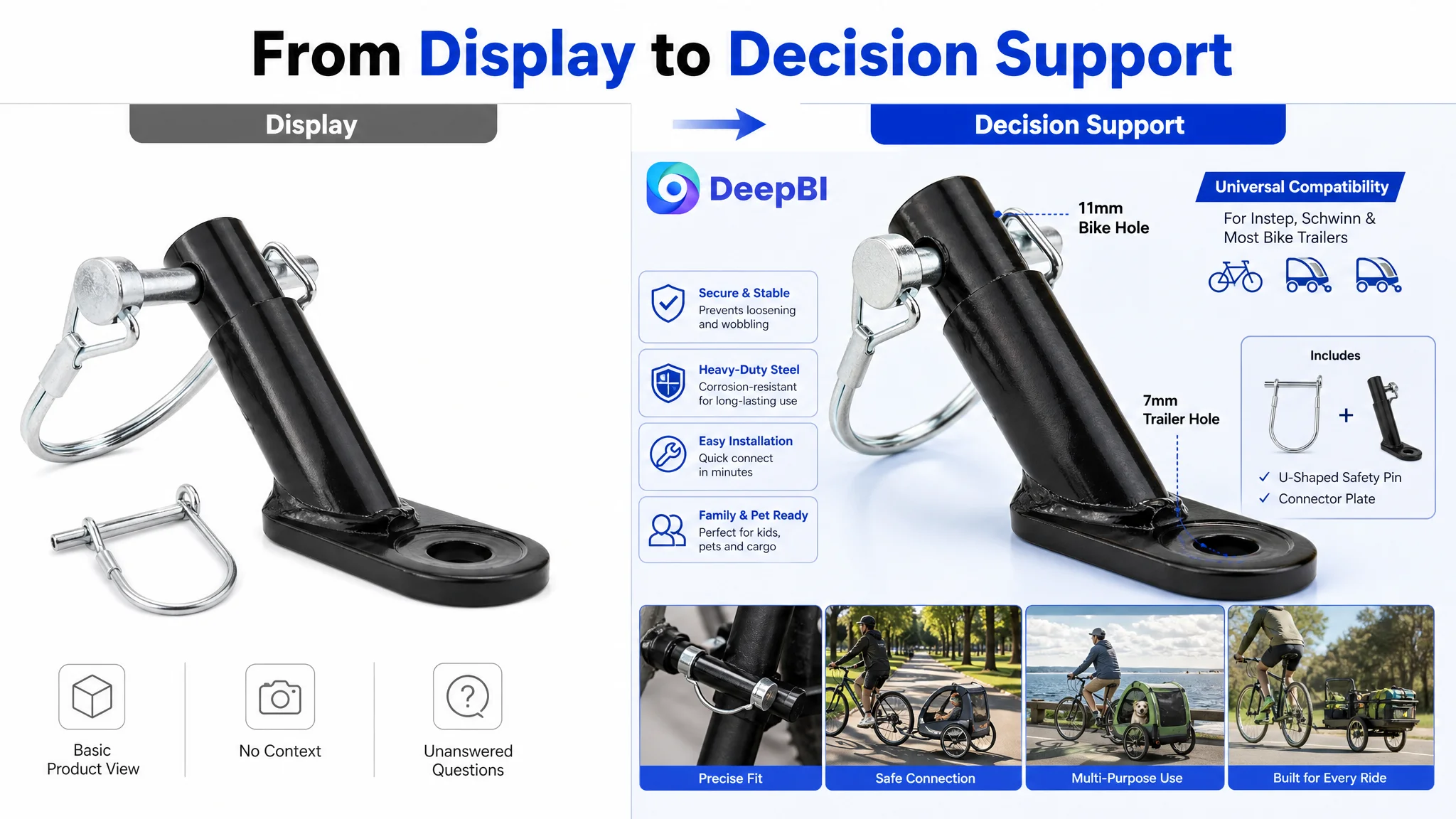
The Listing Was Not Short of Information. It Was Short of Decision Support.
At first glance, the listing appeared to contain the basic elements expected of an Amazon product page. It had a product title, several images, bullet points, and technical information.
But the 32/100 score showed that the presence of content did not equal conversion capacity.
The gaps were concentrated in the parts of the page that help a buyer decide:
- The title did not clearly communicate compatibility and product value.
- The main images showed the product but did not explain why it was a better or safer choice.
- The bullet points described attributes without building a buying logic.
- The listing had no A+ content.
- The listing had no review history or rating signal.
This distinction mattered because a bike trailer coupler is not an impulse-purchase product. Buyers need to know whether it will fit their bicycle and trailer, whether the connection will remain stable, whether installation is manageable, and whether the part can support the intended family or pet outing.
A page that leaves those questions unanswered does not merely look less polished. It creates friction at every stage of the Amazon conversion path.
The central issue was not that the product page lacked content. It was that the content did not reduce enough purchase risk.
The Initial Direction Focused on Surface Improvements
The original listing structure encouraged a familiar optimization response: adjust the title, improve the images, and add more specifications.
That direction was understandable. The title contained important search terms, and the product images communicated the basic form of the coupler. The bullet points also included material, packaging, specifications, and installation information.
Yet these elements were arranged as isolated pieces rather than as a connected sales argument.
The title began with the core keyword “Bike Trailer Coupler,” but then moved into repeated and loosely connected terms such as accessories and attachment components. The application wording was also difficult to follow, making it harder for buyers to identify the intended use case quickly.
The images had a similar problem. They showed the product, but they did not consistently answer the questions buyers were likely to have before purchasing:
- What type of bicycle can it fit?
- What trailer systems can it connect to?
- How does the connection remain secure?
- What do the included components do?
- How should the buyer confirm compatibility?
In other words, the initial direction treated the page as an asset-collection problem. DeepBI reframed it as a decision-logic problem.
The Score Gap Revealed Where Conversion Was Being Lost
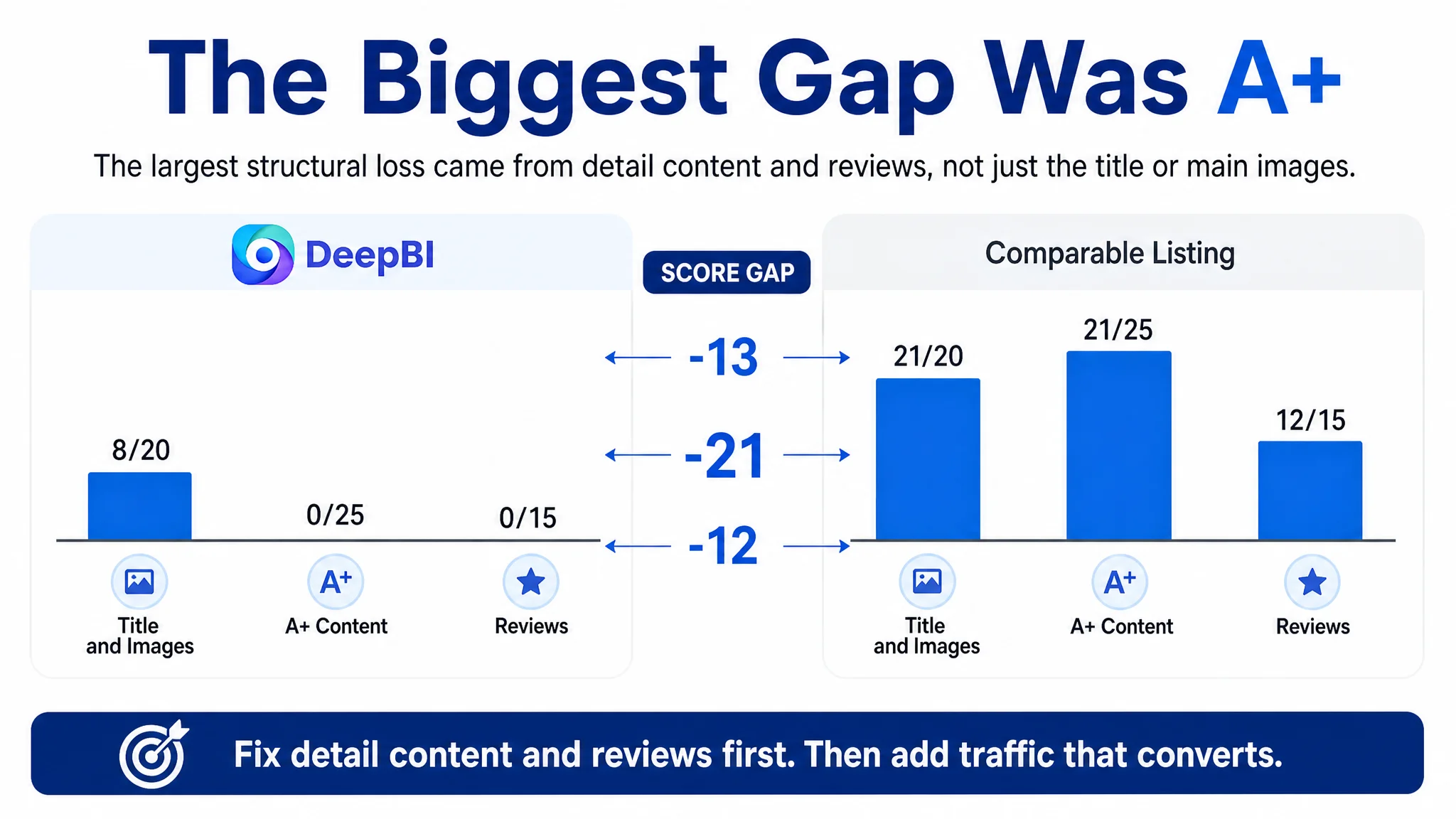
DeepBI’s comparison with a relevant category benchmark produced a clear distribution of the problem.
- Title: Customer listing: 8/20, Comparable listing: 15/20, Gap: -7
- Main images: Customer listing: 21/30, Comparable listing: 27/30, Gap: -6
- Bullet points: Customer listing: 3/10, Comparable listing: 7/10, Gap: -4
- A+ and detail content: Customer listing: 0/25, Comparable listing: 21/25, Gap: -21
- Reviews: Customer listing: 0/15, Comparable listing: 12/15, Gap: -12
- Total: Customer listing: 32/100, Comparable listing: 82/100, Gap: -50
The largest gap was not the title or the main image. It was the detail-page layer.
The customer listing had no A+ content, while the comparable listing used multiple modules to explain the product’s design, compatibility, installation details, and usage scenarios. This made the absence of A+ more than a branding weakness. It removed an entire stage of buyer education from the page.
The review gap created another structural disadvantage. The customer listing had no rating data and no reviews. The benchmark had a 4.9-star rating, 62 total reviews, and multiple detailed five-star reviews visible on the first page.
Reviews could not be created through copy changes alone. That meant the page had to compensate, wherever possible, by making compatibility, construction, installation, and use cases more explicit and credible.
The Real Constraint Was Listing Conversion Capacity
The diagnosis did not conclude that every weak element needed equal attention.
The more important judgment was that the listing could not currently convert traffic with enough confidence. Additional traffic, including paid traffic from Amazon ads, would risk exposing the same page-level weaknesses to more shoppers without fixing the underlying decision barriers.
This is why continuing to tune keywords or campaign settings first would have been an incomplete response. Better targeting may bring more relevant shoppers, but relevance does not guarantee conversion. If those shoppers still cannot confirm fit or understand the product’s practical value, the traffic becomes expensive evidence of a page problem.
The customer listing was especially vulnerable because compatibility was central to the purchase decision. A buyer searching for a bike trailer coupler is not only asking, “What is this product?” They are asking, “Will this connect to my bicycle and trailer without creating another problem?”
That question needed to become the organizing principle of the Amazon product page.
Advertising can bring a buyer to the listing. It cannot confirm compatibility on the seller’s behalf.
The Title Needed to Move From Keyword Inventory to Buyer Confirmation
The title’s main weakness was not the lack of keywords. It was the lack of hierarchy.
The existing structure placed the core keyword first, but then added repeated terms and unclear application wording. The result was closer to a keyword inventory than a concise product explanation.
The recommended direction was to organize the title around:
1. The core product type
2. Compatible trailer or bicycle applications
3. The connection function
4. Kids, pet, or cargo use cases
5. A general-use positioning where accurate
This structure gives the searcher an immediate way to evaluate relevance. It also reduces the mental work required to interpret repeated synonyms.
For a compatibility-sensitive accessory, the title should do more than help indexing. It should help the buyer eliminate uncertainty before opening the page.
Any brand or model references would still need to be verified against the actual product fit and Amazon compliance requirements. The important lesson is not to add familiar names for search volume alone. It is to make the compatibility claim precise enough to support a real purchase decision.
The Main Images Were Not Just a Visual Problem
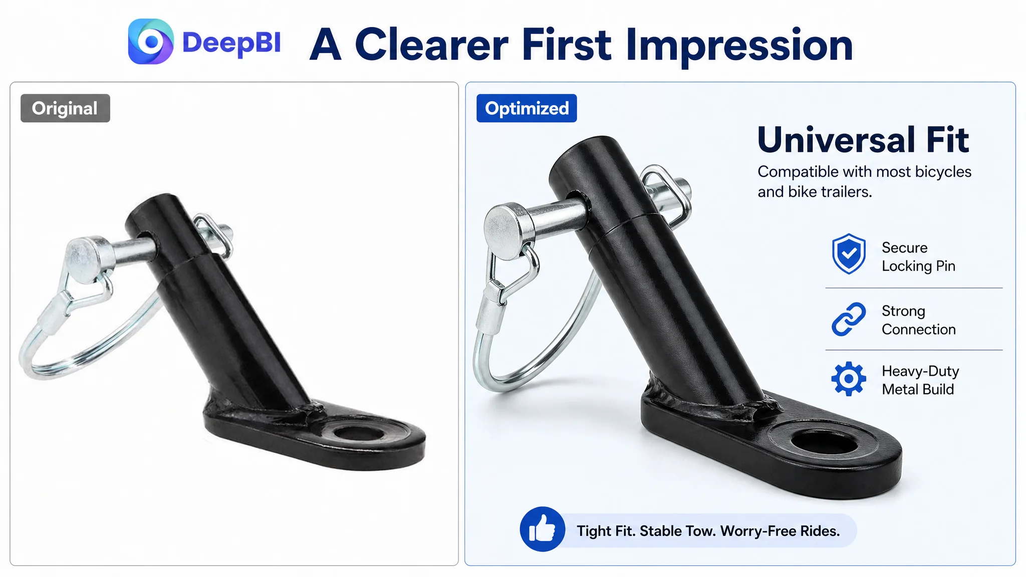
The main-image score was 21/30, so the issue was not that the product was invisible or unusable in the image set.
The larger problem was information density and visual proof.
The customer listing relied heavily on straightforward product close-ups. The comparable listing used a broader visual system:
- Technical detail views
- Installation and fit references
- Stability and wear-related explanations
- More structured component presentation
- Clearer problem-to-solution comparisons
- More realistic outdoor usage context
For this product category, visual improvement should not mean adding decoration. It should mean making the product’s role easier to understand.
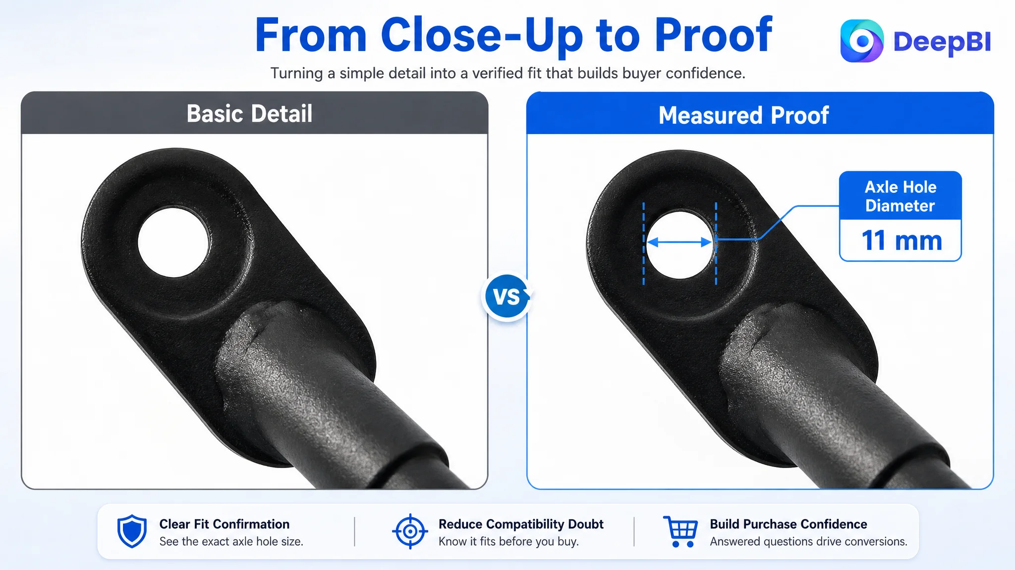
A better image sequence would show the coupler as part of the bicycle-to-trailer connection, then explain the relevant components and dimensions through compliant secondary images. Close-up views could make the holes, safety pin, and connection points easier to inspect. A technical diagram could help buyers understand the fit without forcing them to infer it from a small product photo.
The outdoor scenes recommended for the listing also had a specific purpose. Showing a bicycle towing a child or pet trailer can help buyers understand the product in use, but the scene must remain truthful to the product’s actual function. The goal is not to create an aspirational image detached from the hardware. It is to connect the hardware to a recognizable use case.
The Bullet Points Had Features, but Not a Persuasive Sequence
The bullet points scored 3/10 because they were closer to an instruction sheet than a purchase argument.
The existing order began with basic material and package information. Those details may be useful, but they did not address the buyer’s most urgent concern first: whether the coupler would fit and remain secure.
The stronger sequence identified in the comparison was:
Compatibility before material
The first bullet should explain the fit logic and the range of supported bicycle or trailer configurations, provided those claims are verified.
Material linked to use conditions
A material description becomes more persuasive when it explains why the construction matters in use, such as resistance to wear, rain, or sunlight, without making unsupported durability guarantees.
Specifications linked to stability
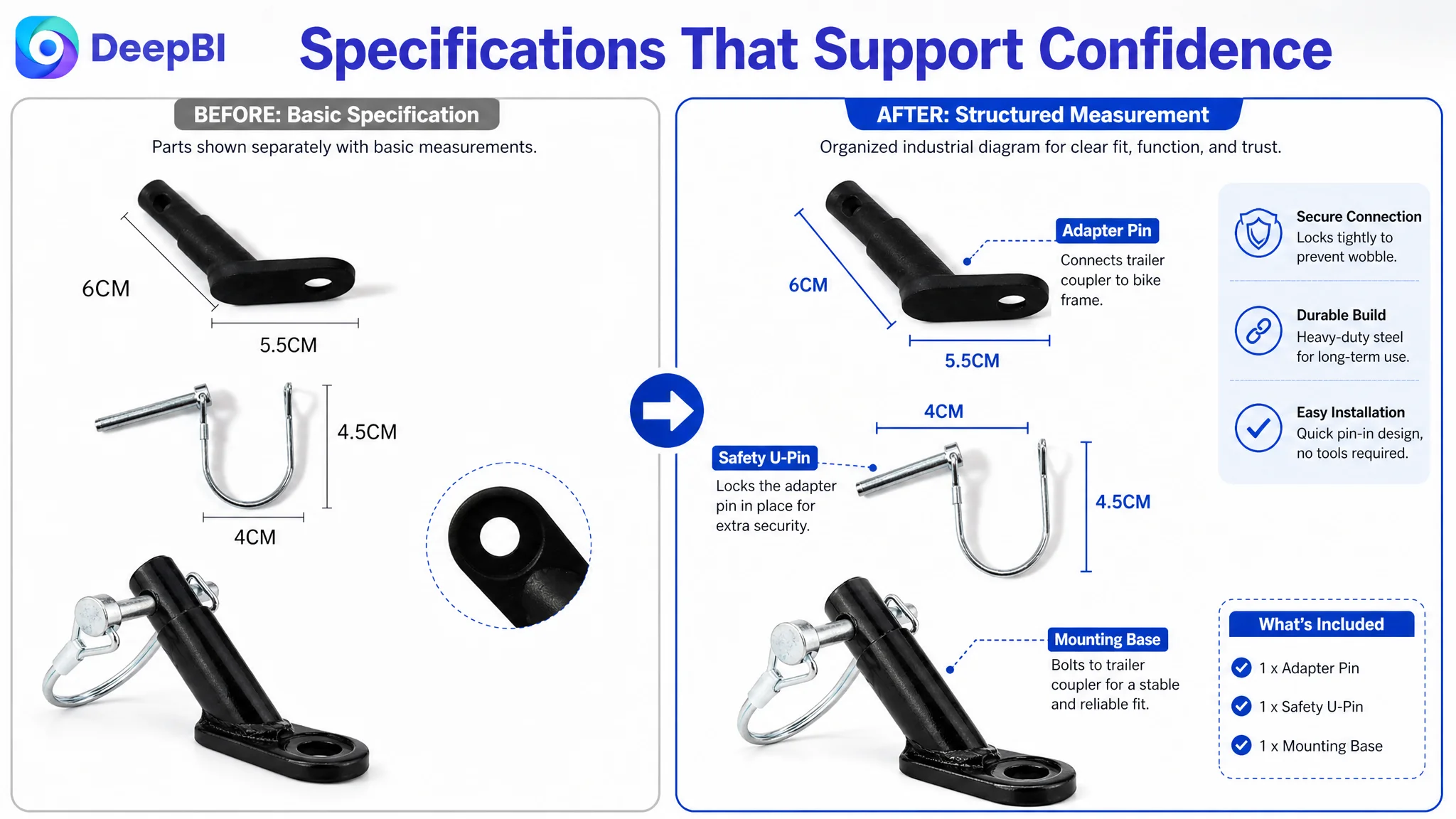
Dimensions should not appear as disconnected numbers. Where the product data supports it, the page should explain how the relevant hole sizes and connection dimensions help create a secure fit.
Use cases linked to user value
Children’s trailers, pet trailers, and cargo trailers are not merely additional keywords. They represent different reasons for buying the product. The page should show how the coupler supports those scenarios without overstating safety or performance.
Installation linked to confidence
Installation instructions should tell the buyer what to do and what to verify after installation. The language should remain accurate to the actual components and tools included.
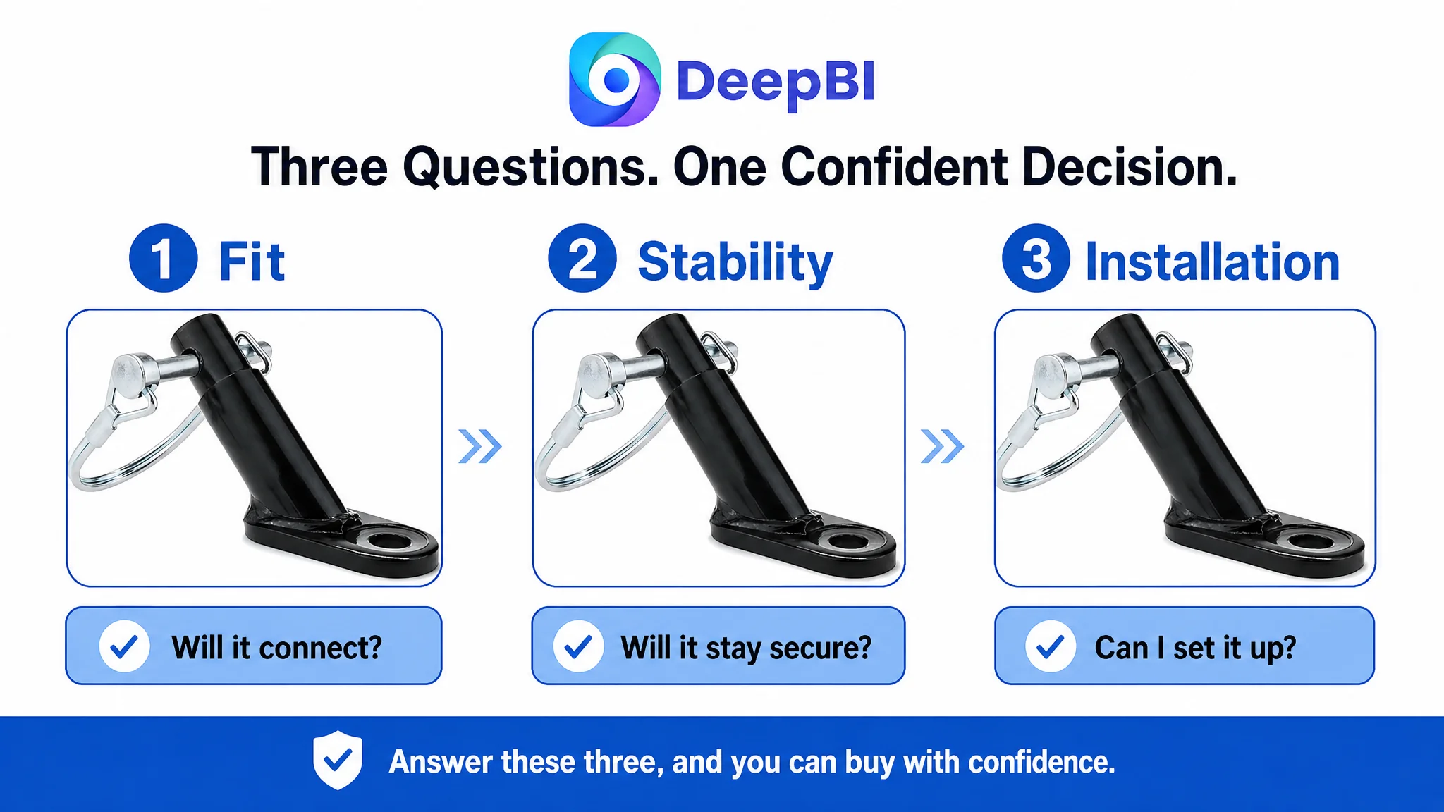
This creates a progression from “Will it fit?” to “Will it hold?” to “Can I install it?” and finally to “Does it suit the way I plan to use it?”
Missing A+ Content Removed the Trust-Building Layer
The most consequential gap was the absence of A+ content.
The benchmark listing used A+ modules to answer questions that the customer’s images and bullets left open:
- What the product looks like in a real outdoor setting
- Which components are included
- How the upgraded hole design works
- How to identify compatible trailer codes
- Which bicycle types may be suitable
- How the product can be used for children or pets
This is not simply a matter of adding more images. It is a matter of assigning each module a job in the decision journey.
Start with the use case
A realistic cycling scene can show the connection in context and help buyers understand where the product fits into a family or pet-outdoor activity.
Explain the components
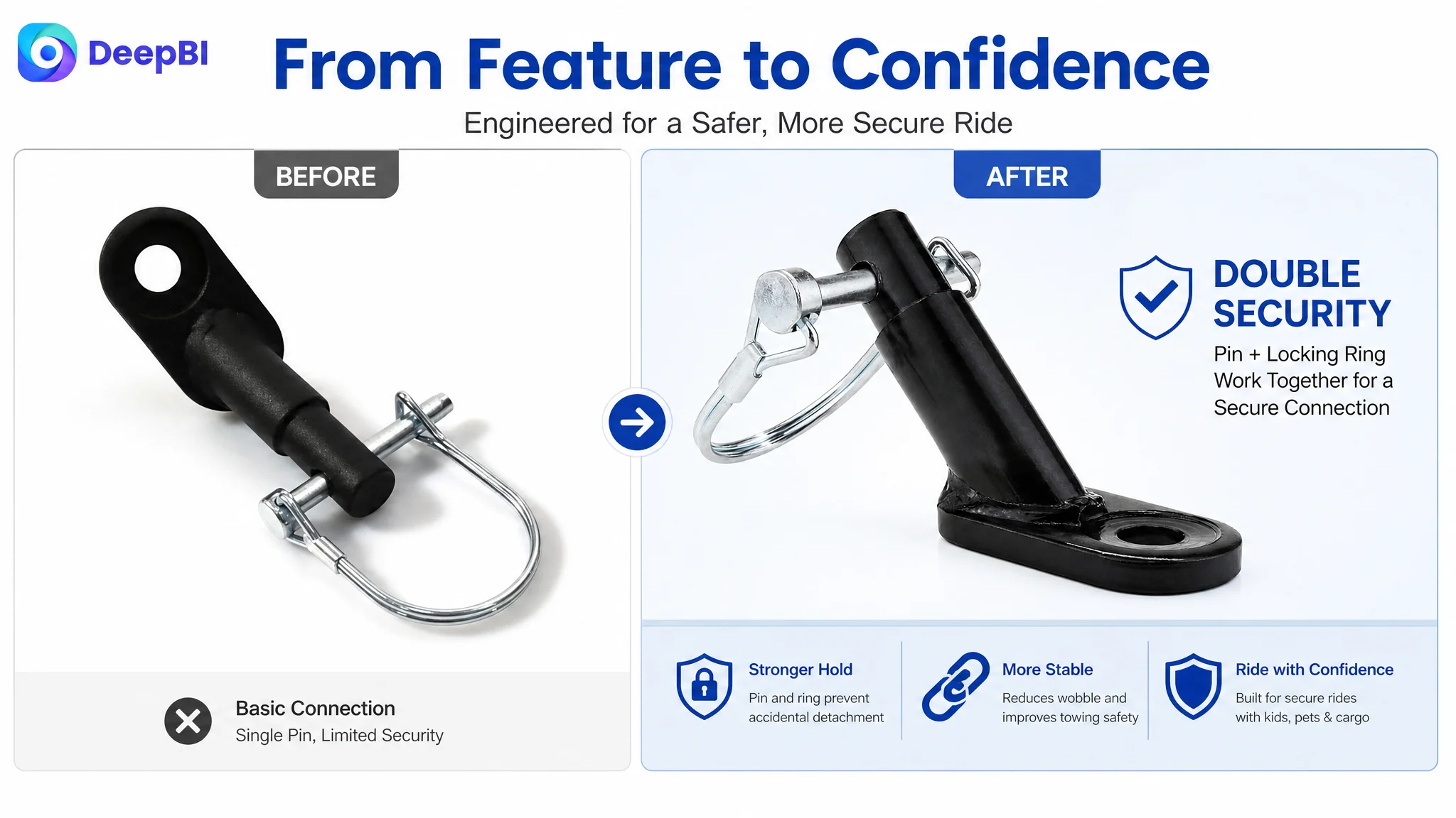
A structured module can identify the coupler, safety pin, and related parts so buyers do not have to guess what is included or how the pieces work together.
Teach compatibility checking
A compatibility guide is particularly important for this category. If trailer codes or model identifiers are relevant, the page should show buyers where to find them and how to compare them with the product’s confirmed compatibility information.
Show bicycle-type references
A simple visual matrix can help buyers compare common bicycle forms, such as folding, mountain, or road bicycles, as long as the compatibility claims are accurate.
Present multiple applications
A split scene showing child and pet trailer use can broaden the product’s relevance, but the connection point and actual product role should remain visually clear.
The purpose of A+ content here is not to make the page longer. It is to remove the need for the buyer to perform research elsewhere.
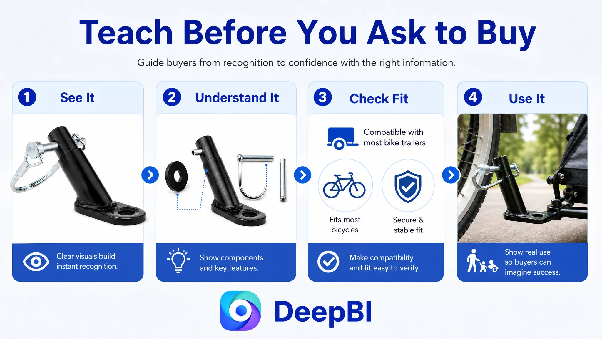
Better Visual Production Still Needed a Business Boundary
The proposed image direction combined industrial clarity with genuine outdoor context: more controlled angles, clearer component views, technical annotations, and real-use scenes.
But visual production had to remain subordinate to product truth.
The coupler’s physical structure, hole positions, dimensions, included parts, and material claims could not be altered simply to make the listing look more advanced. A generated image that changes the product or implies a feature it does not have may improve visual appeal while creating a much larger customer-service and return risk.
This is where DeepBI’s reasoning mattered. The system did not treat competitor visuals as templates to copy. It used them as evidence of what information the market was communicating more effectively.
The useful question was not, “How can this listing look like the competitor?”
It was:
“Which buyer questions does the competitor answer visually, and which of those questions is this listing still leaving unanswered?”
That distinction allows the seller to improve composition, clarity, scene context, and information hierarchy without inventing product attributes.
Why Ads Should Not Be Tuned First
The case did not provide a post-optimization ACOS, CVR, or TACOS result, so no numerical advertising improvement should be claimed.
The decision logic, however, was clear.
When a product page has a 50-point gap against a relevant benchmark, no A+ content, no review foundation, unclear compatibility communication, and weak bullet-point structure, ad optimization is unlikely to be the first constraint to remove.
Continuing to adjust bids or keywords before repairing the page could create three risks:
- Paying for traffic that cannot be converted efficiently
- Misreading low order volume as a targeting problem
- Allowing advertising to amplify weaknesses in the product page
The right sequence was to rebuild the Listing’s ability to receive and convert qualified traffic. After the page could explain fit, stability, installation, and use cases more effectively, Amazon ads would have a stronger destination.
This does not mean ads were irrelevant. It means ad performance should be interpreted together with Listing readiness.
The Business Understanding Changed
The case shifted the customer’s operating question from “Which keyword or image should we adjust?” to “What must a buyer understand before feeling ready to purchase?”
That change affects the entire Amazon workflow.
The title becomes a compatibility filter rather than a keyword container. The main images become a proof sequence rather than a product gallery. The bullet points become a structured response to buyer concerns rather than a list of specifications. A+ content becomes a teaching and trust layer rather than an optional brand decoration.
The listing may still need time to build review strength, and any compatibility or safety statement must be validated against the actual product. But the operating risk becomes easier to manage when the team knows which gaps are structural and which are not immediately solvable through content.
Before scaling Amazon ads, the seller had to make the product page worthy of the traffic it was expected to receive.
What Amazon Sellers Can Take From This Case
This bike trailer coupler listing illustrates a broader Amazon operating principle: conversion problems are often misdiagnosed when teams inspect each asset independently.
A weak title, ordinary images, thin bullets, missing A+, and no reviews may appear to be separate issues. In practice, they can form one larger constraint: the page does not provide enough evidence for a buyer to proceed.
DeepBI’s role in the case was not to produce a longer checklist. It was to connect the score gap to the buyer’s decision path and identify the priority order:
1. Clarify compatibility and product positioning.
2. Make the product’s connection and stability easier to understand.
3. Rebuild bullet points around buyer concerns and practical benefits.
4. Add A+ modules that educate, demonstrate, and reduce fit uncertainty.
5. Keep all visual and copy changes within the product’s verified physical boundaries.
6. Reassess paid and organic traffic only after the page can better convert both.
The practical lesson is straightforward but commercially important: Amazon ads can increase exposure, but Listing quality determines how much of that exposure becomes useful traffic, trust, and orders.