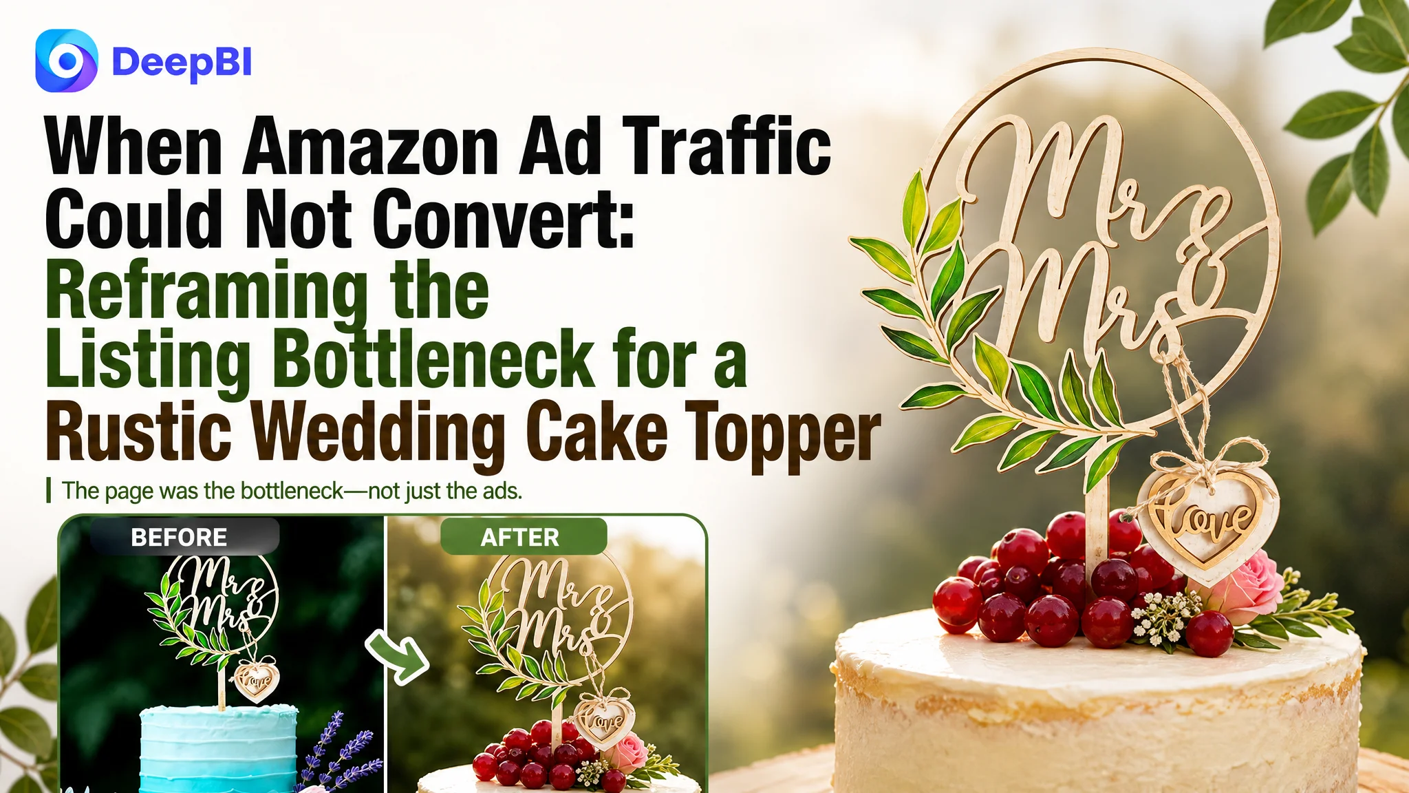
An Amazon seller of a wooden floral wedding cake topper believed the main challenge was competitive pressure: the listing needed stronger keywords, better images, and more reviews to compete in the US marketplace. The team had been looking at the problem through the familiar lens of traffic and visibility, while the product page continued to receive too little trust from shoppers.
DeepBI’s diagnosis pointed somewhere more fundamental. The listing scored 52 out of 100 against 81 for a comparable high-performing listing, but the decisive gap was not the title, main image, or bullet points alone. The product had no A+ content at all, producing a score of 0 out of 25 in the detail-page dimension while the benchmark listing scored 24.
The later optimization therefore focused on rebuilding the Amazon Listing as a decision path: clarify the product’s search identity in the title, make size and use easier to understand through visual content, and use A+ modules to connect wedding atmosphere, product details, sizing, usability, and trust. The case offers a useful reminder for Amazon sellers: before sending more ad traffic to a product page, determine whether the page has enough sales logic to receive it.
The Seller Saw a Visibility Problem. The Listing Had a Conversion Problem.
The product was a wooden wedding cake topper featuring a floral arch design and a “Mr & Mrs” message. Its likely buyers were not making a technical purchase. They were choosing a visual detail for a wedding, engagement celebration, bridal shower, or anniversary.
That distinction mattered.
In this category, shoppers need to answer several questions quickly:
- Does the style fit the event?
- Is the topper the right size for the cake?
- Does it look substantial rather than fragile or inexpensive?
- Is it easy to use?
- Can it arrive safely and be used without assembly?
- Will it look good in photographs?
The customer’s listing addressed some of these points in its title and bullet points. It described the design, material, dimensions, packaging, and possible uses. But the information was not organized into a complete visual and emotional buying journey.
The page was not empty of information. It was missing the structure that helped shoppers believe the information.
The real constraint was not a lack of product details. It was a lack of conversion capacity on the Amazon product page.
That difference explains why isolated improvements could not resolve the broader business pressure. A keyword adjustment might improve relevance. A new image might make the product look cleaner. More reviews might add reassurance. But if the page still failed to show how the product fits into a real celebration, why its size matters, and how easily it can be used, paid traffic would continue to meet friction after the click.
The First Diagnosis Was Too Close to the Ads
When an Amazon Listing underperforms, sellers often begin with the most visible symptoms:
- Traffic is expensive.
- ACOS is difficult to control.
- Clicks do not produce enough orders.
- Competitors appear to win more search exposure.
- Reviews seem insufficient.
These symptoms can lead to an advertising-first response: adjust bids, restructure campaigns, refine keywords, or expand targeting.
For this wedding cake topper, the title did have a search-visibility weakness. It placed the brand phrase “Mr & Mrs” before the more direct product term, while the comparable listing led with “Rustic Wedding Cake Toppers.” It also used a less specific color description and relied on a longer “for” structure that pushed the core product identity further back.
Those were real issues, but they were not the largest business constraint.
The listing’s title score was 11 out of 20, compared with 14 for the benchmark. The main-image score was 24 out of 30, compared with 26. The bullet-point score was actually higher at 7 out of 10, compared with 5.
If the team had treated the title, image, or advertising settings as the entire problem, it would have missed the most consequential gap in the listing.
One Score Changed the Priority: Detail-Page Content Was Missing
The five-dimension comparison produced a clear result:
- Title: Customer listing: 11/20, Comparable listing: 14/20, Gap: -3
- Main image: Customer listing: 24/30, Comparable listing: 26/30, Gap: -2
- Bullet points: Customer listing: 7/10, Comparable listing: 5/10, Gap: +2
- Detail page: Customer listing: 0/25, Comparable listing: 24/25, Gap: -24
- Reviews: Customer listing: 10/15, Comparable listing: 12/15, Gap: -2
- Total: Customer listing: 52/100, Comparable listing: 81/100, Gap: -29
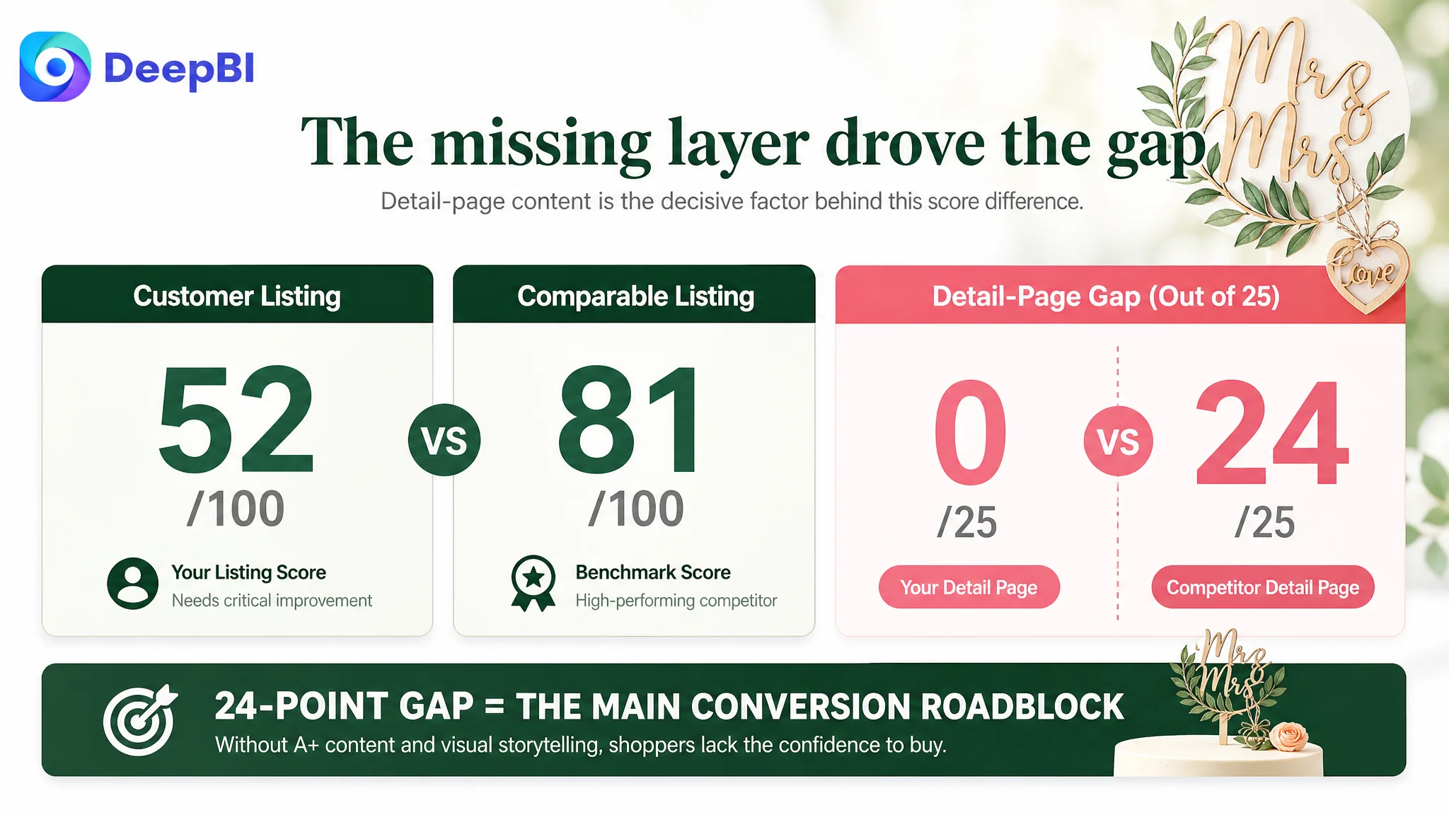
The conclusion was not that every dimension needed equal attention. The conclusion was that one missing layer dominated the diagnosis.
The customer listing had no A+ content. The benchmark listing used a sequence of visual modules covering:
- A strong opening wedding scene
- Product dimensions and material details
- Cake-size comparisons
- Multiple celebration settings
- Usage steps
- Style compatibility
- Packaging and gift value
- Product close-ups
- Related wedding accessories
This was more than a collection of decorative images. It was a progression from attraction to reassurance.
The customer’s page asked the shopper to infer too much from the basic listing content. A buyer had to imagine the topper on a cake, estimate how its dimensions would look, understand how it would be inserted, and decide whether its style suited the event without enough visual support.
That is a conversion leak, not merely a content gap.
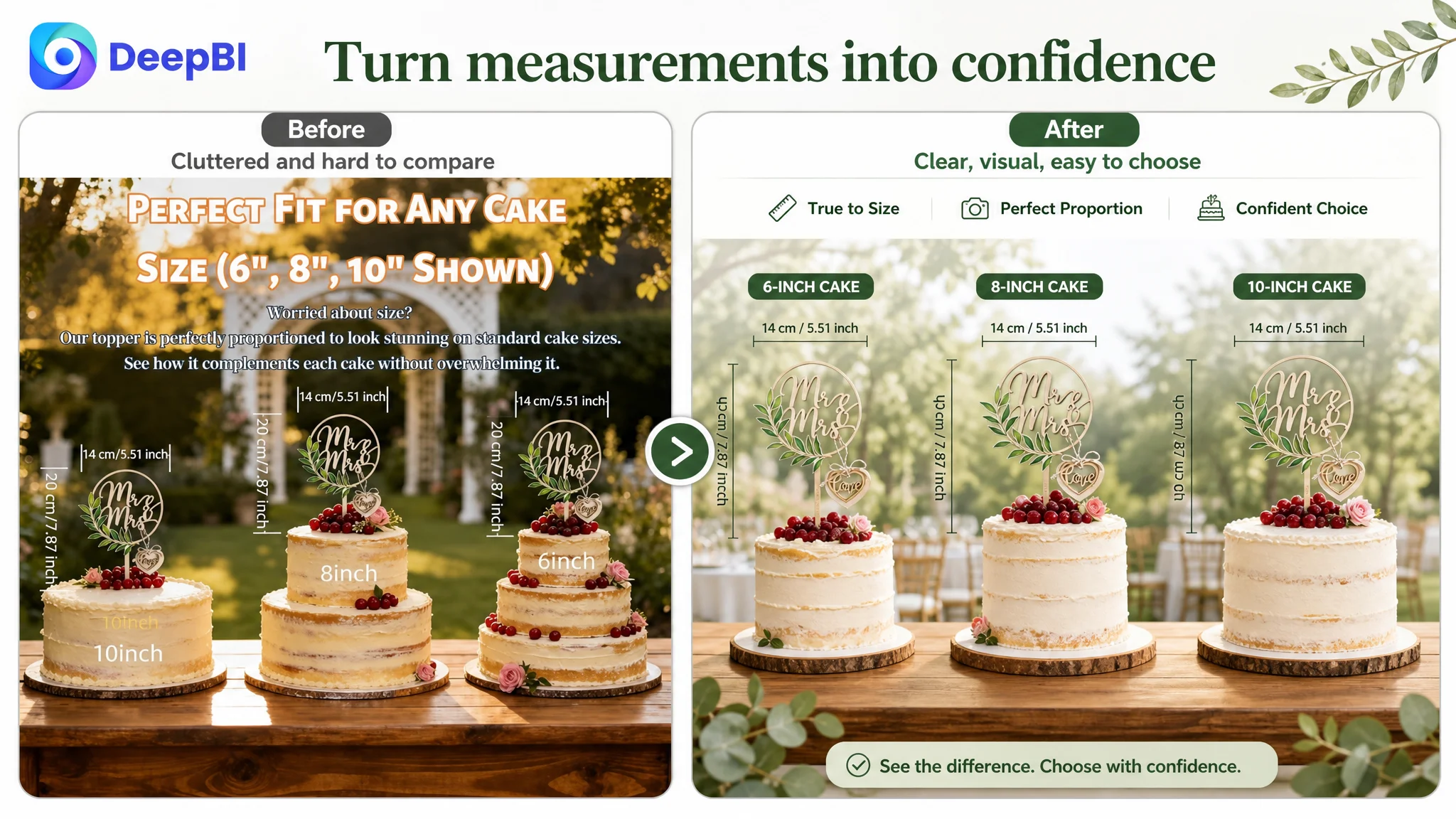
The page had no visual answer to the size question
The product dimensions were available in the bullet points, including a width of approximately 21 cm and a height of approximately 25 cm. But numerical information alone does not always create confidence in a visual category.
A shopper preparing an eight-inch cake wants to see proportion, not only read it.
The recommended direction was to show the topper with cakes of different sizes, using clear width and height markers and a direct comparison across four-, six-, and eight-inch cakes. This would turn an abstract measurement into a practical decision.
The page did not show enough of the use experience
The customer listing could describe that the topper was fully assembled and easy to use. However, a sequence showing unboxing, wiping the surface, and inserting the topper into a cake would answer several concerns at once:
- Is assembly required?
- Is the product easy to handle?
- Can the surface be cleaned?
- Will the topper stand securely?
- Is it suitable for a last-minute event setup?
For an event product, reducing uncertainty is part of the value proposition.
The page did not build a strong emotional setting
Wedding shoppers are buying for an important occasion. A plain or visually weak presentation can make a product feel interchangeable, even when the physical item is attractive.
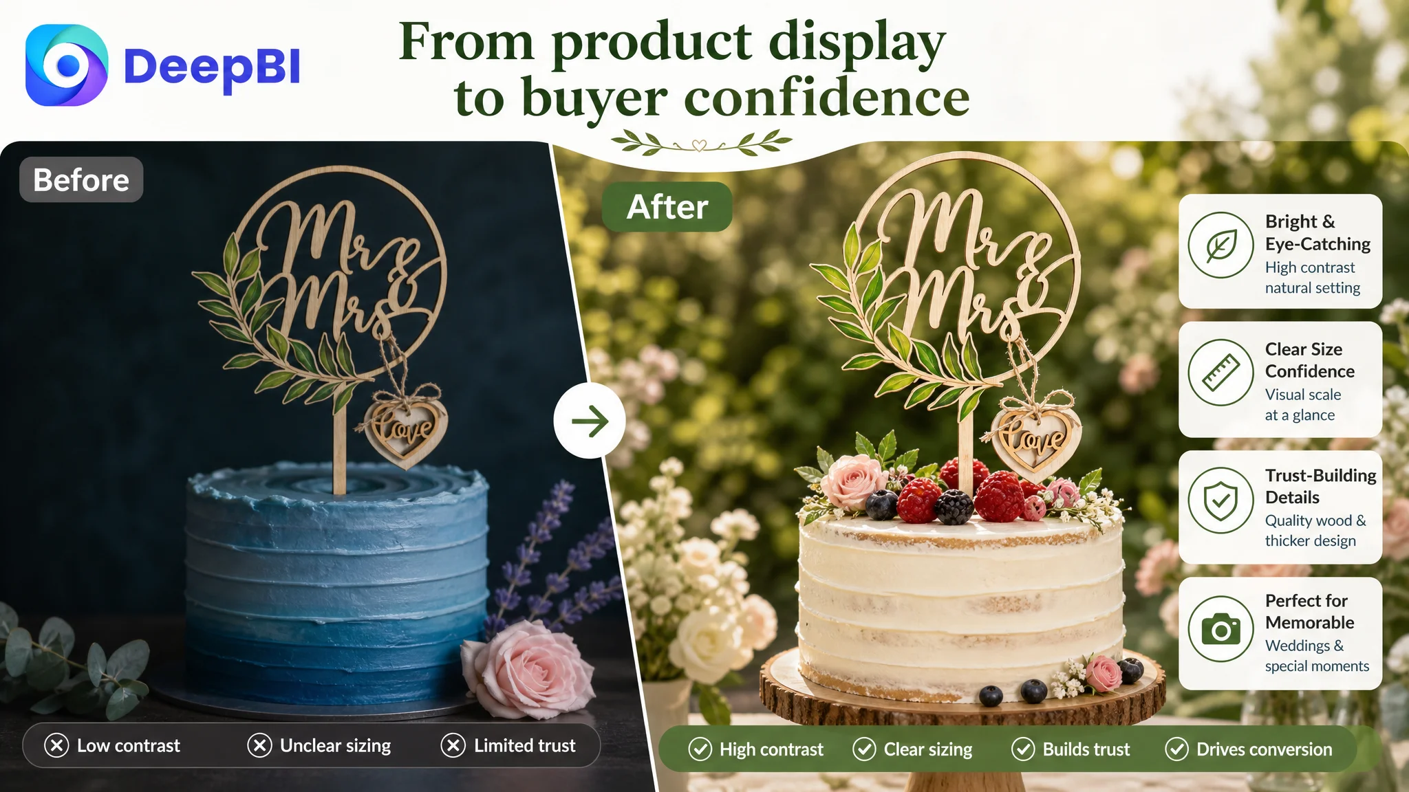
The benchmark listing used high-quality wedding and garden scenes to create a clear emotional context. The recommended direction for the customer listing was a bright, natural, forest-inspired visual language built around cream, wood, and leaf green.
The purpose was not to imitate another listing. It was to make the product’s intended role immediately legible: a refined centerpiece for a meaningful celebration.
The Title Needed a Search Reframe, Not More Words
The title gap was real, but the solution was not to add every possible occasion keyword.
The customer’s original structure emphasized “Mr & Mrs” and “Floral Arch.” Those terms described the design, but they did not establish the broadest product identity early enough. The recommended structure began with:
Wooden Floral Wedding Cake Topper
That opening made the product category clear before introducing the design, material, style, and occasions.
The revised direction also incorporated more specific and commercially useful modifiers such as:
- Wooden
- Floral
- Wedding cake topper
- Bride and groom
- Rustic
- Boho
- Engagement
- Anniversary
- Bridal shower
This was a more disciplined keyword architecture:
core product term → material and style → design detail → event use cases
The goal was not keyword volume for its own sake. It was to help Amazon understand the item and help shoppers recognize it quickly on the search page.
A title can improve discoverability, but it cannot compensate for a product page that fails to support the decision after the click.
The Main Image Was Usable, but It Did Not Carry Enough Commercial Weight
The main-image score was only two points below the comparable listing, so it was not the first issue to repair. Still, DeepBI identified several ways the visual system could become more effective.
The existing visual direction was relatively dark, and the blue cake background reduced the contrast with the wooden topper and green leaf details. The recommended visual approach moved toward:
- A brighter, cleaner background
- A white or cream cake setting
- A natural garden atmosphere with controlled blur
- A more prominent product position
- Clearer dimensional communication in secondary images
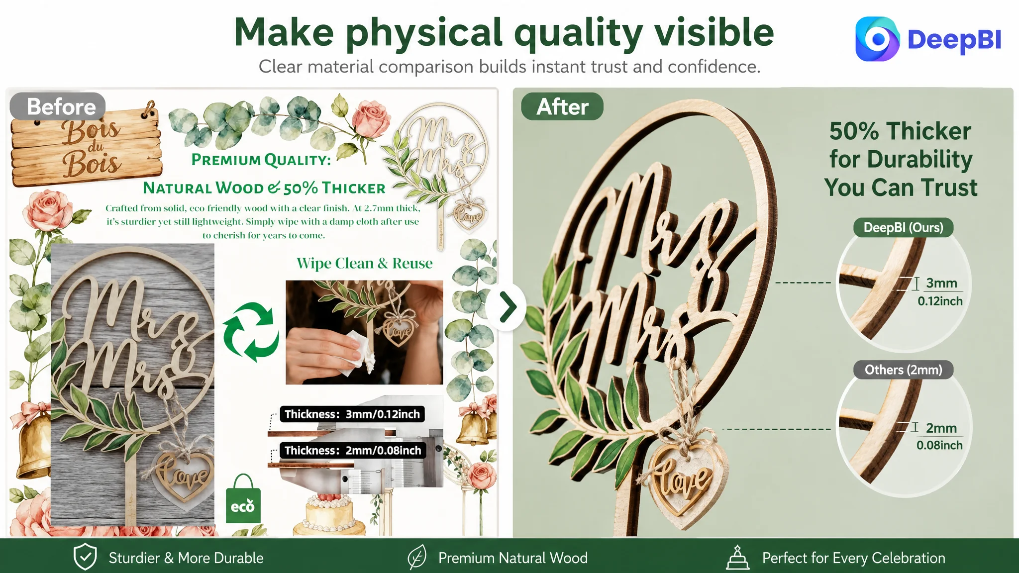
- Close-up treatment of thickness and material details
- Realistic demonstrations of cleaning and insertion
- Multiple celebration contexts
These recommendations were not based on the idea that a more attractive image automatically sells more. Each image had a specific role in the buying process.
The primary image should make the product recognizable
The first visual should communicate what the item is and what kind of celebration it belongs to. A centered topper on a refined cake scene can create that recognition more quickly than a dark or visually crowded composition.
Supporting images should resolve practical doubts
The secondary image set should not repeat the same product view. It should clarify:
- Scale
- Thickness
- Cake compatibility
- Reusability
- Handling
- Style flexibility
- Packaging
In this case, the material stated that the topper was thicker than ordinary alternatives, but the existing presentation did not create enough visual force around that advantage. A close-up comparison could make the physical distinction easier to understand without relying on a vague quality claim.
Bullet Points Were Not the Weakest Link
One of the more important judgments in the case was that the bullet points did not require the same level of intervention as the detail page.
The customer’s bullet structure was relatively clear. It covered the design, material, dimensions, durability, display potential, packaging, and convenience. In fact, the customer listing scored higher than the benchmark in this dimension.
That did not mean the bullets were perfect. It meant that rewriting them extensively was not the best first use of resources.
The recommended refinements were focused:
- Put the core product phrase closer to the beginning.
- Connect the floral design to wedding and engagement use.
- Make “rustic” and “vintage” more concrete.
- Use the 21 cm by 25 cm dimensions to explain suitability for an eight-inch cake.
- Turn the base stand into a keepsake and gift value.
- Clarify that the product arrives assembled and securely packaged.
The difference is subtle but important. The objective was not to replace useful information with emotional language. It was to connect factual information to a buying decision.
For example, a dimension becomes more persuasive when it answers “Will this fit my cake?” A base becomes more valuable when it answers “Can this remain part of the couple’s keepsake display?” Packaging becomes more reassuring when it answers “Will it arrive ready for the event?”
Why DeepBI Did Not Keep Tuning Ads First
The diagnosis created a clear order of operations.
If the page had scored reasonably across its core content areas and only needed incremental improvements, continued advertising adjustments might have been appropriate. But a 24-point gap in detail-page content indicated that the listing was not yet ready to absorb more traffic efficiently.
Advertising could send shoppers to the page. It could not create the missing A+ narrative after they arrived.
Advertising does not only amplify strengths. It can also amplify the defects of a low-conversion page.
This was the biggest risk at the customer’s stage. Increasing traffic before repairing the page could produce more clicks without enough additional orders, making ACOS harder to control and making the ad account appear to be the source of the problem.
The better decision path was:
1. Clarify the listing’s search identity.
2. Improve the visual hierarchy and practical communication.
3. Build A+ content that completes the product story.
4. Then evaluate whether paid traffic is being converted more effectively.
5. Only after that, continue refining advertising scale and efficiency.
This sequence prevents the team from using ad optimization to compensate for a product-page problem.
The A+ Page Had to Become a Decision System
The recommended A+ structure was not a request to “add more images.” It was a way to make the page answer the shopper’s questions in a deliberate order.
First: create the occasion
Open with the topper on a bright, elegant wedding cake in a garden-inspired setting. The first module should establish the emotional role of the product before asking the shopper to process details.
Second: prove the product
Show the wood grain, painted greenery, edge quality, support structure, and actual dimensions. Close-up images should make the product feel tangible and substantial.
Third: remove sizing uncertainty
Use side-by-side cake comparisons to show how the topper looks on different cake diameters. This is more useful than presenting dimensions in isolation.
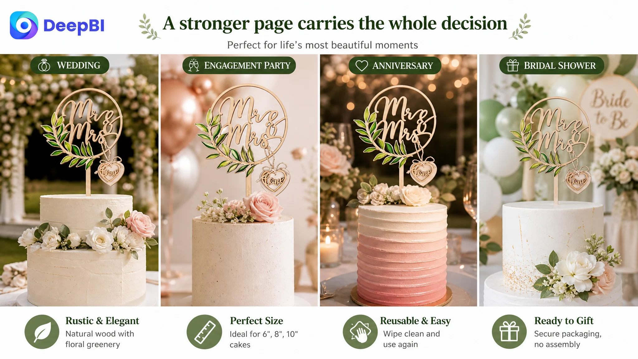
Fourth: expand the use cases
Show the topper in weddings, engagement celebrations, bridal showers, and anniversaries. The goal is to demonstrate relevance without making the product feel generic.
Fifth: demonstrate ease of use
Use a short three-step visual sequence:
Unbox → Wipe → Insert
This turns convenience and care instructions into visible evidence.
Sixth: show style compatibility
Display the same product across rustic, floral, and vintage cake settings. This helps shoppers understand that the design can work with different event aesthetics.
Seventh: reinforce the broader product world
A lower-page comparison of related wooden wedding accessories can help establish a coherent category offering. It should support discovery of complementary products rather than distract from the primary purchase.
Together, these modules create a more complete path:
emotion → product proof → size confidence → occasion fit → ease of use → style reassurance → broader value
That was the missing sales logic in the original listing.
Reviews Added Pressure, but They Were Not the First Repair
The review comparison also showed a trust disadvantage:
- Customer listing: 4.4 stars from 22 reviews
- Comparable listing: 4.7 stars from 53 reviews
- Customer listing first-page lower-rated review share: 37.5%
- Comparable listing first-page lower-rated review share: 0%
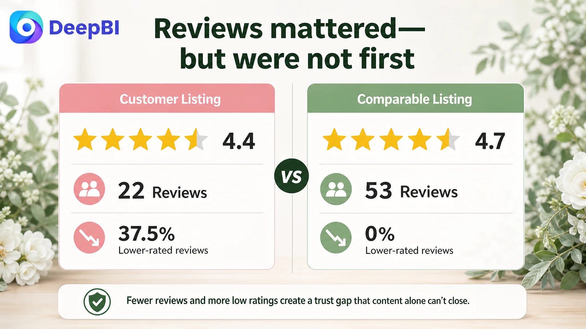
The review gap mattered. A lower rating, smaller review base, and visible lower-rated feedback can make shoppers more cautious, especially when buying for a time-sensitive event.
But reviews were not the most actionable first constraint. The seller could not immediately change the existing review history. The team could, however, improve the page’s ability to explain the product accurately and reduce avoidable uncertainty around size, use, quality, and packaging.
This is another reason the diagnosis needed to distinguish between:
- A trust signal that must be managed over time
- A content deficiency that can be addressed directly
- A traffic problem that should not be scaled before the first two are understood
The listing needed to earn more confidence from the content it controlled.
What Changed in the Business Understanding
The case material does not include confirmed post-optimization results, so it would be inappropriate to claim a specific CVR increase, ACOS reduction, or organic-order recovery.
The more immediate change was in operating judgment.
The customer’s problem was no longer framed as “the ads need more tuning” or “the listing needs more reviews.” It was reframed as a product-page conversion problem with a clear priority: close the missing detail-page layer, then assess the advertising funnel again.
That change improves the quality of subsequent decisions:
- Ads can be evaluated against a stronger landing experience.
- Title changes can be judged by both relevance and downstream conversion.
- Image production can serve defined buying questions rather than general aesthetics.
- A+ content can be designed as a structured sales argument.
- Review weakness can be managed alongside, rather than confused with, content weakness.
- Future traffic increases can be considered only after the page demonstrates that it can receive and convert them.
The Lesson for Amazon Sellers
This Amazon wedding accessory case illustrates a broader operating principle:
When traffic is expensive and orders are weak, do not assume the advertising account is the first place to look.
The seller did have a title opportunity. The image set could communicate size, thickness, use, and style more effectively. Reviews created a real trust disadvantage. But the decisive problem was that the Amazon product page lacked the visual and informational layer needed to turn interest into confidence.
DeepBI’s value in this case was not a list of isolated edits. It was the ability to compare the listing across multiple dimensions, identify where the competitive gap was concentrated, and establish the correct sequence of action.
The page did not first need more traffic.
It needed a clearer reason to click, a stronger reason to trust, and enough practical evidence to make the purchase feel safe for an important occasion. Only after those conditions were addressed could Amazon ads become a more useful source of growth rather than a louder amplifier of page-level weakness.