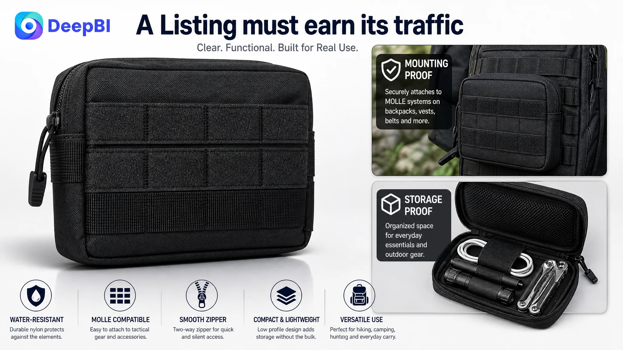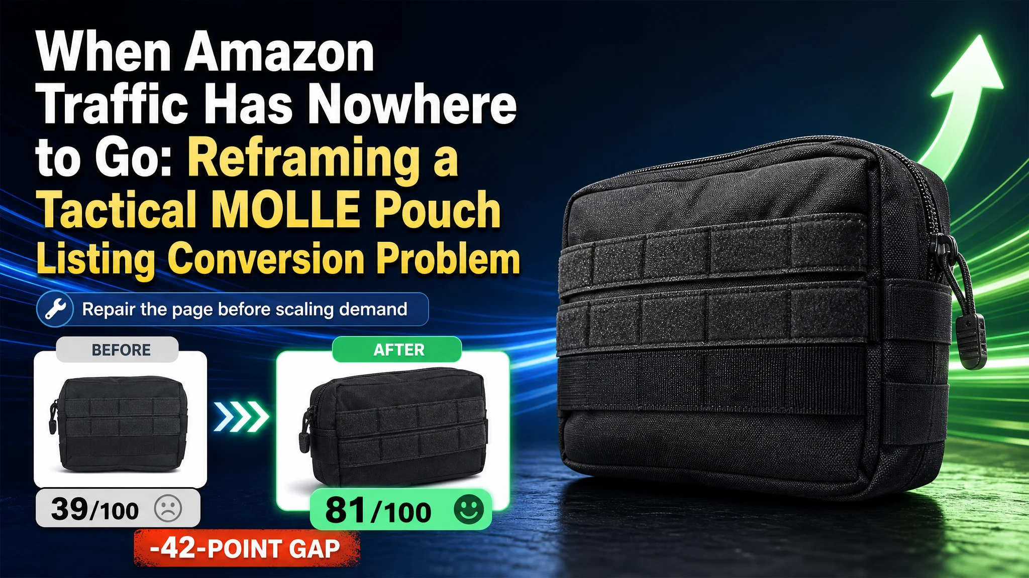
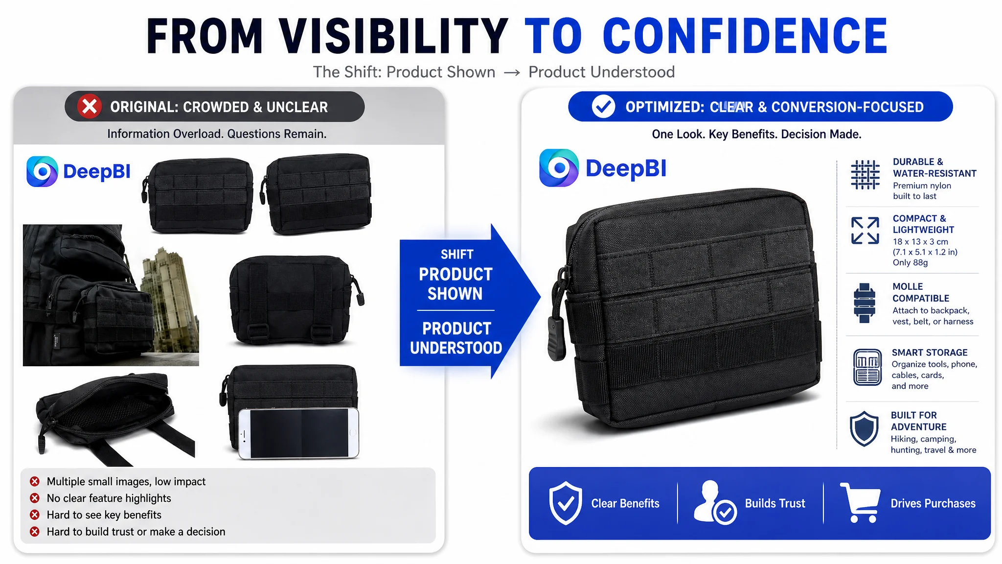
This Amazon seller was not facing a simple keyword or copywriting issue. Its UK Listing for a tactical MOLLE utility pouch had a serious product-page conversion gap: the Listing scored 39 out of 100, while a comparable high-performing listing scored 81. The page had a product, relevant use cases, and basic specifications, but it did not give shoppers enough visual or trust-based reasons to continue toward purchase.
The initial instinct was to improve the visible Listing elements one by one, especially the title, bullet points, and product images. But the deeper diagnosis showed that the main constraint was not a lack of isolated information. It was the absence of a complete buying path. The main image struggled to create a strong first impression, the page had no A+ content, and the Listing had no review history to support the product claims.
DeepBI reframed the problem around Amazon product-page conversion capacity. The later optimization focused on restoring the page's logic in sequence: clarify the title's search intent, rebuild the main-image system, turn specifications into usage evidence, make the bullet points more decision-oriented, and introduce A+ modules that explain durability, MOLLE compatibility, zipper operation, and storage use cases. For other Amazon sellers, the lesson is direct: before sending more traffic to a Listing, determine whether the page has earned the right to receive it.
The Amazon Listing Did Not Lack Information. It Lacked Persuasion.
The product was a compact tactical pouch designed for MOLLE-compatible backpacks, vests, belts, and harness setups. On paper, the Listing covered many relevant attributes:
- Water-resistant nylon construction
- Compact dimensions of 18 x 13 x 3 cm
- MOLLE compatibility
- Outdoor and travel use
- Storage for small everyday items and tools
That information was not irrelevant. The problem was how it appeared across the Amazon product page.
The Listing presented specifications as separate facts rather than as a connected reason to buy. A shopper could learn the pouch's size and material, but still remain uncertain about more important practical questions:
- How securely does it attach?
- What does the inside hold?
- Is the zipper easy to operate when mounted?
- Does the pouch look durable enough for outdoor use?
- How does it fit into a real tactical or hiking setup?
- Why should the shopper trust this product without any review history?
These questions are particularly important in tactical accessories. Buyers are not only purchasing storage capacity. They are evaluating reliability, access, mounting stability, and whether the product will perform in the environment where they intend to use it.
The central issue was not that the page had no product information. It was that the information did not form a convincing decision path.
A 42-Point Gap Changed the Priority Order
DeepBI's comparison produced a clear difference in overall Listing competitiveness:
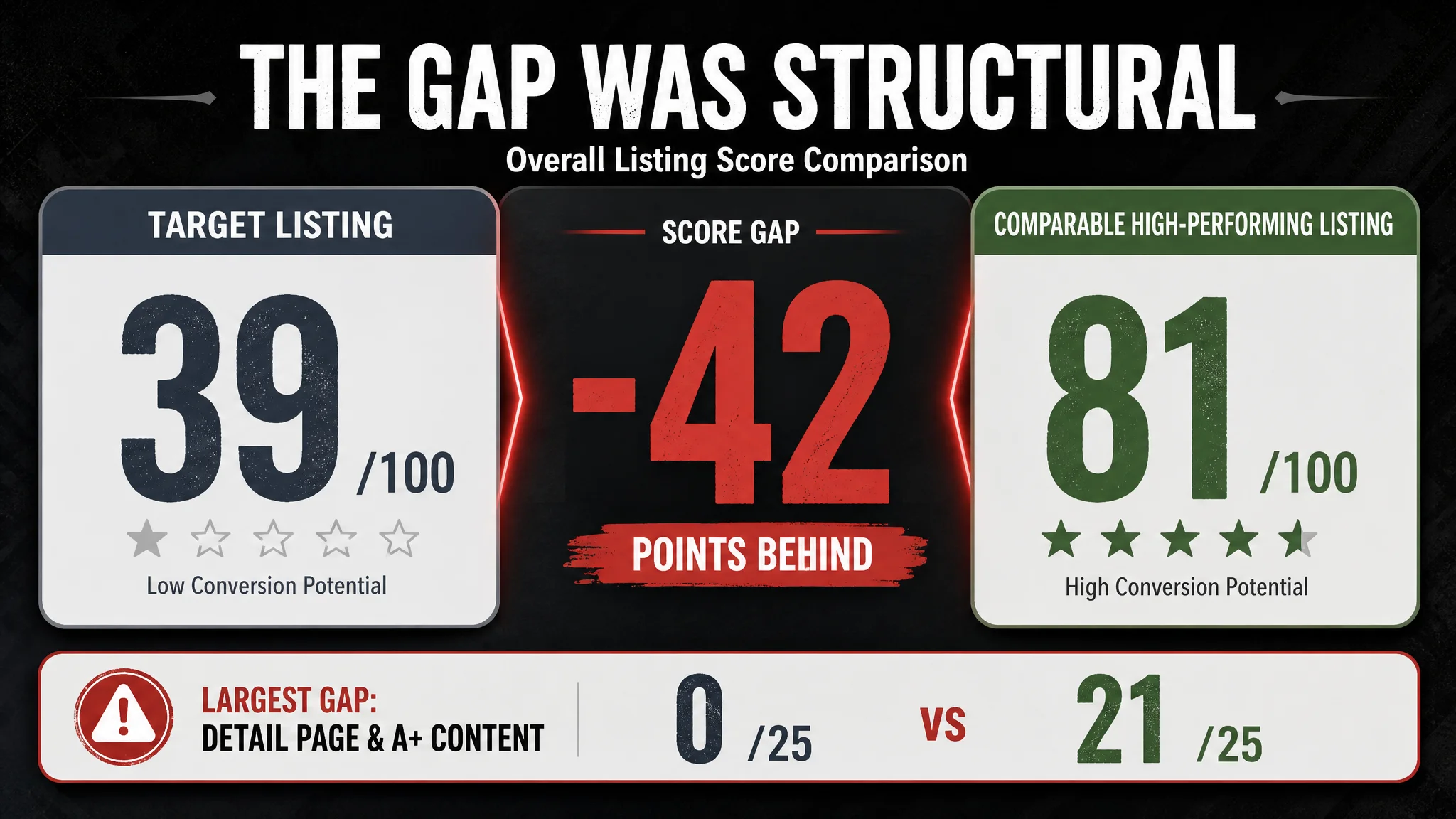
- Overall score: Target Listing: 39/100, Comparable high-performing Listing: 81/100, Gap: -42
- Title: Target Listing: 13/20, Comparable high-performing Listing: 15/20, Gap: -2
- Main image: Target Listing: 21/30, Comparable high-performing Listing: 26/30, Gap: -5
- Bullet points: Target Listing: 5/10, Comparable high-performing Listing: 6/10, Gap: -1
- Detail page and A+ content: Target Listing: 0/25, Comparable high-performing Listing: 21/25, Gap: -21
- Reviews: Target Listing: 0/15, Comparable high-performing Listing: 13/15, Gap: -13
The most important finding was not simply that the score was low. It was where the score was being lost.
The title and bullet-point gaps were real, but relatively limited. The largest deficiencies were in the detail page and review dimensions. The product page had no A+ content, while the comparable listing used a structured visual sequence covering brand positioning, outdoor use, product construction, zipper and buckle details, MOLLE webbing, accessories, and different product views.
The review gap was equally visible. The target Listing had no rating data and no customer reviews. The comparable listing had a 4.3-star rating and 981 reviews, including detailed comments about durability, dimensions, and MOLLE functionality.
This changed the business question.
Instead of asking, “Which keyword should be added next?” the more useful question became:
Can this Amazon product page convert a shopper who has already shown interest in the category?
The score distribution suggested that the page was not primarily losing because of one poorly chosen phrase. It was losing because the shopper had too little evidence with which to evaluate the product.
The Original Diagnosis Focused on Surface Improvements
The initial optimization direction was understandable. The title needed a cleaner structure, the bullet points could be more benefit-oriented, and the images needed to look more professional.
The title placed the dimensions in the middle of the keyword flow and began with “1 Pack,” pushing the core phrase “Tactical Pouch” away from the strongest position. Its use-case wording also leaned toward product compatibility, such as backpack, vest, and harness fitting, rather than directly expressing the search intent around hunting, hiking, camping, and tactical organization.
The bullet points were similarly functional but not sufficiently persuasive. They emphasized material, size, compatibility, and storage details, yet did not consistently translate those details into the user's operating experience. In contrast, the comparable listing described practical benefits such as two-way zipper access, silent cord pulls, and concrete examples of what users could carry.
These were valid issues. But treating them as the whole problem would have led to another round of incremental changes without repairing the larger conversion gap.
The main image was a more consequential weakness. Instead of presenting the pouch as a clear, professional product, the existing image system relied on visually crowded compositions, outdoor imagery with inconsistent lighting, and presentation elements that could make the product feel less established. The product was not always given enough visual dominance, and the images did not consistently prove the features that mattered most in this category.
The page therefore faced a familiar Amazon problem: the team could keep polishing individual assets while leaving the buyer's central uncertainty unresolved.
The Main Image Was Not Just a Design Issue
On Amazon, the main image is the first filter between search visibility and product-page engagement. For a tactical pouch, that first impression needs to communicate more than color and shape.
It needs to establish:
- What the product is
- Whether it looks durable
- How large it is relative to the shopper's expectations
- Whether it belongs in a serious outdoor or tactical setup
- Why it deserves a click over visually stronger alternatives
The target Listing's original image set weakened that first judgment in several ways. The primary image was not a clean, standard white-background product presentation, which could reduce clarity in search results and create a less professional impression. Several supporting images were visually fragmented, and the product occupied too little of the frame in some compositions. Other images showed the product in scenes that appeared more like editing exercises than convincing usage evidence.
DeepBI's recommendation was not to make the images more dramatic for their own sake. It was to give each image a defined commercial role.
The first image needed to win clarity
The primary product image was recommended as a single, high-resolution pouch shown at a clear three-quarter angle, centered on a pure white background. The product would occupy most of the frame, with controlled lighting and a clean silhouette.
This was a correction to the first-click problem. Before a shopper evaluates MOLLE straps or internal capacity, the product must first be easy to recognize and credible at thumbnail size.
The supporting images needed to prove the product
The revised image logic would then move from appearance to evidence:
- A specification-focused image to clarify size and product attributes
- A close-up of the rear MOLLE straps, stitching, and fasteners
- A water-resistance and zipper-detail image
- A fully opened pouch showing realistic storage capacity
- A mounted-use image showing the pouch on relevant tactical equipment
The purpose was not to fill every image slot. It was to reduce the number of assumptions the shopper had to make.
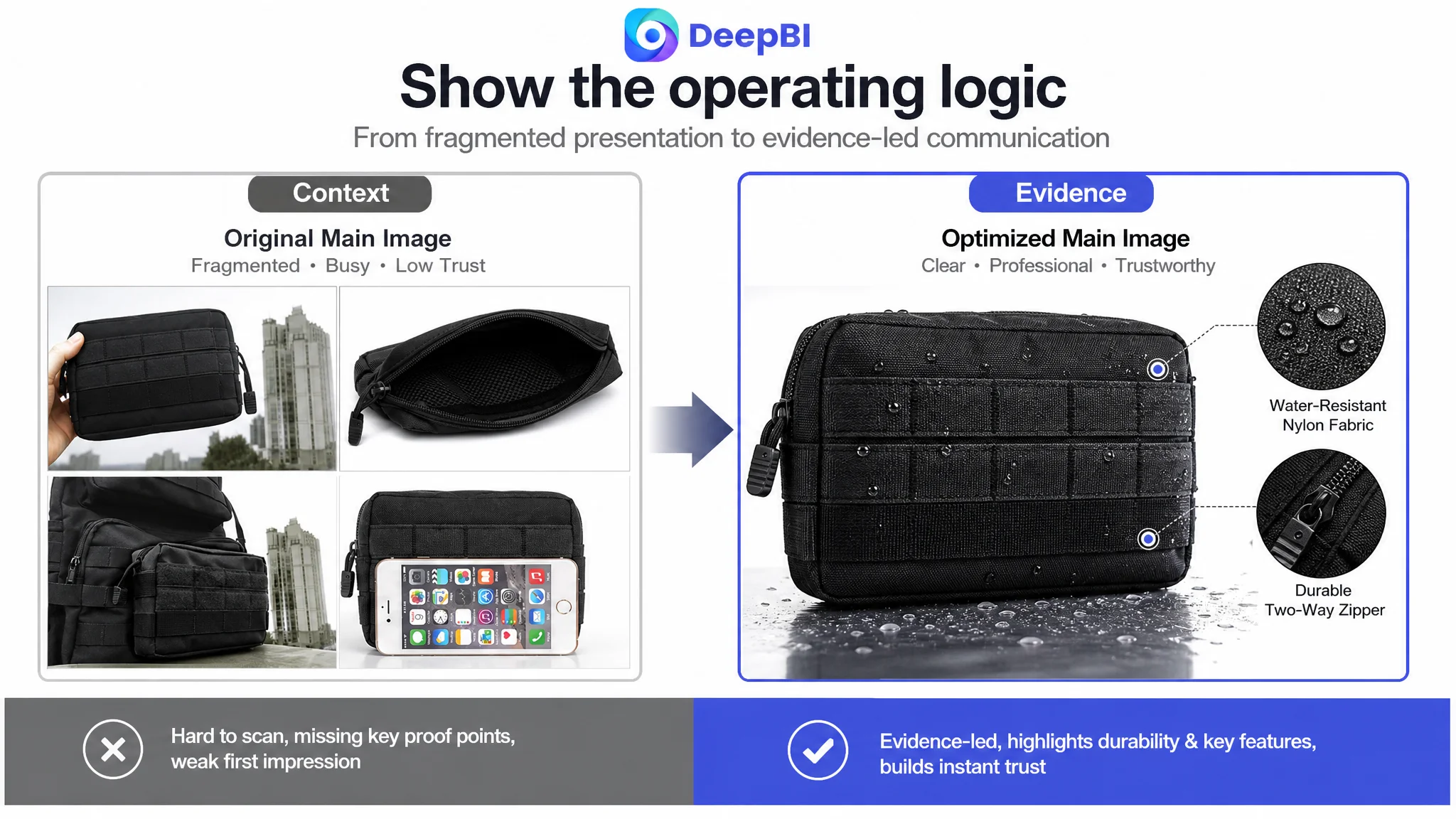
A product image should not ask the shopper to imagine how the pouch works. It should show enough of the operating logic that the decision becomes easier.
The Title Needed Better Search Intent, Not More Words
The title gap was smaller than the A+ and review gaps, but it still affected how the Listing entered the Amazon search journey.
The existing title interrupted its keyword flow by placing the 18 x 13 x 3 cm specification in the middle. It also opened with “1 Pack,” which communicated quantity before communicating the core product type. The usage language emphasized compatibility with backpacks, vests, and harnesses, but did not fully capture the broader search intent around tactical organization and outdoor activities.
The revised direction placed the core phrase first:
Tactical MOLLE Admin Pouch, Water-Resistant Nylon EDC Utility Belt Pouch, Military Gadget Gear Bag for Backpack Vest Harness, Hiking Camping Tools Organizer, 7.1 x 5.1 x 1.2 in, Black
The important change was structural rather than ornamental:
1. Start with the core product and search phrase
2. Add material and functional attributes
3. Clarify the product's role as a utility or gear pouch
4. Connect the pouch to relevant equipment
5. Close with activity-based use cases
6. Retain the dimensions and color without breaking the reading flow
This approach helps the title serve both sides of the Amazon funnel: search relevance at the beginning and shopper understanding throughout.
The Bullet Points Had Features, but Not a Buying Logic
The original bullet points described the product's physical characteristics, but the sequence did not consistently connect those characteristics to user concerns.
For this category, a stronger structure would be:
Durability should answer the outdoor-use concern
Water-resistant and scratch-resistant nylon is not only a material description. It addresses the shopper's concern about protecting small accessories and electronics during outdoor use or daily carry.
Compact dimensions should answer the bulk concern
The pouch's 18 x 13 x 3 cm size can be positioned as low-profile storage that adds organization without creating unnecessary bulk.
MOLLE compatibility should answer the mounting concern
Heavy-duty MOLLE straps should be connected to the equipment the buyer already uses: tactical backpacks, vests, battle belts, or harness systems. The benefit is not merely “compatible.” It is that essential items can remain attached and within reach.
Storage examples should answer the capacity concern
Listing smartphones, power banks, keys, wallets, cables, wipes, and compact tools makes the interior function easier to picture than a general statement about “large capacity.”
Support language should answer the purchase-risk concern
The comparable listing used a seller guarantee as a trust element. The target Listing lacked a similar support message. Any warranty or service statement, however, must reflect the seller's actual policy rather than copying a competitor's promise.
The point of the bullet-point revision was therefore not to add more adjectives. It was to turn each bullet into a compact problem-and-resolution unit.
Missing A+ Content Removed the Final Layer of Trust
The largest Listing score gap was in the detail page: 0 out of 25, compared with 21 out of 25 for the comparable listing.
This was the clearest reason the team should not prioritize continued ad tuning or isolated copy edits first. Without A+ content, the page had no structured space to demonstrate what the title and bullets claimed.
The missing modules left several important questions unanswered:
- What does the pouch look like in a real outdoor environment?
- How are the MOLLE straps attached?
- What makes the zipper practical in use?
- How does the nylon fabric appear at close range?
- What can the pouch realistically store?
- Where can it be mounted?
- How does it fit into a broader outdoor lifestyle?
The recommended A+ structure was designed as a progression rather than a collection of decorative banners.
Start with the use environment
An opening outdoor scene would position the pouch on suitable tactical equipment in a rugged environment. The objective would be to establish relevance quickly: this is equipment intended to be used, carried, and mounted, not simply displayed.
Move to specifications
A clean specification module would reduce uncertainty around materials, dimensions, and other confirmed product information. Transparent data shortens the shopper's evaluation process, especially for a compact accessory whose scale can be difficult to judge from isolated product photos.
Prove the MOLLE system
A close-up of the rear webbing, stitching, and fastening structure would address the category's core mounting concern. The shopper needs to see how the pouch connects, not merely read that it is compatible.
Demonstrate zipper operation
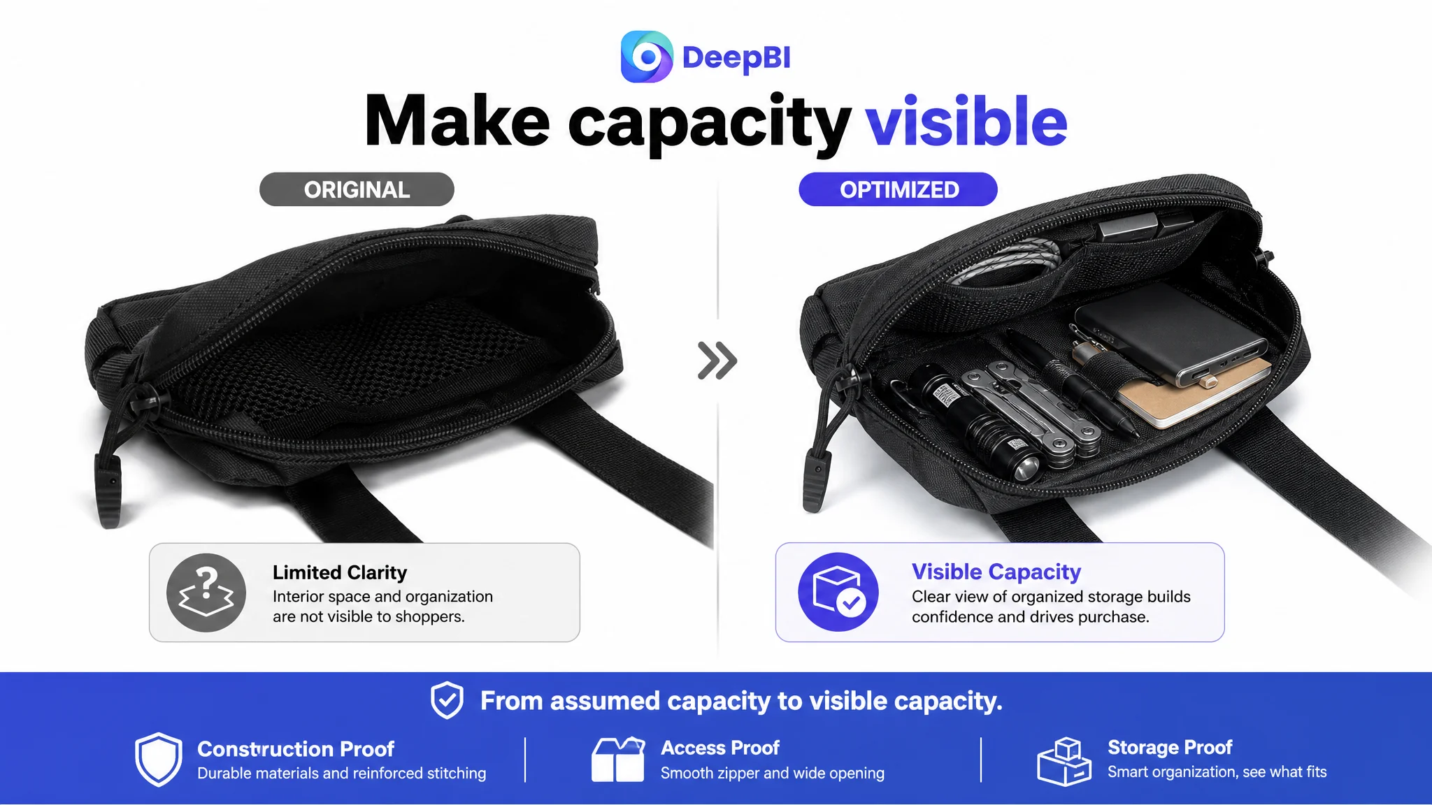
A partially opened pouch with a clear view of the zipper path would make access easier to understand. In outdoor use, ease of opening can matter as much as storage space.
Show the fabric honestly
A macro view of the nylon weave can give substance to the material claim. It should clarify texture and construction without visually implying properties the product has not been verified to possess.
Show different mounting scenarios
A combination of belt, backpack, and hand-carry applications would answer the practical question of where the pouch fits. This is where a tactical accessory can be repositioned as a broader outdoor and everyday organization product, provided those uses are accurate.
Show the inside in a real loaded state
A fully opened pouch with representative items such as a flashlight, tactical pen, or multitool would make internal capacity concrete. The goal is not to exaggerate capacity, but to show the organization value in a way that dimensions alone cannot.
The Review Gap Could Not Be Solved by Design Alone
The target Listing had no review data. The comparable listing had 981 reviews and a 4.3-star rating, with customer comments discussing durability, sizing, and the MOLLE system.
This gap matters because reviews perform a role that images and copy cannot fully replace. They provide third-party confirmation after the brand has made its claims.
A redesigned Listing could improve clarity, professionalism, and trust signals, but it could not manufacture customer experience. The review dimension therefore had to be treated as a separate business constraint rather than something that better images could erase.
That distinction is important for Amazon sellers. Listing optimization can improve how a product is understood and evaluated. It cannot substitute for legitimate review accumulation, accurate product delivery, or consistent customer experience.
The right decision was to repair the controllable page-level weaknesses while recognizing that review authority would take a different operational path.
Why DeepBI Did Not Recommend Tuning Everything at Once
A common Amazon response to weak performance is to adjust the title, bids, keywords, campaign structure, images, and bullet points simultaneously. That may create activity, but it often destroys the ability to identify which change addressed the real constraint.
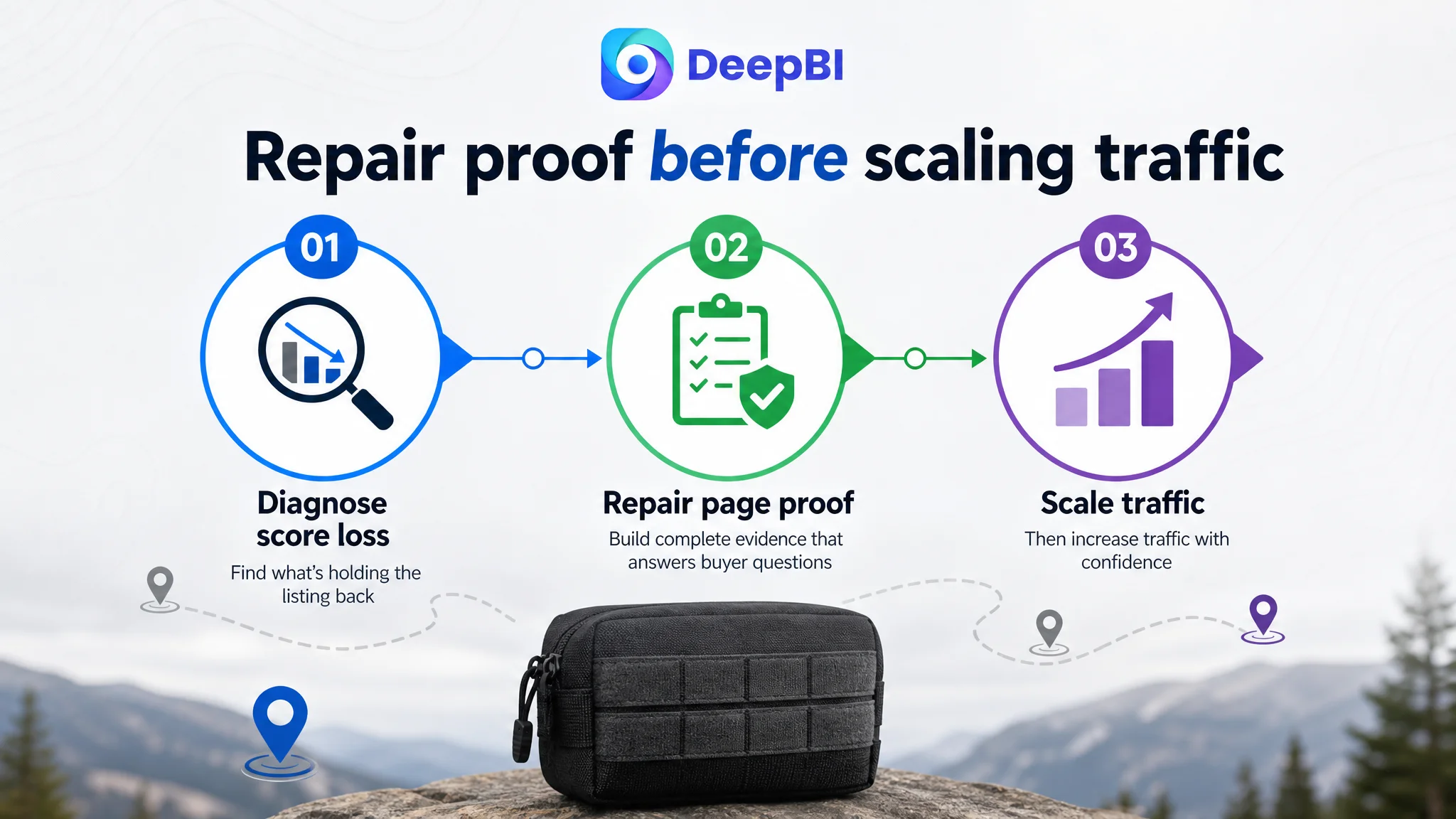
In this case, the score evidence supported a clearer order:
1. Repair the product page's visual and informational foundation
2. Improve title relevance and mobile readability
3. Rebuild the main-image hierarchy
4. Convert bullet points from parameter lists into use-case logic
5. Add A+ modules that demonstrate functionality and trust
6. Address the review gap through legitimate post-purchase operations
7. Only then evaluate how additional Amazon traffic should be scaled
The reason is straightforward. Sending more traffic to a page with weak proof does not solve the page problem. It can simply expose more shoppers to the same uncertainty.
Advertising can amplify demand, but it can also amplify a Listing's inability to convert that demand.
DeepBI's value in this case was not the number of proposed image changes or rewritten sentences. It was the ability to connect the score distribution to an operating decision: the largest conversion risks sat on the product page, so the product page had to be repaired before traffic expansion became the primary move.
The Optimization Direction Shifted from Appearance to Evidence
The revised direction for this Amazon tactical pouch Listing was not “make it look more premium.” That would still be too vague.
The actual shift was toward evidence:
- From collage-style presentation to a clear product-first main image
- From generic outdoor imagery to realistic mounted-use scenes
- From dimension-only communication to functional demonstrations
- From material claims to visible fabric and construction detail
- From general compatibility language to specific MOLLE applications
- From empty page space to a complete A+ decision sequence
- From isolated product facts to a coherent path from recognition to confidence
This is where the relationship between Amazon Listing quality and advertising efficiency becomes commercially important. Whether traffic is organic or paid, the page must answer the shopper's questions after the click. A stronger title may improve relevance, but it cannot compensate for missing product evidence. A better main image may improve engagement, but it cannot fully resolve concerns about mounting stability or storage. A+ content matters because it connects those pieces.
What This Case Changes About Amazon Store Diagnosis
The case did not provide a post-optimization performance dataset, so it would be inappropriate to claim a specific CTR, CVR, ACOS, or organic-order improvement.
What it did provide was a clear change in business understanding.
The seller could now distinguish between several different issues that are often grouped together as “poor performance”:
- Search relevance was a title-structure issue
- First-click competitiveness was a main-image issue
- Product understanding was a bullet-point and detail-page issue
- Trust formation was an A+ and review issue
- Traffic allocation should be considered only after the page could properly receive that traffic
That distinction makes future Amazon operations more controllable. It prevents the team from treating every weak result as an advertising problem and from using more traffic to compensate for missing conversion logic.
For Amazon sellers, the practical lesson is not to copy the exact image style or title wording from this tactical pouch case. It is to examine where the Listing's competitive score is actually being lost.
If the title is close to the category standard but A+ content is absent, the priority is not another keyword variation. If the main image is crowded while competitors communicate the product clearly at thumbnail size, the priority is not a more aggressive bid. If reviews are missing, the team should separate the trust-building problem from the content problem instead of assuming a new graphic can solve both.
A Listing deserves more Amazon traffic when it can explain the product, demonstrate its use, and reduce the buyer's perceived risk. Until then, optimization should begin with diagnosis—not escalation.